
Cys_Control(二) MButton
一、添加自定义Button
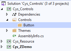
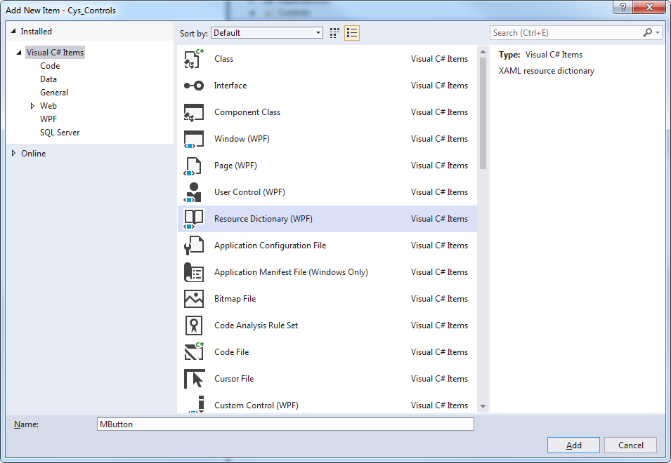
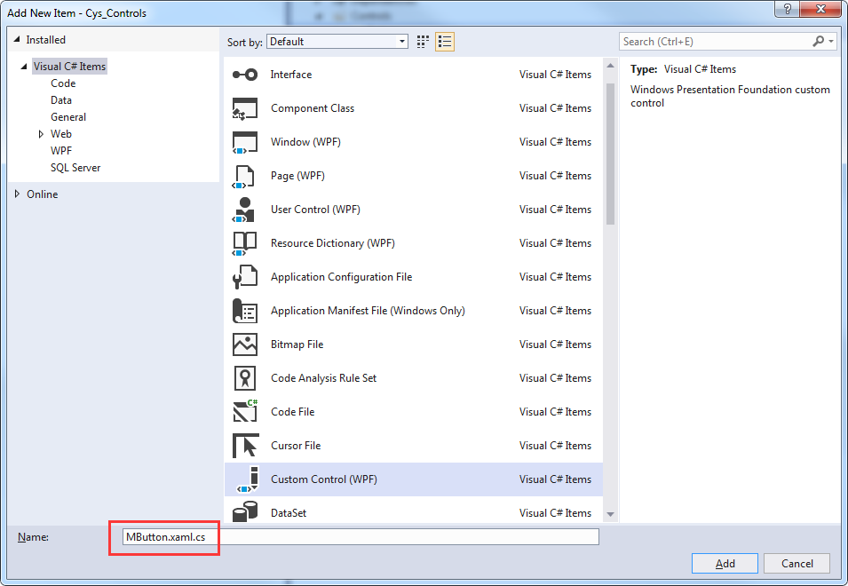
二、Xaml文件自动关联
Custom Control 取名与资源文件相同加.cs文件将自动关联
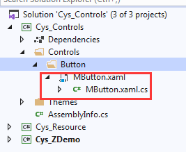
Themes文件下Generic.xaml引入该控件,用于对外公布样式
<ResourceDictionary

    xmlns="http://schemas.microsoft.com/winfx/2006/xaml/presentation">

    <ResourceDictionary.MergedDictionaries>

        <ResourceDictionary Source="pack://application:,,,/Cys_Controls;component/Controls/Button/MButton.xaml"/>

    </ResourceDictionary.MergedDictionaries>

</ResourceDictionary>
至此第一个控件已关联完毕
三、查看Button原始样式
下面自定义MButton样式
打开Blend新建Wpf程序 Button右键查看原始样式

<Style x:Key="ButtonFocusVisual">

    <Setter Property="Control.Template">

        <Setter.Value>

            <ControlTemplate>

                <Rectangle Margin="2" StrokeDashArray="1 2" SnapsToDevicePixels="true" StrokeThickness="1" Stroke="{DynamicResource {x:Static SystemColors.ControlTextBrushKey}}"/>

            </ControlTemplate>

        </Setter.Value>

    </Setter>

</Style>

<LinearGradientBrush x:Key="ButtonNormalBackground" EndPoint="0,1" StartPoint="0,0">

    <GradientStop Color="#F3F3F3" Offset="0"/>

    <GradientStop Color="#EBEBEB" Offset="0.5"/>

    <GradientStop Color="#DDDDDD" Offset="0.5"/>

    <GradientStop Color="#CDCDCD" Offset="1"/>

</LinearGradientBrush>

<SolidColorBrush x:Key="ButtonNormalBorder" Color="#FF707070"/>

<Style x:Key="ButtonStyle1" TargetType="{x:Type Button}">

    <Setter Property="FocusVisualStyle" Value="{StaticResource ButtonFocusVisual}"/>

    <Setter Property="Background" Value="{StaticResource ButtonNormalBackground}"/>

    <Setter Property="BorderBrush" Value="{StaticResource ButtonNormalBorder}"/>

    <Setter Property="BorderThickness" Value="1"/>

    <Setter Property="Foreground" Value="{DynamicResource {x:Static SystemColors.ControlTextBrushKey}}"/>

    <Setter Property="HorizontalContentAlignment" Value="Center"/>

    <Setter Property="VerticalContentAlignment" Value="Center"/>

    <Setter Property="Padding" Value="1"/>

    <Setter Property="Template">

        <Setter.Value>

            <ControlTemplate TargetType="{x:Type Button}">

                <theme:ButtonChrome x:Name="Chrome" Background="{TemplateBinding Background}" BorderBrush="{TemplateBinding BorderBrush}" RenderMouseOver="{TemplateBinding IsMouseOver}" RenderPressed="{TemplateBinding IsPressed}" RenderDefaulted="{TemplateBinding IsDefaulted}" SnapsToDevicePixels="true">

                    <ContentPresenter HorizontalAlignment="{TemplateBinding HorizontalContentAlignment}" Margin="{TemplateBinding Padding}" RecognizesAccessKey="True" SnapsToDevicePixels="{TemplateBinding SnapsToDevicePixels}" VerticalAlignment="{TemplateBinding VerticalContentAlignment}"/>

                </theme:ButtonChrome>

                <ControlTemplate.Triggers>

                    <Trigger Property="IsKeyboardFocused" Value="true">

                        <Setter Property="RenderDefaulted" TargetName="Chrome" Value="true"/>

                    </Trigger>

                    <Trigger Property="ToggleButton.IsChecked" Value="true">

                        <Setter Property="RenderPressed" TargetName="Chrome" Value="true"/>

                    </Trigger>

                    <Trigger Property="IsEnabled" Value="false">

                        <Setter Property="Foreground" Value="#ADADAD"/>

                    </Trigger>

                </ControlTemplate.Triggers>

            </ControlTemplate>

        </Setter.Value>

    </Setter>

</Style>
ControlTemplate 标签下为控件的展示形式如下
<theme:ButtonChrome x:Name="Chrome" Background="{TemplateBinding Background}" BorderBrush="{TemplateBinding BorderBrush}" RenderMouseOver="{TemplateBinding IsMouseOver}" RenderPressed="{TemplateBinding IsPressed}" RenderDefaulted="{TemplateBinding IsDefaulted}" SnapsToDevicePixels="true">

   <ContentPresenter HorizontalAlignment="{TemplateBinding HorizontalContentAlignment}" Margin="{TemplateBinding Padding}" RecognizesAccessKey="True" SnapsToDevicePixels="{TemplateBinding SnapsToDevicePixels}" VerticalAlignment="{TemplateBinding VerticalContentAlignment}"/>

</theme:ButtonChrome>
四、更改默认样式并添加依赖属性
可替换改部分内容为我们的展示 MButton.xaml具体代码
<ResourceDictionary xmlns="http://schemas.microsoft.com/winfx/2006/xaml/presentation"

                    xmlns:x="http://schemas.microsoft.com/winfx/2006/xaml"

                    xmlns:local="clr-namespace:Cys_Controls.Controls">

    <Style TargetType="{x:Type local:MButton}">

        <Setter Property="Foreground" Value="{DynamicResource ColorBrush.FontDefaultColor}" />

        <Setter Property="Background" Value="{DynamicResource ColorBrush.DefaultBackgroundColor}" />

        <Setter Property="BorderBrush" Value="{DynamicResource ColorBrush.DefaultBorderBrushColor}"/>

        <Setter Property="IsMouseOverBrush" Value="{DynamicResource ColorBrush.DefaultBackgroundOverColor}"/>

        <Setter Property="FocusVisualStyle" Value="{x:Null}"/>

        <Setter Property="BorderThickness" Value="1" />

        <Setter Property="VerticalContentAlignment" Value="Center" />

        <Setter Property="Template">

            <Setter.Value>

                <ControlTemplate TargetType="{x:Type local:MButton}">

                    <Border x:Name="PART_Border" Background="{TemplateBinding Background}" BorderThickness="{TemplateBinding BorderThickness}"

                            BorderBrush="{TemplateBinding BorderBrush}" CornerRadius="4">

                        <Grid>

                            <StackPanel HorizontalAlignment="Center" Orientation="Horizontal" VerticalAlignment="Center">

                                <!--Icon区域-->

                                <Image x:Name="PART_Icon" Width="16" Height="16"

                                       Stretch="Fill" HorizontalAlignment="Center" Source="{TemplateBinding Icon}" VerticalAlignment="Center" Margin="0,0,5,0"/>

                                <!--内容区域-->

                                <TextBlock x:Name="PART_ContentHost" Text="{TemplateBinding Content}" Foreground="{TemplateBinding Foreground}"

                                           FontSize="{TemplateBinding FontSize}" SnapsToDevicePixels="{TemplateBinding SnapsToDevicePixels}"

                                           HorizontalAlignment="Center" VerticalAlignment="Center"/>

                            </StackPanel>

                        </Grid>

                    </Border>

                    <ControlTemplate.Triggers>

                        <Trigger Property="IsMouseOver" Value="True">

                            <Setter TargetName="PART_Border" Property="Background" Value="{Binding RelativeSource={RelativeSource FindAncestor, AncestorType={x:Type local:MButton}},Path=IsMouseOverBrush}" />

                        </Trigger>

                        <Trigger Property="Icon" Value="{x:Null}">

                            <Setter TargetName="PART_Icon" Property="Visibility" Value="Collapsed"/>

                        </Trigger>

                    </ControlTemplate.Triggers>

                </ControlTemplate>

            </Setter.Value>

        </Setter>

    </Style>

</ResourceDictionary>
MButton.xaml.cs具体代码
    public class MButton : System.Windows.Controls.Button

    {

        static MButton()

        {

            DefaultStyleKeyProperty.OverrideMetadata(typeof(MButton), new FrameworkPropertyMetadata(typeof(MButton)));

        }

        #region == StyleType 控件样式==

        /// <summary>

        /// StyleType 控件样式

        /// </summary>

        public static readonly DependencyProperty StyleTypeProperty = DependencyProperty.Register("StyleType", typeof(StyleType), typeof(MButton), new PropertyMetadata(StyleType.Default));

        public StyleType StyleType

        {

            get => (StyleType)GetValue(StyleTypeProperty);

            set => SetValue(StyleTypeProperty, value);

        }

        #endregion == StyleType 控件样式==

        #region == IsMouseOverBrush 鼠标停留背景画刷==

        public static readonly DependencyProperty IsMouseOverBrushProperty = DependencyProperty.Register("IsMouseOverBrush", typeof(Brush), typeof(MButton),

            new PropertyMetadata());

        /// <summary>

        /// 鼠标停留背景画刷

        /// </summary>

        public Brush IsMouseOverBrush

        {

            get => (Brush)GetValue(IsMouseOverBrushProperty);

            set => SetValue(IsMouseOverBrushProperty, value);

        }

        #endregion == IsMouseOverBrush 鼠标停留背景画刷==

        #region == Icon 图标==

        public static readonly DependencyProperty IconProperty = DependencyProperty.Register("Icon", typeof(BitmapImage), typeof(MButton),

            new PropertyMetadata(null));

        /// <summary>

        /// Icon 图标

        /// </summary>

        public BitmapImage Icon

        {

            get => (BitmapImage)GetValue(IconProperty);

            set => SetValue(IconProperty, value);

        }

        #endregion == Icon 图标==

        public override void OnApplyTemplate()

        {

            base.OnApplyTemplate();

            InitResourceData();

        }

        /// <summary>

        /// 建立 DynamicResource 绑定

        /// </summary>

        private void InitResourceData()

        {

            this.SetResourceReference(ForegroundProperty,StyleType == StyleType.Default ? "ColorBrush.FontDefaultColor" : "ColorBrush.FontPrimaryColor");

            this.SetResourceReference(BackgroundProperty,$"ColorBrush.{StyleType}BackgroundColor");

            this.SetResourceReference(BorderBrushProperty,$"ColorBrush.{StyleType}BorderBrushColor");

            this.SetResourceReference(IsMouseOverBrushProperty,$"ColorBrush.{StyleType}BackgroundOverColor");

        }

    }
五、效果图
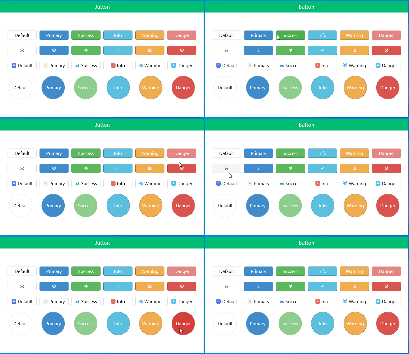
gitee地址:https://gitee.com/sirius_machao/Cys_Controls/tree/dev/
Cys_Control(二) MButton的更多相关文章
- [Unity3D]自制UnityForAndroid二维码扫描插件
一周左右终于将二维码生成和扫描功能给实现了,终于能舒缓一口气了,从一开始的疑惑为啥不同的扫码客户端为啥扫出来的效果不同?通用的扫描器扫出来就是一个下载APK,自制的扫描器扫出来是想要的有效信息,然后分 ...
- Android仿微信二维码扫描
转载:http://blog.csdn.net/xiaanming/article/details/10163203 了解二维码这个东西还是从微信中,当时微信推出二维码扫描功能,自己感觉挺新颖的,从一 ...
- Android 基于google Zxing实现二维码、条形码扫描,仿微信二维码扫描效果
Android 高手进阶(21) 版权声明:本文为博主原创文章,未经博主允许不得转载. 转载请注明出处:http://blog.csdn.net/xiaanming/article/detail ...
- android 二维码扫描
了解二维码这个东西还是从微信 中,当时微信推出二维码扫描功能,自己感觉挺新颖的,从一张图片中扫一下竟然能直接加好友,不可思议啊,那时候还不了解二维码,呵呵,然后做项目的时候, 老板说要加上二维码扫描功 ...
- [Unity+Android]横版扫描二维码
原地址:http://blog.csdn.net/dingxiaowei2013/article/details/25086835 终于解决了一个忧伤好久的问题,严重拖了项目进度,深感惭愧!一直被一系 ...
- 【转】Android 基于google Zxing实现二维码、条形码扫描,仿微信二维码扫描效果--不错
原文网址:http://blog.csdn.net/xiaanming/article/details/10163203 转载请注明出处:http://blog.csdn.net/xiaanming/ ...
- Android在子线程中更新UI(二)
MainActivity如下: package cc.testui2; import android.os.Bundle; import android.view.View; import andro ...
- Android Multimedia框架总结(二十三)MediaCodec补充及MediaMuxer引入(附案例)
请尊重分享成果,转载请注明出处,本文来自逆流的鱼yuiop,原文链接:http://blog.csdn.net/hejjunlin/article/details/53729575 前言:前面几章都是 ...
- Android异步处理系列文章四篇之二 使用AsyncTask异步更新UI界面
Android异步处理一:使用Thread+Handler实现非UI线程更新UI界面Android异步处理二:使用AsyncTask异步更新UI界面Android异步处理三:Handler+Loope ...
随机推荐
- Redis中的一致性哈希问题
在说redis中的哈希(准确来说是一致性哈希)问题之前,先来看一个问题:为什么在分布式集群中一致性哈希会得到大量应用? 在一个分布式系统中,要将数据存储到具体某个节点,或者将来自客户端的请求分配到某个 ...
- 一文搞懂后台高性能服务器设计的常见套路, BAT 高频面试系列
微信搜索「编程指北」,关注这个写干货的程序员,回复「资源」,即可获取后台开发学习路线和书籍 先赞后看,养成习惯~ 前言 金九银十,又是一年校招季. 经历过,才深知不易.最近,和作为校招面试官的同事聊了 ...
- 3.4 MyArrayList 类的实现
3.4 MyArrayList 类的实现 这节提供一个便于使用的 MyArrayList 泛型类的实现,这里不检测可能使得迭代器无效的结构上的修改,也不检测非法的迭代器 remove 方法. MyAr ...
- 【SpringCloud】03.微服务的设计原则
微服务的设计原则: 一.AKF拆分原则 业界对于可扩展的系统架构设计有一个朴素的理念:通过加机器就可以解决容量和可用性问题(如果一台不行就两台). Y轴(功能)--关注应用中功能划分,基于不同的业务拆 ...
- 时间序列数据的定义,读取与指数平滑(Java)
应上头的要求,需要实现以下指数平滑进行资源调度负载的预测,那就是用我最喜欢的Java做一下吧. 引用<计量经济学导论>的一句话:时间序列数据区别于横截面数据的一个明显特点是,时间序列数据集 ...
- Java—多线程
一.多线程 原理: 一个cpu内核有"一个指针",由于cpu的频率过高,所以感觉不到卡顿.(伪线程) 二.进程&线程 进程:进程指正在运行的程序.确切的来说,当一个程序进入 ...
- 利用c++ std::getline实现split
getline reads characters from an input stream and places them into a string: getline从输入流中读取字符, 并把它们转 ...
- 五:request和response的使用
接着上一篇我们在搞完servlet的终极模式之后,接着就需要对发送的请求做出响应了 在这里,所谓的响应,都是返回页面的语言在浏览器上显示也就是HTML语言,所以返回的结果只有HTML语言才能在浏览器上 ...
- 测试_QTP简介
一:什么是QTP? QTP(QuickTest Professional)是一款自动化测试工具,自动化测试就是利用计算机模拟人进行测试,也就是开发一套代码测试另一套代码. QTP主要用它来执行重复的手 ...
- Metasploit渗透使用攻略
msf关于tomcat口令暴力猜解模块 use auxiliary/scanner/http/tomcat_mgr_login show options set rhosts 192.168.2.14 ...