前端CSS3布局display:flex用法
前端CSS3布局display:flex用法
先附上代码
点击查看代码
<!DOCTYPE html>

<html>

  <head>

    <meta charset="utf-8">

    <title>display:flex</title>

    <style>

      .flex-box {

        background-color: aquamarine;

      }

      .flex-box>div {

        background-color: lightgray;

        width: 100px;

        height: 100px;

        text-align: center;

        border: 1px solid red;

      }

    </style>

  </head>

  <body>

    <div class="flex-box">

      <div>1</div>

      <div>2</div>

      <div>3</div>

      <div>4</div>

      <div>5</div>

      <div>6</div>

      <div>7</div>

      <div>8</div>

    </div>

  </body>

</html>
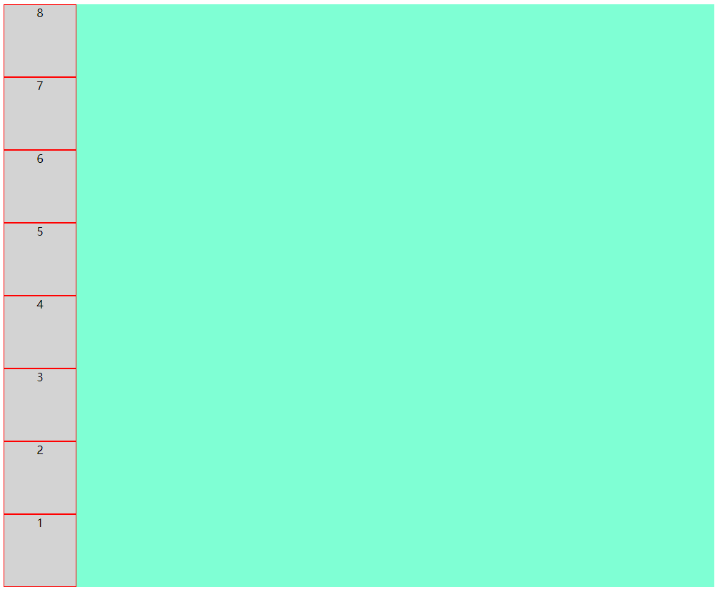
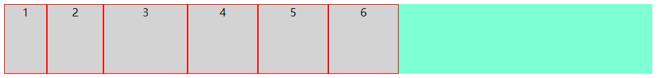
运行效果
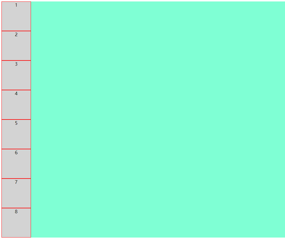
8个小方块呈纵向排列
好,接下来我们看看display:flex到底有哪些好处
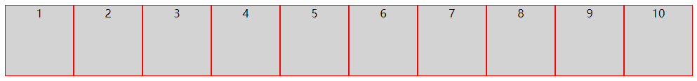
先在flex-box中设置display:flex,看看效果
上代码
点击查看代码
.flex-box {

    background-color: aquamarine;

    display: flex;

}
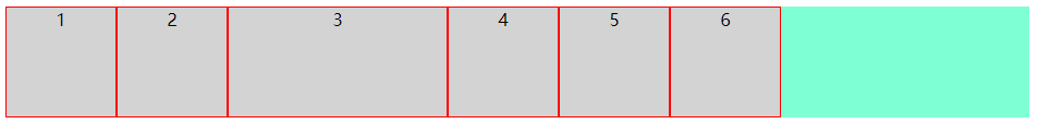
效果图
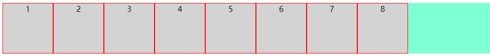
仅仅设置了display: flex,8个小方块呈横向排列了
接下来详解flex布局的几个常用属性
flex-direction
flex-wrap
flex-flow
justify-content
align-items
1. flex-direction
该属性决定小方块按横向或纵向排列
(1):row(决定小方块横向排列,起点在左端)
上代码
点击查看代码
.flex-box {

    background-color: aquamarine;

    display: flex;

    flex-direction: row;

}
效果图
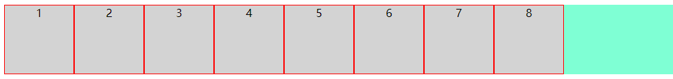
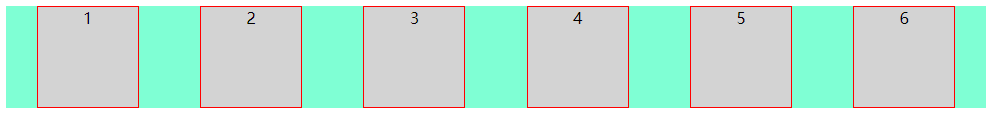
可以看到,样式并没有什么变化,这是因为row是flex-direction的默认排列方式
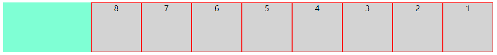
(2):row-reverse(决定小方块横向排列,起点在右端)
上代码
点击查看代码
.flex-box {

    background-color: aquamarine;

    display: flex;

    flex-direction: row-reverse;

}
效果图
(3):column(决定小方块纵向排列,起点在上端)
上代码
点击查看代码
.flex-box {

    background-color: aquamarine;

    display: flex;

    flex-direction: column;

}
效果图
(4):column-reverse(决定小方块纵向排列,起点在下端)
上代码
点击查看代码
.flex-box {

    background-color: aquamarine;

    display: flex;

    flex-direction: column-reverse;

}
效果图
到此,flex-direction属性就讲完了
接下来讲解flex-wrap
2. flex-wrap
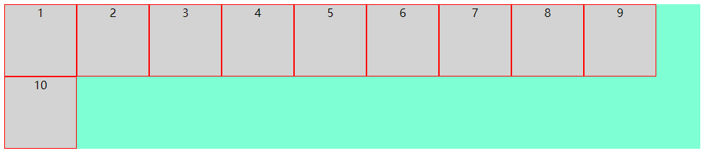
该属性决定小方块是否换行,默认不换行,内容会被挤压
(1):nowrap(决定小方块不换行,起点在上端,内容会被挤压)
上代码
点击查看代码
.flex-box {

    background-color: aquamarine;

    display: flex;

    flex-wrap: nowrap;

}
效果图
(2):wrap(决定小方块换行,起点在上端,内容不会被挤压,)
上代码
点击查看代码
.flex-box {

    background-color: aquamarine;

    display: flex;

    flex-wrap: wrap;

}
效果图
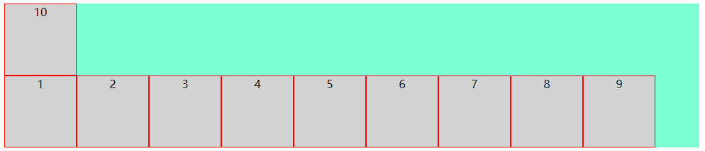
(3):wrap-reverse(决定小方块换行,起点在下端,内容不会被挤压,)
上代码
点击查看代码
.flex-box {

    background-color: aquamarine;

    display: flex;

    flex-wrap: wrap-reverse;

}
效果图
3. flex-flow
该属性是用于同时设置 flex-direction 和 flex-wrap 属性的简写属性
包含如下几种可能
row nowrap|wrap|wrap-reverse
row-reverse nowrap|wrap|wrap-reverse
column nowrap|wrap|wrap-reverse
column-reverse nowrap|wrap|wrap-reverse
由于可能太多了,下面只列举了一种,但小编试过了,所有的可能都是对的
(1):row-reverse wrap-reverse(决定小方块呈横向排列且起点在右端,换行且起点在下端,内容不会被挤压)
上代码
点击查看代码
.flex-box {

    background-color: aquamarine;

    display: flex;

    flex-flow: row-reverse wrap-reverse;

}
效果图
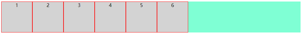
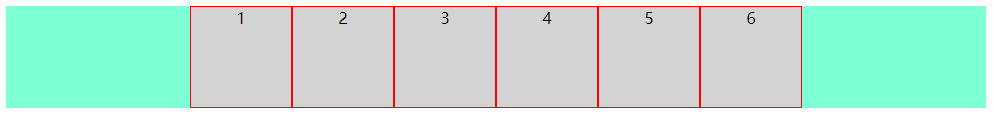
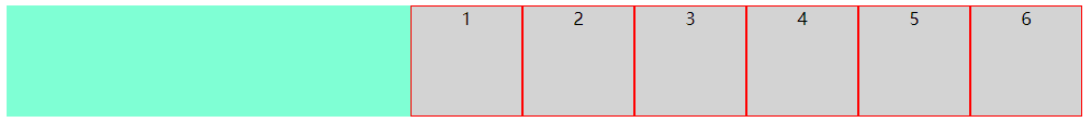
4. justify-content
该属性决定小方块在纵轴上的对齐方式
(1):flex-start(决定小方块左对齐)
上代码
点击查看代码
.flex-box {

    background-color: aquamarine;

    display: flex;

    justify-content: flex-start;

}
效果图
(2):center(决定小方块中心对齐)
上代码
点击查看代码
.flex-box {

    background-color: aquamarine;

    display: flex;

    justify-content: center;

}
效果图
(3):flex-end(决定小方块右对齐)
上代码
点击查看代码
.flex-box {

    background-color: aquamarine;

    display: flex;

    justify-content: flex-end;

}
效果图
(4):space-around(决定小方块之间的间隔比小方块与边框的间隔大一倍)
上代码
点击查看代码
.flex-box {

    background-color: aquamarine;

    display: flex;

    justify-content: space-around;

}
效果图
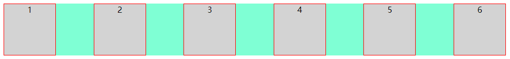
(5):space-between(决定小方块两端对齐,小方块之间间隔相等)
上代码
点击查看代码
.flex-box {

    background-color: aquamarine;

    display: flex;

    justify-content: space-between;

}
效果图
(6):space-evenly(决定小方块之间的间隔相等)
上代码
点击查看代码
.flex-box {

    background-color: aquamarine;

    display: flex;

    justify-content: space-evenly;

}
效果图
5. align-items
该属性决定小方块在横轴上的对齐方式
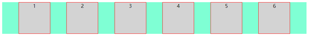
(1):flex-start(决定小方块上对齐)
上代码
点击查看代码
.flex-box {

    background-color: aquamarine;

    display: flex;

    align-items: flex-start;

}
效果图
(2):center(决定小方块中心对齐)
上代码
点击查看代码
.flex-box {

    background-color: aquamarine;

    display: flex;

    align-items: center;

}
效果图
(3):flex-end(决定小方块下对齐)
上代码
点击查看代码
.flex-box {

    background-color: aquamarine;

    display: flex;

    align-items: flex-end;

}
效果图
(4):baseline(决定小方块第一行文字的基线对齐)
上代码
点击查看代码
.flex-box {

    background-color: aquamarine;

    display: flex;

    align-items: baseline;

}
效果图
(5):stretch(决定小方块占满整个容器的高度)
注意:小方块的高度应不设置或设置为auto
上代码
点击查看代码
.flex-box {

    background-color: aquamarine;

    display: flex;

    align-items: stretch;

}
效果图
以上是容器的属性,接下来我们讲解小方块的属性
order
flex-grow
flex-shrink
flex-basis
flex
align-self
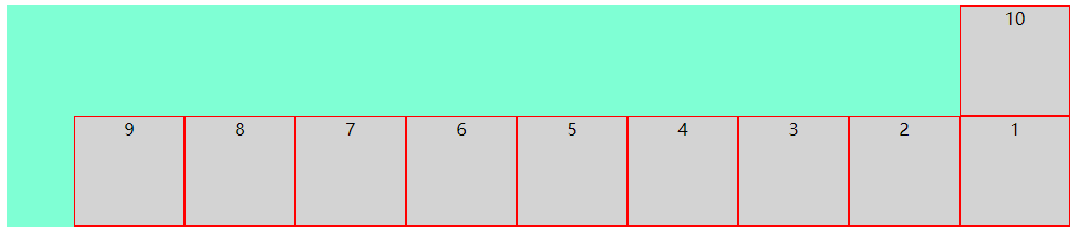
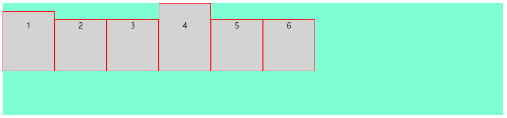
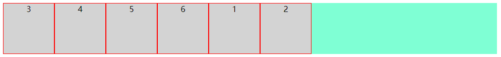
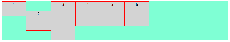
(1):order(决定小方块显示的顺序,默认为0)
注意:小方块order不设置或设置为0的优先级比设置为1的优先级高
注意:该值必须为数字
上代码
点击查看代码
<div class="flex-box">

  <div style="order: 1">1</div>

  <div style="order: 2">2</div>

  <div style="order: 0">3</div>

  <div>4</div>

  <div>5</div>

  <div>6</div>

</div>
效果图
(2):flex-grow(决定某个小方块相对于其它小方块将增长多少)
注意:该值必须为数字,数值越大,增长越多
上代码
点击查看代码
<div class="flex-box">

  <div style="flex-grow: 1">1</div>

  <div style="flex-grow: 2">2</div>

  <div style="flex-grow: 3">3</div>

  <div>4</div>

  <div>5</div>

  <div>6</div>

</div>
效果图
将窗口变长

(3):flex-shrink(决定某个小方块相对于其它小方块将收缩多少)
注意:该值必须为数字,数值越大,收缩越多
上代码
点击查看代码
<div class="flex-box">

  <div style="flex-shrink: 1">1</div>

  <div style="flex-shrink: 2">2</div>

  <div style="flex-shrink: 3">3</div>

  <div>4</div>

  <div>5</div>

  <div>6</div>

</div>
效果图
将窗口缩小
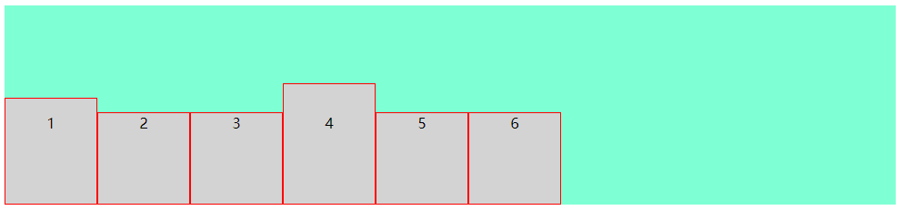
(4):flex-basis(决定某个小方块的初始长度)
上代码
点击查看代码
<div class="flex-box">

  <div style="flex-basis: 60px">1</div>

  <div style="flex-basis: 80px">2</div>

  <div style="flex-basis: 120px">3</div>

  <div>4</div>

  <div>5</div>

  <div>6</div>

</div>
效果图
(5):flex(flex-grow、flex-shrink 和 flex-basis 属性的简写属性)
上代码
点击查看代码
<div class="flex-box">

  <div>1</div>

  <div>2</div>

  <div style="flex: 0 0 200px">3</div>

  <div>4</div>

  <div>5</div>

  <div>6</div>

</div>
效果图
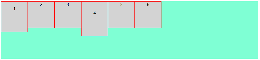
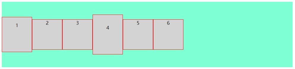
(6):align-self(决定某个小方块的对齐方式,将覆盖容器的 align-items 属性所设置的默认对齐方式)
上代码
点击查看代码
<div class="flex-box">

  <div style="align-self: flex-start; height: 60px;">1</div>

  <div style="align-self: center;  height: 80px;">2</div>

  <div style="align-self: flex-end;  height: 160px;">3</div>

  <div>4</div>

  <div>5</div>

  <div>6</div>

</div>
效果图
至此,display:flex的常用用法就讲完了
前端CSS3布局display:flex用法的更多相关文章
- 前端CSS3布局display:grid用法
前端CSS3布局display:flex用法 1. 先附上代码 点击查看代码 <!DOCTYPE html> <html> <head> <meta char ...
- CSS弹性盒布局(display:flex)
CSS弹性布局(display:flex) 参考: http://www.runoob.com/w3cnote/flex-grammar.html https://www.jianshu.com/p/ ...
- css3 伸缩布局 display:flex等
<!DOCTYPE html> <html lang="en"> <head> <meta charset="UTF-8&quo ...
- 弹性盒布局display:flex详解
一:弹性盒子 随着响应式设计的流行,网站开发者在设计网页布局时往往要考虑到页面在适配不同分辨率的浏览器时其内部组件位置大小都会产生变化,因此需要设计者根据窗口尺寸来调整布局,从而改变组件的尺寸和位置, ...
- css3布局属性flex
html代码如下: <ul class="ul_box"> <li><a href="#">html</a>&l ...
- css display:flex 属性
一:display:flex 布局 display:flex 是一种布局方式.它即可以应用于容器中,也可以应用于行内元素.是W3C提出的一种新的方案,可以简便.完整.响应式地实现各种页面布局.目前,它 ...
- CSS3:布局display属性的flex(弹性布局)
CSS3:布局display属性的flex(弹性布局) 一.简介 Flex是Flexible Box的缩写,意为"弹性布局",用来为盒状模型提供最大的灵活性.设为Flex布局以后, ...
- 浅谈CSS3中display属性的Flex布局
浅谈CSS3中display属性的Flex布局 最近在学习微信小程序,在设计首页布局的时候,新认识了一种布局方式display:flex 1 .container { 2 display: fle ...
- 【分享】谈CSS3中display属性的flex布局
最近在学习微信小程序(重新学习微信小程序),在设计首页布局的时候,新认识了一种布局方式display:flex .guide-top{ height: 36%; display: flex; /*fl ...
随机推荐
- MyEclipse如何刷新项目
第一种:选中项目,点右键Refresh即可, 第二种:选择project->clean,选中所要编译得项目,点ok即可
- window nginx 简单搭建服务器访问静态资源
nginx命令: 启动: start nginx 停止:nginx -s stop || nginx -s quit 注:stop是快速停止nginx,可能并不保存相关信息:quit是完整有序的停止 ...
- IE zoom
zoom是IE浏览器特有的属性,它可以设置或检索对象的缩放比例(它的中文解释是:放大),它的作用通常可以概括为三个方面: 1.hasLayout 2.清除浮动 3.清除div的垂直外边距合并问题 什么 ...
- Blazor组件自做五 : 使用JS隔离封装Google地图
Blazor组件自做五: 使用JS隔离封装Google地图 运行截图 演示地址 正式开始 1. 谷歌地图API 谷歌开发文档 开始学习 Maps JavaScript API 的最简单方法是查看一个简 ...
- 如何在 Java 中实现最小生成树算法
定义 在一幅无向图 \(G=(V,E)\) 中,\((u, v)\) 为连接顶点 \(u\) 和顶点 \(v\) 的边,\(w(u,v)\) 为边的权重,若存在边的子集 \(T\subseteq E\ ...
- oracle system,sys用户 忘记密码,怎么修改密码
sys用户是Oracle中权限最高的用户,而system是一个用于数据库管理的用户.在数据库安装完之后,应立即修改sys,system这两个用户的密码,以保证数据库的安全.但是我们有时候会遗忘密码或者 ...
- 某空间下的令牌访问产生过程--Kubernetes Dashboard(k8s-Dashboard)
在面试中发现,有些运维人员基本的令牌访问方式都不知道,下面介绍下令牌的产生过程 某个空间下的令牌访问产生过程(空间名称为cc) ###创建命名空间[root@vms61 ccadmin]# kubec ...
- 基于HiKariCP组件,分析连接池原理
HiKariCP作为SpringBoot2框架的默认连接池,号称是跑的最快的连接池,数据库连接池与之前两篇提到的线程池和对象池,从设计的原理上都是基于池化思想,只是在实现方式上有各自的特点:
- Java 在Word指定段落/文本位置插入分页符
在Word插入分页符可以在指定段落后插入,也可以在特定文本位置处插入.本文,将以Java代码来操作以上两种文档分页需求.下面是详细方法及步骤. [程序环境] 在程序中导入jar,如下两种方法: 方法1 ...
- jquery的常用API
1, 增 $('body').append('<h1>大标题</h1>') $('body').append('<h2>二标题</h2>') $('&l ...