前端CSS3布局display:flex用法
前端CSS3布局display:flex用法
先附上代码
点击查看代码
<!DOCTYPE html>
<html>
<head>
<meta charset="utf-8">
<title>display:flex</title>
<style>
.flex-box {
background-color: aquamarine;
}
.flex-box>div {
background-color: lightgray;
width: 100px;
height: 100px;
text-align: center;
border: 1px solid red;
}
</style>
</head>
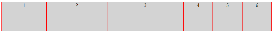
<body>
<div class="flex-box">
<div>1</div>
<div>2</div>
<div>3</div>
<div>4</div>
<div>5</div>
<div>6</div>
<div>7</div>
<div>8</div>
</div>
</body>
</html>
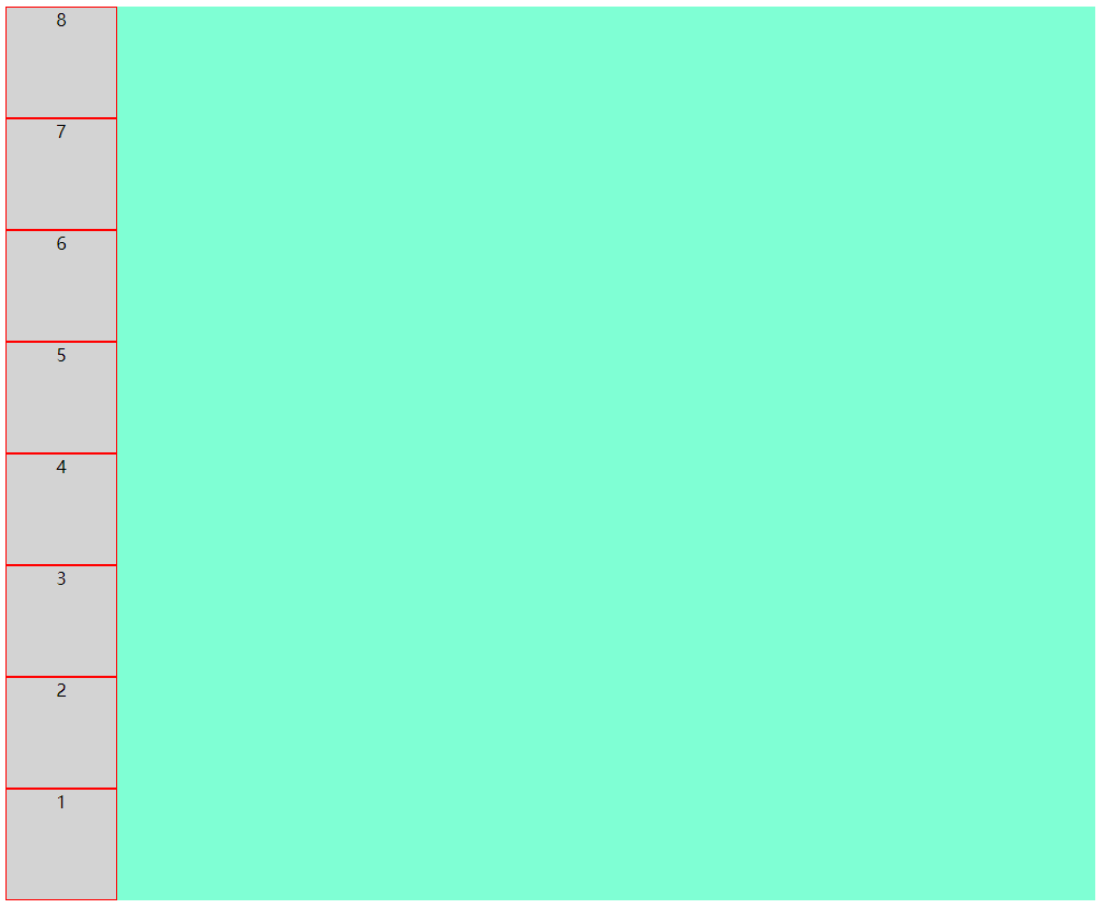
运行效果
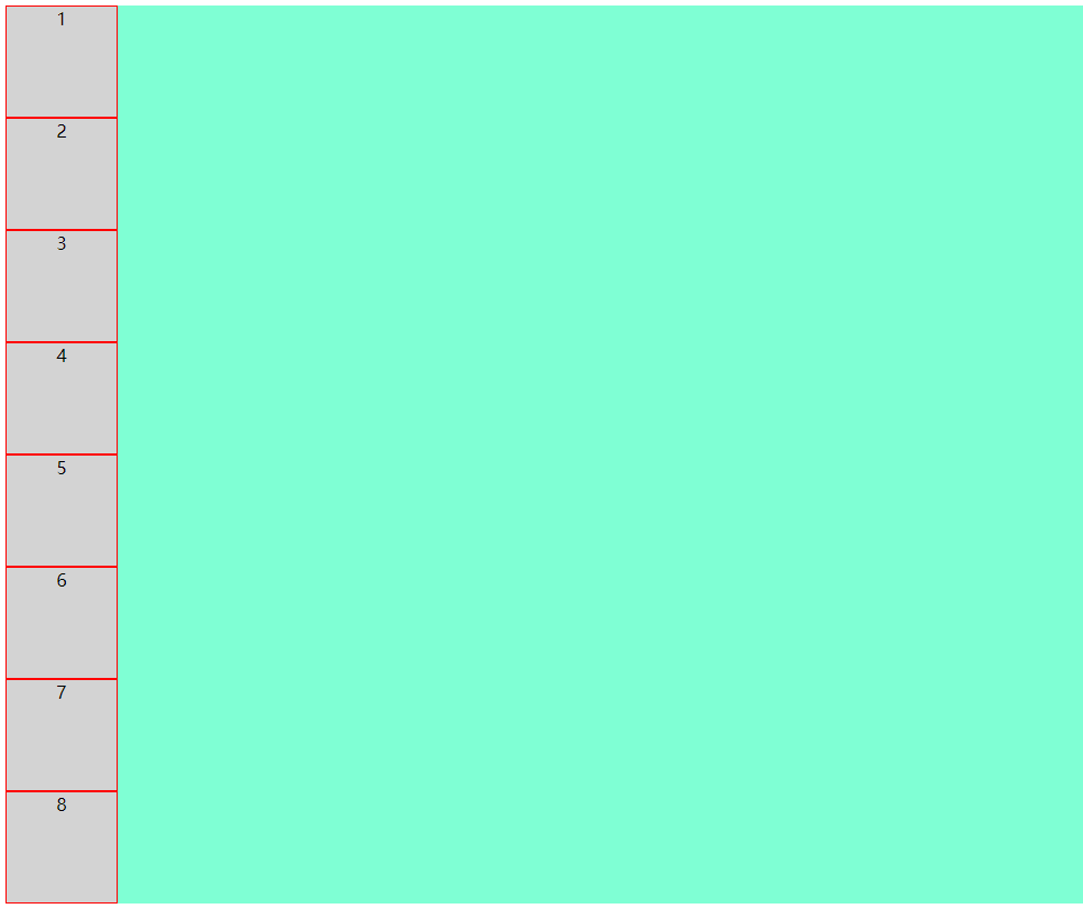
8个小方块呈纵向排列
好,接下来我们看看display:flex到底有哪些好处
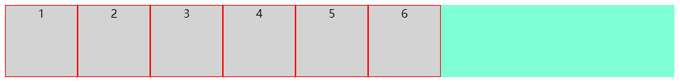
先在flex-box中设置display:flex,看看效果
上代码
点击查看代码
.flex-box {

    background-color: aquamarine;

    display: flex;

}
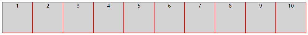
效果图
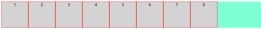
仅仅设置了display: flex,8个小方块呈横向排列了
接下来详解flex布局的几个常用属性
flex-direction
flex-wrap
flex-flow
justify-content
align-items
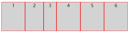
1. flex-direction
该属性决定小方块按横向或纵向排列
(1):row(决定小方块横向排列,起点在左端)
上代码
点击查看代码
.flex-box {

    background-color: aquamarine;

    display: flex;

    flex-direction: row;

}
效果图
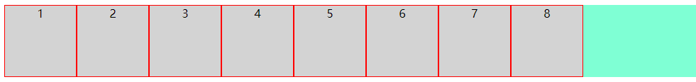
可以看到,样式并没有什么变化,这是因为row是flex-direction的默认排列方式
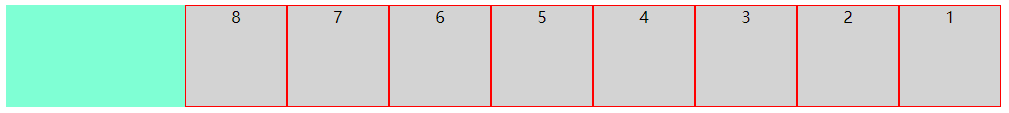
(2):row-reverse(决定小方块横向排列,起点在右端)
上代码
点击查看代码
.flex-box {

    background-color: aquamarine;

    display: flex;

    flex-direction: row-reverse;

}
效果图
(3):column(决定小方块纵向排列,起点在上端)
上代码
点击查看代码
.flex-box {

    background-color: aquamarine;

    display: flex;

    flex-direction: column;

}
效果图
(4):column-reverse(决定小方块纵向排列,起点在下端)
上代码
点击查看代码
.flex-box {

    background-color: aquamarine;

    display: flex;

    flex-direction: column-reverse;

}
效果图
到此,flex-direction属性就讲完了
接下来讲解flex-wrap
2. flex-wrap
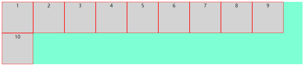
该属性决定小方块是否换行,默认不换行,内容会被挤压
(1):nowrap(决定小方块不换行,起点在上端,内容会被挤压)
上代码
点击查看代码
.flex-box {

    background-color: aquamarine;

    display: flex;

    flex-wrap: nowrap;

}
效果图
(2):wrap(决定小方块换行,起点在上端,内容不会被挤压,)
上代码
点击查看代码
.flex-box {

    background-color: aquamarine;

    display: flex;

    flex-wrap: wrap;

}
效果图
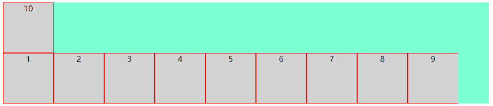
(3):wrap-reverse(决定小方块换行,起点在下端,内容不会被挤压,)
上代码
点击查看代码
.flex-box {

    background-color: aquamarine;

    display: flex;

    flex-wrap: wrap-reverse;

}
效果图
3. flex-flow
该属性是用于同时设置 flex-direction 和 flex-wrap 属性的简写属性
包含如下几种可能
row nowrap|wrap|wrap-reverse
row-reverse nowrap|wrap|wrap-reverse
column nowrap|wrap|wrap-reverse
column-reverse nowrap|wrap|wrap-reverse
由于可能太多了,下面只列举了一种,但小编试过了,所有的可能都是对的
(1):row-reverse wrap-reverse(决定小方块呈横向排列且起点在右端,换行且起点在下端,内容不会被挤压)
上代码
点击查看代码
.flex-box {

    background-color: aquamarine;

    display: flex;

    flex-flow: row-reverse wrap-reverse;

}
效果图
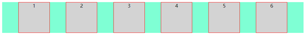
4. justify-content
该属性决定小方块在纵轴上的对齐方式
(1):flex-start(决定小方块左对齐)
上代码
点击查看代码
.flex-box {

    background-color: aquamarine;

    display: flex;

    justify-content: flex-start;

}
效果图
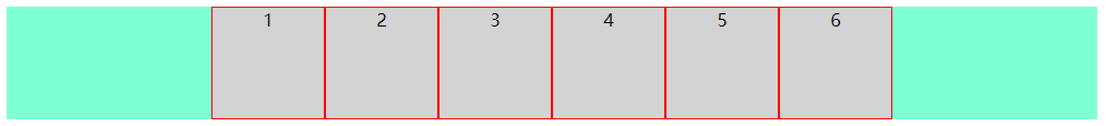
(2):center(决定小方块中心对齐)
上代码
点击查看代码
.flex-box {

    background-color: aquamarine;

    display: flex;

    justify-content: center;

}
效果图
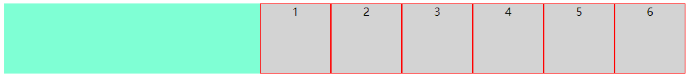
(3):flex-end(决定小方块右对齐)
上代码
点击查看代码
.flex-box {

    background-color: aquamarine;

    display: flex;

    justify-content: flex-end;

}
效果图
(4):space-around(决定小方块之间的间隔比小方块与边框的间隔大一倍)
上代码
点击查看代码
.flex-box {

    background-color: aquamarine;

    display: flex;

    justify-content: space-around;

}
效果图
(5):space-between(决定小方块两端对齐,小方块之间间隔相等)
上代码
点击查看代码
.flex-box {

    background-color: aquamarine;

    display: flex;

    justify-content: space-between;

}
效果图
(6):space-evenly(决定小方块之间的间隔相等)
上代码
点击查看代码
.flex-box {

    background-color: aquamarine;

    display: flex;

    justify-content: space-evenly;

}
效果图
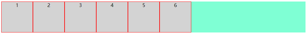
5. align-items
该属性决定小方块在横轴上的对齐方式
(1):flex-start(决定小方块上对齐)
上代码
点击查看代码
.flex-box {

    background-color: aquamarine;

    display: flex;

    align-items: flex-start;

}
效果图
(2):center(决定小方块中心对齐)
上代码
点击查看代码
.flex-box {

    background-color: aquamarine;

    display: flex;

    align-items: center;

}
效果图
(3):flex-end(决定小方块下对齐)
上代码
点击查看代码
.flex-box {

    background-color: aquamarine;

    display: flex;

    align-items: flex-end;

}
效果图
(4):baseline(决定小方块第一行文字的基线对齐)
上代码
点击查看代码
.flex-box {

    background-color: aquamarine;

    display: flex;

    align-items: baseline;

}
效果图
(5):stretch(决定小方块占满整个容器的高度)
注意:小方块的高度应不设置或设置为auto
上代码
点击查看代码
.flex-box {

    background-color: aquamarine;

    display: flex;

    align-items: stretch;

}
效果图
以上是容器的属性,接下来我们讲解小方块的属性
order
flex-grow
flex-shrink
flex-basis
flex
align-self
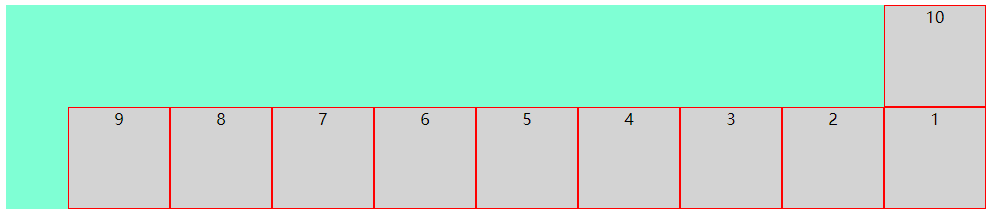
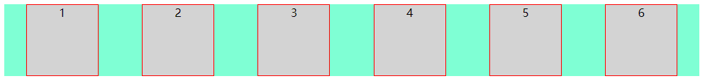
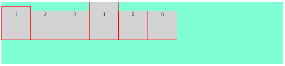
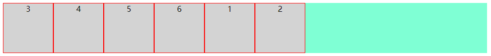
(1):order(决定小方块显示的顺序,默认为0)
注意:小方块order不设置或设置为0的优先级比设置为1的优先级高
注意:该值必须为数字
上代码
点击查看代码
<div class="flex-box">

  <div style="order: 1">1</div>

  <div style="order: 2">2</div>

  <div style="order: 0">3</div>

  <div>4</div>

  <div>5</div>

  <div>6</div>

</div>
效果图
(2):flex-grow(决定某个小方块相对于其它小方块将增长多少)
注意:该值必须为数字,数值越大,增长越多
上代码
点击查看代码
<div class="flex-box">

  <div style="flex-grow: 1">1</div>

  <div style="flex-grow: 2">2</div>

  <div style="flex-grow: 3">3</div>

  <div>4</div>

  <div>5</div>

  <div>6</div>

</div>
效果图
将窗口变长

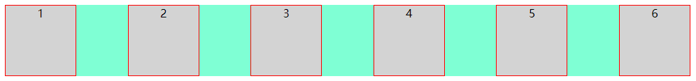
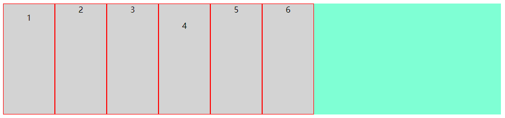
(3):flex-shrink(决定某个小方块相对于其它小方块将收缩多少)
注意:该值必须为数字,数值越大,收缩越多
上代码
点击查看代码
<div class="flex-box">

  <div style="flex-shrink: 1">1</div>

  <div style="flex-shrink: 2">2</div>

  <div style="flex-shrink: 3">3</div>

  <div>4</div>

  <div>5</div>

  <div>6</div>

</div>
效果图
将窗口缩小
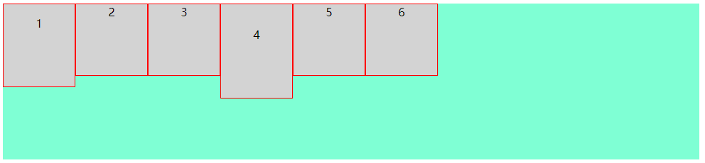
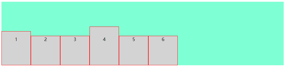
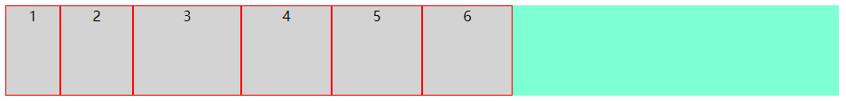
(4):flex-basis(决定某个小方块的初始长度)
上代码
点击查看代码
<div class="flex-box">

  <div style="flex-basis: 60px">1</div>

  <div style="flex-basis: 80px">2</div>

  <div style="flex-basis: 120px">3</div>

  <div>4</div>

  <div>5</div>

  <div>6</div>

</div>
效果图
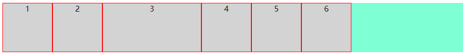
(5):flex(flex-grow、flex-shrink 和 flex-basis 属性的简写属性)
上代码
点击查看代码
<div class="flex-box">

  <div>1</div>

  <div>2</div>

  <div style="flex: 0 0 200px">3</div>

  <div>4</div>

  <div>5</div>

  <div>6</div>

</div>
效果图
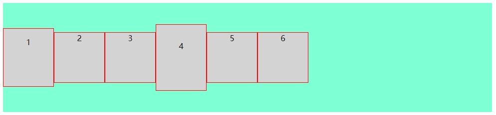
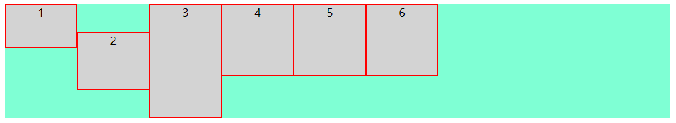
(6):align-self(决定某个小方块的对齐方式,将覆盖容器的 align-items 属性所设置的默认对齐方式)
上代码
点击查看代码
<div class="flex-box">

  <div style="align-self: flex-start; height: 60px;">1</div>

  <div style="align-self: center;  height: 80px;">2</div>

  <div style="align-self: flex-end;  height: 160px;">3</div>

  <div>4</div>

  <div>5</div>

  <div>6</div>

</div>
效果图
至此,display:flex的常用用法就讲完了
前端CSS3布局display:flex用法的更多相关文章
- 前端CSS3布局display:grid用法
前端CSS3布局display:flex用法 1. 先附上代码 点击查看代码 <!DOCTYPE html> <html> <head> <meta char ...
- CSS弹性盒布局(display:flex)
CSS弹性布局(display:flex) 参考: http://www.runoob.com/w3cnote/flex-grammar.html https://www.jianshu.com/p/ ...
- css3 伸缩布局 display:flex等
<!DOCTYPE html> <html lang="en"> <head> <meta charset="UTF-8&quo ...
- 弹性盒布局display:flex详解
一:弹性盒子 随着响应式设计的流行,网站开发者在设计网页布局时往往要考虑到页面在适配不同分辨率的浏览器时其内部组件位置大小都会产生变化,因此需要设计者根据窗口尺寸来调整布局,从而改变组件的尺寸和位置, ...
- css3布局属性flex
html代码如下: <ul class="ul_box"> <li><a href="#">html</a>&l ...
- css display:flex 属性
一:display:flex 布局 display:flex 是一种布局方式.它即可以应用于容器中,也可以应用于行内元素.是W3C提出的一种新的方案,可以简便.完整.响应式地实现各种页面布局.目前,它 ...
- CSS3:布局display属性的flex(弹性布局)
CSS3:布局display属性的flex(弹性布局) 一.简介 Flex是Flexible Box的缩写,意为"弹性布局",用来为盒状模型提供最大的灵活性.设为Flex布局以后, ...
- 浅谈CSS3中display属性的Flex布局
浅谈CSS3中display属性的Flex布局 最近在学习微信小程序,在设计首页布局的时候,新认识了一种布局方式display:flex 1 .container { 2 display: fle ...
- 【分享】谈CSS3中display属性的flex布局
最近在学习微信小程序(重新学习微信小程序),在设计首页布局的时候,新认识了一种布局方式display:flex .guide-top{ height: 36%; display: flex; /*fl ...
随机推荐
- RedisDesktopManager 连接不上远程 Redis
1.首先确保远程redis-server已经启用: 2.连接不到可能的原因: redis3.2以上版本默认开启保护模式,不允许外网访问,需要修改redis.conf文件 3.redis.conf文件需 ...
- 自定义API(Jar包)的创建与使用(简单实现案例)
@ 目录 学习内容 1. 自定义工具类 2. 导出jar 3. 加载Jar包 4. 调用自定义的API方法 总结 学习内容 1. 自定义工具类 新建一个java项目,然后创建包和工具类StringUt ...
- 微信小程序发送验证码功能,验证码倒计时
data{ timer:'', countDownNum:'发送验证码', } // 点击验证码倒计时获取验证码 Gain:function(e){ let that = this let count ...
- Django实现统一包装接口返回值数据格式
前言 最近实在太忙了,开始了一个新的项目,为了快速形成产品,我选择了Django来实现后端,然后又拿起了之前我封装了项目脚手架「DjangoStarter」. 由于前段时间我写了不少.NetCore的 ...
- Windows安装使用wget
Windows安装使用wget 0x01 什么是wget 你肯定知道,否则就不会安装了 0x02 下载wget 下载地址:https://eternallybored.org/misc/wget/ 在 ...
- PCI总线基本概念与历史
PCI总线历史 这里必须说下 PCI-SIG,1991 年下半年,Intel 公司,并联合IBM.Compaq.AST.HP.DEC 等100 多家公司成立了PCI 集团 并且Intel公司首先提出了 ...
- vim 下几种比较省劲的方式(vi结合着用)
Vim的几种模式 正常模式:可以使用快捷键命令,或按:输入命令行. 插入模式:可以输入文本,在正常模式下,按i.a.o等都可以进入插入模式. 可视模式:正常模式下按v可以进入可视模式, 在可视模式下, ...
- mycat实现主从读取中的问题
schema.xml 中的配置如下:..... <dataHost name="aaa" maxCon="2000" minCon="100&q ...
- Python数据展示 - 生成表格图片
前言 前一篇文章介绍了推送信息到企业微信群里,其中一个项目推送的信息是使用Python自动生成的表格,本文来讲讲如何用Python生成表格图片. 选一个合适库 Python最大的优点就是第三方库丰富, ...
- 2019-2020 10th BSUIR Open Programming Championship. Semifinal
2019-2020 10th BSUIR Open Programming Championship. Semifinal GYM链接https://codeforces.com/gym/103637 ...