一款基于jquery和css3的头像恶搞特效
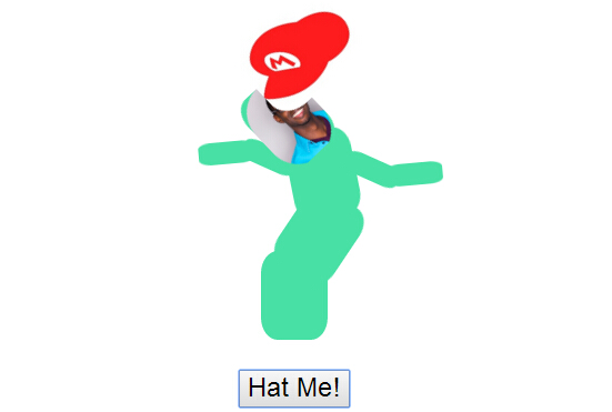
今天给大家分享一款基于jquery和css3的头像恶搞特效。这款实例中,一个头像在画面中跳舞,头像还有可爱的帽子,单击下面的按钮可以为头像切换不同的帽子。效果图如下:
实现的代码。
html代码:
- <div class="wwiaftm-container">
- <div class="base wwiaftm">
- <div class="body-1 wwiaftm">
- <div class="body-2 wwiaftm">
- <div class="hat wwiaftm" style="background-image: url(Mini_Sombrero.png)">
- </div>
- <div class="head wwiaftm">
- <div class="profile">
- <img src="head.png">
- </div>
- </div>
- <div class="wwiaftm arm-1 left">
- <div class="wwiaftm arm-2 left">
- <div class="wwiaftm fingers">
- </div>
- </div>
- </div>
- <div class="wwiaftm arm-1 right">
- <div class="wwiaftm arm-2 right">
- <div class="wwiaftm fingers">
- </div>
- </div>
- </div>
- </div>
- </div>
- </div>
- </div>
- <div class="switch-container">
- <button id="hat-switch">
- Hat Me!</button>
- </div>
- <script src='jquery.min.js'></script>
- <script> var hats = Array(
- 'Mini_Sombrero.png', 'med.png',
- 'svg.med.png',
- 'cartoon-cowboy-8.gif',
- '1313955-witch-hat-002_92007.gif',
- 'hat_mario_101401.jpg',
- 'vector-hat-design1.jpg'
- );
- $('#hat-switch').on('click', function (e) {
- e.preventDefault();
- var hat = hats[Math.floor(Math.random() * hats.length)];
- $('.hat').css('background-image', 'url(' + hat + ')');
- });
- //@ sourceURL=pen.js
- </script>
css3代码:
- .wwiaftm-container {
- position: relative;
- width: 200px;
- height: 275px;
- margin: auto;
- padding-top: 100px;
- }
- .profile {
- border-radius: 100px;
- overflow: hidden;
- }
- .wwiaftm {
- background: #48e0a4;
- position: absolute;
- margin: auto;
- border-radius: 25%;
- }
- .body-1 {
- background-repeat: no-repeat;
- background-position: center;
- background-size: 70%;
- }
- .base {
- width: 60px;
- height: 80px;
- bottom: 0;
- left: 0;
- right: 0;
- }
- .hat {
- top: -120px;
- height: 80px;
- width: 100px;
- -webkit-transform-origin: 50% 100%;
- transform-origin: 50% 100%;
- -webkit-transform: rotate3d(0,0,1,0deg);
- transform: rotate3d(0,0,1,0deg);
- background-repeat: no-repeat;
- background-position: center;
- transparent;
- background-size: 100%;
- z-index: 10 !important;
- }
- .body-1, .body-2, .head {
- top: -60px;
- height: 80px;
- width: 60px;
- -webkit-transform-origin: 50% 100%;
- transform-origin: 50% 100%;
- -webkit-transform: rotate3d(0,0,1,0deg);
- transform: rotate3d(0,0,1,0deg);
- }
- .body-1 {
- -webkit-animation: flail 4s linear infinite;
- animation: flail 4s linear infinite;
- }
- .body-2 {
- -webkit-animation: flail 3s linear infinite;
- animation: flail 3s linear infinite;
- }
- .head, .hat {
- -webkit-animation: flail 2s linear infinite;
- animation: flail 2s linear infinite;
- z-index: 1;
- }
- .head .eye, .head .mouth {
- height: 20%;
- width: 15%;
- background: black;
- position: absolute;
- top: 25%;
- }
- .head .eye.right {
- right: 20%;
- }
- .head .eye.left {
- left: 20%;
- }
- .head .mouth {
- width: 70%;
- top: 60%;
- height: 5%;
- left: 0;
- right: 0;
- margin: auto;
- }
- .arm-1, .arm-2 {
- position: absolute;
- width: 50px;
- height: 20px;
- right: 90%;
- top: 25%;
- -webkit-animation: flail 1s linear infinite;
- animation: flail 1s linear infinite;
- -webkit-transform-origin: 100% 50%;
- transform-origin: 100% 50%;
- }
- .arm-1.right, .arm-2.right {
- left: 90%;
- -webkit-transform-origin: 0% 50%;
- transform-origin: 0% 50%;
- }
- .arm-1 .arm-2 {
- -webkit-animation: flail .5s linear infinite;
- animation: flail .5s linear infinite;
- right: 80%;
- top: auto;
- }
- .arm-1 .arm-2.right {
- left: 80%;
- right: auto;
- }
- @-webkit-keyframes flail {
- 0% {
- -webkit-transform: rotate3d(0,0,1,0deg);
- }
- 25% {
- -webkit-transform: rotate3d(0,0,1,50deg);
- }
- 50% {
- -webkit-transform: rotate3d(0,0,1,0deg);
- }
- 75% {
- -webkit-transform: rotate3d(0,0,1,-50deg);
- }
- 100% {
- -webkit-transform: rotate3d(0,0,1,0deg);
- }
- }
- @keyframes flail {
- 0% {
- transform: rotate3d(0,0,1,0deg);
- }
- 25% {
- transform: rotate3d(0,0,1,50deg);
- }
- 50% {
- transform: rotate3d(0,0,1,0deg);
- }
- 75% {
- transform: rotate3d(0,0,1,-50deg);
- }
- 100% {
- transform: rotate3d(0,0,1,0deg);
- }
- }
- .switch-container {
- text-align: center;
- margin-top: 25px;
- }
- #hat-switch {
- text-align: center;
- font-size: 24px;
- cursor: pointer;
- }
一款基于jquery和css3的头像恶搞特效的更多相关文章
- 一款基于jquery和css3的响应式二级导航菜单
今天给大家分享一款基于jquery和css3的响应式二级导航菜单,这款导航是传统的基于顶部,鼠标经过的时候显示二级导航,还采用了当前流行的响应式设计.效果图如下: 在线预览 源码下载 实现的代码. ...
- 一款基于jquery和css3实现的摩天轮式分享按钮
之前分享了很多css3实现的按钮.今天要给大家带来一款基于jquery和css3实现的摩天轮式分享按钮.这款分享按钮页面底部有一个toggle按钮,单击该按钮,摩天轮按钮以动画的形式出现,各个分享按钮 ...
- 一款基于jquery的鼠标经过图片列表特效
今天要给大家推荐一款基于jquery的鼠标经过图片列表特效.当鼠标经过列表图片的时候,图片放大,且有一个半透明的遮罩层随之移动.效果图如下: 在线预览 源码下载 实现的代码 html代码: < ...
- 一款基于jquery超炫的图片切换特效
今天为给大家介绍一款基于jquery超炫的图片切换特效.由百叶窗飞入显示图片.图片消息的时候也是百叶窗渐行渐远.用于图片展示,效果还是非常好,我们一起看下效果图: 在线预览 源码下载 来看下实现的 ...
- 一款基于jQuery和CSS3炫酷3D旋转画廊特效插件
这是一款效果炫酷的jQuery和CSS3 3D旋转画廊特效插件.该3D画廊插件可以通过前后导航按钮来切换图片,效果就像旋转木马一样.它还带有点击放大图片,显示图片标题和用键盘操作等功能. 在线预览 ...
- 4款基于jquery的列表图标动画切换特效
网页中列表图标随处可见,特别是移动网页上,基本上的导航都采用了列表图标.今天给大家分享4款基于juqery的列表图标和关闭图标的动画切换特效.喜欢的网友赶紧收藏吧. 在线预览 源码下载 实现的代码 ...
- 10款基于jquery的web前端动画特效
1.jQuery横向手风琴图片切换动画 之前我们为大家分享过很多款基于jQuery和CSS3的手风琴菜单和手风琴焦点图插件,比如CSS3响应式垂直手风琴菜单和jQuery横向手风琴图片展示插件.今天要 ...
- 基于jQuery 3D旋转明星人物展示特效
分享一款基于jQuery 3D旋转明星人物展示特效.这是一款来自百度换肤活动的明星旋转展示效果.效果图如下: 在线预览 源码下载 实现的代码. html代码: <div class=&quo ...
- 30款基于 jQuery & CSS3 的加载动画和进度条插件
我们所生活每一天看到的新技术或新设计潮流的兴起,Web 开发正处在上升的时代.HTML5 & CSS3 技术的发展让 Web 端可以实现的功能越来越强大. 加载动画和进度条使网站更具吸引力.该 ...
随机推荐
- atitit.html编辑器的设计要点与框架选型 attilax总结
atitit.html编辑器的设计要点与框架选型 attilax总结 1. html编辑器的设计要求1 1.1. 障碍訪问 1 1.2. 强大Ajax上传 1 1.3. Word完美支持 2 1.4. ...
- Atitit 图像处理之编程之类库调用的接口api cli gui ws rest attilax大总结.docx
Atitit 图像处理之编程之类库调用的接口api cli gui ws rest attilax大总结.docx 1. 为什么需要接口调用??1 1.1. 为了方便集成复用模块类库1 1.2. 嫁 ...
- Atitit 函数调用的原理与本质attilax总结 stdcall cdecl区别
Atitit 函数调用的原理与本质attilax总结 stdcall cdecl区别 通常来说函数调用要用到的两条基本的指令:”CALL”指令和”RET”指令.”CALL”指令将当前的指令指针(这个指 ...
- shouldAutoRotate Method Not Called in iOS6
转自:http://stackoverflow.com/questions/13588325/shouldautorotate-method-not-called-in-ios6 参考1:http:/ ...
- stun服务器搭建(coTurn)
0. 前言 好久之前写过一篇搭建WebRTC的文章,里面有简单的说到怎么搭建一个stun服务.但那时只是一笔带过.正好,这两天搭建stun服务,这篇博客就再复习一遍,并把搭建过程整理一下. 1. 安装 ...
- Unable to load configuration. - [unknown location]
严重: Exception starting filter StrutsPrepareFilterUnable to load configuration. - [unknown location] ...
- RHEL7.2安装部署redmine
redmine的安装方式有很多种,本文使用docker进行安装,关于rhel7的docker安装可以参考这里 1. 使用docker安装redmine [root@localhost ~]# dock ...
- Android实例-获取屏幕的物理分辨率
相关资料: http://blog.qdac.cc/?p=1161 实例代码: unit Unit1; interface uses System.SysUtils, System.Types, Sy ...
- Loadrunner集合点Rendezvous知识
摘自: http://blog.csdn.net/richnaly/article/details/7967364 集合点的意思时等到特定的用户数后再一起执行某个操作,比如一起保存,一起提交(我们通常 ...
- jQuery Validate验证方法及教程
//实名认证 验证 $(function(){ //中文姓名验证 jQuery.validator.addMethod("zh_verify", function(value, e ...