快速使用CSS 弹性盒子
布局的传统解决方案,基于盒状模型,依赖 display属性 + position属性 + float属性。它对于那些特殊布局非常不方便,比如,垂直居中就不容易实现;2009年,W3C提出了一种新的方案—-Flex布局,可以简便、完整、响应式地实现各种页面布局。目前,它已经得到了所有浏览器的支持,这意味着,现在就能很安全地使用这项功能。
弹性盒子是 CSS3 的一种新的布局模式,是一种当页面需要适应不同的屏幕大小以及设备类型时确保元素拥有恰当的行为的布局方式。
引入弹性盒布局模型的目的是提供一种更加有效的方式来对一个容器中的子元素进行排列、对齐和分配空白空间。:
CSS3 弹性盒子内容
弹性盒子由弹性容器(Flex container)和弹性子元素(Flex item)组成。
弹性容器通过设置 display 属性的值为 flex 或 inline-flex将其定义为弹性容器。
弹性容器内包含了一个或多个弹性子元素。
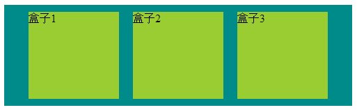
1:最基本的

<style>

        /*body {

            direction: rtl;/*设置 direction 属性为 rtl (right-to-left),

                   弹性子元素的排列方式也会改变 ,整体从右到左

        }*/

        .flex-container{

            display: flex;

            display: -webkit-flex;

            width: 450px;

            height: 150px;

            background-color: darkcyan;

        }

        .flex-item{

            width: 130px;

            height: 125px;

            margin: 10px;

            background-color: yellowgreen;

        }

    </style>

    <body>

        <div class="flex-container">

            <div class="flex-item one">盒子1</div>

            <div class="flex-item tow">盒子2</div>

            <div class="flex-item three">盒子3</div>

        </div>

    </body>
2:flex-direction使用(弹性子元素在父容器中的位置)

<style>

        /*flex-direction的值有:

            row:横向从左到右排列(左对齐),默认的排列方式。

            row-reverse:反转横向排列(右对齐,从后往前排,最后一项排在最前面。

            column:纵向排列。

            column-reverse:反转纵向排列,从后往前排,最后一项排在最上面。

        */

        .flex-container{

            display: flex;

            display: -webkit-flex;

            width: 450px;

            background-color: darkcyan;

            flex-direction: row-reverse;

        }

        .flex-item{

            width: 130px;

            height: 125px;

            margin: 10px;

            background-color: yellowgreen;

        }

    </style>

    <body>

        <div class="flex-container">

            <div class="flex-item one">盒子1</div>

            <div class="flex-item tow">盒子2</div>

            <div class="flex-item three">盒子3</div>

        </div>

    </body>
3:justify-content 的使用(弹性子元素在父容器中的位置) 如下:盒子居中显示
<style>

        /*justify-content属性

             flex-start:从左到右排列

             flex-end:从右到左排列

             center:中间开始排列

             space-between:平分

             space-around:平分,且两边占1/2

        */

        .flex-container{

            display: flex;

            display: -webkit-flex;

            width: 500px;

            background-color: darkcyan;

            justify-content: center;

        }

        .flex-item{

            width: 130px;

            height: 125px;

            margin: 10px;

            background-color: yellowgreen;

        }

    </style>

    <body>

        <div class="flex-container">

            <div class="flex-item one">盒子1</div>

            <div class="flex-item tow">盒子2</div>

            <div class="flex-item three">盒子3</div>

        </div>

    </body>
4:align-items的使用(设置或检索弹性盒子元素在侧轴(纵轴)方向上的对齐方式)如下:从底部开始显示

<style>

        /*align-items 属性:侧轴(纵轴)方向上的对齐方式。

             flex-start: 顶部开始

             flex-end: 低部开始

             center 居中

             baseline 弹性盒子元素的行内轴与侧轴为同一条

             stretch

        */

        .flex-container{

            display: flex;

            display: -webkit-flex;

            width: 500px;

            height: 211px;

            background-color: darkcyan;

            align-items: flex-end;

        }

        .flex-item{

            width: 130px;

            height: 125px;

            margin: 10px;

            background-color: yellowgreen;

        }

    </style>

    <body>

        <div class="flex-container">

            <div class="flex-item one">盒子1</div>

            <div class="flex-item tow">盒子2</div>

            <div class="flex-item three">盒子3</div>

        </div>

    </body>
5:flex-wrap的使用(定弹性盒子的子元素换行方式)如下:自动换行

/*flex-wrap 属性

            nowrap - 默认, 弹性容器为单行。该情况下弹性子项可能会溢出容器。

            wrap - 弹性容器为多行。该情况下弹性子项溢出的部分会被放置到新行,子项内部会发生断行

            wrap-reverse -反转 wrap 排列。

        */

        .flex-container{

            display: flex;

            display: -webkit-flex;

            width: 300px;

            background-color: darkcyan;

            flex-wrap:wrap;

        }

        .flex-item{

            width: 130px;

            height: 125px;

            margin: 10px;

            background-color: yellowgreen;

        }

    </style>

    <body>

        <div class="flex-container">

            <div class="flex-item one">盒子1</div>

            <div class="flex-item tow">盒子2</div>

            <div class="flex-item three">盒子3</div>

        </div>

    </body>
5:align-content的使用(定弹性盒子的子元素各行对齐方式)如下:居中

<style>

        /*align-content 属性

            stretch - 默认。各行将会伸展以占用剩余的空间。

            flex-start - 各行向弹性盒容器的起始位置堆叠。 上到下开始

            flex-end - 各行向弹性盒容器的结束位置堆叠。 下到上开始

            center -各行向弹性盒容器的中间位置堆叠。  中间

            space-between -各行在弹性盒容器中平均分布。

            space-around - 各行在弹性盒容器中平均分布,两端保留子元素与子元素之间间距大小的一半。

        */

        .flex-container{

            display: flex;

            display: -webkit-flex;

            width: 300px;

            height: 350px;

            -webkit-flex-wrap: wrap;

            flex-wrap: wrap;

            background-color: darkcyan;

            align-content: center;

            -webkit-align-content:  center;

        }

        .flex-item{

            width: 130px;

            height: 125px;

            margin: 10px;

            background-color: yellowgreen;

        }

    </style>

    <body>

        <div class="flex-container">

            <div class="flex-item one">盒子1</div>

            <div class="flex-item tow">盒子2</div>

            <div class="flex-item three">盒子3</div>

        </div>

    </body>
6:order的使用(定弹性盒子的子元素的排列顺序)如下:居中

<style>

        /*order 属性

               用整数值来定义排列顺序,数值小的排在前面。可以为负值

        */

        .flex-container{

            display: flex;

            display: -webkit-flex;

            width: 465px;

            -webkit-flex-wrap: wrap;

            flex-wrap: wrap;

            background-color: darkcyan;

            align-content: center;

            -webkit-align-content:  center;

        }

        .flex-item{

            width: 130px;

            height: 125px;

            margin: 10px;

            background-color: yellowgreen;

        }

        .tow{

            order: -1;

            -webkit-order: -1;

        }

    </style>

    <body>

        <div class="flex-container">

            <div class="flex-item one">盒子1</div>

            <div class="flex-item tow">盒子2</div>

            <div class="flex-item three">盒子3</div>

        </div>

    </body>
7:margin 属性,完美居中

<style>

        /*margin 属性

              完美居中

        */

        .flex-container{

            display: flex;

            display: -webkit-flex;

            width: 365px;

            background-color: darkcyan;

            height: 155px;

        }

        .flex-item{

            width: 130px;

            height: 125px;

            margin: auto;

            background-color: yellowgreen;

        }

    </style>

    <body>

        <div class="flex-container">

            <div class="flex-item one">盒子1</div>

        </div>

    </body>
8:align-self 属性用于设置弹性元素自身在侧轴(纵轴)方向上的对齐方式。
<style>

        /*align-self 属性用于设置弹性元素自身在侧轴(纵轴)方向上的对齐方式。

         *

         flex-start:弹性盒子元素的侧轴(纵轴)起始位置的边界紧靠住该行的侧轴起始边界。

         flex-end:弹性盒子元素的侧轴(纵轴)起始位置的边界紧靠住该行的侧轴结束边界。

         center:弹性盒子元素在该行的侧轴(纵轴)上居中放置。(如果该行的尺寸小于弹性盒子元素的尺寸,则会向两个方向溢出相同的长度)。

         baseline:如弹性盒子元素的行内轴与侧轴为同一条,则该值与'flex-start'等效。其它情况下,该值将参与基线对齐。

         stretch:如果指定侧轴大小的属性值为'auto',则其值会使项目的边距盒的尺寸尽可能接近所在行的尺寸,但同时会遵照'min/max-width/height'属性的限制。

        */

        .flex-container{

            display: flex;

            display: -webkit-flex;

            width: 465px;

            height: 365px;

            background-color: darkcyan;

        }

        .flex-item{

            width: 130px;

             min-height: 100px;

            margin: 10px;

            background-color: yellowgreen;

        }

        .one{

            align-self: flex-start;

        }

        .tow{

            align-self: flex-end;

        }

        .three{

                align-self: center;

        }

        .four{

             align-self: stretch;

        }

    </style>

    <body>

        <div class="flex-container">

            <div class="flex-item one">盒子1</div>

            <div class="flex-item tow">盒子2</div>

            <div class="flex-item three">盒子3</div>

            <div class="flex-item four">盒子4</div>

        </div>

    </body>
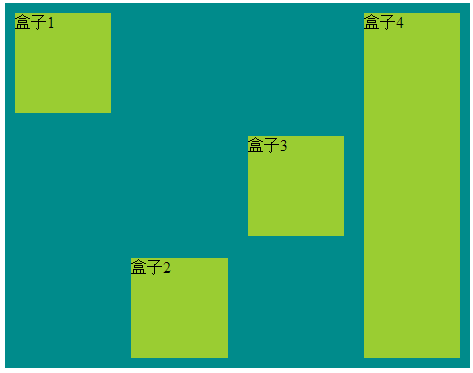
9:flex 用于指定弹性子元素如何分配空间。

    <style>

        /*flex 属性用于指定弹性子元素如何分配空间。

            比例分配

        */

        .flex-container{

            display: flex;

            display: -webkit-flex;

            width: 400px;

            height: 165px;

            background-color: darkcyan;

        }

        .flex-item{

            margin: 10px;

            background-color: yellowgreen;

        }

        .one{

            flex: 2;

            -webkit-flex: 2;

        }

        .tow{

            flex: 1;

            -webkit-flex: 1;

        }

        .three{

               flex: 1;

               -webkit-flex: 1;

        }

    </style>

    <body>

        <div class="flex-container">

            <div class="flex-item one">盒子1</div>

            <div class="flex-item tow">盒子2</div>

            <div class="flex-item three">盒子3</div>

        </div>

    </body>
弹性盒子在开发中常常用得到,前端,app端;弹性盒布局模型可以作为 Web 开发人员工具箱中的一个很好的工具。通过以上学习,希望你能更好的学习弹性盒子。
快速使用CSS 弹性盒子的更多相关文章
- 使用css弹性盒子模型
提示: 当期内容不充实, 修改后再来看吧 以下称:弹性子元素: 子元素, 弹性容器: 容器 弹性盒子的属性 1. css弹性盒子模型规定了弹性元素如何在弹性容器内展示 2. 弹性元素默认显示在弹性容器 ...
- CSS 弹性盒子模型
CSS 弹性盒子模型 https://www.w3.org/TR/2016/CR-css-flexbox-1-20160526/ CSS Flexible Box Layout Module Leve ...
- css弹性盒子学习
css3弹性盒子是一种布局方式,在适应不同的屏幕大小的时候,能够确保元素拥有更恰当的排布行为.它只是视觉呈现上的,即显示顺序适应显示空间,与源代码无关,源代码顺序不受影响. 定义一个弹性盒子: 在cs ...
- CSS弹性盒子的基本用法
.container { width: 302px; height: 302px; border: 1px solid; display: flex } .item { width: 100px; h ...
- CSS:CSS弹性盒子布局 Flexible Box
一.简介 flexbox:全称Flexible Box, 弹性盒子布局.可以简单实现各种伸缩性的设计,它是由伸缩容器和伸缩项目组成.任何一个元素都可以指定为flexbox布局.这种新的布局方案在200 ...
- css弹性盒子新旧兼容
前言:本篇随笔是对弹性盒子有了解的人来写的这篇文章,具体属性产生的效果这里不做说明,基础的东西去查文档.这里只是总结. 时至今日,css3的flex弹性盒子在移动端基本上都是支持的,但不排除有些些低版 ...
- css弹性盒子
body元素设置: <body> <div id="wai"> <div class="zi">1</div> ...
- css 弹性盒子--“垂直居中”--兼容写法
使用弹性盒子兼容低端适配有时需要: display:flex 和 display:-webkit-box display: -webkit-box; -webkit-box-align: cent ...
- CSS 弹性盒子布局
学习地址:https://developer.mozilla.org/zh-CN/docs/Web/CSS/CSS_Flexible_Box_Layout
随机推荐
- Oracle之rman命令的使用全备输出信息的详解(51CTO风哥rman课程)
rman连接数据库 rman target/ catalog rman/rman123456 运行全备命令 backup database; 查看备份集 list backupset;
- DNS的MX记录和CNAME记录(转)
MX记录就是邮件域名对邮件服务器(域名)的映射.可以映射到多个邮件服务器,发送时会选择一台发送. 拿到新域名后,还要再查找DNS,将域名转不ip 原文:http://my.oschina.net/u/ ...
- iptables 执行清除命令 iptables -F 要非常小心的
iptables 执行清除命令 iptables -F 要非常小心的 http://blog.csdn.net/netingcn/article/details/5692972 使用 /sbin/ip ...
- libgomp-4.8.5-28.el7_5.1.x86_64 is a duplicate with libgomp-4.8.5-4.el7.x86_64
列出重复的包 # package-cleanup --dupes 删除重复的包 # package-cleanup --cleandupes
- ZOJ Monthly, June 2018 Solution
A - Peer Review Water. #include <bits/stdc++.h> using namespace std; int t, n; int main() { sc ...
- uva11795
这题说的是一个人要消灭 所有的机器人,但是他有他可以消灭的机器人,他可以通过它消灭的机器人的武器去消灭其他的机器人, 给了一个可以消灭的关系的矩阵,计算消灭这些机器人的顺序的不同方案是多少种 , 刚开 ...
- 20145307陈俊达《网络对抗》Exp4 恶意代码分析
20145307陈俊达<网络对抗>Exp4 恶意代码分析 基础问题回答 如果在工作中怀疑一台主机上有恶意代码,但只是猜想,所有想监控下系统一天天的到底在干些什么.请设计下你想监控的操作有哪 ...
- 20145311 《Java程序设计》第十周学习总结
20145311 <Java程序设计>第十周学习总结 教材学习内容总结 网络编程 ·网络编程就是在两个或两个以上的设备(例如计算机)之间传输数据·程序员所作的事情就是把数据发送到指定的位置 ...
- 从0开始学习 GITHUB 系列之「加入 GITHUB」【转】
本文转载自:http://stormzhang.com/github/2016/05/26/learn-github-from-zero2/ 版权声明:本文为 stormzhang 原创文章,可以随意 ...
- 学习Zookeeper之第1章Zookeeper入门
第 1 章 Zookeeper入门 1.1 概述 1.2 特点 1.3 数据结构 1.4 应用场景 统一命名服务 统一配置管理 统一集群管理 服务器动态上下线 软负载均衡 1.5 下载地址 第 1 章 ...