antd动态tree 自定义样式
import React, { useEffect, useState } from 'react';
import { Tree } from 'antd';
import './index.less';
const { TreeNode } = Tree;
import { getSubAreaData } from "@services/area";
import { HeaderWithBack } from "@/components";
import { Button, SearchBar } from "antd-mobile-v5";
const SelectAreaTree = (props: any) => {
const [selectArea, setSelectArea] = useState([]);
const [treeData, setTreeData] = useState([]);
const [selectAreaKeys, setSelectAreaKeys] = useState([]);
useEffect(() => {
getSubAreaData({ areaId: 0 }).then(response => {
const data = response.data;
const initTreeData = [];
for (const dataKey in data) {
initTreeData.push({
title: data[dataKey].areaName,
key: data[dataKey].areaId,
})
}
setTreeData(initTreeData);
});
}, []);
const onLoadData = treeNode => new Promise((resolve) => {
if (treeNode.props.children) {
resolve();
return;
}
getSubAreaData({ areaId: treeNode.props.dataRef.key }).then(response => {
const data = response.data;
const subOrgArray = [];
data.forEach(item => {
subOrgArray.push({ title: item.areaName, key: item.areaId });
});
treeNode.props.dataRef.children = subOrgArray;
setTreeData([...treeData]);
resolve();
});
})
const renderTreeNodes = data => data.map((item) => {
if (item.children) {
return (
<TreeNode title={item.title} key={item.key} dataRef={item}>
{renderTreeNodes(item.children)}
</TreeNode>
);
}
return <TreeNode {...item} dataRef={item} />;
})
/**
* 节点选择触发事件
* @param selectKey
* @param e
*/
const treeNodeSelect = (selectKey: any, e: any) => {
if (!selectKey || selectKey.length <= 0) {
return;
}
let checkedNodes = e.checkedNodes;
let selectAreaTemp = [];
for (const checkedNodesKey in checkedNodes) {
selectAreaTemp.push(checkedNodes[checkedNodesKey].props.dataRef)
}
setSelectArea(selectAreaTemp);
let selectAreaKeysTemp = [];
for (const key in selectAreaTemp) {
selectAreaKeysTemp.push(selectAreaTemp[key].key);
}
setSelectAreaKeys(selectAreaKeysTemp);
// selectKey[0] + '', e.selectedNodes[0].props.dataRef.title
}
/**
* 移除选择了的区域
* @param item
*/
const removeAreaItem = (item: any) => {
let selectAreaTemp = [];
let selectAreaKeysTemp = [];
for (const key in selectArea) {
if (selectArea[key].key != item.key) {
selectAreaTemp.push(selectArea[key]);
selectAreaKeysTemp.push(selectArea[key].key);
}
}
setSelectArea(selectAreaTemp);
setSelectAreaKeys(selectAreaKeysTemp);
}
/**
* 移除选择了的区域
* @param item
*/
const removeAllAreaItem = () => {
setSelectArea([]);
setSelectAreaKeys([]);
}
/**
* 确认返回
*/
const bakAndOK = () => {
props.onShowOrClose(selectArea);
}
return (
<div>
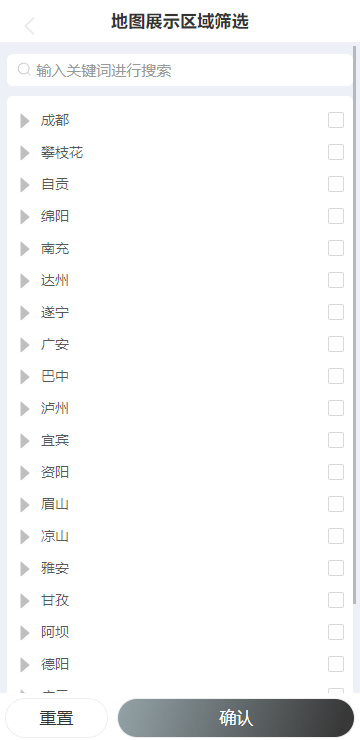
<HeaderWithBack title="地图展示区域筛选" onLeftClick={() => {
props.onShowOrClose()
}} />
<div className="content-info">
<div className="content-info-title">
<SearchBar placeholder='输入关键词进行搜索' style={{ '--background': '#ffffff' }} />
</div>
<div className="content-info-select-area">
{
selectArea.map((item) => {
return <div className="content-info-select-area-item">{item.title}<span onClick={() => {
removeAreaItem(item)
}
}>x</span></div>
})
}
</div>
<div className="content-info-tree">
<Tree
checkable
selectable={false}
loadData={onLoadData}
onCheck={treeNodeSelect}
checkedKeys={selectAreaKeys}
checkStrictly={true}
>
{renderTreeNodes(treeData)}
</Tree>
</div>
</div>
<div className="content-info-btn">
<Button block shape='rounded' className="content-info-btn-cancel" onClick={() => {
removeAllAreaItem()
}}>
重置
</Button>
<Button block shape='rounded' className="content-info-btn-ok" onClick={() => {
bakAndOK()
}}>
确认
</Button>
</div>
</div>
);
};
export default SelectAreaTree;
.content-info{
  padding: 0.15rem;
  background-color: #EDF1F7;
  max-height:88vh;
  overflow-y:  scroll;
}
.content-info-title{
  padding: 0.1rem 0;
}

.content-info-select-area{
  display: flex;
  flex-wrap:wrap;
  color: #2D3545;
}

.content-info-select-area-item{
  background: #FFFFFF;
  border-radius: 4px;
  padding: 0.02rem 0.1rem;
  margin: 0.05rem 0.1rem 0.05rem 0;
}

.content-info-select-area-item span{
  margin: 0 0 0 0.2rem;
  font-size: 0.15rem;
}

.content-info-tree{
  padding: 0.1rem;
  border-radius: 6px;
  margin-top: 0.1rem;
  background-color: #FFF;
}

.content-info-btn{
  display: flex;
  justify-content:space-between;
  margin: 0.1rem 0 0 0;
}

.content-info-btn-cancel{
 width: 30%;
  margin: 0 0.1rem;
}

.content-info-btn-ok{
  width: 70%;
  margin: 0 0.1rem;
  color: #FFF;
  background-image: linear-gradient(107deg, #94A3A8 0%, #383838 94%);
}

//重写tree多选框位置

.ant-tree li span.ant-tree-checkbox {
  float: right;
}

:root .ant-tree li span.ant-tree-switcher.ant-tree-switcher_close .ant-tree-switcher-icon, :root .ant-tree li span.ant-tree-switcher.ant-tree-switcher_close .ant-select-switcher-icon {
  font-size: 26px;
  color: #BFBFBF;
}
:root .ant-tree li span.ant-tree-switcher.ant-tree-switcher_open .ant-tree-switcher-icon, :root .ant-tree li span.ant-tree-switcher.ant-tree-switcher_open .ant-select-switcher-icon {
  font-size: 26px;
  color: #BFBFBF;
}

.ant-tree-checkbox-wrapper:hover .ant-tree-checkbox-inner, .ant-tree-checkbox:hover .ant-tree-checkbox-inner, .ant-tree-checkbox-input:focus + .ant-tree-checkbox-inner {
  border-color: #e7bf97;
}
.ant-tree-checkbox-checked .ant-tree-checkbox-inner {
  background-color: #e7bf97;
  border-color: #e7bf97;
}

.ant-tree-checkbox-indeterminate .ant-tree-checkbox-inner::after {
  background-color: #e7bf97;
}
antd动态tree 自定义样式的更多相关文章
- vue 动态添加 <style> 样式 vue动态添加 绑定自定义字体样式
created(){ //动态添加自定义字体样式 let style = document.createElement('style'); style.type = "text/css&qu ...
- WPF自定义控件与样式(7)-列表控件DataGrid与ListView自定义样式
一.前言 申明:WPF自定义控件与样式是一个系列文章,前后是有些关联的,但大多是按照由简到繁的顺序逐步发布的等,若有不明白的地方可以参考本系列前面的文章,文末附有部分文章链接. 本文主要内容: Dat ...
- checkbox、radio设置自定义样式
老生常谈,做一个简单的记录.浏览器自带的checkbox和radio样式可能不符合项目要求,通常要做一些自定义样式设置,目前基本的解决思路都是将input[type=checkbox/radio]隐藏 ...
- 【转】WPF自定义控件与样式(7)-列表控件DataGrid与ListView自定义样式
一.前言 申明:WPF自定义控件与样式是一个系列文章,前后是有些关联的,但大多是按照由简到繁的顺序逐步发布的等. 本文主要内容: DataGrid自定义样式: ListView自定义样式: 二.Dat ...
- WPF 4 DataGrid 控件(自定义样式篇)
原文:WPF 4 DataGrid 控件(自定义样式篇) 在<WPF 4 DataGrid 控件(基本功能篇)>中我们已经学习了DataGrid 的基本功能及使用方法.本篇将继续 ...
- 关于devexpress报表XtraReport,动态修改报表样式(.repx格式),动态添加数据并使用的理解
一.基本概念: XtraReports 中的每个报表都由 XtraRepot 类的一个实例表示,或者由该类的子类来表示(这种情况更常见). 因此,每个报表都作为带区的容器使用,而每个带区中都包含报表控 ...
- 一步步开发自己的博客 .NET版 剧终篇(6、响应式布局 和 自定义样式)
前言 这次开发的博客主要功能或特点: 第一:可以兼容各终端,特别是手机端. 第二:到时会用到大量html5,炫啊. 第三:导入博客园的精华文章,并做分类.(不要封我) 第四:做 ...
- Ueditor上传图片后自定义样式类名
Ueditor是百度的一个富文本插件,如果使用者会前端语言的话,那适用性就很好,特别是现在移动端纵横的情况.但往往使用者并不懂编程,要让他们使用前端语言的话是不可能的,这就需要我们在开发时就定义好整个 ...
- Android RatingBar 自定义样式
Android RatingBar 自定义样式 1.先定义Style: <style name="RadingStyle" parent="@android:sty ...
- WPF CheckBox 自定义样式
WPF 自定义样式.CheckBox <Style x:Key="EmptyCheckBox" TargetType="CheckBox"> < ...
随机推荐
- leetcode 剑指offer小结
栈与队列 剑指 Offer 09. 用两个栈实现队列 使用两个堆栈,一个输出栈,另一个输入栈.队列入队:直接将元素压入输入栈,队列出队:如果输出栈为空,将输入栈元素压入输出栈,再将输出栈元素出栈. 查 ...
- Linux 释放内存及占用较高问题排查
1. 查看内存情况 #按 k 查看 free #按兆M查看 free -m total:总计物理内存的大小. used:已使用多大. free:可用有多少. Shared:多个进程共享的内存总额. B ...
- Java课堂学习总结
对于Java字段的初始化来说,共有以下几种方法: 1.类的构造函数(构造方法):当创建一个对象时,其构造函数就会自动调用.构造方法必须与类名相同,无返回值.如果程序员没有定义一个构造函数时,系统会自动 ...
- 统计包含关键字的 Key 的数量
- 什么时候用多线程什么时候用多进程呢?GUL
那么在 Python 中什么时候用多线程什么时候用多进程呢?当在CPU-bound(计算密集型:绝大多数时间在计算) 时最好用 - 多进程, 而在 I/O bound(I/O密集型 : IO 处理 并 ...
- Vue基础(2)双向绑定
双向数据绑定 通过修改标签,例:切换radio.checkbox......都会对绑定的数据有影响 通过事件触发方法,修改data中数据,反向作用于radio.checkbox...... 1.v-m ...
- C#中Newtonsoft.Json.dll 的使用
1.类库说明Newtonsoft.Json.dll是.NET 下开源的json格式序列号和反序列化的类库,利用此类库,可以方便地操作json数据,其中在反序列化时,可以直接将格式化的json数据处理成 ...
- 模态框拖拽案例分析--元素偏移量 offset 系列
弹出框,我们也称为模态框. 模态框拖拽案例分析: (1)点击弹出层, 会弹出模态框, 并且显示灰色半透明的遮挡层. (2)点击关闭按钮,可以关闭模态框,并且同时关闭灰色半透明遮挡层. (3)鼠标放到模 ...
- iOS用runtime给一个类动态添加方法 ---class_addMethod
先介绍下class_addMethod这个fangfa /** * Adds a new method to a class with a given name and implementat ...
- 杭电OJ1029题C++实现
解题思路:因为要求的数出现的次数总是比其他数字出现的次数多1,所以若总是用相同的数去与其他的数相抵,那么最后只剩下一个,那就是要求的数. 另外需要注意的一点就是,最好不要去开长度为999999的数组, ...