【每天一个不会秃头的前端案例】CSS + JS 实现早安,晚安动画
从橘子学姐那边学来的 早安,晚安动画(CSS + js)
成果展示
先看成果。
通过点击太阳实现日夜的动画平滑交替
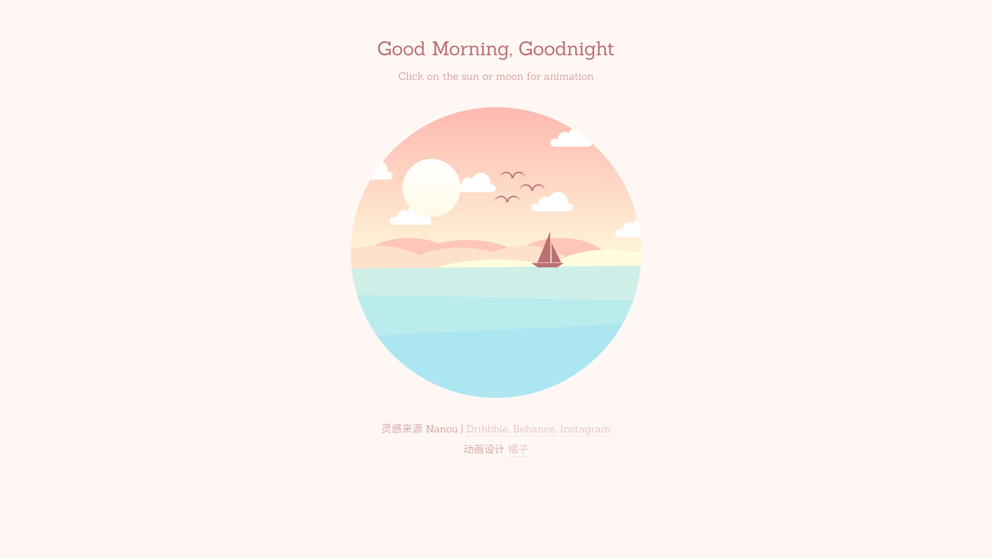
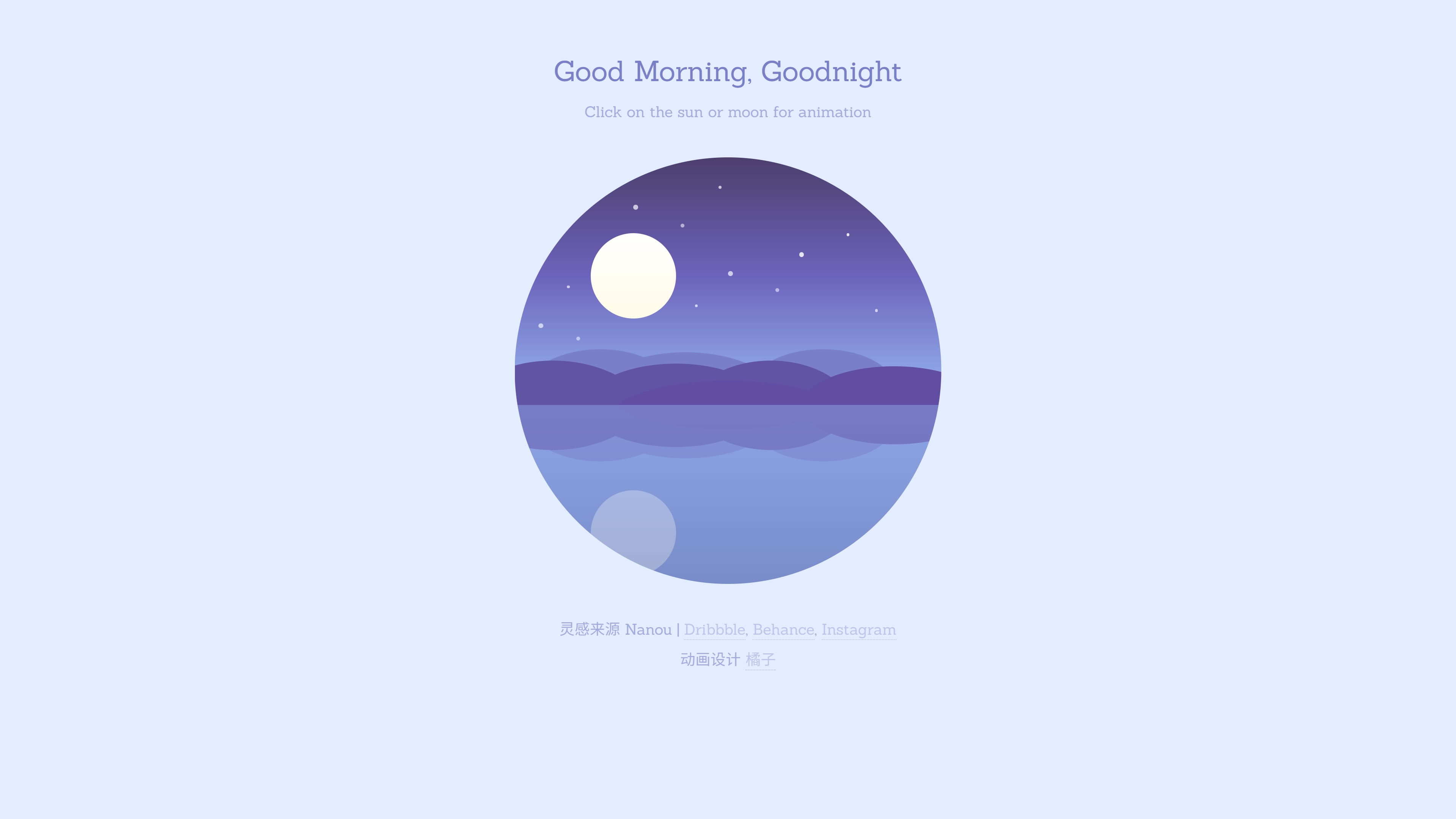
Movie
这里就不多说什么了,直接贴一下代码
HTML部分
<!DOCTYPE html>

<html lang="en">

<head>

  <meta charset="UTF-8">

  <title>早安、晚安动画</title>

  <link rel="stylesheet" href="https://cdnjs.cloudflare.com/ajax/libs/meyer-reset/2.0/reset.min.css">

  <link rel="stylesheet" href="./style.css">

</head>

<body>

  <div class="container-wrapper">

    <h1>Good Morning, Goodnight</h1>

    <p id="subtitle">Click on the sun or moon for animation</p>

    <div class="container">

      <div class="circle-container">

        <!-- 天空部分 -->

        <div class="sky">

          <div class="sky-night">

            <div class="stars">

              <div class="shooting-star"></div>

              <div class="star-group-1"></div>

              <div class="star-group-2"></div>

              <div class="star-group-3"></div>

              <div class="star-group-4"></div>

            </div>

          </div>

          <!-- 云彩 -->

          <div class="cloud cloud-1"></div>

          <div class="cloud cloud-2"></div>

          <div class="cloud cloud-3"></div>

          <div class="cloud cloud-4"></div>

          <div class="cloud cloud-5"></div>

          <div class="cloud cloud-6"></div>

          <div class="bird bird-1"></div>

          <div class="bird bird-2"></div>

          <div class="bird bird-3"></div>

        </div>

        <!-- 山川 -->

        <div class="mountains">

          <div class="mountain-back">

            <div class="mountain-back-1"></div>

            <div class="mountain-back-2"></div>

          </div>

          <div class="mountain-middle">

            <div class="mountain-middle-1"></div>

            <div class="mountain-middle-2"></div>

          </div>

          <div class="mountain-top">

            <div class="mountain-top-1"></div>

          </div>

        </div>

        <!-- 太阳 -->

        <div class="sun-container">

          <div class="sun"></div>

        </div>

        <!-- 海洋 -->

        <div class="ocean">

          <div class="boat"></div>

          <div class="ocean-night">

            <div class="moon"></div>

            <!-- 山川 -->

            <div class="mountains mountains-bottom">

              <div class="mountain-back">

                <div class="mountain-back-1"></div>

                <div class="mountain-back-2"></div>

              </div>

              <div class="mountain-middle">

                <div class="mountain-middle-1"></div>

                <div class="mountain-middle-2"></div>

              </div>

              <div class="mountain-top">

                <div class="mountain-top-1"></div>

              </div>

            </div>

          </div>

        </div>

      </div>

    </div>

    <p>灵感来源 Nanou | <a href="https://dribbble.com/Nanuo" target="_blank">Dribbble</a>, <a

        href="https://www.behance.net/Nanuo" target="_blank">Behance</a>, <a

        href="https://www.instagram.com/nanuonanuo/" target="_blank">Instagram</a> <br><br>动画设计 <a

        href="https://lavender-z.github.io/" target="_blank">橘子</a></p>

  </div>

  <!-- partial -->

  <script src='https://cdnjs.cloudflare.com/ajax/libs/jquery/3.4.1/jquery.min.js'></script>

  <script src="https://cdnjs.cloudflare.com/ajax/libs/prefixfree/1.0.7/prefixfree.min.js"></script>

  <script src="./script.js"></script>

</body>

</html>
CSS
@import url("https://fonts.googleapis.com/css?family=Sanchez");

* {

  padding: 0;

  margin: 0;

  -webkit-box-sizing: border-box;

  box-sizing: border-box;

}

*:before,

*:after {

  content: "";

  position: absolute;

}

html {

  font-family: "Sanchez", serif;

}

.container-wrapper {

  width: 100%;

  height: 100%;

  display: -webkit-box;

  display: -ms-flexbox;

  display: flex;

  -webkit-box-pack: center;

  -ms-flex-pack: center;

  justify-content: center;

  -webkit-box-align: center;

  -ms-flex-align: center;

  align-items: center;

  -webkit-box-orient: vertical;

  -webkit-box-direction: normal;

  -ms-flex-direction: column;

  flex-direction: column;

}

html {

  -webkit-transition: background-color 3s ease;

  -o-transition: background-color 3s ease;

  transition: background-color 3s ease;

  -webkit-transition-delay: 2s;

  -o-transition-delay: 2s;

  transition-delay: 2s;

  background-color: #fff7f4;

}

.container {

  width: 450px;

  height: 450px;

  position: relative;

}

.container-night {

  background-color: #e4ecff;

}

.circle-container {

  width: 450px;

  height: 450px;

  -webkit-clip-path: circle(50% at 50% 50%);

  clip-path: circle(50% at 50% 50%);

  position: absolute;

  overflow: hidden;

  z-index: 100;

}

.sky {

  position: absolute;

  width: 100%;

  height: 55%;

  top: 0;

  background: -webkit-gradient(linear,

      left top,

      left bottom,

      from(#feb8b0),

      to(#fef9db));

  background: -webkit-linear-gradient(#feb8b0, #fef9db);

  background: -o-linear-gradient(#feb8b0, #fef9db);

  background: linear-gradient(#feb8b0, #fef9db);

  z-index: 1;

  overflow: hidden;

}

.sky-night {

  position: absolute;

  width: 100%;

  height: 100%;

  background: -webkit-gradient(linear,

      left top,

      left bottom,

      from(#4c3f6d),

      color-stop(#6c62bb),

      to(#93b1ed));

  background: -webkit-linear-gradient(#4c3f6d, #6c62bb, #93b1ed);

  background: -o-linear-gradient(#4c3f6d, #6c62bb, #93b1ed);

  background: linear-gradient(#4c3f6d, #6c62bb, #93b1ed);

  opacity: 0;

  -webkit-transition: opacity 3s;

  -o-transition: opacity 3s;

  transition: opacity 3s;

  -webkit-transition-delay: 2s;

  -o-transition-delay: 2s;

  transition-delay: 2s;

}

.sky-night-fade {

  opacity: 1;

}

@-webkit-keyframes sky-night {

  0% {

    background: -webkit-gradient(linear,

        left top,

        left bottom,

        from(#feb8b0),

        to(#fef9db));

    background: -webkit-linear-gradient(#feb8b0, #fef9db);

    background: linear-gradient(#feb8b0, #fef9db);

  }

  100% {

    background: -webkit-gradient(linear,

        left top,

        left bottom,

        from(#4c3f6d),

        to(#96b5ee));

    background: -webkit-linear-gradient(#4c3f6d, #96b5ee);

    background: linear-gradient(#4c3f6d, #96b5ee);

  }

}

@keyframes sky-night {

  0% {

    background: -webkit-gradient(linear,

        left top,

        left bottom,

        from(#feb8b0),

        to(#fef9db));

    background: -webkit-linear-gradient(#feb8b0, #fef9db);

    background: -o-linear-gradient(#feb8b0, #fef9db);

    background: linear-gradient(#feb8b0, #fef9db);

  }

  100% {

    background: -webkit-gradient(linear,

        left top,

        left bottom,

        from(#4c3f6d),

        to(#96b5ee));

    background: -webkit-linear-gradient(#4c3f6d, #96b5ee);

    background: -o-linear-gradient(#4c3f6d, #96b5ee);

    background: linear-gradient(#4c3f6d, #96b5ee);

  }

}

.sun-container {

  z-index: 10;

  position: absolute;

  left: 0;

  right: 0;

  margin: auto;

  top: 0;

  bottom: 0;

  width: 290px;

  height: 290px;

  /*    background-color: rgba(255, 0, 255, 0.2);*/

  -webkit-transform-origin: center center;

  -ms-transform-origin: center center;

  transform-origin: center center;

  -webkit-transition: all 5s ease-in-out;

  -o-transition: all 5s ease-in-out;

  transition: all 5s ease-in-out;

}

.sun {

  position: absolute;

  width: 90px;

  height: 90px;

  border-radius: 50%;

  background: -webkit-gradient(linear,

      left top,

      left bottom,

      from(#fefefe),

      to(#fffbe8));

  background: -webkit-linear-gradient(#fefefe, #fffbe8);

  background: -o-linear-gradient(#fefefe, #fffbe8);

  background: linear-gradient(#fefefe, #fffbe8);

  cursor: pointer;

  z-index: 10;

}

.boat {

  position: absolute;

  width: 50px;

  height: 0px;

  border-top: 7px solid #bb7074;

  border-left: 10px solid transparent;

  border-right: 10px solid transparent;

  left: 280px;

  /*    right: -50px;*/

  top: -5px;

  -webkit-transform-origin: center bottom;

  -ms-transform-origin: center bottom;

  transform-origin: center bottom;

  -webkit-animation: boat 5s infinite;

  animation: boat 5s infinite;

  -webkit-animation-delay: 0.25s;

  animation-delay: 0.25s;

  -webkit-transition: all 4s ease-in-out;

  -o-transition: all 4s ease-in-out;

  transition: all 4s ease-in-out;

}

.boat-sail {

  margin-left: -350px;

}

.boat,

.boat:before,

.boat:after {

  position: absolute;

  z-index: 200;

}

@-webkit-keyframes boat {

  0% {

    -webkit-transform: rotate(1deg)translate(2px, 0px);

    transform: rotate(1deg)translate(2px, 0px);

  }

  25% {

    -webkit-transform: rotate(-1deg) translate(-2px, -2px);

    transform: rotate(-1deg) translate(-2px, -2px);

  }

  50% {

    -webkit-transform: rotate(1deg) translate(1px, 0px);

    transform: rotate(1deg) translate(1px, 0px);

  }

  75% {

    -webkit-transform: rotate(-1deg) translate(-1px, -2px);

    transform: rotate(-1deg) translate(-1px, -2px);

  }

  100% {

    -webkit-transform: rotate(1deg) translate(2px, 0px);

    transform: rotate(1deg) translate(2px, 0px);

  }

}

@keyframes boat {

  0% {

    -webkit-transform: rotate(1deg)translate(2px, 0px);

    transform: rotate(1deg)translate(2px, 0px);

  }

  25% {

    -webkit-transform: rotate(-1deg) translate(-2px, -2px);

    transform: rotate(-1deg) translate(-2px, -2px);

  }

  50% {

    -webkit-transform: rotate(1deg) translate(1px, 0px);

    transform: rotate(1deg) translate(1px, 0px);

  }

  75% {

    -webkit-transform: rotate(-1deg) translate(-1px, -2px);

    transform: rotate(-1deg) translate(-1px, -2px);

  }

  100% {

    -webkit-transform: rotate(1deg) translate(2px, 0px);

    transform: rotate(1deg) translate(2px, 0px);

  }

}

.boat:before,

.boat:after {

  width: 0;

  height: 0;

  border: 0 solid transparent;

}

.boat:before {

  bottom: 8px;

  right: -6px;

  border-right-width: 15px;

  border-left-width: 0px;

  border-bottom: 30px solid #bb7074;

}

.boat:after {

  bottom: 8px;

  right: 11px;

  border-right-width: 0px;

  border-left-width: 20px;

  border-bottom: 48px solid #bb7074;

}

.ocean {

  position: absolute;

  width: 100%;

  height: 45%;

  bottom: 0;

  background: #ceefe8;

  z-index: 200;

  -webkit-animation: ocean-top 3s infinite;

  animation: ocean-top 3s infinite;

  opacity: 1;

  -webkit-transition: all 3s ease;

  -o-transition: all 3s ease;

  transition: all 3s ease;

  -webkit-transition-delay: 2s;

  -o-transition-delay: 2s;

  transition-delay: 2s;

  -webkit-transform-origin: top;

  -ms-transform-origin: top;

  transform-origin: top;

}

.animation-stop {

  -webkit-animation: ocean-top 3s forwards;

  animation: ocean-top 3s forwards;

  height: 42%;

}

.ocean-night {

  position: relative;

  width: 100%;

  height: 100%;

  background: -webkit-gradient(linear,

      left top,

      left bottom,

      from(#8da6e6),

      to(#788cc9));

  background: -webkit-linear-gradient(#8da6e6, #788cc9);

  background: -o-linear-gradient(#8da6e6, #788cc9);

  background: linear-gradient(#8da6e6, #788cc9);

  opacity: 0;

  -webkit-transition: opacity 3s;

  -o-transition: opacity 3s;

  transition: opacity 3s;

  -webkit-transition-delay: 2s;

  -o-transition-delay: 2s;

  transition-delay: 2s;

  z-index: 500;

}

.ocean-night-fade {

  opacity: 1;

}

.moon {

  position: absolute;

  width: 90px;

  height: 90px;

  border-radius: 50%;

  background: -webkit-gradient(linear,

      left top,

      left bottom,

      from(#fefefe),

      to(#fffbe8));

  background: -webkit-linear-gradient(#fefefe, #fffbe8);

  background: -o-linear-gradient(#fefefe, #fffbe8);

  background: linear-gradient(#fefefe, #fffbe8);

  opacity: 0;

  left: 80px;

  margin-top: 90px;

  -webkit-transition: opacity 1s ease;

  -o-transition: opacity 1s ease;

  transition: opacity 1s ease;

}

.moon-fade {

  opacity: 0.3;

  -webkit-transition-delay: 4s;

  -o-transition-delay: 4s;

  transition-delay: 4s;

}

.ocean:before,

.ocean:after {

  width: 100%;

  bottom: 0;

  position: absolute;

  z-index: 200;

}

.ocean:before {

  height: 75%;

  background: #baeced;

  -webkit-animation: ocean-middle 3s infinite;

  animation: ocean-middle 3s infinite;

}

.ocean:after {

  height: 50%;

  background: #ace6f1;

  -webkit-animation: ocean-bottom 2s infinite;

  animation: ocean-bottom 2s infinite;

}

@-webkit-keyframes ocean-top {

  0% {

    -webkit-transform: rotate(0deg);

    transform: rotate(0deg);

  }

  25% {

    -webkit-transform: rotate(-1deg);

    transform: rotate(-1deg);

  }

  50% {

    -webkit-transform: rotate(0deg);

    transform: rotate(0deg);

  }

  75% {

    -webkit-transform: rotate(1deg);

    transform: rotate(1deg);

  }

  100% {

    -webkit-transform: rotate(0deg);

    transform: rotate(0deg);

  }

}

@keyframes ocean-top {

  0% {

    -webkit-transform: rotate(0deg);

    transform: rotate(0deg);

  }

  25% {

    -webkit-transform: rotate(-1deg);

    transform: rotate(-1deg);

  }

  50% {

    -webkit-transform: rotate(0deg);

    transform: rotate(0deg);

  }

  75% {

    -webkit-transform: rotate(1deg);

    transform: rotate(1deg);

  }

  100% {

    -webkit-transform: rotate(0deg);

    transform: rotate(0deg);

  }

}

@-webkit-keyframes ocean-middle {

  0% {

    height: 75%;

  }

  50% {

    height: 77%;

    -webkit-transform: rotate(2deg);

    transform: rotate(2deg);

  }

  100% {

    height: 75%;

  }

}

@keyframes ocean-middle {

  0% {

    height: 75%;

  }

  50% {

    height: 77%;

    -webkit-transform: rotate(2deg);

    transform: rotate(2deg);

  }

  100% {

    height: 75%;

  }

}

@-webkit-keyframes ocean-bottom {

  0% {

    height: 50%;

  }

  50% {

    height: 52%;

    -webkit-transform: rotate(-2deg);

    transform: rotate(-2deg);

  }

  100% {

    height: 50%;

  }

}

@keyframes ocean-bottom {

  0% {

    height: 50%;

  }

  50% {

    height: 52%;

    -webkit-transform: rotate(-2deg);

    transform: rotate(-2deg);

  }

  100% {

    height: 50%;

  }

}

.bird:before,

.bird:after {

  border: 2px solid #bb7074;

  border-bottom: 0;

  width: 18px;

  height: 8px;

  z-index: 200;

}

.bird {

  position: absolute;

  -webkit-animation: bird 1s infinite;

  animation: bird 1s infinite;

  z-index: 200;

  -webkit-transition: all 2s ease-in-out;

  -o-transition: all 2s ease-in-out;

  transition: all 2s ease-in-out;

}

.birds-fly {

  margin-left: 150px;

  margin-top: -100px;

}

.bird:after {

  border-top-left-radius: 18px;

  border-top-right-radius: 18px;

  border-right: 0;

  -webkit-animation: wing-right 1s infinite;

  animation: wing-right 1s infinite;

  -webkit-transform-origin: bottom left;

  -ms-transform-origin: bottom left;

  transform-origin: bottom left;

}

.bird:before {

  left: -19px;

  border-top-right-radius: 18px;

  border-top-left-radius: 18px;

  border-left: 0;

  -webkit-animation: wing-left 1s infinite;

  animation: wing-left 1s infinite;

  -webkit-transform-origin: bottom right;

  -ms-transform-origin: bottom right;

  transform-origin: bottom right;

}

.bird-1 {

  left: 240px;

  top: 140px;

  -webkit-transform: scale(0.9)rotate(10deg);

  -ms-transform: scale(0.9)rotate(10deg);

  transform: scale(0.9)rotate(10deg);

  -webkit-animation-delay: 0.4s;

  animation-delay: 0.4s;

}

.bird-2 {

  left: 280px;

  top: 120px;

  -webkit-transform: scale(0.8)rotate(-5deg);

  -ms-transform: scale(0.8)rotate(-5deg);

  transform: scale(0.8)rotate(-5deg);

  -webkit-animation-delay: 0.2s;

  animation-delay: 0.2s;

}

.bird-3 {

  left: 250px;

  top: 100px;

  -webkit-transform: scale(1)rotate(8deg);

  -ms-transform: scale(1)rotate(8deg);

  transform: scale(1)rotate(8deg);

}

@-webkit-keyframes bird {

  0% {

    -webkit-transform: translate(0px, 0px);

    transform: translate(0px, 0px);

  }

  50% {

    -webkit-transform: translate(2px, -3px);

    transform: translate(2px, -3px);

  }

  100% {

    -webkit-transform: translate(0px, 0px);

    transform: translate(0px, 0px);

  }

}

@keyframes bird {

  0% {

    -webkit-transform: translate(0px, 0px);

    transform: translate(0px, 0px);

  }

  50% {

    -webkit-transform: translate(2px, -3px);

    transform: translate(2px, -3px);

  }

  100% {

    -webkit-transform: translate(0px, 0px);

    transform: translate(0px, 0px);

  }

}

@-webkit-keyframes wing-right {

  0% {

    -webkit-transform: rotate(0deg);

    transform: rotate(0deg);

  }

  50% {

    -webkit-transform: rotate(10deg);

    transform: rotate(10deg);

  }

  100% {

    -webkit-transform: rotate(0deg);

    transform: rotate(0deg);

  }

}

@keyframes wing-right {

  0% {

    -webkit-transform: rotate(0deg);

    transform: rotate(0deg);

  }

  50% {

    -webkit-transform: rotate(10deg);

    transform: rotate(10deg);

  }

  100% {

    -webkit-transform: rotate(0deg);

    transform: rotate(0deg);

  }

}

@-webkit-keyframes wing-left {

  0% {

    -webkit-transform: rotate(0deg);

    transform: rotate(0deg);

  }

  50% {

    -webkit-transform: rotate(-10deg);

    transform: rotate(-10deg);

  }

  100% {

    -webkit-transform: rotate(0deg);

    transform: rotate(0deg);

  }

}

@keyframes wing-left {

  0% {

    -webkit-transform: rotate(0deg);

    transform: rotate(0deg);

  }

  50% {

    -webkit-transform: rotate(-10deg);

    transform: rotate(-10deg);

  }

  100% {

    -webkit-transform: rotate(0deg);

    transform: rotate(0deg);

  }

}

.mountains {

  position: absolute;

  width: 100%;

  /*        background-color: #ccc;*/

  height: 20%;

  bottom: 35%;

  /*        overflow: hidden;*/

}

.mountains-bottom {

  opacity: 0.5;

  -webkit-transform-origin: center;

  -ms-transform-origin: center;

  transform-origin: center;

  -webkit-transform: scaleY(-1);

  -ms-transform: scaleY(-1);

  transform: scaleY(-1);

  top: 0;

  position: fixed;

  overflow: hidden;

  height: 31.5%;

}

.mountains div,

.mountains div:after,

.mountains div:before {

  border-radius: 50%;

  position: absolute;

  z-index: 200;

}

.mountains * {

  -webkit-transition: background 3s ease;

  -o-transition: background 3s ease;

  transition: background 3s ease;

  -webkit-transition-delay: 2s;

  -o-transition-delay: 2s;

  transition-delay: 2s;

}

.mountain-top,

.mountain-top * {

  background: #fffcdd;

}

.mountain-top {

  width: 200px;

  height: 90px;

  top: 18px;

  right: 0;

  margin-right: -50px;

}

.mountain-top-1 {

  position: absolute;

  width: 250px;

  height: 80px;

  top: 15px;

  right: 0;

  margin-right: 150px;

}

.mountain-top-night {

  background: #614da2;

}

.mountain-middle,

.mountain-middle * {

  background: #fee1cb;

}

.mountain-middle {

  width: 180px;

  height: 120px;

  top: 12px;

  margin-left: 180px;

}

.mountain-middle-1 {

  width: 200px;

  height: 100px;

  top: 3px;

  margin-left: -110px;

}

.mountain-middle-2 {

  width: 220px;

  height: 150px;

  margin-left: -250px;

}

.mountain-middle-night {

  background: #6154a4;

}

.mountain-back,

.mountain-back * {

  background: #fec6b9;

}

.mountain-back {

  width: 180px;

  height: 120px;

  top: 0px;

}

.mountain-back-1 {

  width: 200px;

  height: 100px;

  top: 3px;

  margin-left: 80px;

}

.mountain-back-2 {

  width: 150px;

  height: 80px;

  margin-left: 250px;

}

.mountain-back-night {

  background: #7980c8;

}

.cloud,

.cloud:after,

.cloud:before {

  background: #fff;

  position: absolute;

  z-index: 500;

}

.cloud {

  width: 65px;

  height: 12px;

  border-radius: 20px;

  -webkit-animation: cloud 4s infinite;

  animation: cloud 4s infinite;

}

@-webkit-keyframes cloud {

  0% {

    -webkit-transform: translate(0px, 0px);

    transform: translate(0px, 0px);

  }

  25% {

    -webkit-transform: translate(2px, 2px);

    transform: translate(2px, 2px);

  }

  50% {

    -webkit-transform: translate(0px, 0px);

    transform: translate(0px, 0px);

  }

  75% {

    -webkit-transform: translate(-1px, -1px);

    transform: translate(-1px, -1px);

  }

  100% {

    -webkit-transform: translate(0px, 0px);

    transform: translate(0px, 0px);

  }

}

@keyframes cloud {

  0% {

    -webkit-transform: translate(0px, 0px);

    transform: translate(0px, 0px);

  }

  25% {

    -webkit-transform: translate(2px, 2px);

    transform: translate(2px, 2px);

  }

  50% {

    -webkit-transform: translate(0px, 0px);

    transform: translate(0px, 0px);

  }

  75% {

    -webkit-transform: translate(-1px, -1px);

    transform: translate(-1px, -1px);

  }

  100% {

    -webkit-transform: translate(0px, 0px);

    transform: translate(0px, 0px);

  }

}

.cloud:after {

  border-radius: 50%;

  height: 30px;

  left: 27px;

  top: -18px;

  width: 30px;

}

.cloud:before {

  border-radius: 50%;

  height: 20px;

  left: 12px;

  top: -11px;

  width: 20px;

}

.cloud-1 {

  left: 310px;

  top: 50px;

}

.cloud-2 {

  left: 280px;

  top: 150px;

  -webkit-animation-delay: 0.2s;

  animation-delay: 0.2s;

}

.cloud-3 {

  left: 410px;

  top: 190px;

  -webkit-animation-delay: 0.4s;

  animation-delay: 0.4s;

}

.cloud-4 {

  left: 160px;

  top: 120px;

  -webkit-animation-delay: 0.6s;

  animation-delay: 0.6s;

}

.cloud-5 {

  left: 60px;

  top: 170px;

  -webkit-animation-delay: 0.8s;

  animation-delay: 0.8s;

}

.cloud-6 {

  left: 0px;

  top: 100px;

  -webkit-animation-delay: 1s;

  animation-delay: 1s;

}

.stars *,

.stars *:before,

.stars *:after {

  border-radius: 50%;

  background-color: #fff;

  position: absolute;

}

.stars {

  opacity: 0;

  -webkit-transition: opacity 2s ease;

  -o-transition: opacity 2s ease;

  transition: opacity 2s ease;

}

.stars-fade {

  opacity: 1;

  -webkit-transition-delay: 4s;

  -o-transition-delay: 4s;

  transition-delay: 4s;

}

.star-group-1 {

  width: 5px;

  height: 5px;

  left: 225px;

  top: 120px;

  animation: twinkle 2s infinite linear;

}

.star-group-1:before {

  width: 4px;

  height: 4px;

  left: 50px;

  top: 18px;

  opacity: 0.8;

}

.star-group-1:after {

  width: 3px;

  height: 3px;

  left: -35px;

  top: 35px;

  opacity: 1;

}

.star-group-2 {

  width: 5px;

  height: 5px;

  left: 25px;

  top: 175px;

  animation: twinkle 1s infinite linear;

}

.star-group-2:before {

  width: 4px;

  height: 4px;

  left: 40px;

  top: 14px;

  opacity: 0.8;

}

.star-group-2:after {

  width: 3px;

  height: 3px;

  left: 30px;

  top: -40px;

  opacity: 1;

}

.star-group-3 {

  width: 5px;

  height: 5px;

  left: 125px;

  top: 50px;

  animation: twinkle 0.8s infinite linear;

}

.star-group-3:before {

  width: 4px;

  height: 4px;

  left: 50px;

  top: 20px;

  opacity: 0.8;

}

.star-group-3:after {

  width: 3px;

  height: 3px;

  left: 90px;

  top: -20px;

  opacity: 1;

}

.star-group-4 {

  width: 5px;

  height: 5px;

  left: 300px;

  top: 100px;

  animation: twinkle 1.2s infinite linear;

}

.star-group-4:before {

  width: 3px;

  height: 3px;

  left: 80px;

  top: 60px;

  opacity: 0.8;

}

.star-group-4:after {

  width: 3px;

  height: 3px;

  left: 50px;

  top: -20px;

  opacity: 1;

}

@-webkit-keyframes twinkle {

  0% {

    opacity: 1;

  }

  25% {

    opacity: 0.3;

  }

  50% {

    opacity: 0.8;

  }

  75% {

    opacity: 0.5;

  }

  100% {

    opacity: 0.8;

  }

}

@keyframes twinkle {

  0% {

    opacity: 1;

  }

  25% {

    opacity: 0.3;

  }

  50% {

    opacity: 0.8;

  }

  75% {

    opacity: 0.5;

  }

  100% {

    opacity: 0.8;

  }

}

.shooting-star {

  position: absolute;

  background: -webkit-gradient(linear,

      left top,

      right top,

      from(rgba(255, 255, 255, 1)),

      to(rgba(255, 255, 255, 0)));

  background: -webkit-linear-gradient(left,

      rgba(255, 255, 255, 1) 0%,

      rgba(255, 255, 255, 0) 100%);

  background: -o-linear-gradient(left,

      rgba(255, 255, 255, 1) 0%,

      rgba(255, 255, 255, 0) 100%);

  background: linear-gradient(to right,

      rgba(255, 255, 255, 1) 0%,

      rgba(255, 255, 255, 0) 100%);

  width: 35px;

  height: 3px;

  left: 310px;

  top: 10px;

  -webkit-transform-origin: left;

  -ms-transform-origin: left;

  transform-origin: left;

  -webkit-transform: rotate(-40deg);

  -ms-transform: rotate(-40deg);

  transform: rotate(-40deg);

}

.shooting {

  -webkit-animation: shooting-star 2s 2 ease-in-out;

  animation: shooting-star 2s 2 ease-in-out;

  -webkit-animation-delay: 5s;

  animation-delay: 5s;

}

@-webkit-keyframes shooting-star {

  100% {

    -webkit-transform: rotate(-40deg)translateX(-450px);

    transform: rotate(-40deg)translateX(-450px);

  }

}

@keyframes shooting-star {

  100% {

    -webkit-transform: rotate(-40deg)translateX(-450px);

    transform: rotate(-40deg)translateX(-450px);

  }

}

p a:link,

p a:active,

p a:visited {

  color: inherit;

  text-decoration: none;

  border-bottom: 1px dotted;

  border-bottom-color: inherit;

  opacity: 0.6;

}

h1,

p {

  color: #bb7074;

  -webkit-transition: color 3s;

  -o-transition: color 3s;

  transition: color 3s;

  -webkit-transition-delay: 2s;

  -o-transition-delay: 2s;

  transition-delay: 2s;

  text-align: center;

}

h1 {

  margin: 60px 0 10px 0;

  font-size: 30px;

  position: relative;

}

p {

  font-size: 16px;

  line-height: 16px;

  margin: 40px;

  position: relative;

  opacity: 0.6;

}

p#subtitle {

  margin-top: 10px;

}

.text-color {

  color: #7980c8;

}
Javascript
$(function () {

    $('.sun').click(function (e) {

        e.stopPropagation();

        $("html").toggleClass('container-night');

        $(".sky-night").toggleClass('sky-night-fade');

        $("p, h1").toggleClass('text-color');

        $(".ocean-night").toggleClass('ocean-night-fade');

        $(".moon").toggleClass('moon-fade');

        $(".ocean").toggleClass('animation-stop');

        $(".bird").toggleClass('birds-fly');

        $(".boat").toggleClass('boat-sail');

        $(".mountain-top, .mountain-top >*").toggleClass('mountain-top-night');

        $(".mountain-middle, .mountain-middle >*").toggleClass('mountain-middle-night');

        $(".mountain-back, .mountain-back >*").toggleClass('mountain-back-night');

        $(".cloud").delay(2500).fadeToggle(2500);

        $(".stars").toggleClass('stars-fade');

        $(".shooting-star").toggleClass('shooting');

        var angle = ($('.sun-container').data('angle') + 360) || 360;

        $('.sun-container').css({

            'transform': 'rotate(' + angle + 'deg)'

        });

        $('.sun-container').data('angle', angle);

    });

});
【每天一个不会秃头的前端案例】CSS + JS 实现早安,晚安动画的更多相关文章
- 认识大前端html+css+js
认识大前端:前端就是将效果图生成网页,利用html+css+js等技术. 如果把前端比作一台汽车,那么html就是车的骨架,css就是完整的车的模型,而js就充当着车的发动机... 建议: 刚刚开 ...
- 中阶d01-- web前端 html css js bootstrap
html 页面骨架结构css 页面优化js(脚本语言) 页面和用户互动 bootstrap 前端框架,主要实现不同设备直接打开页面时播放比例设置(全屏暂时,不要滚动条)
- 实现简易版德州扑克|学习麻瓜编程以项目为导向入门前端 HTML+CSS+JS
实现简易版德州扑克 1.先上达到网页效果图(简易版德州扑克) 网页分为发牌区和牌池,上面为发牌区,下面是牌池区 2. 代码实现 2.1 HTML和JS代码 ` <link rel="s ...
- 用CSS实现蒙德里安名画|学习麻瓜编程以项目为导向入门前端 HTML+CSS+JS
实现项目:用CSS实现蒙德里安名画 1.首先,献上代码和效果图 1.1代码: <head> <style> .centerframe{ display: flex; heigh ...
- Java匹马行天下之C国程序员的秃头原因
Java帝国的崛起 前言: 分享技术之前先请允许我分享一下黄永玉老先生说过的话:“明确的爱,直接的厌恶,真诚的喜欢.站在太阳下的坦荡,大声无愧地称赞自己.” <编程常识知多少> <走 ...
- 做一个会PS切图的前端开发
系列链接 做一个会使用PS的前端开发 做一个会PS切图的前端开发 切图方法分类 PhotoShop从CS版本演变到现在的CC版本,切图功能发生了比较大的变化,我们可以把PhotoShop CS版本时的 ...
- Puer是一个可以实时编辑刷新的前端服务器
##Puer是一个可以实时编辑刷新的前端服务器 确保你安装了nodejs(现在还有没nodejs环境的前端? 拖出去喂狗吧) 使用npm全局安装puer命令 npm install puer -g 输 ...
- Amaze UI 是一个移动优先的跨屏前端框架。 http://amazeui.org/
http://amazeui.org/ Amaze UI 是一个移动优先的跨屏前端框架.... Amaze UI 以移动优先(Mobile first)为理念,从小屏逐步扩展到大屏,最终实现所有屏幕适 ...
- 前端使用node.js的http-server开启一个本地服务器
前端使用node.js的http-server开启一个本地服务器 在写前端页面中,经常会在浏览器运行HTML页面,从本地文件夹中直接打开的一般都是file协议,当代码中存在http或https的链接时 ...
- 一个小公司的前端笔试HTML CSS JS
网上有这套题的答案,版本也很多,我做了很多参考.本文就当个小笔记,可能有错误,还望指正~ 第1章 Html篇 1. 你做的网页在哪些浏览器测试过?这些浏览器的内核分别是什么? 浏览器类型 内核 Fi ...
随机推荐
- [ABC246F] typewriter
Problem Statement We have a typewriter with $N$ rows. The keys in the $i$-th row from the top can ty ...
- [ABC261B] Tournament Result
Problem Statement $N$ players played a round-robin tournament. You are given an $N$-by-$N$ table $A$ ...
- Mongodb安装篇+可视化工具篇
下载MongoDB 官网下载地址:Download MongoDB Community Server | MongoDB Version 选择:稳定版4.4.2 Mongo的版本分为稳定版和开发版 ...
- 基于一维卷积神经网络模型的AI量化智能选股策略
这是早前BigQuant专题研究:基于卷积神经网络CNN的深度学习因子选股模型.卷积神经网络(Convolutional Neural Network, CNN),是计算机视觉研究和应用领域中最具影响 ...
- Selenium-无头模式headless
无头模式适合的场景: 部署到没有gui界面的服务器,比如linux 开发环境测试完全没问题后可以使用无头模式,提高selenium速度. # 使用headless无界面浏览器模式 chrome_opt ...
- C语言之检验三边能否构成三角形
要求: 编写程序检验由三边能否构成三角形,检验方法是任意两边和均要大于第三边. 输出格式:若结果可以构成,输出YES,否则输出ERROR DATA 其实很简单,运用与逻辑运算符&&判断 ...
- TeeChart 的使用从入门到精通
1.首先nutGet 进行使用 2.如果需要使用管方的Key 进行激活 3.直接上写的Demo代码 1 using System; 2 using System.Collections.Generic ...
- 元数据管理平台对比预研 Atlas VS Datahub VS Openmetadata
大家好,我是独孤风.元数据管理平台层出不穷,但目前主流的还是Atlas.Datahub.Openmetadata三家,那么我们该如何选择呢? 本文就带大家对比一下.要了解元数据管理平台,先要从架构说起 ...
- Tailscale 基础教程:Headscale 的部署方法和使用教程
Tailscale 是一种基于 WireGuard 的虚拟组网工具,它在用户态实现了 WireGuard 协议,相比于内核态 WireGuard 性能会有所损失,但在功能和易用性上下了很大功夫: 开箱 ...
- Spring表达式语言(SPEL)学习(03)
rootObject 在表达式中直接写name和getName(),这时候Expression是无法解析的,因为其不知道name和getName()对应什么意思 @Test public void t ...