【转载】 机器学习数据可视化 (t-SNE 使用指南)—— Why You Are Using t-SNE Wrong
原文地址:
https://towardsdatascience.com/why-you-are-using-t-sne-wrong-502412aab0c0
=====================================
Source: https://datascienceplus.com/multi-dimensional-reduction-and-visualisation-with-t-sne/
t-SNE has become a very popular technique for visualizing high dimensional data. It’s extremely common to take the features from an inner layer of a deep learning model and plot them in 2-dimensions using t-SNE to reduce the dimensionality. Unfortunately, most people just use scikit-learn’s implementation without actually understanding the results and misinterpreting what they mean.
While t-SNE is a dimensionality reduction technique, it is mostly used for visualization and not data pre-processing (like you might with PCA). For this reason, you almost always reduce the dimensionality down to 2 with t-SNE, so that you can then plot the data in two dimensions.
The reason t-SNE is common for visualization is that the goal of the algorithm is to take your high dimensional data and represent it correctly in lower dimensions — thus points that are close in high dimensions should remain close in low dimensions. It does this in a non-linear and local way, so different regions of data could be transformed differently.
t-SNE has a hyper-parameter called perplexity. Perplexity balances the attention t-SNE gives to local and global aspects of the data and can have large effects on the resulting plot. A few notes on this parameter:
- It is roughly a guess of the number of close neighbors each point has. Thus, a denser dataset usually requires a higher perplexity value.
- It is recommended to be between 5 and 50.
- It should be smaller than the number of data points.
The biggest mistake people make with t-SNE is only using one value for perplexity and not testing how the results change with other values. If choosing different values between 5 and 50 significantly change your interpretation of the data, then you should consider other ways to visualize or validate your hypothesis.
It is also overlooked that since t-SNE uses gradient descent, you also have to tune appropriate values for your learning rate and the number of steps for the optimizer. The key is to make sure the algorithm runs long enough to stabilize.
There is an incredibly good article on t-SNE that discusses much of the above as well as the following points that you need to be aware of:
- You cannot see the relative sizes of clusters in a t-SNE plot. This point is crucial to understand as t-SNE naturally expands dense clusters and shrinks spares ones. I often see people draw inferences by comparing the relative sizes of clusters in the visualization. Don’t make this mistake.
- Distances between well-separated clusters in a t-SNE plot may mean nothing. Another common fallacy. So don’t necessarily be dismayed if your “beach” cluster is closer to your “city” cluster than your “lake” cluster.
- Clumps of points — especially with small perplexity values — might just be noise. It is important to be careful when using small perplexity values for this reason. And to remember to always test many perplexity values for robustness.
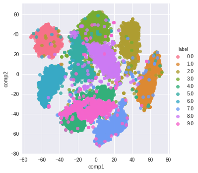
Now — as promised some code! A few things of note with this code:
- I first reduce the dimensionality to 50 using PCA before running t-SNE. I have found that to be good practice (when having over 50 features) because otherwise, t-SNE will take forever to run.
- I don’t show various values for perplexity as mentioned above. I will leave that as an exercise for the reader. Just run the t-SNE code a few more times with different perplexity values and compare visualizations.
from sklearn.datasets import fetch_mldata

from sklearn.manifold import TSNE

from sklearn.decomposition import PCA

import seaborn as sns

import numpy as np

import matplotlib.pyplot as plt

# get mnist data

mnist = fetch_mldata("MNIST original")

X = mnist.data / 255.0

y = mnist.target

# first reduce dimensionality before feeding to t-sne

pca = PCA(n_components=50)

X_pca = pca.fit_transform(X)

# randomly sample data to run quickly

rows = np.arange(70000)

np.random.shuffle(rows)

n_select = 10000

# reduce dimensionality with t-sne

tsne = TSNE(n_components=2, verbose=1, perplexity=50, n_iter=1000, learning_rate=200)

tsne_results = tsne.fit_transform(X_pca[rows[:n_select],:])

# visualize

df_tsne = pd.DataFrame(tsne_results, columns=['comp1', 'comp2'])

df_tsne['label'] = y[rows[:n_select]]sns.lmplot(x='comp1', y='comp2', data=df_tsne, hue='label', fit_reg=False)
And here is the resulting visualization:
=========================================
【转载】 机器学习数据可视化 (t-SNE 使用指南)—— Why You Are Using t-SNE Wrong的更多相关文章
- 前端数据可视化echarts.js使用指南
一.开篇 首先这里要感谢一下我的公司,因为公司需求上面的新颖(奇葩)的需求,让我有幸可以学习到一些好玩有趣的前端技术,前端技术中好玩而且比较实用的我想应该要数前端的数据可视化这一方面,目前市面上的数据 ...
- 机器学习-数据可视化神器matplotlib学习之路(五)
这次准备做一下pandas在画图中的应用,要做数据分析的话这个更为实用,本次要用到的数据是pthon机器学习库sklearn中一组叫iris花的数据,里面组要有4个特征,分别是萼片长度.萼片宽度.花瓣 ...
- 机器学习-数据可视化神器matplotlib学习之路(四)
今天画一下3D图像,首先的另外引用一个包 from mpl_toolkits.mplot3d import Axes3D,接下来画一个球体,首先来看看球体的参数方程吧 (0≤θ≤2π,0≤φ≤π) 然 ...
- 机器学习-数据可视化神器matplotlib学习之路(三)
之前学习了一些通用的画图方法和技巧,这次就学一下其它各种不同类型的图.好了先从散点图开始,上代码: from matplotlib import pyplot as plt import numpy ...
- 机器学习-数据可视化神器matplotlib学习之路(二)
之前学习了matplotlib的一些基本画图方法(查看上一节),这次主要是学习在图中加一些文字和其其它有趣的东西. 先来个最简单的图 from matplotlib import pyplot as ...
- 机器学习-数据可视化神器matplotlib学习之路(一)
直接上代码吧,说明写在备注就好了,这次主要学习一下基本的画图方法和常用的图例图标等 from matplotlib import pyplot as plt import numpy as np #这 ...
- Python数据可视化编程实战pdf
Python数据可视化编程实战(高清版)PDF 百度网盘 链接:https://pan.baidu.com/s/1vAvKwCry4P4QeofW-RqZ_A 提取码:9pcd 复制这段内容后打开百度 ...
- python数据可视化编程实战PDF高清电子书
点击获取提取码:3l5m 内容简介 <Python数据可视化编程实战>是一本使用Python实现数据可视化编程的实战指南,介绍了如何使用Python最流行的库,通过60余种方法创建美观的数 ...
- Python Seaborn综合指南,成为数据可视化专家
概述 Seaborn是Python流行的数据可视化库 Seaborn结合了美学和技术,这是数据科学项目中的两个关键要素 了解其Seaborn作原理以及使用它生成的不同的图表 介绍 一个精心设计的可视化 ...
- 机器学习PAL数据可视化
机器学习PAL数据可视化 本文以统计全表信息为例,介绍如何进行数据可视化. 前提条件 完成数据预处理,详情请参见数据预处理. 操作步骤 登录PAI控制台. 在左侧导航栏,选择模型开发和训练 > ...
随机推荐
- java的ConCurrentHashMap
一般的应用的编程,用到ConCurrentHashMap的机会很少,就象大家调侃的一样:只有面试的时候才用得着. 但还是有. 网上关于这个的资料,多如牛毛,大部分是原理分析和简单例子. 原理的核心就一 ...
- Linux/Unix-stty命令详解
文章目录 介绍 stty命令的使用方法 stty的参数 我常用的选项 所有选项 介绍 stty用于查询和设置当前终端的配置. 如果你的终端回车不换行.输入命令不显示等各种奇葩问题,那么stty命令可以 ...
- FEDORA 显卡驱动安装
FEDORA 显卡驱动安装 在fedora中akmod-nvidia包可以自动的处理开源驱动屏蔽等各种问题, 强烈推荐用这个安显卡驱动. -1. 在 BIOS 中关闭安全启动 0. 切换桌面环境至 X ...
- python重拾第六天-面向对象基础
本节内容: 面向对象编程介绍 为什么要用面向对象进行开发? 面向对象的特性:封装.继承.多态 类.方法. 引子 你现在是一家游戏公司的开发人员,现在需要你开发一款叫做<人狗大战>的 ...
- Debezium-Flink-Hudi:实时流式CDC
1. 什么是Debezium Debezium是一个开源的分布式平台,用于捕捉变化数据(change data capture)的场景.它可以捕捉数据库中的事件变化(例如表的增.删.改等),并将其转为 ...
- 实测14us,Linux-RT实时性能及开发案例分享—基于全志T507-H国产平台
本文带来的是基于全志T507-H(硬件平台:创龙科技TLT507-EVM评估板),Linux-RT内核的硬件GPIO输入和输出实时性测试及应用开发案例的分享.本次演示的开发环境如下: Windows开 ...
- 【资料分享】Xilinx XCZU7EV工业核心板规格书(四核ARM Cortex-A53 + 双核ARM Cortex-R5 + FPGA,主频1.5GHz)
1 核心板简介 创龙科技SOM-TLZU是一款基于Xilinx UltraScale+ MPSoC系列XCZU7EV高性能处理器设计的高端异构多核SoC工业核心板,处理器集成PS端(四核ARM Cor ...
- TI AM62x工业开发板规格书(单/双/四核ARM Cortex-A53 + 单核ARM Cortex-M4F,主频1.4GHz)
1 评估板简介 创龙科技TL62x-EVM是一款基于TI Sitara系列AM62x单/双/四核ARM Cortex-A53 + 单核ARM Cortex-M4F多核处理器设计的高性能低功耗工业评估板 ...
- nginx配置端口转发 并修改swagger路径配置
项目服务器为linux,仅开放特定外网端口 所以部署的docker服务需要通过nginx 做端口转发 这里的配置使用的是 nginx docker服务 配置步骤: 1. 修改nginx配置文件,我这里 ...
- ubuntu16.04 python2&3 pip升级后报错:sys.stderr.write(f"ERROR: {exc}")
ubuntu16.04 python2&3 pip升级后报错: sys.stderr.write(f"ERROR: {exc}") 描述 最近使用ubuntu16.04上的 ...