CSS3/CSS之居中解析(水平+垂直居中、水平居中,垂直居中)
首先,我们来看下垂直居中:
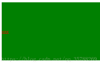
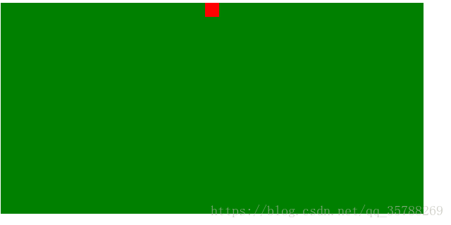
(1)、如果是单行文本,则可以设置的line-height的数值,让其等于父级元素的高度!
<!DOCTYPE html>

<html lang="en">

<head>

    <meta charset="UTF-8">

    <meta name="viewport" content="width=device-width, initial-scale=1.0">

    <meta http-equiv="X-UA-Compatible" content="ie=edge">

    <title>Document</title>

    <style>

        .box{

            background: green;

            height:200px;

        }

        a {height:%;

        line-height: 200px;

        color:red;

}

 </style>

</head>

<body>

   <div class="box">

       <a href="">ggg </a>

   </div>

</body>

</html>
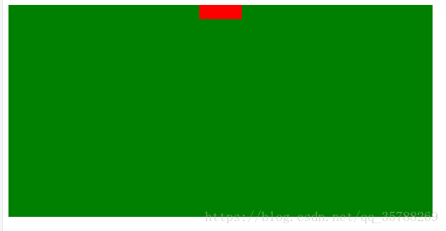
(2)、如果元素是行内块级元素,一般会使用diaplay:inline-block,vertical-align:middle,还有一个伪元素让元素内容处于容器中央!给父元素添加伪元素!
<!DOCTYPE html>
<html lang="en">
<head>
<meta charset="UTF-8">
<meta name="viewport" content="width=device-width, initial-scale=1.0">
<meta http-equiv="X-UA-Compatible" content="ie=edge">
<title>Document</title>
<style>
.box {
background: green;
height:200px;
}
.box::after, .box2{
display:inline-block;
vertical-align: middle;
}
.box::after{
content:'';
height:%;
}
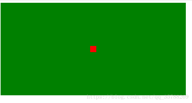
.box2{background-color:red;width:20px;height:20px;}
</style>
</head>
<body>
<div class="box">
<div class="box2"></div>
</div>
</body>
</html>

(3)、通过display:flex来实现垂直居中;
父级:display:flex;
子元素:align-self:center;
<!DOCTYPE html>

<html lang="en">

<head>

    <meta charset="UTF-8">

    <meta name="viewport" content="width=device-width, initial-scale=1.0">

    <meta http-equiv="X-UA-Compatible" content="ie=edge">

    <title>Document</title>

    <style>

        .box {

            background: green;

            height:300px;

            width: 600px;

            display:flex;

        }

        .box2{background:red;

        width:%;

        height:%;

        align-self: center;

     }

 </style>

</head>

<body>

   <div class="box">

       <div class="box2"></div>

   </div>

</body>

</html>
(4)、使用display:table进行垂直居中!
给父元素设置display:table;子元素设置为display:table-cell;
<!DOCTYPE html>

<html lang="en">

<head>

    <meta charset="UTF-8">

    <meta name="viewport" content="width=device-width, initial-scale=1.0">

    <meta http-equiv="X-UA-Compatible" content="ie=edge">

    <title>Document</title>

    <style>

        .box {

            background-color: green;

            height:300px;

            width: 600px;

            display:table;

        }

       .box .box2{

           color:red;

        display:table-cell;

         vertical-align: middle;

}

 </style>

</head>

<body>

   <div class="box">

       <div class="box2">ddddd</div>

   </div>

</body>

</html>
(5),已经知道父元素的高度,给子元素相对定位,在通过translaY()得到垂直居中
<!DOCTYPE html>

<html lang="en">

<head>

    <meta charset="UTF-8">

    <meta name="viewport" content="width=device-width, initial-scale=1.0">

    <meta http-equiv="X-UA-Compatible" content="ie=edge">

    <title>Document</title>

    <style>

        .box {

            background-color: green;

            height:300px;

            width: 600px;

        }

       .box .box2{

           background-color:red;

            width:%;

             height:%;

             position: relative;

             top:%;

             transform:translateY(-%);

}

 </style>

</head>

<body>

   <div class="box">

       <div class="box2"></div>

   </div>

</body>

</html>

6)、父元素高度不知道,同过transform实现,先给父元素相对定位,在给子元素绝对定位
<!DOCTYPE html>

<html lang="en">

<head>

    <meta charset="UTF-8">

    <meta name="viewport" content="width=device-width, initial-scale=1.0">

    <meta http-equiv="X-UA-Compatible" content="ie=edge">

    <title>Document</title>

    <style>

        .box {

            background-color: green;

            height:300px;

            width: 600px;

            position: relative;

        }

       .box .box2{

           background-color:red;

            width:%;

             height:%;

             position: absolute;

             top:%;

             transform:translateY(-%);

}

 </style>

</head>

<body>

   <div class="box">

       <div class="box2"></div>

   </div>

</body>

</html>
二、水平居中:
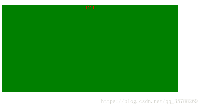
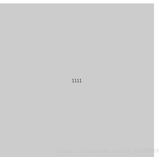
(1)、行内元素方案,只要把行内元素包裹 在一个盒子中,并且在他父级元素添加如下属性:text-align:center;
<!DOCTYPE html>

<html lang="en">

<head>

    <meta charset="UTF-8">

    <meta name="viewport" content="width=device-width, initial-scale=1.0">

    <meta http-equiv="X-UA-Compatible" content="ie=edge">

    <title>Document</title>

    <style>

        .box {

            background-color: green;

            height:300px;

            width: 600px;

            text-align:center;

        }

      P{color:red;}

 </style>

</head>

<body>

   <div class="box">

       <p>1111</p>

   </div>

</body>

</html>
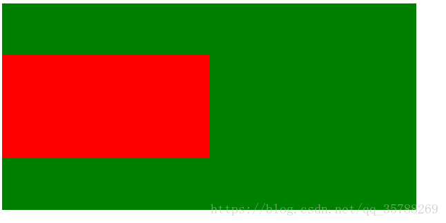
(2)、单个块状元素解决方案:
<!DOCTYPE html>

<html lang="en">

<head>

    <meta charset="UTF-8">

    <meta name="viewport" content="width=device-width, initial-scale=1.0">

    <meta http-equiv="X-UA-Compatible" content="ie=edge">

    <title>Document</title>

    <style>

        .box {

            background-color: green;

            height:300px;

            width: 600px;

            text-align:center;

        }

    .box2{

        background-color: red;

        width: 20px;

        height: 20px;

        margin: auto;

    }

 </style>

</head>

<body>

   <div class="box">

       <div class="box2"></div>

   </div>

</body>

</html>
3)、多个块状元素解决方案:父元素设置为text-align:center;子元素设置为:display:inline-block;

相信很多人在刚接触前端或者中期时候总会遇到一些问题及瓶颈期,如学了一段时间没有方向感或者坚持不下去一个人学习枯燥乏味有问题也不知道怎么解决,对此我整理了一些资料 喜欢我的文章想与更多资深大牛一起讨论和学习的话 欢迎加入我的学习交流群907694362
!DOCTYPE html>

<html lang="en">

<head>

    <meta charset="UTF-8">

    <meta name="viewport" content="width=device-width, initial-scale=1.0">

    <meta http-equiv="X-UA-Compatible" content="ie=edge">

    <title>Document</title>

    <style>

        .box {

            background-color: green;

            height:300px;

            width: 600px;

            text-align:center;

        }

    .box2, .box3{

        background-color: red;

        width: 20px;

        height: 20px;

        display:inline-block;

    }

 </style>

</head>

<body>

   <div class="box">

       <div class="box2"></div>

       <div class="box3"></div>

   </div>

</body>

</html>
也可以使用flexbox来实现:
<!DOCTYPE html>

<html lang="en">

<head>

    <meta charset="UTF-8">

    <meta name="viewport" content="width=device-width, initial-scale=1.0">

    <meta http-equiv="X-UA-Compatible" content="ie=edge">

    <title>Document</title>

    <style>

        .box {

            background-color: green;

            height:300px;

            width: 600px;

           display:flex;

           justify-content:center;

        }

    .box2, .box3, .box4{

        background-color: red;

        width: 20px;

        height: 20px;

    }

 </style>

</head>

<body>

   <div class="box">

       <div class="box2"></div>

       <div class="box3"></div>

       <div class="box4"></div>

   </div>

</body>

</html>
(4)、不定宽度块元素水平居中:
<!DOCTYPE html>

<html lang="en">

<head>

    <meta charset="UTF-8">

    <meta name="viewport" content="width=device-width, initial-scale=1.0">

    <meta http-equiv="X-UA-Compatible" content="ie=edge">

    <title>Document</title>

    <style>

        .box {

            float:left;

            position: relative;

            left:%;

        }

    .box ul{

        position:relative;

        left:-%;

    }

 </style>

</head>

<body>

   <div class="box">

       <ul>

           <li></li>

           <li></li>

           <li></li>

       </ul>

   </div>

</body>

</html>
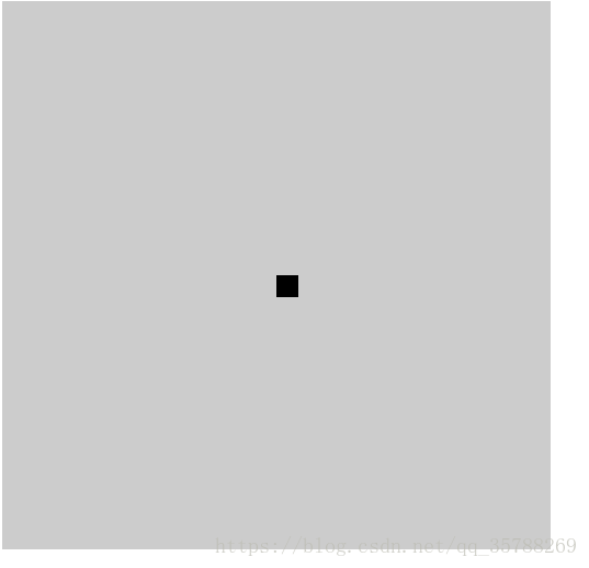
三:实现水平+垂直居中,也就是在中央:(1)单行行内元素:父元素设置:text-align:center,display:table-cell;vertical-align:middle,在这里,图片,文字,都是一样的操作
<!DOCTYPE html>

<html lang="en">

<head>

    <meta charset="UTF-8">

    <meta name="viewport" content="width=device-width, initial-scale=1.0">

    <meta http-equiv="X-UA-Compatible" content="ie=edge">

    <title>Document</title>

    <style>

        .box {

            background-color: #ccc;

            width:500px;

            height: 500px;

            display:table-cell;

            text-align: center;

            vertical-align: middle;

        }

        img{width:50px;

        height: 50px;}

 </style>

</head>

<body>

   <div class="box">

      <img src="5.jpg" alt="">

   </div>

</body>

</html>

文字在中央,还可以父级设置为text-align:center;line-height设置为父元素的height
<!DOCTYPE html>

<html lang="en">

<head>

    <meta charset="UTF-8">

    <meta name="viewport" content="width=device-width, initial-scale=1.0">

    <meta http-equiv="X-UA-Compatible" content="ie=edge">

    <title>Document</title>

    <style>

        .box {

            background-color: #ccc;

            width:500px;

            height: 500px;

            text-align: center;

        }

   p{line-height: 500px;}

 </style>

</head>

<body>

   <div class="box">

  <p></p>

   </div>

</body>
(2)对于单个块级元素,父元素设置为相对定位,子元素设置为绝对定位高度,宽度为50%
!DOCTYPE html>

<html lang="en">

<head>

    <meta charset="UTF-8">

    <meta name="viewport" content="width=device-width, initial-scale=1.0">

    <meta http-equiv="X-UA-Compatible" content="ie=edge">

    <title>Document</title>

    <style>

        .box {

            background-color: #ccc;

            width:500px;

            height: 500px;

            position: relative;

        }

        .box2{position: absolute;

        top:%;

        left:%;

        background-color: black;

        width: 20px;

        height: 20px;}

 </style>

</head>

<body>

   <div class="box">

       <div class="box2"></div>

   </div>

</body>

</html>
(3)、flex实现不定宽度水平+垂直居中
<!DOCTYPE html>

<html lang="en">

<head>

    <meta charset="UTF-8">

    <meta name="viewport" content="width=device-width, initial-scale=1.0">

    <meta http-equiv="X-UA-Compatible" content="ie=edge">

    <title>Document</title>

    <style>

        .box {

            background-color: green;

            height:300px;

            width: 600px;

           display:flex;

           justify-content:center;

           align-items:center;

        }

    .box2, .box3, .box4{

        background-color: red;

        width: 20px;

        height: 20px;

    }

 </style>

</head>

<body>

   <div class="box">

       <div class="box2"></div>

   </div>

</body>

</html>
推荐阅读:CSS边框长度控制
原文链接:https://blog.csdn.net/qq_35788269/article/details/80691114
<!DOCTYPE html><html lang="en"><head> <meta charset="UTF-8"> <meta name="viewport" content="width=device-width, initial-scale=1.0"> <meta http-equiv="X-UA-Compatible" content="ie=edge"> <title>Document</title> <style> .box{ background: green; height:200px; } a {height:100%; line-height: 200px; color:red;} </style></head><body> <div class="box"> <a href="">ggg </a> </div></body></html>————————————————版权声明:本文为CSDN博主「左手写爱等等」的原创文章,遵循 CC 4.0 BY-SA 版权协议,转载请附上原文出处链接及本声明。原文链接:https://blog.csdn.net/qq_35788269/article/details/80691114
CSS3/CSS之居中解析(水平+垂直居中、水平居中,垂直居中)的更多相关文章
- CSS - div居中在屏幕中(水平居中 + 垂直居中)
方法一代码 <div> <h1>404 Not Found.</h1> </div> <style> div { text-align: c ...
- 用CSS 实现 非浮动元素的 水平居中/垂直居中/水平垂直居中
一.水平居中 (1)行内元素解决方案 只需要把行内元素包裹在一个属性display为block的父层元素中,并且把父层元素添加如下属性即可: .parent { text-align:center ...
- CSS position &居中(水平,垂直)
css position是个很重要的知识点: 知乎Header部分: 知乎Header-inner部分: position属性值: fixed:生成绝对定位的元素,相对浏览器窗口进行定位(位置可通过: ...
- (前端)面试300问之(2)CSS元素居中【水平、垂直、2者同时居中】
一 仅水平居中 1 行内元素 1)给父元素添加 text-align:center 即可 <div class="parent"> <span class=&qu ...
- css图片居中(水平居中和垂直居中)
css图片居中(水平居中和垂直居中) css图片居中分css图片水平居中和垂直居中两种情况,有时候还需要图片同时水平垂直居中,下面分几种居中情况分别介绍. css图片水平居中 利用margin: 0 ...
- HTML+CSS,让div在屏幕中居中(水平居中+垂直居中)方法总结
最近写网页经常需要将div在屏幕中居中显示,遂记录下几个常用的方法,都比较简单. 水平居中直接加上<center>标签即可,或者设置margin:auto;当然也可以用下面的方法 下面说两 ...
- 用css让一个容器水平垂直居中
阅读目录 方法一:position加margin 方法二: diaplay:table-cell 方法三:position加 transform 方法四:flex;align-items: cente ...
- CSS布局:元素水平垂直居中
CSS布局:元素水平垂直居中 本文将依次介绍在不同条件下实现水平垂直居中的多种方法 水平垂直居中是在写网页时经常会用到的需求,在上两篇博客中,分别介绍了水平居中和垂直居中的方法.本文的水平垂直居中就是 ...
- css知识笔记:水平垂直居中(别只看,请实操!!!)
css实现元素的水平垂直居中. (尝试采用5W2H方法说明): 别只看,请实操!!! What: 1.这篇文档主要描述元素水平方向居中的几种最常见和最实用的几种方式,并说明优缺点. 2.写这篇文章的目 ...
随机推荐
- 痞子衡嵌入式:飞思卡尔i.MX RTyyyy系列MCU特性那些事(1)- 概览
大家好,我是痞子衡,是正经搞技术的痞子.今天痞子衡给大家介绍的是飞思卡尔i.MX RTyyyy系列MCU的基本特性. ARM Cortex-M微控制器芯片厂商向来竞争激烈,具体可参看我的另一篇文章&l ...
- Thinkphp 5.0.15 设计缺陷导致Insert/update-SQL注入 分析
分析 与上一个漏洞类似,这个也是前端可以传入一个数组变量,如['exp','123','123'],后端根据array[0]来将array[1]和array[2]直接拼接到SQL语句中. 由于TP只是 ...
- C# 使用WM_COPYDATA传输数据(两个窗体间通信)
//发送方 using System; using System.Collections.Generic; using System.ComponentModel; using System.Data ...
- Prism_Commanding(2)
Commanding 除了提供对要在视图中显示或编辑的数据的访问之外,ViewModel还可能定义可由用户执行的一个或多个动作或操作.用户可以通过UI执行的动作或操作通常被定义为命令.命令提供了一种方 ...
- PostgreSQL update set from 两表联合更新,注意与其它数据库更新语法有差别
最近用PostgreSql数据库进行表关联更新时,发现与之前用的Sql Server 和My Sql语法有很大差别,稍微不注意,很容易出错. PostgreSql表更新时,两个表只允许一个表起别名,一 ...
- ES6-Symbol的用法 ,symbol在对象中的应用,改变值
ES6-Symbol的用法,,symbol在对象中的应用,改变值 let a = new String; let b = new Number; let c = new Boolean; let d ...
- Thymeleaf常用语法:数据延迟加载
在处理模板时,可以由模板逻辑决定是否加载数据,以提高性能.在Spring Boot控制器中设置数据时,使用LazyContextVariable可以实现这功能. 开发环境:IntelliJ IDEA ...
- 安装SQL数据库时遇到问题。需要更新以前的visual studio 2010实例
安装SQL数据库时遇到问题.需要更新以前的visual studio 2010实例此计算机安装了需要service pack 1更新的visual 2010,必须安装此更新才能成功安装选择的SQL s ...
- 元数据MetaData(五)
JDBC的元数据接口有: DatabaseMetaData数据库级 ResultSetMetaData结果集级 一.DatabaseMetaData 在对数据源进行连接以后,得到一个Connectio ...
- css 两行、多行超出后用省略号...表示
.item-name { letter-spacing: ; overflow: hidden; display: -webkit-box; text-overflow: ellipsis; -web ...