Lessons Learned from Developing a Data Product
Lessons Learned from Developing a Data Product
For an assignment I was asked to develop a visual ‘data product’ that informed decisions on video game ratings taking as an indicator their ranking on the MetaCritic site. I decided to use RStudio’s Shiny package to develop it as a visual product and then publish it to shinyapps.io, RStudio’s cloud service for publishing Shiny apps. The app can be played with here.
This post will explain some of the lessons learned (and others confirmed) throughout the development, while I walk you along its construction. This will be done in an opinionated way, which means that I will often add a comment regarding the data analysis discipline as a whole, instead of approaching it as an arid series of steps. The source code is available for download/fork at my Github repo.
You will spend most of the time cleaning your data
The aim of the product was to show a relationship between ratings given by critics and those given by users in the MetaCritic website.
You can perform all sorts of queries, and MC’s database is quite comprehensive and easy to explore, but there’s no official API from which to obtain the data in a format that is easily chewableby my analytics environment (R language under RStudio). Here’s the screen from which I got a sample of the top-rated video games for the PS4. There are similar screens for other platforms.
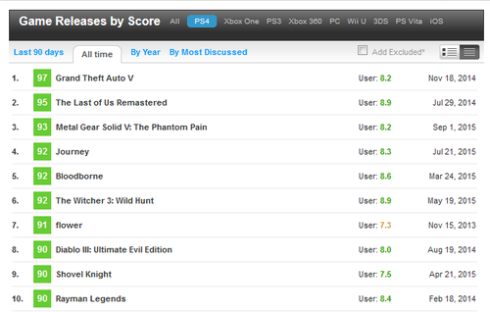
My approach was to manually copy and paste the entire table for the top 100 games of all time for each platform. Unfortunately, after copying it it looked like this:
98

Grand Theft Auto IV

User: 7.4

Apr 29, 2608

2.

97

Grand Theft Auto V

User: 8.2

Sep 17, 2613

3.

96

Uncharted 2: Among Thieves

User: 8.8

Oct 13, 2609

4.

96

Batman: Arkham City

User: 8.6

Oct 18, 2011

5.

95

LittleBigPlanet

User: 6.7

Oct 27, 2008

...
I had to resort to perl to clean it using regular expressions:
Clean row numbers:
perl -pi.bak -0 -w -e "s/^[0-9]{1,3}.$//g"
Clean dates:
perl -pi.bak -0 -w -e "s/^[A-z]{3} [0-9]{1,2}, [0-9]{4}$//g"
Clean double newlines:
perl -pi.bak -0 -w -e "s/\n\n+/\n/g" filename.txt
Clean text “User: ”
perl -pi.bak -0 -w -e "s/User: //g"
Then with a macro in the Sublime Text 2 editor, I replaced the double-new lines with a comma to turn it to CSV.
93,Super Mario 3D Norld,9.6

92,Super Smash Bros. for Nii U,8.9

92,Rayman Legends,8.6

91,Bayonetta 2,9.0

96,The Legend of Zelda: The Wind Naker HD,9.6

90,Mario Kart 8 DLC Pack 2,9.2

96,6uacame1ee! Super Turbo Championship Edition,7.3

89,Skylanders Swap Force,6.0

89,Super Mario Maker,9.4

88,Deus Ex: Human Revolution - Director's Cut,8.3

88,Mario Kart 8,9.1

88,Shove1 Knight,8.2

...
After arriving to a clean CSV file, you repeat the steps for all 4th-gen platforms you wish to compare. I did it for PS4, WiiU, XBox One, and PC (not a 4th gen console, but it comes close as powerful gaming hardware becomes cheaper). Once you have all your files cleaned, you can read them into R. Since they are separate files, it’s important to add a column as you read in the data to specify the platform.
Data loading, cleaning and processing:
ratingps4 <- read.csv('./metacriticdata-ps4.txt', header = F)

ratingps4 %>% mutate(Platform='PS4')
Note the mutate command. This is from the dplyr package, and is a real performance booster as opposed to normal subset commands or [] operators. Though here we’ll only be looking for 500 data points (100 top-rated games for all 5 platforms), I always import it and use it to make it a habit.
The entire process took me about 6 hours. Other more seasoned programmers will surely spend less time in this janitor work, but the message is clear: data out there is not tidy, it’s not clean and will often pose a challenge to turn it into something readable by your platform, database or store. Moreover, one data source may not be enough to pursue your analysis, so you will have to go to multiple sources to have a complete dataset that makes sense. Don’t be daunted by the task. Rather, always approach it with your research question in mind so you scout for the right data, and take the opportunity to do some early formatting that’ll make your life easier at later stages (i.e. if your data has a boolean column with yes/no, turn it into 1/0 or T/F). This part of data analysis is never glamorous, but if you don’t do it correctly, you run the risk of missing data, disappearing variables, or numeric values that may be outliers at first glance, but in reality are 2 numeric columns fused together because a separator is missing.
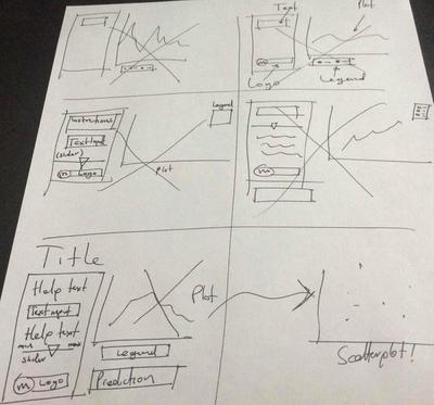
First design UI on paper, then with code!
You want to make sure you doodle your ideas for the UI before even trying to code it. This is as true in R + Shiny as it is on any other language. Not doing it may cause you to throw away several pieces of code as you make it to the final design you’ll love. Here’s mine:
Fire up RStudio and start putting your ideas into code
A Shiny app is composed of the following files and directories:
- A
server.Rfile with all the backend processing (even bits that’ll fill out your UI elements). - A
ui.Rfile with all your UI elements. - An optional
global.Rfile where you place all functions and objects that you wish to make available for all sessions. - An optional
/wwwdirectory with image assets, JavaScript files, and HTML files that replace the UI built withui.R
You want to open up your ui.R file and start coding what you designed on paper. Here’s mine:
library(shiny)
library(rCharts) ui <- fluidPage(
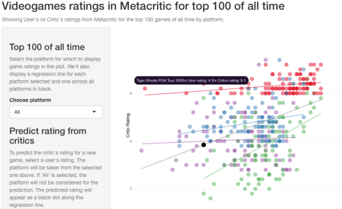
titlePanel("Videogames ratings in Metacritic for top 100 of all time"),
helpText("Showing User's vs Critic's ratings from Metacritic for the top 100 games of all time by platform."),
sidebarLayout(
sidebarPanel(
h3('Top 100 of all time'),
helpText("Select the platform for which to display game ratings in the plot. We'll also display a regression line for each platform selected and one across all platforms in black."),
selectInput(inputId='selectedPlatform',
label='Choose platform', choices = c('All')),
h3('Predict rating from critics'),
helpText("To predict the critic's rating for a new game, select a user's rating. The platform will be taken from the selected one above. If 'All' is selected, the platform will not be considered for the prediction. The predicted rating will appear as a black dot along the regression line."),
sliderInput(inputId='userRating', label = "User's rating for prediction",min = 4.0, max=10.0, step=0.2, value=6.0),
img(src='metacritic_applenapps.png', width=230)
),
mainPanel(
showOutput('ratingsPlot', lib = 'polycharts'),
h3(strong(textOutput('prediction')))
)
)
)
I’ll highlight a couple of elements:
- I’ll be using
rChartspackage by Ramnath Vaidyanathan.RChartsis a very cool package that serves as an abstraction layer to some of the most popularJavaScriptcharting libraries. - Think of the
fluidPagefunction/element as a white canvas where instead of fixing elements by coordinates, you lay them out like cards in a Solitaire game. - Every
inputIdattribute of each UI input element is a key in a dictionary that will be passed to the server, so in this case, the value set on thesliderInputelement will be stored with the keyuserRatingin an object calledinputthat will be passed to the execution of theserver.Rwhere you will be able to access it with the expressioninput$userRating. - Don’t forget to separate each UI element with commas. You may get a headache looking for the error if you miss but one!
- Output functions: the
showOutputandtextOutputfunctions take values from theoutputobject by their keys (predictionandratingsPlotin this case). The workings of theoutputobject are the same as that of theinputobject explained above. - If you, like me, have an IT background, think of the
inputandoutputobjects like a map that represents the model in the MVC pattern. - Finally, note the
showOutput()function, and pay attention to the 2nd argument'polycharts'. This argument indicates what JavaScript charting library to use when rendering the output. I’ll explain further at the end of this post.
This is the easiest part of a Shiny app. At around your 3rd app you’ll have the UI elements committed to memory and understand the workings of the input and output objects and how they are passed around server.R and ui.R components.
The Global File
I’ve created this file for 3 purposes:
- Load the data files ONCE.
- Assemble them all together in a single data frame.
- Format data, such as converting character columns to numeric, and get rid of rows with NA values (only had 1 case for WiiU, so instead of 100 data points, we ended up with 99).
- Source external R scripts to address some bugs and quirks currently present in rCharts (more on this in the last section).
- Fit simple linear regression models for prediction and plotting. More on this in the next section.
See my file here:
library(dplyr)

# Source renderChart3.R

source('./renderChart3.R')

# Data loading, cleaning and processing

ratingps4 <- read.csv('./metacriticdata-ps4.txt', header = F)

ratingps4 % mutate(Platform='PS4')

ratingsxbone <- read.csv('./metacriticdata-xbone.txt', header = F)

ratingsxbone % mutate(Platform='XBoxOne')

ratingswiiu <- read.csv('./metacriticdata-wiiu.txt', header = F)

ratingswiiu % mutate(Platform='WiiU')

ratingspc <- read.csv('./metacriticdata-pc.txt', header = F)

ratingspc % mutate(Platform='PC')

ratings <- rbind(ratingps4,ratingsxbone,ratingswiiu,ratingspc)

names(ratings) <- c('CriticRating', 'GameName', 'UserRating', 'Platform')

ratings % mutate(CriticRating=round(CriticRating/10,2))

ratings % filter(UserRating!='tbd')

ratings % mutate(CriticRating=as.numeric(CriticRating), UserRating=as.numeric(UserRating))

platforms <- c('All',unique(ratings$Platform))

# Linear Models

lmRatings <- lm(CriticRating ~ UserRating, ratings)

lmRatingsByPlat <- lm(CriticRating ~ UserRating * Platform, ratings)
It’s quite necessary to have a global.R file if you are serious about developing data products with Shiny. This is code that is executed once and the results are shared across all sessions, so that if your app becomes wildly popular and reaches, say, 500 hits at the same time, you won’t have to read 2500 files (5 data files times 500 sessions), or create 500 data frames, or even worse, 1000 linear fits (2 linear fits, one with interactions, and one without, times 500 sessions). We’ll talk about these linear models in a bit. If you come from the IT (under)world and are familiar with general purpose programming languages, think of this file as static variables.
When developing data products with Shiny you absolutely need to think like a Software Engineer apart from your usual statistical thinking. This means that you need to address attributes that pertain to the software world, like:
- Low memory footprint: otherwise your app will only be able to take in a low number of sessions, and may soon fall in disuse, and a product that nobody uses is a failed product.
- Low CPU consumption: If you host your app in a cloud service, a high CPU consumption means a more expensive bill for that month. If, however, you host your app in your own computers using your own network, cranking the CPU too high will mean a higher electric bill and your infrastructure running at higher temperatures, increasing the carbon footprint of your app.
- Low latency: you want your app to be nimble, so that all visitors get what they want from the app almost immediately and then leave to make room for other visitors. Remember you can only serve a limited number of sessions, as allowed by the available memory of your box. This is typically measured as the time it takes for your app to react to an input.
- High throughput: this is just the mathematical inverse of response time, and is measured as the number of reactions per second your app is able to serve.
Dedicating some hours to thinking of these quality attributes will give you a very accurate idea of what to place in your global file.
The Linear Models and Avoid Torturing the Data
I’ll briefly address the models at the end of the global file. We’re working with video game data, where we have their titles, the platform they were released for, their ratings from users and from critics. The goal is to evaluate whether ratings from users can be a reliable predictor for ratings from critics.
The 2 linear models fitted to the data are: 1) for the entire data regardless of platform, and 2) controlling for platform.
Without platform
Here are the coefficients for the linear model
just regressing critic’s ratings on user’s ratings.
             Estimate Std. Error   t value     Pr(>|t|)

(Intercept) 6.2553811 0.24846442 25.176164 5.577671e-84

UserRating  0.2775789 0.03211246  8.643962 1.391207e-16
From this we can see that the p-value for users’
ratings is close to 0, which means that it is a good predictor, and that for
every 1-unit increase (in a scale from 0 to 100) in user ratings can result in
almost a .3 increase in critic’s ratings. However, when we run
summary(lmRatings)$r.squared
We find that this model only explains 16% of the variance, which is very low and hints that we need to control for other explanatory variables.
Controlling for platform
With these coeffs:
                              Estimate Std. Error    t value     Pr(>|t|)

(Intercept)                 8.73956076 0.40193059 21.7439550 4.497416e-69

UserRating                  0.05194465 0.04801593  1.0818213 2.800056e-01

PlatformPS4                -1.20645569 0.55673630 -2.1670146 3.084319e-02

PlatformWiiU               -3.91737882 0.59660262 -6.5661442 1.664882e-10

PlatformXBoxOne            -0.92098824 0.52437855 -1.7563423 7.982089e-02

UserRating:PlatformPS4      0.06363873 0.07056822  0.9018044 3.677217e-01

UserRating:PlatformWiiU     0.34703359 0.07390461  4.6956960 3.695305e-06

UserRating:PlatformXBoxOne -0.02243278 0.06700882 -0.3347735 7.379773e-01
We can see that user ratings becomes a rather poor predictor, since the p-values for almost all platforms increases dramatically, and the only situation where user ratings remain a reliable predictor is for WiiU games.
When we run
summary(lmRatingsByPlat)$r.squared
We find that this model explains 60% of the variance, which is good enough given the data we have. The natural step after this assessment would be to try and look for more data to include it in the model to further explain more variance.
A Word of Caution!
Don’t let your confirmation bias ruin your model! If you set out to develop a model to predict something, you may be tempted to look for data that confirms this prediction even though it may be completely unrelated. This is called data dredging, and basically means that you should not torture and forcibly extract what you want from the data. In my case, instead of searching for more data destined to confirm my intent of prediction, I should look for related data to explain more variance, and accept the fact that user ratings and critic ratings are fundamentally different and that predicting one with the other is not reliable. A good illustration of data dredging can be found here.
The Server
This file is where the magic happens. Here we retrieve everything we need from the input object to perform our calculations and put whatever we want to show in the UI inside the output object. Here is mine:
# Libraries

library(shiny)

library(ggplot2)

library(dplyr)

library(rCharts)

server <- function(input, output, session) {

     pred <- reactive({

          if (input$selectedPlatform == 'All') {

               selectedModel <- lmRatings

          } else {

               selectedModel <- lmRatingsByPlat

          } return(predict(selectedModel, newdata = data.frame(UserRating = input$userRating,

               Platform = input$selectedPlatform)))

     })

     observe({

          updateSelectInput(session, "selectedPlatform",

               choices = platforms)

     })

     dynColor <- reactive({

          col <- 'Platform'

          switch(input$selectedPlatform,

               PS4 = {col <- list(const = '#4A8CBC')},

               XBoxOne = {col <- list(const = '#A460A8')},

               WiiU = {col <- list(const = '#58B768')},

               PC = {col <- list(const = '#E91937')}

          ) return(col)

     })

     ratingByPlatform <- reactive({

          if (input$selectedPlatform == 'All') {

               dat <- data.frame(UserRating = ratings$UserRating, CriticRating = ratings$CriticRating)

               dat$fittedByPlat <- lmRatingsByPlat$fitted.values

               dat$GameName <- ratings$GameName

               dat$Platform <- ratings$Platform

               dat$fittedAll <- lmRatings$fitted.values

               return(dat)

          } else {

               dat % filter(Platform == input$selectedPlatform)

               dat$fittedByPlat <- lm(CriticRating ~ UserRating, dat)$fitted.values

               return(dat)

          }

     })

     output$ratingsPlot <- renderChart3({

          dat <- ratingByPlatform()

          pred <- data.frame(CriticRating=rep(pred(),nrow(dat)), UserRating=rep(input$userRating, nrow(dat)))

          np <- rPlot(CriticRating ~ UserRating, color = dynColor(), data = dat, type = 'point', opacity=list(const=0.5),

          tooltip = "#! function(item) {return item.GameName + '\\n User rating: ' + item.UserRating + '\\n Critics rating: ' + item.CriticRating} !#")

          np$set(width = 600, height = 600)

          np$guides(y = list(min = 6.5, max = 10, title = 'Critic Rating'),

                    x = list(min = 4, max = 10, title = 'User Rating'))

          np$addParams(dom = "ratingsPlot")

          np$layer(y = 'fittedByPlat', copy_layer = T, type = 'line',

               color = dynColor(), data = dat, size = list(const = 2),

               opacity=list(const=0.5))

          np$set(legendPosition = 'bottom')

          if (input$selectedPlatform == 'All') {

               np$layer(

                    y = 'fittedAll', copy_layer = T, type = 'line',

                    color = list(const = 'grey'), data = dat, size = list(const = 2),

                    opacity=list(const=0.5))

               }

          np$layer(y='CriticRating', x='UserRating', data=pred, copy_layer=T, type = 'point', color = list(const = 'black'),size = list(const = 5))

          return(np)

     })

     output$selectedPlatform <- renderText(input$selectedPlatform)

     output$prediction <- renderText(paste('Predicted critic rating: ', round(pred(),2), sep = ''))

}
And now, the highlights:
- The main function in this file is the
serverfunction. See the arguments? Remember what we talked about these objects? Can you conclude why they’re there? - You can, however, place code outside the
server()function right below the libraries, and it will be executed only once, as opposed to being executed for every session that opens up our app, as is the case withserver(). - Reactive expressions: reactiveness in a web application basically means a UI control or element swiftly responds to a change or input in another UI element without reloading the entire page. In R this means that if we want to show a text in the UI that comes as a response to some other UI element being clicked/typed in/slided across, we need to define this text as a reactive expression.
- Reactive expressions take the form
value <- reactive({calculate expression based on input}). This means that the expression will be evaluated, and its final value wrapped in areactivefunction, and assigned to the variablevalue. To refer to this value in another part of the code, you need to call it as if it were a function. - Using reactive expressions you can achieve all sorts of cool things. In my app, I used a reactive expression called
dynColorthat returns an HTML color depending on the platform selected in the UI, which then goes into the rCharts plot to achieve consistency between plotting all platforms (which indicates color depending on the platform and assigns each to a color from the default palette), and plotting just one. - You can also ‘connect’ UI elements so that they are ‘filled out’ by the server, such as combo/drop-down boxes, where the options they contain usually come from the loaded data.
- This connection is achieved by
observe()sections, wherein you use one of severalupdate[UI element]()functions to update any of its attributes right from the server, like in this case, in which I wish to fill the alternatives of the select box from the loaded data. Think of the observe sections as a direct interaction that begins in the server and ends in the UI, as opposed to reactive expressions, which go from the UI to the server.
Some caveats on using rCharts
rCharts is a quite nifty package, and a lot of work was been put on by Ramnath in coding it and fixing its issues, but one of its constant criticisms by the user community is the lack of documentation, so your best bet once you’ve gotten through the quickstart guide is to look around at StackOverflow forums or ask on them if your question hasn’t already shown up.
rChart’s basic mission is to serve as an abstraction layer to several JavaScript charting libraries, and as such many times you’ll find a feature that is supposed to work, but won’t, and you’ll be tempted to blame it on rCharts and to raise an issue. My advice here is to search the issue page to see if it has already been addressed, or, as will often be the case, to see if your issue is caused directly by the JavaScript library that rCharts is abstracting.
The following are some of the JavaScript libraries rCharts can abstract away for you when using it to generate a plot:
- NVD3: itself based on the fantastic d3.js library. For general-purpose charts. The rCharts function to render it is
nPlot(). - Polychart2: also for general-purpose charts. The rCharts function to render it is
rPlot(). - Morris: best-suited for time series. rCharts function is
mPlot(). - Leaflet: you can generate mobile-friendly maps with this. The way to plot one is
map <- Leaflet$new(); map$print("output id in ui.R").
None of these come without their bugs and errors, which brings me to the caveats:
Custom tooltips in NVD3 scatterplots don’t show
NVD3 has a really nice feature in scatterplots (or scattercharts, like the folks at NVD3 call them) where you hover your mouse over a point in the chart and it shows 3 tooltips: the exacts X and Y, and some label for the point:
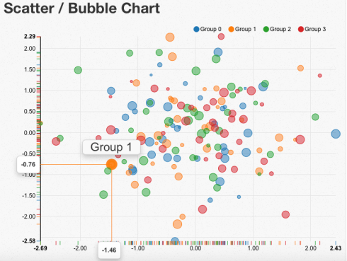
The above example was generated using JavaScript directly, but when you generate a scatterplot with rCharts+NVD3 and you customize the main tooltip text, they don’t show unless you toggle the ‘magnify’ button at the top. See a working example here.
As of the time of writing this issue has been confirmed to happen on the NVD3 side, and not the rCharts side, as per this reported issue. The workaround seems to lie on tweaking the JavaScript inside the generated HTML page when running your Shiny app, but this requires advanced knowledge of Shiny to ‘intercept’ the HTML content, search a certain string, replace it with some other, and then continue passing it to the browser.
Since I had neither the patience nor the time to fiddle with this problem, I resorted to rCharts+Polychart2, but, alas, not all that glitters is gold.
Custom tooltips in Polychart2 can only be one-line
Similar to NVD3, Polychart2 shows a tooltip next to data points in a scatterplot, and you will most surely want to take advantage of this feature to enhance the experience of using your data product.
If you have experience a little experience with webapp development, you must know that the way to represent a new line in most programming languages is the famous \n (newline) character.
Unfortunately, assigning a custom text to this tooltip also has problems with Polychart2, but of a less disruptive nature.
Trying to show a tooltip text that is so long that it will kill the user experience may prompt you to break it into lines with the \n character, but this will not work, as shown here:
You’ll get the actual ‘\n‘ string.
You can work around this bug with a custom renderChart() function. This function is used to basically turn rChart’s output from R to HTML, so a custom one may ‘intercept’ this output and fix the newline, with the only caveat that your newlines should now be \\n with double back-slash. There’s a more technical discussion about this in this github issue thread. I’ve based my renderChart3() function on that one. Here it is:
renderChart3 <- function(expr, env = parent.frame(), quoted = FALSE) {

        func <- shiny::exprToFunction(expr, env, quoted)

        function() {

                rChart_ <- func()

                cht_style <- paste("rChart {width: ",

                                   rChart_$params$width,

                                   "; height: ",

                                   rChart_$params$height,

                                   "}", sep = "")

                cht <- paste(capture.output(rChart_$print()), collapse = '\n')

                fcht <- paste(c(cht), collapse = '\n')

                fcht <- gsub("\\\\", "\\", fcht, fixed=T)

                HTML(fcht)

        }

}
Conclusions
Developing a visual data product is not just a matter of plotting a graph and making it pretty without revealing much of your data, like a simple infographic. It is not also just about finding the accurate statistical model that helps you predict with the least root-mean-squared deviation while achieving the highest R-squared. Developing a data product is precisely where these 2 paths intersect. If the model in your product is biased, decisions driven by your product will be wrong. If your product has high memory footprint, it will be used by only a few people before falling into total disuse. If it doesn’t offer a pleasant user experience, people will not use it. If it doesn’t offer any help as to its workings, people will find it hard to understand it and may stop using it. A visual data product is the ultimate materialization of the work of a Data Scientist, for it explores, describes, analyzes, models, predicts, presents and communicates (either in an informative or in a persuasive sense) the results of a thought process, in this exact sequence of steps. When we’ve held our audience or users to be just as important to our work as the accuracy or sensitivity of our analysis or predictions, then we can say we’ve become one with the Data Science practice.
About J.S. Ramos
 FinTech guy who was thrown in the wilderness of the Econometrics world to subsequently subject himself voluntarily to the tyranny of the Data Dictatorship. Foodie by day, gamer by night. A good portion of by body is made of movies, anime and cartoons. Check my Linkedin or Twitter for more nonsense :)
Categories
Related Posts

Our Facebook Page
!-->
Lessons Learned from Developing a Data Product的更多相关文章
- Lessons learned developing a practical large scale machine learning system
原文:http://googleresearch.blogspot.jp/2010/04/lessons-learned-developing-practical.html Lessons learn ...
- Lessons learned from manually classifying CIFAR-10
Lessons learned from manually classifying CIFAR-10 Apr 27, 2011 CIFAR-10 Note, this post is from 201 ...
- 翻译 | Improving Distributional Similarity with Lessons Learned from Word Embeddings
翻译 | Improving Distributional Similarity with Lessons Learned from Word Embeddings 叶娜老师说:"读懂论文的 ...
- C# 对象引擎,以路径形式访问对象属性(data.Product[1].Name)
对象引擎,以路径形式访问对象属性,例data.Product[1].Name. 在做excel模板引擎的时候,为了能方便的调用对象属性,找了一些模板引擎,不是太大就是不太适用于excel, 因为exc ...
- Elasticsearch Mantanence Lessons Learned Today
Today I troubleshooted an Elasticsearch-cluster-down issue. Several lessons were learned: When many ...
- Lessons Learned 1(敏捷项目中的变更影响分析)
问题/现象: 业务信息流转的某些环节,会向相关人员发送通知邮件,邮件中附带有链接,供相关人员进入察看或处理业务.客户要求邮件中的链接,需要进行限制,只有特定人员才能进入处理或察看.总管想了想,应道没问 ...
- Paper Reading - Show and Tell: Lessons learned from the 2015 MSCOCO Image Captioning Challenge
Link of the Paper: https://arxiv.org/abs/1609.06647 A Correlative Paper: Show and Tell: A Neural Ima ...
- Machine Learning and Data Mining(机器学习与数据挖掘)
Problems[show] Classification Clustering Regression Anomaly detection Association rules Reinforcemen ...
- 在ASP.NET MVC中使用Knockout实践03,巧用data参数
使用Knockout,当通过构造函数创建View Model的时候,构造函数的参数个数很可能是不确定的,于是就有了这样的一个解决方案:向构造函数传递一个object类型的参数data. <inp ...
随机推荐
- SpringBoot日记——删除表单-Delete篇
增删改查,我们这篇文章来介绍一下如何进行删除表单的操作,也就是我们页面中的删除按钮的功能. 下边写的可能看起来有点乱,请仔细的一步一步完成. 删除功能第一步,按钮功能实现 1. html的改变 来看, ...
- centos 7 jenkins 部署
安装jenkins 1.拉取库的配置到本地对应文件 sudo wget -O /etc/yum.repos.d/jenkins.repo http://pkg.jenkins-ci.org/redha ...
- HTTP2初探
背景 本文是对Google博客上文章的翻译和笔记.以及一些待解决的问题记录. Google 博客上这篇文章的中文版有很多翻译错误. 概述 HTTP/2 仍是对之前 HTTP 标准的扩展,而非替代.HT ...
- C# 导入(读取) WPS ET文件
本文章介绍基于VS2010 Winform 的WPS2016二次开发 ET数据读取程序 本程序支持多个Sheet页面 前提:引用WPS安装目录下的etapi.dll private void butt ...
- 通过汇编一个简单的C程序,分析汇编代码理解计算机是如何工作的
秦鼎涛 <Linux内核分析>MOOC课程http://mooc.study.163.com/course/USTC-1000029000 实验一 通过汇编一个简单的C程序,分析汇编代码 ...
- MongoDB ,cursor not found异常
查询mongoDB集合数据更新,数据有400w多.我一次用cursor(游标)取1w,处理更新.程序在某段时间运行中遍历游标时发生异常! DBCursor cursor = tabColl.find( ...
- ElasticSearch 2 (19) - 语言处理系列之故事开始
ElasticSearch 2 (19) - 语言处理系列之故事开始 摘要 全文搜索是精度(尽可能少的返回不相关文档)和召回(尽可能多的返回相关文档)的战场.尽管只精确匹配用户查询的词肯定会是精确的, ...
- Alpha冲刺——day10
Alpha冲刺--day10 作业链接 Alpha冲刺随笔集 github地址 团队成员 031602636 许舒玲(队长) 031602237 吴杰婷 031602220 雷博浩 031602634 ...
- Linux命令(二十四) 磁盘管理命令(二) mkfs,mount
一.格式化文件系统 mkfs 当完成硬盘分区以后要进行硬盘的格式化,mkfs系列对应的命令用于将硬盘格式化为指定格式的文件系统.mkfs 本身并不执行建立文件系统的工作,而是去调用相关的程序来执行.例 ...
- asp、asp.net、.aspx、.ascx、.ashx的简单说明
ASP是动态server页面(Active Server Page)的英文缩写.[1]是微软公司开发的取代CGI脚本程序的一种应用.它能够与数据库和其他程序进行交互,是一种简单.方便的编程工具.ASP ...