
【Flutter学习】基本组件之TabBar顶部导航
一,概述
TabBar,是材料设计(Material design)中很常用的一种横向标签页。在Android原生开发中,我们常用ViewPage或者一些常用的标签页开源库,来实现并行界面的横向滑动展示,在iOS原生开发中我们可以基于UICollectionView/UIButton来封装实现这一功能,在Flutter的世界中,TabBar是被定义在Material Component中,所以他的使用需要在MaterialApp中。通常,我们会在AppBar的底部部分结合TabBarView来使用TabBar。
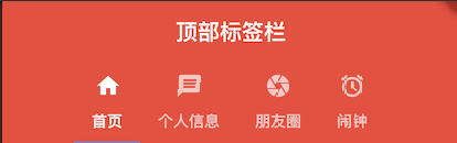
二,Tab关键元素
- TabController
这是Tab页的控制器,用于定义Tab标签和内容页的坐标,还可配置标签页的切换动画效果等。
TabController一般放入有状态控件中使用,以适应标签页数量和内容有动态变化的场景,如果标签页在APP中是静态固定的格局,则可以在无状态控件中加入简易版的DefaultTabController以提高运行效率,毕竟无状态控件要比有状态控件更省资源,运行效率更快。
- TabBar
Tab页的Title控件,切换Tab页的入口,一般放到AppBar控件下使用,内部有*Title属性。其子元素按水平横向排列布局,如果需要纵向排列,请使用Column或ListView控件包装一下。子元素为Tab类型的数组。
- TabBarView
Tab页的内容容器,其内放置Tab页的主体内容。子元素可以是多个各种类型的控件。
三,构造函数
- TabController
- DefalutTabController
 const DefaultTabController({

    Key key,

    @required this.length,

    this.initialIndex = ,

    @required this.child,

  }) : assert(initialIndex != null),

       assert(length >= ),

       assert(initialIndex >=  && initialIndex < length),

super(key: key); - TabController
TabController({ int initialIndex = , @required this.length, @required TickerProvider vsync })

    : assert(length != null && length >= ),

      assert(initialIndex != null && initialIndex >=  && (length ==  || initialIndex < length)),

      _index = initialIndex,

      _previousIndex = initialIndex,

      _animationController = AnimationController.unbounded(

        value: initialIndex.toDouble(),

        vsync: vsync,

      );
- DefalutTabController
- TabBar
/**

    const TabBar({

    Key key,

    @required this.tabs,//显示的标签内容,一般使用Tab对象,也可以是其他的Widget

    this.controller,//TabController对象

    this.isScrollable = false,//是否可滚动

    this.indicatorColor,//指示器颜色

    this.indicatorWeight = 2.0,//指示器高度

    this.indicatorPadding = EdgeInsets.zero,//底部指示器的Padding

    this.indicator,//指示器decoration,例如边框等

    this.indicatorSize,//指示器大小计算方式,TabBarIndicatorSize.label跟文字等宽,TabBarIndicatorSize.tab跟每个tab等宽

    this.labelColor,//选中label颜色

    this.labelStyle,//选中label的Style

    this.labelPadding,//每个label的padding值

    this.unselectedLabelColor,//未选中label颜色

    this.unselectedLabelStyle,//未选中label的Style

    }) : assert(tabs != null),

    assert(isScrollable != null),

    assert(indicator != null || (indicatorWeight != null && indicatorWeight > 0.0)),

    assert(indicator != null || (indicatorPadding != null)),

    super(key: key);

*/- Tab
const Tab({

    Key key,

    this.text,

    this.icon,

    this.child,

  }) : assert(text != null || child != null || icon != null),

       assert(!(text != null && null != child)), // TODO(goderbauer): https://github.com/dart-lang/sdk/issues/34180

       super(key: key);
- Tab
- TabBarView
  const TabBarView({

    Key key,

    @required this.children, //Tab页内容页组件数组集合

    this.controller, //TabController对象

    this.physics,

    this.dragStartBehavior = DragStartBehavior.start,

  }) : assert(children != null),

       assert(dragStartBehavior != null),

       super(key: key);
四,创建标签栏
- 1.创建TabController
- 使用默认的DefaultController
 /**2.创建Tabbar */

  @override

  Widget build(BuildContext context) {

    // TODO: implement build

    return new DefaultTabController(

        length: myTabs.length,

        child:  new Scaffold(

          //AppBar

          appBar:new AppBar(

            title: new Text('顶部标签栏'),

            bottom: new TabBar(

              tabs: myTabs, //标签数组

              indicatorColor: Colors.blue,//指示器的颜色

              isScrollable: true,//是否滑动

            ),

          ) ,

  /**3.绑定Tabbar 和 TabBarView */

          //body

          body: new TabBarView(

            children: myTabs.map((Tab tab){

                return new Center( child: new Text(tab.text));

            }).toList(),

          ),

        ),

    );

} - 使用自定义的TabController的
class TabBarDemoState extends State<TabBarDemo>

    with SingleTickerProviderStateMixin {

  TabController _tabController; //定义tabcontroller变量

  @override

  void dispose() {

    _tabController.dispose(); //销毁

    super.dispose();

  }

  void initState() {

    super.initState();

    _tabController = new TabController(vsync: this, length: ); //创建

  }

  @override

  Widget build(BuildContext context) {

    return new Scaffold(

      appBar: new AppBar(

        title: new Text('顶部tab切换'),

        bottom: new TabBar(

          tabs: <Widget>[

            new Tab(

              icon: new Icon(Icons.directions_bike),

            ),

            new Tab(

              icon: new Icon(Icons.directions_boat),

            ),

            new Tab(

              icon: new Icon(Icons.directions_bus),

            ),

          ],

          controller: _tabController, //tabbar与自定义的tabcontroller绑定

        ),

      ),

      body: new TabBarView(

        controller: _tabController, //tabbarView与 自定义的tabController绑定

        children: <Widget>[

          new Center(child: new Text('自行车')),

          new Center(child: new Text('船')),

          new Center(child: new Text('巴士')),

        ],

      ),

    );

  }
- 使用默认的DefaultController
- 2.构建Tab数据/TabBarView数据
/**1. 创建Tab数据 */

  final List<Tab> myTabs = <Tab>[

      new Tab(icon: new Icon(Icons.home),

      text:'首页',

      ),

      new Tab(

        icon: new Icon(Icons.message),

         text:'个人信息',

      ),

      new Tab(

        icon: new Icon(Icons.camera),

        text:'朋友圈',

      ),

      new Tab(

        icon: new Icon(Icons.access_alarm),

        text: '闹钟',

      )

]; - 3. 创建Tabbar
appBar:new AppBar(

            title: new Text('顶部标签栏'),

            bottom: new TabBar(

              tabs: myTabs, //标签数组

              indicatorColor: Colors.blue,//指示器的颜色

              isScrollable: true,//是否滑动

            ),

) - 4.绑定TabBar 和 TabBarView
/**3.绑定Tabbar 和 TabBarView */

          //body

          body: new TabBarView(

            children: myTabs.map((Tab tab){

                return new Center( child: new Text(tab.text));

            }).toList(),

), - 5.全部代码
import 'package:flutter/material.dart';

void main() => runApp(MyApp());

class MyApp extends StatelessWidget {

    @override

    Widget build(BuildContext context) {

    // TODO: implement build

    return new MaterialApp(

      title: '顶部标签栏',

      theme: new ThemeData(

        primaryColor: Colors.red

      ),

      home: new App(),

    );

  }

}

class App extends StatelessWidget {

  /**1. 创建Tab数据 */

  final List<Tab> myTabs = <Tab>[

      new Tab(icon: new Icon(Icons.home),

      text:'首页',

      ),

      new Tab(

        icon: new Icon(Icons.message),

         text:'个人信息',

      ),

      new Tab(

        icon: new Icon(Icons.camera),

        text:'朋友圈',

      ),

      new Tab(

        icon: new Icon(Icons.access_alarm),

        text: '闹钟',

      )

  ];

  /**2.创建Tabbar */

  @override

  Widget build(BuildContext context) {

    // TODO: implement build

    return new DefaultTabController(

        length: myTabs.length,

        child:  new Scaffold(

          //AppBar

          appBar:new AppBar(

            title: new Text('顶部标签栏'),

            bottom: new TabBar(

              tabs: myTabs, //绑定标签数组

              indicatorColor: Colors.blue,//指示器的颜色

              isScrollable: true,//是否滑动

            ),

          ) ,

  /**3.绑定Tabbar 和 TabBarView */

          //body

          body: new TabBarView(

            children: myTabs.map((Tab tab){

                return new Center( child: new Text(tab.text));

            }).toList(),

          ),

        ),

    );

  }

}
五,总结
TabBarView和TabBar都有一个TabController的参数,TabbarView和TabBar就是由TabController来控制同步,点击某个Tab后,要同步显示对应的TabBarView,创建TabController有两种方式:
- 第一种:使用系统自带的DefaultTabController,在Scaffold套一层DefaultTabController,这种方式TabBarView会自动查找这个tabController。
@override

Widget build(BuildContext context) {

   return new DefaultTabController();

} - 第二种是自己定义一个TabController,实现SingleTickerProviderStateMixin
参考上面“使用自定tabcontroller代码”
【Flutter学习】基本组件之TabBar顶部导航的更多相关文章
- Flutter学习笔记(17)--顶部导航TabBar、TabBarView、DefaultTabController
如需转载,请注明出处:Flutter学习笔记(17)--顶部导航TabBar.TabBarView.DefaultTabController 上一篇我们说了BottmNavigationBar底部导航 ...
- 【Flutter学习】基本组件之AppBar顶部导航栏
一,概述 AppBar 显示在app的顶部.AppBar包含5大部分,如下图: 二,构造函数及参数含义 构造函数 AppBar({ Key key, this.leading, //在标题前面显示的一 ...
- 【Flutter学习】组件学习之目录
01. Flutter组件-Layout-Container-容器 02. Flutter组件-Text-Text-文本 03. Flutter组件-Text-RichText-富文本 04. ...
- 【Flutter学习】组件通信(父子、兄弟)
一,概述 flutter一个重要的特性就是组件化.组件分为两种状态,一种是StatefulWidget有状态组件,一种是StatelessWidget无状态组件. 无状态组件不能更新状态,有状态组件具 ...
- Flutter学习笔记(16)--Scaffold脚手架、AppBar组件、BottomNavigationBar组件
如需转载,请注明出处:Flutter学习笔记(15)--MaterialApp应用组件及routes路由详解 今天的内容是Scaffold脚手架.AppBar组件.BottomNavigationBa ...
- uni-app 去除顶部导航栏
自学uni-app第一天,因为有一点点的小程序和vue的基础所以感觉对uni-app有一点点的亲切感,从今天呢开始着手从登录页学习uni-app,记录一些用到的知识点,欢迎大家一起学习. 启动页隐藏顶 ...
- Flutter学习笔记(15)--MaterialApp应用组件及routes路由详解
如需转载,请注明出处:Flutter学习笔记(15)--MaterialApp应用组件及routes路由详解 最近一段时间生病了,整天往医院跑,也没状态学东西了,现在是好了不少了,也该继续学习啦!!! ...
- Flutter学习笔记(18)--Drawer抽屉组件
如需转载,请注明出处:Flutter学习笔记(18)--Drawer抽屉组件 Drawer(抽屉组件)可以实现类似抽屉拉出和推入的效果,可以从侧边栏拉出导航面板.通常Drawer是和ListView组 ...
- Flutter学习笔记(24)--SingleChildScrollView滚动组件
如需转载,请注明出处:Flutter学习笔记(23)--多 在我们实际的项目开发中,经常会遇到页面UI内容过多,导致手机一屏展示不完的情况出现,以Android为例,在Android中遇到这类情况的做 ...
随机推荐
- WRNavigationBar 使用记录
最近在做一个导航栏透明度渐变的效果,发现 WRNavigationBar库很好用,一开始导入到项目,发现导航tiltle颜色一直是黑色的,无论怎么用系统方法改都改不了.后来发现原来库里面有一个方法可以 ...
- vector内存增长方式
首先必须要了解vector是一种特殊的数组,因此其内存必然是连续的 其次它的连续是建立在不断地对内存的预分配上的,即不断地销毁当前,重新建立内存,效率有点低.所以存在几个函数capacity, siz ...
- HDU 6638 - Snowy Smile 线段树区间合并+暴力枚举
HDU 6638 - Snowy Smile 题意 给你\(n\)个点的坐标\((x,\ y)\)和对应的权值\(w\),让你找到一个矩形,使这个矩阵里面点的权值总和最大. 思路 先离散化纵坐标\(y ...
- 2019牛客多校第六场 B - Shorten IPv6 Address 模拟
B - Shorten IPv6 Address 题意 给你\(128\)位的二进制,转换为十六进制. 每\(4\)位十六进制分为\(1\)组,每两组用一个\(":"\)分开. 每 ...
- 【MySQL】实现自增函数sequence
前言 当前数据库为:mysql由于mysql和oracle不太一样,不支持直接的sequence,所以需要创建一张table来模拟sequence的功能,理由sql语句如下: 步骤 1.创建seque ...
- PWN入门的入门——工具安装
安装pwntool: 命令行运行: pip install pwntools python import pwn pwn.asm("xor eax,eax") 出现'1\xc0' ...
- Android setXfermode 模式
参考:http://onewayonelife.iteye.com/blog/1169176 setXfermode 设置两张图片相交时的模式 我们知道 在正常的情况下,在已有的图像上绘图将会在 ...
- 取余运算 C和python的区别
今天看书发现python与C的负数取余运算结果不同,查资料理解. 取余运算的算法是相同的 r = a- n*(a/n) n!=0 r是余数,a是被除数,n是除数.n不能为0,否则都会报错. 负数 ...
- Hibernate注解详解(超全面不解释)
原博客地址:http://blog.csdn.net/sufei58/article/details/48223731 我只是收藏来方便自己查阅的,希望博主不要介意 一.实体Bean 每个持久化POJ ...
- 如何保存android app日志
android 手机日志保存方法如下: 前置条件:已安装adb 1,手机usb连接电脑,打开USB调试模式(注意仅连接一台手机设备) 2,win+R输入cmd打开命令窗口,输入指令:adb devic ...