纯css3实现的超炫checkbox复选框和radio单选框
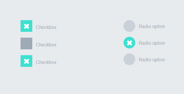
之前为大家分享了好多css3实现的按钮。今天要为大家分享的是纯css3实现的checkbox复选框和radio单选框,效果超级炫。先让我们看看图吧!
这个实例完全由css3实现的没有任何js代码。下面我们一起看下实现代码吧
html代码:
 <div style="width:200px; float:left">

            <label>

                <input type="checkbox" class="option-input checkbox" checked="">

                Checkbox

            </label>

            <label>

                <input type="checkbox" class="option-input checkbox">

                Checkbox

            </label>

            <label>

                <input type="checkbox" class="option-input checkbox">

                Checkbox

            </label>

        </div>

        <div style="width:200px; float:left">

            <label>

                <input type="radio" class="option-input radio" name="example">

                Radio option

            </label>

            <label>

                <input type="radio" class="option-input radio" name="example">

                Radio option

            </label>

            <label>

                <input type="radio" class="option-input radio" name="example">

                Radio option

            </label>

        </div>
css3代码:
@-webkit-keyframes click-wave {

  0% {

    width: 40px;

    height: 40px;

    opacity: 0.35;

    position: relative;

  }

  100% {

    width: 200px;

    height: 200px;

    margin-left: -80px;

    margin-top: -80px;

    opacity: 0.0;

  }

}

@-moz-keyframes click-wave {

  0% {

    width: 40px;

    height: 40px;

    opacity: 0.35;

    position: relative;

  }

  100% {

    width: 200px;

    height: 200px;

    margin-left: -80px;

    margin-top: -80px;

    opacity: 0.0;

  }

}

@-o-keyframes click-wave {

  0% {

    width: 40px;

    height: 40px;

    opacity: 0.35;

    position: relative;

  }

  100% {

    width: 200px;

    height: 200px;

    margin-left: -80px;

    margin-top: -80px;

    opacity: 0.0;

  }

}

@keyframes click-wave {

  0% {

    width: 40px;

    height: 40px;

    opacity: 0.35;

    position: relative;

  }

  100% {

    width: 200px;

    height: 200px;

    margin-left: -80px;

    margin-top: -80px;

    opacity: 0.0;

  }

}

.option-input {

  -webkit-appearance: none;

  -moz-appearance: none;

  -ms-appearance: none;

  -o-appearance: none;

  appearance: none;

  position: relative;

  top: 13.33333px;

  width: 40px;

  height: 40px;

  -webkit-transition: all 0.15s ease-out 0;

  -moz-transition: all 0.15s ease-out 0;

  transition: all 0.15s ease-out 0;

  background: #cbd1d8;

  border: none;

  color: #fff;

  cursor: pointer;

  display: inline-block;

  outline: none;

  position: relative;

  margin-right: 0.5rem;

  z-index:;

}

.option-input:hover {

  background: #9faab7;

}

.option-input:checked {

  background: #40e0d0;

}

.option-input:checked::before {

  width: 40px;

  height: 40px;

  position: absolute;

  content: '\2716';

  display: inline-block;

  font-size: 26.66667px;

  text-align: center;

  line-height: 40px;

}

.option-input:checked::after {

  -webkit-animation: click-wave 0.65s;

  -moz-animation: click-wave 0.65s;

  animation: click-wave 0.65s;

  background: #40e0d0;

  content: '';

  display: block;

  position: relative;

  z-index:;

}

.option-input.radio {

  border-radius: 50%;

}

.option-input.radio::after {

  border-radius: 50%;

}

body {

  display: -webkit-box;

  display: -moz-box;

  display: box;

  -webkit-box-orient: horizontal;

  -moz-box-orient: horizontal;

  box-orient: horizontal;

  -webkit-box-pack: start;

  -moz-box-pack: start;

  box-pack: start;

  -webkit-box-align: stretch;

  -moz-box-align: stretch;

  box-align: stretch;

  background: #e8ebee;

  color: #9faab7;

  font-family: "Helvetica Neue", Helvetica, Arial, sans-serif;

  text-align: center;

}

body div {

  padding: 5rem;

}

body label {

  display: block;

  line-height: 40px;

}
是不是很简单。只要复制上面的html代码和css代码到页面上。运行就可以看到效果了。赶紧试一试吧。哈哈
注:本文爱编程原创文章,转载请注明原文地址:http://www.w2bc.com/Article/5384
纯css3实现的超炫checkbox复选框和radio单选框的更多相关文章
- 你见过吗?9款超炫的复选框(Checkbox)效果
复选框(Checkbox)在各个浏览器中的效果不一致,因此很多 Web 开发人员会自己重新设计一套界面和使用体验都更佳的复选框功能.下面就给大家分享9款超炫的复选框(Checkbox)效果,纯 CSS ...
- 纯css3简单实用的checkbox复选框和radio单选框
昨天为大家分享了一款很炫的checkbox复选框和radio单选框,今天再给大家带来一款简单实用的checkbox复选框和radio单选框.界面清淅.舒服.先给大家来张效果图: 在线预览 源码下载 ...
- 一款纯css3实现的超炫动画背画特效
之前为大家介绍了很多款由纯css3实现的特效.今天要再给大家带来一款纯css3实现的超炫动画背画特效.代码非常简单,没有引用任何其它js代码.css代码也不多.效果非常炫.一起看下效果图: 在线预览 ...
- 一款纯css3实现的超炫3D表单
今天要给大家分享一款纯css3实现的超炫3D表单.该特效页面的加载的时候3d四十五度倾斜,当鼠标经过的时候表单动画回正.效果非常炫,一起看下效果图: 在线预览 源码下载 实现的代码. html代码 ...
- iHover – 30+ 纯 CSS3 实现的超炫的图片悬停特效
iHover 是一个令人印象深刻的图片悬停效果集合,完全基于 CSS3 实现,无依赖,能够搭配 Bootstrap 3 很好地工作.基于 SCSS 技术构建(包括文件),便于修改变量.有模块化的代码, ...
- [oldboy-django][2深入django]Form组件实现生成: select下拉框, checkbox复选框,radio单选框以及如何实现自定义数据格式要求
1 需求 - 1Form组件如何实现生成选择类标签: select,check, radio - 默认值 - 保留上次输入的值 - 2自定义验证规则 - RegexField - -
- iHover – 30+ 纯 CSS 实现的超炫的图片悬停特效
iHover 是一个令人印象深刻的图片悬停效果集合,完全基于 CSS3 实现,无依赖,能够搭配 Bootstrap 3 很好地工作.基于 SCSS 技术构建,便于修改变量.有模块化的代码,无需包含整个 ...
- 【转】纯CSS设置Checkbox复选框控件的样式
Checkbox复选框是一个可能每一个网站都在使用的HTML元素,但大多数人并不给它们设置样式,所以在绝大多数网站它们看起来是一样的.为什么不把你的网站中的Checkbox设置一个与众不同的样式,甚至 ...
- 自定义常用input表单元素一:纯css 实现自定义checkbox复选框
最下面那个是之前写的 今天在做项目的时候发现,之前写的貌似还是有点多,起码增加的span标签可以去掉,这样保持和原生相同的结构最好的,仅仅是样式上的变化.今天把项目中的这个给更新上来.下面就直接还是 ...
随机推荐
- mysql字符集和字符排序
mysql的字符集和字符序: 字符序:字符序(Collation)是指在同一字符集内字符之间的比较规则 一个字符序唯一对应一种字符集,但一个字符集可以对应多种字符序,其中有一个是默认字符序 ...
- pdo,更高的sql安全性
介绍 PHP 数据对象 (PDO) 扩展为PHP访问数据库定义了一个轻量级的一致接口.实现 PDO 接口的每个数据库驱动可以公开具体数据库的特性作为标准扩展功能. 注意利用 PDO 扩展自身并不能实现 ...
- Fn键
需求分析 我想开机禁用触摸板. 方案设计 安装驱动:比较麻烦,驱动也不一定支持开机禁用触摸板. 编程实现,让一段代码开机禁用触摸板 编程实现也分好几种方法: 使用windows API禁用触摸板,这需 ...
- 让你的APP和你的服务器畅快通讯
做安卓开发有很多时候都是要和web交互的,我们很难制作本地应用,这次把小弟整出来的安卓和服务器通讯贡献出来,希望能帮到需要的朋友,同时也是加深印象. 我们先来搭建安卓客户端,首先写好布局文件: 1.布 ...
- matplotlib热图
1.基础知识点回顾 1.plot(x, y, marker='D')表示绘制折线图,marker设置样式菱形. 2.scatter(x, y, marker='s', color='r')绘制散点图, ...
- WebDav的java客户端开发包:sardine
最近需要对WebDav服务器进行操作,查找了一下,基于java的开发包主要有这几个: slide Jackrabbit sardine webdavclient4j 其中slide是apache的一个 ...
- System V 共享内存 和 系列函数
跟消息队列一样,共享内存也有自己的数据结构,如下: struct shmid_ds { struct ipc_perm shm_perm; /* Ownership and permission ...
- ActiveReports 报表控件官方中文新手教程 (1)-安装、激活以及产品资源
本系列文章主要是面向初次接触 ActiveReports 产品的用户,能够帮助您在三天之内轻松的掌握ActiveReports控件的基本用法,包含安装.激活.创建报表.绑定数据源以及公布等内容. ...
- Android Intent Scheme URLs攻击
0x0 引言 我们知道,在Android上的Intent-based攻击非常普遍.这样的攻击轻则导致应用程序崩溃.重则可能演变提权漏洞.当然,通过静态特征匹配,Intent-Based的恶意样本还是非 ...
- Oracle监听配置、数据库实例配置等
参考:http://jingyan.baidu.com/article/3aed632e7a638b70108091dd.html linux下面搞Orale参考:http://blog.sina.c ...