纯css3实现的超炫checkbox复选框和radio单选框
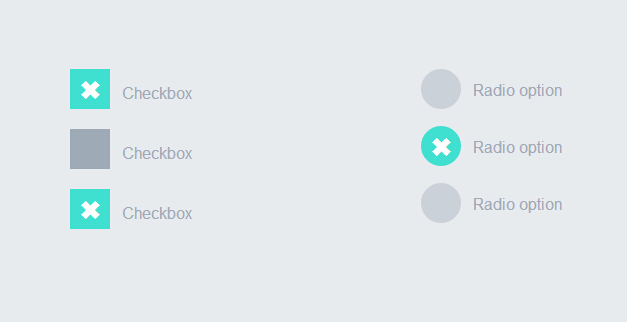
之前为大家分享了好多css3实现的按钮。今天要为大家分享的是纯css3实现的checkbox复选框和radio单选框,效果超级炫。先让我们看看图吧!
这个实例完全由css3实现的没有任何js代码。下面我们一起看下实现代码吧
html代码:
 <div style="width:200px; float:left">

            <label>

                <input type="checkbox" class="option-input checkbox" checked="">

                Checkbox

            </label>

            <label>

                <input type="checkbox" class="option-input checkbox">

                Checkbox

            </label>

            <label>

                <input type="checkbox" class="option-input checkbox">

                Checkbox

            </label>

        </div>

        <div style="width:200px; float:left">

            <label>

                <input type="radio" class="option-input radio" name="example">

                Radio option

            </label>

            <label>

                <input type="radio" class="option-input radio" name="example">

                Radio option

            </label>

            <label>

                <input type="radio" class="option-input radio" name="example">

                Radio option

            </label>

        </div>
css3代码:
@-webkit-keyframes click-wave {

  0% {

    width: 40px;

    height: 40px;

    opacity: 0.35;

    position: relative;

  }

  100% {

    width: 200px;

    height: 200px;

    margin-left: -80px;

    margin-top: -80px;

    opacity: 0.0;

  }

}

@-moz-keyframes click-wave {

  0% {

    width: 40px;

    height: 40px;

    opacity: 0.35;

    position: relative;

  }

  100% {

    width: 200px;

    height: 200px;

    margin-left: -80px;

    margin-top: -80px;

    opacity: 0.0;

  }

}

@-o-keyframes click-wave {

  0% {

    width: 40px;

    height: 40px;

    opacity: 0.35;

    position: relative;

  }

  100% {

    width: 200px;

    height: 200px;

    margin-left: -80px;

    margin-top: -80px;

    opacity: 0.0;

  }

}

@keyframes click-wave {

  0% {

    width: 40px;

    height: 40px;

    opacity: 0.35;

    position: relative;

  }

  100% {

    width: 200px;

    height: 200px;

    margin-left: -80px;

    margin-top: -80px;

    opacity: 0.0;

  }

}

.option-input {

  -webkit-appearance: none;

  -moz-appearance: none;

  -ms-appearance: none;

  -o-appearance: none;

  appearance: none;

  position: relative;

  top: 13.33333px;

  width: 40px;

  height: 40px;

  -webkit-transition: all 0.15s ease-out 0;

  -moz-transition: all 0.15s ease-out 0;

  transition: all 0.15s ease-out 0;

  background: #cbd1d8;

  border: none;

  color: #fff;

  cursor: pointer;

  display: inline-block;

  outline: none;

  position: relative;

  margin-right: 0.5rem;

  z-index:;

}

.option-input:hover {

  background: #9faab7;

}

.option-input:checked {

  background: #40e0d0;

}

.option-input:checked::before {

  width: 40px;

  height: 40px;

  position: absolute;

  content: '\2716';

  display: inline-block;

  font-size: 26.66667px;

  text-align: center;

  line-height: 40px;

}

.option-input:checked::after {

  -webkit-animation: click-wave 0.65s;

  -moz-animation: click-wave 0.65s;

  animation: click-wave 0.65s;

  background: #40e0d0;

  content: '';

  display: block;

  position: relative;

  z-index:;

}

.option-input.radio {

  border-radius: 50%;

}

.option-input.radio::after {

  border-radius: 50%;

}

body {

  display: -webkit-box;

  display: -moz-box;

  display: box;

  -webkit-box-orient: horizontal;

  -moz-box-orient: horizontal;

  box-orient: horizontal;

  -webkit-box-pack: start;

  -moz-box-pack: start;

  box-pack: start;

  -webkit-box-align: stretch;

  -moz-box-align: stretch;

  box-align: stretch;

  background: #e8ebee;

  color: #9faab7;

  font-family: "Helvetica Neue", Helvetica, Arial, sans-serif;

  text-align: center;

}

body div {

  padding: 5rem;

}

body label {

  display: block;

  line-height: 40px;

}
是不是很简单。只要复制上面的html代码和css代码到页面上。运行就可以看到效果了。赶紧试一试吧。哈哈
注:本文爱编程原创文章,转载请注明原文地址:http://www.w2bc.com/Article/5384
纯css3实现的超炫checkbox复选框和radio单选框的更多相关文章
- 你见过吗?9款超炫的复选框(Checkbox)效果
复选框(Checkbox)在各个浏览器中的效果不一致,因此很多 Web 开发人员会自己重新设计一套界面和使用体验都更佳的复选框功能.下面就给大家分享9款超炫的复选框(Checkbox)效果,纯 CSS ...
- 纯css3简单实用的checkbox复选框和radio单选框
昨天为大家分享了一款很炫的checkbox复选框和radio单选框,今天再给大家带来一款简单实用的checkbox复选框和radio单选框.界面清淅.舒服.先给大家来张效果图: 在线预览 源码下载 ...
- 一款纯css3实现的超炫动画背画特效
之前为大家介绍了很多款由纯css3实现的特效.今天要再给大家带来一款纯css3实现的超炫动画背画特效.代码非常简单,没有引用任何其它js代码.css代码也不多.效果非常炫.一起看下效果图: 在线预览 ...
- 一款纯css3实现的超炫3D表单
今天要给大家分享一款纯css3实现的超炫3D表单.该特效页面的加载的时候3d四十五度倾斜,当鼠标经过的时候表单动画回正.效果非常炫,一起看下效果图: 在线预览 源码下载 实现的代码. html代码 ...
- iHover – 30+ 纯 CSS3 实现的超炫的图片悬停特效
iHover 是一个令人印象深刻的图片悬停效果集合,完全基于 CSS3 实现,无依赖,能够搭配 Bootstrap 3 很好地工作.基于 SCSS 技术构建(包括文件),便于修改变量.有模块化的代码, ...
- [oldboy-django][2深入django]Form组件实现生成: select下拉框, checkbox复选框,radio单选框以及如何实现自定义数据格式要求
1 需求 - 1Form组件如何实现生成选择类标签: select,check, radio - 默认值 - 保留上次输入的值 - 2自定义验证规则 - RegexField - -
- iHover – 30+ 纯 CSS 实现的超炫的图片悬停特效
iHover 是一个令人印象深刻的图片悬停效果集合,完全基于 CSS3 实现,无依赖,能够搭配 Bootstrap 3 很好地工作.基于 SCSS 技术构建,便于修改变量.有模块化的代码,无需包含整个 ...
- 【转】纯CSS设置Checkbox复选框控件的样式
Checkbox复选框是一个可能每一个网站都在使用的HTML元素,但大多数人并不给它们设置样式,所以在绝大多数网站它们看起来是一样的.为什么不把你的网站中的Checkbox设置一个与众不同的样式,甚至 ...
- 自定义常用input表单元素一:纯css 实现自定义checkbox复选框
最下面那个是之前写的 今天在做项目的时候发现,之前写的貌似还是有点多,起码增加的span标签可以去掉,这样保持和原生相同的结构最好的,仅仅是样式上的变化.今天把项目中的这个给更新上来.下面就直接还是 ...
随机推荐
- servlet 服务器HTTP请求头说明
Accept:用于告诉服务器,客户机支持的数据类型. Accept-Charset:用于告诉服务器,客户机采用的编码. Accept-Language:客户机的语言环境. Host:客户机通过该头告诉 ...
- HTTP 协议中的 Transfer-Encoding
HTTP 协议中的 Transfer-Encoding 文章目录 Persistent Connection Content-Length Transfer-Encoding: chunked 本文作 ...
- LeetCode(35):Palindrome Number
Determine whether an integer is a palindrome. Do this without extra space. Some hints: Could negativ ...
- Oracle JDBC配置
Oracle数据库是收费的,Oracle的JDBC驱动在Maven仓库中虽有其名,却无法下载到jar包. 这就需要手动下载Oracle JDBC驱动并将其安装到本地Maven仓库中. 如果从官网下载, ...
- JavaScript 设计模式之命令模式
一.命令模式概念解读 1.命令模式概念文字解读 命令模式(Command)的定义是:用来对方法调用进行参数化处理和传送,经过这样处理过的方法调用可以在任何需要的时候执行.也就是说该模式旨在将函数的调用 ...
- 【jQuery】form表单元素序列化为json对象
序列化form表单元素为json对象: <!Doctype html> <html xmlns=http://www.w3.org/1999/xhtml> <head&g ...
- Form_通过FND_FNDFLUPL标准功能上传CSV控件(案例)
2014-06-08 Created By BaoXinjian
- BZOJ 2466 中山市选2009 树 高斯消元+暴力
题目大意:树上拉灯游戏 高斯消元解异或方程组,对于全部的自由元暴力2^n枚举状态,代入计算 这做法真是一点也不优雅... #include <cstdio> #include <cs ...
- HTML - 隐藏滚动条但可以滚动
代码:(原理就是遮盖) 1.如果你把子div的140px宽度移除,你就明白其中的奥妙了. 2.原理就是父元素负责滚动,子元素负责遮盖. <html> <style> .scro ...
- nginx https ssl 设置受信任证书[转然哥]
nginx https ssl 设置受信任证书[原创] 1. 安装nginx 支持ssl模块 http://nginx.org/en/docs/configure.html yum -y instal ...