
position(static-relative-absolute-fixed),margin(top-right-bottom-left),top-right-bottom-left
最近写css遇到一些问题,所以准备写下来捋一下思路。
1.position=satic下看margin的使用。(top-right-bottom-left在这种case下无效)
1-1)margin
a,margin值为具体的px
<!DOCTYPE html>

<html>

<head lang="en">

    <meta charset="UTF-8">

    <title></title>

    <style>

        .container{

            border: 1px solid blue;

            padding-left: 100px;/*设置父元素的padding为了明显子元素的包含块区域*/

            background: darkgoldenrod;

        }

        .inner{

            width: 200px;

            height: 200px;

            background: red;

            margin-left: 100px;/*相对于包含块移动,static的包含块为父元素的content边界以内。准确说是相对于元素自身移动

        }

    </style>

</head>

<body>

<div class="container">

    <div class="inner">

    </div>

</div>

</body>

</html>
结果如图,

b,margin值为百分比
<!DOCTYPE html>

<html>

<head lang="en">

    <meta charset="UTF-8">

    <title></title>

    <style>

        .container{

            width: 800px;

            border: 1px solid blue;

            padding-left: 100px;

            background: darkgoldenrod;

        }

        .inner{

            width: 200px;

            height: 200px;

            background: red;

            margin-left: 50%;

        }

        .half{

            width: 500px;

            height: 100px;

            background: yellow;

        }

    </style>

</head>

<body>

<div class="container">

    <div class="inner">

    </div>

</div>

<div class="half"></div>

</body>

</html>
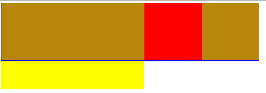
margin仍然是相对于包含块移动(因为包含块包裹着子元素,准确来说是相对于子元素本身移动),移动的值是父元素的宽度的百分比(如,50%),不是父元素这个盒子的宽度。
结果如下图,为了明显移动的情况,我在底部添加了一个宽度50%的div做对比。
2.position=relative.由于top和margin-top的百分比情况下容易导致问题,所以这里讨论时会同时看top和left两个边。
2-1)margin
a,margin值为具体px
<!DOCTYPE html>

<html>

<head lang="en">

    <meta charset="UTF-8">

    <title></title>

    <style>

        .container{

            border: 1px solid blue;

            padding-left: 100px;

            padding-top: 100px;

            background: darkgoldenrod;

        }

        .inner{

            position: relative;

            width: 200px;

            height: 200px;

            background: red;

            margin-left: 100px;//relative元素的包含块也是父元素的content边界以内区域

            margin-top: 100px;

        }

        /*.half{*/

        /*width: 50%;*/

        /*height: 100px;*/

        /*background: yellow;*/

        /*}*/

    </style>

</head>

<body>

<div class="container">

    <div class="inner">

    </div>

</div>

<!--<div class="half"></div>-->

</body>

</html>
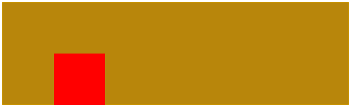
结果如图,margin依然是相对于包含块做移动。准确来说是相对于元素自身移动。
b,margin值为百分比
<!DOCTYPE html>

<html>

<head lang="en">

    <meta charset="UTF-8">

    <title></title>

    <style>

        .container{

            width: 800px;

            height: 400px;

            border: 1px solid blue;

            padding-left: 100px;

            padding-top:100px ;

            background: darkgoldenrod;

        }

        .inner{

            position: relative;

            width: 200px;

            height: 200px;

            background: red;

            margin-left: 50%;

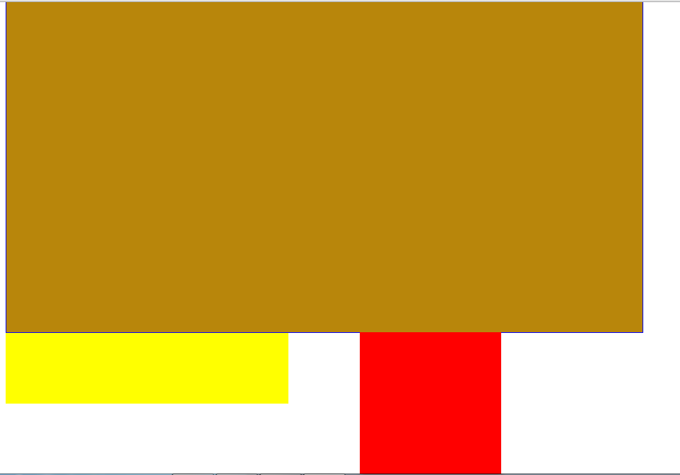
            margin-top: 50%;//父元素height=width(400px)+padding-top(100px)=500px.marin-top相对于包含块使子元素向下移动margin-top(父元素宽度的50%,即400px)

        }

        .half{

            width: 400px;

            height: 100px;

            background: yellow;

        }

    </style>

</head>

<body>

<div class="container">

    <div class="inner">

    </div>

</div>

<div class="half"></div>

</body>

</html>
结果如图,margin依然是以包含块左上角为原点移动(准确说是元素自身),不过margin-left/margin-top的值均是父元素宽度的百分比(尤其需要注意margin-top也是相对于父元素的宽度而不是高度,同理padding).不过也并不是绝对的,当设置了writing-mode为纵向书写时,比如-webkit-writing-mode: vertical-lr;此时按百分比书写的margin就会参照容器的高度来计算了
2-2)top-right-bottom-left
a,top和left为具体值(px)
<!DOCTYPE html>

<html>

<head lang="en">

    <meta charset="UTF-8">

    <title></title>

    <style>

        .container{

            /*width: 800px;*/

            height: 400px;

            border: 1px solid blue;

            padding-left: 100px;

            padding-top:100px ;

            background: darkgoldenrod;

        }

        .inner{

            position: relative;

            width: 200px;

            height: 200px;

            background: red;

            top:400px;

            left: 300px;

            opacity: 0.3;

        }

        .half{

            width: 400px;

            height: 100px;

            background: yellow;

        }

    </style>

</head>

<body>

<div class="container">

    <div class="inner">

    </div>

</div>

<div class="half"></div>

</body>

</html>
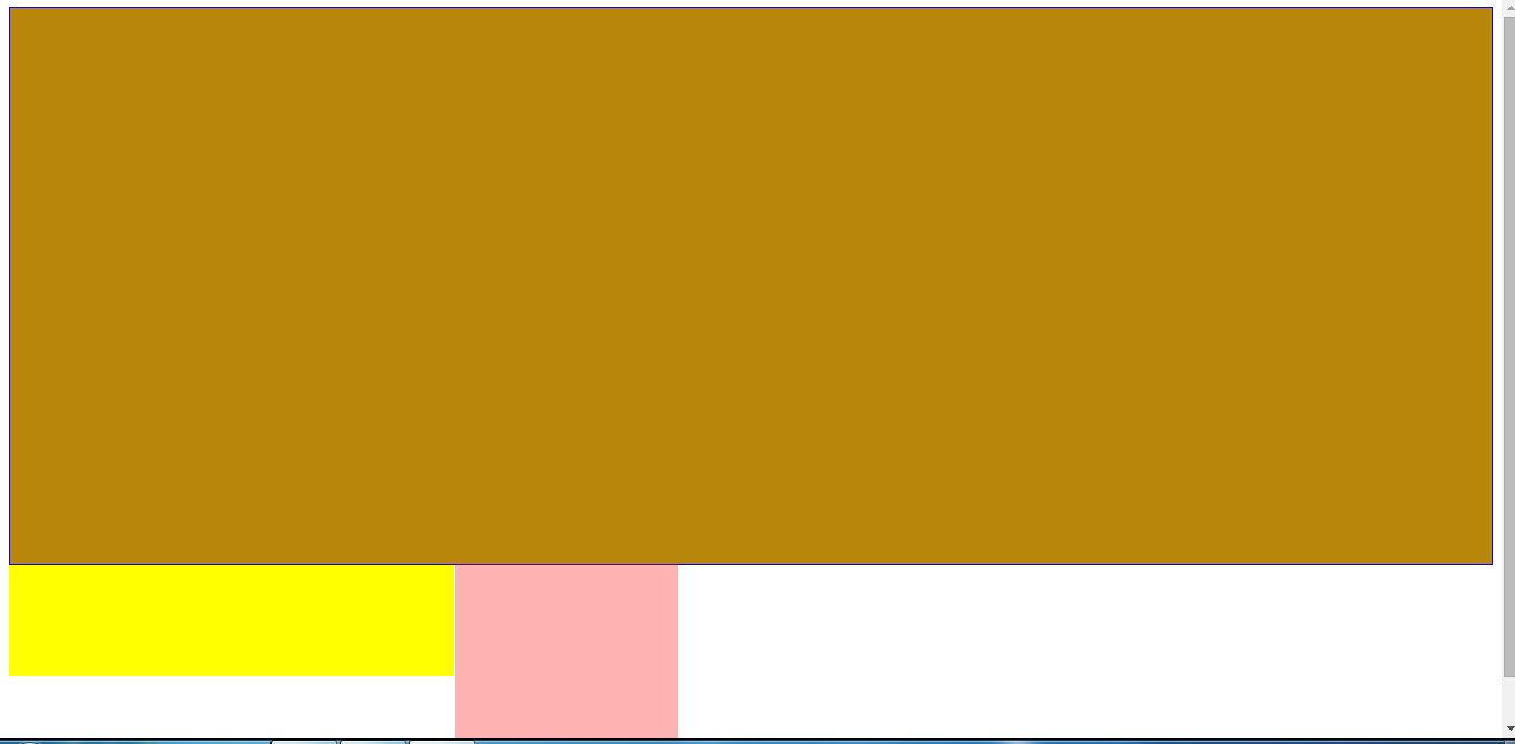
结果如图,注意这里为了显示明显,选的值都是比较特殊的。
top/left也是相对于包含块进行位移。
b,top和left为百分比
1)top/left值为百分比时,以包含块为参考进行移动,移动的值分别相对的是父元素的width和height(width和height指定的是父元素的content区域,即包含块),而不是父元素这个盒子。

2)top/bottom值为百分比时,需要保证父元素的height存在(具体的值或者设置了百分比),不然top/bottom就无效。
<!DOCTYPE html>

<html>

<head lang="en">

    <meta charset="UTF-8">

    <title></title>

    <style>

        .container{

            width: 800px;

            /*height: 400px;*/  /*如果没有设置height,子元素的top就无效*/

            border: 1px solid blue;

            padding-left: 100px;

            padding-top:100px ;

            background: darkgoldenrod;

        }

        .inner{

            position: relative;

            width: 200px;

            height: 200px;

            background: red;

            left: 50%;

            top:50%;  /*因为父元素没设置高度,所以无效*/

        }

        .half{

            width: 500px;

            height: 100px;

            background: yellow;

        }

    </style>

</head>

<body>

<div class="container">

    <div class="inner">

    </div>

</div>

<div class="half"></div>

</body>

</html>
结果如下,由于父元素没有现式设置高,则top:50%设置无效。

3.position=absolute.
absolute元素的包含块是最近的已定位祖先元素的padding边界以内区域。
3-1)margin
a.margin-top/margin-left为具体的值(px)
<!DOCTYPE html>

<html>

<head lang="en">

    <meta charset="UTF-8">

    <title></title>

    <style>

        .container{

            position: relative;

            width: 800px;

            /*height: 400px;*/

            border: 1px solid blue;

            padding-left: 100px;

            padding-top:100px ;

            background: rgba(0,0,255,0.3);

        }

        .inner{

            position: absolute;

            width: 200px;

            height: 200px;

            background: red;

            margin-left: 100px;

            margin-top: -100px;

        }

        .half{

            width: 500px;

            height: 100px;

            background: yellow;

        }

    </style>

</head>

<body>

<div class="container">

    <div class="inner">

    </div>

</div>

<!--<div class="half"></div>-->

</body>

</html>
结果如图,margin相对于元素自身移动
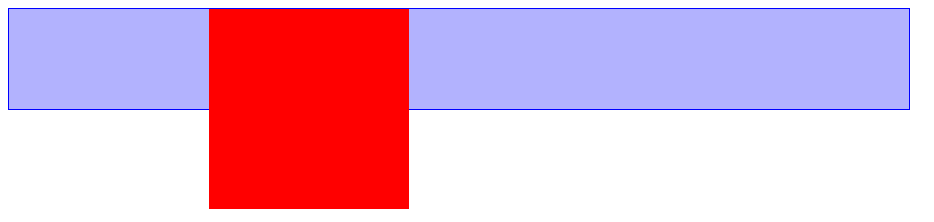
b.margin-top/margin-left为百分比
<!DOCTYPE html>

<html>

<head lang="en">

    <meta charset="UTF-8">

    <title></title>

    <style>

        .container{

            position: relative;

            width: 800px;

            /*height: 400px;*/

            border: 1px solid blue;

            padding-left: 100px;

            padding-top:100px ;

            background: rgba(0,0,255,0.3);

        }

        .inner{

            position: absolute;

            width: 200px;

            height: 200px;

            background: red;

            margin-left: 50%;

            /*margin-top: -100px;*/

            opacity: 0.3;

        }

        .half{

            width: 550px;

            height: 100px;

            background: yellow;

        }

    </style>

</head>

<body>

<div class="container">

    <div class="inner">

    </div>

</div>

<div class="half"></div>

</body>

</html>
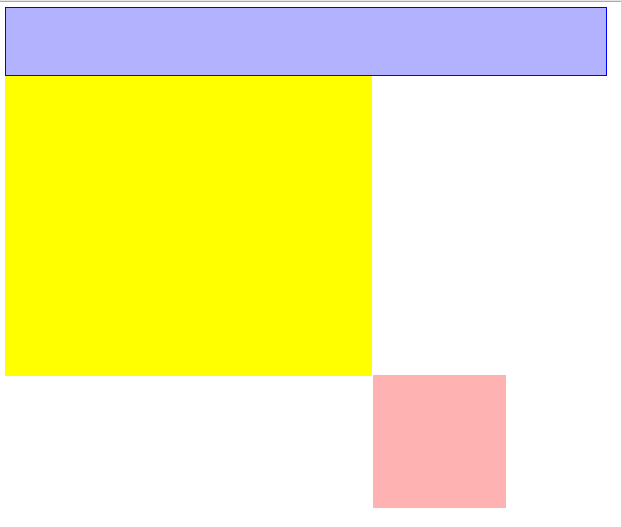
结果如图,margin-top/margin-left值为百分比时,相对的是父元素的wdith+padding的百分比(即absolute元素的包含块---父元素的padding边界以内区域。上面我们测试static/relative元素时,相对的是父元素的width的百分比,即relative的包含块)。
同时margin-top/margin-bottom相对的是width+padding,而不是height+padding。
3-2)top-right-bottom-left
a.top/left为具体的值(px)
<!DOCTYPE html>

<html>

<head lang="en">

    <meta charset="UTF-8">

    <title></title>

    <style>

        .container{

            position: relative;

            width: 800px;

            height: 400px;

            border: 1px solid blue;

            padding-left: 100px;

            padding-top:100px ;

            background: rgba(0,0,255,0.3);

        }

        .inner{

            position: absolute;

            width: 200px;

            height: 250px;

            background: red;

            left:0px;

            top:0px;

        }

        .half{

            width: 450px;

            height: 150px;

            background: yellow;

        }

    </style>

</head>

<body>

<div class="container">

    <div class="inner">

    </div>

</div>

<!--<div class="half"></div>-->

</body>

</html>
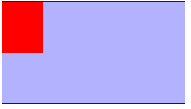
结果如图,top/left相对于包含块移动。
b.top/left为百分比
<!DOCTYPE html>

<html>

<head lang="en">

    <meta charset="UTF-8">

    <title></title>

    <style>

        .container{

            position: relative;

            width: 800px;

            height: 400px;

            border: 1px solid blue;

            padding-left: 100px;

            padding-top:100px ;

            background: rgba(0,0,255,0.3);

        }

        .inner{

            position: absolute;

            width: 200px;

            height: 250px;

            background: red;

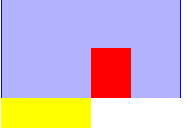
            top: 50%;/*移动了250px*/

            /*left: 0;*/

            left: 50%;/*移动了450px*/

        }

        .half{

            width: 450px;

            height: 150px;

            background: yellow;

        }

    </style>

</head>

<body>

<div class="container">

    <div class="inner">

    </div>

</div>

<div class="half"></div>

</body>

</html>
结果如图,相对于包含块移动。移动的值是相对于父元素的width+padding或height+padding(包含块)的百分比。
4.position=fixed.
4-1)margin
a.margin-top/margin-left为具体的值(px)
与absolute一样,不重复了。
b.margin-top/margin-left为百分比
<!DOCTYPE html>

<html>

<head lang="en">

    <meta charset="UTF-8">

    <title></title>

    <style>

        body{

            border: 1px solid red;

            width: 50%;

            height: 200px;

        }

        div{

            position: fixed;

            width: 200px;

            height: 100px;

            background: darkviolet;

            margin-left: 50%;

            margin-top:200px;//这里使用百分比比较复杂,所以用具体的值。

        }

    </style>

</head>

<body>

<div></div>

</body>

</html>
结果如图,以元素自身为参考移动。值是相对于窗口大小viewport的百分比。

4-2)top-right-bottom-left
a.top/left为具体的值(px)
于absolute差不多,不重复了。
b.top/left为百分比
<!DOCTYPE html>

<html>

<head lang="en">

    <meta charset="UTF-8">

    <title></title>

    <style>

        *{

            margin: 0;

            padding: 0;

        }

        body{

            border: 1px solid red;

            width: 50%;

            height: 200px;

        }

        div{

            position: fixed;

            width: 200px;

            height: 100px;

            background: darkviolet;

            top: 50%;

            left: 50%;

        }

    </style>

</head>

<body>

<div></div>

</body>

</html>
结果如图,相对于包含块(窗口)移动,值是相对于窗口大小viewport的百分比。

总结几条:
1)static/relative的包含块是父级元素的content区域(width和height决定)。
static/relative元素的 margin-left/margin-top/margin-right/margin-bottom,以元素自身为参考移动,值为百分比时,指的是包含块(width)的百分比,margin-top/margin-bottom相对的也是width而不是height。
static元素的top/left/bottom/right.以包含块为参考移动,值为百分比时,指的是包含块(width或height)的百分比。
2)absolute元素的包含块是最近的已定位祖先元素的padding边框以内区域。
它的 margin-left/margin-top/margin-right/margin-bottom,以元素自身为参考移动,值为百分比时,指的是包 含块(width+padding)的百分比,margin-top/margin-bottom相对的也是width+padding而不是垂直方向的height+padding.
它的top/left/bottom/right.以包含块为参考移动,值为百分比时,指的是包含块(width+padding或height+padding)的百分比。
3)fixed的包含块为窗口,大小为viewport.
position(static-relative-absolute-fixed),margin(top-right-bottom-left),top-right-bottom-left的更多相关文章
- css属性position: static|relative|absolute|fixed|sticky简单解析
目录 static 静态定位(默认) relative 相对定位 正常文档流 加了relative之后的布局 加上margin/padding/border之后的布局 absolute 绝对定位 正常 ...
- What is the difference between position: static,relative,absolute,fixed
What is the difference between static,relative, absolute,fixed we can refer to this link: expand
- 【前段开发】10步掌握CSS定位: position static relative absolute float
希望能帮到须要的人,转自:http://www.see-design.com.tw/i/css_position.html 1. position:static 元素的 position 屬性默認值為 ...
- css的定位,relative/absolute/fixed的用法
其实position的值有四个,static/relative/absolute/fixed,而static是默认值,不算具有有定位属性,这里就不讲了. 定位其实就是跟元素设置定位属性,然后设置其对位 ...
- CSS之定位,relative/absolute/fixed的用法
其实position的值有四个,static/relative/absolute/fixed,而static是默认值,不算具有有定位属性,这里就不讲了. 定位其实就是跟元素设置定位属性,然后设置其对位 ...
- CSS position relative absolute fixed
position属性absolute与relative 详解 最近一直在研究javascript脚本,熟悉DOM中CSS样式的各种定位属性,以前对这个属性不太了解,从网上找到两篇文章感觉讲得很透彻 ...
- CSS 浅析position:relative/absolute定位方式
## 一.position:relative 相对定位 ## 分两种情况分析: · 无 position: relative: · 有 position: relative. 代码如下图: 显示效果如 ...
- 对于position:relative,absolute,fixed的见解:
1.switch--fixed,div脱离父元素,top,left,right,bottom都是相对于body,自己原来的位置不存在,即不占父元素位置了 2.switch--relative,div相 ...
- CSS定位:相对定位、绝对定位和固定定位(relative absolute fixed)
相对定位:position:relative; 不脱离文档流,参考自身静态位置通过top,bottom,left,right定位,并且可通过z-index进行层次分级. 绝对定位:position:a ...
- CSS:static/relative/absolute
static - default and this is the FLOW. ------------------------------------------------------------- ...
随机推荐
- iOS 开发百问(5)
42. 警告:Multiplebuild commands for output file target引用了名字反复的资源 找到当前的target,展开之后.找到CopyBundle Resourc ...
- 同学们,OpenCV出3.0了,速去围观!
OpenCV3.0 OpenCV > NEWS > OpenCV 3.0 2015-06-04 With a great pleasure and great relief OpenCV ...
- hdu2795Billboard(线段树,找第一个大于w的点)
Billboard Time Limit: 20000/8000 MS (Java/Others) Memory Limit: 32768/32768 K (Java/Others) Total ...
- scikit-learn:3.2. Grid Search: Searching for estimator parameters
參考:http://scikit-learn.org/stable/modules/grid_search.html GridSearchCV通过(蛮力)搜索參数空间(參数的全部可能组合).寻找最好的 ...
- IIS Modules Overview
Introduction The IIS 7 and above Web server feature set is componentized into more than thirty indep ...
- BZOJ 3940 AC自动机
思路: 需要维护一个栈的AC自动机--. 要求出来 最后的栈顶是在自动机上的哪个节点. if(!ac.ch[st[tp-1]][a[i]-'a']) st[tp]=ac.ch[ac.f[st[tp-1 ...
- Spring Security Java Config Preview--官方
原文地址:[1]https://spring.io/blog/2013/07/02/spring-security-java-config-preview-introduction/ [2]https ...
- Inter-process Communication (IPC)
For Developers > Design Documents > Inter-process Communication (IPC) 目录 1 Overview 1.1 I ...
- android+myeclipse+mysql自定义控件下拉框的数据绑定
原创作品,允许转载,转载时请务必声明作者信息和本声明.http://www.cnblogs.com/zhu520/p/8031936.html 本人小白,那个大神看到有问题可指出,谢谢.... 这个是 ...
- CentOS6.4安装Docker
首先,须要安装EPEL仓库 # wget http://mirrors.yun-idc.com/epel/6/i386/epel-release-6-8.noarch.rpm # rpm -ivh e ...