R语言实战读书笔记(六)基本图形
#安装vcd包,数据集在vcd包中
library(vcd)
counts <- table(Arthritis$Improved)
counts
# 垂直
barplot(counts, main = "Simple Bar Plot", xlab = "Improvement",
ylab = "Frequency")
# 改为水平
barplot(counts, main = "Horizontal Bar Plot", xlab = "Frequency",
ylab = "Improvement", horiz = TRUE)
# 两个列
counts <- table(Arthritis$Improved, Arthritis$Treatment)
counts
# 堆砌条形图
barplot(counts, main = "Stacked Bar Plot", xlab = "Treatment",
ylab = "Frequency", col = c("red", "yellow", "green"),
legend = rownames(counts))

#分组条形图
barplot(counts, main = "Grouped Bar Plot", xlab = "Treatment",
ylab = "Frequency", col = c("red", "yellow", "green"),
legend = rownames(counts),
beside = TRUE)

states <- data.frame(state.region, state.x77)
means <- aggregate(states$Illiteracy, by = list(state.region), FUN = mean)
means
means <- means[order(means$x), ]
means
barplot(means$x, names.arg = means$Group.1)
title("Mean Illiteracy Rate")

library(vcd)
attach(Arthritis)
counts <- table(Treatment, Improved)
#棘状图
spine(counts, main = "Spinogram Example")
detach(Arthritis)

#屏幕分成2行2列,可以放4副图
par(mfrow = c(2, 2))
#图1中的数据
slices <- c(10, 12, 4, 16, 8)
#图1中的文字
lbls <- c("US", "UK", "Australia", "Germany", "France")
#饼图1
pie(slices, labels = lbls, main = "Simple Pie Chart")
#图2中的数据,是图1中数据的百分比
pct <- round(slices/sum(slices) * 100)
lbls2 <- paste(lbls, " ", pct, "%", sep = "")
pie(slices, labels = lbls2, col = rainbow(length(lbls)), main = "Pie Chart with Percentages")
#三维饼图
library(plotrix)
pie3D(slices, labels = lbls, explode = 0.1, main = "3D Pie Chart ")
#
mytable <- table(state.region)
lbls <- paste(names(mytable), "\n", mytable, sep = "")
pie(mytable, labels = lbls, main = "Pie Chart from a Table\n (with sample sizes)")

#扇形图
par(opar)
library(plotrix)
slices <- c(10, 12, 4, 16, 8)
lbls <- c("US", "UK", "Australia", "Germany", "France")
fan.plot(slices, labels = lbls, main = "Fan Plot")

#直方图
#2行2列
par(mfrow = c(2, 2))
#普通的直方图
hist(mtcars$mpg)
#指定12组
hist(mtcars$mpg, breaks = 12, col = "red",xlab = "Miles Per Gallon", main = "Colored histogram with 12 bins")
#freq=FALSE表示密度直方图
hist(mtcars$mpg, freq = FALSE, breaks = 12, col = "red", xlab = "Miles Per Gallon", main = "Histogram, rug plot, density curve")
#jitter是添加一些噪声,rug是在坐标轴上标出元素出现的频数。出现一次,就会画一个小竖杠。从rug的疏密可以看出变量是什么地方出现的次数多,什么地方出现的次数少。
#轴须图是实际数据值的一种一维呈现方式。如果数据中有很多结(相同的值),可以使用如下代码将数据打散布,会向每个数据点添加一个小的随机值,以避免重叠点产生的影响。
rug(jitter(mtcars$mpg))
#画密度线
lines(density(mtcars$mpg), col = "blue", lwd = 2)
# Histogram with Superimposed Normal Curve
x <- mtcars$mpg
h <- hist(x, breaks = 12, col = "red", xlab = "Miles Per Gallon", main = "Histogram with normal curve and box")
xfit <- seq(min(x), max(x), length = 40)
#正态分布
yfit <- dnorm(xfit, mean = mean(x), sd = sd(x))
yfit <- yfit * diff(h$mids[1:2]) * length(x)
lines(xfit, yfit, col = "blue", lwd = 2)
#添加一个框
box()

par(mfrow = c(2, 1))
d <- density(mtcars$mpg)
plot(d)
d <- density(mtcars$mpg)
plot(d, main = "Kernel Density of Miles Per Gallon")
#画多边形
polygon(d, col = "red", border = "blue")
#添加棕色轴须图
rug(mtcars$mpg, col = "brown")

#双倍线宽
par(lwd = 2)
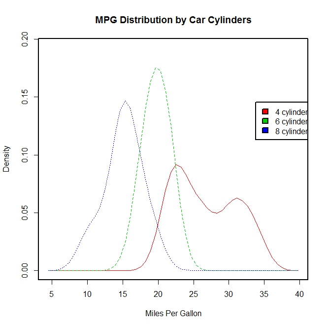
library(sm)
attach(mtcars)
#产生一个因子cyl.f,cyl是mtcars的一个列
cyl.f <- factor(cyl, levels = c(4, 6, 8),labels = c("4 cylinder", "6 cylinder", "8 cylinder"))
sm.density.compare(mpg, cyl, xlab = "Miles Per Gallon")
title(main = "MPG Distribution by Car Cylinders")
#指定颜色值
colfill <- c(2:(2 + length(levels(cyl.f))))
cat("Use mouse to place legend...", "\n\n")
#locator表示在鼠标点击的位置上添加图例
legend(locator(1), levels(cyl.f), fill = colfill)
detach(mtcars)
par(lwd = 1)
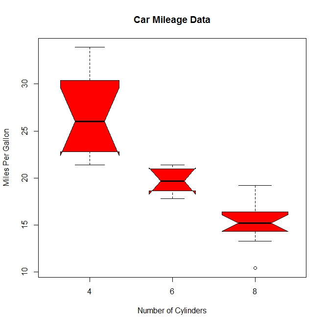
boxplot(mpg ~ cyl, data = mtcars, main = "Car Milage Data", xlab = "Number of Cylinders", ylab = "Miles Per Gallon")

#notch=TRUE含凹槽的箱线图,有凹槽不重叠,表示中位数有显著差异,如下图,都有明显差异,
boxplot(mpg ~ cyl, data = mtcars, notch = TRUE, varwidth = TRUE, col = "red", main = "Car Mileage Data", xlab = "Number of Cylinders", ylab = "Miles Per Gallon")
mtcars$cyl.f <- factor(mtcars$cyl, levels = c(4, 6, 8), labels = c("4", "6", "8"))
mtcars$am.f <- factor(mtcars$am, levels = c(0, 1), labels = c("auto", "standard"))
boxplot(mpg ~ am.f * cyl.f, data = mtcars, varwidth = TRUE, col = c("gold", "darkgreen"), main = "MPG Distribution by Auto Type", xlab = "Auto Type")
#如下图,再一次清晰显示油耗随着缸数下降而减少,对于四和六缸,标准变速箱的油耗更高。对于八缸车型,油耗似乎没有差别
#也可以从箱线图的宽度看出,四缸标准变速成箱的车型和八缸自动变速箱的车型在数据集中最常见

dotchart(mtcars$mpg, labels = row.names(mtcars), cex = 0.7, main = "Gas Milage for Car Models", xlab = "Miles Per Gallon")

x <- mtcars[order(mtcars$mpg), ]
x$cyl <- factor(x$cyl)
x$color[x$cyl == 4] <- "red"
x$color[x$cyl == 6] <- "blue"
x$color[x$cyl == 8] <- "darkgreen"
dotchart(x$mpg, labels = row.names(x), cex = 0.7,
pch = 19, groups = x$cyl,
gcolor = "black", color = x$color,
main = "Gas Milage for Car Models\ngrouped by cylinder",
xlab = "Miles Per Gallon")

R语言实战读书笔记(六)基本图形的更多相关文章
- R语言实战读书笔记(三)图形初阶
这篇简直是白写了,写到后面发现ggplot明显更好用 3.1 使用图形 attach(mtcars)plot(wt, mpg) #x轴wt,y轴pgabline(lm(mpg ~ wt)) #画线拟合 ...
- R语言实战读书笔记(二)创建数据集
2.2.2 矩阵 matrix(vector,nrow,ncol,byrow,dimnames,char_vector_rownames,char_vector_colnames) 其中: byrow ...
- R语言实战读书笔记1—语言介绍
第一章 语言介绍 1.1 典型的数据分析步骤 1.2 获取帮助 help.start() help("which") help.search("which") ...
- R语言实战读书笔记(八)回归
简单线性:用一个量化验的解释变量预测一个量化的响应变量 多项式:用一个量化的解决变量预测一个量化的响应变量,模型的关系是n阶多项式 多元线性:用两个或多个量化的解释变量预测一个量化的响应变量 多变量: ...
- R语言实战读书笔记2—创建数据集(上)
第二章 创建数据集 2.1 数据集的概念 不同的行业对于数据集的行和列叫法不同.统计学家称它们为观测(observation)和变量(variable) ,数据库分析师则称其为记录(record)和字 ...
- R语言实战读书笔记(五)高级数据管理
5.2.1 数据函数 abs: sqrt: ceiling:求不小于x的最小整数 floor:求不大于x的最大整数 trunc:向0的方向截取x中的整数部分 round:将x舍入为指定位的小数 sig ...
- R语言实战读书笔记(四)基本数据管理
4.2 创建新变量 几个运算符: ^或**:求幂 x%%y:求余 x%/%y:整数除 4.3 变量的重编码 with(): within():可以修改数据框 4.4 变量重命名 包reshape中有个 ...
- R语言实战读书笔记(一)R语言介绍
1.3.3 工作空间 getwd():显示当前工作目录 setwd():设置当前工作目录 ls():列出当前工作空间中的对象 rm():删除对象 1.3.4 输入与输出 source():执行脚本
- R语言实战读书笔记(十三)广义线性模型
# 婚外情数据集 data(Affairs, package = "AER") summary(Affairs) table(Affairs$affairs) # 用二值变量,是或 ...
随机推荐
- python入门:最基本的用户登录用户登录,三次错误机会
#!/usr/bin/env python # -*- coding:utf-8 -*- #用户登录,三次错误机会 """ 导入getpass,给x赋值为1,while真 ...
- 蓝牙nrf52832的架构和开发(转载)
相比TI的CC254X.DIALOG的DA1458X,nordic推出的nrf51822和nrf52832在架构和开发商都有自己独特的地方.这几颗产品都是蓝牙低功耗芯片.DA1458X使用OTP硬件架 ...
- Docker容器技术的核心原理
目录 1 前言 2 docker容器技术 2.1 隔离:Namespace 2.2 限制:Cgroup 2.3 rootfs 2.4 镜像分层 3 docker容器与虚拟机的对比 1 前言 上图是百度 ...
- vss安装注意点
一:装好IIS 二:win7用管理员权限打开 server configuration 才能打上勾 三:用计算机名,不要用 Ip地址
- PHP函数参数传递(相对于C++的值传递和引用传递)
学语言学得比较多了,今天突然想PHP函数传递,对于简单类型(基本变量类型)和复杂类型(类)在函数参数传递时,有没有区别呢,今天测试了下: 代码如下: <?php function test($a ...
- web自动化之selenium
一.Selenium(http://www.selenium.org/) Web自动化测试工具.它支持各种浏览器,包括Chrome,Safari,Firefox等主流界面式浏览器,如果你在这些浏览器里 ...
- 前面板插口耳机无声音?无Realtek控制器?
今天碰到一个很恶心的问题,电脑又没有声音了, 因为新装的系统,怀疑没有驱动,就装了驱动,还是没有有声音, 网上搜了半天都是让在控制面板找Realtek控制器,可以我的控制面板没有. 最后找到一篇百度经 ...
- 【转】深入理解JVM—JVM内存模型
http://www.cnblogs.com/dingyingsi/p/3760447.html#3497199 我们知道,计算机CPU和内存的交互是最频繁的,内存是我们的高速缓存区,用户磁盘和CPU ...
- iOS-----openGL--openGL ES iOS 入门篇--->搭建openGL环境
OpenGL版本 iOS系统默认支持OpenGl ES1.0.ES2.0以及ES3.0 3个版本,三者之间并不是简单的版本升级,设计理念甚至完全不同,在开发OpenGL项目前,需要根据业务需求选择合适 ...
- 【bzoj3170】[Tjoi 2013]松鼠聚会 旋转坐标系
题目描述 有N个小松鼠,它们的家用一个点x,y表示,两个点的距离定义为:点(x,y)和它周围的8个点即上下左右四个点和对角的四个点,距离为1.现在N个松鼠要走到一个松鼠家去,求走过的最短距离. 输入 ...