
WPF DataGrid Control

Introduction
Since .NET 4.0, Microsoft is shipping a DataGrid control that provides all the basic functionality needed, like:
- Auto generation of columns
- Manual definition of columns
- Selection
- Grouping
- Column sorting, reordering and resizing
- Row Details
- Alternating BackgroundBrush
- Frozen columns
- Headers Visibility
- How to template autogenerated columns
Basic usage: Auto generate columns
To show a basic data grid , just drop a DataGrid control to your view and bind the ItemsSource to a collection of data objects and you're done. The DataGrid provides a feature called AutoGenerateColumns that automatically generates column according to the public properties of your data objects. It generates the following types of columns:
- TextBox columns for string values
- CheckBox columns for boolean values
- ComboBox columns for enumerable values
- Hyperlink columns for Uri values

<DataGrid ItemsSource="{Binding Customers}" />
Manually define columns
Alternatively you can define your columns manually by setting the AutoGenerateColumns property to False. In this case you have to define the columns in the Columns collection of the data grid. You have the following types of columns available:
DataGridCheckBoxColumnfor boolean valuesDataGridComboBoxColumnfor enumerable valuesDataGridHyperlinkColumnfor Uri valuesDataGridTemplateColumnto show any types of data by defining your own cell templateDataGridTextColumnto show text values
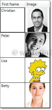
  <DataGrid ItemsSource="{Binding Customers}" AutoGenerateColumns="False" >

    <DataGrid.Columns>

        <DataGridTemplateColumn Header="Image" Width="SizeToCells" IsReadOnly="True">

            <DataGridTemplateColumn.CellTemplate>

                <DataTemplate>

                    <Image Source="{Binding Image}" />

                </DataTemplate>

            </DataGridTemplateColumn.CellTemplate>

            </DataGridTemplateColumn>

    </DataGrid.Columns>

</DataGrid>
Selection
The data grid includes a variety of selection modes. They are configured by the SelectionMode and SelectionUnit property.
- The
SelectionModecan be set toSingleorExtendedto define if one or multiple units can be selected simultaneously. - The
SelectionUnitdefines the scope of one selection unit. It can be set toCell,CellAndRowHeaderandFullRow.

  <DataGrid ItemsSource="{Binding Customers}"

          SelectionMode="Extended" SelectionUnit="Cell" />
Column sorting, reordering and resizing
The data grid provides features to sort, reorder and resize columns. They can be enabled or disabled by the following properties:
CanUserReorderColumnsenables or disables column re-orderingCanUserResizeColumnsenables or disables column resizingCanUserResizeRowsenables or disables row resizingCanUserSortColumnsenables or disables column sorting
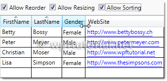
  <DataGrid ItemsSource="{Binding Customers}"

          CanUserReorderColumns="True" CanUserResizeColumns="True"

          CanUserResizeRows="False" CanUserSortColumns="True"/>
Grouping
The data grid also supports grouping. To enable grouping you have to define a CollectionView that contains to least one GroupDescriptionthat defines the criterias how to group.

  Customers = new ListCollectionView(_customers);

Customers.GroupDescriptions.Add(new PropertyGroupDescription("Gender"));
Second thing you need to do is defining a template how the groups should look like. You can do this by setting the GroupStyle to something like the following snippet.
  <DataGrid ItemsSource="{Binding GroupedCustomers}">

    <DataGrid.GroupStyle>

        <GroupStyle>

            <GroupStyle.HeaderTemplate>

                <DataTemplate>

                    <StackPanel>

                        <TextBlock Text="{Binding Path=Name}" />

                    </StackPanel>

                </DataTemplate>

            </GroupStyle.HeaderTemplate>

            <GroupStyle.ContainerStyle>

                <Style TargetType="{x:Type GroupItem}">

                    <Setter Property="Template">

                        <Setter.Value>

                            <ControlTemplate TargetType="{x:Type GroupItem}">

                                <Expander>

                                    <Expander.Header>

                                        <StackPanel Orientation="Horizontal">

                                          <TextBlock Text="{Binding Path=Name}" />

                                          <TextBlock Text="{Binding Path=ItemCount}"/>

                                          <TextBlock Text="Items"/>

                                        </StackPanel>

                                    </Expander.Header>

                                    <ItemsPresenter />

                                </Expander>

                            </ControlTemplate>

                        </Setter.Value>

                    </Setter>

                </Style>

            </GroupStyle.ContainerStyle>

        </GroupStyle>

    </DataGrid.GroupStyle>

</DataGrid>
Row Details
The data grid provides a feature that shows a detail panel for a selected row. It can be enabled by setting a DataTemplate to theRowDetailsTemplate property. The data template gets the object that is bound to this row passed by the DataContext and can bind to it.

  <DataGrid ItemsSource="{Binding Customers}">

    <DataGrid.Columns>

    <DataGridTextColumn Header="First Name" Binding="{Binding FirstName}" />

    </DataGrid.Columns>

    <DataGrid.RowDetailsTemplate>

        <DataTemplate>

            <Image Height="100" Source="{Binding Image}" />

        </DataTemplate>

    </DataGrid.RowDetailsTemplate>

</DataGrid>
Row Details depending on the type of data
You can specify a RowDetailsTemplateSelector that selects a data template according to the type or data that this row contains. To do this, create a type that derives from DataTemplateSelector and override the SelectTemplate method. In the items argument you get the data and you can determine which data template to display. Return an instance of that data template as return value.

  public class GenderTemplateSelector : DataTemplateSelector

{

    public DataTemplate MaleTemplate { get; set; }

    public DataTemplate FemaleTemplate { get; set; }   public override DataTemplate SelectTemplate(object item,

                  DependencyObject container)

    {

        var customer = item as Customer;

        if (customer == null)

            return base.SelectTemplate(item, container);   if( customer.Gender == Gender.Male)

        {

            return MaleTemplate;

        }

        return FemaleTemplate;

    }

}
  <l:GenderTemplateSelector x:Key="genderTemplateSelector">

    <l:GenderTemplateSelector.MaleTemplate>

        <DataTemplate>

            <Grid Background="LightBlue">

                <Image Source="{Binding Image}" Width="50" />

            </Grid>

        </DataTemplate>

    </l:GenderTemplateSelector.MaleTemplate>

    <l:GenderTemplateSelector.FemaleTemplate>

        <DataTemplate>

            <Grid Background="Salmon">

                <Image Source="{Binding Image}" Width="50" />

            </Grid>

        </DataTemplate>

    </l:GenderTemplateSelector.FemaleTemplate>

</l:GenderTemplateSelector>   <DataGrid ItemsSource="{Binding Customers}"

          RowDetailsTemplateSelector="{StaticResource genderTemplateSelector}" />
Alternating BackgroundBrush
You can define a an AlternatingRowBackground that is applied every even row. You can additionally specify an AlternationCount if you only want to ink every every n-th data row.
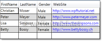
  <DataGrid ItemsSource="{Binding Customers}"

          AlternatingRowBackground="Gainsboro"  AlternationCount="2"/>
Frozen Columns
The data grid also supports the feature to freeze columns. That means they stay visible while you scoll horizontally through all columns. This is a useful feature to keep a referencing column like an ID or a name always visible to keep your orientation while scrolling.
To freeze a numer of columns just set the FrozenColumnCount property to the number of columns you want to freeze.

<DataGrid ItemsSource="{Binding Customers}" FrozenColumnCount="2" />
Headers visbility
You can control the visibility of row and column headers by setting the HeadersVisibility property to either None,Row,Column or All

<DataGrid ItemsSource="{Binding Customers}" HeadersVisibility="None" />
How to template autogenerated columns
If you want to autogenerate columns using AutoGenerateColumns="True", you cannot use CellTemplates, because the DataGridautogenerates either a text, combo, hyperlink or checkbox column, but none of these are templateable. A simple workaround is to hook into the autogeneration, cancel it and always create a DataGridTemplateColumn. The following snippet shows the idea (the code is just a draft):
  public class MyDataGrid : DataGrid

{   public DataTemplateSelector CellTemplateSelector

    {

        get { return (DataTemplateSelector)GetValue(CellTemplateSelectorProperty); }

        set { SetValue(CellTemplateSelectorProperty, value); }

    }   public static readonly DependencyProperty CellTemplateSelectorProperty =

        DependencyProperty.Register("Selector", typeof(DataTemplateSelector), typeof(MyDataGrid),

        new FrameworkPropertyMetadata(null));       protected override void OnAutoGeneratingColumn(DataGridAutoGeneratingColumnEventArgs e)

    {

        e.Cancel = true;

        Columns.Add(new DataGridTemplateColumn

            {

                Header = e.Column.Header,

                CellTemplateSelector = CellTemplateSelector

            });

    }

}
  <l:MyDataGrid ItemsSource="{Binding}"

              AutoGenerateColumns="True"

              CellTemplateSelector="{StaticResource templateSelector}" />
WPF DataGrid Control的更多相关文章
- csharp: Data binding in WPF DataGrid control
<Window x:Class="WpfProjectDemo.MainWindow" xmlns="http://schemas.microsoft.com/wi ...
- WPF DataGrid常用属性记录
WPF DataGrid常用属性记录 组件常用方法: BeginEdit:使DataGrid进入编辑状态. CancelEdit:取消DataGrid的编辑状态. CollapseRowGroup:闭 ...
- xceed wpf datagrid
<!--*********************************************************************************** Extended ...
- WPF DataGrid自定义样式
微软的WPF DataGrid中有很多的属性和样式,你可以调整,以寻找合适的(如果你是一名设计师).下面,找到我的小抄造型的网格.它不是100%全面,但它可以让你走得很远,有一些非常有用的技巧和陷阱. ...
- WPF DataGrid显格式
Guide to WPF DataGrid formatting using bindings Peter Huber SG, 25 Nov 2013 CPOL 4.83 (13 votes) ...
- WPF DataGrid Custommization using Style and Template
WPF DataGrid Custommization using Style and Template 代码下载:http://download.csdn.net/detail/wujicai/81 ...
- WPF DATAGRID - COMMITTING CHANGES CELL-BY-CELL
In my recent codeproject article on the DataGrid I described a number of techniques for handling the ...
- Hosting custom WPF calendar control in AX 2012
原作者: https://community.dynamics.com/ax/b/axilicious/archive/2013/05/20/hosting-custom-wpf-calendar-c ...
- Tutorial: WPF User Control for AX2012
原作者: https://community.dynamics.com/ax/b/goshoom/archive/2011/10/06/tutorial-wpf-user-control-for-ax ...
随机推荐
- Android利用Gson解析嵌套多层的Json
参考:http://www.cnblogs.com/jxgxy/p/3677256.html 比如我们要解析一个下面这种的Json: String json = {"a":&quo ...
- NYOJ926(概率)
题目链接:http://acm.nyist.net/JudgeOnline/problem.php?pid=926 设最终A获胜的概率为P,则B获胜的概率为1-P: 因此我们只需要考虑A获胜的概率即可 ...
- Apache commons-dbutils笔记
- NYOJ题目872开会
aaarticlea/png;base64,iVBORw0KGgoAAAANSUhEUgAAAsoAAAKwCAIAAAAOTc6wAAAgAElEQVR4nO3dO3LcSpOG4dkEfS6Edi
- hdu 2546饭卡
用5块钱去买最贵的物品,用剩下的m-5块去买尽量多的物品 #include<stdio.h> #include<math.h> #include<vector> # ...
- php 投票系统练习
<!DOCTYPE html PUBLIC "-//W3C//DTD XHTML 1.0 Transitional//EN" "http://www.w3.org/ ...
- Redis不同数据类型的的数据结构实现
我们知道Redis支持五种数据类型, 分别是字符串.哈希表(map).列表(list).集合(set)和有序集合,和Java的集合框架类似,不同数据类型的数据结构实也是不一样的. >>Re ...
- JavaWeb学习之什么JSP、JSP是如何工作的、JSP语言(各种指令和九大内置对象)、EL表达式简单使用(5)
1.什么JSP * servlet:java编写的处理动态web的技术 * 特点:Java代码中嵌套html代码 * jsp * 特点:HTMl代码中嵌套java代码 * %tomcat%/conf/ ...
- Android请求服务器的两种方式--post, get的区别
android中用get和post方式向服务器提交请求_疯狂之桥_新浪博客http://blog.sina.com.cn/s/blog_a46817ff01017yxt.html Android提交数 ...
- Delphi多线程开发注意事项
Q1: 多线程中需避免多个线程同时向全局变量进行写入操作,导致访问冲突问题. A1: 可以通过使用加锁机制(比如:临界区.互斥.信号量)解决此问题. Q2:多线程中对于结构体和CLASS类型的全局变 ...