
WPF DataGrid Custommization using Style and Template
WPF DataGrid Custommization using Style and Template
Introduction
In this article we will go though how to change the appearance of the datagrid control.
how to customize template of DataGridColumnHeader, DataGridRow, DataGridCell, DatagridRowHeader and ScrollViewer of the DataGrid.
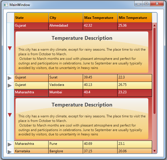
In this article you can learn, how to expand multiple RowDetailTemplate using DatagridRowHeader style,
how to change ScrollBar style in DataGrid.
Background
DataGrid is a powerful control in WPF. it is used to render collection of data in customization grid.
Using the code
DataGridColumnHeader Style
Default Column Header :

Customize Column Header :

Step 1 : Create style of TargetType=DatagridColumnHeader
  <Style TargetType="{x:Type DataGridColumnHeader}">

     <Setter Property="VerticalContentAlignment" Value="Center" />

     <Setter Property="Height" Value="" />

     <Setter Property="SeparatorBrush" Value="DarkRed" />

     <Setter Property="FontWeight" Value="Black" />

     <Setter Property="Template">

         <Setter.Value>

            <!-- Your Template goes here -->

         </Setter.Value>

     </Setter>

 </Style>
Step 2 : Create ControlTemplate of TargetType=DatagridColumnHeader and add within Template.
 <ControlTemplate TargetType="{x:Type DataGridColumnHeader}">

    <Grid>

     <Border x:Name="columnHeaderBorder"

         BorderThickness=""

         Padding="3,0,3,0">

         <Border.BorderBrush>

             <LinearGradientBrush StartPoint="0.5,0" EndPoint="0.5,1">

                 <GradientStop Offset="" Color="#A5A5A5" />

                 <GradientStop Offset="" Color="#4B4B4B" />

             </LinearGradientBrush>

         </Border.BorderBrush>

         <Border.Background>

             <LinearGradientBrush StartPoint="0.5,0" EndPoint="0.5,1">

                 <GradientStop Offset="" Color="#DEB40A" />

                 <GradientStop Offset="" Color="#FF7F00" />

             </LinearGradientBrush>

         </Border.Background>

        <ContentPresenter HorizontalAlignment="{TemplateBinding HorizontalContentAlignment}"

                  VerticalAlignment="{TemplateBinding VerticalContentAlignment}"

                 SnapsToDevicePixels="{TemplateBinding SnapsToDevicePixels}" />

     </Border>

    </Grid>

 </ControlTemplate>
Created border with setting Background color using LinearGradientBrush to set multiple color in linear with specified offset.
LinearGradientBrush has 2 properties
- StartPoint : used to fill color at given point (X and Y).
- EndPoint : gradient color will stop fill to given end point (X and Y)
ContentPresenter holds the Content (Data/Header Text, etc.) of the DataGridColumn.
Step 3: Add VisualState for Change BackgroundColor of DataGridColumn on Mouse Hover.
 <VisualStateManager.VisualStateGroups>

    <VisualStateGroup x:Name="CommonStates">

     <VisualState x:Name="Normal" />

     <VisualState x:Name="MouseOver">

        <Storyboard>

         <ColorAnimationUsingKeyFrames Storyboard.TargetName="columnHeaderBorder"

 Storyboard.TargetProperty="(Panel.Background).(GradientBrush.GradientStops)[1].(GradientStop.Color)">

             <EasingColorKeyFrame KeyTime="" Value="LightYellow" />

         </ColorAnimationUsingKeyFrames>

        </Storyboard>

     </VisualState>

    </VisualStateGroup>

 </VisualStateManager.VisualStateGroups>
VisualStateManager is used for animate control when specific state changed ( Normal, MouseOver, Focus etc.)
Storyboard is a container timeline that provides object and property targeting information for its child animation. In short all animations are placed within storyboard.
Storyboard has Storyboard.TargetName and Storyboard.TargetProperty attached properties. these properties are used for set specified animation to target property of target control.
ColorAnimationUsingKeyFrames is used to animates the value of a Color property along a set of KeyFrames over a specified Duration.
In above code, added ColorAnimationUsingKeyFrames to change datagrid columnHeaderBorder control GardientStop[1] Color from #FF7F00 To LightYellow.
To know more about Animation and Storyboardplease read linked post.
ColorAnimation added within Storyboard to change the color when user mouse over the datagrid column.
DataGridRow Style
Default Row :
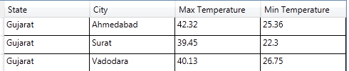
Customize Row :

As shown in above 2 figure, first one is default DataGrid style,
second one is customize style with Row Color, Alternate Row Color and Mouse Over Row Color.
Step 1: Create Style of TargetType=DataGridRow
 <Style TargetType="{x:Type DataGridRow}">

     <Setter Property="Background" Value="LightYellow" />

     <Setter Property="Validation.ErrorTemplate" Value="{x:Null}" />

     <Setter Property="Template">

         <Setter.Value>

             <!-- Row Template goes here -->

         </Setter.Value>

     </Setter>

 </Style>
In above code, created style for DataGridRow and setting Row Background Property to LightYellow.
Step 2: Create Template for DataGridRow
 <Setter Property="Template">

    <Setter.Value>

     <ControlTemplate TargetType="{x:Type DataGridRow}">

        <Border x:Name="DGR_Border"

             BorderBrush="{TemplateBinding BorderBrush}"

             BorderThickness="{TemplateBinding BorderThickness}"

                 SnapsToDevicePixels="True">

         <Border.Background>

             <LinearGradientBrush StartPoint="0.5,0" EndPoint="0.5,1">

                 <GradientStop Offset="" Color="#AAFFFFAA" />

                 <GradientStop Offset="" Color="#AAFFD455" />

             </LinearGradientBrush>

         </Border.Background>

         <SelectiveScrollingGrid>

            <SelectiveScrollingGrid.ColumnDefinitions>

             <ColumnDefinition Width="Auto" />

             <ColumnDefinition Width="*" />

            </SelectiveScrollingGrid.ColumnDefinitions>

            <SelectiveScrollingGrid.RowDefinitions>

             <RowDefinition Height="*" />

             <RowDefinition Height="Auto" />

            </SelectiveScrollingGrid.RowDefinitions>

            <DataGridCellsPresenter Grid.Column=""

             ItemsPanel="{TemplateBinding ItemsPanel}"

             SnapsToDevicePixels="{TemplateBinding SnapsToDevicePixels}" />

            <DataGridDetailsPresenter Grid.Row=""

             Grid.Column=""

             SelectiveScrollingGrid.SelectiveScrollingOrientation="{Binding

  AreRowDetailsFrozen,

   ConverterParameter={x:Static SelectiveScrollingOrientation.Vertical},

               Converter={x:Static DataGrid.RowDetailsScrollingConverter},

               RelativeSource={RelativeSource AncestorType={x:Type DataGrid}}}"

             Visibility="{TemplateBinding DetailsVisibility}" />

            <DataGridRowHeader Grid.RowSpan=""

             SelectiveScrollingGrid.SelectiveScrollingOrientation="Vertical"

             Visibility="{Binding HeadersVisibility,

 ConverterParameter={x:Static DataGridHeadersVisibility.Row},

    Converter={x:Static DataGrid.HeadersVisibilityConverter},

     RelativeSource={RelativeSource AncestorType={x:Type DataGrid}}}" />

         </SelectiveScrollingGrid>

         </Border>

     </ControlTemplate>

    </Setter.Value>

 </Setter>
In above code, DataGridRow ControlTemplate contains DataGridCellPresenter, DataGridDetailsPresenter and DataGridRowHeader.
Keep all these Presenter as it is.
we need to just change the main border background color,
Set the Border (DGR_Border) background color as LinerGradientBrush with combination of Yellow and rad.
so each row is highlighted with this background color in grid.
Step 3: Now, Add VisualState for Setting DataGridRow Background color for Alternate Row, MouseOver Row and Selected Row.
For setting alternate row color, first we need to set AlternationCount property value to 2 in the DataGrid.
  <DataGrid Name="dataGrid1"

     AlternationCount=""   />
Then, Add VisualStates (AlternatingRow, MouseOver and Selected Row)
 <VisualStateManager.VisualStateGroups>

    <VisualStateGroup x:Name="CommonStates">

     <VisualState x:Name="Normal" />

     <VisualState x:Name="Normal_AlternatingRow">

        <Storyboard>

         <ColorAnimationUsingKeyFrames Storyboard.TargetName="DGR_Border"

 Storyboard.TargetProperty="(Panel.Background).(GradientBrush.GradientStops)[0].(GradientStop.Color)">

             <EasingColorKeyFrame KeyTime="" Value="#AAF0C570" />

         </ColorAnimationUsingKeyFrames>

         <ColorAnimationUsingKeyFrames Storyboard.TargetName="DGR_Border"

 Storyboard.TargetProperty="(Panel.Background).(GradientBrush.GradientStops)[1].(GradientStop.Color)">

             <EasingColorKeyFrame KeyTime="" Value="#AAFF7F00" />

         </ColorAnimationUsingKeyFrames>

        </Storyboard>

     </VisualState>

     <VisualState x:Name="Normal_Selected">

        <Storyboard>

         <!-- ColorAnimation here same as Normal_AlternatingRow state -->

        </Storyboard>

     </VisualState>

     <VisualState x:Name="MouseOver">

        <Storyboard>

         <!-- ColorAnimation here same as Normal_AlternatingRow state -->

        </Storyboard>

     </VisualState>

    </VisualStateGroup>

 </VisualStateManager.VisualStateGroups>
To change Alternate row color, visualstatemanager provides Normal_AlternatingRow visual state for datagrid row.
In above code snippet, Three VisualState added
one for AlternateRow, one for MouseOverRow and one for SelectedRow.
All have ColorAnimation, that changes DGR_Border control Background's GradientStop[0] & GradientStop[1] color on specific state change.
DataGridCell Style
I have created this style for hide the default datagrid row selected color (Blue).
Because even setting DataGridRow selected color, it doesn't affect on UI, DataGridCell default style will overwrite background color to its default one.
 <Style TargetType="{x:Type DataGridCell}">

    <Setter Property="Template">

     <Setter.Value>

        <ControlTemplate TargetType="{x:Type DataGridCell}">

         <Border x:Name="border"

             Background="Transparent"

             BorderBrush="Transparent"

             BorderThickness=""

             SnapsToDevicePixels="True">

            <ContentPresenter SnapsToDevicePixels="{TemplateBinding SnapsToDevicePixels}" />

         </Border>

        </ControlTemplate>

     </Setter.Value>

    </Setter>

 </Style>
In above code, i have set child as ConentPresenter wihtin Border control, and Border control is placed in ControlTemplate root.
I sets Border control Background and BorderBrush to Transparent, so DatGridCell background is hided.
Now, selected row style will applied from DataGridRow Selected VisualSate.
DataGrid RowDetail Template

Step 1: Create DataTemplate for RowDetails
 <DataTemplate x:Key="RowDetailTemplate">

    <Grid x:Name="RowDetailGrid"

      Width=""

      Height="Auto"

      Margin="">

     <Border HorizontalAlignment="Left"

         VerticalAlignment="Top"

         CornerRadius="">

         <Border.Background>

             <LinearGradientBrush StartPoint="0,0" EndPoint="0,1">

                 <GradientStop Offset="" Color="WhiteSmoke" />

                 <GradientStop Offset="0.75" Color="#AAFFFFAA" />

                 <GradientStop Offset="" Color="#AAFFD455" />

             </LinearGradientBrush>

         </Border.Background>

         <Grid>

         <Grid.RowDefinitions>

                 <RowDefinition Height="Auto" />

                 <RowDefinition Height="*" />

             </Grid.RowDefinitions>

             <TextBlock Grid.Row=""

                    Margin=""

                    HorizontalAlignment="Center"

                    FontSize=""

                    FontWeight="Black"

                    Text="Temperature Description" />

             <TextBlock Grid.Row=""

                    Margin=""

                    HorizontalAlignment="Left"

                    Text="{Binding Description}"

                    TextWrapping="WrapWithOverflow" />

         </Grid>

     </Border>

     <Border Margin="0 0 8 0" CornerRadius="">

         <Border.Background>

             <RadialGradientBrush Center="0.5,1" GradientOrigin="0,1"

      Opacity="0.3" RadiusX="0.8" RadiusY="0.8">

                 <GradientStop Offset="" Color="#AAFFD455" />

                 <GradientStop Offset="" Color="WhiteSmoke" />

             </RadialGradientBrush>

         </Border.Background>

     </Border>

    </Grid>

 </DataTemplate>
In above code, Two Border controls are placed within grid.
In First Border Backgroud is set with LinearGradientBrush, Data binded for display in RowDetails Panel.
In Second Birder Background is set with RadialGradientBrush to put a light cirlce on top of the Detail Panel as show in above image (Color around Temperature Description Text in RowDetail Panel).
Below image will describes how RadialGradient works (Fill the color).

Step 2: Create ToggleButon style for Show/Hide RowDetail Panel.
  <Style TargetType="ToggleButton">

         <Setter Property="Padding" Value="" />

         <Setter Property="Template">

             <Setter.Value>

                 <ControlTemplate TargetType="ToggleButton">

                     <Grid>

                         <ContentPresenter x:Name="contentPresenter"

                                           Margin="{TemplateBinding Padding}"

                                           HorizontalAlignment="{TemplateBinding HorizontalContentAlignment}"

                                           VerticalAlignment="{TemplateBinding VerticalContentAlignment}"

                                           Content="{TemplateBinding Content}"

                                           ContentTemplate="{TemplateBinding ContentTemplate}" />

                         <Path x:Name="DefaultPath"

                               VerticalAlignment="Top"

                               Data="M0,0 14,7 0,14 Z"

                               Fill="Gray"

                               Stretch="Fill" />

                         <Path x:Name="CheckedPath"

                               VerticalAlignment="Top"

                               Data="M0,0 14,0 7,14 Z"

                               Fill="LightGray"

                               Stretch="Fill"

                               Visibility="Collapsed" />

                     </Grid>

                 </ControlTemplate>

             </Setter.Value>

         </Setter>

     </Style>
Created Two Shapes using path, one for Collapsed RowDetail Panel, one for Expand RowDetail Panel.


Path is used to create shapes or graphic objects like Triange, Hexagone, Ellipse, etc, Path is inherited from Shape class.
you can also draw a picture using path. you can Fill shape with color using Fill property.
Step 3: Add VisualState for Change Path on Checked/Unchecked State.
 <VisualStateManager.VisualStateGroups>

    <VisualStateGroup x:Name="CheckStates">

     <VisualState x:Name="Checked">

        <Storyboard>

         <ObjectAnimationUsingKeyFrames Duration=""

                                   Storyboard.TargetName="DefaultPath"

                                    Storyboard.TargetProperty="Visibility">

             <DiscreteObjectKeyFrame KeyTime="">

                 <DiscreteObjectKeyFrame.Value>

                     <Visibility>Collapsed</Visibility>

                 </DiscreteObjectKeyFrame.Value>

             </DiscreteObjectKeyFrame>

         </ObjectAnimationUsingKeyFrames>

         <ObjectAnimationUsingKeyFrames Duration=""

                                Storyboard.TargetName="CheckedPath"

                                Storyboard.TargetProperty="Visibility">

             <DiscreteObjectKeyFrame KeyTime="">

                 <DiscreteObjectKeyFrame.Value>

                     <Visibility>Visible</Visibility>

                 </DiscreteObjectKeyFrame.Value>

             </DiscreteObjectKeyFrame>

         </ObjectAnimationUsingKeyFrames>

         <ColorAnimationUsingKeyFrames Storyboard.TargetName="CheckedPath"

 Storyboard.TargetProperty="(Path.Fill).(SolidColorBrush.Color)">

             <SplineColorKeyFrame KeyTime="0:0:0.2" Value="#CCAA0000" />

         </ColorAnimationUsingKeyFrames>

        </Storyboard>

     </VisualState>

     <VisualState x:Name="Unchecked" />

    </VisualStateGroup>

 </VisualStateManager.VisualStateGroups>
The ObjectAnimationUsingKeyFrames animation allows you to use object instead of primitive values for your animation keyframes.
The only DiscreteObjectkeyframes keyframe allowed in the ObjectAnimationUsingKeyFrames animation.
In above code, Visiblity of Expand/Collapsed Path is changed using ObjectAnimationUsingKeyFrames on CheckedVisualState.
On Checked State of ToggleButton Expanded Path's color changed using ColorAnimationUsingKeyFrames.
SplineColorKeyFrame is used to animates from the Color value of the previous key frame to its own Value using splined interpolation. it creates a variable transition between values which is determined by the KeySpline property.
Step 4: Set RowDetailTemplate in DataGrid and Add ToggleButton in RowHeaderTemplate.
 <DataGrid Name="dataGrid1"

     Margin=""

     HorizontalAlignment="Left"

     VerticalAlignment="Top"

     AlternationCount=""

     MinRowHeight=""

     RowDetailsTemplate="{StaticResource RowDetailTemplate}" >

     <DataGrid.RowHeaderTemplate>

         <DataTemplate>

             <ToggleButton x:Name="RowHeaderToggleButton"

                 Click="ToggleButton_Click"

                 Cursor="Hand" />

         </DataTemplate>

     </DataGrid.RowHeaderTemplate>

 </DataGrid>
I have set RowDetailTemplate as StaticResource because DataTemplate is created in same page. if DataTemplate or Style is placed in ResourceDictionary then you have to set Style using DynamicResource.
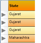
To add ToggleButton in every row header, you need to set RowHeaderTemplate, as shown in above source, ToggleButton control is set in DataTemplate of DataGrid RowHeaderTemplate.
it will show triangle image (created using path) on every row header like :
Now, we need to Expand RowDetail on click of Triangle or we can say on TogggleButton checked
Step 5: Handle ToggleButton click event to Expand/Collapsed RowDetail
First you have to set one property in DataGrid Style for change RowDetail Visibility on DataGridRow selected
    <Style TargetType="{x:Type DataGrid}">

         <Setter Property="RowDetailsVisibilityMode" Value="VisibleWhenSelected" />
This will set RowDetailVisibilityMode to Visible when perticular DataRow is selected.
 private void ToggleButton_Click(object sender, RoutedEventArgs e)

 {

     DependencyObject obj = (DependencyObject)e.OriginalSource;

     while (!(obj is DataGridRow) && obj != null) obj = VisualTreeHelper.GetParent(obj);

     if (obj is DataGridRow)

     {

         if ((obj as DataGridRow).DetailsVisibility == Visibility.Visible)

         {

             (obj as DataGridRow).IsSelected = false;

         }

         else

         {

             (obj as DataGridRow).IsSelected = true;

         }

     }

 }
In ToggleButton click event, first find current datagrid row of selected togglebutton usingVisualTreeHelper.GerParent method.
VisualTreeHelper is used to perform task involving nodes in visual tree.
GetParent method will Returns a DependencyObject value that represents the parent of the visual object.
Now, set the DataGridRow IsSelected property based on ToggleButton checked state and DataGridRow.DetailsVisibility.
Step 6: Add Event Handler - RowDetailsVisibilityChanged to manage ToggleButton checked state
 <DataGrid Name="dataGrid1"

     RowDetailsVisibilityChanged="dataGrid1_RowDetailsVisibilityChanged">
- Create Method in .CS file that will find FrameworkElement by name from Parent DependencyObject.
 public static FrameworkElement GetTemplateChildByName(DependencyObject parent, string name)

 {

     int childnum = VisualTreeHelper.GetChildrenCount(parent);

     for (int i = ; i < childnum; i++)

     {

         var child = VisualTreeHelper.GetChild(parent, i);

         if (child is FrameworkElement && ((FrameworkElement)child).Name == name)

         {

             return child as FrameworkElement;

         }

         else

         {

             var s = GetTemplateChildByName(child, name);

             if (s != null)

                 return s;

         }

     }

     return null;

 }
Above method will iterate through all children available in Parent DependencyObject and return child control by its name. This mehod is recursive method, it will call method itself until child control found or up to last child element whatever is first.
if child element not found, it will iterate till last child element and return null value.
VisualTreeHelper.GetChild method will find first child in Visual Tree.
- Create DataGrid RowDetailsVisibilityChanged Event Handler
 private void dataGrid1_RowDetailsVisibilityChanged(object sender,DataGridRowDetailsEventArgs e)

 {

     DataGridRow row = e.Row as DataGridRow;

     FrameworkElement tb = GetTemplateChildByName(row, "RowHeaderToggleButton");

     if (tb != null)

     {

         if (row.DetailsVisibility == System.Windows.Visibility.Visible)

         {

             (tb as ToggleButton).IsChecked = true;

         }

         else

         {

             (tb as ToggleButton).IsChecked = false;

         }

     }

 }
Above method will find ToggleButton from Selected DataGridRow Template.
If ToggleButton found then, set its IsChecked property to true if DataGridRow DetailsVisibility=Visible
otherwise set IsChecked property to false.
this method is only for the purpose of change the Expand/Collapsed Path(Shape) based on row detail visibility changed.
DataGrid ScrollBar Style

Step 1 : Create Repeat Button Style
 <Style x:Key="ScrollButtons" TargetType="{x:Type RepeatButton}">

     <Setter Property="Template">

         <Setter.Value>

             <ControlTemplate TargetType="{x:Type RepeatButton}">

                 <Border Name="Border" Background="Transparent">

                      <ContentPresenter />

                 </Border>

             </ControlTemplate>

         </Setter.Value>

     </Setter>

 </Style>
Change the Repeat Button Template to remove default style.
Added Border control within ControlTemplate and set Background to Transparent. now placeContentPresenter within Border,
ContentPresenter is used to displays the content of ContentControl.
when you going to customize the template of control do not forget to put ContentPresenter within Template otherwise your data will not display.
Step 2 : Create Required Brushes and Color Resources
 <Color x:Key="BackgroundColor">#AE2F33</Color>

 <Color x:Key="StandardColor">#</Color>

 <Color x:Key="HoverColor">#AAC64D45</Color>

 <Color x:Key="PressedColor">#AA0000</Color>

 <Color x:Key="DialogBackgroundColor">#FF666666</Color>

 <Color x:Key="ScollBarBackgroundStart">#77C64D45</Color>

 <Color x:Key="ScollBarBackgroundEnd">#99C64D45</Color>

 <SolidColorBrush x:Key="StandardBrush" Color="{StaticResource StandardColor}" />

 <SolidColorBrush x:Key="HoverBrush" Color="{StaticResource HoverColor}" />

 <SolidColorBrush x:Key="BackgroundBrush" Color="{StaticResource BackgroundColor}" />

 <LinearGradientBrush x:Key="ScollBarBackgroundBrush" StartPoint="0,0" EndPoint="1,0">

     <LinearGradientBrush.GradientStops>

         <GradientStop Offset="" Color="{StaticResource ScollBarBackgroundStart}" />

         <GradientStop Offset="" Color="{StaticResource ScollBarBackgroundEnd}" />

     </LinearGradientBrush.GradientStops>

 </LinearGradientBrush>
WPF provides following different types of brushes :
- SolidColorBrush : will paints an area with solid color.
- LinearGradientBrush : will paints an area with linear gradient .
- RadialGradientBrush : will Paints an area with a radial gradient. A focal point defines the beginning of the gradient, and a circle defines the end point of the gradient.
- ImageBrush : will paint an area with image.
- DrawingBrush : Paints an area with a System.Windows.Media.Drawing, which can include shapes,text, video, images, or other drawings.
Brushes are used to Fill/Paint objects/FrameworkElements with Graphics/Colors.
I have created brushes for Default, Hover and Pressed state of ScrollBars.
Step 3: Create ScrollBar Thumb Style
 <Style x:Key="ScrollThumbs" TargetType="{x:Type Thumb}">

     <Setter Property="Background" Value="{StaticResource BackgroundBrush}" />

     <Setter Property="Template">

         <Setter.Value>

            <ControlTemplate TargetType="{x:Type Thumb}">

                 <Grid Name="Grid">

                     <Rectangle Name="Rectangle1"

                          Width=""

                          Height="Auto"

                          HorizontalAlignment="Stretch"

                          VerticalAlignment="Stretch"

                          Fill="{TemplateBinding Background}"

                          RadiusX=""

                          RadiusY="" />

                 </Grid>

            </ControlTemplate>

         </Setter.Value>

     </Setter>

 </Style>
Created style of TargetType=Thumb, it will apply Thumb style in scrollbar by setting Style to StaticResource/DynamiceResource.
Added Rectangle control within ControlTemplate and setting Fill property to {TemplateBinding Background} , this TemplateBinding will bind color from Control Background, so it will set Rectangle Fill color to BackgroundBrush ( <Setter Property="Background" Value="{StaticResource BackgroundBrush}" />)
Step 4: Create ScrollBar Style
 <Style x:Key="MyScrollBar" TargetType="{x:Type ScrollBar}">

    <Setter Property="Background" Value="{DynamicResource ScollBarBackgroundBrush}" />

    <Setter Property="Width" Value="" />

    <Setter Property="Template">

     <Setter.Value>

        <ControlTemplate TargetType="{x:Type ScrollBar}">

           <Grid x:Name="GridRoot"

            Width="{DynamicResource {x:Static SystemParameters.VerticalScrollBarWidth}}"

             Background="{TemplateBinding Background}">

         <Grid.RowDefinitions>

             <RowDefinition MaxHeight="" />

             <RowDefinition Height="0.00001*" />

             <RowDefinition MaxHeight="" />

         </Grid.RowDefinitions>

         <RepeatButton x:Name="DecreaseRepeat"

             Command="ScrollBar.LineUpCommand"

             Foreground="{StaticResource StandardBrush}"

             Style="{DynamicResource ScrollButtons}">

                 <Path x:Name="DecreaseArrow"

                     HorizontalAlignment="Center"

                     VerticalAlignment="Center"

                     Data="F1 M 3.5,0L 0,7L 7,7L 3.5,0 Z "

                     Fill="{StaticResource StandardBrush}" />

         </RepeatButton>

         <Track x:Name="PART_Track"

             Grid.Row=""

             Focusable="false"

             IsDirectionReversed="true">

             <Track.Thumb>

                 <Thumb x:Name="Thumb"

                     Background="{DynamicResource ButtonDefaultBrush}"

                     Style="{DynamicResource ScrollThumbs}" />

             </Track.Thumb>

         </Track>

         <RepeatButton x:Name="IncreaseRepeat"

             Grid.Row=""

             Command="ScrollBar.LineDownCommand"

             Foreground="{DynamicResource StandardBrush}"

             Style="{DynamicResource ScrollButtons}">

                 <Path x:Name="IncreaseArrow"

                     HorizontalAlignment="Center"

                     VerticalAlignment="Center"

                     Data="F1 M 3.5,7L 7,0L 0,0L 3.5,7 Z "

                     Fill="{StaticResource StandardBrush}" />

         </RepeatButton>

            </Grid>

        </ControlTemplate>

     </Setter.Value>

    </Setter>

 </Style>
In ScollBar ControlTemplate, Two Repeat Buttons (one for Top, one for Bottom) and Thumb is added.
For Top RepeatButton you have to set Command to ScrollBar.LineUpCommand and set Style={DynamicResource ScrollButtons} previously created in ResourceDictionary.
Create Shape for Top Button using Path and Put wihtin RepeatButton.
Same way, for Bottom RepeatButton you have to set Command to ScrollBar.LineDownCommand as set same style as top button.
Create Track and add Thumb to Track.Thumb. Set Previously created Thumb style to Track.Thumb.
Track Represents a control primitive that handles the positioning and sizing of a System.Windows.Controls.Primitives. Thumb control used to set a Primitives.Track.Value
Step 5 : Add Trigger for RepeatButton and Thumb to change color on MouseOver and Pressed Property changed.
 <ControlTemplate.Triggers>

     <Trigger SourceName="IncreaseRepeat" Property="IsMouseOver" Value="true">

         <Setter TargetName="IncreaseArrow" Property="Fill"

                         Value="{StaticResource HoverBrush}" />

         </Trigger>

     <Trigger SourceName="Thumb" Property="IsMouseOver" Value="true">

         <Setter TargetName="Thumb" Property="Background"

                          Value="{StaticResource HoverBrush}" />

     </Trigger>

     <Trigger SourceName="Thumb" Property="IsDragging" Value="true">

         <Setter TargetName="Thumb" Property="Background"

                         Value="{StaticResource StandardBrush}" />

     </Trigger>

 </ControlTemplate.Triggers> <span style="font-size: 9pt;"> </span>
In above example, i have created MouseOver trigger for RepeatButton to change Fill porperty.
For Thumb 2 trigger is created, one for MouseOver and one for Dragging to change Thumb Background Property.
you can create trigger on other property also (like : Press, Enable etc.)
Step 6 : Last, Set ScrollBar style in DataGrid Tempalate.
 <ControlTemplate TargetType="{x:Type DataGrid}">

    <ScrollViewer x:Name="DG_ScrollViewer" Focusable="false">

     <ScrollViewer.Template>

         <ControlTemplate TargetType="{x:Type ScrollViewer}">

             <Grid>

              <!--your DataGridColumnHeadersPresenter,ScrollContentPresenter -->                 <ScrollContentPresenter x:Name="PART_ScrollContentPresenter"

                    Grid.Row=""

                    Grid.ColumnSpan=""

                    CanContentScroll="{TemplateBinding CanContentScroll}" />

                 <ScrollBar x:Name="PART_VerticalScrollBar"

                     Maximum="{TemplateBinding ScrollableHeight}"

                     Orientation="Vertical"

                     Style="{DynamicResource MyScrollBar}"

                     ViewportSize="{TemplateBinding ViewportHeight}" />

                                <ScrollBar x:Name="PART_HorizontalScrollBar"                                            Maximum="{TemplateBinding ScrollableWidth}"

                                        Orientation="Horizontal"

                                        ViewportSize="{TemplateBinding ViewportWidth}" />

                 </ControlTemplate>

          <ScrollViewer.Template>

          <ItemPresenter />

    </ScrollViewer>

 </ControlTemplate >
Two ScrollBars added within ScrollViewer in DataGrid ControlTemplate.
one for vertical and one for horizontal scroll. set Style to {DynamicResource MyScrollBar} as previously created scrollbar style.
In this post I tried to include all points for fully customize DataGrid style to change the appearance and look of the control.
Points of Interest
During Development question arise in mind that how to show mutliple RowDetails Panels and Show/Hide RowDetail Panel when we needed.
for that, I have Crated ToggleButton and added in RowHeaderTemplate of DataGrid, on Click on ToggleButton show the RowDetails and again on Click Hide the Detail Panel.
I have implemented change related to Show/Hide RowDetail Panel in this post also. that is the new thing in DataGrid.
History
License
This article, along with any associated source code and files, is licensed under The Code Project Open License (CPOL)
Share

About the Author

India

2 + year of Excperience in .Net Development with C# and SQL Server 2005/2008.
3 + years of Experience in WPF/Silverlight.
Current area of Development in Mono for Android (Xamarin), Silverlight/ WPF and Windows Phone 7 Application.
Follow him on : http://hirenkhirsaria.blogspot.com/
WPF DataGrid Custommization using Style and Template的更多相关文章
- WPF Style和Template
WPF中的Style类似于Web应用程序中的CSS,它是控件的一个属性,属于资源的一种. ControlTemplate和DataTemplate区别: ControlTemplate用于改变控件原来 ...
- wpf中在style的template寻找ControlTemplate和DataTemplate的控件
一.WPF中的两棵树 WPF中每个控件的Template都是由ControlTemplate构成,ControlTemplate包含了构成该控件的各种子控件,这些子控件就构成了VisualTree:而 ...
- WPF DataGrid常用属性记录
WPF DataGrid常用属性记录 组件常用方法: BeginEdit:使DataGrid进入编辑状态. CancelEdit:取消DataGrid的编辑状态. CollapseRowGroup:闭 ...
- xceed wpf datagrid
<!--*********************************************************************************** Extended ...
- WPF DataGrid自定义样式
微软的WPF DataGrid中有很多的属性和样式,你可以调整,以寻找合适的(如果你是一名设计师).下面,找到我的小抄造型的网格.它不是100%全面,但它可以让你走得很远,有一些非常有用的技巧和陷阱. ...
- WPF DataGrid 样式设置
隔行换色,鼠标单击,悬浮样式都有,其具体效果如图 1 所示. 图 1 WPF DataGrid 样式设置效果图 其中: 界面设计代码下所示 ? + 查看代码 1 2 3 4 5 6 7 8 9 10 ...
- C# WPF DataGrid 分组(Group)
原文:C# WPF DataGrid 分组(Group) 效果如图,每个列的名字可以自定义.我随便用了”File”和”Attachment Name”. 在Window的Resources里面设置S ...
- WPF DataGrid 样式分享
原文:WPF DataGrid 样式分享 隔行换色,鼠标单击,悬浮样式都有 先看效果: 代码: <DataGrid AutoGenerateColumns="False" N ...
- C# WPF DataGrid 隔行变色及内容居中对齐
C# WPF DataGrid 隔行变色及内容居中对齐. dqzww NET学习0 先看效果: 前台XAML代码: <!--引入样式文件--> <Window.Resourc ...
随机推荐
- 【★】KMP算法完整教程
KMP算法完整教程 全称: Knuth_Morris_Pratt Algorithm(KMP算法) 类型: ...
- 转:【Java集合源码剖析】HashMap源码剖析
转载请注明出处:http://blog.csdn.net/ns_code/article/details/36034955 您好,我正在参加CSDN博文大赛,如果您喜欢我的文章,希望您能帮我投一票 ...
- SNS团队第七次站立会议(2017.04.28)
一.当天站立式会议照片 本次会议主要内容:汇报工作进度,根据完成情况调整进度 二.每个人的工作 成员 今天已完成的工作 明天计划完成的工作 罗于婕 导入相关词库数据 研究如何存取语音.图片文件 龚晓 ...
- sudoku--SE第二次作业
git传送门 编译环境: windows10.vs2017 所用语言: c++ 首先作为一个晚上闭眼的玩家,我先来讲一下我的心路历程: 最开始接到作业的时候心里是拒绝的,刚出了一趟小远门就这样,就很难 ...
- 201521123023《Java程序设计》第8周学习总结
1. 本周学习总结 1.1 以你喜欢的方式(思维导图或其他)归纳总结集合与泛型相关内容. 1.2 选做:收集你认为有用的代码片段 2. 书面作业 本次作业题集集合 1.List中指定元素的删除(题目4 ...
- java课程设计团队博客
java课程设计 本组主题:Calculator(简易计算器) 功能要求:基本实现计算器的功能,可运行加.减.乘.除.求倒数.求平方根.求百分号运算.正负数运算等 一.团队介绍 团队名称:熬夜做不出随 ...
- 201521123029《Java程序设计》第十二周学习总结
1. 本周学习总结 1.1 以你喜欢的方式(思维导图或其他)归纳总结多流与文件相关内容. 2. 书面作业 将Student对象(属性:int id, String name,int age,doubl ...
- 201521123108《Java程序设计》第14周学习总结
1. 本周学习总结 2. 书面作业 Q1. MySQL数据库基本操作 建立数据库,将自己的姓名.学号作为一条记录插入.(截图,需出现自己的学号.姓名) 答: 在自己建立的数据库上执行常见SQL语句(截 ...
- C#调用AForge实现摄像头录像
1: 首先下载库文件>> 也可以去官网寻找>> 下载本教程全代码>> 输出为MP4需要用到ffmpeg相关的文件,我打包的库已经带了,去官网找的库可以在这个目录找到 ...
- bind9的一些配置
/etc/bind/named.conf.options:options { listen-on port 53 { any; }; // 监听在主机的53端口上.any代表监听所有的主机 direc ...