【读书笔记《Android游戏编程之从零开始》】5.Android 游戏开发常用的系统控件(ProgressBar、Seekbar)
3.7 ProgressBar
ProgressBar类官方文档地址:http://developer.android.com/reference/android/widget/ProgressBar.html
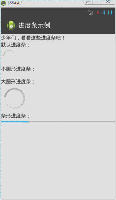
在Android应用开发中,ProgressBar(运行进度条)是比较常用到的组件,例如下载进度、安装程序进度、加载资源进度显示等。在Android中提供了两种样式来分别表示在不同状态下显示的进度条,下面来实现这两种样式。
默认进度条是圆形,通过style属性来指定系统进度条的大小:
style="?android:attr/progressBarStyleSmall",小圆形进度条
style="?android:attr/progressBarStyleLarge",大圆形进度条
如果需要将进度条显示为长条形,那么style必须设定为这种类型:
style="?android:attr/progressBarStyleHorizontal",长条形进度条
针对长条形进度条,还有几个常用属性:
android:max,设置进度条最大进度值
android:progress,设置进度条出事进度值。
android:secondaryProgress,设置底层(浅色)进度值
圆形显示进度条默认是动态,但是长条进度条却是静态的,那么修改源代码MainActivity实现长条进度条为动态显示:
ProgressBar类中常用函数如下所示:
getProgress();获取当前进度值;
setProgress();设置进度值;
getSecondaryProgress();获取底层进度值
setSecondaryProgress();设置底层进度值
getMax();获取当前最大进度值
在线程循环中对进度条的最大进度值与当前进度值进行判断处理,然后不断设置进度值进而达到动态进度值越来越大,或越来越小的动态效果。
<?xml version="1.0" encoding="utf-8"?>

<LinearLayout xmlns:android="http://schemas.android.com/apk/res/android"

    android:layout_width="match_parent"

    android:layout_height="match_parent"

    android:orientation="vertical" >

    <TextView

        android:layout_width="match_parent"

        android:layout_height="wrap_content"

        android:text="@string/txt_ProgressBar" />

    <TextView

        android:layout_width="wrap_content"

        android:layout_height="wrap_content"

        android:text="默认进度条:" />

    <ProgressBar

        android:id="@+id/pb1"

        android:layout_width="wrap_content"

        android:layout_height="wrap_content" />

    <TextView

        android:layout_width="wrap_content"

        android:layout_height="wrap_content"

        android:text="小圆形进度条:" />

    <ProgressBar

        android:id="@+id/pb2"

        style="?android:attr/progressBarStyleSmall"

        android:layout_width="wrap_content"

        android:layout_height="wrap_content" />

    <TextView

        android:layout_width="wrap_content"

        android:layout_height="wrap_content"

        android:text="大圆形进度条:" />

    <ProgressBar

        android:id="@+id/pb3"

        style="?android:attr/progressBarStyleLarge"

        android:layout_width="wrap_content"

        android:layout_height="wrap_content" />

    <TextView

        android:layout_width="wrap_content"

        android:layout_height="wrap_content"

        android:text="条形进度条:" />

    <ProgressBar

        android:id="@+id/pb4"

        style="?android:attr/progressBarStyleHorizontal"

        android:layout_width="match_parent"

        android:layout_height="wrap_content"

        android:max="100"

        android:progress="50"

        android:secondaryProgress="70" />

</LinearLayout>
import android.app.Activity;

import android.os.Bundle;

import android.widget.ProgressBar;

public class MainActivity extends Activity implements Runnable {

    private Thread th; // 声明一个线程

    private ProgressBar pb;// 声明一个进度条对象

    private Boolean stateChage = false;// 标识进度值的最大最小的状态

    @Override

    protected void onCreate(Bundle savedInstanceState) {

        super.onCreate(savedInstanceState);

        setContentView(R.layout.activity_main);

        // 实例化进度条对象

        pb = (ProgressBar) findViewById(R.id.pb4);

        th = new Thread(this);// 实例化线程对象

        th.start();// 启动线程

    }

    @Override

    public void run() {// 实现Runnable接口抽象函数

        while (true) {

            int current = pb.getProgress();// 得到当前的进度值

            int currentMax = pb.getMax();// 得到进度条的最大进度值

            // int secCurrent = pb.getSecondaryProgress();// 得到底层当前进度值

            // 一下代码实现进度值越大,越来越小的一个动态效果

            if (stateChage == false) {

                if (current >= currentMax) {

                    stateChage = true;

                } else {

                    // 设置进度值

                    pb.setProgress(current + 1);

                    // 设置底层进度值

                    pb.setSecondaryProgress(current + 1);

                }

            } else {

                if (current <= 0) {

                    stateChage = false;

                } else {

                    pb.setProgress(current - 1);

                }

            }

            try {

                Thread.sleep(50);

            } catch (InterruptedException e) {

                e.printStackTrace();

            }

        }

    }

}
自定义圆形进度条样式的方法:
方法1:通过一张图片填充android:indeterminateDrawable

准备图片: progress_load.png

在drawable下新建image_progress_01.xml文件
<?xml version="1.0" encoding="utf-8"?>

<rotate xmlns:android="http://schemas.android.com/apk/res/android"

    android:drawable="@drawable/progress_load"

    android:fromDegrees="0"

    android:pivotX="50%"

    android:pivotY="50%"

    android:toDegrees="360" />
在 \value\style.xml中定义myProgressBarStyle
<style name="myProgressBarStyle" >

  <item name="android:indeterminateDrawable">@drawable/image_progress_01</item>

  <item name="android:minWidth">100dip</item>

  <item name="android:maxWidth">100dip</item>

  <item name="android:minHeight">100dip</item>

  <item name="android:maxHeight">100dip</item>

</style>
最后在ProgressBar中使用我们自己定义的style,android:indeterminateDuration="700"指定图片旋转的速度,这样我们就可以根据自己的需要来定义ProgressBar的样式。
 <ProgressBar

        android:id="@+id/pb1"

        style="@style/myProgressBarStyle"

        android:layout_width="wrap_content"

        android:layout_height="wrap_content"

        android:indeterminateDuration="700" />
方法2:定义一个动画来实现
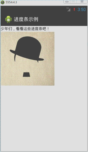
准备图片:photo1.jpg、photo2.jpg、photo3.jpg、photo4.jpg、photo5.jpg

定义res/anim/image_progress.xml如下:
<?xml version="1.0" encoding="utf-8"?>

<animation-list xmlns:android="http://schemas.android.com/apk/res/android" android:oneshot="false">

     <item android:duration="1000" android:drawable="@drawable/photo1" />

  <item android:duration="1000" android:drawable="@drawable/photo2" />

  <item android:duration="1000" android:drawable="@drawable/photo3" />

  <item android:duration="1000" android:drawable="@drawable/photo4" />

  <item android:duration="1000" android:drawable="@drawable/photo5" />

</animation-list>
在我们定义的style中引入<item name="android:indeterminateDrawable">@anim/image_progress.xml</item>
<style name="myProgressBarStyle2" >

  <item name="android:indeterminateDrawable">@anim/image_progress</item>

  <item name="android:minWidth">200dip</item>

  <item name="android:maxWidth">200dip</item>

  <item name="android:minHeight">200dip</item>

  <item name="android:maxHeight">200dip</item>

</style>
最后在ProgressBar中使用我们自己定义的style
style="@style/myProgressBarStyle2"
方法3:自定义颜色来实现
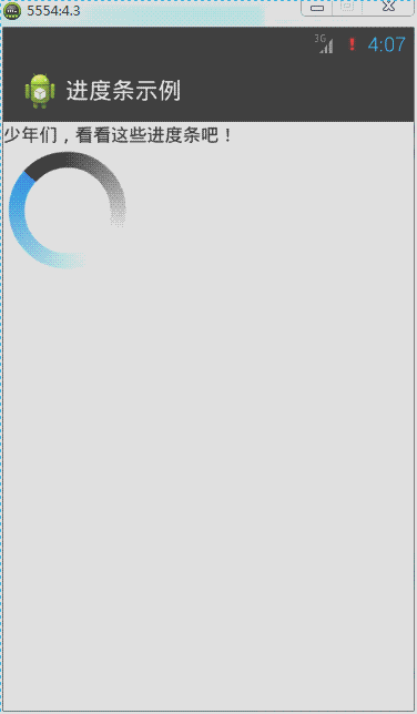
定义res/drawable/image_progress_02.xml如下:
<?xml version="1.0" encoding="utf-8"?>

<rotate xmlns:android="http://schemas.android.com/apk/res/android"

    android:fromDegrees="0"

    android:pivotX="50%"

    android:pivotY="50%"

    android:toDegrees="360" >

    <shape

        android:innerRadiusRatio="3"

        android:shape="ring"

        android:thicknessRatio="8"

        android:useLevel="false" >

        <gradient

            android:centerColor="#FFFFFF"

            android:centerY="0.50"

            android:endColor="#1E90FF"

            android:startColor="#000000"

            android:type="sweep"

            android:useLevel="false" />

    </shape>

</rotate>
在我们定义的style中引入<item name="android:indeterminateDrawable">@drawable/image_progress_02</item>
<style name="myProgressBarStyle3" >

  <item name="android:indeterminateDrawable">@drawable/image_progress_02</item>

  <item name="android:minWidth">100dip</item>

  <item name="android:maxWidth">100dip</item>

  <item name="android:minHeight">100dip</item>

  <item name="android:maxHeight">100dip</item>

</style>
最后在ProgressBar中使用我们自己定义的style
style="@style/myProgressBarStyle3"
自定义长条形进度条样式:

原理:在XML文件中分别定义进度条背景、第一进度颜色、第二进度颜色,然后在ProgressBar的android:progressDrawable属性应用即可。
先在drawable下建立progressbar_style.xml文件,内容如下:
<?xml version="1.0" encoding="utf-8"?>

<layer-list xmlns:android="http://schemas.android.com/apk/res/android" >

     <item android:id="@android:id/background">

        <shape>

            <corners android:radius="5.0dip" />

            <gradient android:startColor="#656666" android:endColor="#dbdedf" android:angle="270.0" android:centerY="0.75" android:centerColor="#bbbbbc" />

        </shape>

    </item>

    <item android:id="@android:id/secondaryProgress">

        <clip>

            <shape>

                <corners android:radius="8.0dip" />

                <gradient android:startColor="#e71a5e" android:endColor="#6c213a" android:angle="90.0" android:centerY="0.75" android:centerColor="#ac6079" />

            </shape>

        </clip>

    </item>

    <item android:id="@android:id/progress">

        <clip>

            <shape>

                <corners android:radius="8.0dip" />

                <gradient android:startColor="#464647" android:endColor="#2d9ae7" android:angle="270.0" />

            </shape>

        </clip>

    </item>

</layer-list>
分别定义背景,第一进度颜色,第二进度颜色gradient定义的是渐变,corners定义的是圆角布局中:
<ProgressBar

        android:id="@+id/pb1"

        style="?android:attr/progressBarStyleHorizontal"

        android:layout_width="match_parent"

        android:layout_height="wrap_content"

        android:max="100"

        android:progress="50"

        android:progressDrawable="@drawable/image_progress_03"

        android:secondaryProgress="70" />
MainActivity.java文件:
import android.app.Activity;

import android.os.Bundle;

import android.widget.ProgressBar;

public class MainActivity extends Activity implements Runnable {

    private Thread th; // 声明一个线程

    private ProgressBar pb;// 声明一个进度条对象

    private Boolean stateChage = false;// 标识进度值的最大最小的状态

    @Override

    protected void onCreate(Bundle savedInstanceState) {

        super.onCreate(savedInstanceState);

        setContentView(R.layout.activity_main);

        // 实例化进度条对象

        pb = (ProgressBar) findViewById(R.id.pb1);

        th = new Thread(this);// 实例化线程对象

        th.start();// 启动线程

    }

    @Override

    public void run() {// 实现Runnable接口抽象函数

        while (true) {

            int current = pb.getProgress();// 得到当前的进度值

            int currentMax = pb.getMax();// 得到进度条的最大进度值

            // int secCurrent = pb.getSecondaryProgress();// 得到底层当前进度值

            // 一下代码实现进度值越大,越来越小的一个动态效果

            if (stateChage == false) {

                if (current >= currentMax) {

                    stateChage = true;

                } else {

                    // 设置进度值

                    pb.setProgress(current + 1);

                    // 设置底层进度值

                    pb.setSecondaryProgress(current + 1);

                }

            } else {

                current =0;

                pb.setProgress(current);

                stateChage = false;

            }

            try {

                Thread.sleep(50);

            } catch (InterruptedException e) {

                e.printStackTrace();

            }

        }

    }

}
3.8 Seekbar
SeekBar类官方文档地址:http://developer.android.com/reference/android/widget/SeekBar.html
SeekBar(拖动条)的外观类似长条进度条。Android手机上最常见到拖动条的地方就是在播放音乐的时候,当用户在拖动条上任意拖动可以调整音乐播放的时间段;调整铃声音量大小界面也是利用拖动条与用户进行交互。下面来学习如何定义和监听拖动条事件。
对拖动条进行监听的是setOnSeekBarChangeListener这个接口,这里使用的内部类实现绑定监听,然后重写接口的三个函数:
onStopTrackingTouch:当用户对拖动条的拖动动作完成时触发;
onStartTrackingTouch:当用户对拖动条进行拖动时触发;
onProgressChanged:当拖动条的值发生改变时触发。
其实拖动条类似长条提示进度条,也拥有setMax()、setProgress()、setSecondaryProgress()这些函数。
简单示例如下:
 .
.
<?xml version="1.0" encoding="utf-8"?>

<LinearLayout xmlns:android="http://schemas.android.com/apk/res/android"

    android:layout_width="match_parent"

    android:layout_height="match_parent"

    android:orientation="vertical" >

    <TextView

        android:id="@+id/tv"

        android:layout_width="match_parent"

        android:layout_height="wrap_content"

        android:text="@string/txt_SeekBar" />

    <SeekBar

        android:id="@+id/skb"

        android:layout_width="match_parent"

        android:layout_height="wrap_content" />

</LinearLayout>
import android.app.Activity;

import android.os.Bundle;

import android.widget.SeekBar;

import android.widget.SeekBar.OnSeekBarChangeListener;

import android.widget.TextView;

public class MainActivity extends Activity {

    private SeekBar skb;

    private TextView tv;

    @Override

    protected void onCreate(Bundle savedInstanceState) {

        super.onCreate(savedInstanceState);

        setContentView(R.layout.activity_main);

        skb = (SeekBar) findViewById(R.id.skb);

        tv = (TextView) findViewById(R.id.tv);

        skb.setOnSeekBarChangeListener(new OnSeekBarChangeListener() {

            @Override

            public void onStopTrackingTouch(SeekBar seekBar) {

                tv.setText("“拖动条”完成拖动。");

            }

            @Override

            public void onStartTrackingTouch(SeekBar seekBar) {

                tv.setText("“拖动条”拖动中。。。");

            }

            @Override

            public void onProgressChanged(SeekBar seekBar, int progress,

                    boolean fromUser) {

                tv.setText("当前“拖动条”的值为" + progress);

            }

        });

    }

}
自定义拖动条样式:
SeekBar的系统有提供一种样式如下:
style="@android:style/Widget.SeekBar"

在android的源码目录\platforms\android-18\data\res\values\styles.xml下,我找到了Widget.SeekBar的代码
<style name="Widget.SeekBar">

        <item name="android:indeterminateOnly">false</item>

        <item name="android:progressDrawable">@android:drawable/progress_horizontal</item>

        <item name="android:indeterminateDrawable">@android:drawable/progress_horizontal</item>

        <item name="android:minHeight">20dip</item>

        <item name="android:maxHeight">20dip</item>

        <item name="android:thumb">@android:drawable/seek_thumb</item>

        <item name="android:thumbOffset">8dip</item>

        <item name="android:focusable">true</item>

        <item name="android:mirrorForRtl">true</item>

    </style>
这里最重要的几个属性:
        <!-- 背景,进度条,次进度条的设置。 -->

        <item name="android:progressDrawable">@android:drawable/progress_horizontal</item>

        <!-- 背景,进度条,次进度条的设置【进度不确定】。 -->

        <item name="android:indeterminateDrawable">@android:drawable/progress_horizontal</item>

        <!-- 拖拽的图标。 -->

        <item name="android:thumb">@android:drawable/seek_thumb</item>
上面有indeterminate这个概念,是指进度不确定。这种情形下,进度会来回快闪。Seekbar默认样式是进度确定的,拖拽到具体位置就停止。图片资源progress_horizontal相当关键,它不是单一的图片。
在\platforms\android-18\data\res\drawable下,有progress_horizontal.xml:
<?xml version="1.0" encoding="utf-8"?>

<layer-list xmlns:android="http://schemas.android.com/apk/res/android" >

    <item android:id="@android:id/background">

        <shape>

            <corners android:radius="5dip" />

            <gradient

                android:angle="270"

                android:centerColor="#ff5a5d5a"

                android:centerY="0.75"

                android:endColor="#ff747674"

                android:startColor="#ff9d9e9d" />

        </shape>

    </item>

    <item android:id="@android:id/secondaryProgress">

        <clip>

            <shape>

                <corners android:radius="5dip" />

                <gradient

                    android:angle="270"

                    android:centerColor="#80ffb600"

                    android:centerY="0.75"

                    android:endColor="#a0ffcb00"

                    android:startColor="#80ffd300" />

            </shape>

        </clip>

    </item>

    <item android:id="@android:id/progress">

        <clip>

            <shape>

                <corners android:radius="5dip" />

                <gradient

                    android:angle="270"

                    android:centerColor="#ffffb600"

                    android:centerY="0.75"

                    android:endColor="#ffffcb00"

                    android:startColor="#ffffd300" />

            </shape>

        </clip>

    </item>

</layer-list>
上面其实就是三张自定义色彩渐变的图片。
我们可以依葫芦画瓢定义自己的三张图片(背景图有点淡,gif截图看不清楚,不过大家知道是那样就行了):

my_seekbar.xml
<?xml version="1.0" encoding="utf-8"?>

<layer-list xmlns:android="http://schemas.android.com/apk/res/android" >

    <!-- 背景样式 -->

    <item

        android:id="@android:id/background"

        android:drawable="@drawable/my_seekbar_no">

    </item>

    <!-- 次拖动条样式 -->

    <item android:id="@android:id/secondaryProgress">

        <scale

            android:drawable="@drawable/my_seekbar_back"

            android:scaleWidth="100%" />

    </item>

    <!-- 拖动后的样式 -->

    <item android:id="@android:id/progress">

        <scale

            android:drawable="@drawable/my_seekbar_sh"

            android:scaleWidth="100%" />

    </item>

</layer-list>
<style name="mySeekBar">

        <item name="android:minHeight">20dip</item>

        <item name="android:maxHeight">20dip</item>

        <item name="android:progressDrawable">@drawable/my_seekbar</item>

        <item name="android:indeterminateDrawable">@drawable/my_seekbar</item>

        <item name="android:thumb">@drawable/ic_launcher</item>

        <item name="android:thumbOffset">8dip</item>

    </style>
<SeekBar

        android:id="@+id/skb"

         style="@style/mySeekBar"

        android:layout_width="match_parent"

        android:layout_height="wrap_content"

        android:secondaryProgress="50"

        android:max="100"

        android:progress="10" />
拖拽的小图标是由thumb属性决定的。只要搞清楚以上的东东,SeekBar做成什么样就看自己了。
【读书笔记《Android游戏编程之从零开始》】5.Android 游戏开发常用的系统控件(ProgressBar、Seekbar)的更多相关文章
- 【读书笔记《Android游戏编程之从零开始》】6.Android 游戏开发常用的系统控件(TabHost、ListView)
3.9 TabSpec与TabHost TabHost类官方文档地址:http://developer.android.com/reference/android/widget/TabHost.htm ...
- 【读书笔记《Android游戏编程之从零开始》】4.Android 游戏开发常用的系统控件(EditText、CheckBox、Radiobutton)
3.4 EditText EditText类官方文档地址:http://developer.android.com/reference/android/widget/EditText.html Edi ...
- 【读书笔记《Android游戏编程之从零开始》】3.Android 游戏开发常用的系统控件(Button、Layout、ImageButton)
3.1 Button Button这控件不用多说,就是一个按钮,主要是点击后进行相应事件的响应. 给组件添加ID属性:定义格式为 android:id="@+id/name",这里 ...
- 【读书笔记《Android游戏编程之从零开始》】8.Android 游戏开发常用的系统控件(系统控件常见问题)
Android 中常用的计量单位Android有时候需要一些计量单位,比如在布局Layout文件中可能需要指定具体单位等.常用的计量单位有:px.dip(dp).sp,以及一些不常用的pt.in.mm ...
- 【读书笔记《Android游戏编程之从零开始》】7.Android 游戏开发常用的系统控件(Dialog)
在Android应用开发中,Dialog(对话框)创建简单且易于管理因而经常用到,对话框默认样式类似创建样式的Activity.首先介绍android.app.AlertDialog下的Builder ...
- android学习日记03--常用控件progressbar/seekbar
常用控件 5.progressbar 进度条,比较常用的组件,在某些操作的进度中的可视指示器,为用户呈现操作的进度,还它有一个次要的进度条,用来显示中间进度,如在流媒体播放的缓冲区的进度.一个进度条也 ...
- Windows游戏编程之从零开始d
Windows游戏编程之从零开始d I'm back~~恩,几个月不见,大家还好吗? 这段时间真的好多童鞋在博客里留言说或者发邮件说浅墨你回来继续更新博客吧. woxiangnifrr童鞋说每天都在来 ...
- Java并发编程的艺术读书笔记(2)-并发编程模型
title: Java并发编程的艺术读书笔记(2)-并发编程模型 date: 2017-05-05 23:37:20 tags: ['多线程','并发'] categories: 读书笔记 --- 1 ...
- Java并发编程的艺术读书笔记(1)-并发编程的挑战
title: Java并发编程的艺术读书笔记(1)-并发编程的挑战 date: 2017-05-03 23:28:45 tags: ['多线程','并发'] categories: 读书笔记 --- ...
随机推荐
- php实现添加图片水印
实际运行时需要开启php 的gd2功能,运行环境php4.0以上(demo中的路径改为实际路径) <?php/*打开图片*/ //1.配置图片路径 $src="image/61.jpg ...
- svn的管理与维护要点—纯手工编写
由于在公司要维护阿里云的linux服务器,我们的svn服务器就安在阿里云上面.所以经常会涉及到svn的维护操作.离职的时候编写交接文档,刚好有充足的时间写一篇说明介绍,此说明纯原创,不是从网上复制,手 ...
- oschina github使用指南
我的github仓库开通,https://git.oschina.net/zhjh256. 1.打开https://git.oschina.net/signup,没有账号的话,则新创建账号. 2.从h ...
- Selenium&EmguCV实现爬虫图片识别
概述 爬虫需要抓取网站价格,与一般抓取网页区别的是抓取内容是通过AJAX加载,并且价格是通过CSS背景图片显示的. 每一个数字对应一个样式,如'p_h57_5' .p_h57_5 { backgrou ...
- Exchange 2013 、Lync 2013、SharePoint 2013
Office办公系列 在企业中广泛应用,目前服务的客户当中,部分客户已经应用到了 Exchange.Lync.CRM.SharePoint等产品,在开发当中多多少少会涉及到集成,为了更好的服务客户.了 ...
- Android主线程不能访问网络异常解决办法
从两个方面说下这个问题: 1. 不让访问网络的原因 2. 解决该问题的办法 不让访问网络的原因: 由于对于网络状况的不可预见性,很有可能在网络访问的时候造成阻塞,那么这样一来我们的主线程UI线程 就会 ...
- iOS常用第三方库之Masonry
有更新,请往最下边查看. 一.前言 关于苹果的布局一直是我比较纠结的问题,是写代码来控制布局,还是使用storyboard来控制布局呢?以前我个人开发的时候很少使用代码去写约束,因为太麻烦了.所以最终 ...
- UISlider显示进度(并且实现图片缩放)
图片展示效果如下: 其他没什么好说的,直接上代码: RootView.h: #import <UIKit/UIKit.h> @interface RootView : UIView @pr ...
- UIButton 内部介绍
** 设置内容距btn边框距离 **/ btn.contentEdgeInsets = UIEdgeInsetsMake(0, 0, 0, 0); /** 将lab ...
- iOS实现(超级猜图)源码
//首先建立模型文件 QLLQuestion.hheQLLQuestion.m文件 #import <Foundation/Foundation.h> @interface QLLQues ...