CSS3美化表单控件
表单的默认控件在不同的浏览器中的样式不同,用户体验很差。用CSS3可以实现表单控件的美化,可以提供更好的用户体验。不足之处就是浏览器的兼容性问题。
一.下拉控件
效果图:
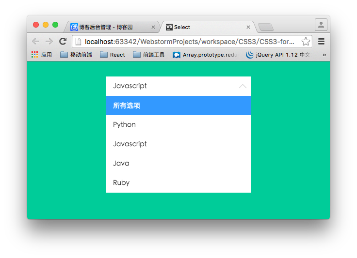
下拉控件的布局结构:
<div class="container">

        <div class="select">

            <p>所有选项</p>

            <ul>

                <li class="selected" data-value="所有选项">所有选项</li>

                <li data-value="Python">Python</li>

                <li data-value="Javascript">Javascript</li>

                <li data-value="Java">Java</li>

                <li data-value="Ruby">Ruby</li>

            </ul>

        </div>

    </div>
ul用来模拟下拉列表,在实际的使用过程中,可以根据后台返回过来的数据动态生成。p元素用来渲染选中的选项。
核心样式:
.container .select{

    width: 300px;

    height: 40px;

    font-size: 14px;

    background-color:#fff;

    margin-left: auto;

    margin-right: auto;

    position: relative;

}

/*下拉箭头的样式*/

.container .select:after{

    content: "";

    display: block;

    width: 10px;

    height: 10px;

    position: absolute;

    top: 11px;

    right: 12px;

    border-left: 1px solid #ccc;

    border-bottom: 1px solid #ccc;

    -webkit-transform: rotate(-45deg);

    transform: rotate(-45deg);

    -webkit-transition: transform .2s ease-in, top .2s ease-in;

    transition: transform .2s ease-in, top .2s ease-in;

}

/*

    被选中的列表项显示的区域

*/

.container .select p{

    padding: 0 15px;

    line-height: 40px;

    cursor: pointer;

}

/*

    下拉列表的样式

    默认高度为0

*/

.container .select ul{

    list-style: none;

    background-color: #fff;

    width: 100%;

    overflow-y: auto;

    position: absolute;

    top: 40px;

    left:;

    max-height:;

    -webkit-transition: max-height .3s ease-in;

    transition: max-height .3s ease-in;

}

.container .select ul li{

    padding: 0 15px;

    line-height: 40px;

    cursor: pointer;

}

.container .select ul li:hover{

    background-color: #e0e0e0;

}

.container .select ul li.selected{

    background-color: #39f;

    color: #fff;

}

/*下拉控件动画*/

@-webkit-keyframes slide-down{

    0%{

        -webkit-transform: scale(1, 0);

        transform: scale(1, 0);

    }

    25%{

        -webkit-transform: scale(1, 1.2);

        transform: scale(1, 1.2);

    }

    50%{

        -webkit-transform: scale(1, .85);

        transform: scale(1, .85);

    }

    75%{

        -webkit-transform: scale(1, 1.05);

        transform: scale(1, 1.05);

    }

    100%{

        -webkit-transform: scale(1, 1);

        transform: scale(1, 1);

    }

}

@keyframes slide-down{

    0%{

        -webkit-transform: scale(1, 0);

        transform: scale(1, 0);

    }

    25%{

        -webkit-transform: scale(1, 1.2);

        transform: scale(1, 1.2);

    }

    50%{

        -webkit-transform: scale(1, .85);

        transform: scale(1, .85);

    }

    75%{

        -webkit-transform: scale(1, 1.05);

        transform: scale(1, 1.05);

    }

    100%{

        -webkit-transform: scale(1, 1);

        transform: scale(1, 1);

    }

}

.container .select.on ul{

    /*

        默认情况下,ul的高度为0,当点击控控件的时候,

        设置下拉列表的高度。

    */

    max-height: 300px;

    -webkit-transform-origin: 50% 0;

    transform-origin: 50% 0;

    -webkit-animation: slide-down .5s ease-in;

    animation: slide-down .5s ease-in;

}

/*下拉选项被选中后控制箭头的方向*/

.container .select.on:after{

    -webkit-transform: rotate(-225deg);

    transform: rotate(-225deg);

    top: 18px;

}
这里只是静态的样式,如果要实现“选择”这个过程,需要用到JavaScript来实现。
$(function(){

    var selected  = $('.select > p');

    //控制列表显隐

    selected.on('click', function(event){

        $(this).parent('.select').toggleClass('on');

        event.stopPropagation();

    });

    //点击列表项,将列表项的值添加到p标签中

    $('.select li').on('click', function(event){

        var self = $(this);

        selected.text(self.data('value'));

    });

    //点击文档其他区域隐藏列表

    $(document).on('click', function(){

        $('.select').removeClass('on');

    });

});
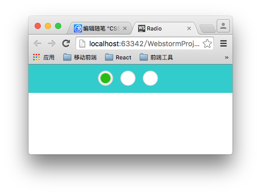
二 美化单选框
lable标签可以通过for属性与单选框实现联动。我们利用这一特性来实现美化单选框,这也是原理所在。还有就是别忘了将真正的单选框(type="radio")隐藏掉。
/*用过label标签来模拟radio 的样式*/

.radio-block label{

    display: inline-block;

    position: relative;

    width: 28px;

    height: 28px;

    border: 1px solid #cccccc;

    background-color: #fff;

    border-radius: 28px;

    cursor: pointer;

    margin-right:10px;

}

input[type="radio"]{

    display: none;

}

.radio-block label:after{

    content: '';

    display: block;

    position: absolute;

    width: 20px;

    height: 20px;

    left: 4px;

    top: 4px;

    background-color: #28bd12;

    border-radius: 20px;

    /*通过scale属性来控制中心点*/

    -webkit-transform: scale(0);

    transform: scale(0);

}

/*选中样式*/

input[type="radio"]:checked + label{

    background-color :#eee;

    -webkit-transition: background-color .3s ease-in;

    transition: background-color .3s ease-in;

}

/*选中之后的样式*/

input[type="radio"]:checked + label:after{

    -webkit-transform: scale(1);

    transform: scale(1);

    -webkit-transition: transform .2s ease-in;

    transition: transform .2s ease-in;

}
最后效果:
三 美化复选框
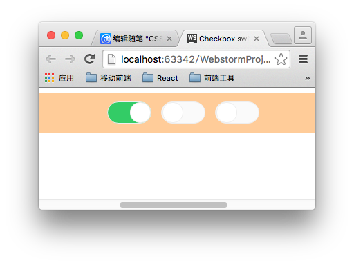
原理和单选框的制作方式类似。在checked的时候该表圆形的left值和label的背景。
.switch-block{

    width: 980px;

    padding: 3% 0;

    margin: 0 auto;

    text-align: center;

    background-color: #fc9;

}

.switch-block label{

    display: inline-block;

    width: 62px;

    height: 30px;

    background-color:#fafafa;

    border:1px solid #eee;

    border-radius: 16px;

    position: relative;

    margin-right: 10px;

    cursor: pointer;

    -webkit-transition: background .2s ease-in;

    transition :background .2s ease-in;

}

input[type="checkbox"]{

    display: none;

}

.switch-block label:after{

    content: '';

    position: absolute;

    width: 28px;

    height: 28px;

    border: 1px solid #eee;

    border-radius: 14px;

    left: 1px;

    background-color:#fff;

    -webkit-transition: left .2s ease-in;

    transition: left .2s ease-in;

}

.switch-block input[type="checkbox"]:checked + label{

    background-color:#3c6;

    -webkit-transition: background .2s ease-in;

    transition :background .2s ease-in;

}

.switch-block input[type="checkbox"]:checked + label:after{

    left: 32px;

    -webkit-transition: left .2s ease-in;

    transition: left .2s ease-in;

}
CSS3美化表单控件的更多相关文章
- html bottom html submit按钮表单控件与CSS美化
一.html submit与bottom按钮基本语法结构 1.html submit按钮在input标签里设置type="submit"即可设置此表单控件为按钮. submit按钮 ...
- 表单控件 css的三中引入方式css选择器
1. 表单控件: 单选框 如果两个单选的name值一样,会产生互斥效果 <p> <!--单选框--> 男<input type="radio" nam ...
- “此网页上的某个 Web 部件或 Web 表单控件无法显示或导入。找不到该类型,或该类型未注册为安全类型。”
自从vs装了Resharper,看见提示总是手贱的想去改掉它.于是乎手一抖,把一个 可视web部件的命名空间给改了. 喏,从LibrarySharePoint.WebPart.LibraryAddEd ...
- MVC树控件,mvc中应用treeview,实现复选框树的多层级表单控件
类似于多层级的角色与权限控制功能,用MVC实现MVC树控件,mvc中应用treeview,实现复选框树的多层级表单控件.最近我们的项目中需要用到树型菜单,以前使用WebForm时,树型菜单有微软提供的 ...
- AnjularJS系列2 —— 表单控件功能相关指令
第二篇,表单控件功能相关指令. ng-checked控制radio和checkbox的选中状态 ng-selected控制下拉框的选中状态 ng-disabled控制失效状态 ng-multiple控 ...
- 基于CkEditor实现.net在线开发之路(3)常用From表单控件介绍与说明
上一章已经简单介绍了CKEditor控件可以编写C#代码,然后可以通过ajax去调用,但是要在网页上面编写所有C#后台逻辑,肯定痛苦死了,不说实现复杂的逻辑,就算实现一个简单增删改查,都会让人头痛欲裂 ...
- Vue#表单控件绑定
使用v-model 在表单控件上实现数据双向绑定. 单选:https://jsfiddle.net/miloer/bs49p0fx/ <input type="checkbox&quo ...
- 了解HTML表单之13个表单控件
目录 传统控件 button select option optgroup textarea fieldset legend label 新增控件 datalist keygen output pro ...
- HTML5(常用的表单控件)
常用的HTML5的表单控件: Input 类型: color color 类型用在input字段主要用于选取颜色,如下所示: 从拾色器中选择一个颜色: 选择你喜欢的颜色: <input type ...
随机推荐
- codeforce --- 340D
D. Bubble Sort Graph time limit per test 1 second memory limit per test 256 megabytes input standard ...
- linux apache模块的安装
最近,想使用apache的mod_status来查看一下apache的服务器状态,就自己安装了一下mod_status,以前觉得好像很难的东西其实很简单. 第一步, 去http://httpd.apa ...
- HDOJ 2030 汉字统计
Problem Description 统计给定文本文件中汉字的个数. Input 输入文件首先包含一个整数n,表示测试实例的个数,然后是n段文本. Output 对于每一段文本,输出其中的汉字的个数 ...
- ACM2096
#include<iostream> int main() { using namespace std; int a,b,count; cin>>count; while(co ...
- 《Numerical Methods》-chaper7-解线性方程组的直接方法和最小二乘问题
基于我们在线性代数中学习过的知识,我们知道解线性方程组本质上就是Gauss消元,也就是基于增广矩阵A的矩阵初等变换.关于数学层面的内容这里不做过多的介绍,这里的侧重点是从数值计算的角度来看这些常见的问 ...
- lightoj 1032 二进制的dp
题目链接:http://lightoj.com/volume_showproblem.php?problem=1032 #include <cstdio> #include <cst ...
- mahout算法源码分析之Collaborative Filtering with ALS-WR拓展篇
Mahout版本:0.7,hadoop版本:1.0.4,jdk:1.7.0_25 64bit. 额,好吧,心头的一块石头总算是放下了.关于Collaborative Filtering with AL ...
- ecshop获取客户端操作系统
<?php /** * 获得客户端的操作系统 * * @access private * @return void */ function get_os() { if (empty($_SERV ...
- java传递json数据到前台jsp
在数据传输流程中,json是以文本,即字符串的形式传递的,而JS操作的是JSON对象,所以,JSON对象和JSON字符串之间的相互转换是关键.例如: JSON字符串: var str1 = '{ &q ...
- AngularJS的开发工具---yeoman 简易安装
AngularJS 不错,yeoman作为推荐开发工具,网上的安装步骤较烦,这里给出简易步骤. 1.安装 Ruby 自己到 Ruby 官方下载最新安装包: http://rubyinstall ...