css笔记 - 张鑫旭css课程笔记之 border 篇
border特性:
能形成BFC但是不能清除浮动。但是bfc也是把子元素的margin包裹进来,但是拿自己的margin穿透没办法的。
边框宽度不支持百分比
透明border可以突破可视区域的限制
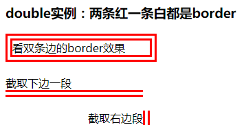
border-style:double巧用
double可以利用来配合border-style:solid制作三条杠小icon
具体代码见下边
border-style:dotted来做圆
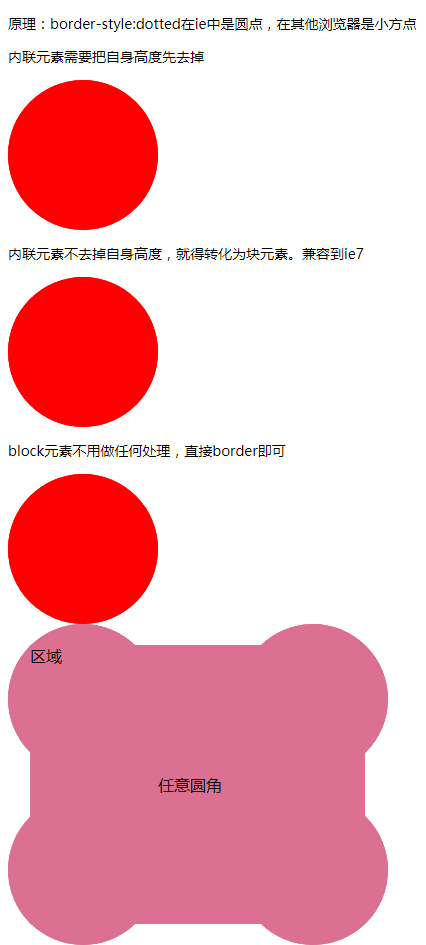
  <h3>原理:border-style:dotted在ie中是圆点,在其他浏览器是小方点</h3>

  <h3>内联元素需要把自身高度先去掉</h3>

  <div class="box2">

    <span class="dot2">圆</span>

  </div>

  <h3>内联元素不去掉自身高度,就得转化为块元素。兼容到ie7</h3>

  <div class="box1">

    <span class="dot1">圆</span>

  </div>

  <h3>block元素不用做任何处理,直接border即可</h3>

  <div class="box3">

    <div class="dot3">圆</div>

  </div>

  <span class="dot"></span>

  <div class="ever">

    <div class="dots">任意圆角</div>

    <div class="area">区域</div>

  </div>
   .dot {

      background: green;

      padding: 20px;

      /* 这样,元素宽40,高61。即使是一个空文本。 */

    }

    .box1 {

      width: 150px;

      height: 150px;

      overflow: hidden;

    }

    .dot1 {

      display: block;

      width: 100%;

      height: 100%;

      /* 解决内联元素不可见内容的高度 */

      border: 150px dotted red;

    }

    .box2 {

      margin: 10px 0;

      width: 150px;

      height: 150px;

      overflow: hidden;

      font-size: 0;

      /* 解决内联元素不可见内容的高度 */

    }

    .dot2 {

      border: red 150px dotted;

    }

    .box3 {

      width: 150px;

      height: 150px;

      overflow: hidden;

    }

    .dot3 {

      border: 150px dotted red;

    }

   .ever {

      width: 380px;

      /* overflow: hidden; */

    }

    .dots {

      border: 150px dotted palevioletred;

    }

    .area {

      width: 335px;

      background: palevioletred;

      margin-top: -300px;

      margin-left: 22px;

      height: 279px;

    }
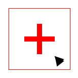
border-color : 默认颜色就是color
利用这个原理,用border做的icon,可以在hover时只改变color颜色值即可。
示例:
<div class="add"></div>
  <style>

    .add{

      position: relative;

      width: 120px;

      height: 120px;

      margin: 200px;

      color: #ccc;//border的颜色来自于此

      border: 1px solid;

      transition: color .5s;

    }

    .add::before,.add::after{

      content: "";

      width: 60px;

      height: 60px;

      position: absolute;

      left: 50%;

      top: 50%;

    }

    .add::before{

      margin-top: -5px;

      margin-left: -30px;

      border-top: 10px solid;

    }

    .add::after{

      margin-top: -30px;

      margin-left: -5px;

      border-left: 10px solid;

    }

    .add:hover{

      color: red;//hover的时候只需要修改color即可

      cursor: pointer;

    }

  </style>
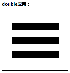
border应用
1. 三条杠
横向效果:
<div></div>
div {

    width: 200px;

    position: relative;

    border: 1px solid;

    padding: 51px 40px;

}

div::after {

    content: "";

    display: block;

    height: 30px;

    border-top: 90px double;

    border-bottom: 30px solid;

}
竖排效果:
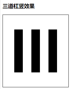
<div class="shu"></div>
div.shu {

    height: 150px;

    width: 150px;

    position: relative;

    border: 1px solid;

    padding: 51px 40px;

}

div.shu::after {

    content: "";

    display: block;

    border: 0;

    width: 30px;

    border-right: 90px double;

    border-left: 30px solid;

    height: 150px;

}
2. 加号icon (可以用伪元素的宽高实现)
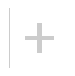
代码:
<div class="add">

  </div>

  <style>

    .add{

      position: relative;

      width: 120px;

      height: 120px;

      margin: 200px;

      color: #ccc;

      border: 1px solid;

      transition: color .5s;

    }

    .add::before,.add::after{

      content: "";

      width: 60px;

      height: 60px;

      position: absolute;

      left: 50%;

      top: 50%;

    }

    .add::before{

      margin-top: -5px;

      margin-left: -30px;

      border-top: 10px solid;

    }

    .add::after{

      margin-top: -30px;

      margin-left: -5px;

      border-left: 10px solid;

    }

    .add:hover{

      color: red;

      cursor: pointer;

    }

  </style>
3. 小三角效果、梯形效果
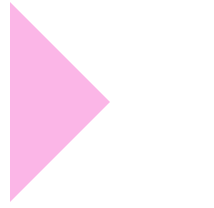
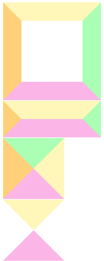
  <div class="trans"></div>

  <div class="trans2"></div>

  <div class="trans3"></div>

  <div class="trans4"></div>

  <div class="trans5"></div>
div{

      margin: 2px;

    }

    .trans{

      width: 200px;

      height: 200px;

      border: 60px solid;

      border-top-color: #fff6b9;

      border-right-color: #aaffb4;

      border-bottom-color: #fbb6e7;

      border-left-color: #ffd07a;

    }

    .trans2{

      width: 200px;

      border: 60px solid;

      border-top-color: #fff6b9;

      border-right-color: #aaffb4;

      border-bottom-color: #fbb6e7;

      border-left-color: #ffd07a;

    }

    .trans3{

      width: 0px;

      height: 0px;

      border: 100px solid;

      border-top-color: #aaffb4;

      border-right-color: #fff6b9;

      border-bottom-color: #fbb6e7;

      border-left-color: #ffd07a;

    }

    .trans4{

      width: 0px;

      height: 0px;

      border: 100px solid;

      border-top-color: #fff6b9;

      border-right-color: transparent;

      border-bottom-color: #fbb6e7;

      border-left-color: transparent;

    }

    .trans5{

      width: 0px;

      height: 0px;

      border: 100px solid;

      border-top-color: transparent;

      border-right-color: transparent;

      border-bottom-color: transparent;

      border-left-color: #fbb6e7;

    }
4. 模拟圆角效果
- 利用border-top和border-bottom的两端斜边效果
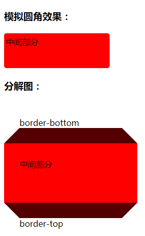
<h3>模拟圆角效果:</h3>

  <div class="top"></div>

  <div class="cont">中间部分</div>

  <div class="bottom"></div>

  <h3>分解图:</h3>

  <div class="top top1">border-bottom</div>

  <div class="cont cont1">中间部分</div>

  <div class="bottom bottom1">border-top</div>
div{

      width: 200px;

      border: 3px solid transparent;

    }

    .top{

      border-bottom-color: red;

    }

    .cont{

      height: 56px;

      background: red;

      border-color: red;

    }

    .bottom{

      border-top-color: red;

    }

    .cont1{

      border-width: 30px;

    }

    .top1{

      border-width: 30px;

      border-bottom-color: rgb(83, 0, 0);

    }

    .bottom1{

      border-width: 30px;

      border-top-color: rgb(83, 0, 0);

    }
5. 使用透明边框增加可点击区域的大小,兼容到ie7+;
- 利用原理:透明border可以突破可视区域的限制,原边框用盒阴影制作
6. 增加图标的可渲染区域:
png图标是可以设置颜色的;
icon{filter:drop-shadow(20px 0 #000);}
布局应用:
border等高布局 (不支持百分比结构)
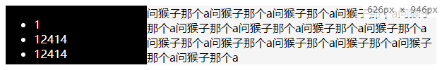
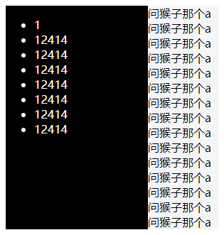
<div class="box">

    <div class="left">

      <ul>

        <li>1</li>

        <li>12414</li>

        <li>12414</li>

        <li>12414</li>

        <li>12414</li>

        <li>12414</li>

        <li>12414</li>

        <li>12414</li>

      </ul>

    </div>

    <div class="right">

      <article>问猴子那个a问猴子那个a问猴子那个a问猴子那个a问猴子那个a问猴子那个a问猴子那个a问猴子那个a问猴子那个a问猴子那个a问猴子那个a问猴子那个a问猴子那个a问猴子那个a问猴子那个a</article>

    </div>

  </div>
   .box{

      border-left: 200px solid black;

      background: #f5f5f5;

      color: #fff;

      clear:both;

    }

    .right{

      color: #000;

    }

    .left{

      float: left;

      width: 200px;

      margin-left: -200px;

    }
2018-08-29 14:57
css笔记 - 张鑫旭css课程笔记之 border 篇的更多相关文章
- css笔记 - 张鑫旭css课程笔记之 float 篇
https://www.imooc.com/t/197450float float的设计初衷/原本作用-是为了实现文字环绕效果如,一个图片和一段文字垂直放置,给图片加上浮动,文字就环绕图片展示了. 浮 ...
- css笔记 - 张鑫旭css课程笔记之 vertical-align 篇
支持负值的属性: margin letter-spacing word-spacing vertical-align 元素vertical-align垂直对齐的位置与前后元素都没有关系元素vertic ...
- css笔记 - 张鑫旭css课程笔记之 overflow 篇
overflow基本属性值 visible(默认值):超出依然显示 hidden :超出隐藏 scroll :超出,滚动显示.子元素不超出也会有滚动条的那条轨道. auto:如果超出,滚动显示.如果不 ...
- css笔记 - 张鑫旭css课程笔记之 line-height 篇
一.line-height line-height: 指两行文字基线之间的距离. 行高200px表示两行文字基线之间的距离是200px: 二.基线:baseline 字母x下边缘的位置 基线是任意线定 ...
- css笔记 - 张鑫旭css课程笔记之 padding 篇
[padding地址](https://www.imooc.com/learn/710) 一.padding与容器尺寸之间的关系 padding会影响元素的尺寸(通常情况下是通过增加/挤压内容区域) ...
- css笔记 - 张鑫旭css课程笔记之 margin 篇
margin - 人若犯我,我必犯人! [margin地址](https://www.imooc.com/learn/680) 一.margin与容器尺寸的关系 relative可定位,但是不改变容器 ...
- css笔记 - 张鑫旭css课程笔记之 z-index 篇
一.z-index语法.支持的属性值等 z-index: 在支持z-index的元素上, z-index规定了元素(包括子元素)的垂直z方向的层级顺序, z-index可以决定哪个元素覆盖在哪个元素上 ...
- css笔记 - 张鑫旭css课程笔记之 relative 篇
relative地址 relative 对 absolute的限制作用 限制left/top/right/bottom(方位值)定位 限制描述:absolute设置了方位值时,这些方位值是相对于pos ...
- css笔记 - 张鑫旭css课程笔记之 absolute 篇
absolute地址 absolute绝对定位 绝对定位与浮动鲜为人知的兄弟关系 即是说,absolute后,元素和浮动元素的特性差不多,只不过absolute脱离文档流,元素飘在天上,float还在 ...
随机推荐
- 关于sdl_ttf使用字体库加载失败的问题
今天同事拿着前期阶段开发的视频绘图库给另外一个同事的电脑上测试,结果发现老是出现打开字体库失败,但从打印的日志信息看,路径下确实存在字体库啊,这是什么原因? 于是没办法,搬到自己本级上再测试下,从他机 ...
- LigerUI编辑表格组件单元格校验问题
这几天在使用LigerUI(版本为1.2.2)编辑表格组件的时候,遇到几个小问题,从官方demo和api中没有找到解决的办法 问题1.从数据库查询出来的主键单元格不可编辑问题 主键单元格已经保存之前编 ...
- linux stat命令参数及用法详解
功能说明:显示inode内容.语 法:stat [文件或目录]补充说明:stat以文字的格式来显示inode的内容. ls 命令及其许多参数提供了一些非常有用的文件信息.另一个不太为人所熟知的命令 s ...
- IDEA添加非空Getter方法模板
#if($field.modifierStatic) static ## #end $field.type ## #set($name = $StringUtil.capitalizeWithJava ...
- Android 布局学习之——Layout(布局)详解二(常见布局和布局参数)
[Android布局学习系列] 1.Android 布局学习之——Layout(布局)详解一 2.Android 布局学习之——Layout(布局)详解二(常见布局和布局参数) 3.And ...
- JIRA 初体验
JIRA 使用神奇的JQL查询数据,很nice啊 ! 官网API: https://docs.atlassian.com/jira/REST/latest/#d2e2344 测试一下search: ...
- 使用System.Web.Optimization对CSS和JS文件合并压缩
在ASP.NET MVC 中JS/CSS文件动态合并及压缩通过调用System.Web.Optimization定义的类ScriptBundle及StyleBundle来实现. 大致步骤如下: 1.A ...
- yum 安装nginx
1.下载一个rpm包 wget http://nginx.org/packages/centos/6/noarch/RPMS/nginx-release-centos-6-0.el6.ngx.noar ...
- 第五种方式,python使用组合来添加类方法和属性(二),以selenium的webdriver为例
组合优点多,但经常比继承需要额外的代码. 上一篇是 介绍装饰器.继承.元类.mixin,四种給类动态添加类属性和方法的四种方式. 此篇介绍直接把被组合的类的属性直接加入到类里面,前面的四个例子很简单, ...
- PHP常用的缓存技术汇总
一.数据缓存 这里所说的数据缓存是指数据库查询缓存,每次访问页面的时候,都会先检测相应的缓存数据是否存在,如果不存在,就连接数据库,得到数据,并把查询结果序列化后保存到文件中,以后同样的查询结果就直接 ...