CSS魔法堂:Flex布局
前言
Flex是Flexible Box的缩写,就是「弹性布局」。从2012年已经面世,但由于工作环境的原因一直没有详细了解。最近工作忙到头晕脑胀,是要学点新东西刺激一下大脑,打打鸡血。
Flex就这么简单
浏览器兼容性
一说到兼容性就是永远的痛,不过幸运的是只要在IE10加-ms-前缀就可以用啦_
涉及的对象
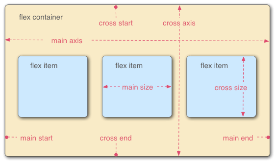
Flex布局主要是操作Flex Container 和 Flex Item两类对象。
Flex Container为作为布局容器拥有main axis,main start,main end,cross axis,cross start 和 cross end属性。
- main axis为主轴,默认是水平方向;
- main start为主轴起始位置,默认是主轴和左侧边框的交叉点(Flex Item会从main start和cross start开始排列);
- main end为主轴结束位置,默认是主轴和右侧边框的交叉点;
- cross axis为交叉轴,默认是垂直方向;
- cross start为交叉轴起始位置,默认是交叉轴和上边框的交叉点;
- cross end为交叉轴结束位置,默认是交叉轴和下边框的交叉点。
Flex Item则为容器内的孩子元素,拥有main size和cross size属性。
- main size为Flex Item的主轴方向宽度;
- cross size为Flex Item的交叉轴方向宽度。
玩转Flex Container
/* 设置Flex Container,为其直接孩子节点创建Flex Context */

display: flex;        /* 定义块级Flex Contianer */

display: inline-flex; /* 定义行级Flex Contianer */
/* 设置main/cross axis方向和main/cross start, main/cross end的位置

 * row - 默认值,main axis为水平,main start为主轴和左侧边框的交叉点,main end为主轴和右侧边框的交叉点

 *               cross axis为垂直,cross start为交叉轴和上边框的交叉点,cross end为交叉轴和下边框的交叉点

 * row-reverse - main axis为水平,main start为主轴和右侧边框的交叉点,main end为主轴和左侧边框的交叉点

 *               cross axis为垂直,cross start为交叉轴和上边框的交叉点,cross end为交叉轴和下边框的交叉点

 * column - main axis为垂直,main start为主轴和上边框的交叉点,main end为主轴和下边框的交叉点

 *          cross axis为水平,cross start为交叉轴和左侧边框的交叉点,cross end为交叉轴和右侧边框的交叉点

 * column-reverse - main axis为垂直,main start为主轴和下边框的交叉点,main end为主轴和上边框的交叉点

 *                  cross axis为水平,cross start为交叉轴和左侧边框的交叉点,cross end为交叉轴和右侧边框的交叉点

 */

flex-direction: row | row-reverse | column | column-reverse
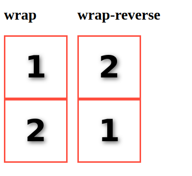
/* 是否换行

 * nowrap - 默认值,打死都不换行

 * wrap - 乖乖换行,第一行到最后一行的方向为从 cross start 到 cross end

 * wrap-reverse - 乖乖换行,但第一行到最后一行的方向为从 cross end 到 cross start

 */

flex-wrap: nowrap | wrap | wrap-reverse
/* 一次搞定flex-direction 和 flex-wrap设置

 */

flex-flow: <flex-direction> || <flex-wrap>
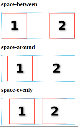
/* 设置main axis方向的对齐方式

 * flex-start - 默认值,向main start对齐

 * flex-end - 向main end对齐

 * center - 居中

 * space-between - 若有多余空间,则平均分配到各Flex Item之间

 * space-around - 若有多余空间,则平均分配到各Flex Item两边

 * space-evenly - 若有多余空间,按"多余空间/(FlexItem数+1)"计算得到空间宽度,然后分配到各Flex Item两边

 */

justify-content: flex-start | flex-end | center | space-between | space-around | space-evenly
/* 设置cross axis方向的对齐方式

 * stretch - 默认值,当height为auto时,Flex Item被拉伸沾满cross axis的空间;否则无效果。

 * flex-start - 向cross start对齐

 * flex-end - 向cross end对齐

 * center - 居中

 * baseline - 对齐Flex Container的baseline

 */

align-items: flex-start | flex-end | center | stretch | baseline
/* 设置cross axis出现多行时,cross axis方向的对齐方式。当仅有一行时,无效果。

 * stretch - 默认值,当height为auto时,Flex Item被拉伸沾满cross axis的空间;否则无效果。

 * flex-start - 向cross start对齐

 * flex-end - 向cross end对齐

 * center - 居中

 * space-between - 若有多余空间,则平均分配到各Flex Item之间

 * space-round - 若有多余空间,则平均分配到各Flex Item两边

 */

align-content: flex-start | flex-end | center | stretch | space-between | space-around
玩转Flex Item
注意:Flex Item的float,clear和vertical-align均无效。
/* 设置显示顺序

 * 默认值为0,根据元素在DOM树的位置决定显示的顺序

 */

order: <integer>
/* 设置当main axis方向存在多余空间时,元素拉伸所占的比例。

 * 例如#div1[style="flex-grow:1"]和#div2[style="flex-grow:3"],现在多余空间为400px,那么div1占400*1/(1+3),而div2占400*3/(1+3)。

 * 默认值为0,即元素不拉伸

 */

flex-grow: <number>
/* 设置当main axis方向存在空间不足且flex-wrap:nowrap时,元素的缩放比例。

 * 默认值为1

 */

flex-shrink: <number>
/* 设置元素的默认宽度,当设置为0时flex-grow无效

 * 默认值为auto

 */

flex-basis: auto | <length>
/* 一次搞定flex-grow、 flex-shrink和flex-basis

 * 默认值0 1 auto,关键值none 为 0 0 auto,关键值auto为 1 1 auto。

 */

flex: none | [<flex-grow> <flex-shrink>? || <flex-basis>]
/* 设置cross axis方向的对齐方式

 * stretch - 默认值,当height为auto时,Flex Item被拉伸沾满cross axis的空间;否则无效果。

 * flex-start - 向cross start对齐

 * flex-end - 向cross end对齐

 * center - 居中

 * baseline - 对齐Flex Container的baseline

 */

align-self: auto | flex-start | flex-end | center | baseline | stretch
应用
通过Flex Layout我们可以轻松实现过去不好实现的效果
色子

<div class="box box1">

  <span class="dot"></span>

</div>

<div class="box box2">

  <span class="dot"></span>

  <span class="dot"></span>

</div>

<div class="box box3">

  <span class="dot"></span>

  <span class="dot"></span>

  <span class="dot"></span>

</div>

<div class="box box4">

  <div class="column">

    <span class="dot"></span>

    <span class="dot"></span>

  </div>

  <div class="column">

    <span class="dot"></span>

    <span class="dot"></span>

  </div>

</div>

<div class="box box5">

  <div class="column">

    <span class="dot"></span>

    <span class="dot"></span>

  </div>

  <span class="dot"></span>

  <div class="column">

    <span class="dot"></span>

    <span class="dot"></span>

  </div>

</div>

<div class="box box6">

  <div class="column">

    <span class="dot"></span>

    <span class="dot"></span>

    <span class="dot"></span>

  </div>

  <div class="column">

    <span class="dot"></span>

    <span class="dot"></span>

    <span class="dot"></span>

  </div>

</div>
.box{

	vertical-align: top;

	margin: 10px;

	padding: 10px;

	width: 100px;

	height: 100px;

	background: #ccc;

	border-radius: 10%;

	box-shadow: 0 5px 1px #fff inset

		, 0 -5px 1px #888 inset

		, 5px 0 1px #aaa inset

		, -5px 0 1px #aaa inset;

	display: inline-flex;

	flex-flow: row wrap;

}

.dot{

	width:30px;

  height:30px;

	background: #222;

	border-radius:50%;

	box-shadow: 1px 4px 1px #000 inset

		, -1px -3px 3px #444 inset;

}

.box1{

	justify-content: center;

	align-items: center;

}

.box2{

	justify-content: space-between;

}

.box2 > .dot:last-child{

	align-self: flex-end;

}

.box3{

	justify-content: space-between;

}

.box3 > .dot:nth-of-type(2){

	align-self: center;

}

.box3 > .dot:last-child{

	align-self: flex-end;

}

.box4{

	  flex-flow: column;

		justify-content: space-between;

}

.column{

	display: flex;

	justify-content: space-between;

}

.box5{

	  flex-flow: column;

		justify-content: space-between;

}

.box5 > .dot{

	align-self: center;

}

.box6{

	  flex-flow: row;

		justify-content: space-between;

}

.box6 > .column{

  flex-flow: column;

}
圣杯布局
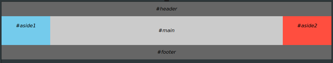
<body class="container">

  <header>#header</header>

  <main>#main</main>

  <aside class="left-aside">#aside1</aside>

  <aside class="right-aside">#aside2</aside>

  <footer>#footer</footer>

</body>
body{

	margin:0;

	font-style: italic;

	font-family: sans;

}

/* Holy Grail Layout */

.container{

	display: flex;

	flex-direction: column;

}

@media all and (min-width: 600px){

	.container{

		flex-flow: row wrap;

	}

	header,footer{

		flex: 0 0 100%;

	}

	header{

		order: 0;

	}

	footer{

		order: 4;

	}

	.left-aside{

		order: 1;

	}

	.right-aside{

		order: 3;

	}

	.left-aside,.right-aside{

		flex: 0 0 10em;

	}

	main{

		order: 2;

		flex: 1;

	}

}

/* User Defined Style*/

.container > *{

	text-align: center;

}

main{

	background: #ccc;

	line-height: 6;

}

.left-aside{

	background: skyblue;

	line-height: 4;

}

.right-aside{

	background: tomato;

	line-height: 4;

}

header,footer{

	background: #666;

	line-height: 3;

}
栅格系统

<div class="grid">

  <div class="row">

    <div class="col col-5">

      <div>5/10</div>

    </div>

    <div class="col col-4">

      <div>4/10</div>

    </div>

    <div class="col col-1">

      <div>1/10</div>

    </div>

  </div>

</div>

<div class="row">

  <div class="col">

    <div>

      auto

    </div>

  </div>

  <div class="col col-3">

    <div>

      3/10

    </div>

  </div>

</div>
/* Mobile First Grid System */

.grid{

	display: flex;

	flex-flow: row wrap;

}

.row{

	flex:0 0 100%;

	display:flex;

	flex-flow: row wrap;

}

.col{

	box-sizing: border-box;

	padding: 5px;

	flex: 0 0 100%;

}

@media all and (min-width:600px){

.col{

	flex: 1;

}

.col-10{flex:0 0 100%;}

.col-9{flex:0 0 90%;}

.col-8{flex:0 0 80%;}

.col-7{flex:0 0 70%;}

.col-6{flex:0 0 60%;}

.col-5{flex:0 0 50%;}

.col-4{flex:0 0 40%;}

.col-3{flex:0 0 30%;}

.col-2{flex:0 0 20%;}

.col-1{flex:0 0 10%;}

}

/* User Defined Style*/

.col>div{

	text-align: center;

	background: #bbb;

	line-height: 2.5;

	height: 100%;

	font-family: sans;

}
带附加项的表单控件

<div class="form-input">

  <i class="form-addon">Amount</i>

  <input class="form-control">

  <i class="form-addon form-addon-after">Encrypt</i>

</div>
.form-input{

	display: inline-flex;

	line-height: 2;

	border: solid 1px rgba(0,0,0,0.3);

}

.form-input:hover{

		border: solid 1px rgba(0,0,0,0.4);

}

.form-addon{

	font-style: normal;

	color: #666;

	background: #ddd;

	padding-left: 10px;

	padding-right: 10px;

	border-right: solid 1px rgba(0,0,0,0.3);

}

.form-addon-after{

	border-left: solid 1px rgba(0,0,0,0.3);

	border-right: none 0;

}

.form-control{

	border:none 0;

	outline-color: transparent;

	padding: 5px;

	caret-color: #888;

	font-size: 16px;

}
总结
尊重原创,转载请注明转自:https://www.cnblogs.com/fsjohnhuang/p/9134088.html _肥仔John
参考
CSS魔法堂:Flex布局的更多相关文章
- CSS魔法堂:hasLayout原来是这样!
前言 过去一直听说旧版本IE下很多诡异bug均由一个神秘角色引起的,那就是hasLayout.趁着最近突然发神经打算好好学习CSS,顺便解答多年来的疑惑. hasLayout到底是何方神圣? hasL ...
- CSS魔法堂:Box-Shadow没那么简单啦:)
前言 说起box-shadow那第一个想法当然就是用来实现阴影,其实它还能用于实现其他好玩的效果的,本篇就打算说说box-shadow的那些事. 二话不说看效果 3D小球 <style typ ...
- CSS魔法堂:"那不是bug,是你不懂我!" by inline-block
前言 每当来个需要既要水平排版又要设置固定高宽时,我就会想起display:inline-block,还有为了支持IE5.5/6/7的hack*display:inline;*zoom:1;.然后发 ...
- CSS魔法堂:小结一下Box Model与Positioning Scheme
前言 对于Box Model和Positioning Scheme中3种定位模式的细节,已经通过以下几篇文章记录了我对其的理解和思考. <CSS魔法堂:重新认识Box Model.IFC.B ...
- CSS魔法堂:说说Float那个被埋没的志向
前言 定位系统中第一难理解就是Normal flow,而第二就非Float莫属了,而Float难理解的原因有俩,1. 一开头我们就用错了:2. 它跟Normal flow靠得太近了.本文尝试理清Fl ...
- CSS魔法堂:你真的懂text-align吗?
前言 也许提及text-align你会想起水平居中,但除了这个你对它还有多少了解呢?本篇打算和大家一起来跟text-align来一次负距离的交往,你准备好了吗? text-align属性详解 The ...
- CSS魔法堂:display:none与visibility:hidden的恩怨情仇
前言 还记得面试时被问起"请说说display:none和visibility:hidden的区别"吗?是不是回答完display:none不占用原来的位置,而visibilit ...
- CSS魔法堂:重拾Border之——更广阔的遐想
前言 当CSS3推出border-radius属性时我们是那么欣喜若狂啊,一想到终于不用再添加额外元素来模拟圆角了,但发现border-radius还分水平半径和垂直半径,然后又发现border-t ...
- CSS魔法堂:重拾Border之——不仅仅是圆角
前言 当CSS3推出border-radius属性时我们是那么欣喜若狂啊,一想到终于不用再添加额外元素来模拟圆角了,但发现border-radius还分水平半径和垂直半径,然后又发现border-t ...
- CSS魔法堂:重拾Border之——图片作边框
前言 当CSS3推出border-radius属性时我们是那么欣喜若狂啊,一想到终于不用再添加额外元素来模拟圆角了,但发现border-radius还分水平半径和垂直半径,然后又发现border-t ...
随机推荐
- Shell文本处理四剑客
5.1 [grep] 全面搜索正则表达式(GREP)是一种强大的文本搜索工具,能使用正则 表达式搜索文本,并把匹配的行打印出来 过滤来自一个文件或标准输入匹配模式内容 除了grep外,还有egrep, ...
- 039 在weblogic下部署jndi的多数据源
这个问题,在公司遇到了,一直没有学,今天学了一下. 后续,还要实验一下,暂时粘贴一下一个不错的url:https://www.cnblogs.com/xdp-gacl/p/4201094.html
- Java 之 Web前端(五)
1.过滤器 a.定义:是一个中间组件,用于拦截源数据和目的数据之间的消息,并过滤二者之间传递的数据 b.步骤: ①建class继承Filter实现抽象方法 public class EncodingF ...
- Sublime Text3搭建PHP开发环境
Sublime Text3搭建PHP开发环境 本文主要给大家分享了关于Sublime Text3搭建PHP开发环境 ,感兴趣的小伙伴可以做一下参考 一.Sublime text3安装 到官网http: ...
- Sort功能极强!
Sort功能极强! 可以排string: sort(a.begin(),a.end()); 普通数组 结合结构体 逆序 而且贼快
- [ 高危 ] my网任意账户登陆
该网站的任意登录其实都已经提交得差不多了,本来以为这个漏洞会是一个重复的,然而试了一下发现思路奇葩. 任意登录,一般都为验证码爆破,4位手机验证码,而用于拦截的图片验证码没有或者可以重复使用,所以就能 ...
- vsftpd中配置文件详解
在vsftp服务器中,配置文件/etc/vsftpd/vsftpd.conf文件是配置的核心内容,其具体的配置信息详细情况如下: 1.默认配置: 1>允许匿名用户和本地用户登陆. anonymo ...
- DRF 权限 频率
DRF的权限 权限是什么 大家之前都应该听过权限~那么我们权限到底是做什么用的呢~~ 大家都有博客~或者去一些论坛~一定知道管理员这个角色~ 比如我们申请博客的时候~一定要向管理员申请~也就是说管理员 ...
- Visual Assist X 助手下载
链接:http://pan.baidu.com/s/1pLUErhT 密码:c6in
- 12.7 Test
目录 2018.12.7 Test A 序列sequence(迭代加深搜索) B 轰炸bomb(Tarjan DP) C 字符串string(AC自动机 状压DP) 考试代码 A C 2018.12. ...