微信小程序-表单组件
button 按钮

注:button-hover 默认为{background-color: rgba(0, 0, 0, 0.1); opacity: 0.7;}
示例代码:
/** wxss **/
/** 修改button默认的点击态样式类**/
.button-hover {
  background-color: red;
}
/** 添加自定义button点击态样式类**/
.other-button-hover {
  background-color: blur;
}
<button type="default" size="{{defaultSize}}" loading="{{loading}}" plain="{{plain}}"
        disabled="{{disabled}}" bindtap="default" hover-class="other-button-hover"> default </button>
<button type="primary" size="{{primarySize}}" loading="{{loading}}" plain="{{plain}}"
        disabled="{{disabled}}" bindtap="primary"> primary </button>
<button type="warn" size="{{warnSize}}" loading="{{loading}}" plain="{{plain}}"
        disabled="{{disabled}}" bindtap="warn"> warn </button>
<button bindtap="setDisabled">点击设置以上按钮disabled属性</button>
<button bindtap="setPlain">点击设置以上按钮plain属性</button>
<button bindtap="setLoading">点击设置以上按钮loading属性</button>
var types = ['default', 'primary', 'warn']
var pageObject = {
  data: {
    defaultSize: 'default',
    primarySize: 'default',
    warnSize: 'default',
    disabled: false,
    plain: false,
    loading: false
  },
  setDisabled: function(e) {
    this.setData({
      disabled: !this.data.disabled
    })
  },
  setPlain: function(e) {
    this.setData({
      plain: !this.data.plain
    })
  },
  setLoading: function(e) {
    this.setData({
      loading: !this.data.loading
    })
  }
}

for (var i = 0; i < types.length; ++i) {
  (function(type) {
    pageObject[type] = function(e) {
      var key = type + 'Size'
      var changedData = {}
      changedData[key] =
        this.data[key] === 'default' ? 'mini' : 'default'
      this.setData(changedData)
    }
  })(types[i])
}

Page(pageObject)
checkbox-group 多项选择器,内部由多个checkbox组成。

checkbox 多选项目

示例:
<checkbox-group bindchange="checkboxChange">
  <label class="checkbox" wx:for="{{items}}">
    <checkbox value="{{item.name}}" checked="{{item.checked}}"/>{{item.value}}
  </label>
</checkbox-group>
Page({
  data: {
    items: [
      {name: 'USA', value: '美国'},
      {name: 'CHN', value: '中国', checked: 'true'},
      {name: 'BRA', value: '巴西'},
      {name: 'JPN', value: '日本'},
      {name: 'ENG', value: '英国'},
      {name: 'TUR', value: '法国'},
    ]
  },
  checkboxChange: function(e) {
    console.log('checkbox发生change事件,携带value值为:', e.detail.value)
  }
})
form 表单
表单,将组件内的用户输入的<switch/> <input/> <checkbox/> <slider/> <radio/> <picker/> 提交。

示例代码:
<form bindsubmit="formSubmit" bindreset="formReset">
  <view class="section section_gap">
    <view class="section__title">switch</view>
    <switch name="switch"/>
  </view>
  <view class="section section_gap">
    <view class="section__title">slider</view>
    <slider name="slider" show-value ></slider>
  </view>

  <view class="section">
    <view class="section__title">input</view>
    <input name="input" placeholder="please input here" />
  </view>
  <view class="section section_gap">
    <view class="section__title">radio</view>
    <radio-group name="radio-group">
      <label><radio value="radio1"/>radio1</label>
      <label><radio value="radio2"/>radio2</label>
    </radio-group>
  </view>
  <view class="section section_gap">
    <view class="section__title">checkbox</view>
    <checkbox-group name="checkbox">
      <label><checkbox value="checkbox1"/>checkbox1</label>
      <label><checkbox value="checkbox2"/>checkbox2</label>
    </checkbox-group>
  </view>
  <view class="btn-area">
    <button formType="submit">Submit</button>
    <button formType="reset">Reset</button>
  </view>
</form>
Page({
  formSubmit: function(e) {
    console.log('form发生了submit事件,携带数据为:', e.detail.value)
  },
  formReset: function() {
    console.log('form发生了reset事件')
  }
})
input 输入框

示例代码:
<!--input.wxml-->
<view class="section">
  <input placeholder="这是一个可以自动聚焦的input" auto-focus/>
</view>
<view class="section">
  <input placeholder="这个只有在按钮点击的时候才聚焦" focus="{{focus}}" />
  <view class="btn-area">
    <button bindtap="bindButtonTap">使得输入框获取焦点</button>
  </view>
</view>
<view class="section">
  <input  maxlength="10" placeholder="最大输入长度10" />
</view>
<view class="section">
  <view class="section__title">你输入的是:{{inputValue}}</view>
  <input  bindinput="bindKeyInput" placeholder="输入同步到view中"/>
</view>
<view class="section">
  <input  bindinput="bindReplaceInput" placeholder="连续的两个1会变成2" />
</view>
<view class="section">
  <input  bindinput="bindHideKeyboard" placeholder="输入123自动收起键盘" />
</view>
<view class="section">
  <input password type="number" />
</view>
<view class="section">
  <input password type="text" />
</view>
<view class="section">
  <input type="digit" placeholder="带小数点的数字键盘"/>
</view>
<view class="section">
  <input type="idcard" placeholder="身份证输入键盘" />
</view>
<view class="section">
  <input placeholder-style="color:red" placeholder="占位符字体是红色的" />
</view>
//input.js
Page({
  data: {
    focus: false,
    inputValue: ''
  },
  bindButtonTap: function() {
    this.setData({
      focus: true
    })
  },
  bindKeyInput: function(e) {
    this.setData({
      inputValue: e.detail.value
    })
  },
  bindReplaceInput: function(e) {
    var value = e.detail.value
    var pos = e.detail.cursor
    if(pos != -1){
      //光标在中间
      var left = e.detail.value.slice(0,pos)
      //计算光标的位置
      pos = left.replace(/11/g,'2').length
    }

    //直接返回对象,可以对输入进行过滤处理,同时可以控制光标的位置
    return {
      value: value.replace(/11/g,'2'),
      cursor: pos
    }

    //或者直接返回字符串,光标在最后边
    //return value.replace(/11/g,'2'),
  },
  bindHideKeyboard: function(e) {
    if (e.detail.value === '123') {
      //收起键盘
      wx.hideKeyboard()
    }
  }
})
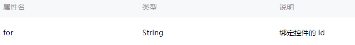
label
用来改进表单组件的可用性,使用for属性找到对应的id,或者将控件放在该标签下,当点击时,就会触发对应的控件。
for优先级高于内部控件,内部有多个控件的时候默认触发第一个控件。
目前可以绑定的控件有:<button/>, <checkbox/>, <radio/>, <switch/>。
示例代码:
<view class="section section_gap">
<view class="section__title">表单组件在label内</view>
<checkbox-group class="group" bindchange="checkboxChange">
  <view class="label-1" wx:for="{{checkboxItems}}">
    <label>
      <checkbox hidden value="{{item.name}}" checked="{{item.checked}}"></checkbox>
      <view class="label-1__icon">
        <view class="label-1__icon-checked" style="opacity:{{item.checked ? 1: 0}}"></view>
      </view>
      <text class="label-1__text">{{item.value}}</text>
    </label>
  </view>
</checkbox-group>
</view>

<view class="section section_gap">
<view class="section__title">label用for标识表单组件</view>
<radio-group class="group" bindchange="radioChange">
  <view class="label-2" wx:for="{{radioItems}}">
    <radio id="{{item.name}}" hidden value="{{item.name}}" checked="{{item.checked}}"></radio>
    <view class="label-2__icon">
      <view class="label-2__icon-checked" style="opacity:{{item.checked ? 1: 0}}"></view>
    </view>
    <label class="label-2__text" for="{{item.name}}"><text>{{item.name}}</text></label>
  </view>
</radio-group>
</view>
Page({
  data: {
    checkboxItems: [
      {name: 'USA', value: '美国'},
      {name: 'CHN', value: '中国', checked: 'true'},
      {name: 'BRA', value: '巴西'},
      {name: 'JPN', value: '日本', checked: 'true'},
      {name: 'ENG', value: '英国'},
      {name: 'TUR', value: '法国'},
    ],
    radioItems: [
      {name: 'USA', value: '美国'},
      {name: 'CHN', value: '中国', checked: 'true'},
      {name: 'BRA', value: '巴西'},
      {name: 'JPN', value: '日本'},
      {name: 'ENG', value: '英国'},
      {name: 'TUR', value: '法国'},
    ],
    hidden: false
  },
  checkboxChange: function(e) {
    var checked = e.detail.value
    var changed = {}
    for (var i = 0; i < this.data.checkboxItems.length; i ++) {
      if (checked.indexOf(this.data.checkboxItems[i].name) !== -1) {
        changed['checkboxItems['+i+'].checked'] = true
      } else {
        changed['checkboxItems['+i+'].checked'] = false
      }
    }
    this.setData(changed)
  },
  radioChange: function(e) {
    var checked = e.detail.value
    var changed = {}
    for (var i = 0; i < this.data.radioItems.length; i ++) {
      if (checked.indexOf(this.data.radioItems[i].name) !== -1) {
        changed['radioItems['+i+'].checked'] = true
      } else {
        changed['radioItems['+i+'].checked'] = false
      }
    }
    this.setData(changed)
  }
})
.label-1, .label-2{
    margin-bottom: 15px;
}
.label-1__text, .label-2__text {
    display: inline-block;
    vertical-align: middle;
}

.label-1__icon {
    position: relative;
    margin-right: 10px;
    display: inline-block;
    vertical-align: middle;
    width: 18px;
    height: 18px;
    background: #fcfff4;
}

.label-1__icon-checked {
    position: absolute;
    top: 3px;
    left: 3px;
    width: 12px;
    height: 12px;
    background: #1aad19;
}

.label-2__icon {
    position: relative;
    display: inline-block;
    vertical-align: middle;
    margin-right: 10px;
    width: 18px;
    height: 18px;
    background: #fcfff4;
    border-radius: 50px;
}

.label-2__icon-checked {
    position: absolute;
    left: 3px;
    top: 3px;
    width: 12px;
    height: 12px;
    background: #1aad19;
    border-radius: 50%;
}

.label-4_text{
    text-align: center;
    margin-top: 15px;
}
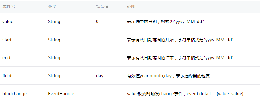
picker
滚动选择器,现支持三种选择器,通过mode来区分,分别是普通选择器,时间选择器,日期选择器,默认是普通选择器。
普通选择器:mode = selector

时间选择器:mode = time

日期选择器:mode = date
示例代码:
<view class="section">
  <view class="section__title">地区选择器</view>
  <picker bindchange="bindPickerChange" value="{{index}}" range="{{array}}">
    <view class="picker">
      当前选择:{{array[index]}}
    </view>
  </picker>
</view>
<view class="section">
  <view class="section__title">时间选择器</view>
  <picker mode="time" value="{{time}}" start="09:01" end="21:01" bindchange="bindTimeChange">
    <view class="picker">
      当前选择: {{time}}
    </view>
  </picker>
</view>

<view class="section">
  <view class="section__title">日期选择器</view>
  <picker mode="date" value="{{date}}" start="2015-09-01" end="2017-09-01" bindchange="bindDateChange">
    <view class="picker">
      当前选择: {{date}}
    </view>
  </picker>
</view>
Page({
  data: {
    array: ['美国', '中国', '巴西', '日本'],
    index: 0,
    date: '2016-09-01',
    time: '12:01'
  },
  bindPickerChange: function(e) {
    console.log('picker发送选择改变,携带值为', e.detail.value)
    this.setData({
      index: e.detail.value
    })
  },
  bindDateChange: function(e) {
    this.setData({
      date: e.detail.value
    })
  },
  bindTimeChange: function(e) {
    this.setData({
      time: e.detail.value
    })
  }
})
radio-group
单项选择器,内部由多个<radio/>组成。

radio
单选项目

<radio-group class="radio-group" bindchange="radioChange">
  <label class="radio" wx:for="{{items}}">
    <radio value="{{item.name}}" checked="{{item.checked}}"/>{{item.value}}
  </label>
</radio-group>
Page({
  data: {
    items: [
      {name: 'USA', value: '美国'},
      {name: 'CHN', value: '中国', checked: 'true'},
      {name: 'BRA', value: '巴西'},
      {name: 'JPN', value: '日本'},
      {name: 'ENG', value: '英国'},
      {name: 'TUR', value: '法国'},
    ]
  },
  radioChange: function(e) {
    console.log('radio发生change事件,携带value值为:', e.detail.value)
  }
})
slider 滑动选择器。

示例代码:
<view class="section section_gap">
  <text class="section__title">设置left/right icon</text>
  <view class="body-view">
    <slider bindchange="slider1change" left-icon="cancel" right-icon="success_no_circle"/>
  </view>
</view>

<view class="section section_gap">
  <text class="section__title">设置step</text>
  <view class="body-view">
    <slider bindchange="slider2change" step="5"/>
  </view>
</view>

<view class="section section_gap">
  <text class="section__title">显示当前value</text>
  <view class="body-view">
    <slider bindchange="slider3change" show-value/>
  </view>
</view>

<view class="section section_gap">
  <text class="section__title">设置最小/最大值</text>
  <view class="body-view">
    <slider bindchange="slider4change" min="50" max="200" show-value/>
  </view>
</view>
var pageData = {}
for (var i = 1; i ; i++) {
  (function (index) {
    pageData['slider' + index + 'change'] = function(e) {
      console.log('slider' + 'index' + '发生 change 事件,携带值为', e.detail.value)
    }
  })(i)
}
Page(pageData)
switch
开关选择器。

<view class="body-view">
    <switch checked bindchange="switch1Change"/>
    <switch bindchange="switch2Change"/>
</view>
Page({
  switch1Change: function (e){
    console.log('switch1 发生 change 事件,携带值为', e.detail.value)
  },
  switch2Change: function (e){
    console.log('switch2 发生 change 事件,携带值为', e.detail.value)
  }
})
textarea
多行输入框。

示例代码:
<!--textarea.wxml-->
<view class="section">
  <textarea bindblur="bindTextAreaBlur" auto-height placeholder="自动变高" />
</view>
<view class="section">
  <textarea placeholder="placeholder颜色是红色的" placeholder-style="color:red;"  />
</view>
<view class="section">
  <textarea placeholder="这是一个可以自动聚焦的textarea" auto-focus />
</view>
<view class="section">
  <textarea placeholder="这个只有在按钮点击的时候才聚焦" focus="{{focus}}" />
  <view class="btn-area">
    <button bindtap="bindButtonTap">使得输入框获取焦点</button>
  </view>
</view>
//textarea.js
Page({
  data: {
    height: 20,
    focus: false
  },
  bindButtonTap: function() {
    this.setData({
      focus: true
    })
  },
  bindTextAreaBlur: function(e) {
    console.log(e.detail.value)
  }
})
微信小程序-表单组件的更多相关文章
- 微信小程序——表单验证插件WxValidate的二次封装(终极版)
微信小程序表单验证前面的两篇文章做的效果总感觉都有点不太友好,第一篇里的效果是将错误信息通过对话框形式弹出来,这种形式在web形式下早已经淘汰了:第二篇是一次性全部显示所有的错误,然后3秒后自动消失, ...
- 微信小程序——表单验证插件WxValidate的二次封装(二)
在上一篇博客<微信小程序——仿jqueryValidate表单验证插件WxValidate的二次封装>中,我将WxValidate做了再次封装,简化了初始规则数据的构造,但是当有错误时页面 ...
- 微信小程序-表单
wxml <view> 按钮: <button size="{{buttom.size}}" type="{{buttom.type}}" p ...
- 微信小程序-表单笔记
发布页——向云端数据库上传多行文字和4张图片 第6,8行注释掉和不注释掉都可以实现数据上传 var _this = this; wx.cloud.callFunction({ name: 'searc ...
- 微信小程序 - 表单验证插件WxValidate使用
插件下载地址及官方文档:https://github.com/skyvow/wx-extend 具体的WxValidate.js文件的位置在wx-extend/src/assets/plugins/w ...
- 微信小程序 - 表单验证插件WxValidate(自定义警告信息形式)
弹出的形式对于用户来说,总是不太友好的 可能会出现层级问题(只需要设置一下提示的层级即可) WxValidate内置规则 以下代码拷贝即可使用~ wxml <form bindsubmit='s ...
- 微信小程序-表单笔记2
本地添加4张图片并显示至页面——组件位置.设置样式.列表渲染 Q.button是一张图片,需要实现点击这张图片后选择本地图片后显示至页面,不知道怎么让本地图片将button挤到右边 S.在wxml中 ...
- 微信小程序 --- 表单输入验证(手机号、邮箱验证、输入非空)
js代码 Page({ /** * 页面的初始数据 */ data: { indicatorDots: false, ...
- 微信小程序内置组件web-view的缓存问题探讨
前言:博客或者论坛上面,还有自习亲身经历,发现微信小程序的webview组件的页面缓存问题相当严重,对开发H5的小童鞋来说应该困扰了不少.很多小童鞋硬是抓破脑袋也没有办法解决这个问题,那我们今天就来探 ...
随机推荐
- 如何让tomcat不记录catalina.out这个日志文件
tomcat日志记录配置在conf/logging.properties中 有这5类日志 catalina,localhost,manager,admin(控制台),host-manager 还有8个 ...
- sed 引入shell变量
双单引号即可 1.eval sed ’s/$a/$b/’ filename2.sed "s/$a/$b/" filename3.sed ’s/’$a’/’$b’/’ filenam ...
- sh脚本异常:/bin/sh^M:bad interpreter: No such file or directory
在Linux中执行.sh脚本,异常/bin/sh^M: bad interpreter: No such file or directory. 分析:这是不同系统编码格式引起的:在windows系统中 ...
- 在windows 与Linux间实现文件传输(C++&C实现)
要实现windows与linux间的文件传输,可以通过socket网络编程来实现. 这次要实现的功能与<Windows下通过socket进行字符串和文件传输>中实现的功能相同,即客户端首先 ...
- 基础编程-java之股神
买了一支股票,他知道从他买股票的那天开始,股票会有以下变化:第一天不变,以后涨一天,跌一天,涨两天,跌一天,涨三天,跌一天...依此类推. 为方便计算,假设每次涨和跌皆为1,股票初始单价也为1,请计算 ...
- HTML5探秘:用requestAnimationFrame优化Web动画
本文转载自: HTML5探秘:用requestAnimationFrame优化Web动画
- WebAPI使用多个xml文件生成帮助文档
一.前言 上篇有提到在WebAPI项目内,通过在Nuget里安装(Microsoft.AspNet.WebApi.HelpPage)可以根据注释生成帮助文档,查看代码实现会发现是基于解析项目生成的xm ...
- Centos vsftpd服务器搭建
Centos vsftpd服务器搭建 时间:2016-07-18 1.最为简单的vsftpd服务器搭建 1.安装vsftpd 1.yum 安装 yum install vsftpd 2.rpm文件安装 ...
- WCF 、Web API 、 WCF REST 和 Web Service 的区别
WCF .Web API . WCF REST 和 Web Service 的区别 The .Net framework has a number of technologies that allow ...
- zmap在阿里云主机上的编译
环境: cat /etc/issueUbuntu 14.04.2 LTS \n \l cat /proc/cpuinfoprocessor : 0vendor_id : GenuineIntelcpu ...