
Matplotlib绘图设置---图形颜色和风格调整
绘图函数
plt.plot()函数可以通过相应的参数设置绘图风格。
plt.plot(*args, scalex=True, scaley=True, data=None, **kwargs)

Docstring:

Plot y versus x as lines and/or markers.

Call signatures::

    plot([x], y, [fmt], *, data=None, **kwargs)

    plot([x], y, [fmt], [x2], y2, [fmt2], ..., **kwargs)

The coordinates of the points or line nodes are given by *x*, *y*.

The optional parameter *fmt* is a convenient way for defining basic

formatting like color, marker and linestyle. It's a shortcut string

notation described in the *Notes* section below.

>>> plot(x, y)        # plot x and y using default line style and color

>>> plot(x, y, 'bo')  # plot x and y using blue circle markers

>>> plot(y)           # plot y using x as index array 0..N-1

>>> plot(y, 'r+')     # ditto, but with red plusses

You can use `.Line2D` properties as keyword arguments for more

control on the appearance. Line properties and *fmt* can be mixed.

The following two calls yield identical results:

>>> plot(x, y, 'go--', linewidth=2, markersize=12)

>>> plot(x, y, color='green', marker='o', linestyle='dashed',

...      linewidth=2, markersize=12)

When conflicting with *fmt*, keyword arguments take precedence.

**Plotting labelled data**

There's a convenient way for plotting objects with labelled data (i.e.

data that can be accessed by index ``obj['y']``). Instead of giving

the data in *x* and *y*, you can provide the object in the *data*

parameter and just give the labels for *x* and *y*::

>>> plot('xlabel', 'ylabel', data=obj)

All indexable objects are supported. This could e.g. be a `dict`, a

`pandas.DataFame` or a structured numpy array.

**Plotting multiple sets of data**

There are various ways to plot multiple sets of data.

- The most straight forward way is just to call `plot` multiple times.

  Example:

  >>> plot(x1, y1, 'bo')

  >>> plot(x2, y2, 'go')

- Alternatively, if your data is already a 2d array, you can pass it

  directly to *x*, *y*. A separate data set will be drawn for every

  column.

  Example: an array ``a`` where the first column represents the *x*

  values and the other columns are the *y* columns::

  >>> plot(a[0], a[1:])

- The third way is to specify multiple sets of *[x]*, *y*, *[fmt]*

  groups::

  >>> plot(x1, y1, 'g^', x2, y2, 'g-')

  In this case, any additional keyword argument applies to all

  datasets. Also this syntax cannot be combined with the *data*

  parameter.

By default, each line is assigned a different style specified by a

'style cycle'. The *fmt* and line property parameters are only

necessary if you want explicit deviations from these defaults.

Alternatively, you can also change the style cycle using the

'axes.prop_cycle' rcParam.

Parameters

----------

x, y : array-like or scalar

    The horizontal / vertical coordinates of the data points.

    *x* values are optional and default to `range(len(y))`.

    Commonly, these parameters are 1D arrays.

    They can also be scalars, or two-dimensional (in that case, the

    columns represent separate data sets).

    These arguments cannot be passed as keywords.

fmt : str, optional

    A format string, e.g. 'ro' for red circles. See the *Notes*

    section for a full description of the format strings.

    Format strings are just an abbreviation for quickly setting

    basic line properties. All of these and more can also be

    controlled by keyword arguments.

    This argument cannot be passed as keyword.

data : indexable object, optional

    An object with labelled data. If given, provide the label names to

    plot in *x* and *y*.

    .. note::

        Technically there's a slight ambiguity in calls where the

        second label is a valid *fmt*. `plot('n', 'o', data=obj)`

        could be `plt(x, y)` or `plt(y, fmt)`. In such cases,

        the former interpretation is chosen, but a warning is issued.

        You may suppress the warning by adding an empty format string

        `plot('n', 'o', '', data=obj)`.

Other Parameters

----------------

scalex, scaley : bool, optional, default: True

    These parameters determined if the view limits are adapted to

    the data limits. The values are passed on to `autoscale_view`.

**kwargs : `.Line2D` properties, optional

    *kwargs* are used to specify properties like a line label (for

    auto legends), linewidth, antialiasing, marker face color.

    Example::

    >>> plot([1,2,3], [1,2,3], 'go-', label='line 1', linewidth=2)

    >>> plot([1,2,3], [1,4,9], 'rs',  label='line 2')

    If you make multiple lines with one plot command, the kwargs

    apply to all those lines.

    Here is a list of available `.Line2D` properties:

  agg_filter: a filter function, which takes a (m, n, 3) float array and a dpi value, and returns a (m, n, 3) array

  alpha: float

  animated: bool

  antialiased or aa: bool

  clip_box: `.Bbox`

  clip_on: bool

  clip_path: [(`~matplotlib.path.Path`, `.Transform`) | `.Patch` | None]

  color or c: color

  contains: callable

  dash_capstyle: {'butt', 'round', 'projecting'}

  dash_joinstyle: {'miter', 'round', 'bevel'}

  dashes: sequence of floats (on/off ink in points) or (None, None)

  drawstyle or ds: {'default', 'steps', 'steps-pre', 'steps-mid', 'steps-post'}, default: 'default'

  figure: `.Figure`

  fillstyle: {'full', 'left', 'right', 'bottom', 'top', 'none'}

  gid: str

  in_layout: bool

  label: object

  linestyle or ls: {'-', '--', '-.', ':', '', (offset, on-off-seq), ...}

  linewidth or lw: float

  marker: marker style

  markeredgecolor or mec: color

  markeredgewidth or mew: float

  markerfacecolor or mfc: color

  markerfacecoloralt or mfcalt: color

  markersize or ms: float

  markevery: None or int or (int, int) or slice or List[int] or float or (float, float)

  path_effects: `.AbstractPathEffect`

  picker: float or callable[[Artist, Event], Tuple[bool, dict]]

  pickradius: float

  rasterized: bool or None

  sketch_params: (scale: float, length: float, randomness: float)

  snap: bool or None

  solid_capstyle: {'butt', 'round', 'projecting'}

  solid_joinstyle: {'miter', 'round', 'bevel'}

  transform: `matplotlib.transforms.Transform`

  url: str

  visible: bool

  xdata: 1D array

  ydata: 1D array

  zorder: float

Returns

-------

lines

    A list of `.Line2D` objects representing the plotted data.
颜色设置
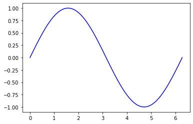
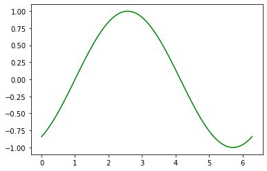
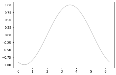
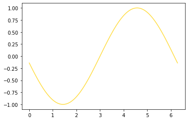
通过color参数设置。
#标准颜色名称

plt.plot(x, np.sin(x-0), color='blue')
#缩写颜色代码(rgbcmyk)

plt.plot(x, np.sin(x-1), color='g')
#范围在0~1的灰度值

plt.plot(x, np.sin(x-2), color='0.75')
#十六进制(RRGGBB, 00~FF)

plt.plot(x, np.sin(x-3), color='#FFDD44')
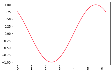
#RGB元组,范围在0~1

plt.plot(x, np.sin(x-4), color=(1.0, 0.2, 0.3))
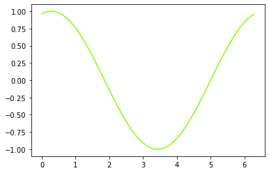
#HTML颜色名称

plt.plot(x, np.sin(x-5), color='chartreuse')
线条风格设置
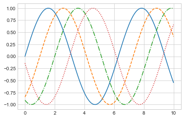
通过linesyle设置线条风格。
#实线

plt.plot(x, np.sin(x-0), linestyle='solid')

# plt.plot(x, np.sin(x-0), linestyle='-')

#虚线

plt.plot(x, np.sin(x-1), linestyle='dashed')

# plt.plot(x, np.sin(x-0), linestyle='--')

#点划线

plt.plot(x, np.sin(x-2), linestyle='dashdot')

# plt.plot(x, np.sin(x-0), linestyle='-.')

#实点线

plt.plot(x, np.sin(x-3), linestyle='dotted')

# plt.plot(x, np.sin(x-0), linestyle=':')
组合设置
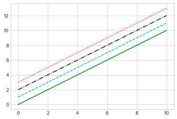
将linestyle和color编码组合起来。
#绿色实线

plt.plot(x, x + 0, '-g')

#青色虚线

plt.plot(x, x + 1, '--c')

#黑色点划线

plt.plot(x, x + 2, '-.k')

#红色实点线

plt.plot(x, x + 3, ':r')
Matplotlib绘图设置---图形颜色和风格调整的更多相关文章
- matplotlib学习——设置线条颜色及形状
在图形表示中,不同的画布或画布中不同的函数,我们常常要用不同的形状或颜色来区分开,这里小编向大家介绍这些参数的表示方法: 一.控制颜色 b--blue c--cyan(青色) ...
- Python matplotlib绘图设置图例
一.语法简介 plt.legend(loc=2,edgecolor='red',facecolor='green',shadow='True',fontsize=10) #edgecolor 图例边框 ...
- Python matplotlib绘图设置坐标轴的标题
一.语法简介 plt.xlabel("销售月份",fontsize=16,color='red',fontweight='bold',loc='center',background ...
- 【划重点】Python matplotlib绘图设置坐标轴的刻度
一.语法简介 plt.xticks(ticks,labels,rotation=30,fontsize=10,color='red',fontweight='bold',backgroundcolor ...
- 【原】在Matplotlib绘图中添加Latex风格公式
Matplotlib绘图的过程中,可以为各个轴的Label,图像的Title.Legend等元素添加Latex风格的公式. 只需要在Latex公式的文本前后各增加一个$符号,Matplotlib就可以 ...
- matplotlib 设置图形大小时 figsize 与 dpi 的关系
matplotlib 中设置图形大小的语句如下: fig = plt.figure(figsize=(a, b), dpi=dpi) 其中: figsize 设置图形的大小,a 为图形的宽, b 为图 ...
- matplotlib绘图教程,设置标签与图例
大家好,欢迎大家阅读周四数据处理专题,我们继续介绍matplotlib作图工具. 在上一篇文章当中我们介绍了matplotlib这个包当中颜色.标记和线条这三种画图的设置,今天我们同样也介绍三种新的设 ...
- UI设计篇·入门篇·绘制简单自定义矩形图/设置按钮按下弹起颜色变化/设置图形旋转
Android的基本控件和图形有限,难以满足所有的实际需要和设计需求,好在Android给出了相对完善的图形绘制和自定义控件的API,利用这些API,可以基本满足设计的需求. 自定义图像和控件的方法: ...
- Matplotlib绘图双纵坐标轴设置及控制设置时间格式
双y轴坐标轴图 今天利用matplotlib绘图,想要完成一个双坐标格式的图. fig=plt.figure(figsize=(20,15)) ax1=fig.add_subplot(111) ax1 ...
- 使用ECharts制作图形时,如何设置指定图形颜色?
使用ECharts制作图形时,图形颜色是默认的颜色,有时需求需要指定图形颜色,这就需要自己去设置. 在option下的series属性中设置itemStyle,如下所示: itemStyle: { n ...
随机推荐
- 在矩池云安装使用PaddleHub 和 PaddlePaddle
之前在安装 PaddleHub 导入的时候遇到各种错误,不是这个包没这个模块,就是哪个包没这个属性 ...很头痛,网上也没有 PaddleHub 和 PaddlePaddle 对应的版本,只能自己慢慢 ...
- 浅谈errgroup的使用以及源码分析
本文讲解的是golang.org/x/sync这个包中的errgroup 1.errgroup 的基础介绍 学习过 Go 的朋友都知道 Go 实现并发编程是比较容易的事情,只需要使用go关键字就可以开 ...
- 【Azure App Service】如何来停止 App Service 的高级工具站点 Kudu ?
问题描述 如何来停止 App Service 的高级工具站点 Kudu ? kudu 介绍 Kudu 提供了一组面向开发人员的工具和扩展点,用于您的应用服务应用程序. Kudu (Advanced T ...
- Spring Cloud跟Dubbo区别?
Spring Cloud是一个微服务框架,提供了微服务中很多功能组件,Dubbo一开始时RPC调用框架,核心是解决服务调用间的问题, Spring Cloud是一个大而全的框架,Dubbo更侧重于服务 ...
- 线段树-多个懒标记pushdown
P3373 [模板]线段树 2 这里需要用到两个懒标记,一个懒标记为add,记录加,另一个懒标记为mul,记录乘. 我们需要规定一个优先级,然后考虑如何将懒标记下传. 这里无非有两种顺序,一种是先乘后 ...
- vue3,实战项目随心笔记
本项目模仿bibi 网站,主要是做一个pc和手机端的应用案例,主要涉及支付,三方登陆,css原子,妹子ui,路由缓存,组件封装,tailwindcss,vueuse 等常见企业级术应用, 由于本项目是 ...
- Spring事务(三)-事务传播行为
在Spring里,一个事务方法被另外一个事务方法调用时,两个方法的事务应该如何进行,说白话一点,就是说当出现异常需要回滚时,各个方法的数据操作是否要全部回滚,事务传播行为就是决定了这样的一个处理结果. ...
- 删除文件或目录 被进程占用或锁定locked 查询进程 资源监视器-cpu-关联句柄-输入文件全路径
删除文件或目录 被进程占用或锁定 查询进程 资源监视器-cpu-关联句柄-输入文件全路径 右键点击桌面的Win图标,点击"任务管理器">>点击左上角"性能&q ...
- 开源K线图辅助线编辑工具模块
基本就像使用photoshop一样,同一DC上应用叠加图像. 辅助线模块,提供浮动工具条,以及两层Layer,附加在DC上,交互处理DC对应窗口区域的鼠标事件,时间轴价格轴与x轴y轴坐标转换. XW全 ...
- 阿里云配置http转https
参考:https://www.cnblogs.com/alexfly/p/10615986.htmlhttps://www.cnblogs.com/SemiconductorKING/p/910697 ...