el-select封装(单选框、多选框、全选功能)
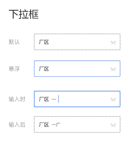
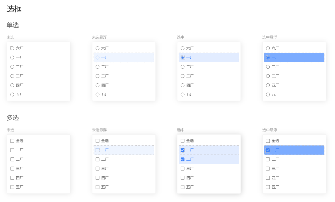
先看看设计图:
网上找了一溜,都是扯淡,样式也没个
自己动手吧,先把样式搞定
popper-class="xx-option"
所有单选框都用 :after和:before类 + 定位 实现
样式逻辑复杂点,再加上:hover、:active伪类,看不惯还要封装
就出来了
.xx-option {

  .el-select-dropdown__list .el-select-dropdown__item {

    background-color: var(--select-bg);

    color: var(--select-txt);

    font-weight: 400;

    padding-left: 40px;

    &.hover {

      background-color: var(--select-hover-bg);

      color: var(--select-hover-txt);

    }

    &.selected {

      background-color: var(--select-active-bg);

      color: var(--select-active-txt);

    }

    &.selected.hover {

      background-color: var(--select-active-hover-bg);

      color: var(--select-active-hover-txt);

    }

    &.selected::before {

      height: 10px;

      width: 10px;

      box-sizing: border-box;

      content: "";

      display: inline-block;

      position: absolute;

      left: 17px;

      top: 50%;

      transform: translateY(-50%);

      background-color: var(--select-radio-bg);

      border-radius: 50%;

      transition: 0.2s;

    }

    &::after {

      height: 16px;

      width: 16px;

      box-sizing: border-box;

      position: absolute;

      font-family: element-icons;

      content: "";

      font-size: 12px;

      font-weight: 700;

      left: 14px;

      top: 50%;

      transform: translateY(-50%);

      border: 1px solid var(--select-checkbox-border);

      border-radius: 50%;

      text-align: center;

      line-height: 16px;

      transition: 0.2s;

    }

    &.hover::after {

      border-color: var(--select-checkbox-hover-border);

      background-color: transparent;

    }

    &.selected::after {

      border-color: var(--select-checkbox-bg);

    }

  }

  &.is-multiple .el-select-dropdown__list .el-select-dropdown__item {

    &::after {

      border-radius: 0;

    }

    &.selected::after {

      content: "\E6DA";

      color: #fff;

      background-color: var(--select-checkbox-bg);

    }

    &.hover.selected::after {

      border-color: var(--select-checkbox-bg);

      background-color: var(--select-checkbox-bg);

    }

  }

}
用看的肯定是看不懂的,要不就直接拿走换颜色用,要不就动动小手自己敲一遍,再比对一番~
接下来是全选功能,先看看代码
组件
    <el-select

      ref="selector"

      popper-class="xx-option"

      v-model="selectValue"

      v-bind="$attrs"

      v-on="$listeners"

      :multiple="multiple"

      collapse-tags

    >

      <div

        v-if="multiple"

        class="el-select-dropdown__item"

        @click="onAllClick"

        @mouseenter="onAllEnter"

        @mouseleave="hoverAll = false"

        :class="{

          selected: selectedAll,

          hover: hoverAll

        }"

      >

        <span>全选</span>

      </div>

      <el-option

        v-for="(item, key) in options"

        :key="key"

        :label="item[labelKey]"

        :value="item[valueKey]"

      >

      </el-option>

    </el-select>
el-options写在了封装组件内,也是因为全选功能的局限性导致
在调用组件时,要传展示的labelKey和取值的valueKey
事件
    onAllClick() {

      this.selectedAll = !this.selectedAll;

      // 选中全选

      if (this.selectedAll) {

        if (this.selectValue.length < this.options.length) {

          this.selectValue = !this.valueKey

            ? this.options

            : this.options.map(item => item[this.valueKey]);

        }

      } else {

        this.selectValue = [];

      }

      this.$emit("change", this.selectValue);

    },

    onAllEnter() {

      this.hoverAll = true;

      const options = this.$refs.selector.options;

      this.$nextTick(() => {

        this.$refs.selector.options = options.map(item => {

          item.hover = false;

          return item;

        });

      });

      this.$refs.selector.hoverIndex = -1;

    },
用v-bind和v-on接受所有的参数和事件,这里就有点繁琐了
对比vue3 :=$attrs 属性逻辑都搞定
v-bind的参数,如果已经通过props传了过来,那就不会出现在this.$attrs里面
另外$attrs拿到的是个对象{string: string},对Boolean类型的数据不太友好
v-on就不像v-bind,可以存在同名的事件emit出去,自己组件本身和v-on的事件都能调用到(其实也是坑)
另外,要想调用自身事件的而不用组件的,需要加上修饰符.native(扯远了..)
onAllClick就是全选和反选功能,再emit一个change事件
那为什么要有onAllEnter事件呢,样式有问题
看了下源码,ele对option的鼠标移入事件添加了个hoverIndex状态来记录
需要手动处理一下,重置hoverIndex和option组件内的hover属性
功能完成,基本看得过去,处理一些数据绑定的小bug
@visible-change="onVisibleChange"
    onVisibleChange(visible) {

      // 验证多选全选

      this.selectedAll =

        visible &&

        this.multiple &&

        this.selectValue.length >= this.options.length;

    },
数据一进来,先判断是否全部选择,勾上全选按钮
每次数据change,除了绑定到外层v-model上,再加个全选判断
  computed: {

    selectValue: {

      get() {

        return this.value;

      },

      set(val) {

        this.selectedAll = this.multiple && val.length >= this.options.length;

        this.$emit("input", val);

      }

    }

  },
最后就是一些小细节,hover边框,active边框
上完整代码!!
<template>

  <div

    :class="[

      'xx-select',

      focusing && 'xx-select-focus',

      !title && 'xx-select-no-title'

    ]"

  >

    <span class="title" v-if="title">{{ title }}</span>

    <el-select

      ref="selector"

      class="select"

      popper-class="xx-option"

      v-model="selectValue"

      v-bind="$attrs"

      v-on="$listeners"

      :multiple="multiple"

      :placeholder="placeholder"

      :clearable="clearable"

      collapse-tags

      @visible-change="onVisibleChange"

      @blur="blur"

      @focus="focus"

    >

      <div

        v-if="multiple"

        class="el-select-dropdown__item"

        @click="onAllClick"

        @mouseenter="onAllEnter"

        @mouseleave="hoverAll = false"

        :class="{

          selected: selectedAll,

          hover: hoverAll

        }"

      >

        <span>全选</span>

      </div>

      <el-option

        v-for="(item, key) in options"

        :key="key"

        :label="labelKey ? item[labelKey] : item"

        :value="valueKey ? (valueKey === '$key' ? key : item[valueKey]) : item"

      >

      </el-option>

    </el-select>

  </div>

</template>

<script>

export default {

  name: "XxSelect",

  props: {

    title: {

      type: String,

      default: ""

    },

    placeholder: {

      type: String,

      default: ""

    },

    value: {

      type: [String, Number, Object, Array],

      required: true

    },

    multiple: {

      type: Boolean,

      default: false

    },

    clearable: {

      type: Boolean,

      default: true

    },

    options: {

      type: [Array, Object, Number],

      default: () => {

        return [];

      }

    },

    // valueKey

    // - 不传则为整个item赋值

    // - 传`$key` 返回index(array)或key(object)

    valueKey: {

      type: String

    },

    labelKey: {

      type: String

    }

  },

  data() {

    return {

      focusing: false,

      hoverAll: false,

      selectedAll: false

    };

  },

  computed: {

    selectValue: {

      get() {

        return this.value;

      },

      set(val) {

        this.selectedAll = this.multiple && val.length >= this.options.length;

        this.$emit("input", val);

      }

    }

  },

  methods: {

    onAllEnter() {

      this.hoverAll = true;

      const options = this.$refs.selector.options;

      this.$nextTick(() => {

        this.$refs.selector.options = options.map(item => {

          item.hover = false;

          return item;

        });

      });

      this.$refs.selector.hoverIndex = -1;

    },

    onAllClick() {

      this.selectedAll = !this.selectedAll;

      // 选中全选

      if (this.selectedAll) {

        if (this.selectValue.length < this.options.length) {

          this.selectValue = !this.valueKey

            ? this.options

            : this.options.map(item => item[this.valueKey]);

        }

      } else {

        this.selectValue = [];

      }

      this.$emit("change", this.selectValue);

    },

    onVisibleChange(visible) {

      // 验证多选全选

      this.selectedAll =

        visible &&

        this.multiple &&

        this.selectValue.length >= this.options.length;

    },

    focus() {

      this.focusing = true;

      this.$refs.selector.focus();

    },

    blur() {

      this.focusing = false;

    }

  }

};

</script>

<style lang="scss" scoped>

.xx-select {

  display: flex;

  align-items: center;

  justify-content: space-between;

  height: 100%;

  width: 24%;

  box-sizing: border-box;

  padding-left: 16px;

  border: 1px solid var(--default-border);

  border-radius: 4px;

  background-color: #fff;

  overflow: hidden;

  &:hover {

    border-color: var(--default-hover-border);

  }

  &-focus {

    border-color: var(--default-active-border) !important;

  }

  &-no-title {

    padding-left: 0px;

  }

  .title {

    flex: 2;

    font-size: 16px;

    color: #333;

  }

  .select {

    flex: 5;

    height: 100%;

    :deep(.el-select__tags) {

      margin-top: 1px;

    }

    :deep(.el-input--suffix) {

      line-height: 1;

      .el-input__inner {

        border: none;

      }

      .el-input__icon {

        line-height: 1;

      }

      .el-select__caret:not(.el-icon-circle-close) {

        transform: rotateZ(90deg);

        &::before {

          content: "\E6E1";

        }

      }

      &.is-focus {

        .el-select__caret:not(.el-icon-circle-close) {

          transform: rotateZ(0deg);

        }

      }

    }

  }

}

.xx-option {

  .el-select-dropdown__list .el-select-dropdown__item {

    background-color: var(--select-bg);

    color: var(--select-txt);

    font-weight: 400;

    padding-left: 40px;

    &.hover {

      background-color: var(--select-hover-bg);

      color: var(--select-hover-txt);

    }

    &.selected {

      background-color: var(--select-active-bg);

      color: var(--select-active-txt);

    }

    &.selected.hover {

      background-color: var(--select-active-hover-bg);

      color: var(--select-active-hover-txt);

    }

    &.selected::before {

      height: 10px;

      width: 10px;

      box-sizing: border-box;

      content: "";

      display: inline-block;

      position: absolute;

      left: 17px;

      top: 50%;

      transform: translateY(-50%);

      background-color: var(--select-radio-bg);

      border-radius: 50%;

      transition: 0.2s;

    }

    &::after {

      height: 16px;

      width: 16px;

      box-sizing: border-box;

      position: absolute;

      font-family: element-icons;

      content: "";

      font-size: 12px;

      font-weight: 700;

      left: 14px;

      top: 50%;

      transform: translateY(-50%);

      border: 1px solid var(--select-checkbox-border);

      border-radius: 50%;

      text-align: center;

      line-height: 16px;

      transition: 0.2s;

    }

    &.hover::after {

      border-color: var(--select-checkbox-hover-border);

      background-color: transparent;

    }

    &.selected::after {

      border-color: var(--select-checkbox-bg);

    }

  }

  &.is-multiple .el-select-dropdown__list .el-select-dropdown__item {

    &::after {

      border-radius: 0;

    }

    &.selected::after {

      content: "\E6DA";

      color: #fff;

      background-color: var(--select-checkbox-bg);

    }

    &.hover.selected::after {

      border-color: var(--select-checkbox-bg);

      background-color: var(--select-checkbox-bg);

    }

  }

}

</style>
options的label和value为啥这么复杂呢,主要是为了通用
支持数组、对象、数字
valueKey传$key可拿到key(对象)、index(数组、数字)
不传valueKey,则获取整个"item"
试试就明白了
给两个调用示例
<xx-select

  :ref="`productCode${index}`"

  v-model="product.productCode"

  filterable

  remote

  :remote-method="

    $event =>

      onFilterProduct(product.typeCode, 'productCode', $event)

  "

  :loading="productLoading"

  @visible-change="onProductVisibleChange($event, product.typeCode)"

  @change="onProductChange($event, 'productCode', index)"

  :options="products"

  valueKey="productCode"

  labelKey="productName"

/>
<xx-select v-model="product.priority" :options="9" />
好的。
el-select封装(单选框、多选框、全选功能)的更多相关文章
- jQuery 复选框全选/取消全选/反选
jQuery实现的复选框全选/取消全选/反选及获得选择的值. 完整代码: <!DOCTYPE html> <html> <head> <script type ...
- Jquery CheckBox复选框 全选/取消全选 最佳实现方式 参考案例
<input id="chkAll" type="checkbox" />全选/取消全选</div> <asp:Repeater ...
- vue实现功能 单选 取消单选 全选 取消全选
vue实现功能 单选 取消单选 全选 取消全选 代码部分 <template> <div class=""> <h1>全选框</h1> ...
- 让前端的下拉框支持单选、多选及全选,后台MyBaits解决方案
目录 一.解决思路 二.请求参数 三.后台相关代码 四.Mybatis注意要点 一.解决思路 让前端的下拉框支持单选.多选及全选,后台让Mybatis使用** trim **标签拼接动态SQL,实 ...
- jQuery--checkbox全选/取消全选
用JavaScript使页面上的一组checkbox全选/取消全选,逻辑很简单,实现代码也没有太难的语法.但使用jQuery实现则更简单,代码也很简洁,精辟! jQuery版本:1.3.2 <h ...
- vue多级复杂列表展开/折叠,全选/分组全选实现
首先,来看下效果图 在线体验地址:https://hxkj.vip/demo/multipleList/.温馨提示,打开之后按F12,使用手机模式食用,口味更佳! 可以看出,这个列表有三种展现形式: ...
- checkbox全选/取消全选
//checkbox全选/取消全选 $(function() { $("#checkAll").click(function() { if(this.checked){ $(&qu ...
- 关于在repeater中的checkbox实行多选和全选
今天项目中用到这一块,是一个b2b商城,业务是别人给客户留言后,客户从会员中心的留言管理中查看,用checkbox实行多选和全选后进行批量审核 首先在checkbox后加个hidden,作用见代码: ...
- AngularJS--购物车全选/取消全选功能实现
刚学习angularJS,于是练习写了一个类似于购物车的全选/取消全选的功能,主要实现的功能有: 1.勾选全选checkbox,列表数据全部被勾选,取消同理,用ng-model实现双向绑定: 2.选中 ...
- html checkbox 实现全选/取消全选
html checkbox 实现全选/取消全选 <html> <body> <table border="1"> <tr> < ...
随机推荐
- 微信小程序-页面跳转wxAPI
官方文档地址:https://developers.weixin.qq.com/miniprogram/dev/api/route/wx.navigateTo.html wx.navigateTo(O ...
- python快速入门【二】----常见的数据结构
python入门合集: python快速入门[一]-----基础语法 python快速入门[二]----常见的数据结构 python快速入门[三]-----For 循环.While 循环 python ...
- 1.5 为x64dbg编写插件
任何一个成熟的软件都会具有可扩展性,可扩展性是现代软件的一个重要特征,因为它使软件更易于维护和适应变化的需求,x64dbg也不例外其可通过开发插件的方式扩展其自身功能,x64dbg提供了多种插件接口, ...
- Qwik 1.0 发布,全栈式 Web 框架
Qwik 是一个全栈式 Web 框架,Qwik 基于 React.Angular 和 Vue 等其他 Web 框架的概念,但以 JavaScript 流等更新的方法脱颖而出,允许以高性能向用户交付复杂 ...
- PHP的无限极分类
PHP的无限极分类 一.使用数据表 添加from字段 id name parent_id from 1 中国 0 0 2 广东 1 0,1 3 深圳 2 0,1,2 4 龙华 3 0,1,2,3 5 ...
- 轻量级按键动作识别模块(C语言)
1.前言 继嵌入式(单片机)裸机 C 语言开发 + 按键扫描(模块分层/非阻塞式)文章后,原来的按键识别基本能满足大部分需求,但是对于双击和多击等多样化的功能需求并不能满足,因此对整个按键动作识别模块 ...
- 记录一则exachk进程占用大量CPU资源
有Exadata客户在进行exachk巡检之后反馈,发现系统中,exachk进程占用了大量CPU资源. 了解之前的变更,只是巡检之前升级了AHF,然后进行标准的exachk巡检. 现象: 目前机器整体 ...
- 从零开始手写 mybatis(四)- mybatis 事务管理机制详解
前景回顾 第一节 从零开始手写 mybatis(一)MVP 版本 中我们实现了一个最基本的可以运行的 mybatis. 第二节 从零开始手写 mybatis(二)mybatis interceptor ...
- Java设计模式-职责链模式Chain of Responsibility
介绍 职责链模式(Chain of Responsibility Pattern), 又叫 责任链模式,为请求创建了一个接收者对象的链(简单示意图).这种模式对请求的发送者和接收者进行解耦. 职责链模 ...
- java: -source 1.5 中不支持 diamond 运算符
1.问题说明 平常在用idea编译spring boot多模块项目时,老是无端提示: Error:(107, 55) java: -source 1.5 中不支持 diamond 运算符 (请使用 - ...