WPF Style和Template
WPF中的Style类似于Web应用程序中的CSS,它是控件的一个属性,属于资源的一种。
ControlTemplate和DataTemplate区别:
ControlTemplate用于改变控件原来的形状(一般定义在Style中,给控件穿上一层新的外壳,改变这个控件的外观),而DataTemplate不改变控件原来的形状(给某个控件加上数据,相当于给控件显示它想显示的内容(可能会有多种控件组合))。
通常把Style定义在Resources中,使用方式如下:
<Windows.Resources>

  <Style  x:Key="btnstyle"  TargetType="Button">

     <Setter Property="Width" Value="80"/>

     <Setter Property="Height" Value="50"/>

     <Setter Property="Foreground" Value="Pink"/>

     <Setter Property="FontSize" Value="20"/>

     <Style.Triggers>

        <Trigger Property="IsMouseOver" Value="true">

           <Setter Property="Background" Value="pink"/>

        </Trigger>

        <MultiTrigger>

          <MultiTrigger.Conditions>

             <Condition Property="IsMouseOver" Value="false"/>

             <Condition Property="FontSize" Value="20"/>

          </MultiTrigger.Conditions>

          <MultiTrigger.Setters>

             <Setter Property="Background" Value="Gold"/>

          </MultiTrigger.Setters>

        </MultiTrigger>

     </Style.Triggers>

  </Style>

<Window.Resources>
<Button x:Name="button1" Style="{StaticResource btnstyle}" Content="button1" >
button1.style=(style)Resources["btnstyle"];
如果只需对控件进行小幅度修饰(调整大小、位置、字体、颜色等)就用style;如果需要改变控件的外观和行为就用controlTemplate(形状、事件触发如鼠标停留效果等)。在实际项目中,经常把Template定义在Style中,通过Style 中的Property来设置控件的Template属性。
WPF中的所有COntrol控件都有Template属性。下面以代码的形式,展现WPF中常用的Template。
<Window x:Class="WPFXAMLTest.WindowControlTemplate"
xmlns="http://schemas.microsoft.com/winfx/2006/xaml/presentation"
xmlns:x="http://schemas.microsoft.com/winfx/2006/xaml"
Title="WindowControlTemplate" Height="" Width="">
<Grid Background="Yellow">
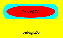
<Button Width="" Height="" Background="Cyan">
<Button.Template>
<ControlTemplate TargetType="Button">
<Grid>
<Rectangle Width="" Height="" Fill="{TemplateBinding Background}" RadiusX="" RadiusY=""/>
<ContentPresenter Content="{TemplateBinding Content}" VerticalAlignment="Center" HorizontalAlignment="Center" RecognizesAccessKey="True"/>
</Grid>
</ControlTemplate>
</Button.Template>
<Button.Content>
<Grid>
<Ellipse Fill="Red" Width="" Height=""/>
<TextBlock Text="DebugLZQ" VerticalAlignment="Center" HorizontalAlignment="Center"/>
</Grid>
</Button.Content>
</Button>
<Button HorizontalAlignment="Left" Margin="105,190,0,0" VerticalAlignment="Top" Width="">
<Button.Template>
<ControlTemplate >
<TextBlock Text="DebugLZQ" VerticalAlignment="Center" HorizontalAlignment="Center"/>
</ControlTemplate>
</Button.Template>
</Button>
</Grid>
</Window>
<Style  x:Key="btnstyle" TargetType="Button">

            <Setter Property="Width" Value="80"/>

            <Setter Property="Height" Value="50"/>

            <Setter Property="Foreground" Value="Pink"/>

            <Setter Property="FontSize" Value="20"/>

            <Setter Property="Template"><!--所有Control控件都有Style和Template属性,前者用来控制控件的原有属性;后者用来定义控件的内部结构,对控件外观和形状进行改变 -->

                <Setter.Value>

                    <ControlTemplate TargetType="Button"><!--ControlTemplate 描述控件的行为和样式-->

                        <Grid Width="80" Height="50">

                            <Image Source="Images/1.png" Stretch="Fill" />

                            <!---->

                            <ContentPresenter HorizontalAlignment="Center"  VerticalAlignment="Center" />

                        </Grid>

                        <ControlTemplate.Triggers>

                            <Trigger Property="IsMouseOver" Value="true">

                                <Setter Property="Effect">

                                    <Setter.Value>

                                        <DropShadowEffect ShadowDepth="4"/>

                                    </Setter.Value>

                                </Setter>

                            </Trigger>

                        </ControlTemplate.Triggers>

                    </ControlTemplate>

                </Setter.Value>

            </Setter>

        </Style>
<Button x:Name="button1" Style="{StaticResource btnstyle}" Content="button1" Click="Button_Click" Margin="30,23,393,238"/>
<Style x:Key="btnstyle2" TargetType="Button">

            <Setter Property="Width" Value="80"/>

            <Setter Property="Height" Value="50"/>

            <Setter Property="ContentTemplate"><!--2.ContentTemplate不改变控件行为的基础上,只对控件内容进行更改 -->

                <Setter.Value>

                    <DataTemplate><!--返回值是 DataTemplate-->

                         <Grid>

                             <Image Source="Images/1.png" Stretch="Fill" />

                              <TextBlock  Text="{TemplateBinding Content}" FontSize="20" HorizontalAlignment="Center" VerticalAlignment="Center" Foreground="Pink" />

                         </Grid>

                    </DataTemplate>

                </Setter.Value>

            </Setter>

        </Style>
<Button x:Name="button2" Style="{StaticResource btnstyle2}" Content="button2" Margin="30,117,392,144" />
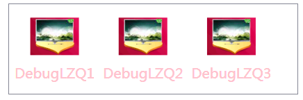
<Style x:Key="lstboxstyle" TargetType="ListBox">

            <Setter Property="ItemTemplate">

                <Setter.Value>

                    <DataTemplate>

                        <StackPanel>

                            <Image Source="{Binding ImgPath}" Width="70" Height="70" Margin="0"/>

                            <TextBlock Text="{Binding ImgTxt}" HorizontalAlignment="Center" Margin="5"/>

                        </StackPanel>

                    </DataTemplate>

                </Setter.Value>

            </Setter>

        </Style>
<ListBox Style="{StaticResource lstboxstyle }" Height="214" HorizontalAlignment="Left" Margin="226,12,0,0" Name="listBox1" VerticalAlignment="Top" Width="153" />
//Binding ListBox

            ArrayList list = new ArrayList();

            list.Add(new { ImgPath="Images/1.png",ImgTxt="DebugLZQ1"});

            list.Add(new { ImgPath = "Images/1.png", ImgTxt = "DebugLZQ2" });

            list.Add(new { ImgPath = "Images/1.png", ImgTxt = "DebugLZQ3" });

            listBox1.ItemsSource = listBox2.ItemsSource = list;

<Style x:Key="lstboxstyle2" TargetType="ListBox">

            <Setter Property="ItemsPanel">

                <Setter.Value>

                    <ItemsPanelTemplate><!-- ItemsPanelTemplate指定控件子项的布局样式,Combox,TreeView,DataGrid,TabelControl也都均有此属性-->

                        <StackPanel Orientation="Horizontal" />

                    </ItemsPanelTemplate>

                </Setter.Value>

            </Setter>

            <Setter Property="ItemTemplate"><!-- ItemTemplate定义子项的外观-->

                <Setter.Value>

                    <DataTemplate><!-- 返回值DataTemplate-->

                        <StackPanel>

                            <Image Source="{Binding ImgPath}" Width="70" Height="70" Margin="0"/>

                            <TextBlock Text="{Binding ImgTxt}" HorizontalAlignment="Center" Margin="5" Foreground="Pink"/><!--可以这里改-->

                        </StackPanel>

                    </DataTemplate>

                </Setter.Value>

            </Setter>

            <Setter Property="ItemContainerStyle"><!--也能在这里改,也能直接在TextBlock里改-->

                <Setter.Value>

                    <Style TargetType="ListBoxItem">

                        <Setter Property="FontSize" Value="20"/>

                    </Style>

                </Setter.Value>

            </Setter>

        </Style>
<ListBox Style="{StaticResource lstboxstyle2 }" Height="131" HorizontalAlignment="Left" Margin="42,256,0,0" Name="listBox2" VerticalAlignment="Top" Width="417" />
WPF Style和Template的更多相关文章
- WPF DataGrid Custommization using Style and Template
WPF DataGrid Custommization using Style and Template 代码下载:http://download.csdn.net/detail/wujicai/81 ...
- Bootstrap WPF Style(二)--Glyphicons 字体图标
介绍 关于Glyphicons字体图标,首先给出友情链接 Glyphicons 这个项目是在Bootstrap WPF Style项目基础上做的,详见http://www.cnblogs.com/ts ...
- WPF QuickStart系列之样式和模板(Style and Template)
在WPF桌面程序中,当我们想构建一个统一的UI表现时(在不同操作系统下,显示效果一致),此时我们就需要使用到WPF中的样式和模板技术.简单来说,如果我们需要简单的给一个Button设置宽,高,Marg ...
- WPF Style设置和模板化Template
WPF样式设置和模板化是一套功能(样式,模板,触发器和演示图版),可以为产品设置统一外观.类似于html的css,可以快速的设置一系列属性值到控件. 案例:ButtonStyle 这里创建了一个目标类 ...
- wpf中在style的template寻找ControlTemplate和DataTemplate的控件
一.WPF中的两棵树 WPF中每个控件的Template都是由ControlTemplate构成,ControlTemplate包含了构成该控件的各种子控件,这些子控件就构成了VisualTree:而 ...
- Bootstrap WPF Style,Bootstrap风格的WPF样式
简介 GitHub地址:https://github.com/ptddqr/bootstrap-wpf-style 此样式基于bootstrap-3.3.0,样式文件里的源码行数都是指的这个版本.CS ...
- wpf 的各个template
--转载 在使用TabControl.ListView.Menu.TreeView的时候被各种Template搞得头昏眼花,决心把这个问题搞清楚,究竟什么时候该用什么Template?这是个麻烦的问题 ...
- C#工具:Bootstrap WPF Style,Bootstrap风格的WPF样式
简介 GitHub地址:https://github.com/ptddqr/bootstrap-wpf-style 此样式基于bootstrap-3.3.0,样式文件里的源码行数都是指的这个版本.CS ...
- WPF Style
<Application x:Class="WzlyTool.App" xmlns="http://schemas.microsoft.com/winfx/20 ...
随机推荐
- 四则运算 Python实现(杨浩政,张兆敏)
四则运算 GitHub仓库:https://github.com/15crmor/Arithmetic 项目要求: 题目:实现一个自动生成小学四则运算题目的命令行程序说明: 说明: 自然数:0, 1, ...
- Struts2-057/CVE-2018-11776两个版本RCE漏洞分析(含EXP)
0x01 前言 2018年8月22日,Apache Strust2发布最新安全公告,Apache Struts2存在远程代码执行的高危漏洞(S2-057/CVE-2018-11776),该漏洞由Sem ...
- ASP.NET Core 2 学习笔记(六)MVC
ASP.NET Core MVC跟ASP.NET MVC观念是一致的,使用上也没有什么太大的变化.之前的ASP.NET MVC把MVC及Web API的套件分开,但在ASP.NET Core中MVC及 ...
- C#MVC和cropper.js实现剪裁图片ajax上传的弹出层
首先使用cropper.js插件,能够将剪裁后的图片返回为base64编码,后台根据base64编码解析保存图片. jQuery.cropper: 是一款使用简单且功能强大的图片剪裁jquery插件 ...
- Flask基础-基础实例
1. 10行代码的迷你程序 flask项目 from flask import Flask app = Flask(__name__) @app.route("/index") d ...
- Kafka副本同步机制
引用自:http://blog.csdn.net/lizhitao/article/details/51718185 Kafka副本 Kafka中主题的每个Partition有一个预写式日志文件,每个 ...
- python实战——网络爬虫
学习网络爬虫的目的: 1,可以私人定制一个搜索引擎,可以深层次的了解搜索引擎的工作原理. 2,大数据时代,要进行数据分析,首先要有数据源,学习爬虫,可以让我们获取更多的数据. 3,从业人员可以可好的利 ...
- Alamofire源码导读二:发起请求及内部加锁的逻辑
以创建一个 DataRequest 为例子  发起请求 创建 SessionManager 顺带也创建了一个 SessionDelegate 持有一个urlSession,持有一个串行的 Dispa ...
- java解压缩.gz .zip .tar.gz等格式的压缩包方法总结
1..gz文件是linux下常见的压缩格式.使用 java.util.zip.GZIPInputStream即可,压缩是 java.util.zip.GZIPOutputStream public s ...
- SQL与NOSQL
一:关系型数据库 1.概念: 采用了关系模型来组织数据的数据库.简单讲,关系模型就是二维表格模型.二维表格在 数据库中我们称之为记录,列在数据库中我们成为字段. 2举例: M ...