iOS - UIButton
前言
	NS_CLASS_AVAILABLE_IOS(2_0) @interface UIButton : UIControl <NSCoding>

	@available(iOS 2.0, *)		 public class UIButton : UIControl, NSCoding
1、UIButton 的创建
Objective-C
	// 实例化 button 对象

	UIButton *button = [UIButton buttonWithType:UIButtonTypeCustom];

	// 将 button 添加到 window

	[self.view addSubview:button];
Swift
	// 实例化 button 对象

	let button:UIButton = UIButton(type: .Custom)

	// 将 button 添加到 window

	self.view.addSubview(button)
2、UIButton 的设置
Objective-C
	// 设置 button 类型

	/*

		UIButtonTypeCustom = 0,         // 定制按钮,不带图标(常加载图片),默认文字颜色为白色,无触摸时的高亮效果

		UIButtonTypeSystem              // 不带图标,默认文字颜色为蓝色,有触摸时的高亮效果

		UIButtonTypeDetailDisclosure,   // “!” 图标按钮,默认文字颜色为蓝色,有触摸时的高亮效果

		UIButtonTypeInfoLight,          // “!” 图标按钮,默认文字颜色为蓝色,有触摸时的高亮效果

		UIButtonTypeInfoDark,           // “!” 图标按钮,默认文字颜色为蓝色,有触摸时的高亮效果

		UIButtonTypeContactAdd,         // “+” 图标按钮,默认文字颜色为蓝色,有触摸时的高亮效果

		UIButtonTypeRoundedRect = UIButtonTypeSystem,

		[[UIButton alloc] init] 方式创建的 button 为 UIButtonTypeCustom 类型。

		StoryBoard 创建的 button 默认为 UIButtonTypeSystem 类型。

	*/

	UIButton *button = [UIButton buttonWithType:UIButtonTypeCustom];

	// 设置 frame

	button.frame = CGRectMake(10, 100, 110, 50);

	// 设置内边距大小

	/*

    	设置的内边距范围内不会显示内容

 	*/

    	// 内容内边距(标题文字和图片)

    	button.contentEdgeInsets = UIEdgeInsetsMake(20, 20, 10, 10);

    	// 标题文字内边距

    	button.titleEdgeInsets = UIEdgeInsetsMake(40, 20, 10, 10);

    	// 图片内边距

    	button.imageEdgeInsets = UIEdgeInsetsMake(20, 10, 10, 10);

	// 背景颜色

	/*

		默认为透明色(clearColor)

	*/

	button.backgroundColor = [UIColor grayColor];

	// 设置按钮的文字

	/*

		UIControlStateNormal       = 0,           // 未选中状态,常规状态

		UIControlStateHighlighted  = 1 << 0,      // 高亮状态,点击状态

		UIControlStateDisabled     = 1 << 1,      // 禁用状态

		UIControlStateSelected     = 1 << 2,      // flag usable by app (see below),选中状态

		UIControlStateFocused NS_ENUM_AVAILABLE_IOS(9_0) = 1 << 3,

		                                          // Applicable only when the screen supports focus

		UIControlStateApplication  = 0x00FF0000,  // additional flags available for application use

		UIControlStateReserved     = 0xFF000000   // flags reserved for internal framework use

	*/

	[button setTitle:@"普通状态" forState:UIControlStateNormal];

	// 设置文字颜色

	[button setTitleColor:[UIColor blackColor] forState:UIControlStateNormal];

	// 设置文字阴影颜色

	[button setTitleShadowColor:[UIColor yellowColor] forState:UIControlStateNormal];

	// 修改文字字体

	button.titleLabel.font = [UIFont systemFontOfSize:30];               // 普通

	button.titleLabel.font = [UIFont boldSystemFontOfSize:30];           // 加粗

	button.titleLabel.font = [UIFont italicSystemFontOfSize:30];         // 斜体(对中文无效)

	button.titleLabel.font = [UIFont fontWithName:@"Zapfino" size:15];   // 设置为指定字体类型的文字

	// 修改文字水平对齐方式

	/*

		UIControlContentHorizontalAlignmentCenter = 0,    // 居中

		UIControlContentHorizontalAlignmentLeft   = 1,    // 左对齐

		UIControlContentHorizontalAlignmentRight  = 2,    // 右对齐

		UIControlContentHorizontalAlignmentFill   = 3,    // 分散对齐

	*/

	button.contentHorizontalAlignment = UIControlContentHorizontalAlignmentCenter;

	// 修改文字垂直对齐方式

	/*

		UIControlContentVerticalAlignmentCenter  = 0,     // 居中

		UIControlContentVerticalAlignmentTop     = 1,     // 上对齐

		UIControlContentVerticalAlignmentBottom  = 2,     // 下对齐

		UIControlContentVerticalAlignmentFill    = 3,     // 分散对齐

	*/

	button.contentVerticalAlignment = UIControlContentVerticalAlignmentCenter;

	// 设置内部的小图片

	/*

		图片将会以原始比例显示,button 上的图片和文字可以同时添加

	*/

	[button setImage:[UIImage imageNamed:@"hehe.png"] forState:UIControlStateNormal];

	// 设置背景图片

	/*

		图片将会填充整个背景

		为了保证高亮状态下的图片正常显示,必须设置按钮的 type 为 custom

	*/

	[button setBackgroundImage:[UIImage imageNamed:@"pic1.png"] forState:UIControlStateNormal];

	// 设置图片不变暗

	/*

		在未设置触摸状态图片时,触摸状态或禁用状态下图片会变暗

	*/

		// 触摸状态时图标不变暗

		button.adjustsImageWhenHighlighted = NO;

		// 禁用状态时图标不变暗

		button.adjustsImageWhenDisabled = YES;

	// 设置 button 的激活与失效状态

	/*

		YES 激活状态,默认状态,NO 失效状态(不可点击)

	*/

	button.enabled = YES;

	// 设置 butotn 的隐藏与显示状态

	/*

		YES 隐藏状态,NO 显示状态,默认状态

	*/

	button.hidden = YES;

	// 设置 butotn 的选中状态

	/*

		YES 选中,NO 未选中

	*/

	button.selected = YES;

	// 获取 butotn 当前的选中状态

	BOOL selected = button.selected;

	// readonly 只读属性

		NSString *title = button.currentTitle;                                 // 获取按钮当前的标题

		NSAttributedString *attributedTitle = button.currentAttributedTitle;   // 获取按钮当前的标题属性

		UIColor *titleColor = button.currentTitleColor;                        // 获取按钮当前的标题颜色

		UIColor *shadowColor = button.currentTitleShadowColor;                 // 获取按钮当前的标题阴影颜色

		UIImage *currentImage = button.currentImage;                           // 获取按钮当前的图片

		UIImage *backgroundImage = button.currentBackgroundImage;              // 获取按钮当前的背景图片

		NSString *title1 = [button titleForState:UIControlStateNormal];        // 获取按钮指定状态的文字

		// 获取按钮指定状态的标题属性

		NSAttributedString *attributedTitle1 = [button attributedTitleForState:UIControlStateNormal];

		// 获取按钮指定状态的标题颜色

		UIColor *titleColor1 = [button titleColorForState:UIControlStateNormal];

		// 获取按钮指定状态的标题阴影颜色

		UIColor *shadowColor1 = [button titleShadowColorForState:UIControlStateNormal];

		// 获取按钮指定状态的图片

		UIImage *currentImage1 = [button imageForState:UIControlStateNormal];

		// 获取按钮指定状态的背景图片

		UIImage *backgroundImage1 = [button backgroundImageForState:UIControlStateNormal];

	// 设置 button 点击触发事件

	/*

		UIControlEventTouchDown           = 1 <<  0,  // on all touch downs

		UIControlEventTouchDownRepeat     = 1 <<  1,  // on multiple touchdowns (tap count > 1)

		UIControlEventTouchDragInside     = 1 <<  2,

		UIControlEventTouchDragOutside    = 1 <<  3,

		UIControlEventTouchDragEnter      = 1 <<  4,

		UIControlEventTouchDragExit       = 1 <<  5,

		UIControlEventTouchUpInside       = 1 <<  6,

		UIControlEventTouchUpOutside      = 1 <<  7,

		UIControlEventTouchCancel         = 1 <<  8,

		UIControlEventValueChanged        = 1 << 12,  // sliders, etc.

		UIControlEventPrimaryActionTriggered NS_ENUM_AVAILABLE_IOS(9_0) = 1 << 13,

		                                  // semantic action: for buttons, etc.

		UIControlEventEditingDidBegin     = 1 << 16,  // UITextField

		UIControlEventEditingChanged      = 1 << 17,

		UIControlEventEditingDidEnd       = 1 << 18,

		UIControlEventEditingDidEndOnExit = 1 << 19,  // 'return key' ending editing

		UIControlEventAllTouchEvents      = 0x00000FFF,  // for touch events

		UIControlEventAllEditingEvents    = 0x000F0000,  // for UITextField

		UIControlEventApplicationReserved = 0x0F000000,  // range available for application use

		UIControlEventSystemReserved      = 0xF0000000,  // range reserved for internal framework use

		UIControlEventAllEvents           = 0xFFFFFFFF

	*/

	[button addTarget:self action:@selector(buttonClick:) forControlEvents:UIControlEventTouchUpInside];
Swift
	// 设置 button 类型

	/*

		case Custom             // 定制按钮,不带图标(常加载图片),默认文字颜色为白色,无触摸时的高亮效果

		case System             // 不带图标,默认文字颜色为蓝色,有触摸时的高亮效果

		case DetailDisclosure   // “!” 图标按钮,默认文字颜色为蓝色,有触摸时的高亮效果

		case InfoLight          // “!” 图标按钮,默认文字颜色为蓝色,有触摸时的高亮效果

		case InfoDark           // “!” 图标按钮,默认文字颜色为蓝色,有触摸时的高亮效果

		case ContactAdd         // “+” 图标按钮,默认文字颜色为蓝色,有触摸时的高亮效果

		UIButton() 方式创建的 button 为 Custom 类型。

		StoryBoard 创建的 button 默认为 System 类型。

	*/

	let button:UIButton = UIButton(type: .Custom)

	// 设置 frame

	button.frame = CGRectMake(10, 100, 110, 50)

	// 设置内边距大小

	/*

    	设置的内边距范围内不会显示内容

 	*/

    	// 内容内边距(标题文字和图片)

    	button.contentEdgeInsets = UIEdgeInsetsMake(20, 20, 10, 10)

    	// 标题文字内边距

    	button.titleEdgeInsets = UIEdgeInsetsMake(40, 20, 10, 10)

    	// 图片内边距

    	button.imageEdgeInsets = UIEdgeInsetsMake(20, 10, 10, 10)

	// 背景颜色

	/*

		默认为透明色(clearColor)

	*/

	button.backgroundColor = UIColor.grayColor()

	// 设置按钮的文字

	/*

		Normal         // 普通状态,未选中状态

		Highlighted    // used when UIControl isHighlighted is set,高亮状态,点击状态

		Disabled       // 禁用状态

		Selected       // flag usable by app (see below),选中状态

		@available(iOS 9.0, *)

		Focused        // Applicable only when the screen supports focus

		Application    // additional flags available for application use

		Reserved       // flags reserved for internal framework use

	*/

	button.setTitle("普通状态", forState: .Normal)

	// 设置文字颜色

	button.setTitleColor(UIColor.blackColor(), forState: .Normal)

	// 设置文字阴影颜色

	button.setTitleShadowColor(UIColor.yellowColor(), forState: .Normal)

	// 修改文字字体

	button.titleLabel?.font = UIFont.systemFontOfSize(30)           // 普通

	button.titleLabel?.font = UIFont.boldSystemFontOfSize(30)       // 加粗

	button.titleLabel?.font = UIFont.italicSystemFontOfSize(30)     // 斜体(对中文无效)

	button.titleLabel?.font = UIFont(name: "Zapfino", size: 15)     // 设置为指定字体类型的文字

	// 修改文字水平对齐方式

	/*

		case Center      // 居中

		case Left        // 左对齐

		case Right       // 右对齐

		case Fill        // 分散对齐

	*/

	button.contentHorizontalAlignment = .Center

	// 修改文字垂直对齐方式

	/*

		case Center      // 居中

		case Top         // 上对齐

		case Bottom      // 下对齐

		case Fill        // 分散对齐

	*/

	button.contentVerticalAlignment = .Center

	// 设置内部的小图片

	/*

		图片将会以原始比例显示,button 上的图片和文字可以同时添加

	*/

	button.setImage(UIImage(named: "hehe.png"), forState: .Normal)

	// 设置背景图片

	/*

		图片将会填充整个背景

		为了保证高亮状态下的图片正常显示,必须设置按钮的 type 为 custom

	*/

	button.setBackgroundImage(UIImage(named: "pic1.png"), forState: .Normal)

	// 设置图片不变暗

	/*

		在未设置触摸状态图片时,触摸状态或禁用状态下图片会变暗

	*/

		// 触摸状态时图标不变暗

		button.adjustsImageWhenHighlighted = false

		// 禁用状态时图标不变暗

		button.adjustsImageWhenDisabled = false

	// 设置 button 的激活与失效状态

	/*

		true 激活状态,默认状态,false 失效状态(不可点击)

	*/

	button.enabled = true

	// 设置 butotn 的隐藏与显示状态

	/*

		true 隐藏状态,false 显示状态,默认状态

	*/

	button.hidden = true

	// 设置 butotn 的选中状态

	/*

		true 选中,false 未选中

	*/

	button.selected = true

	// 获取 butotn 当前的选中状态

	let selected:Bool = button.selected

	// readonly 只读属性

		let title:String? = button.currentTitle                                   // 获取按钮当前的标题

		let attributedTitle:NSAttributedString? = button.currentAttributedTitle   // 获取按钮当前的标题属性

		let titleColor:UIColor = button.currentTitleColor                         // 获取按钮当前的标题颜色

		let shadowColor:UIColor? = button.currentTitleShadowColor                 // 获取按钮当前的标题阴影颜色

		let currentImage:UIImage? = button.currentImage                           // 获取按钮当前的图片

		let backgroundImage:UIImage? = button.currentBackgroundImage              // 获取按钮当前的背景图片

		// 获取按钮指定状态的文字

		let title1:String? = button.titleForState(.Normal)

		// 获取按钮指定状态的标题属性

		let attributedTitle1:NSAttributedString? = button.attributedTitleForState(.Normal)

		// 获取按钮指定状态的标题颜色

		let titleColor1:UIColor? = button.titleColorForState(.Normal)

		// 获取按钮指定状态的标题阴影颜色

		let shadowColor1:UIColor? = button.titleShadowColorForState(.Normal)

		// 获取按钮指定状态的图片

		let currentImage1:UIImage? = button.imageForState(.Normal)

		// 获取按钮指定状态的背景图片

		let backgroundImage1:UIImage? = button.backgroundImageForState(.Normal)

	// 设置 button 点击触发事件

	/*

		TouchDown        		   // on all touch downs

		TouchDownRepeat  		   // on multiple touchdowns (tap count > 1)

		TouchDragInside

		TouchDragOutside

		TouchDragEnter

		TouchDragExit

		TouchUpInside

		TouchUpOutside

		TouchCancel

		ValueChanged              // sliders, etc.

		@available(iOS 9.0, *)

		PrimaryActionTriggered    // semantic action: for buttons, etc.

		EditingDidBegin           // UITextField

		EditingChanged

		EditingDidEnd

		EditingDidEndOnExit       // 'return key' ending editing

		AllTouchEvents            // for touch events

		AllEditingEvents          // for UITextField

		ApplicationReserved       // range available for application use

		SystemReserved            // range reserved for internal framework use

		AllEvents

	*/

	button.addTarget(self, action: #selector(UiButton.buttonClick(_:)), forControlEvents: .TouchUpInside)
3、Storyboard 中设置
在 Storyboard 场景中设置
Button 设置
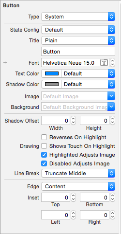
Type 按钮类型 |
State Config | 按钮状态
Title | 按钮文字
Font | 按钮文字字体
Text Color | 按钮文字颜色
Shadow Color | 按钮文字阴影颜色
Image | 按钮图片
Background | 按钮背景图片
|
Shadow Offset | 按钮阴影偏移量
-- Reverses On Highlight |
Drawing |
-- Shows Touch On Highlight |
-- Highlighted Adjusts Image | 高亮状态图片不变暗
-- Disabled Adjusts Image | 禁用状态图片不变暗
Line Break | 断行方式
|
Edge | 边距类型设置
Inset | 内边距大小设置Control 设置
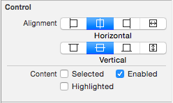
Alignment 文字对齐方式 |
Content |
-- Selected | 选中
-- Enable | 可用
-- Highlighted | 高亮
4、UIButton、UIImageView、UILabel 的选择
特点:
UIButton:
- 既能显示文字,又能显示图片(能显示 2 张图片,背景图片和内容图片)。
- 长按高亮的时候可以切换图片\文字。
- 直接通过 addTarget... 方法监听点击。
UIImageView:
- 能显示图片,不能直接通过 addTarget... 方法监听点击。
UILabel:
- 能显示文字,不能直接通过 addTarget... 方法监听点击。
选择:
仅仅是显示数据,不需要点击
- 建议选择 UIImageView、UILabel。
不仅显示数据,还需要监听点击
- 建议选择 UIButton。
- 其实 UIImageView、UILabel 也可以通过手势识别器来监听。
- 建议选择 UIButton。
长按控件后,会改变显示的内容
- 选择 UIButton
- 因为 UIButton 有 highlighted 这种状态。
- 选择 UIButton
同时显示 2 张图片:背景图片、内容图片
- 选择 UIButton。
5、UIButton 子控件
1、不要直接拿出按钮内部的子控件,来修改文字、图片属性,按钮内部的子控件设置是有状态的。
直接拿出设置时无法显示
	self.imageView.image = [UIImage imageNamed:@"shop.icon"];

  	self.titleLabel.text = shop.name;
带状态设置时才能正常显示
	self setImage:[UIImage imageNamed:shop.icon] forState:UIControlStateNormal];

	[self setTitle:shop.name forState:UIControlStateNormal];
2、子控件 frame 设置
	self.imageView.frame = CGRectMake(0, 0, buttonW, imageH);

	self.titleLabel.frame = CGRectMake(0, imageH, buttonW, buttonH - imageH);
	// 设置按钮中 title 的尺寸

	- (CGRect)titleRectForContentRect:(CGRect)contentRect {

	    return CGRectMake(0, 30, 70, 30);

	}
	// 设置按钮中 imageView 的尺寸

	- (CGRect)imageRectForContentRect:(CGRect)contentRect {

	    // 计算 imageView 控件尺寸,contentRect 为按钮的尺寸

	    CGFloat W = 40;

	    CGFloat H = 46;

	    CGFloat X = (contentRect.size.width - W) * 0.5;

	    CGFloat Y = 20;

	    return CGRectMake(X, Y, W, H);

	}
3、子控件 接收点击事件的区域 设置
	// 设置按钮接收点击事件的区域

	- (UIView *)hitTest:(CGPoint)point withEvent:(UIEvent *)event {

	    CGFloat btnW = self.bounds.size.width;

	    CGFloat btnH = self.bounds.size.height;

	    // 计算不接收点击事件的区域

	    CGFloat X = 0;

	    CGFloat Y = btnH / 2;

	    CGFloat W = btnW;

	    CGFloat H = Y;

	    CGRect rect = CGRectMake(X, Y, W, H);

	    if (CGRectContainsPoint(rect, point)) {

	        return nil;

	    } else {

	        return [super hitTest:point withEvent:event];

	    }

	}
iOS - UIButton的更多相关文章
- IOS UIButton用法详解
这段代码动态的创建了一个UIButton,并且把相关常用的属性都列举了.希望对大家有用. //这里创建一个圆角矩形的按钮UIButton *button1 = [UIButton buttonWi ...
- iOS UIButton 图片文字上下垂直布局 解决方案
实现如图所示效果: 这是一个UIButton,需要改变image和title相对位置. 解决如下: //设置文字偏移:向下偏移图片高度+向左偏移图片宽度 (偏移量是根据[图片]大小来的,这点是关键)b ...
- iOS UIButton文字和图片间距随意调整
代码地址如下:http://www.demodashi.com/demo/11606.html 前记 在开发中,我们经常会遇到这么一种情况,就是一个按钮上面有图片也有文字,但是往往设计并不是我们想要的 ...
- iOS - UIButton设置文字标题下划线以及下划线颜色
创建button设置可以折行显示 - (void)viewDidLoad { [super viewDidLoad]; UIButton * button = [[UIButton alloc] in ...
- iOS - UIButton折行文字显示设置
首先在控制器中创建一个button - (void)viewDidLoad { [super viewDidLoad]; UIButton * button = [[UIButton alloc] i ...
- iOS·UIButton如何文字在下图片在上
创建子类继承自UIButton,在layoutSubviews方法中改变文字和图片的位置就可以了,同理,稍作改变,可以写出文字在上图片在下.本文只给出文字在下图片在上的代码 -(void)layout ...
- iOS UIButton单双击处理响应不同的方法
//显示目标 双击显示当前用户坐标位置 UIButton * btnShowDistination = [[UIButton alloc]initWithFrame:CGRectMake(, SCRE ...
- iOS UIButton setTitle与setAttributedTitle
今天遇到一个问题,查了好久,终于解决. 我需要根据不同的条件给uibutton赋不同的值,由于字体要求有不同颜色变化,所以我选择了一个条件下用setTitle,另一个条件下用setAttributed ...
- ios UIButton设置单选效果,以及同时设置图片和标题
一,设置单选效果 - (void)selectedBtnPress:(UIButton*)sender { //首先把原来按钮的选中效果消除 for (int i=0;i<num;i++) {/ ...
随机推荐
- 【Pro ASP.NET MVC 3 Framework】.学习笔记.5.SportsStore一个真实的程序
我们要建造的程序不是一个浅显的例子.我们要创建一个坚固的,现实的程序,坚持使它成为最佳实践.与Web Form中拖控件不同.一开始投入MVC程序付出利息,它给我们可维护的,可扩展的,有单元测试卓越支持 ...
- CentOS 7 更新源 – 使用国内 163 yum 源
突然想起试试 Docker,在一台计算机上安装了 CentOS 7,准备开工,突然想起还需要做一件事情,更改源,不然安装肯定会很慢,网上搜索了一下,文章很多,但是会出一些问题,所以将自己的成功的日志写 ...
- HDU 5996:dingyeye loves stone(阶梯博弈)
http://acm.hdu.edu.cn/showproblem.php?pid=5996 题意:在一棵树上进行博弈,每次只能将当前的结点的石子放到父节点上,最后不能移动的输. 思路:比赛的时候想的 ...
- 错误: 找不到或无法加载主类 Files\apache-activemq-5.10.0\bin\..\conf\login.config
在启动activemq的时候出现错误:“错误: 找不到或无法加载主类 Files\apache-activemq-5.10.0\bin\..\conf\login.config”,之前用activem ...
- Linux用户组与用户组基本命令
1.添加用户组:groupadd sexy2.修改组名:groupmod -n market sexy3.修改组编号:groupmod -g 668 market4.添加有编号的用户组:group - ...
- Java实现批量修改文件名称
import java.io.File; import java.util.HashMap; import java.util.Map; import java.util.Map.Entry; /** ...
- 浪首登录浮层增加收藏入口项目学到的几点知识-IE7 bug、relatedTarget、字符串换行
这两天做这个项目略有收获,记录如下: 1. 项目中有个bug,在IE7中登录成功时下拉菜单没有展开的情况下总有个残影在页面中,如下图所示: 通过多种方法都没有解决,后来才知道原来是在IE中displa ...
- 在repeart中获取行数据
ItemCreated(){ if (e.Item.DataItem != null) { string examTypeId = ((DataRowView)e.Item.DataItem).Row ...
- Adam 演示demo内容整理
在这个6个多G的演示demo中,还是发现了不少东西. 这篇文章八卦向的东西比较多,不过支持abc格式的话,做Cutscene一下子多了很多可以用的东西. 1.在插件目录下发现了ABC格式的导入dll. ...
- acdeream Matrix Multiplication
D - Matrix Multiplication Time Limit: 2000/1000MS (Java/Others) Memory Limit: 128000/64000KB (Java/O ...