
Jetpack compose学习笔记之自定义layout(布局)
一,简介
Compose中的自定义Layout主要通过LayoutModifier和Layout方法来实现。
不管是LayoutModifier还是Layout,都只能measure一次它的孩子View。
二,LayoutModifier(自定义View)
fun Modifier.customLayoutModifier(...) = Modifier.layout {

// measurable: child to be measured and placed

// constraints: minimum and maximum for the width and height of the child

measurable, constraints ->

  ...

  // measure child

  val placeable = measurable.measure(constraints)

  // 设置view的width和height

  layout(width, height) {

      ...

      // 设置child显示的位置

      placeable.placeRelative(0, 0)

  }

})
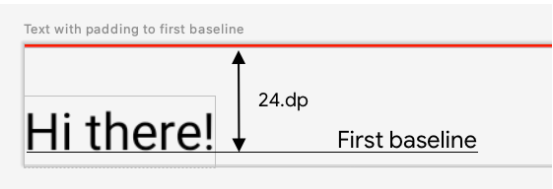
例:实现设置Firstbaseline的padding功能
效果图
自定义LayoutModifier
@Composable

fun Modifier.firstBaselineTop(firstBaselineToTop: Dp) = this.then(

    layout { measurable, constraints ->

        val placeable = measurable.measure(constraints)

        check(placeable[FirstBaseline] != AlignmentLine.Unspecified)

        val firstBaseline = placeable[FirstBaseline]

        // 计算需要设置的padding值和原来的firstBaseline的差值

        val placeableY = firstBaselineToTop.roundToPx() - firstBaseline

        // View的高度(placeable.height为原来view的高度,包括padding)

        val height = placeable.height + placeableY

        layout(placeable.width, height) {

            placeable.placeRelative(

                0, placeableY

            )

        }

    }

)
设置padding
@Preview

@Composable

fun TextWithPaddingToBaselinePreview() {

  ComposeTestTheme {

    Text("Hi there!", Modifier.firstBaselineToTop(24.dp))

  }

}
继承LayoutModifier,创建自定义Modifier
// How to create a modifier

@Stable

fun Modifier.padding(all: Dp) =

    this.then(

        PaddingModifier(start = all, top = all, end = all, bottom = all, rtlAware = true)

    )

// Implementation detail

private class PaddingModifier(

    val start: Dp = 0.dp,

    val top: Dp = 0.dp,

    val end: Dp = 0.dp,

    val bottom: Dp = 0.dp,

    val rtlAware: Boolean,

) : LayoutModifier {

    override fun MeasureScope.measure(

        measurable: Measurable,

        constraints: Constraints

    ): MeasureResult {

        val horizontal = start.roundToPx() + end.roundToPx()

        val vertical = top.roundToPx() + bottom.roundToPx()

        val placeable = measurable.measure(constraints.offset(-horizontal, -vertical))

        val width = constraints.constrainWidth(placeable.width + horizontal)

        val height = constraints.constrainHeight(placeable.height + vertical)

        return layout(width, height) {

            if (rtlAware) {

                placeable.placeRelative(start.roundToPx(), top.roundToPx())

            } else {

                placeable.place(start.roundToPx(), top.roundToPx())

            }

        }

    }

}
三,Layout(自定义ViewGroup)
@Composable

fun MyOwnColumn(

    modifier: Modifier = Modifier,

    content: @Composable () -> Unit

) {

    Layout(

        modifier = modifier,

        content = content

    ) { measurables, constraints ->

        // Don't constrain child views further, measure them with given constraints

        // List of measured children

        val placeables = measurables.map { measurable ->

            // Measure each child

            measurable.measure(constraints)

            // Set the size of the layout as big as it can

            layout(constraints.maxWidth, constraints.maxHeight) {

                // Place children

                placeable.placeRelative(x = 0, y = yPosition)

            }

        }

    }

}
例:实现自定义Column
效果图

@Composable

fun MyOwnColumn(

    modifier: Modifier = Modifier,

    content: @Composable () -> Unit

) {

    Layout(

        modifier = modifier,

        content = content

    ) { measurables, constraints ->

        // Don't constrain child views further, measure them with given constraints

        // List of measured children

        val placeables = measurables.map { measurable ->

            // Measure each child

            measurable.measure(constraints)

        }

        // child y方向的位置

        var yPosition = 0

        // Set the size of the layout as big as it can

        layout(constraints.maxWidth, constraints.maxHeight) {

            // Place children in the parent layout

            placeables.forEach { placeable ->

                // Position item on the screen

                placeable.placeRelative(x = 0, y = yPosition)

                // 累加当前view的高度

                yPosition += placeable.height

            }

        }

    }

}
使用自定义Layout
@Composable

fun BodyContent(modifier: Modifier = Modifier) {

    MyOwnColumn(modifier.padding(8.dp)) {

        Text("MyOwnColumn")

        Text("places items")

        Text("vertically.")

        Text("We've done it by hand!")

    }

}
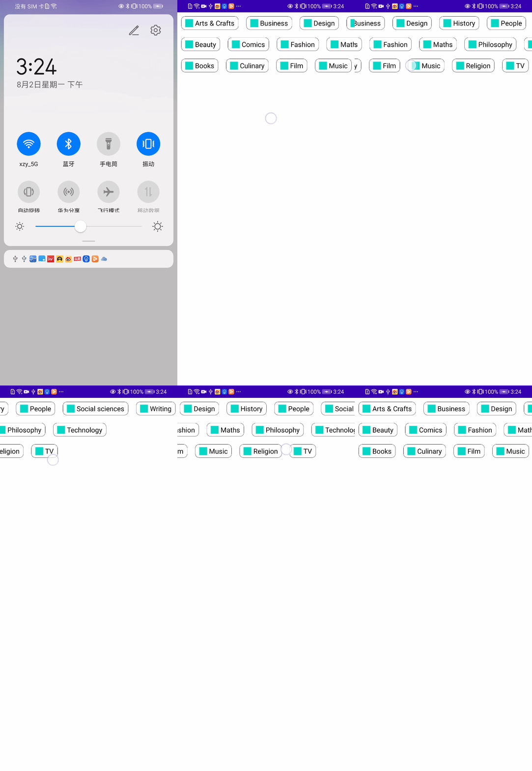
四,创建类似瀑布流式自定义View
效果图
自定义Layout
@Composable

fun StaggeredGrid(

    modifier: Modifier = Modifier,

    // 默认显示的行数

    rows: Int = 3,

    content: @Composable () -> Unit

) {

    Layout(

        modifier = modifier,

        content = content

    ) { measurables, constraints ->

        // 每行的宽度

        val rowWidths = IntArray(rows) {0}

        // 每行的高度

        val rowHeights = IntArray(rows) {0}

        val placeables = measurables.mapIndexed { index, measurable ->

            // measure每一个孩子

            val placeable = measurable.measure(constraints)

            val row = index % rows

            // 根据children累计每行的宽度

            rowWidths[row] += placeable.width

            // 选择children中最高的高度

            rowHeights[row] = max(rowHeights[row], placeable.height)

            placeable

        }

        // 选择所有行中最宽的宽度

        val width = rowWidths.maxOrNull()

                // 限制rowWidths在minWidth和maxWidth之间
                ?.coerceIn(constraints.minWidth.rangeTo(constraints.maxWidth))

                // 如果rowWidths为null,则设置为minWidth

                ?: constraints.minWidth

        // 累加所有行的高度

        val height = rowHeights.sumOf { it}

               // 限制rowHeights在minHeight和maxHeight之间

               .coerceIn(constraints.minHeight.rangeTo(constraints.maxHeight))

        // 计算每行纵向显示的位置

        val rowY = IntArray(rows) { 0 }

        for (i in 1 until rows) {

            rowY[i] = rowY[i-1] + rowHeights[i-1]

        }

        // width,height为父布局的宽度和高度(即StaggeredGrids)

        layout(width, height) {

            val rowX = IntArray(rows) { 0 }

            placeables.forEachIndexed { index, placeable ->

                val row = index % rows

                placeable.placeRelative(

                    x = rowX[row],

                    y = rowY[row]

                )

                rowX[row] += placeable.width

            }

        }

    }

}
创建GridItemView
@Composable

fun Chip(modifier: Modifier = Modifier, text: String) {

    Card(

        modifier = modifier,

        border = BorderStroke(color = Color.Black, width = Dp.Hairline),

        shape = RoundedCornerShape(8.dp)

    ) {

        Row(

            modifier = Modifier.padding(start = 8.dp, top = 4.dp, end = 8.dp, bottom = 4.dp),

            verticalAlignment = Alignment.CenterVertically

        ) {

            Box(

                modifier = Modifier

                    .size(16.dp, 16.dp)

                    .background(color = MaterialTheme.colors.secondary)

            )

            // 创建4dp的空隙

            Spacer(Modifier.width(4.dp))

            Text(text = text)

        }

    }

}
设置数据源
val topics = listOf(

    "Arts & Crafts", "Beauty", "Books", "Business", "Comics", "Culinary",

    "Design", "Fashion", "Film", "History", "Maths", "Music", "People", "Philosophy",

    "Religion", "Social sciences", "Technology", "TV", "Writing"

)
调用自定义Layout
@Composable

fun BodyContent(modifier: Modifier = Modifier) {

    // 不设置horizontalScroll的话,横向无法滑动

    StaggeredGrid(modifier = modifier.horizontalScroll(rememberScrollState())) {

        for (topic in topics) {

            Chip(modifier = Modifier.padding(8.dp), text = topic)

        }

    }

}
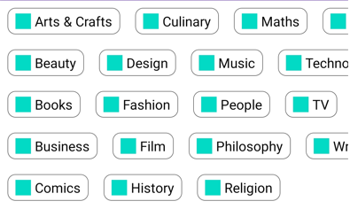
设置行数为5
@Composable

fun BodyContent(modifier: Modifier = Modifier) {

    StaggeredGrid(modifier = modifier.horizontalScroll(rememberScrollState()), rows = 5) {

        for (topic in topics) {

            Chip(modifier = Modifier.padding(8.dp), text = topic)

        }

    }

}
效果图
更多信息请参看Layouts in Jetpack Compose (google.cn)
Jetpack compose学习笔记之自定义layout(布局)的更多相关文章
- Jetpack Compose学习(5)——从登录页美化开始学习布局组件使用
原文:Jetpack Compose学习(5)--从登录页美化开始学习布局组件使用 | Stars-One的杂货小窝 本篇主要讲解常用的布局,会与原生Android的布局控件进行对比说明,请确保了解A ...
- Jetpack Compose学习(3)——图标(Icon) 按钮(Button) 输入框(TextField) 的使用
原文地址: Jetpack Compose学习(3)--图标(Icon) 按钮(Button) 输入框(TextField) 的使用 | Stars-One的杂货小窝 本篇分别对常用的组件:图标(Ic ...
- Jetpack Compose学习(6)——关于Modifier的妙用
原文: Jetpack Compose学习(6)--关于Modifier的妙用 | Stars-One的杂货小窝 之前学习记录中也是陆陆续续地将常用的Modifier的方法穿插进去了,本期就来详细的讲 ...
- Jetpack Compose学习(9)——Compose中的列表控件(LazyRow和LazyColumn)
原文:Jetpack Compose学习(9)--Compose中的列表控件(LazyRow和LazyColumn) - Stars-One的杂货小窝 经过前面的学习,大致上已掌握了compose的基 ...
- shiro学习笔记_0600_自定义realm实现授权
博客shiro学习笔记_0400_自定义Realm实现身份认证 介绍了认证,这里介绍授权. 1,仅仅通过配置文件来指定权限不够灵活且不方便.在实际的应用中大多数情况下都是将用户信息,角色信息,权限信息 ...
- ASP.NET MVC 学习笔记-7.自定义配置信息 ASP.NET MVC 学习笔记-6.异步控制器 ASP.NET MVC 学习笔记-5.Controller与View的数据传递 ASP.NET MVC 学习笔记-4.ASP.NET MVC中Ajax的应用 ASP.NET MVC 学习笔记-3.面向对象设计原则
ASP.NET MVC 学习笔记-7.自定义配置信息 ASP.NET程序中的web.config文件中,在appSettings这个配置节中能够保存一些配置,比如, 1 <appSettin ...
- Jetpack Compose学习(1)——从登录页开始入门
原文地址:Jetpack Compose学习(1)--从登录页开始入门 | Stars-One的杂货小窝 Jetpack Compose UI在前几天出了1.0正式版,之前一直还在观望,终于是出了正式 ...
- Jetpack Compose学习(2)——文本(Text)的使用
原文: Jetpack Compose学习(2)--文本(Text)的使用 | Stars-One的杂货小窝 对于开发来说,文字最为基础的组件,我们先从这两个使用开始吧 本篇涉及到Kotlin和DSL ...
- Jetpack Compose学习(4)——Image(图片)使用及Coil图片异步加载库使用
原文地址 Jetpack Compose学习(4)--Image(图片)使用及Coil图片异步加载库使用 | Stars-One的杂货小窝 本篇讲解下关于Image的使用及使用Coil开源库异步加载网 ...
- Jetpack Compose学习(7)——MD样式架构组件Scaffold及导航底部菜单
Jetpack Compose学习(7)--MD样式架构组件Scaffold及导航底部菜单 | Stars-One的杂货小窝 Compose给我们提供了一个Material Design样式的首页组件 ...
随机推荐
- Java- 基础知识脑图
- 详解搭建ubuntu版hadoop集群
https://download.csdn.net/download/weixin_38583278/12844195?ops_request_misc=%257B%2522request%255Fi ...
- TCP&UDP测试工具使用方式方法
第一项:测试TCP 步骤1:首先需要一台电脑上建立一个TCP服务器.并设置一个端口号如下图60003即可.并开启服务 步骤2:在另外一台电脑上,创建一个客户端连接,如下图.输入服务器的IP地址和端口号 ...
- nanopi SOCKS5 代理
nanopi (SOCKS5+openvpn) + 阿里ES(openvpn + socat) 构建内网代理. 需求: 公网 阿里ES服务器1台,内网nanopi1个(可连接公网服务器), 想从外 ...
- 第三周day1
第三周day1,星期一 所花时间(上课时间+练习时间):6h 代码量:110 博客量:2 所学到的知识:学了一些Map的相关知识,还有如何切割字符串,如何将字符串转换成字符数组str.toCharAr ...
- 微信退费报错:SSLHandshakeException No appropriate protocol (protocol is disabled or cipher suites are inappropr)
微信退费报错:No appropriate protocol (protocol is disabled or cipher suites are inappropr) javax.net.ssl.S ...
- qt creator 在ubuntu22.04下显示不正常处理
打开:sudo vim /etc/gdm3/custom.conf 找到:#WaylandEnable=false 去掉注释,问题解决
- Netbeans 16 的学习日志(购物车GUI)(建设中)
1.前期准备 Netbeans点我下载 Netbeans快捷键 学习视频1 郑老师的java 购物车实例 ①Netbeans 16没有中文,更老的版本可能会有,但就我目前使用来看,有中文反倒是一件坏事 ...
- 蓝桥杯训练赛二-1199 问题 E: 哥德巴赫曾猜测
题目描述 德国数学家哥德巴赫曾猜测:任何大于6的偶数都可以分解成两个素数(素数对)的和.但有些偶数可以分解成多种素数对的和,如: 10=3+7,10=5+5,即10可以分解成两种不同的素数对 输入 输 ...
- 华为交换机,改vlan的方法
telnet 登录1.1.1.111, 如果登录再到其他交换机,需要在用户状态,telnet其他的ip.不能在系统用户状态下跳转登录. sys改为系统用户 状态符由尖括号,改为方括号 display ...