实现鼠标悬停,div勾画div边框的动画
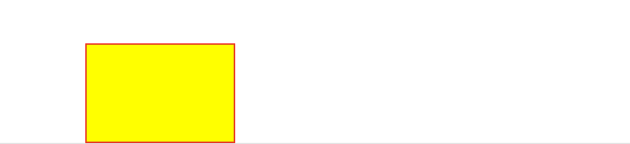
鼠标悬浮,边框div边框的动画样式,效果图如下:
首先定义div及其样式:
 <style>

   .show

   {

        width:300px;

        height:200px;

        border:1px solid red;

        background:yellow;

 }

 </style>

 <div class="show"></div>
界面展示效果如下:
通过指定样式clip来指定,裁剪的区域:
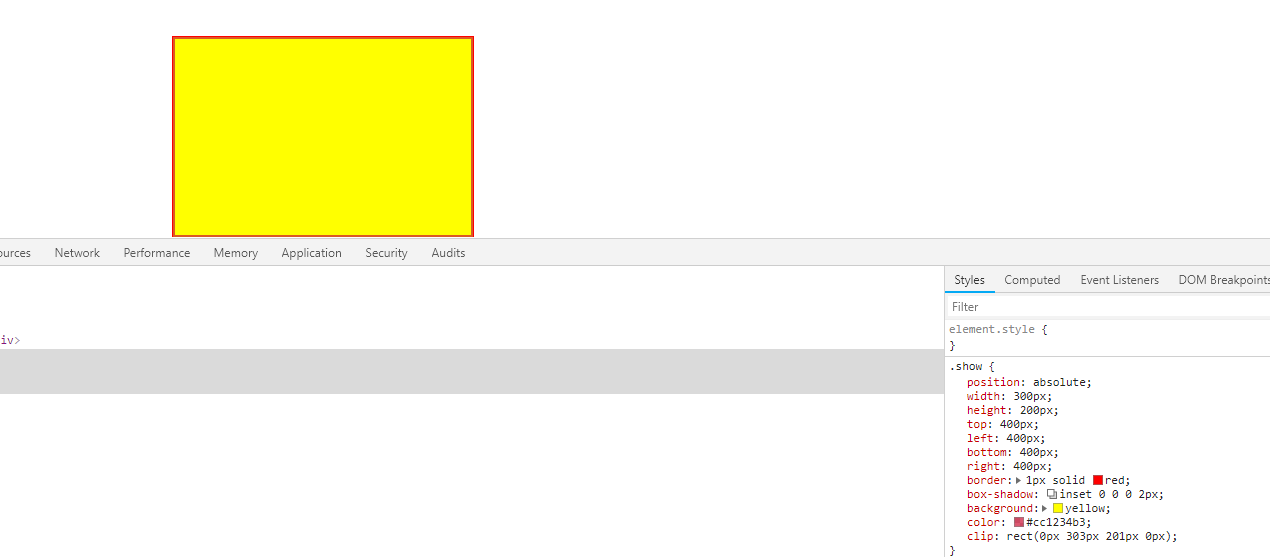
然后需要做的是将这个裁剪过程用动画连贯起来,修改css样式
    .show

     {

         position: absolute;

         width: 300px;

         height: 200px;

         top: 400px;

         left: 400px;

         bottom: 400px;

         right: 400px;

         border:1px solid red;

         animation: ClipAfter 4s linear infinite;

         background: yellow;

     }

     @keyframes ClipAfter {

         0%, 100% {

             /*为了在动画过程中能保留右边框和下边框,rect的right和bottom分别多取两个像素*/

             /*为了在动画的终点和起点不要显示上边框和左边框,rect的top和left分别多取了一个像素*/

             clip: rect(1px,302px,202px,1px);

         }

         25% {

             clip: rect(100px,302px,202px,150px);

         }

         50% {

             clip: rect(200px,302px,202px,300px);

         }

         75% {

             clip: rect(100px,302px,202px,150px);

         }

     }
更改之后的效果图如下:
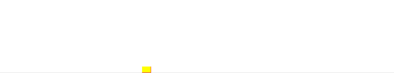
同样可以定义出保留上边框和左边框的动画样式:
   @keyframes ClipBefore {

         100%,0%{

             clip:rect(0px,300px,200px,0px);

         }

         25%

         {

             clip:rect(0px,150px,100px,0px);

         }

         50%{

             clip:rect(0px,0px,0px,0px);

         }

         75%{

             clip:rect(0px,150px,100px,0px);

         }

     }
由于开篇示例中的动画,是左上,和右下方边框的动画是同步进行的,所以使用div的伪类before(实现左上边框动画),after(实现右下边框动画)
css:
     .region-wrap {

         width: 320px;

         height: 220px;

         border: 1px solid #f4f4f4;

     }

     .region {

         position: absolute;

     }

     .content

     {

         position:  absolute;

         top: 10px;

         left: 10px;

         width: 300px;

         height: 200px;

         border:1px solid #aa0507;

     }

     .content:before,.content:after

     {

         position: absolute;

         top:;

         right:;

         bottom:;

         left:;

         color: #A0A0A0;

         content: '';

         box-sizing: border-box;

         margin: -10px;

         z-index: -1;

     }

     .content:before

     {

         /*background: #cc1234;*/

         box-shadow: inset 0 0 0 1px;

         animation: ClipBefore 4s linear infinite;

     }

     .content:after

     {

         box-shadow: inset 0 0 0 2px;

         animation: ClipAfter 4s linear infinite;

         /*由于图片展示的区域比外边框小,所以这里要重新定位after的展示位置*/

         top: 18px;

         bottom: 0px;

         right: 0px;

         left: 18px;

     }

     .content>img

     {

         width: 300px;

         height: 200px;

     }

     @keyframes ClipAfter {

         0%, 100% {

             clip: rect(0px,302px,202px,0px);

         }

         25% {

             clip: rect(100px,302px,202px,150px);

         }

         50% {

             clip: rect(200px,302px,202px,300px);

         }

         75% {

             clip: rect(100px,302px,202px,150px);

         }

     }

     @keyframes ClipBefore {

         100%,0%{

             clip:rect(0px,300px,200px,0px);

         }

         25%

         {

             clip:rect(0px,150px,100px,0px);

         }

         50%{

             clip:rect(0px,0px,0px,0px);

         }

         75%{

             clip:rect(0px,150px,100px,0px);

         }

     }

     @keyframes ClipAfter {

         0%, 100% {

             /*为了在动画过程中能保留右边框和下边框,rect的right和bottom分别多取两个像素*/

             /*重新定位后,为了在动画的终点和起点不要显示上边框和左边框,rect的top和left分别多取了二个像素*/

             clip: rect(2px,302px,202px,2px);

         }

         25% {

             clip: rect(100px,302px,202px,150px);

         }

         50% {

             clip: rect(200px,302px,202px,300px);

         }

         75% {

             clip: rect(100px,302px,202px,150px);

         }

     }
html:
 <div class="region-wrap">

     <div class="region">

         <div class="content">

             <img src="./images/show-window/timg.jpg"/>

         </div>

     </div>

 </div>
效果如下:
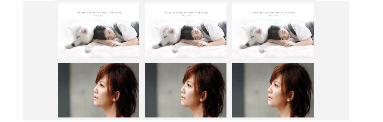
最后,利用flex布局,放入以列表的形式展示,并将样式应用到hover伪类中
html
 <div class="showwindow-wrap">

     <div class="showwindow">

         <ul class="li-items">

             <li>

                 <div class="region-wrap">

                     <div class="region">

                         <div class="content">

                             <img src="./images/show-window/timg1.jpg"/>

                         </div>

                     </div>

                 </div>

             </li>

             <li>

                 <div class="region-wrap">

                     <div class="region">

                         <div class="content">

                             <img src="./images/show-window/timg.jpg"/>

                         </div>

                     </div>

                 </div>

             </li>

         </ul>

     </div>

 </div>
css
.showwindow-wrap

    {

        width: 100%;

        display:flex;

        flex-direction: column;

        align-items: center;

        justify-content: center;

    }

    .showwindow

    {

        width:1200px;

        flex:;

        background: #f4f4f4;

    }

    .li-items

    {

        margin: 0px;

        padding: 0px;

        display:flex;

        flex-direction: row;

        align-items: flex-start;

        flex-wrap: wrap;

        justify-content: center;

    }

    .li-items>li

    {

        float: left;

        width: 323px;

        height: 222px;

        overflow: hidden;

        margin-left: -2px;

        margin-top: -1px;

    }

    .region-wrap {

        width: 320px;

        height: 220px;

        border: 1px solid #f4f4f4;

    }

    .region {

        position: absolute;

    }

    .content

    {

        position:  absolute;

        top: 10px;

        left: 10px;

        width: 300px;

        height: 200px;

        /*border:1px solid #aa0507;*/

    }

    .content:before,.content:after

    {

        position: absolute;

        top:;

        right:;

        bottom:;

        left:;

        color: #ea0c0c;

        content: '';

        box-sizing: border-box;

        margin: -10px;

        z-index:;

    }

    .content:hover

    {

        cursor: pointer;

    }

    .content:hover:before

    {

        top: -1px;

        right:;

        bottom:;

        left: -1px;

        box-shadow: inset 0 0 0 1px;

        animation: ClipBefore 4s linear infinite;

    }

    .content:hover:after

    {

        box-shadow: inset 0 0 0 1px;

        animation: ClipAfter 4s linear infinite;

        /*由于图片展示的区域比外边框小,所以这里要重新定位after的展示位置*/

        top: 18px;

        bottom: 0px;

        right: 0px;

        left: 18px;

    }

    .content>img

    {

        width: 300px;

        height: 200px;

    }

    @keyframes ClipAfter {

        0%, 100% {

            clip: rect(0px,302px,202px,0px);

        }

        25% {

            clip: rect(100px,302px,202px,150px);

        }

        50% {

            clip: rect(200px,302px,202px,300px);

        }

        75% {

            clip: rect(100px,302px,202px,150px);

        }

    }

    @keyframes ClipBefore {

        100%,0%{

            clip:rect(0px,300px,200px,0px);

        }

        25%

        {

            clip:rect(0px,150px,100px,0px);

        }

        50%{

            clip:rect(0px,0px,0px,0px);

        }

        75%{

            clip:rect(0px,150px,100px,0px);

        }

    }

    @keyframes ClipAfter {

        0%, 100% {

            /*为了在动画过程中能保留右边框和下边框,rect的right和bottom分别多取两个像素*/

            /*重新定位后,为了在动画的终点和起点不要显示上边框和左边框,rect的top和left分别多取了二个像素*/

            clip: rect(2px,302px,202px,2px);

        }

        25% {

            clip: rect(100px,302px,202px,150px);

        }

        50% {

            clip: rect(200px,302px,202px,300px);

        }

        75% {

            clip: rect(100px,302px,202px,150px);

        }

    }

    *{

        font-size:12px;

        list-style: none;

        color: rgba(146, 248, 206, 0.91);

    }
效果如开篇所发.
实现鼠标悬停,div勾画div边框的动画的更多相关文章
- CSS鼠标悬停图片加边框效果,不位移的方法
<!DOCTYPE HTML> <html lang="en-US"> <head> <title>css实现鼠标悬停时图片加边框效 ...
- 【MFC】MFC DLEdit 设计属于自己的编辑框_鼠标悬停
MFC DLEdit 设计属于自己的编辑框 2012-02-04 13:00 by 捣乱小子, 3543 阅读, 5 评论, 收藏, 编辑 起因 无意间看到了大牛们写的自定义编辑框控件,于是找了个时间 ...
- 鼠标悬停显示CSS3动画边框
效果体验:http://keleyi.com/keleyi/phtml/css3/14.htm 以下是代码: <!DOCTYPE html> <html xmlns="ht ...
- css3鼠标悬停图片边框线条动画特效
css3鼠标经过内容区时,边框线条特效效果制作. html: <div class="strength grWidth hidden"> <div class ...
- 使用JS制作一个鼠标可拖的DIV(一)——鼠标拖动
使用 JS 来实现一个可拖动的DIV,主要是使用到以下几个事件: 1.鼠标按下:DIV元素的onmousedown. 2.鼠标按住拖动:document 的 onmousemove 元素. 3.鼠标放 ...
- 如何给div加一个边框border样式
如何给div加一个边框样式? 对div盒子加一个边框样式很简单只需要使用border板块样式即可. 一.虚线与实线边框 边框虚线样式:dashed 边框实现样式:solid border:1px da ...
- 一款基于TweenMax跟随鼠标单击移动的div
今天给大家分享一款基于TweenMax跟随鼠标单击移动的div.在这款实例中你可以单击任意位置,div会移动到你单击的位置.效果图如下: 在线预览 源码下载 实现的代码. html代码: < ...
- CSS鼠标悬停图片加边框效果,页面布局发生错位的解决办法
CSS鼠标悬停图片加边框效果,页面布局发生错位的解决办法 .recomend-list{ width:1200px; a{ @extend %fl; margin-right: 30px; width ...
- 【案例】鼠标按下,DIV跟随移动
<!DOCTYPE html> <html lang="en"> <head> <meta charset="UTF-8&quo ...
随机推荐
- wget 使用
1.很多软件官网会有安装脚本,并把脚本搞成raw模式,方便下载后直接运行的shell文件.比如docker wget -qO- get.docker.com | bash -q的含义是:--quiet ...
- Linux 问题
Loaded plugins: fastestmirror cd /etc/yum.repos.d mv CentOS-Base.repo CentOS-Base.repo.backup wget h ...
- linq中分组查询而且获取每个分组中的第一条记录,数据用于分页绑定
LINQ分组取出第一条数据 Person1: Id=1, Name="Test1" Person2: Id=1, Name="Test1" Person3: I ...
- python第三方库------jieba库(中文分词)
jieba“结巴”中文分词:做最好的 Python 中文分词组件 github:https://github.com/fxsjy/jieba 特点支持三种分词模式: 精确模式,试图将句子最精确地切开, ...
- Python_Mix*生成器,生成器函数,推导式,生成器表达式
生成器: 生成器的本质就是迭代器 生成器一般由生成器函数或者生成器表达式来创建,其实就是手写的迭代器 def func(): print('abc') yield 222 #由于函数中有了yield ...
- elk的一些零碎知识
1.elasticsearch检查是否健康 http://12.20.511.141:9200/_cat/health?v 绿色表示一切正常, 黄色表示所有的数据可用但是部分副本还没有分配,红色表示部 ...
- python学习------文件处理
文件操作 一 介绍 计算机系统分为:计算机硬件,操作系统,应用程序三部分. 我们用python或其他语言编写的应用程序若想要把数据永久保存下来,必须要保存于硬盘中,这就涉及到应用程序要操作硬件,众所周 ...
- 记一次用express手写博客
1.req.session时一直是undefined 解决方法: // sesssion应用的配置 app.use(session({ secret:'blog', cookie: ('name', ...
- 阿里巴巴开源项目汇总-(JAVA)
来源:https://segmentfault.com/a/1190000017346799 1.分布式应用服务开发的一站式解决方案 Spring Cloud Alibaba Spring Cloud ...
- 大数据面试题——如何找出访问最多的IP
问题描述: 现有海量日志数据保存在一个超大的文件中,该文件无法直接存入内存,要求从 中提取某天访问BD次数最多的IP 分析解读: 由于这个题目只关心某一天访问次数最多的IP,因此可以首先对文件进行一次 ...