
利用 css 制作简单的提示框
在网页开发中,为了提高用户体验,经常会用到一些提示框来引导用户,这里分享下一些简单的提示框的制作
1.首先类似一个长方形右上角一个关闭按钮
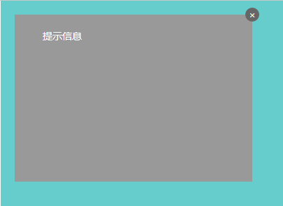
这里用到的主要是一些定位的知识,运用relative和absolute可以快速制作这样的一个提示框,想详细了解,点击这里
html代码:
<div id="position">
<div class="position-relative">
<span>提示信息</span>
<a href="javascript:;"><i class="icon">×</i></a>
</div>
</div>
css代码:
     #position {

           position: relative;

           width: 500px;

           height: 400px;

            margin: 0 auto;

           color: #fff;

           background: #66cccc;

     }

     #position .position-relative {

            position: relative;

            top: 20px;

            left: 20px;

            width: 300px;

            height: 200px;

            padding: 20px;

            background: #999;

        }

        #position .position-relative .icon {

            display: block;

            position: absolute;

            top: -10px;

            right: -10px;

            overflow: hidden;

            /*

            white-space: nowrap;

            text-overflow: ellipsis;

            */

            border-radius: 50%;

            width: 20px;

            height: 20px;

            line-height: 20px;

            color: #eee;

            font-style: normal;

            text-align: center;

            background: #666;

        }
2.还有类似这种qq对话框

有了定位的知识后,这种对话框主要就是左边的小三角的制作了,其实这个我们可以利用border来制作,首先我们先来开一个例子:
我们就给一个span标签来看看
html
<span class="icon-s"></span>
css
.icon-s {

            display: block;

            margin: 0 auto;

            width:;

            height:;

            border-style: solid;

            border-width: 40px;

            border-top-color: red;

            border-right-color: blue;

            border-bottom-color: yellow;

            border-left-color: black;

}
我们来看看效果:
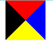
怎么样!很神奇对不对!其实到这里我们就可以看到我们要的三角形了,我们只要保留四个中的一个就行了,那么将其他三边设置为透明就行了
css
.icon-s {

            display: block;

            margin: 0 auto;

            width:;

            height:;

            border-style: solid;

            border-width: 40px;

            border-top-color: transparent; /*-*/

            border-right-color: red;

            border-bottom-color: transparent; /*-*/
            border-left-color: transparent; /*-*/
}

现在我们可以看到一个基本的雏形,接下来我们在来改改,把上边框的高度设为0,右边框的宽度设长一点
css:
.icon-s {

            display: block;

            margin: 0 auto;

            width:;

            height:;

            border-style: solid;

            border-width: 40px;

            border-top-width:; //

            border-right-width: 70px; //

            border-top-color: transparent;

            border-right-color: red;

            border-bottom-color: transparent;

            border-left-color: transparent;

}

这样子左边的三角形就出来了,接下来我们来简化一下代码:
.icon-s {

            display: block;

            margin: 0 auto;

            width:;

            height:;

            border-style: solid;

            border-color: transparent red transparent transparent;

            border-width: 0 70px 40px 40px;

}
考虑到IE低版本不支持transparent 属性我们可以设置dotted或是dashed
原因是在IE6下, 点线与虚线均以边框宽度为基准,点线长度必须是其宽度的3倍以上(height>=border-width*3),虚线宽长度必须是其宽度的5倍 以上(height>=border-width*5),否则点线和虚线都不会出现.
.icon-s {

            display: block;

            margin: 0 auto;

            width:;

            height:;

            border-style: dashed solid dashed dashed;

            border-color: transparent red transparent transparent;

            border-width: 0 70px 40px 40px;

        }
完整的demo:
<!doctype html>
<html lang="en">
<head>
<meta charset="UTF-8">
<meta name="Author" content="阿林十一">
<meta name="Keywords" content="关键字">
<meta name="Description" content="描述">
<title>提示框</title> <!--style start-->
<style type="text/css">
/*-------- begin-base ------------*/
html,
body,
div,
h1,h2,h3,
ul,li,
a,
p,
span {
margin: 0;
padding: 0;
}
html,
body {
width: 100%;
height: 100%;
}
body {
color: #666;
font-size: 14px;
font-family: "Microsoft Yahei";
}
a {
color: #eee;
text-decoration: none;
}
li {
list-style: none;
}
/*-------- end-base -------*/
#position {
position: relative;
width: 500px;
height: 400px;
margin: 0 auto;
color: #fff;
background: #66cccc;
}
#position .position-relative {
position: relative;
top: 20px;
left: 20px;
width: 300px;
height: 200px;
padding: 20px;
background: #999;
}
#position .position-relative .icon {
display: block;
position: absolute;
top: -10px;
right: -10px;
overflow: hidden;
/*
white-space: nowrap;
text-overflow: ellipsis;
*/
border-radius: 50%;
width: 20px;
height: 20px;
line-height: 20px;
color: #eee;
font-style: normal;
text-align: center; background: #666;
}
#position .position-relative .tip {
position: absolute;
right: -212px;
top:50%;
margin-top: -20px;
width: 200px;
height: 40px;
border-radius: 5px;
background: #4392e0;
}
#position .position-relative .tip .icon-tip {
position: absolute;
top: 8px;
left: -23px;
border: 12px solid transparent;
border-top-width: 0;
border-right-color: #4392e0; }
.icon-s {
display: block;
margin: 0 auto;
width: 0;
height: 0;
border-style: dashed solid dashed dashed;
border-color: transparent red transparent transparent;
border-width: 0 70px 40px 40px;
}
</style>
<!--style end--> </head> <body>
<!--
position 定位 (参照点) 1、static
2、relative 相对定位(self)
3、absolute 绝对定位(2 1、relative |absolute| absolute first 2、body)
4、fixed
-->
<div id="position">
<div class="position-relative">
<span>提示信息</span>
<a href="javascript:;"><i class="icon">×</i></a>
<div class="tip">
<span class="tx">这里是提示信息!!!</span>
<span class="icon-tip"></span>
</div>
</div>
</div> <span class="icon-s"></span> </body>
</html>
利用 css 制作简单的提示框的更多相关文章
- div+css制作带箭头提示框效果图(原创文章)
一直都在看站友们的作品,今天也来给大家分享一个小的效果,第一次发还有点小紧张呢,语言表达能力不是很好,还请见谅…^ 先来个简单点的吧,上效果图 刚开始在网上看到效果图的时候感觉好神奇,当我试着写出来的 ...
- HTML简单的提示框
由于项目中需要一个简单的提示框,就是鼠标放上去,可以提示相关信息,引用第三方的比较麻烦,所以,这里封装了一个很简单的HTML方法. <script src="http://cdn.st ...
- 利用CSS制作背景变色的横向导航栏
1.表单 页面如下: <html> <head> <title>注册表单页面</title> </head> <body> &l ...
- 使用css实现全兼容tooltip提示框
在上一篇文章中,使用css实现了一个全兼容的三角形图标,这个三角型图标可以使用于多种场景,比如下拉图标.多级菜单等,这篇文章我们使用这个图标通过纯css来实现一个我们常见的tooltip提示框. 最终 ...
- 利用CSS制作脸书
很多网站都支持图片上的头像框识别,鼠标在头像框处,会提示一些人物信息. 这次就利用CSS实现这样一个功能: div处主要包括两部分,一部分是图片:另一部分是链接以及脸框 <div class=& ...
- 利用CSS制作图形效果
前言 关于如何使用CSS来制作图形,比如说圆形,半圆形,三角形等的相关教程还是挺多的,今天我主要想解释一下里面一些demo的实现原理,话不多说,开始吧 以下所有内容只使用一个HTML元素.任何类型 ...
- Android:Toast简单消息提示框
Toast是简单的消息提示框,一定时间后自动消失,没有焦点. 1.简单文本提示的方法: Toast.makeText(this, "默认的toast", Toast.LENGTH_ ...
- CSS制作简单图标
CSS制作图标包括知识点如border-width.border-style.border-color.border-radius.对元素的定位拼接.旋转等结合起来. 图标效果如下(拖动滑块可缩放图标 ...
- 利用css制作带边框的小三角
标签(空格分隔):css 在项目中会使用到的小实例,目前知道的有两种方法来实现 设置元素的宽和高,利用rotate实现,比较简单的一种 div{ width: 10px; height: 10px; ...
随机推荐
- ELK beats平台介绍(11th)
beats是一个代理,将不同类型的数据发送到elasticsearch.beats可以直接将数据发送到elasticsearch,也可以通过logstash将数据发送elasticsearch. be ...
- angular中的promise
angular中的promise用法 标签(空格分隔): angular 前言 Promise其实是一个规范,用类似then().then()这样的链式调用形式来处理因为异步带来意大利面条式的代码(多 ...
- 【Stage3D学习笔记续】山寨Starling(六):动画实现和测试
我发布了一个版本v0.2,该版本是未优化版本,且没有添加Touch事件体系,但是由于是最基础且未优化的,所以可以通过参考代码快速的了解实现原理. 接下来的一段笔记开始进行渲染优化,我会把所有的目光都集 ...
- MySql实现远程连接
MySql实现远程连接 1.进入mysql,创建一个新用户root,密码为root: 格式:grant 权限 on 数据库名.表名 to 用户@登录主机 identified by "用户密 ...
- GMT-Note 基本参数详细说明
http://blog.sciencenet.cn/blog-381041-897592.html 控制经纬度标示中是否带N或者W PLOT_DEGREE_FORMAT = ddd:mm:ss ...
- iOS 正则表达式小结
#pragma mark - 正则第一种表示方式-利用NSPredicate(谓词)匹配// NSString *email = @"15078357696@163.com" ...
- 逻辑网络(Logical Network)
Introduction The VMM documentation indicates that “A logical network is used to organize and simplif ...
- 使用Go语言两三事
使用Go语言两三事,在网上看到的总结的很不错哦,转自http://www.cnblogs.com/sevenyuan/archive/2013/02/27/2935887.html 一.channel ...
- Android 获取手机SIM资料详解
TelephonyManager类主要提供了一系列用于访问与手机通讯相关的状态和信息的get方法.其中包括手机SIM的状态和信息.电信网络的状态及手机用户的信息.在应用程序中可以使用这些get方法获取 ...
- android4.4短信新概念
android4.4对短信引入了一个全新的概念:默认短信应用.即android用户可以在系统设置里面选择一个默认的短信应用,只有这个应用才能进行手机的基本短信操作.按照google自己的解释这样做的原 ...