Matplotlib.pyplot.plot 绘图
Matplotlib.pyplot 创建图形、在图形中创建创建一个绘图区域、在绘图区域中你那个绘制一些线、在图形中添加标签之类
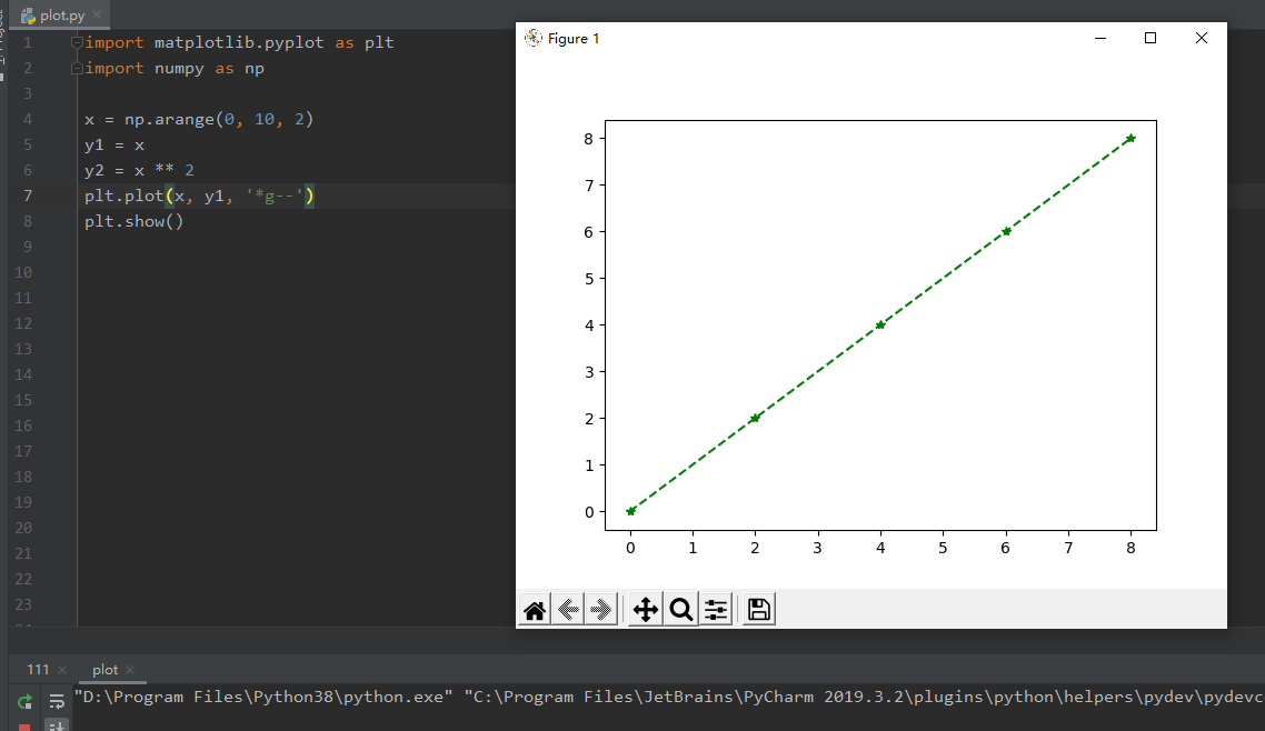
画二维平面图
x = np.arange(0, 10, 2)

y1 = x

y2 = x ** 2

plt.plot(x, y1, '*g--') #g 表示颜色

plt.show()
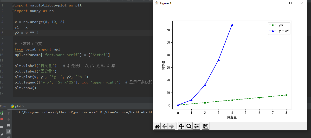
同一个坐标系里画多条线段
import matplotlib.pyplot as plt

import numpy as np

x = np.arange(0, 10, 2)

y1 = x

y2 = x ** 2

# 正常显示中文

from pylab import mpl

mpl.rcParams['font.sans-serif'] = ['SimHei']

plt.xlabel('自变量')   # 若是使用 汉字,则显示出错

plt.ylabel('因变量')

plt.plot(x, y1, '*g--', y2, '^b-')

plt.legend(['y=x', '$y=x^2$'], loc='upper right')  # 显示每条线段的解释, $$ 里是 LaTeX语句

# 保存图片

plt.savefig('./Big Title.png')

# 防止图片部分缺失 方法一 增大画布

fig = plt.figure(figsize=(8,4))

# 防止图片部分缺失 方法一 紧致布局

plt.tight_layout()

#增大分辨率

plt.savefig('./Big Title.png', dpi=400)

plt.show()
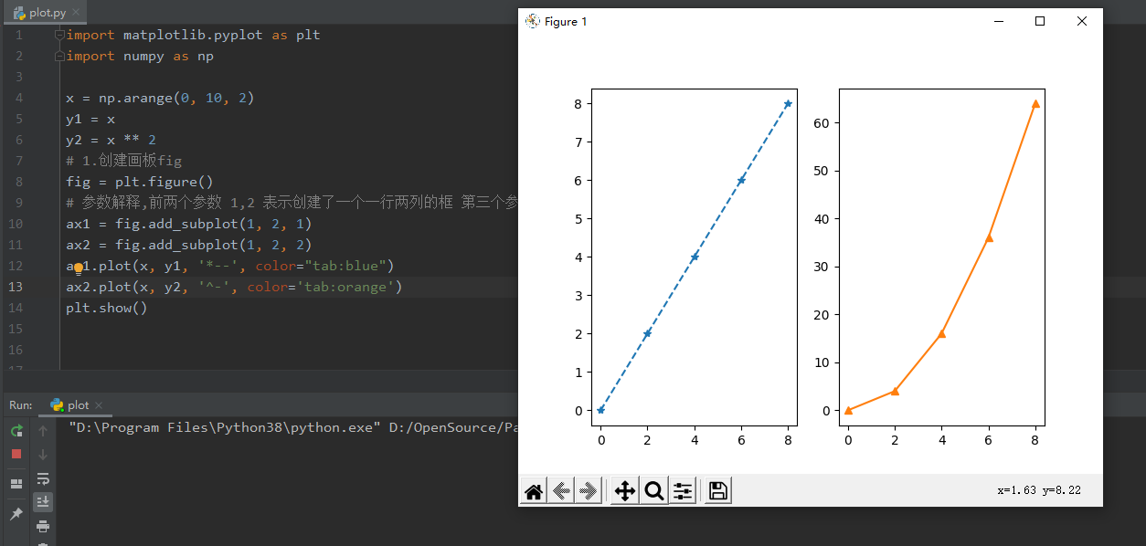
分别放两个框中
import matplotlib.pyplot as plt

import numpy as np

x = np.arange(0, 10, 2)

y1 = x

y2 = x ** 2

# 1.创建画板fig

fig = plt.figure()

# 参数解释,前两个参数 1,2 表示创建了一个一行两列的框 第三个参数表示当前所在的框

ax1 = fig.add_subplot(1, 2, 1)

ax2 = fig.add_subplot(1, 2, 2)

ax1.plot(x, y1, '*--', color="tab:blue")

ax2.plot(x, y2, '^-', color='tab:orange')

plt.show()
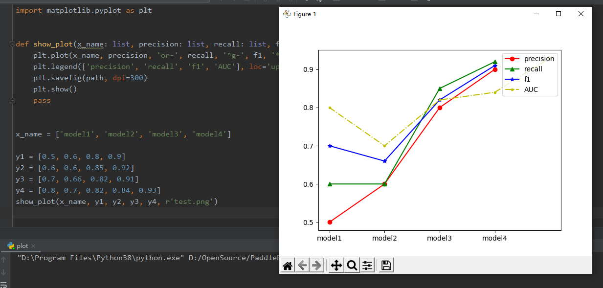
函数封装
import matplotlib.pyplot as plt

def show_plot(x_name: list, precision: list, recall: list, f1: list, AUC: list, path):

    plt.plot(x_name, precision, 'or-', recall, '^g-', f1, '*b-', AUC, '.y-.')

    plt.legend(['precision', 'recall', 'f1', 'AUC'], loc='upper right')

    plt.savefig(path, dpi=300)

    plt.show()

    pass

x_name = ['model1', 'model2', 'model3', 'model4']

y1 = [0.5, 0.6, 0.8, 0.9]

y2 = [0.6, 0.6, 0.85, 0.92]

y3 = [0.7, 0.66, 0.82, 0.91]

y4 = [0.8, 0.7, 0.82, 0.84, 0.93]

show_plot(x_name, y1, y2, y3, y4, r'test.png')
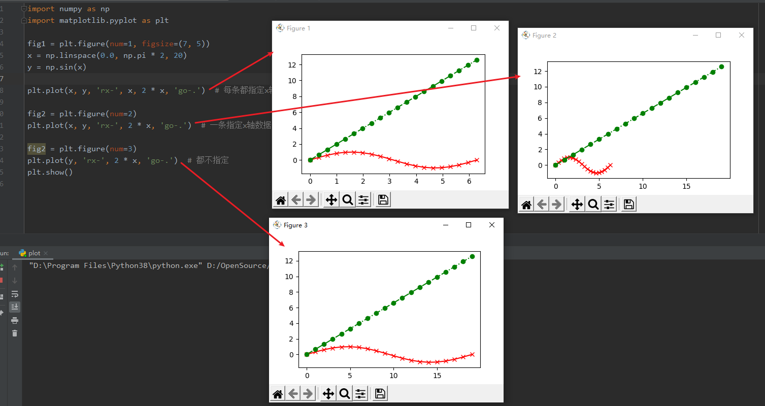
画多条曲线
import numpy as np

import matplotlib.pyplot as plt

fig1 = plt.figure(num=1, figsize=(7, 5))

x = np.linspace(0.0, np.pi * 2, 20)

y = np.sin(x)

plt.plot(x, y, 'rx-', x, 2 * x, 'go-.')  # 每条都指定x轴数据

fig2 = plt.figure(num=2)

plt.plot(x, y, 'rx-', 2 * x, 'go-.')  # 一条指定x轴数据,其他不指定

fig2 = plt.figure(num=3)

plt.plot(y, 'rx-', 2 * x, 'go-.')  # 都不指定

plt.show()
说明
format_string 控制曲线的格式字符串,可选,由颜色字符、风格字符和标记字符组成
颜色
| 字符 | 说明 | 字符 | 说明 | 字符 | 说明 |
|---|---|---|---|---|---|
| 'r' | 红色 | 'g' | 绿色 | 'b' | 蓝色 |
| 'c' | 青绿色 | 'k' | 黑色 | 'y' | 黄色 |
| 'w' | 白色 | 'm' | 洋红色 |
风格
| 字符 | 说明 | 字符 | 说明 | 字符 | 说明 | 字符 | 说明 |
|---|---|---|---|---|---|---|---|
| '-' | 实线 | '–' | 破折线 | '-.' | 点画线 | ':' | 虚线 |
风格
| 字符 | 说明 | 字符 | 说明 | 字符 | 说明 |
|---|---|---|---|---|---|
| '.' | 点标记 | ',' | 像素标记 | 'o' | 实心圈标记 |
| 'v' | 倒三角标记 | '^' | 上三角标记 | '>' | 右三角标记 |
| '<' | 左三角标记 | 'h' | 竖六边形标记 | 'H' | 横六边形标记 |
| '+' | 十字标记 | 'x' | x标记 | 'D' | 菱形标记 |
| 'd' | 瘦菱形标记 | '|' | 垂直线标记 | '*' | 星形标记 |
| 'p' | 实心五角标记 | 's' | 实心方形标记 | '4' | 右花三角标记 |
| '3' | 左花三角标记 | '2' | 上花三角标记 | '1' | 下花三角标记 |
使用方法
plt.plot(x, y,'g')

plt.plot(x, y,color='green')

plt.plot(x, y,'go')

plt.plot(x, y,color='green',marker = 'o')

plt.plot(x, y,'go-.')
Matplotlib.pyplot.plot 绘图的更多相关文章
- matplotlib.pyplot.plot详解
参考资料: https://blog.csdn.net/baidu_41902768/article/details/80686608 之前的随笔也有说过,matplotlib是python中一个非常 ...
- scikit-learn:matplotlib.pyplot经常使用绘图功能总结(1)
參考:http://matplotlib.org/api/pyplot_api.html 绘图功能总结(2):http://blog.csdn.net/mmc2015/article/details/ ...
- python matplotlib.pyplot学习记录
matplotlib是python中很强大的绘图工具,在机器学习中经常用到 首先是导入 import matplotlib.pyplot as plt plt中有很多方法,记录下常用的方法 plt.p ...
- matplotlib作图——plot() 线图
线图 #定义 matplotlib.pyplot.plot() plot([x], y, [fmt], data=None, **kwargs) plot([x], y, [fmt], [x2], y ...
- 在绘图的时候import matplotlib.pyplot as plt报错:ImportError: No module named '_tkinter', please install the python-tk package
在绘图的时候import matplotlib.pyplot as plt报错:ImportError: No module named '_tkinter', please install the ...
- matplotlib plot 绘图函数发生阻塞(block)时的解决方法
Is there a way to detach matplotlib plots so that the computation can continue? 在一般编辑器中: from matplo ...
- 使用matplotlib.pyplot中plot()绘制折线图
1.函数形式 plt.plot(x, y, format_string, **kwargs) x轴数据,y轴数据,format_string控制曲线的格式字串(format_string 由颜色字符, ...
- matplotlib.pyplot 绘图详解 matplotlib 安装
apt-get install python-matplotlib 转载自: http://www.cnblogs.com/qianlifeng/archive/2012/02/13/2350086. ...
- 服务器上使用matplotlib.pyplot绘图
在linux服务器端执行python脚本,有时候需要画图,但是linux没有GUI界面,因此需要在导入matplotlib.pyplot库之前先执行 import matplotlib as mpl ...
- 【搬砖】【Python数据分析】Pycharm中plot绘图不能显示出来
最近在看<Python数据分析>这本书,而自己写代码一直用的是Pycharm,在练习的时候就碰到了plot()绘图不能显示出来的问题.网上翻了一下找到知乎上一篇回答,试了一下好像不行,而且 ...
随机推荐
- vulnhub靶场之HARRYPOTTER: ARAGOG (1.0.2)
准备: 攻击机:虚拟机kali.本机win10. 靶机:HarryPotter: Aragog (1.0.2),下载地址:https://download.vulnhub.com/harrypotte ...
- sql server连接的基本使用(包含自身验证和连接Navicat)
自身验证的步骤 1.先默认使用Windows身份验证连接上SQL Server数据库 2.右键连接名称,选择属性 来到这个界面: 3.选中左侧的安全性 4.将服务器身份验证修改为SQL Server和 ...
- uniapp微信小程序解析详情页的四种方法
一.用微信文档提供的RICH-TEXT 官方文档:微信文档rich-text 这种是直接使用: <!-->content是API获取的html代码</--> <rich- ...
- 使用Mathematica做序列的DTFT的几个例子
ListFourierSequenceTransform[{-2, -1, 1, 3, 3, 1, -1, -2}, \[Omega]] ParametricPlot[{Re[%], Im[%]}, ...
- SpringBoot——定制错误页面及原理
更多内容,前往 IT-BLOG 一.SpringBoot 默认的错误处理机制 [1]浏览器返回的默认错误页面如下: ☞ 浏览器发送请求的请求头信息如下:text/html 会在后面的源码分析中说到 ...
- 在线调试工具 Arthas
Arthas(阿尔萨斯) 是 Alibaba开源的一款 Java在线诊断工具,能够分析,诊断,定位Java应用问题,例如:JVM信息,线程信息,搜索类中的方法,跟踪代码执行,观测方法的入参和返回参数等 ...
- Linux耳机音响独立输出
记得之前在用Ubuntu系统的时候,耳机和音响(线缆输出和模拟耳机输出)只能单独插一个,如果两个设备同时插入主机,将会导致只能耳机输出,即使选择后置音响(线缆输出)也不会有声音.在Windows下,即 ...
- 【Avalonia】【跨平台】关于控件阴影简单用法
背景 当我们在用Avalonia开发项目时,我们可能会对控件添加一些阴影效果,改善用户体验,我们开发WPF的人知道,WPF会给我提供Effect这么一个属性,这是方便我们进行阴影以及特效使用,但是Av ...
- vue3 ts 类式写法的mixins
vue-property-decorator 混入(mixins) // mixins.ts import { Vue } from 'vue-property-decorator' class Mi ...
- 二进制安装Kubernetes(k8s) v1.25.0 IPv4/IPv6双栈
二进制安装Kubernetes(k8s) v1.25.0 IPv4/IPv6双栈 Kubernetes 开源不易,帮忙点个star,谢谢了 介绍 kubernetes(k8s)二进制高可用安装部署,支 ...