
使用 WPF 创建预加载控件
Introduction
At the time when WPF applications do a very long process like getting response from a web server, download file from a distant server, search files, etc., this control can be used to make the wait time more interactive. This is an alternative method to create preloader by using WPF methods instead of using GIF animation images. GIF animation might require more bitmap processing.
This demo will explain how to use this control in your projects. The solution used for this demo is created using Visual Studio 2008 (WPF, C#, .NET 3.5).
Using the Code
This user control is created with four rectangle blocks animated sequentially with Width property with a defined speed.
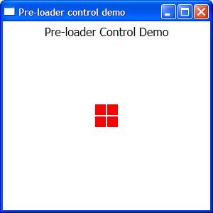
The following XAML is to create the rectangle block: Block.xaml
Height and width property is set by the PreLoaderControl.xaml control automatically. Developer would not require to change the values of these properties.
<UserControl x:Class="PreLoader.CustomControls.Block"

    xmlns="http://schemas.microsoft.com/winfx/2006/xaml/presentation"

    xmlns:x="http://schemas.microsoft.com/winfx/2006/xaml"

    Height="Auto" Width="Auto">

    <Grid x:Name="PreLoaderBlock">

        <Rectangle Width="Auto" Height="Auto" Fill="Red" Margin="0">

            <Rectangle.Style>

                <Style TargetType="{x:Type Rectangle}">

                    <Setter Property="RenderOptions.BitmapScalingMode" Value="NearestNeighbor" />

                    <Setter Property="RenderOptions.EdgeMode" Value="Aliased" />

                </Style>

            </Rectangle.Style>

        </Rectangle>

    </Grid>

</UserControl>
The Fill property can be changed to your desired color or bind with a style theme.
Fill="{DynamicResource PreLoaderColor}"
The resource PreLoaderColor can be defined in the App.xaml or in any style theme.
<ResourceDictionary>

    <SolidColorBrush x:Key="PreLoaderColor" Color="Red" />

</ResourceDictionary>
The following xaml is to define the animation: PreLoaderControl.xaml.
The UserControl.Resources holds the definition for the storyboard animation targeting the Width property for all the four rectangle blocks defined in the Grid as shown below.
The speed of the animation can be adjusted with the property SpeedRatio.
A Completed event is created in each storyboard to notify when the animation is completed respectively.
 Copy Code
<UserControl x:Class="PreLoader.CustomControls.PreLoaderControl"
xmlns="http://schemas.microsoft.com/winfx/2006/xaml/presentation"
xmlns:x="http://schemas.microsoft.com/winfx/2006/xaml"
xmlns:local="clr-namespace:PreLoader.CustomControls"
Height="{Binding}" Width="{Binding}" Loaded="UserControl_Loaded">
<UserControl.Resources>
<Storyboard x:Key="ProgressAnimation1" SpeedRatio="12">
<DoubleAnimation Storyboard.TargetName="block1"
Storyboard.TargetProperty="Width" From="16" To="0"
Completed="ProgressAnimation1_Completed" Duration="0:0:2"/>
</Storyboard>
<Storyboard x:Key="ProgressAnimation2" SpeedRatio="12">
<DoubleAnimation Storyboard.TargetName="block2"
Storyboard.TargetProperty="Width" From="16" To="0"
Completed="ProgressAnimation2_Completed" Duration="0:0:2" />
</Storyboard>
<Storyboard x:Key="ProgressAnimation3" SpeedRatio="12">
<DoubleAnimation Storyboard.TargetName="block3"
Storyboard.TargetProperty="Width" From="16" To="0"
Completed="ProgressAnimation3_Completed" Duration="0:0:2" />
</Storyboard>
<Storyboard x:Key="ProgressAnimation4" SpeedRatio="12">
<DoubleAnimation Storyboard.TargetName="block4"
Storyboard.TargetProperty="Width" From="16" To="0"
Completed="ProgressAnimation4_Completed" Duration="0:0:2" />
</Storyboard>
</UserControl.Resources>
<Grid Width="Auto" Height="Auto" >
<Grid HorizontalAlignment="Left" x:Name="gridBlock1"
VerticalAlignment="Top" Margin="0,0,0,0" >
<local:Block x:Name="block1" RenderTransformOrigin="0.5,4.3689"
HorizontalAlignment="Stretch" Height="Auto"
Width="Auto" VerticalAlignment="Stretch">
<local:Block.RenderTransform>
<TransformGroup>
<ScaleTransform/>
<SkewTransform/>
<TranslateTransform/>
</TransformGroup>
</local:Block.RenderTransform>
</local:Block>
</Grid>
<Grid HorizontalAlignment="Right" x:Name="gridBlock2"
VerticalAlignment="Top" Margin="0.5,0,0,0" >
<local:Block x:Name="block2" RenderTransformOrigin="0.5,4.3689"
HorizontalAlignment="Stretch" Height="Auto"
Width="Auto" VerticalAlignment="Stretch">
<local:Block.RenderTransform>
<TransformGroup>
<ScaleTransform />
<SkewTransform/>
<TranslateTransform/>
</TransformGroup>
</local:Block.RenderTransform>
</local:Block>
</Grid>
<Grid HorizontalAlignment="Right" x:Name="gridBlock3"
VerticalAlignment="Bottom" Margin="0.5,0.5,0,0" >
<local:Block x:Name="block3" RenderTransformOrigin="0.5,4.3689"
HorizontalAlignment="Stretch" Height="Auto"
Width="Auto" VerticalAlignment="Stretch">
<local:Block.RenderTransform>
<TransformGroup>
<ScaleTransform/>
<SkewTransform/>
<TranslateTransform/>
</TransformGroup>
</local:Block.RenderTransform>
</local:Block>
</Grid>
<Grid HorizontalAlignment="Left" x:Name="gridBlock4"
VerticalAlignment="Bottom" Margin="0,0.5,0,0" >
<local:Block x:Name="block4" RenderTransformOrigin="0.5,4.3689"
HorizontalAlignment="Stretch" Height="Auto"
Width="Auto" VerticalAlignment="Stretch">
<local:Block.RenderTransform>
<TransformGroup>
<ScaleTransform />
<SkewTransform/>
<TranslateTransform/>
</TransformGroup>
</local:Block.RenderTransform>
</local:Block>
</Grid>
</Grid>
</UserControl>
When the user control is loaded in the parent window, the width and height for all blocks is set automatically.
<local:PreLoaderControl Height="32" Width="32" />
Below is the code behind which actually controls the animation.
Copy Codenamespace PreLoader.CustomControls
{
public partial class PreLoaderControl : UserControl
{ // Flag variables used as a toggle to animate the block in both directions private bool Animation1RuningForward = true;
private bool Animation2RuningForward = true;
private bool Animation3RuningForward = true;
private bool Animation4RuningForward = true;
private double blockWidth = 16; public PreLoaderControl()
{
InitializeComponent();
} // Calculate the width and height property based on the size defined in the parent
// window where the control is added and starts the animation #1. private void UserControl_Loaded(object sender, RoutedEventArgs e)
{
Double blockSplitWidth = this.Width / 100;
if (blockSplitWidth > 0.50)
blockSplitWidth = 0.50;
blockWidth = (this.Width / 2) - (blockSplitWidth * 4);
double blockHeight = (this.Height / 2) - (blockSplitWidth * 4);
gridBlock1.Width = blockWidth;
gridBlock2.Width = blockWidth;
gridBlock3.Width = blockWidth;
gridBlock4.Width = blockWidth;
gridBlock1.Height = blockHeight;
gridBlock2.Height = blockHeight;
gridBlock3.Height = blockHeight;
gridBlock4.Height = blockHeight;
StartAnimation("ProgressAnimation1", Animation1RuningForward);
} // When the animation #1 is completed the following event function
// will start the animation #2
// Animation1RunningForward is toggled to animate the width from and to 0 private void ProgressAnimation1_Completed(object sender, EventArgs e)
{
Animation1RuningForward = !Animation1RuningForward;
StartAnimation("ProgressAnimation2", Animation2RuningForward);
} // When the animation #2 is completed the following event function
// will start the animation #3
// Animation2RunningForward is toggled to animate the width from and to 0 private void ProgressAnimation2_Completed(object sender, EventArgs e)
{
Animation2RuningForward = !Animation2RuningForward;
StartAnimation("ProgressAnimation3", Animation3RuningForward);
} // When the animation #3 is completed the following event function
// will start the animation #4
// Animation3RunningForward is toggled to animate the width from and to 0 private void ProgressAnimation3_Completed(object sender, EventArgs e)
{
Animation3RuningForward = !Animation3RuningForward;
StartAnimation("ProgressAnimation4", Animation4RuningForward);
} // When the animation #4 is completed the following event function
// will start the animation #1
// Animation4RunningForward is toggled to animate the width from and to 0 private void ProgressAnimation4_Completed(object sender, EventArgs e)
{
Animation4RuningForward = !Animation4RuningForward;
StartAnimation("ProgressAnimation1", Animation1RuningForward);
} // Begins the storyboard animation specified in the storyboardResourceName variable
// The RunForward flag will toggle the widthFrom, widthTo values from 0 to
// the calculated block width and vice versa. private void StartAnimation(String storyboardResourceName, bool RunForward)
{
double widthFrom = blockWidth;
double widthTo = 0;
if (RunForward)
{
widthFrom = blockWidth;
widthTo = 0;
}
else
{
widthFrom = 0;
widthTo = blockWidth;
}
Storyboard storyboard = this.FindResource(storyboardResourceName) as Storyboard;
DoubleAnimation doubleanimation = storyboard.Children[0] as DoubleAnimation;
doubleanimation.From = widthFrom;
doubleanimation.To = widthTo;
storyboard.Begin();
}
}
}
Below is the sample WPF window loaded with the above defined preloader control.
Create a new window, include the CustomControls folder containing Block.xaml and PreLoader.xaml.
Add the PreLoaderControl with the local tag in the grid and specify the Height and Width property values.
<Window x:Class="PreLoader.Window1"

    xmlns="http://schemas.microsoft.com/winfx/2006/xaml/presentation"

    xmlns:x="http://schemas.microsoft.com/winfx/2006/xaml"

    xmlns:local="clr-namespace:PreLoader.CustomControls"

    Title="Pre-loader control demo" Height="300" Width="300">

    <Grid>

        <Label Content="Pre-loader Control Demo" Height="28"

        VerticalAlignment="Top" HorizontalContentAlignment="Center"

        FontSize="16"></Label>

        <local:PreLoaderControl Height="32" Width="32" />

    </Grid>

</Window>
You can also add the control programmatically during run-time like the code below:
using Your_Namespace.CustomControls;
Your_Namespace will be the namespace defined in your solution and the CustomControls is the folder name where the usercontrol files are present.
Below is the sample pop-up window which loads the PreLoaderControl programmatically in the gridloaderGrid.
<Window x:Class="Your_NameSpace.WindowPreloader"

    xmlns="http://schemas.microsoft.com/winfx/2006/xaml/presentation"

    xmlns:x="http://schemas.microsoft.com/winfx/2006/xaml"

    Title="Status" Height="140" Width="250"

    Background="Transparent" xmlns:my="clr-namespace:Your_Namespace"

    ResizeMode="NoResize" ShowInTaskbar="False" WindowStartupLocation="CenterScreen"

    WindowStyle="None" Topmost="True" BorderThickness="0" AllowsTransparency="True"

    Closing="Window_Closing" Loaded="Window_Loaded" Icon="images/icon16.png">

    <Grid>

        <GroupBox Header="Processing..." Name="groupBoxHeader">

            <Grid x:Name="loaderGrid">

                <Label Name="labelStatus"

                Content="Please wait..." VerticalContentAlignment="Center"

                HorizontalAlignment="Right" Width="106" />

            </Grid>

        </GroupBox>

    </Grid>

</Window>
The following code loads the PreLoader control in the Window_Loaded event dynamically. In this example, thePreLoader control is created with the size of 64 includes all required parameters (like alignment, margin, etc.) set and added as children to the grid loaderGrid.
public partial class WindowPreloader : Window

{

    PreLoader preloader = null;

    public WindowPreloader()

    {

        InitializeComponent();

    }

    private void Window_Closing(object sender, System.ComponentModel.CancelEventArgs e)

    {

        preloader = null;

        //...

        // include other finalizing statements if you require

        //...

    }

    private void Window_Loaded(object sender, RoutedEventArgs e)

    {

        preloader = CommonFunctions.GetPreloader(64);

        preloader.HorizontalAlignment = HorizontalAlignment.Left;

        preloader.VerticalAlignment = VerticalAlignment.Center;

        preloader.Margin = new Thickness(20, 0, 0, 0);

        loaderGrid.Children.Add(preloader);

    }

}
The following function will return the PreLoader control with the defined width and height specified in thesize parameter.
public PreLoader GetPreloader(int size)

{

    PreLoader preloader = new PreLoader();

    try

    {

        preloader.VerticalAlignment = VerticalAlignment.Center;

        preloader.HorizontalAlignment = HorizontalAlignment.Center;

        preloader.Width = size;

        preloader.Height = size;

        preloader.ToolTip = "Processing...";

    }

    catch (Exception ex)

    {

        //throw ex;

    }

    return (preloader);

}
As Control Library
You can also use this control by adding reference as the control library. Both the source and compiled DLL is available for download.
Create a new WPF project and include the existing (control library) project. Now add the reference ofDMACControls to your project.
In the below screenshot, the project is created as PreLoaderLibSample and the DMACControls is included in the reference.
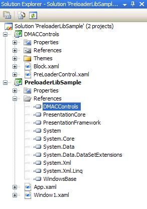
In Window1 design, include the reference to the DMACControls as shown below:
xmlns:local="clr-namespace:DMACControls;assembly=DMACControls"
Now add the PreLoaderControl to your grid in Window1 with local tag and set the desired values forWidth and Height properties:
<Window x:Class="PreloaderLibSample.Window1"

    xmlns="http://schemas.microsoft.com/winfx/2006/xaml/presentation"

    xmlns:x="http://schemas.microsoft.com/winfx/2006/xaml"

    xmlns:local="clr-namespace:DMACControls;assembly=DMACControls"

    Title="Window1" Height="300" Width="300">

    <Grid>

        <Label Content="Pre-loader Control Demo" Height="28"

        VerticalAlignment="Top" HorizontalContentAlignment="Center"

        FontSize="16"></Label>

        <local:PreLoaderControl Height="32" Width="32" />

    </Grid>

</Window>
Ensure you set a static color or a dynamic resource style of the Block.xaml in the DMACControls project.
Changing the Color
Initially in this tip, the Rectangle is filled with static color Red as shown below:
<Rectangle Width="Auto" Height="Auto" Fill="Red" Margin="0">
Using the control library, the Fill property can be dynamically set with value set in app resources or in theme styles. From the below example, the Fill value for the Rectangle is set in App.xaml
<Rectangle Width="Auto" Height="Auto"

Fill="{DynamicResource PreLoaderColor}" Margin="0">
This can be found in Block.xaml in the DMACControls project:
<UserControl x:Class="DMACControls.Block"

    xmlns="http://schemas.microsoft.com/winfx/2006/xaml/presentation"

    xmlns:x="http://schemas.microsoft.com/winfx/2006/xaml"

    Height="Auto" Width="Auto">

    <Grid x:Name="PreLoaderBlock">

        <Rectangle Width="Auto" Height="Auto"

        Fill="{DynamicResource PreLoaderColor}" Margin="0">

            <Rectangle.Style>

                <Style TargetType="{x:Type Rectangle}">

                    <Setter Property="RenderOptions.BitmapScalingMode" Value="NearestNeighbor" />

                    <Setter Property="RenderOptions.EdgeMode" Value="Aliased" />

                </Style>

            </Rectangle.Style>

        </Rectangle>

    </Grid>

</UserControl>
Open App.xaml in your WPF application project and set the color as shown below in key PreLoaderColor. AnyFill style like gradients, solid color, dynamic colors... can be set in the key PreLoaderColor.
<Application x:Class="PreloaderLibSample.App"

    xmlns="http://schemas.microsoft.com/winfx/2006/xaml/presentation"

    xmlns:x="http://schemas.microsoft.com/winfx/2006/xaml"

    StartupUri="Window1.xaml">

    <Application.Resources>

         <SolidColorBrush x:Key="PreLoaderColor" Color="Orange" />

    </Application.Resources>

</Application>
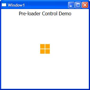
Ensure the key is defined in the App.xaml or in any theme files before you assign the DynamicResource in theFill property.
使用 WPF 创建预加载控件的更多相关文章
- 发布我的图片预加载控件YPreLoadImg v1.0
介绍 大家好!很高兴向大家介绍我的图片预加载控件YPreLoadImg.它可以帮助您预加载图片,并且能显示加载的进度,在预加载完成后调用指定的方法. YPreLoadImg控件由一个名为PreLoad ...
- WinForm的延时加载控件概述
这篇文章主要介绍了WinForm的延时加载控件,很实用的技巧,在C#程序设计中有着比较广泛的应用,需要的朋友可以参考下 本文主要针对WinForm的延迟加载在常用控件的实现做简单的描述.在进行C# ...
- 解决tableView中cell动态加载控件的重用问题
解决tableView中cell动态加载控件的重用问题 tableView的cell,有时候需要在运行时取得对应的数据后才能够动态的创建该cell中的控件并加载到该cell中,此时,你一定会遇到重用问 ...
- uGUI动态加载控件位置错误
最近在使用uGUI时遇到了一个问题,在此记录一下.在Canvas的Render Mode设置为Screen Space-Overlay模式时,动态加载控件是不会发生问题的.但是在Screen Spac ...
- uGUI动态加载控件位置错误(转自:https://www.cnblogs.com/mezero/p/4542939.html)
最近在使用uGUI时遇到了一个问题,在此记录一下.在Canvas的Render Mode设置为Screen Space-Overlay模式时,动态加载控件是不会发生问题的.但是在Screen Spac ...
- [iOS微博项目 - 1.8] - 各种尺寸图片加载 & 控件不显示研究
A. 图片的加载: [UIImage imageNamed:@"home"]; 加载png图片 一.非retina屏幕 1.3.5 inch(320 x 480) * ...
- 图片加载控件Fresco
使用教程:https://www.fresco-cn.org/docs/index.html https://github.com/facebook/fresco application初始化fre ...
- 每天进步一点点-WPF-根据数据类型加载控件
目的,根据数据类型的不同,动态的加载适用于不同数据类型的控件(布局) 原理:为自定义的数据类型添加数据魔板,绑定的时候绑定这些数据类型的实例. 例子: 数据类型: 数据模板: <DataTemp ...
- ListView 刷新加载控件
1.MaterialRefreshLayout刷新加载: 导入依赖: compile 'com.cjj.materialrefeshlayout:library:1.3.0' 布局 <com.c ...
随机推荐
- 深入 CSocket 编程之阻塞和非阻塞模式
有时,花上几个小时阅读.调试.跟踪优秀的源码程序,能够更快地掌握某些技术关键点和精髓.当然,前提是对这些技术大致上有一个了解. 我通过几个采用 CSocket 类编写并基于 Client/Server ...
- newlisp 注释生成文档
最近写了一个newlisp_armory库,用来实现一些newlisp自身不支持的操作.比如跨windows和ubuntu的目录拷贝功能等. 自己用的时候,发现没有API reference文档参考, ...
- 【编程之美】java二进制实现重建
package com.cn.binarytree.utils; /** * @author 刘利娟 liulijuan132@gmail.com * @version 创建时间:2014年7月20日 ...
- AFNetworking2.0后 进行Post请求
本文以新浪微博的Oauth认证为样例进行Post请求的演示 以下直接上代码: #import "ViewController.h" #import "AFNetworki ...
- g++编C++11/C++0x遇到的问题
在看<Cplusplus Concurrency In Action Practical Multithreading>当遇到第一个样品: #include<iostream> ...
- hdu5176(并查集)
传送门:The Experience of Love 题意:一个叫Gorwin的女孩和一个叫Vivin的男孩是一对情侣.他们来到一个叫爱情的国家,这个国家由N个城市组成而且只有N−1条小道(像一棵树) ...
- c++中volatile详解
1. 为什么用volatile? C/C++ 中的 volatile 关键字和 const 对应,用来修饰变量,通常用于建立语言级别的 memory barrier.这是 BS 在 "The ...
- HDU1087:Super Jumping! Jumping! Jumping!(DP)
Problem Description Nowadays, a kind of chess game called “Super Jumping! Jumping! Jumping!” is very ...
- java读写文件
对于任何文件,不管有没有扩展名,都可以读写.切记,最后要.close();,否则效果出不来. 读操作: package com.wjy.read; import java.io.BufferedRea ...
- 消息队列(Message Queue)基本概念(转)
背景 之前做日志收集模块时,用到flume.另外也有的方案,集成kafaka来提升系统可扩展性,其中涉及到消息队列当时自己并不清楚为什么要使用消息队列.而在我自己提出的原始日志采集方案中不适用消息队列 ...