VueUI -- iView4.0简单使用
一、iView(View UI)
1、简介
官网:https://www.iviewui.com/
仓库:https://github.com/view-design/ViewUI
iView 与 View UI 本质上是一个东西,随着版本的升级,iView (4.0)改名为 View UI。是一套基于Vue.js 的开源 UI 组件库。
2、安装、使用
(1)使用 npm 安装(项目中如何使用,命令行运行)
npm install view-design --save
使用 vue-cli3.0 创建项目,可以参考:https://www.cnblogs.com/l-y-h/p/11241503.html。
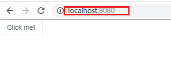
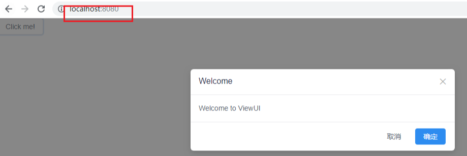
【小案例:在项目的 main.js 中引入】

【main.js】

import Vue from 'vue'

import App from './App.vue'

// step1: 引入 ViewUI

import ViewUI from 'view-design'

// step2: 引入 css

import 'view-design/dist/styles/iview.css'

Vue.config.productionTip = false

// step3:声明使用 ViewUI

Vue.use(ViewUI)

new Vue({

  render: h => h(App),

}).$mount('#app')

【修改App.vue】

<template>

    <div>

        <i-button @click="show">Click me!</i-button>

        <Modal v-model="visible" title="Welcome">Welcome to ViewUI</Modal>

    </div>

</template>

<script>

    export default {

        data() {

            return {

                visible: false

            }

        },

        methods: {

            show() {

                this.visible = true

            }

        }

    }

</script>

<style>

</style>
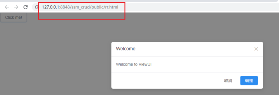
(2)不使用 npm 安装(单 html 中使用,直接运行)
【使用 <script> 标签引入 js 文件】

<script type="text/javascript" src="http://unpkg.com/view-design/dist/iview.min.js"></script>

【使用 <link> 标签引入 css 文件】

<link rel="stylesheet" type="text/css" href="http://unpkg.com/view-design/dist/styles/iview.css">

【小案例:(index.html)】

<!DOCTYPE html>

<html>

<head>

    <meta charset="utf-8">

    <title>ViewUI example</title>

    <link rel="stylesheet" type="text/css" href="http://unpkg.com/view-design/dist/styles/iview.css">

    <script type="text/javascript" src="http://vuejs.org/js/vue.min.js"></script>

    <script type="text/javascript" src="http://unpkg.com/view-design/dist/iview.min.js"></script>

</head>

<body>

<div id="app">

    <i-button @click="show">Click me!</i-button>

    <Modal v-model="visible" title="Welcome">Welcome to ViewUI</Modal>

</div>

<script>

    new Vue({

        el: '#app',

        data: {

            visible: false

        },

        methods: {

            show: function () {

                this.visible = true

            }

        }

    })

  </script>

</body>

</html>

二、组件 -- 基础
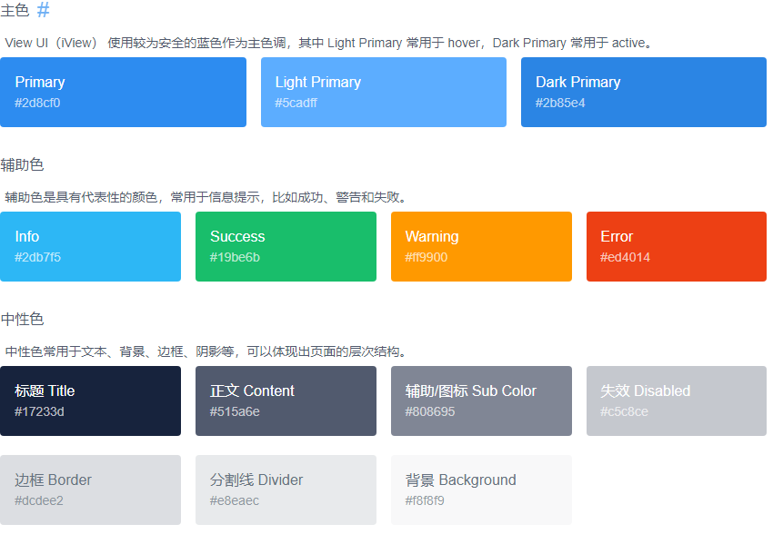
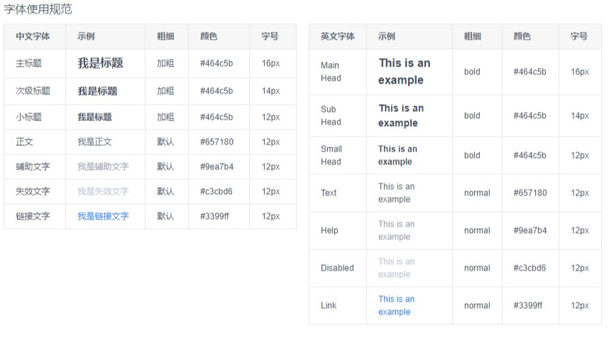
1、颜色(Color)
详见: https://www.iviewui.com/components/color
2、字体(Font)
详见:https://www.iviewui.com/components/font
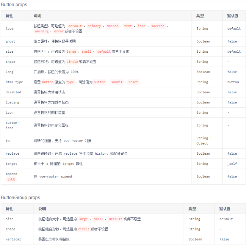
3、按钮(Button)
详见:https://www.iviewui.com/components/button
【App.vue】
<template>
<div>
<p>通过 type 来设置不同样式的按钮</p>
<Button>Default</Button>
<Button type="primary">Primary</Button>
<Button type="dashed">Dashed</Button>
<Button type="text">Text</Button>
<Button type="info">Info</Button>
<Button type="success">Success</Button>
<Button type="warning">Warning</Button>
<Button type="error">Error</Button>
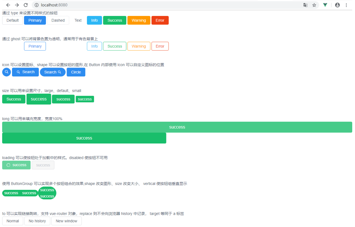
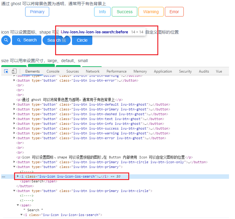
<br/><br/><br/> <p>通过 ghost 可以将背景色置为透明,通常用于有色背景上</p>
<Button ghost>Default</Button>
<Button type="primary" ghost>Primary</Button>
<Button type="dashed" ghost>Dashed</Button>
<Button type="text" ghost>Text</Button>
<Button type="info" ghost>Info</Button>
<Button type="success" ghost>Success</Button>
<Button type="warning" ghost>Warning</Button>
<Button type="error" ghost>Error</Button>
<br/><br/><br/> <P>icon 可以设置图标、shape 可以设置按钮的图形,在 Button 内部使用 Icon 可以自定义图标的位置</P>
<Button type="primary" shape="circle" icon="ios-search"></Button>
<Button type="primary" icon="ios-search">Search</Button>
<Button type="primary" shape="circle">
Search <Icon type="ios-search"></Icon>
</Button>
<Button type="primary">Circle</Button>
<br/><br/><br/> <p>size 可以用来设置尺寸,large、default、small</p>
<Button type="success">Success</Button>
<Button type="success" size="large">success</Button>
<Button type="success" size="default">success</Button>
<Button type="success" size="small">success</Button>
<br/><br/><br/> <p>long 可以用来填充宽度,宽度100%</p>
<Button type="success" size="large" long>success</Button>
<Button type="success" size="large" long style="width: 600px;">success</Button>
<br/><br/><br/> <p>loading 可以使按钮处于加载中的样式。disabled 使按钮不可用</p>
<Button type="success" loading>success</Button>
<Button type="success" disabled>success</Button>
<br/><br/><br/> <p>使用 ButtonGroup 可以实现多个按钮组合的效果,shape 改变图形、size 改变大小、 vertical 使按钮组垂直显示</p>
<ButtonGroup shape="circle" size="small">
<Button type="success">success</Button>
<Button type="success">success</Button>
</ButtonGroup>
<ButtonGroup shape="circle" size="small" vertical>
<Button type="success">success</Button>
<Button type="success">success</Button>
</ButtonGroup>
<br/><br/><br/> <p>to 可以实现链接跳转,支持 vue-router 对象,replace 则不会向浏览器 history 中记录, target 等同于 a 标签</p>
<Button to="https://www.baidu.com">Normal</Button>
<Button to="https://www.baidu.com" replace>No history</Button>
<Button to="https://www.baidu.com" target="_blank">New window</Button>
</div>
</template> <script>
export default {
}
</script> <style> </style>
4、图标(Icon)
详见:https://www.iviewui.com/components/icon
【渲染前:】

<Icon type="ios-search" />

【渲染后:】

<i class="ivu-icon ivu-icon-ios-search"></i>
三、组件 -- 布局
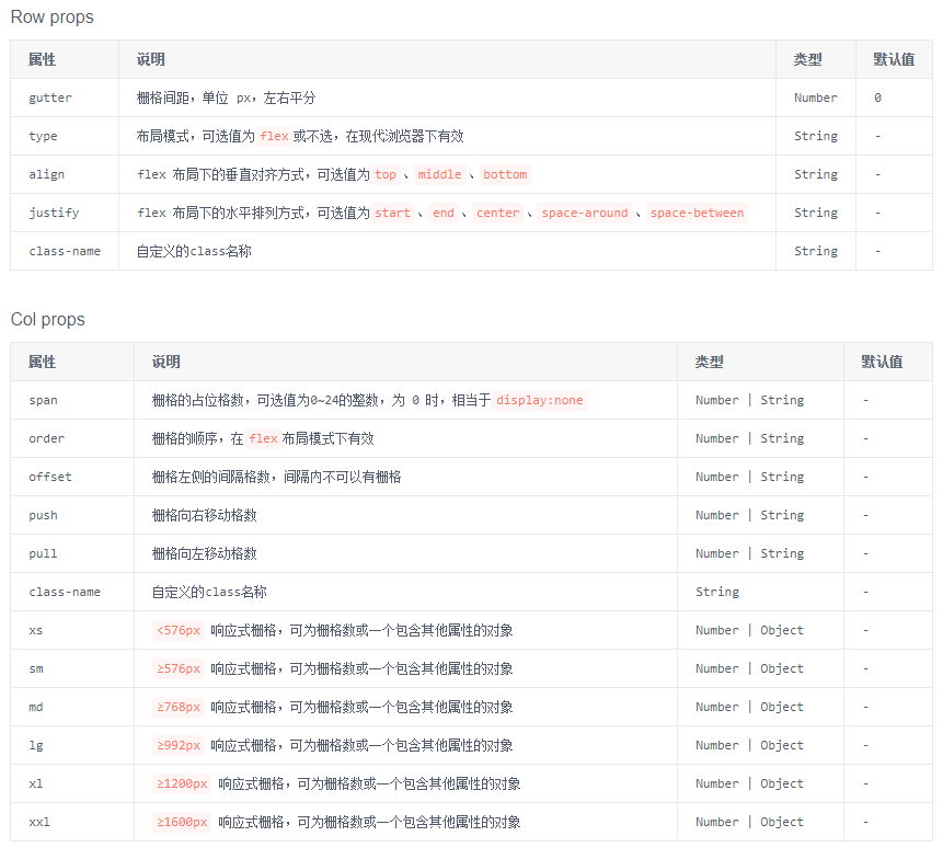
1、栅格系統(Grid)
详见:https://www.iviewui.com/components/grid
(1)使用栅格系统进行网页布局,可以使页面排版更加美观、舒适。
(2)采用 24 栅格系统。分为 row(行)和 col (列),其中 col 24 等分,可以使用 span 来控制。
【App.vue】

<template>

    <div style="width: 800px;">

        <h5>基本使用、水平布局</h5>

        <row>

            <i-col span="4"><div style="background: #219161;">col-4</div></i-col>

            <i-col span="8"><div style="background: #19469D">col-8</div></i-col>

            <i-col span="12"><div style="background: #880000">col-12</div></i-col>

        </row>

        <row>

            <i-col span="4" style="background: #219161;">col-4</i-col>

            <i-col span="4" style="background: #19469D">col-8</i-col>

            <i-col span="12" style="background: #880000">col-12</i-col>

        </row>

        <br/>

        <h5>区块间隔, 使用 :gutter 可以设置区块间隔,Flex 可以改变 栅格顺序(与 order 连用)</h5>

        <row :gutter="16">

            <i-col span="4" order="3"><div style="background: #219161;">col-4</div></i-col>

            <i-col span="8" order="2"><div style="background: #19469D">col-8</div></i-col>

            <i-col span="12" order="1"><div style="background: #880000">col-12</div></i-col>

        </row>

        <row :gutter="16" type="flex">

            <i-col span="4" order="3"><div style="background: #219161;">col-4</div></i-col>

            <i-col span="8" order="2"><div style="background: #19469D">col-8</div></i-col>

            <i-col span="12" order="1"><div style="background: #880000">col-12</div></i-col>

        </row>

        <br/>

        <h5>push="x" 向右移 x 格, pull="x" 向左移 x 格, offset="x" 向右偏移 x 格</h5>

        <Row>

            <i-col span="18" push="6"><div style="background: #219161;">push-6</div></i-col>

            <i-col span="6" pull="18"><div style="background: #880000;">pull-18</div></i-col>

        </Row>

        <Row>

            <i-col span="8" offset="2"><div style="background: #219161;">push-6</div></i-col>

            <i-col span="10" offset="4"><div style="background: #880000;">pull-18</div></i-col>

        </Row>

        <br/>

        <h5>justify:flex 布局下的水平排列方式,可选值为start、end、center、space-around、space-between</h5>

        <p>子元素向左排列</p>

        <Row type="flex" justify="start" style="background-color: #999999">

            <i-col span="4"><div style="background: #219161;">col-4</div></i-col>

            <i-col span="4"><div style="background: #19469D;">col-4</div></i-col>

            <i-col span="4"><div style="background: #880000;">col-4</div></i-col>

            <i-col span="4"><div style="background: #00A000">col-4</div></i-col>

        </Row>

        <p>子元素向右排列</p>

        <Row type="flex" justify="end" style="background-color: #999999">

            <i-col span="4"><div style="background: #219161;">col-4</div></i-col>

            <i-col span="4"><div style="background: #19469D;">col-4</div></i-col>

            <i-col span="4"><div style="background: #880000;">col-4</div></i-col>

            <i-col span="4"><div style="background: #00A000">col-4</div></i-col>

        </Row>

        <p>子元素向居中排列</p>

        <Row type="flex" justify="center" style="background-color: #999999">

            <i-col span="4"><div style="background: #219161;">col-4</div></i-col>

            <i-col span="4"><div style="background: #19469D;">col-4</div></i-col>

            <i-col span="4"><div style="background: #880000;">col-4</div></i-col>

            <i-col span="4"><div style="background: #00A000">col-4</div></i-col>

        </Row>

        <p>子元素等宽排列</p>

        <Row type="flex" justify="space-around" style="background-color: #999999">

            <i-col span="4"><div style="background: #219161;">col-4</div></i-col>

            <i-col span="4"><div style="background: #19469D;">col-4</div></i-col>

            <i-col span="4"><div style="background: #880000;">col-4</div></i-col>

            <i-col span="4"><div style="background: #00A000">col-4</div></i-col>

        </Row>

        <p>子元素分散排列</p>

        <Row type="flex" justify="space-between" style="background-color: #999999">

            <i-col span="4"><div style="background: #219161;">col-4</div></i-col>

            <i-col span="4"><div style="background: #19469D;">col-4</div></i-col>

            <i-col span="4"><div style="background: #880000;">col-4</div></i-col>

            <i-col span="4"><div style="background: #00A000">col-4</div></i-col>

        </Row>

        <br/>

        <h5>align:flex 布局下的垂直对齐方式,可选值为top、middle、bottom</h5>

        <p>子元素顶部对齐</p>

        <Row type="flex" justify="center" align="top" style="background-color: #999999">

            <i-col span="4"><div style="background: #219161; height: 40px;">col-4</div></i-col>

            <i-col span="4"><div style="background: #19469D; height: 30px;">col-4</div></i-col>

            <i-col span="4"><div style="background: #880000; height: 20px;">col-4</div></i-col>

            <i-col span="4"><div style="background: #00A000; height: 35px;">col-4</div></i-col>

        </Row>

        <p>子元素居中对齐</p>

        <Row type="flex" justify="center" align="middle" style="background-color: #999999">

            <i-col span="4"><div style="background: #219161; height: 40px;">col-4</div></i-col>

            <i-col span="4"><div style="background: #19469D; height: 30px;">col-4</div></i-col>

            <i-col span="4"><div style="background: #880000; height: 20px;">col-4</div></i-col>

            <i-col span="4"><div style="background: #00A000; height: 35px;">col-4</div></i-col>

        </Row>

        <p>子元素底部对齐</p>

        <Row type="flex" justify="center" align="bottom" style="background-color: #999999">

            <i-col span="4"><div style="background: #219161; height: 40px;">col-4</div></i-col>

            <i-col span="4"><div style="background: #19469D; height: 30px;">col-4</div></i-col>

            <i-col span="4"><div style="background: #880000; height: 20px;">col-4</div></i-col>

            <i-col span="4"><div style="background: #00A000; height: 35px;">col-4</div></i-col>

        </Row>

    </div>

</template>

<script>

    export default {}

</script>

<style>

</style>

2、布局(Layout)
详见:https://www.iviewui.com/components/layout
常用组件:Header、Sider、Content、Footer、 Layout
(1)Layout:布局容器,内部可嵌套 Header、Sider、Content、Footer、 Layout。可放在任意父容器中。
(2)Header:顶部布局,自带默认样式,只能放在 Layout 中。
(3)Sider:侧边栏布局,自带默认样式,只能放在 Layout 中。
(4)Content:内容主体布局,自带默认样式,只能放在 Layout 中。
(5)Footer:底部布局,自带默认样式,只能放在 Layout 中。
【App.vue】

<template>

    <div class="layout">

        <Layout>

            <Header>

                <Menu mode="horizontal" theme="dark" active-name="1">

                    <div class="layout-logo"></div>

                    <div class="layout-nav">

                        <MenuItem name="1">

                            <Icon type="ios-navigate"></Icon>

                            Item 1

                        </MenuItem>

                        <MenuItem name="2">

                            <Icon type="ios-keypad"></Icon>

                            Item 2

                        </MenuItem>

                        <MenuItem name="3">

                            <Icon type="ios-analytics"></Icon>

                            Item 3

                        </MenuItem>

                        <MenuItem name="4">

                            <Icon type="ios-paper"></Icon>

                            Item 4

                        </MenuItem>

                    </div>

                </Menu>

            </Header>

            <Layout>

                <!-- hide-trigger,隐藏默认触发器 -->

                <Sider hide-trigger :style="{background: '#fff'}">

                    <Menu active-name="1-2" theme="light" width="auto" :open-names="['1']">

                        <Submenu name="1">

                            <!-- 使用 slot 自定义触发器 -->

                            <template slot="title">

                                <Icon type="ios-navigate"></Icon>

                                Item 1

                            </template>

                            <MenuItem name="1-1">Option 1</MenuItem>

                            <MenuItem name="1-2">Option 2</MenuItem>

                            <MenuItem name="1-3">Option 3</MenuItem>

                        </Submenu>

                        <Submenu name="2">

                            <template slot="title">

                                <Icon type="ios-keypad"></Icon>

                                Item 2

                            </template>

                            <MenuItem name="2-1">Option 1</MenuItem>

                            <MenuItem name="2-2">Option 2</MenuItem>

                        </Submenu>

                        <Submenu name="3">

                            <template slot="title">

                                <Icon type="ios-analytics"></Icon>

                                Item 3

                            </template>

                            <MenuItem name="3-1">Option 1</MenuItem>

                            <MenuItem name="3-2">Option 2</MenuItem>

                        </Submenu>

                    </Menu>

                </Sider>

                <Layout :style="{padding: '0 24px 24px'}">

                    <Breadcrumb :style="{margin: '24px 0'}">

                        <BreadcrumbItem>Home</BreadcrumbItem>

                        <BreadcrumbItem>Components</BreadcrumbItem>

                        <BreadcrumbItem>Layout</BreadcrumbItem>

                    </Breadcrumb>

                    <Content :style="{padding: '24px', minHeight: '280px', background: '#fff'}">

                        Content

                    </Content>

                </Layout>

            </Layout>

        </Layout>

    </div>

</template>

<script>

    export default {

    }

</script>

<style scoped>

.layout{

    border: 1px solid #d7dde4;

    background: #f5f7f9;

    position: relative;

    border-radius: 4px;

    overflow: hidden;

    width: 800px;

}

.layout-logo{

    width: 100px;

    height: 30px;

    background: #5b6270;

    border-radius: 3px;

    float: left;

    position: relative;

    top: 15px;

    left: 20px;

}

.layout-nav{

    width: 420px;

    margin: 0 auto;

    margin-right: 20px;

}

</style>

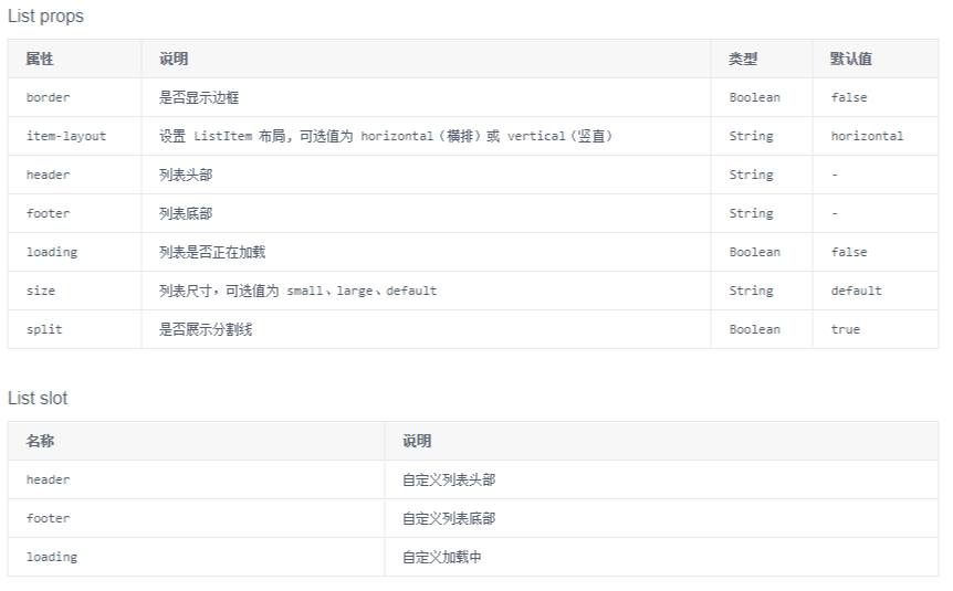
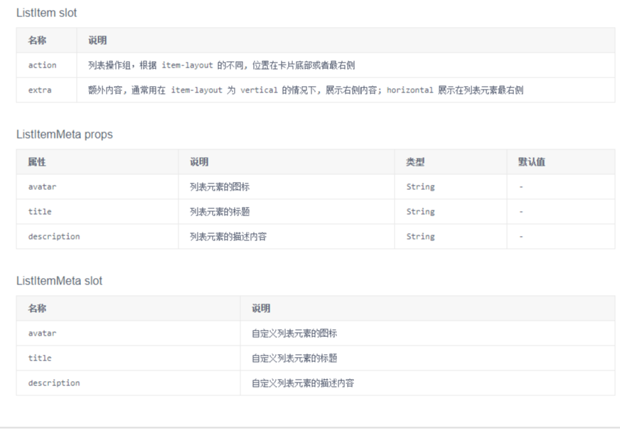
3、列表(List)
详见:https://www.iviewui.com/components/list
(1)基础的列表展示,可承载文字、列表、图片、段落,常用于后台数据展示页面。
(2)小案例分析
【App.vue】
<template>
<div style="width: 900px;">
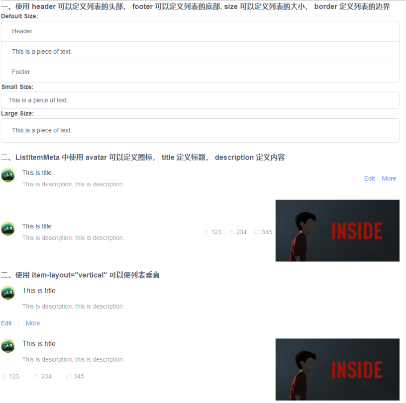
<h3>一、使用 header 可以定义列表的头部, footer 可以定义列表的底部, size 可以定义列表的大小, border 定义列表的边界</h3>
<strong>Default Size:</strong>
<List header="Header" footer="Footer" border>
<ListItem>This is a piece of text.</ListItem>
</List>
<strong>Small Size:</strong>
<List border size="small">
<ListItem>This is a piece of text.</ListItem>
</List>
<strong>Large Size:</strong>
<List border size="large">
<ListItem>This is a piece of text.</ListItem>
</List>
<br> <h3>二、ListItemMeta 中使用 avatar 可以定义图标, title 定义标题, description 定义内容</h3>
<List>
<ListItem>
<ListItemMeta avatar="https://dev-file.iviewui.com/userinfoPDvn9gKWYihR24SpgC319vXY8qniCqj4/avatar" title="This is title" description="This is description, this is description." />
<template slot="action">
<li>
<a href="">Edit</a>
</li>
<li>
<a href="">More</a>
</li>
</template>
</ListItem>
</List>
<List>
<ListItem>
<ListItemMeta avatar="https://dev-file.iviewui.com/userinfoPDvn9gKWYihR24SpgC319vXY8qniCqj4/avatar" title="This is title" description="This is description, this is description." />
<template slot="action">
<li>
<Icon type="ios-star-outline" /> 123
</li>
<li>
<Icon type="ios-thumbs-up-outline" /> 234
</li>
<li>
<Icon type="ios-chatbubbles-outline" /> 345
</li>
</template>
<template slot="extra">
<img src="https://dev-file.iviewui.com/5wxHCQMUyrauMCGSVEYVxHR5JmvS7DpH/large" style="width: 280px">
</template>
</ListItem>
</List> <h3>三、使用 item-layout="vertical" 可以使列表垂直</h3>
<List item-layout="vertical">
<ListItem>
<ListItemMeta avatar="https://dev-file.iviewui.com/userinfoPDvn9gKWYihR24SpgC319vXY8qniCqj4/avatar" title="This is title" description="This is description, this is description." />
<template slot="action">
<li>
<a href="">Edit</a>
</li>
<li>
<a href="">More</a>
</li>
</template>
</ListItem>
</List> <List item-layout="vertical">
<ListItem>
<ListItemMeta avatar="https://dev-file.iviewui.com/userinfoPDvn9gKWYihR24SpgC319vXY8qniCqj4/avatar" title="This is title" description="This is description, this is description." />
<template slot="action">
<li>
<Icon type="ios-star-outline" /> 123
</li>
<li>
<Icon type="ios-thumbs-up-outline" /> 234
</li>
<li>
<Icon type="ios-chatbubbles-outline" /> 345
</li>
</template>
<template slot="extra">
<img src="https://dev-file.iviewui.com/5wxHCQMUyrauMCGSVEYVxHR5JmvS7DpH/large" style="width: 280px">
</template>
</ListItem>
</List>
</div>
</template>
<script>
export default { }
</script>
<style>
</style>
4、卡片(Card)
详见:https://www.iviewui.com/components/card
(1)基础容器,用来显示文字、列表、图文等内容,也可以配合其它组件一起使用。
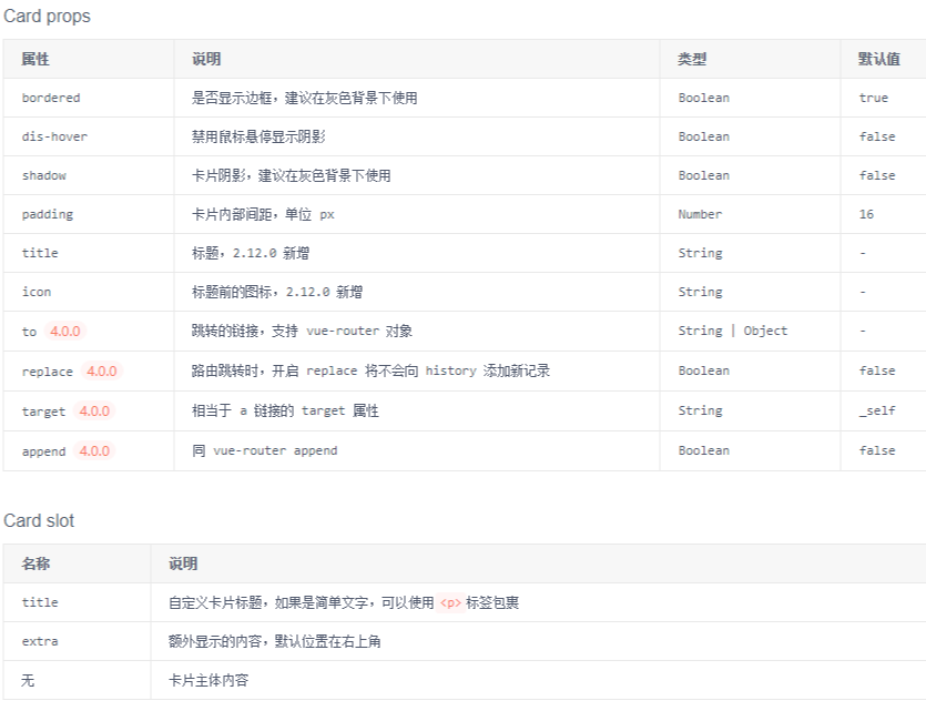
(2)小案例分析:
【App.vue】

<template>

    <div style="width: 800px;">

        <Row style="background:#eee;padding:20px">

            <i-col span="5">

                <p>默认卡片效果</p>

                <Card>

                    <p slot="title">default</p>

                    <p>Content of card</p>

                    <p>Content of card</p>

                    <p>Content of card</p>

                </Card>

            </i-col>

            <i-col span="5" offset="1">

                <p>不显示边框</p>

                <Card :bordered="false">

                    <p slot="title">bordered</p>

                    <p>Content of card</p>

                    <p>Content of card</p>

                    <p>Content of card</p>

                </Card>

            </i-col>

            <i-col span="5" offset="1">

                <p>shadow显示卡片阴影</p>

                <Card shadow>

                    <p slot="title">shadow</p>

                    <p>shadow存在时,dis-hover、bordered无效</p>

                </Card>

            </i-col>

            <i-col span="5" offset="1">

                <p>禁用鼠标悬停显示阴影</p>

                <Card dis-hover>

                    <p slot="title">dis-hover</p>

                    <p>Content of card</p>

                    <p>Content of card</p>

                    <p>Content of card</p>

                </Card>

            </i-col>

        </Row>

    </div>

</template>

<script>

    export default {

    }

</script>
截图看的不明显,可以复制代码自行比较。
5、折叠面板(Collapse)
详见:https://www.iviewui.com/components/collapse
(1)可以显示、隐藏内容
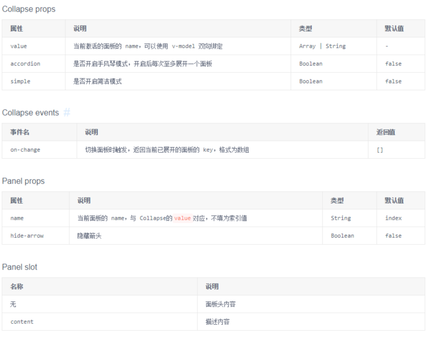
(2)小案例分析
【App.vue】

<template>

    <div style="width: 800px;">

        <h3>一、v-model 绑定的是 当前索引值,指向选择的某个面板,与 Panel 的 name 相对应</h3>

        <Collapse v-model="value1">

            <Panel name="1">

                Java

                <p slot="content">J A V A</p>

            </Panel>

            <Panel name="2">

                Python

                <p slot="content">P Y T H O N</p>

            </Panel>

            <Panel name="3">

                JavaScript

                <p slot="content">J A V A S C R I P T</p>

            </Panel>

        </Collapse>

        <br/>

        <h3>二、accordion 只允许展开一个面板,面板可以嵌套</h3>

        <Collapse v-model="value2" accordion>

            <Panel name="1">

                Java

                <p slot="content">J A V A</p>

            </Panel>

            <Panel name="2">

                Python

                <p slot="content">P Y T H O N</p>

            </Panel>

            <Panel name="3">

                JavaScript

                <Collapse slot="content" v-model="value3">

                    <Panel name="1">

                        Vue

                        <p slot="content">V U E</p>

                    </Panel>

                    <Panel name="2">

                        Jquery

                        <p slot="content">J Q U E R Y</p>

                    </Panel>

                    <Panel name="3">

                        React

                        <p slot="content">R E A C T</p>

                    </Panel>

                </Collapse>

            </Panel>

        </Collapse>

    </div>

</template>

<script>

    export default {

        data() {

            return {

                value1: '2',

                value2: '1',

                value3: '3'

            }

        }

    }

</script>
6、面板切割、拖动效果(Split)
详见:https://www.iviewui.com/components/split
(1)可将一片区域,分割为可以拖拽调整宽度或高度的两部分区域。

(2)小案例分析:
【App.vue】

<template>

    <div style="width: 800px; background-color:#BBBBCC">

        <h3>一、左右分割</h3>

        <div class="demo-split">

            <Split v-model="split1">

                <div slot="left" class="demo-split-pane">

                    Left Pane

                </div>

                <div slot="right" class="demo-split-pane">

                    Right Pane

                </div>

            </Split>

        </div>

        <br>

        <h3>二、上下分割</h3>

        <div class="demo-split">

            <Split v-model="split2" mode="vertical">

                <div slot="top" class="demo-split-pane">

                    Top Pane

                </div>

                <div slot="bottom" class="demo-split-pane">

                    Bottom Pane

                </div>

            </Split>

        </div>

        <br>

        <h3>三、组合分割</h3>

        <div class="demo-split">

            <Split v-model="split3">

                <div slot="left" class="demo-split-pane">

                    Left Pane

                    <div class="demo-split2">

                        <Split v-model="split4" mode="vertical">

                            <div slot="top" class="demo-split-pane">

                                Top Pane

                            </div>

                            <div slot="bottom" class="demo-split-pane">

                                Bottom Pane

                            </div>

                        </Split>

                    </div>

                </div>

                <div slot="right" class="demo-split-pane">

                    Right Pane

                </div>

            </Split>

        </div>

    </div>

</template>

<script>

    export default {

        data() {

            return {

                split1: 0.5,

                split2: 0.3,

                split3: 0.7,

                split4: 0.4

            }

        },

    }

</script>

<style>

    .demo-split {

        height: 250px;

        border: 1px solid #dcdee2;

    }

    .demo-split2 {

        height: 200px;

        border: 1px solid #dcdee2;

    }

    .demo-split-pane {

        padding: 10px;

    }

</style>

7、分割线(Divider)
详见:https://www.iviewui.com/components/divider
(1)区分内容的分割线。

(2)小案例分析:
【App.vue】 <template>
<div style="width: 800px; background-color: #BBBBCC;">
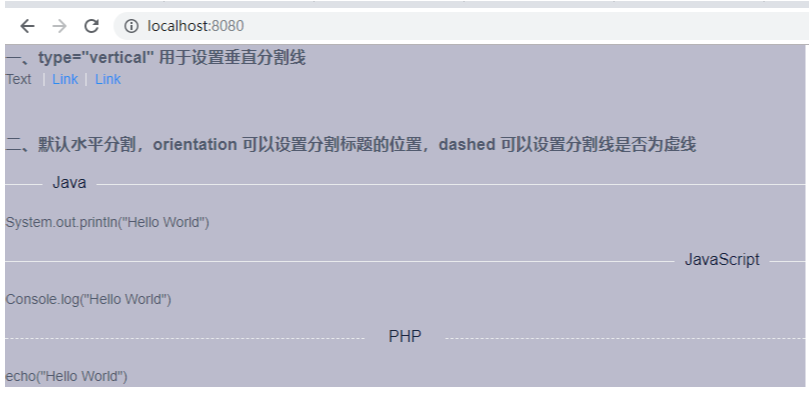
<h3>一、type="vertical" 用于设置垂直分割线</h3>
Text
<Divider type="vertical" />
<a href="#">Link</a>
<Divider type="vertical" />
<a href="#">Link</a>
<br><br><br> <h3>二、默认水平分割,orientation 可以设置分割标题的位置,dashed 可以设置分割线是否为虚线</h3>
<div>
<Divider orientation="left">Java</Divider>
<p>System.out.println("Hello World")</p>
<Divider orientation="right">JavaScript</Divider>
<p>Console.log("Hello World")</p>
<Divider orientation="center" dashed>PHP</Divider>
<p>echo("Hello World")</p>
</div>
</div>
</template>
<script>
export default { }
</script>
8、单元格(Cell)
详见:https://www.iviewui.com/components/cell
(1)常用于菜单列表
(2)小案例分析
【App.vue】
<template>
<div style="padding: 10px;background: #f8f8f9">
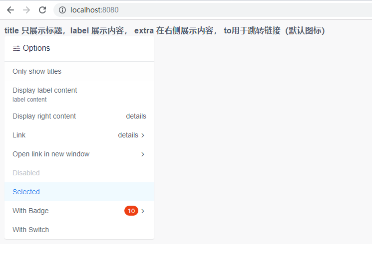
<h3>title 只展示标题,label 展示内容, extra 在右侧展示内容, to用于跳转链接(默认图标)</h3>
<Card title="Options" icon="ios-options" :padding="0" shadow style="width: 300px;">
<CellGroup>
<Cell title="Only show titles" />
<Cell title="Display label content" label="label content" />
<Cell title="Display right content" extra="details" />
<Cell title="Link" extra="details" to="https://www.baidu.com" />
<Cell title="Open link in new window" to="https://www.baidu.com" target="_blank" />
<Cell title="Disabled" disabled />
<Cell title="Selected" selected />
<Cell title="With Badge" to="https://www.baidu.com">
<Badge :count="10" slot="extra" />
</Cell>
<Cell title="With Switch">
<Switch v-model="switchValue" slot="extra" />
</Cell>
</CellGroup>
</Card>
</div>
</template>
<script>
export default {
data () {
return {
switchValue: true
}
},
}
</script>
四、组件 -- 导航
1、导航菜单(Menu)
详见:https://www.iviewui.com/components/menu
(1)为页面和功能提供导航的菜单列表,常用于网站顶部和左侧。
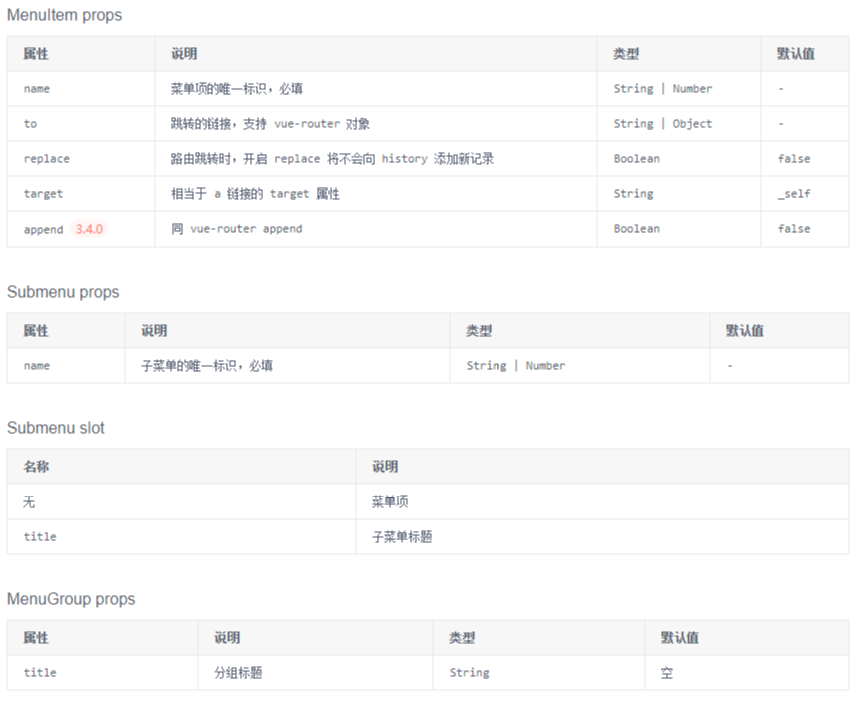
(2)小案例分析:
【App.vue】 <template>
<div style="width: 800px;background: #f8f8f9">
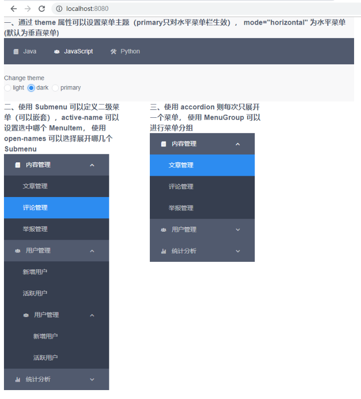
<h3>一、通过 theme 属性可以设置菜单主题(primary只对水平菜单栏生效), mode="horizontal" 为水平菜单(默认为垂直菜单)</h3>
<Menu mode="horizontal" :theme="theme1" active-name="2">
<MenuItem name="1">
<Icon type="ios-paper" />
Java
</MenuItem>
<MenuItem name="2">
<Icon type="ios-people" />
JavaScript
</MenuItem>
<MenuItem name="3">
<Icon type="ios-construct" />
Python
</MenuItem>
</Menu>
<br>
<p>Change theme</p>
<RadioGroup v-model="theme1">
<Radio label="light"></Radio>
<Radio label="dark"></Radio>
<Radio label="primary"></Radio>
</RadioGroup>
<br><br> <i-col span="8">
<h3>二、使用 Submenu 可以定义二级菜单(可以嵌套),active-name 可以设置选中哪个 MenuItem, 使用 open-names 可以选择展开哪几个Submenu</h3>
<Menu :theme="theme1" active-name="1-2" open-names="['1', '2']">
<Submenu name="1">
<template slot="title">
<Icon type="ios-paper" />
内容管理
</template>
<MenuItem name="1-1">文章管理</MenuItem>
<MenuItem name="1-2">评论管理</MenuItem>
<MenuItem name="1-3">举报管理</MenuItem>
</Submenu>
<Submenu name="2">
<template slot="title">
<Icon type="ios-people" />
用户管理
</template>
<MenuItem name="2-1">新增用户</MenuItem>
<MenuItem name="2-2">活跃用户</MenuItem>
<Submenu name="3">
<template slot="title">
<Icon type="ios-people" />
用户管理
</template>
<MenuItem name="2-1">新增用户</MenuItem>
<MenuItem name="2-2">活跃用户</MenuItem>
</Submenu>
</Submenu>
<Submenu name="4">
<template slot="title">
<Icon type="ios-stats" />
统计分析
</template>
<MenuGroup title="使用">
<MenuItem name="3-1">新增和启动</MenuItem>
<MenuItem name="3-2">活跃分析</MenuItem>
<MenuItem name="3-3">时段分析</MenuItem>
</MenuGroup>
<MenuGroup title="留存">
<MenuItem name="3-4">用户留存</MenuItem>
<MenuItem name="3-5">流失用户</MenuItem>
</MenuGroup>
</Submenu>
</Menu>
</i-col> <i-col span="8" offset="2">
<h3>三、使用 accordion 则每次只展开一个菜单, 使用 MenuGroup 可以进行菜单分组</h3>
<Menu :theme="theme1" active-name="1-1" open-names="['1']" accordion>
<Submenu name="1">
<template slot="title">
<Icon type="ios-paper" />
内容管理
</template>
<MenuItem name="1-1">文章管理</MenuItem>
<MenuItem name="1-2">评论管理</MenuItem>
<MenuItem name="1-3">举报管理</MenuItem>
</Submenu>
<Submenu name="2">
<template slot="title">
<Icon type="ios-people" />
用户管理
</template>
<MenuItem name="2-1">新增用户</MenuItem>
<MenuItem name="2-2">活跃用户</MenuItem>
</Submenu>
<Submenu name="3">
<template slot="title">
<Icon type="ios-stats" />
统计分析
</template>
<MenuGroup title="使用">
<MenuItem name="3-1">新增和启动</MenuItem>
<MenuItem name="3-2">活跃分析</MenuItem>
<MenuItem name="3-3">时段分析</MenuItem>
</MenuGroup>
<MenuGroup title="留存">
<MenuItem name="3-4">用户留存</MenuItem>
<MenuItem name="3-5">流失用户</MenuItem>
</MenuGroup>
</Submenu>
</Menu>
</i-col>
</div>
</template>
<script>
export default {
data() {
return {
theme1: 'light'
}
}
}
</script>
2、标签页(Tabs)
详见:https://www.iviewui.com/components/tabs
(1)选项卡切换组件,常用于平级区域大块内容的的收纳和展现。
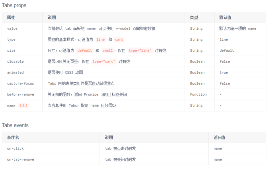

(2)小案例分析:
【App.vue】 <template>
<div style="width: 800px; background-color:#F5F5FF">
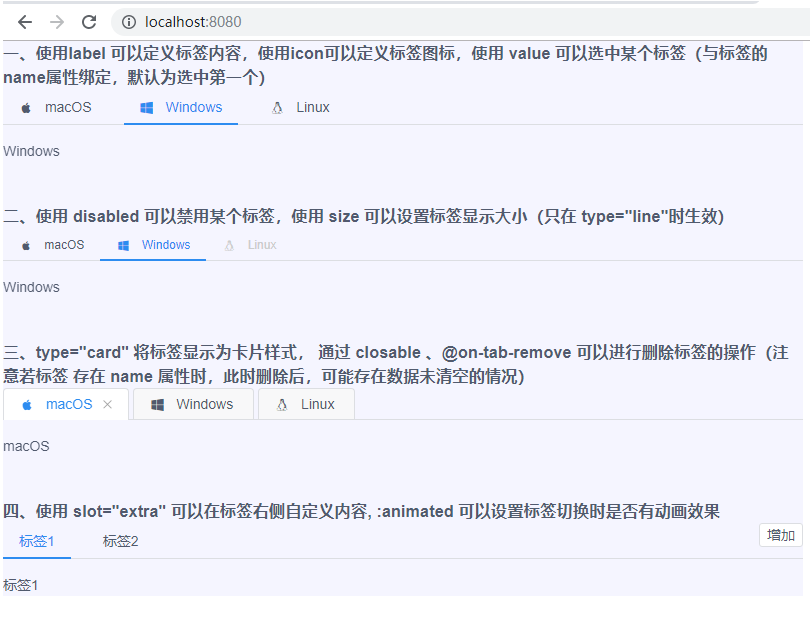
<h3>一、使用label 可以定义标签内容,使用icon可以定义标签图标,使用 value 可以选中某个标签(与标签的name属性绑定,默认为选中第一个)</h3>
<Tabs value="name2">
<TabPane label="macOS" icon="logo-apple" name="name1">macOS</TabPane>
<TabPane label="Windows" icon="logo-windows" name="name2">Windows</TabPane>
<TabPane label="Linux" icon="logo-tux" name="name3">Linux</TabPane>
</Tabs>
<br><br> <h3>二、使用 disabled 可以禁用某个标签,使用 size 可以设置标签显示大小(只在 type="line"时生效)</h3>
<Tabs value="name2" size="small">
<TabPane label="macOS" icon="logo-apple" name="name1">macOS</TabPane>
<TabPane label="Windows" icon="logo-windows" name="name2">Windows</TabPane>
<TabPane label="Linux" icon="logo-tux" name="name3" disabled>Linux</TabPane>
</Tabs>
<br><br> <h3>三、type="card" 将标签显示为卡片样式, 通过 closable 、@on-tab-remove 可以进行删除标签的操作(注意若标签 存在 name 属性时,此时删除后,可能存在数据未清空的情况)</h3>
<Tabs type="card" closable @on-tab-remove="handleTabRemove">
<TabPane label="macOS" icon="logo-apple" v-if="tab0">macOS</TabPane>
<TabPane label="Windows" icon="logo-windows" v-if="tab1">Windows</TabPane>
<TabPane label="Linux" icon="logo-tux" name="name3" v-if="tab2">Linux</TabPane>
</Tabs>
<br><br> <h3>四、使用 slot="extra" 可以在标签右侧自定义内容, :animated 可以设置标签切换时是否有动画效果</h3>
<Tabs :animated="false">
<TabPane v-for="tab in tabs" :key="tab" :label="'标签' + tab">标签{{ tab }}</TabPane>
<Button @click="handleTabsAdd" size="small" slot="extra">增加</Button>
</Tabs>
</div>
</template>
<script>
export default {
data() {
return {
tab0: true,
tab1: true,
tab2: true,
tabs: 2
}
},
methods: {
handleTabRemove(name) {
this['tab' + name] = false;
},
handleTabsAdd() {
this.tabs++;
} }
}
</script>
3、下拉菜单(Dropdown)
详见:https://www.iviewui.com/components/dropdown
(1)展示一组折叠的下拉菜单。用起来类似于 折叠面板(Collapse)

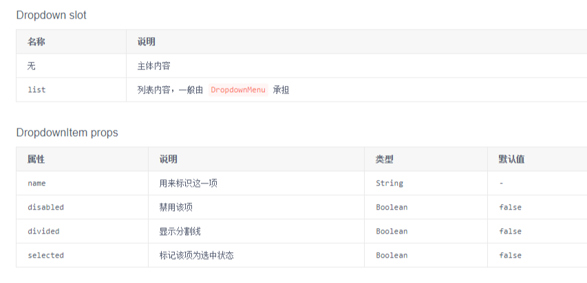
(2)小案例分析:
【App.vue】 <template>
<div style="width: 800px; background-color:#F5F5FF">
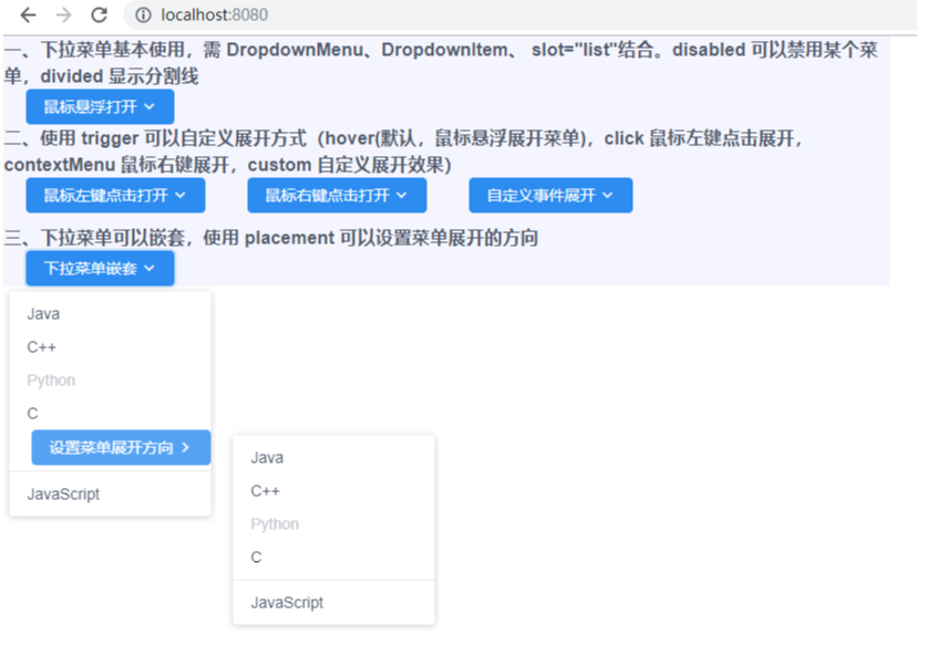
<h3>一、下拉菜单基本使用,需 DropdownMenu、DropdownItem、 slot="list"结合。disabled 可以禁用某个菜单,divided 显示分割线</h3>
<Dropdown style="margin-left: 20px">
<Button type="primary">
鼠标悬浮打开
<Icon type="ios-arrow-down"></Icon>
</Button>
<DropdownMenu slot="list">
<DropdownItem>Java</DropdownItem>
<DropdownItem>C++</DropdownItem>
<DropdownItem disabled>Python</DropdownItem>
<DropdownItem>C</DropdownItem>
<DropdownItem divided>JavaScript</DropdownItem>
</DropdownMenu>
</Dropdown> <h3>二、使用 trigger 可以自定义展开方式(hover(默认,鼠标悬浮展开菜单),click 鼠标左键点击展开,contextMenu 鼠标右键展开,custom 自定义展开效果)</h3>
<i-col span="4">
<Dropdown trigger="click" style="margin-left: 20px">
<Button type="primary">
鼠标左键点击打开
<Icon type="ios-arrow-down"></Icon>
</Button>
<DropdownMenu slot="list">
<DropdownItem>Java</DropdownItem>
<DropdownItem>C++</DropdownItem>
<DropdownItem disabled>Python</DropdownItem>
<DropdownItem>C</DropdownItem>
<DropdownItem divided>JavaScript</DropdownItem>
</DropdownMenu>
</Dropdown>
</i-col>
<i-col span="4" offset="2">
<Dropdown trigger="contextMenu" style="margin-left: 20px">
<Button type="primary">
鼠标右键点击打开
<Icon type="ios-arrow-down"></Icon>
</Button>
<DropdownMenu slot="list">
<DropdownItem>Java</DropdownItem>
<DropdownItem>C++</DropdownItem>
<DropdownItem disabled>Python</DropdownItem>
<DropdownItem>C</DropdownItem>
<DropdownItem divided>JavaScript</DropdownItem>
</DropdownMenu>
</Dropdown>
</i-col>
<i-col span="4" offset="2">
<Dropdown trigger="custom" :visible="visible" style="margin-left: 20px">
<Button type="primary" @click="visible = !visible">
自定义事件展开
<Icon type="ios-arrow-down"></Icon>
</Button>
<DropdownMenu slot="list">
<DropdownItem>Java</DropdownItem>
<DropdownItem>C++</DropdownItem>
<DropdownItem disabled>Python</DropdownItem>
<DropdownItem>C</DropdownItem>
<DropdownItem divided>JavaScript</DropdownItem>
</DropdownMenu>
</Dropdown>
</i-col>
<br><br> <h3>三、下拉菜单可以嵌套,使用 placement 可以设置菜单展开的方向</h3>
<Dropdown style="margin-left: 20px">
<Button type="primary">
下拉菜单嵌套
<Icon type="ios-arrow-down"></Icon>
</Button>
<DropdownMenu slot="list">
<DropdownItem>Java</DropdownItem>
<DropdownItem>C++</DropdownItem>
<DropdownItem disabled>Python</DropdownItem>
<DropdownItem>C</DropdownItem>
<Dropdown style="margin-left: 20px" placement="right-start">
<Button type="primary">
设置菜单展开方向
<Icon type="ios-arrow-forward"></Icon>
</Button>
<DropdownMenu slot="list">
<DropdownItem>Java</DropdownItem>
<DropdownItem>C++</DropdownItem>
<DropdownItem disabled>Python</DropdownItem>
<DropdownItem>C</DropdownItem>
<DropdownItem divided>JavaScript</DropdownItem>
</DropdownMenu>
</Dropdown>
<DropdownItem divided>JavaScript</DropdownItem>
</DropdownMenu>
</Dropdown>
</div>
</template>
<script>
export default {
data() {
return {
visible: false
}
}
}
</script>
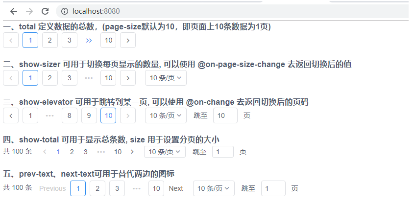
4、分页(Page)
详见:https://www.iviewui.com/components/page
(1)当数据量较多时,使用分页可以快速进行数据切换。

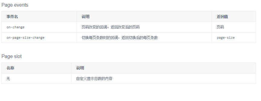
(2)小案例分析:
【App.vue】

<template>

    <div style="width: 800px;">

        <h3>一、total 定义数据的总数,(page-size默认为10,即页面上10条数据为1页)</h3>

        <Page :total="100" />

        <br>

        <h3>二、show-sizer 可用于切换每页显示的数量, 可以使用 @on-page-size-change 去返回切换后的值</h3>

        <Page :total="100" show-sizer @on-page-size-change="showPageSize"/>

        <br>

        <h3>三、show-elevator  可用于跳转到某一页, 可以使用 @on-change 去返回切换后的页码</h3>

        <Page :total="100" show-sizer show-elevator @on-change="showPage"/>

        <br>

        <h3>四、show-total 可用于显示总条数, size 用于设置分页的大小</h3>

        <Page :total="100" show-sizer show-elevator show-total size="small"/>

        <br>

        <h3>五、prev-text、next-text可用于替代两边的图标</h3>

        <Page :total="100" show-sizer show-elevator show-total prev-text="Previous" next-text="Next"/>

        <br>

    </div>

</template>

<script>

    export default {

        methods: {

            showPageSize (index) {

                alert(index)

            },

            showPage (index) {

                alert(index)

            }

        }

    }

</script>
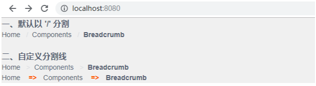
5、面包屑(Breadcrumb )
详见:https://www.iviewui.com/components/breadcrumb
(1)显示网站的层级结构,告知用户当前所在位置,以及在需要向上级导航时使用。
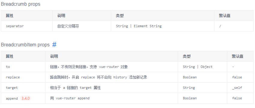
(2)小案例分析:
【App.vue】

<template>

    <div style="width: 800px; background-color:#F8F8FF">

        <h3>一、默认以 '/' 分割</h3>

        <Breadcrumb>

            <BreadcrumbItem to="https://www.baidu.com">Home</BreadcrumbItem>

            <BreadcrumbItem to="https://www.baidu.com">Components</BreadcrumbItem>

            <BreadcrumbItem>Breadcrumb</BreadcrumbItem>

        </Breadcrumb>

        <br>

        <h3>二、自定义分割线</h3>

        <Breadcrumb separator=">">

            <BreadcrumbItem to="https://www.baidu.com">Home</BreadcrumbItem>

            <BreadcrumbItem to="https://www.baidu.com">Components</BreadcrumbItem>

            <BreadcrumbItem>Breadcrumb</BreadcrumbItem>

        </Breadcrumb>

        <Breadcrumb separator="<b class='demo-breadcrumb-separator'>=></b>">

            <BreadcrumbItem to="https://www.baidu.com">Home</BreadcrumbItem>

            <BreadcrumbItem to="https://www.baidu.com">Components</BreadcrumbItem>

            <BreadcrumbItem>Breadcrumb</BreadcrumbItem>

        </Breadcrumb>

    </div>

</template>

<script>

    export default {

    }

</script>

<style>

    .demo-breadcrumb-separator {

        color: #ff5500;

        padding: 0 5px;

    }

</style>
6、步骤条(Steps)
详见:https://www.iviewui.com/components/steps
(1)拆分某项流程的步骤,引导用户按流程完成任务。
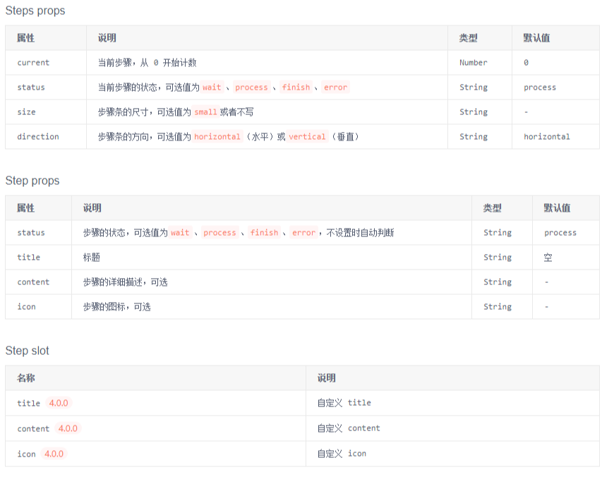
(2)小案例分析
【App.vue】

<template>

    <div style="width: 800px; background-color:#F8F8FF">

        <h3>一、根据current 自动判断各个步骤的状态(从 0 开始计数)</h3>

        <Steps :current="1">

            <Step title="已完成" content="这里是该步骤的描述信息"></Step>

            <Step title="进行中" content="这里是该步骤的描述信息"></Step>

            <Step title="待进行" content="这里是该步骤的描述信息"></Step>

            <Step title="待进行" content="这里是该步骤的描述信息"></Step>

        </Steps>

        <br>

        <h3>二、size 可以设置大小</h3>

        <Steps :current="2" size="small">

            <Step title="已完成"></Step>

            <Step title="已完成"></Step>

            <Step title="待进行"></Step>

            <Step title="待进行"></Step>

        </Steps>

        <br>

        <h3>三、icon 可以设置图标, status 可以设置执行某步骤的状态(wait、process、finish、error)</h3>

        <Steps :current="1" status="error">

            <Step title="注册" icon="ios-person"></Step>

            <Step title="上传头像" icon="ios-camera"></Step>

            <Step title="验证邮箱" icon="ios-mail"></Step>

        </Steps>

        <br>

        <h4>四、direction 可以设置为垂直的步骤条</h4>

        <p>当前正在进行第 {{ current + 1 }} 步</p>

        <Steps :current="current" direction="vertical">

            <Step title="步骤1"></Step>

            <Step title="步骤2"></Step>

            <Step title="步骤3"></Step>

            <Step title="步骤4"></Step>

        </Steps>

        <Button type="primary" @click="next">Next step</Button>

    </div>

</template>

<script>

    export default {

        data () {

            return {

                current: 0

            }

        },

        methods: {

            next () {

                if (this.current === 3) {

                    this.current = 0

                } else {

                    this.current++

                }

            }

        }

    }

</script>

<style>

    .demo-badge {

        width: 42px;

        height: 42px;

        background: #eee;

        border-radius: 6px;

        display: inline-block;

    }

</style>

五、表单
1、输入框(Input)
详见:https://www.iviewui.com/components/input
(1)基本表单组件,支持 input 和 textarea,并在原生控件基础上进行了功能扩展,可以组合使用。
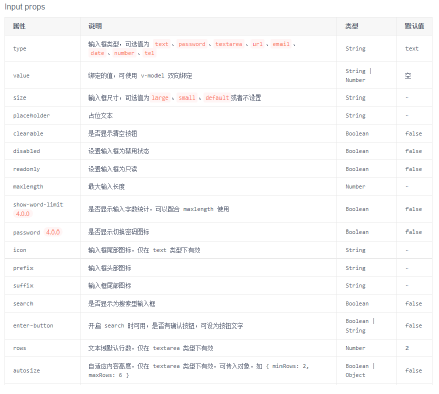
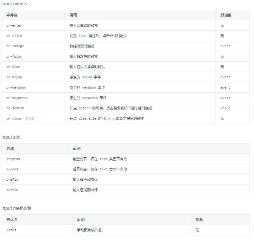
(2)小案例分析
【App.vue】

<template>

    <div style="width: 800px; background-color:#F8F8FF">

        <h3>一、可以使用 v-model 实现双向绑定, placeholder 可以定义提示内容, size 可以设置输入框大小</h3>

        <Input v-model="value" placeholder="Enter something..." style="width: 300px" size="large" />

        <Input v-model="value" placeholder="Enter something..." />

        <Input v-model="value" placeholder="Enter something..." style="width: 300px" size="small" />

        <br><br>

        <h3>二、使用 clearable 可以在输入框中显示清除按钮(输入框有值时). maxlength、show-word-limit 可以用于提示限制字符输入(会影响clearable)</h3>

        <Input v-model="value" placeholder="Enter something..." clearable />

        <Input v-model="value" maxlength="10" show-word-limit placeholder="Enter something..." />

        <Input v-model="value" maxlength="100" show-word-limit type="textarea" placeholder="Enter something..." />

        <br><br>

        <h3>三、使用密码框(type="password" password 可以隐藏、显示密码).

            使用 icon 可以定义图标,点击图标可以触发 on-click 事件.

            使用 search 可以设置搜索框样式, 可以结合 enter-button 使搜索图标变成 按钮的形式</h3>

        <Input v-model="value" placeholder="Enter something..." type="password" password />

        <Input v-model="value" @on-click="iconClick" icon="ios-clock-outline" placeholder="Enter something..." style="width: 200px" />

        <Input v-model="value" search placeholder="Enter something..." style="width: 200px" />

        <Input v-model="value" search enter-button placeholder="Enter something..." style="width: 200px" />

        <Input v-model="value" search enter-button="search" placeholder="Enter something..." style="width: 200px" />

        <br><br>

        <h3>四、可以通过 prefix 和 suffix 设置图标位置,直接使用 或者 使用slot同名引用</h3>

        <div>

            Props:

            <Input prefix="ios-contact" placeholder="Enter name" style="width: auto" />

            <Input suffix="ios-search" placeholder="Enter text" style="width: auto" />

        </div>

        <div style="margin-top: 6px">

            Slots:

            <i-input placeholder="Enter name" style="width: auto">

                <Icon type="ios-contact" slot="prefix" />

            </i-input>

            <i-input placeholder="Enter text" style="width: auto">

                <Icon type="ios-search" slot="suffix" />

            </i-input>

        </div>

        <br><br>

        <h3>五、可以使用 slot 引用 prepend, append 来设置前后样式</h3>

        <div>

            <i-input v-model="value">

                <span slot="prepend">http://</span>

                <span slot="append">.com</span>

            </i-input>

        </div>

    </div>

</template>

<script>

    export default {

        data() {

            return {

                value: 'HelloWorld'

            }

        },

        methods: {

            iconClick() {

                alert("hello")

            }

        }

    }

</script>

<style>

    .demo-badge {

        width: 42px;

        height: 42px;

        background: #eee;

        border-radius: 6px;

        display: inline-block;

    }

</style>

2、开关(Switch)
详见:https://www.iviewui.com/components/switch
(1)在两种状态间切换时用到的开关选择器。
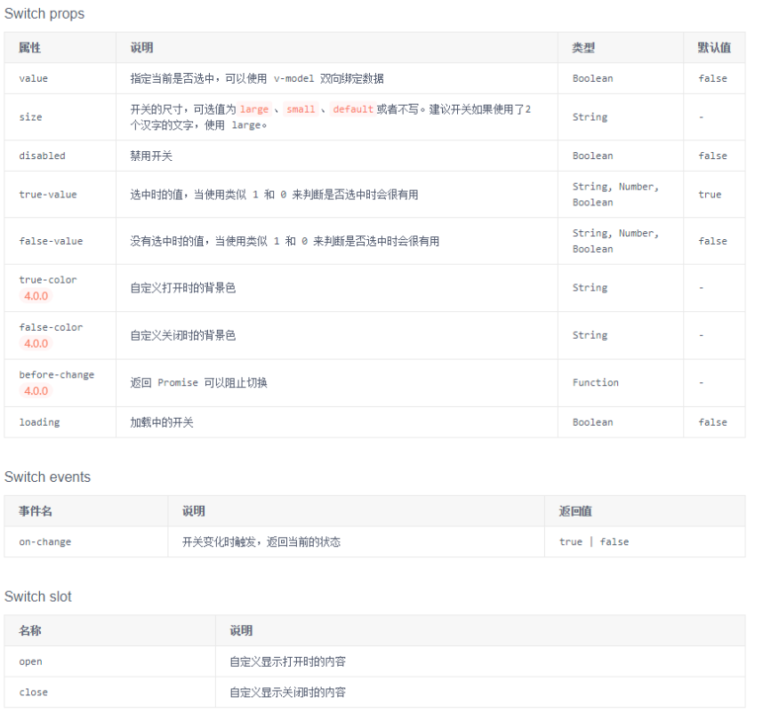
(2)小案例分析:
【App.vue】 <template>
<div style="width: 800px;">
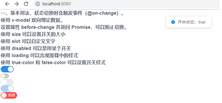
<h3>一、基本用法,状态切换时会触发事件(@on-change)。<br>
使用 v-model 双向绑定数据。<br>
设置属性 before-change 并返回 Promise,可以阻止切换。<br>
使用 size 可以设置开关的大小 <br>
使用 slot 可以自定义文字 <br>
使用 disabled 可以禁用某个开关 <br>
使用 loading 可以出现加载中的样式 <br>
使用 true-color 和 false-color 可以设置开关样式 <br>
</h3>
<i-switch v-model="switch1" @on-change="change" :before-change="handleBeforeChange"/> <br>
<i-switch v-model="switch2" @on-change="change" size="small" /> <br>
<i-switch @on-change="change" disabled/> <br>
<i-switch v-model="switch3" @on-change="change" loading /> <br>
<i-switch size="large" true-color="#13ce66" false-color="#ff4949">
<span slot="open">开启</span>
<span slot="close">关闭</span>
</i-switch>
</div>
</template>
<script>
export default {
data() {
return {
switch1: false,
switch2: false,
switch3: true
}
},
methods: {
change(status) {
this.$Message.info('开关状态:' + status)
},
handleBeforeChange() {
return new Promise((resolve) => {
this.$Modal.confirm({
title: '切换确认',
content: '您确认要切换开关状态吗?',
onOk: () => {
resolve()
}
})
})
}
}
}
</script>
3、表格(Table)
详见:https://www.iviewui.com/components/table
(1)主要用于展示大量结构化数据。支持排序、筛选、分页、自定义操作、导出 csv 等复杂功能。
(2)小案例分析:
【App.vue】 <template>
<div style="width: 800px;">
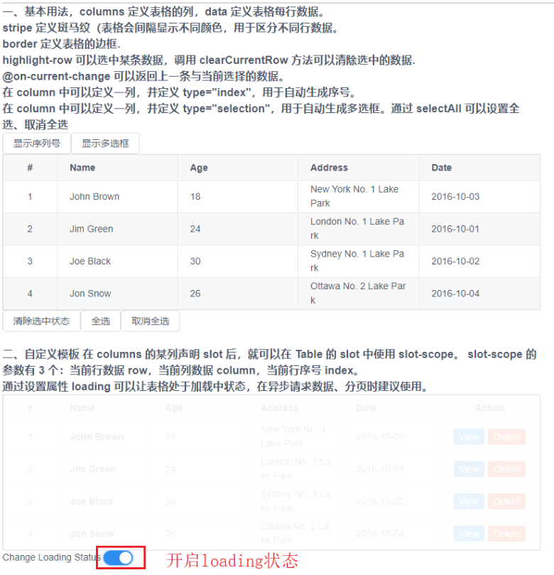
<h3>一、基本用法,columns 定义表格的列,data 定义表格每行数据。<br>
stripe 定义斑马纹(表格会间隔显示不同颜色,用于区分不同行数据。<br>
border 定义表格的边框.<br>
highlight-row 可以选中某条数据,调用 clearCurrentRow 方法可以清除选中的数据.<br>
@on-current-change 可以返回上一条与当前选择的数据。<br>
在 column 中可以定义一列,并定义 type="index",用于自动生成序号。<br>
在 column 中可以定义一列,并定义 type="selection",用于自动生成多选框。通过 selectAll 可以设置全选、取消全选<br>
</h3>
<Button @click="showIndex">显示序列号</Button>
<Button @click="showCheckBox">显示多选框</Button>
<Table :columns="column === true ? columns1 : columns2" :data="data1" stripe border highlight-row ref="currentRowTable" @on-current-change="changeData"></Table>
<Button @click="handleClearCurrentRow">清除选中状态</Button>
<Button @click="handleSelectAll(true)">全选</Button>
<Button @click="handleSelectAll(false)">取消全选</Button>
<br><br> <h3>二、自定义模板
在 columns 的某列声明 slot 后,就可以在 Table 的 slot 中使用 slot-scope。
slot-scope 的参数有 3 个:当前行数据 row,当前列数据 column,当前行序号 index。
<br>
通过设置属性 loading 可以让表格处于加载中状态,在异步请求数据、分页时建议使用。
</h3>
<Table border :columns="columns3" :data="data1" :loading="loading">
<template slot-scope="{ row }" slot="name">
<strong>{{ row.name }}</strong>
</template>
<template slot-scope="{ row, index }" slot="action">
<Button type="primary" size="small" style="margin-right: 5px" @click="show(index)">View</Button>
<Button type="error" size="small" @click="remove(index)">Delete</Button>
</template>
</Table>
Change Loading Status <i-switch v-model="loading"></i-switch>
</div>
</template>
<script>
export default {
data() {
return {
loading: false,
column: true,
columns1: [{
type: 'index',
width: 80,
align: 'center'
}, {
title: 'Name',
key: 'name'
},
{
title: 'Age',
key: 'age'
},
{
title: 'Address',
key: 'address'
}, {
title: 'Date',
key: 'date'
}
],
columns2: [{
type: 'selection',
width: 80,
align: 'center'
}, {
title: 'Name',
key: 'name'
},
{
title: 'Age',
key: 'age'
},
{
title: 'Address',
key: 'address'
}, {
title: 'Date',
key: 'date'
}
],
columns3: [{
type: 'index',
width: 80,
align: 'center'
}, {
title: 'Name',
slot: 'name'
},
{
title: 'Age',
key: 'age'
},
{
title: 'Address',
key: 'address'
}, {
title: 'Date',
key: 'date'
},
{
title: 'Action',
slot: 'action',
width: 150,
align: 'center'
}
],
data1: [{
name: 'John Brown',
age: 18,
address: 'New York No. 1 Lake Park',
date: '2016-10-03'
},
{
name: 'Jim Green',
age: 24,
address: 'London No. 1 Lake Park',
date: '2016-10-01'
},
{
name: 'Joe Black',
age: 30,
address: 'Sydney No. 1 Lake Park',
date: '2016-10-02'
},
{
name: 'Jon Snow',
age: 26,
address: 'Ottawa No. 2 Lake Park',
date: '2016-10-04'
}
]
}
},
methods: {
handleClearCurrentRow() {
this.column = false
this.$refs.currentRowTable.clearCurrentRow();
},
handleSelectAll(status) {
this.column = false
this.$refs.currentRowTable.selectAll(status);
},
changeData(currentRow, oldCurrentRow) {
console.log(oldCurrentRow)
console.log(currentRow)
},
showIndex() {
this.column = true
},
showCheckBox() {
this.column = false
},
show(index) {
this.$Modal.info({
title: 'User Info',
content: `Name:${this.data1[index].name}<br>Age:${this.data1[index].age}<br>Address:${this.data1[index].address}`
})
},
remove(index) {
this.data1.splice(index, 1);
}
}
}
</script>
(3)表格实用小案例(表格 + 分页):
自定义模板、可以分页、分页后索引值可以跟着修改。
【App.vue】

<template>

    <div style="width: 1000px;">

        <div style="margin: 10px">

            Display border <i-switch v-model="showBorder" style="margin-right: 5px"></i-switch>

            Display stripe <i-switch v-model="showStripe" style="margin-right: 5px"></i-switch>

            Display index <i-switch v-model="showIndex" style="margin-right: 5px"></i-switch>

            Display multi choice <i-switch v-model="showCheckbox" style="margin-right: 5px"></i-switch>

            Display header <i-switch v-model="showHeader" style="margin-right: 5px"></i-switch>

            Table scrolling <i-switch v-model="fixedHeader" style="margin-right: 5px"></i-switch>

            <br>

            <br>

            Table size

            <Radio-group v-model="tableSize" type="button">

                <Radio label="large">large</Radio>

                <Radio label="default">medium(default)</Radio>

                <Radio label="small">small</Radio>

            </Radio-group>

        </div>

        <Table :data="data2" :columns="tableColumns1" :stripe="showStripe" :border="showBorder" :showHeader="showHeader" :size="tableSize" :height="fixedHeader ? 250 : ''">

            <template slot-scope="{ row }" slot="name">

                <strong>{{ row.name }}</strong>

            </template>

            <template slot-scope="{ row, index }" slot="action">

                <Button type="primary" size="small" style="margin-right: 5px" @click="show(index)">View</Button>

                <Button type="error" size="small" @click="remove(index)">Delete</Button>

            </template>

        </Table>

        <div style="margin: 10px;overflow: hidden">

            <div style="float: right;">

                <!-- current 设置当前选中页 -->

                <Page :total="data1.length" :current="currentPage" @on-change="changePage"></Page>

            </div>

        </div>

    </div>

</template>

<script>

    export default {

        data() {

            return {

                // 当前页码

                currentPage: 1,

                // 每页数据的条数

                pageSize: 10,

                // 表格的列

                tableColumns1: [{

                        // 分页时,若要出现自动索引,设置type = "index2",并使用 render 来返回索引值

                        type: 'index2',

                        width: 80,

                        align: 'center',

                        render: (h, params) => {

                            return h('span', params.index + (this.currentPage - 1) * this.pageSize + 1);

                        }

                    },{

                        title: 'Name',

                        slot: 'name'

                    },

                    {

                        title: 'Age',

                        key: 'age',

                        sortable: true

                    },

                    {

                        title: 'Address',

                        key: 'address'

                    }, {

                        title: 'Date',

                        key: 'date',

                        sortable: true

                    },

                    {

                        title: 'Action',

                        slot: 'action',

                        width: 150,

                        align: 'center'

                    }

                ],

                // 表格的源数据

                data1: [{

                        name: 'John Brown',

                        age: 18,

                        address: 'New York No. 1 Lake Park',

                        date: '2016-10-03'

                    },

                    {

                        name: 'Jim Green',

                        age: 24,

                        address: 'London No. 1 Lake Park',

                        date: '2016-10-01'

                    },

                    {

                        name: 'Joe Black',

                        age: 30,

                        address: 'Sydney No. 1 Lake Park',

                        date: '2016-10-02'

                    },

                    {

                        name: 'Jon Snow',

                        age: 26,

                        address: 'Ottawa No. 2 Lake Park',

                        date: '2016-10-04'

                    }, {

                        name: 'John Brown',

                        age: 18,

                        address: 'New York No. 1 Lake Park',

                        date: '2016-10-03'

                    },

                    {

                        name: 'Jim Green',

                        age: 24,

                        address: 'London No. 1 Lake Park',

                        date: '2016-10-01'

                    },

                    {

                        name: 'Joe Black',

                        age: 30,

                        address: 'Sydney No. 1 Lake Park',

                        date: '2016-10-02'

                    },

                    {

                        name: 'Jon Snow',

                        age: 26,

                        address: 'Ottawa No. 2 Lake Park',

                        date: '2016-10-04'

                    },

                    {

                        name: 'Jim Green',

                        age: 24,

                        address: 'London No. 1 Lake Park',

                        date: '2016-10-01'

                    },

                    {

                        name: 'Joe Black',

                        age: 30,

                        address: 'Sydney No. 1 Lake Park',

                        date: '2016-10-02'

                    },

                    {

                        name: 'Jon Snow',

                        age: 26,

                        address: 'Ottawa No. 2 Lake Park',

                        date: '2016-10-04'

                    }

                ],

                // 表格每页的数据

                data2: [],

                // 表格边框是否显示

                showBorder: false,

                // 表格斑马纹是否显示

                showStripe: false,

                // 表格头是否显示

                showHeader: true,

                // 表格索引是否显示

                showIndex: true,

                // 表格多选框是否显示

                showCheckbox: false,

                // 表格滚动条是否开启

                fixedHeader: false,

                // 改变表格大小

                tableSize: 'default'

            }

        },

        methods: {

            changePage(index) {

                // 改变当前的页码,并获取当前页码所拥有的数据

                this.currentPage = index

                this.data2 = this.data1.slice((index - 1) * this.pageSize, index * this.pageSize);

            },

            show(index) {

                // 弹出一个模态框,用于展示某条数据的信息(``是ES6的模板字符串)

                this.$Modal.info({

                    title: 'User Info',

                    content: `Name:${this.data2[index].name}<br>Age:${this.data2[index].age}<br>Address:${this.data2[index].address}`

                })

            },

            remove(index) {

                // 删除某条数据(删除源数据)

                this.data1.splice((this.currentPage-1) * 10 + index, 1)

            }

        },

        watch: {

            showIndex(newVal) {

                if (newVal) {

                    // 为true时,在首部增加一个索引列

                    this.tableColumns1.unshift({

                        // 分页时,若要出现自动索引,设置type = "index2",并使用 render 来返回索引值

                        type: 'index2',

                        width: 80,

                        align: 'center',

                        render: (h, params) => {

                            return h('span', params.index + (this.currentPage - 1) * this.pageSize + 1);

                        }

                    })

                } else {

                    // 为false时,若首部存在索引列,则移除该列

                    this.tableColumns1.forEach((item, index) => {

                        if (item.type === 'index2') {

                            this.tableColumns1.splice(index, 1)

                        }

                    })

                }

            },

            showCheckbox(newVal) {

                if (newVal) {

                    // 为 true 时,在首部增加一多选框列,

                    this.tableColumns1.unshift({

                        type: 'selection',

                        width: 60,

                        align: 'center'

                    })

                } else {

                    // 为false时,若存在多选框列,则移除该列

                    this.tableColumns1.forEach((item, index) => {

                        if (item.type === 'selection') {

                            this.tableColumns1.splice(index, 1)

                        }

                    })

                }

            },

            data1() {

                // 当列表数据改变时(比如删除某数据),触发一次刷新列表的操作

                this.changePage(this.currentPage)

            }

        },

        mounted() {

            // 页面加载时,触发第一次刷新列表的操作

            this.changePage(this.currentPage)

        }

    }

</script>


六、视图
1、警告提示(Alert)
详见:https://www.iviewui.com/components/alert
(1)静态地呈现一些警告信息,可手动关闭。
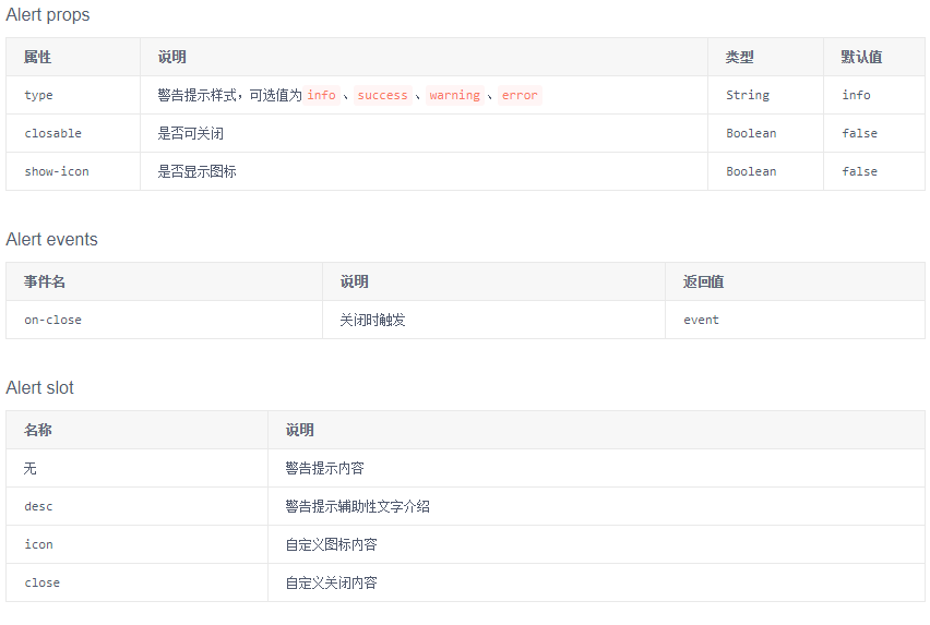
(2)小案例分析:
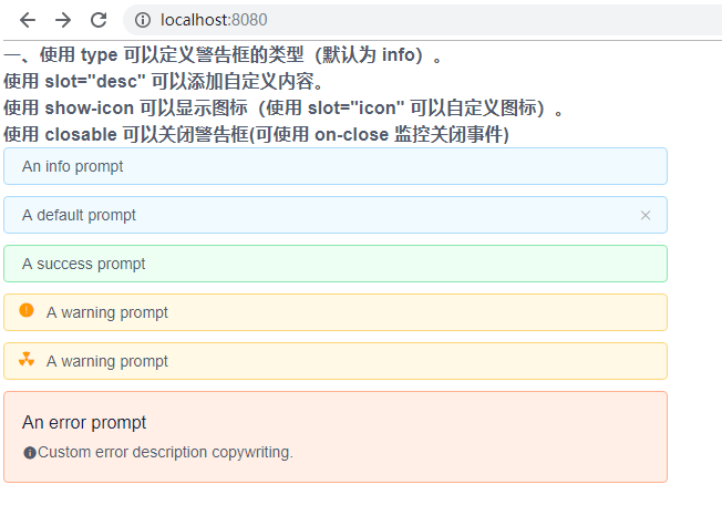
【App.vue】

<template>

    <div style="width: 600px;">

        <h3>一、使用 type 可以定义警告框的类型(默认为 info)。<br>

            使用 slot="desc" 可以添加自定义内容。<br>

            使用 show-icon 可以显示图标(使用 slot="icon" 可以自定义图标)。<br>

            使用 closable 可以关闭警告框(可使用 on-close 监控关闭事件)

        </h3>

        <Alert>An info prompt</Alert>

        <Alert type="info" closable @on-close="close">A default prompt</Alert>

        <Alert type="success">A success prompt</Alert>

        <Alert type="warning" show-icon>A warning prompt</Alert>

        <Alert type="warning" show-icon>

            <Icon type="ios-nuclear" slot="icon" /> A warning prompt</Alert>

        <Alert type="error">

            An error prompt

            <span slot="desc">

                <Icon type="md-information-circle" />Custom error description copywriting.

            </span>

        </Alert>

    </div>

</template>

<script>

    export default {

        methods: {

            close() {

                alert("Hello")

            }

        }

    }

</script>
2、全局提示(Message)
详见:https://www.iviewui.com/components/message
(1)轻量级的信息反馈组件,在顶部居中显示,并自动消失。有多种不同的提示状态可选择。
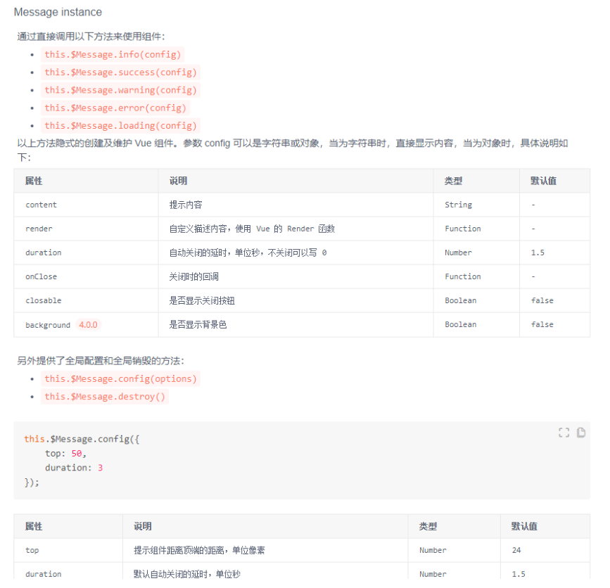
(2)小案例分析:
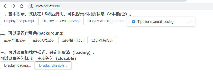
【App.vue】

<template>

    <div style="width: 800px;">

        <h3>一、基本提示,默认在1.5秒后消失。可以提示不同的状态(不同颜色)。</h3>

        <Button @click="info">Display info prompt</Button>

        <Button @click="success">Display success prompt</Button>

        <Button @click="warning">Display warning prompt</Button>

        <Button @click="error">Display error prompt</Button>

        <br><br>

        <h3>二、可以设置背景色(background).</h3>

        <Button @click="background('info')">显示普通提示</Button>

        <Button @click="background('success')">显示成功提示</Button>

        <Button @click="background('warning')">显示警告提示</Button>

        <Button @click="background('error')">显示错误提示</Button>

        <br><br>

        <h3>三、可以设置加载中样式,并定时取消(loading)。<br>

            可以设置关闭样式,主动关闭(closable)

        </h3>

        <Button @click="loading">Display loading...</Button>

        <Button @click="closable">Display closable...</Button>

    </div>

</template>

<script>

    export default {

        methods: {

            info() {

                this.$Message.info('This is a info tip')

            },

            success() {

                this.$Message.success('This is a success tip')

            },

            warning() {

                this.$Message.warning('This is a warning tip')

            },

            error() {

                this.$Message.error('This is an error tip')

            },

            background(type) {

                this.$Message[type]({

                    background: true,

                    content: 'This is a ' + type + ' tip'

                })

            },

            loading() {

                // 两种延时关闭方法

                // 第一种,使用定时器关闭(毫秒为单位)

                // const msg = this.$Message.loading({

                //     content: 'Loading...',

                //     duration: 0

                // })

                // setTimeout(msg, 1000)

                // 第二种,自定义关闭时间(秒为单位)

                const msg = this.$Message.loading({

                    content: 'Loading...',

                    duration: 1

                })

            },

            closable() {

                this.$Message.info({

                    content: 'Tips for manual closing',

                    duration: 10,

                    closable: true

                })

            }

        }

    }

</script>
3、通知提醒(Notice)
详见:https://www.iviewui.com/components/notice
(1)在界面右上角显示可关闭的全局通知,常用于:系统主动推送、通知内容带有描述信息。
(2)小案例分析:
【App.vue】

<template>

    <div style="width: 800px;">

        <h3>一、基本用法,默认在 4.5秒后关闭。如果 desc 参数为空或不填,则自动应用仅标题模式下的样式。</h3>

        <Button type="primary" @click="open(false)">Open notice</Button>

        <Button @click="open(true)">Open notice(only title)</Button>

        <h3>二、可以设置不同的类型(带图标、不带图标)。可以使用 duration 定时(为0时则为不定时)</h3>

        <Button @click="info(true)">Info</Button>

        <Button @click="success(true)">Success</Button>

        <Button @click="warning(true)">Warning</Button>

        <Button @click="error(true)">Error</Button>

        <Button type="primary" @click="time">Open notice</Button>

    </div>

</template>

<script>

    export default {

        methods: {

            open(nodesc) {

                this.$Notice.open({

                    title: 'Notification title',

                    desc: nodesc ? '' : 'Here is the notification description. Here is the notification description. '

                })

            },

            info(nodesc) {

                this.$Notice.info({

                    title: 'Notification title',

                    desc: nodesc ? '' : 'Here is the notification description. Here is the notification description. '

                })

            },

            success(nodesc) {

                this.$Notice.success({

                    title: 'Notification title',

                    desc: nodesc ? '' : 'Here is the notification description. Here is the notification description. '

                })

            },

            warning(nodesc) {

                this.$Notice.warning({

                    title: 'Notification title',

                    desc: nodesc ? '' : 'Here is the notification description. Here is the notification description. '

                })

            },

            error(nodesc) {

                this.$Notice.error({

                    title: 'Notification title',

                    desc: nodesc ? '' : 'Here is the notification description. Here is the notification description. '

                })

            },

            time() {

                this.$Notice.open({

                    title: 'Notification title',

                    desc: 'This notification does not automatically close, and you need to click the close button to close.',

                    duration: 1

                })

            }

        }

    }

</script>

4、抽屉(Drawer)
详见:https://www.iviewui.com/components/drawer
(1)抽屉从父窗体边缘滑入,覆盖住部分父窗体内容。用户在抽屉内操作时不必离开当前任务,操作完成后,可以平滑地回到到原任务。

(2)小案例分析:
【App.vue】

<template>

    <div style="width: 800px;">

        <h3>一、基础抽屉,点击触发按钮抽屉从右滑出,点击遮罩区关闭(mask-closable 为false时,点击遮罩区不可关闭)。</h3>

        <Button @click="value1 = true" type="primary">Basic Drawer From Right</Button>

        <Drawer title="Basic Drawer From Right" :closable="true" :mask-closable="false" v-model="value1">

            <p>Some contents...</p>

            <p>Some contents...</p>

            <p>Some contents...</p>

        </Drawer>

        <br><br>

        <h3>二、使用 placement 可以设置抽屉出现的位置。当 closable = true 时,可以在右上角显示关闭按钮. <br>

            mask 为 false 时,不显示遮罩层.

        </h3>

        <Button @click="value2 = true" type="primary">Basic Drawer From Left</Button>

        <Drawer title="Basic Drawer From Left" placement="left" :closable="true" :mask="false" v-model="value2">

            <p>Some contents...</p>

            <p>Some contents...</p>

            <p>Some contents...</p>

        </Drawer>

    </div>

</template>

<script>

    export default {

        data() {

            return {

                value1: false,

                value2: false

            }

        }

    }

</script>
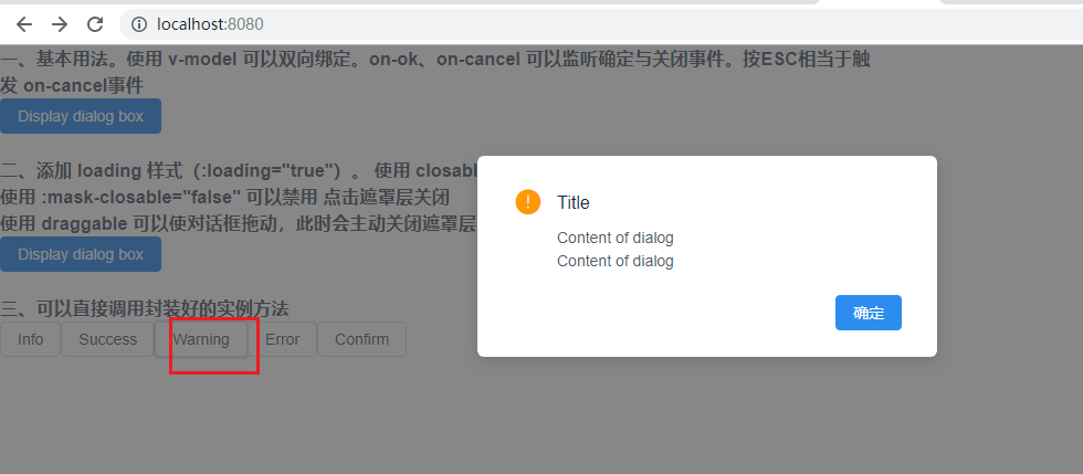
5、对话框(Modal)
详见:https://www.iviewui.com/components/modal
(1)模态对话框,在浮层中显示,引导用户进行相关操作。

(2)小案例分析
【App.vue】

<template>

    <div style="width: 800px;">

        <h3>一、基本用法。使用 v-model 可以双向绑定。on-ok、on-cancel 可以监听确定与关闭事件。按ESC相当于触发 on-cancel事件</h3>

        <Button type="primary" @click="modal1 = true">Display dialog box</Button>

        <Modal v-model="modal1" title="Common Modal dialog box title" @on-ok="ok" @on-cancel="cancel">

            <p>Content of dialog</p>

            <p>Content of dialog</p>

            <p>Content of dialog</p>

        </Modal>

        <br><br>

        <h3>二、添加 loading 样式(:loading="true")。

            使用 closable = "false" 可以禁用右上角关闭按钮。<br>

            使用 :mask-closable="false" 可以禁用 点击遮罩层关闭<br>

            使用 draggable 可以使对话框拖动,此时会主动关闭遮罩层</h3>

        <Button type="primary" @click="modal2 = true">Display dialog box</Button>

        <Modal v-model="modal2" title="Title" :loading="loading" :closable="false" draggable :mask-closable="false" @on-ok="asyncOK">

            <p>After you click ok, the dialog box will close in 2 seconds.</p>

        </Modal>

        <br><br>

        <h3>三、可以直接调用封装好的实例方法</h3>

        <Button @click="instance('info')">Info</Button>

        <Button @click="instance('success')">Success</Button>

        <Button @click="instance('warning')">Warning</Button>

        <Button @click="instance('error')">Error</Button>

        <Button @click="instance('confirm')">Confirm</Button>

    </div>

</template>

<script>

    export default {

        data() {

            return {

                modal1: false,

                modal2: false,

                loading: true

            }

        },

        methods: {

            ok() {

                this.$Message.info('Clicked ok');

            },

            cancel() {

                this.$Message.info('Clicked cancel');

            },

            asyncOK() {

                setTimeout(() => {

                    this.modal2 = false;

                }, 2000);

            },

            instance(type) {

                const title = 'Title';

                const content = '<p>Content of dialog</p><p>Content of dialog</p>';

                switch (type) {

                    case 'info':

                        this.$Modal.info({

                            title: title,

                            content: content

                        })

                        break

                    case 'success':

                        this.$Modal.success({

                            title: title,

                            content: content

                        })

                        break

                    case 'warning':

                        this.$Modal.warning({

                            title: title,

                            content: content

                        })

                        break

                    case 'error':

                        this.$Modal.error({

                            title: title,

                            content: content

                        })

                        break

                    case 'confirm':

                        this.$Modal.confirm({

                            title: 'Title',

                            content: '<p>Content of dialog</p><p>Content of dialog</p>',

                            onOk: () => {

                                this.$Message.info('Clicked ok')

                            },

                            onCancel: () => {

                                this.$Message.info('Clicked cancel')

                            },

                            okText: 'OK',

                            cancelText: 'Cancel'

                        })

                }

            }

        }

    }

</script>
未完待续。。。
VueUI -- iView4.0简单使用的更多相关文章
- struts2.0简单教程
Struts2.0简单配置教程: 在Eclipse中配置Struts2 步骤一:首先打开java ee并建立一个动态网站项目,我建立的项目名为TestDemo,如下图: 建立之后可在左侧发现工程,展开 ...
- HTTP/2.0 简单总结(转载)
HTTP/2.0 简单总结(转载于https://linjunzhu.github.io/blog/2016/03/10/http2-zongjie/) 如何使用上 HTTP/2.0 需要浏览器的支持 ...
- moloch1.8.0简单操作手册
moloch1.8.0简单操作手册 Sessions 页面:Sessions主要通过非常简单的查询语言来构建表达式追溯数据流量,以便分析. SPIView 页面: SPIGraph页面:SPIGrap ...
- Spark学习笔记0——简单了解和技术架构
目录 Spark学习笔记0--简单了解和技术架构 什么是Spark 技术架构和软件栈 Spark Core Spark SQL Spark Streaming MLlib GraphX 集群管理器 受 ...
- 学python2.7简单还是python3.0简单,两者区别
学python2.7简单还是python3.0简单,谈谈两者区别 1. 使用__future__模块 Python 3.X 引入了一些与Python 2 不兼容的关键字和特性.在Python 2中,可 ...
- AppScan8.0简单扫描
上篇文章介绍了如何在WindowsXP中安装AppScan8.0,接着本篇就来说说怎么进行一次简单的扫描吧. AppScan8.0开始扫描 1.新建扫描,选择“常规扫描”,如下图: (常规.快速.综合 ...
- Unity3D 5.0简单的射线检测实现跳跃功能
这里是一个简单的跳跃,5.0和其他版本貌似不一样,并且,再起跳功能做的不完全. 不过一个基本的思路在这里. 1.首先,射线检测,这里是利用一个空对象,放到主角对象的下面 2.然后调节射线的位置,在主角 ...
- python 3.4.0 简单的print 'hello world',出错--SyntaxError: invalid syntax
问题描写叙述: win7下安装的python 3.4.0版本号, 在命令行里写入简单的输出语句: print 'hello world' 然后enter,结果返回结果为: SyntaxError: i ...
- 第一篇:SpringBoot2.0简单介绍
距离Spring Boot1.0发布已经4年了,今年3月份SpringBoot2.0正式发布.让我们一起来了解一下它. Spring Boot主要依赖于Spring,整合了很多框架的使用方式,帮助开发 ...
随机推荐
- 整合多个maven工程时Spring配置加载JDBC问题
问题叙述: 两个工程都通过JDBC访问mysql数据库,各自运行OK, 但合并成一个maven工程后,发现前一个工程访问数据库异常,貌似拿不到自己的DAO. 解决办法: 发现这两个工程的xml配置中, ...
- 智能家居CC2530功率放大组网RFX2401C和AT2401C的区别
两者最大的区别就是RFX2401C的增益为12dbmAT2401C的增益为14dbm这就会导致AT2401C的功耗会比RFX2401C大一点点,但距离也会相对更远,并且增加了EDS防静电等级,多出2个 ...
- UILabel(label控件)的详细使用及特殊效果
转自:http://blog.sina.com.cn/s/blog_af73e7a70101ahlm.html UILabel *label = [[UILabelalloc] initWithFra ...
- 用jquery实现楼层滚动对应导航高亮
html 结构排版: // 定位到页面左侧或者右侧 <div class="nav"> <ul id="menu-list"& ...
- MacOS下制作linux启动盘
在Windows下,我们经常使用软碟通来制作各种系统的启动盘,那么在MacOS下,如何做到呢?MacOS跟Linux的做法基本一致.如果你只想快速地制作好启动盘,请看下面的快速版 首先,你需要以下两样 ...
- ARTS-S golang函数作为参数传递
函数作为参数传递在单元测试的时候非常有用,看下面的例子. package main import "fmt" func output(f func(string, string, ...
- tensorflow常用函数解释
从二维数组中选一个矩形 import tensorflow as tf data = [[1,2,3,4,5,6,7,8],[11,12,13,14,15,16,17,18]] x = tf.stri ...
- Day 02 计算机的基本组成及工作原理
目录 计算机的构成 CPU 控制器 运算器 存储器 内存 外存 I/O (input & output) 输入设备 输出设备 什么是编程语言 什么是编程 为什么要编程 多核CPU 32位和64 ...
- 【系列专题】JavaScript设计模式 重温系列(9篇全)
JavaScript 设计模式 [JS]164-JavaScript设计模式--单体模式 [JS]165-JavaScript设计模式--工厂模式 [JS]166-JavaScript设计模式--迭代 ...
- Linux查看文本的第20~30行
一.模拟环境 [root@WT ~]# seq >/data/test.txt [root@WT ~]# xargs -n </data/test.txt 二.实现命令 方法一(head+ ...