WPF - 简单的UI框架
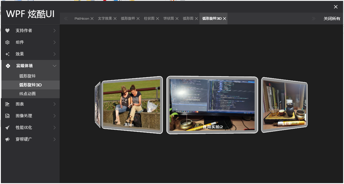
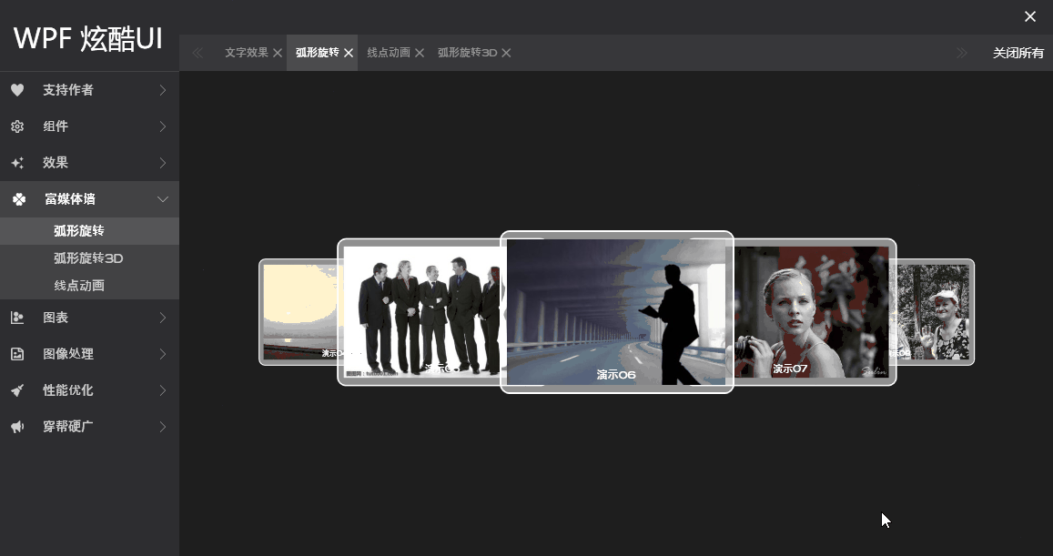
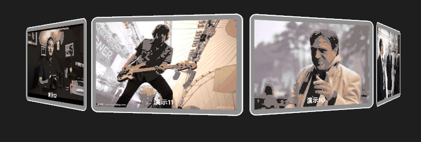
实现了一个简单的WPF应用程序UI框架 ,分享出来。界面效果图如下:
运行效果如下:
喜欢的可以下载源码参考:https://github.com/DuelWithSelf/WPFEffects
左侧分类导览按钮为自定义的CustomControl, 参照ListBox的模式。 为了偷懒,暂时未深度封装,先用StackPanel承载,先用上再说,效果还不错
<StackPanel x:Name="SpNavItems">
<CustomFrms:ListMenuBox Text="支持作者" IconData="{StaticResource PathData.Heart}"
Key="AboutMe"/>
<CustomFrms:ListMenuBox Text="组件" IconData="{StaticResource PathData.SettingsOutline}">
<CustomFrms:ListMenuItem Text="PathIcon" Key="PathData"/>
</CustomFrms:ListMenuBox>
<CustomFrms:ListMenuBox Text="效果" IconData="{StaticResource PathData.Creation}">
<CustomFrms:ListMenuItem Text="文字效果" Key="TextblockEffect"/>
</CustomFrms:ListMenuBox>
<CustomFrms:ListMenuBox Text="富媒体墙" IconData="{StaticResource PathData.Clover}">
<CustomFrms:ListMenuItem Text="弧形旋转" Key="Carousel"/>
<CustomFrms:ListMenuItem Text="弧形旋转3D" Key="Carousel3D"/>
<CustomFrms:ListMenuItem Text="线点动画" Key="AnimLine"/>
</CustomFrms:ListMenuBox>
<CustomFrms:ListMenuBox Text="图表" IconData="{StaticResource PathData.ChartScatterplotHexbin}">
<CustomFrms:ListMenuItem Text="柱状图" Key="HistogramChart"/>
<CustomFrms:ListMenuItem Text="饼状图" Key="PieChart"/>
<CustomFrms:ListMenuItem Text="弧形图" Key="RadianChart"/>
</CustomFrms:ListMenuBox>
<CustomFrms:ListMenuBox Text="图像处理" IconData="{StaticResource PathData.FileImageRegular}">
<CustomFrms:ListMenuItem Text="图片分隔" Key="ImgCoordinate"/>
</CustomFrms:ListMenuBox>
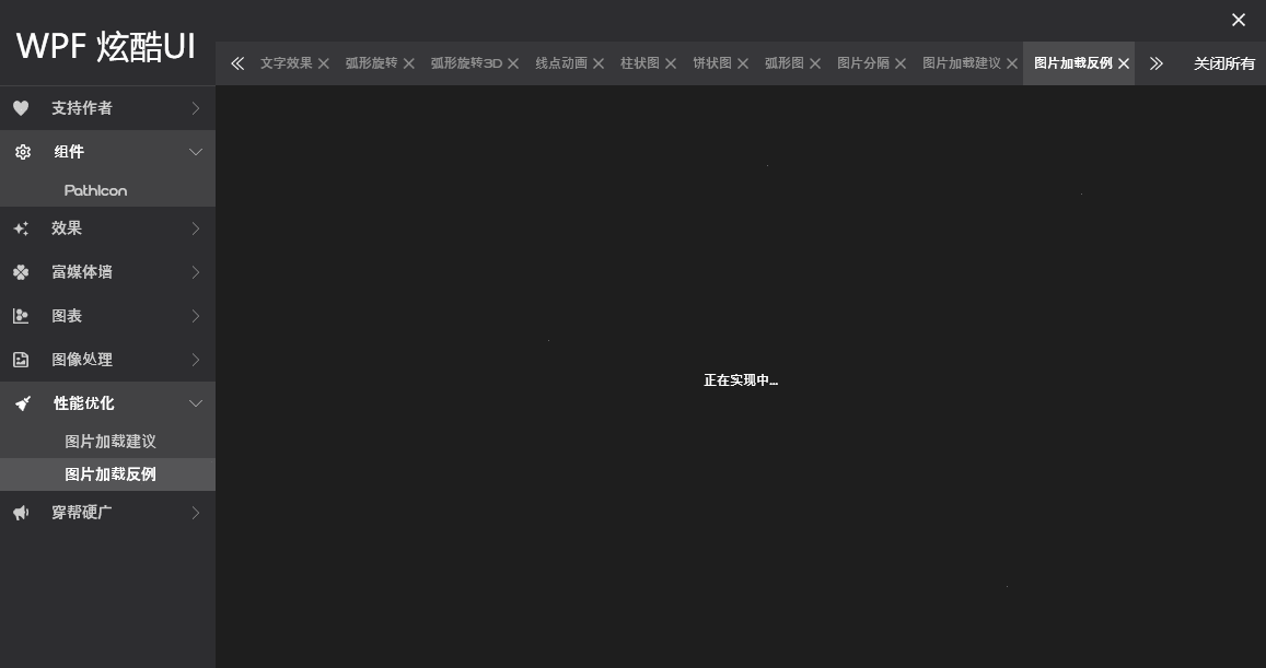
<CustomFrms:ListMenuBox Text="性能优化" IconData="{StaticResource PathData.BroomSolid}">
<CustomFrms:ListMenuItem Text="图片加载建议" Key="ImagePerformance"/>
<CustomFrms:ListMenuItem Text="图片加载反例" Key="ImagePerformance2"/>
</CustomFrms:ListMenuBox>
<CustomFrms:ListMenuBox Text="穿帮硬广" IconData="{StaticResource PathData.Bullhorn}"
Key="Advertise"/>
</StackPanel>
自定义的样式:
<Style TargetType="{x:Type CustomFrms:ListMenuBox}">

    <Setter Property="IconWidth" Value="14"/>

    <Setter Property="IconHeight" Value="14"/>

    <Setter Property="FontSize" Value="14"/>

    <Setter Property="NormalBrush" Value="{StaticResource ColorBrush.MiddleWhite}"/>

    <Setter Property="FocusBrush" Value="White"/>

    <Setter Property="BorderBrush" Value="White"/>

    <Setter Property="FocusBackground" Value="{StaticResource ColorBrush.LightWhite}"/>

    <Setter Property="Template">

        <Setter.Value>

            <ControlTemplate TargetType="{x:Type CustomFrms:ListMenuBox}">

                <Border x:Name="Part_BdrContainer" Background="{TemplateBinding Background}"

                        BorderBrush="{TemplateBinding BorderBrush}"

                        BorderThickness="{TemplateBinding BorderThickness}">

                    <Grid>

                        <Grid x:Name="Part_Header" Height="40" Background="Transparent" VerticalAlignment="Top">

                            <Path x:Name="Part_Icon" Margin="15,0,0,0"

                                      Width="{Binding Path=IconWidth, RelativeSource={RelativeSource TemplatedParent}}"

                                      Height="{Binding Path=IconHeight, RelativeSource={RelativeSource TemplatedParent}}"

                                      Data="{Binding Path=IconData, RelativeSource={RelativeSource TemplatedParent}}"

                                      Fill="{Binding Path=NormalBrush, RelativeSource={RelativeSource TemplatedParent}}"

                                      Stretch="Fill" HorizontalAlignment="Left" VerticalAlignment="Center"/>

                            <TextBlock x:Name="Part_Title" Padding="{Binding Path=TextPadding, RelativeSource={RelativeSource TemplatedParent}}"

                                           FontSize="{Binding Path=FontSize, RelativeSource={RelativeSource TemplatedParent}}"

                                           HorizontalAlignment="Left" VerticalAlignment="Center" Margin="50,0,0,0"

                                           Foreground="{Binding Path=NormalBrush, RelativeSource={RelativeSource TemplatedParent}}"

                                           Text="{Binding Path=Text, RelativeSource={RelativeSource TemplatedParent}}"/>

                            <Path x:Name="Part_Arrow" Data="M0,20 L10,10 L0,0 L0,1 L9,10 L0,19 L0,20 V20 H10 Z"

                                      Width="6" Height="12" Stretch="Fill"

                                      Fill="{Binding Path=NormalBrush, RelativeSource={RelativeSource TemplatedParent}}"

                                      HorizontalAlignment="Right" Margin="0,0,15,0" VerticalAlignment="Center">

                                    <Path.RenderTransform>

                                        <TransformGroup>

                                            <RotateTransform Angle="0"/>

                                        </TransformGroup>

                                    </Path.RenderTransform>

                                </Path>

                        </Grid>

                        <StackPanel x:Name="Part_ItemsContainer" Margin="0,40,0,0" Height="0">

                            <ItemsPresenter SnapsToDevicePixels="{TemplateBinding SnapsToDevicePixels}"/>

                        </StackPanel>

                    </Grid>

                </Border>

                <ControlTemplate.Triggers>

                        <Trigger Property="IsExpanded" Value="True">

                            <Setter TargetName="Part_Icon" Property="Fill"

                                    Value="{Binding Path=FocusBrush, RelativeSource={RelativeSource TemplatedParent}}"/>

                            <Setter TargetName="Part_Title" Property="Foreground"

                                    Value="{Binding Path=FocusBrush, RelativeSource={RelativeSource TemplatedParent}}"/>

                            <Setter TargetName="Part_Arrow" Property="Fill"

                                    Value="{Binding Path=FocusBrush, RelativeSource={RelativeSource TemplatedParent}}"/>

                            <Setter TargetName="Part_BdrContainer" Property="Background"

                                    Value="{Binding Path=FocusBackground, RelativeSource={RelativeSource TemplatedParent}}"/>

                            <Setter TargetName="Part_BdrContainer" Property="BorderThickness"

                                    Value="2,0,0,0"/>

                        </Trigger>

                        <Trigger Property="IsMouseOver" Value="True">

                            <Setter TargetName="Part_Icon" Property="Fill"

                                    Value="{Binding Path=FocusBrush, RelativeSource={RelativeSource TemplatedParent}}"/>

                            <Setter TargetName="Part_Title" Property="Foreground"

                                    Value="{Binding Path=FocusBrush, RelativeSource={RelativeSource TemplatedParent}}"/>

                            <Setter TargetName="Part_Arrow" Property="Fill"

                                    Value="{Binding Path=FocusBrush, RelativeSource={RelativeSource TemplatedParent}}"/>

                            <Setter TargetName="Part_BdrContainer" Property="Background"

                                    Value="{Binding Path=FocusBackground, RelativeSource={RelativeSource TemplatedParent}}"/>

                            <Setter TargetName="Part_BdrContainer" Property="BorderThickness"

                                    Value="2,0,0,0"/>

                        </Trigger>

                    </ControlTemplate.Triggers>

            </ControlTemplate>

        </Setter.Value>

    </Setter>

</Style>
打算持续更新,将左侧面板所有功能模块全给实现了。比如已实现的:

WPF - 简单的UI框架的更多相关文章
- WPF - 简单的UI框架 - 仪表盘
源码链接:https://github.com/DuelWithSelf/WPFEffects 参考:https://www.cnblogs.com/duel/p/duel_clock.html 更新 ...
- laya fgui 超简单的UI框架
FairyGUI 超简单的UI框架 Laya使用fgui的超简单UI框架 使用场景:用于使用fgui进行layaUI开发的程序人员 整个框架分为3个模块,共有4个类: FGUIManager :FGU ...
- 【设计和开发一套简单自己主动化UI框架】
!有兴趣的朋友请直接移步Github,本帖子已经不做更新,框架的详细的实现已经做了优化和代码整理,本文仅仅介绍了详细的设计思路! 目标:编写一个简单通用UI框架用于管理页面和完毕导航跳转 终于的实现效 ...
- 【转】发布一个基于NGUI编写的UI框架
发布一个基于NGUI编写的UI框架 1.加载,显示,隐藏,关闭页面,根据标示获得相应界面实例 2.提供界面显示隐藏动画接口 3.单独界面层级,Collider,背景管理 4.根据存储的导航信息完成界面 ...
- 造轮子,模仿WPF的UI框架,还没完善。。。
Wtf(暂时命名,随便起的 = _=),模仿WPF的框架,还没有完善,只有简单的基础元素,支持数据绑定.虽然支持mono但是mono有bug 写这个只是兴趣爱好,感觉也没多大意义了,如果这个UI框架完 ...
- WPF简单导航框架(Window与Page互相调用)
相当多的WPF程序都有着丰富的页面和功能,如何使程序在不同页面间转换并降低资源占用,选择适合自己的导航框架就很重要了.最近花了一点时间做了一个简单的导航框架,并在这个过程中对Window.Page.U ...
- (转载)基于Unity~UGUI的简单UI框架(附UIFramework源码)
此博客跟随siki老师的课程笔记生成,感谢siki老师的辛勤付出! 此框架功能较简单,适用于学习,可以很好的锻炼我们的设计思想 框架源码地址: UIFramework litjson.dll下载地址: ...
- 关于几种UI框架简单总结
最近两年多的时间先后做过几款终端程序,UI框架从MFC转向过WxWidgets,之后再转向Qt.三种框架精通远谈不上,用起来还是没什么问题. 简单聊聊三种框架的优缺点. 1.MFC 似乎作为一种饱受批 ...
- 浅谈WPF中的MVVM框架--MVVMFoundation
先科普一下:什么是WPF,请看下图 微软对于WPF技术的构想是很宏大的,可惜普及率不高,不过如果你要做Windows客户端开发的话WPF技术还是值得一学的. 什么是MVVM模式 简单来说它是一种高级的 ...
随机推荐
- D-Power Products
题目连接: 题解: 根据题目的意思,对每个X进行质因子分解,保存其质因子以及质因子出现的个数,如果两个数的乘积变成一个数的K次幂,那么两个数的质因子的指数之间相加应为k的倍数.保存完毕后,开始遍历,将 ...
- F - Dragon Balls
Five hundred years later, the number of dragon balls will increase unexpectedly, so it's too difficu ...
- 4. Object
1. Object.is( ); //用来判断,不同等 == 与===接近.NaN作出的调整 let obj={a:1,b:2}; Object.is(obj,obj);//true Object. ...
- MyBatis model、xml、mapper 自动生成,附源码
Mybatis 代码自动生成 model.xml.mapper 代码结构图 代码地址 https://github.com/shootercheng/codegen 需要修改的地方见 readme
- Flutter 步骤进度组件
老孟导读:最近文章更新拖后腿了,一直忙着网站改版的事情,今天总算落地了,全新的Flutter网站即将上线,敬请期待.网站目前收集197个组件的详细用法,还有150多个组件待整理. Stepper S ...
- 面试官:你对Redis缓存了解吗?面对这11道面试题你是否有很多问号?
前言 关于Redis的知识,总结了一个脑图分享给大家 1.在项目中缓存是如何使用的?为什么要用缓存?缓存使用不当会造成什么后果? 面试官心理分析 这个问题,互联网公司必问,要是一个人连缓存都不太清楚, ...
- 0day笔记(1)PE文件格式与虚拟文件内存的映射
PE文件格式 PE 文件格式把可执行文件分成若干个数据节(section),不同的资源被存放在不同的节中. 一个典型的 PE 文件中包含的节如下: .text 存放着二进制的机器代码 .data 初始 ...
- 4.K均值算法应用
一.课堂练习 from sklearn.cluster import KMeans import matplotlib.pyplot as plt import numpy as np from sk ...
- 《JavaScript 模式》读书笔记(6)— 代码复用模式3
我们之前聊了聊基本的继承的概念,也聊了很多在JavaScript中模拟类的方法.这篇文章,我们主要来学习一下现代继承的一些方法. 九.原型继承 下面我们开始讨论一种称之为原型继承(prototype ...
- optparse--强大的命令行参数处理包
optparse,它功能强大,而且易于使用,可以方便地生成标准的.符合Unix/Posix 规范的命令行说明. optparse的简单示例: from optparse import OptionPa ...