CSS3动画第二式--组合动画
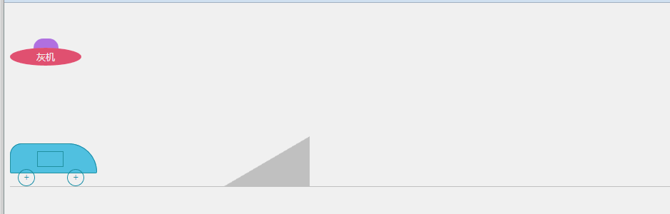
接第一式之后的进阶招式,加入一些组合动画,剧情、动画啥的都是随意瞎想的,纯粹是为了熟悉2D、3D和过渡等css3代码写法。效果见下图:
代码如下(有点长,折叠一下):
<!DOCTYPE html>
<html lang="zh-cn">
<head>
<meta charset="UTF-8">
<title>test</title>
<style>
ul,ol,li {
list-style: none;
margin: 0;
padding: 0;
}
.box {
position: relative;
margin-top: 50px;
height: 135px;
}
.talkBox {
position: absolute;
overflow: hidden;
}
.talkBox ul {
position: absolute;
left: 0;
width: 100%;
}
.talkBox ul li{
margin: 0;
padding: 0;
font:12px/22px Microsoft YaHei;
text-align: left;
}
.ufoBox {
position: absolute;
top: 0;
left: 0;
width: 100px;
height: 40px;
text-align: center;
color: #fff;
-webkit-animation-name: gogogo;
-webkit-animation-duration: 6s;
-webkit-animation-delay: 9.5s;
-webkit-animation-timing-function: ease;
-webkit-animation-iteration-count: 2;
animation-name: gogogo;
animation-duration: 6s;
animation-delay: 9.5s;
animation-timing-function:ease;
animation-iteration-count: 2;
}
.talkBox01 {
position: absolute;
top: 0;
left: 115px;
width: 150px;
height: 22px;
}
.talkBox01 ul {
top: 22px;
-webkit-animation-name: talk01;
-webkit-animation-duration: 9.5s;
-webkit-animation-delay: 0.5s;
-webkit-animation-timing-function: ease;
-webkit-animation-fill-mode: forwards;
animation-name: talk01;
animation-duration: 9.5s;
animation-delay: 0.5s;
animation-timing-function: ease;
animation-fill-mode: forwards;
}
.talkBox01 ul li{
color: #6978e6;
}
.ufoBox .ufoTop {
margin: 0 auto;
width: 35px;
height: 15px;
border-radius: 13px 13px 0 0;
background-color: #b37de6;
}
.ufoBox .ufoBody {
width: 100px;
height: 25px;
margin-top: -2px;
font:13px/25px Microsoft YaHei;
border-radius: 50%;
background-color: #eb5C7e;
}
@-webkit-keyframes talk01
{
0% {
top: 22px;
}
15% {
top: 0;
}
30% {
top: -22px;
}
45% {
top: -44px;
}
60%,85% {
top: -66px;
}
95% {
top: -88px;
}
100% {
top: -110px;
}
}
@keyframes talk01
{
0% {
top: 22px;
}
15% {
top: 0;
}
30% {
top: -22px;
}
45% {
top: -44px;
}
60% {
top: -66px;
}
90%, 95% {
top: -88px;
}
100% {
top: -110px;
}
}
@-webkit-keyframes gogogo
{
0%,10% {
-webkit-transform: rotate(0);
}
30%{
left: 0;
top: 0;
-webkit-transform: rotate(30deg);
}
50%{
left: 400px;
top: 55px;
-webkit-transform: rotate(0);
}
70%{
left: 400px;
-webkit-transform: rotate(0);
}
100%{
left:0;
-webkit-transform: rotate(-360deg);
}
}
@keyframes gogogo
{
0%,10 {
transform: rotate(0);
}
30%{
left: 0;
top: 0;
transform: rotate(30deg);
}
50%{
left: 400px;
top: 55px;
transform: rotate(0);
}
70%{
left: 400px;
transform: rotate(0);
}
100%{
left:0;
transform: rotate(-360deg);
}
}
.box02 {
position: relative;
height: 72px;
border-bottom: 1px solid #ccc;
}
.box02 .hill {
position: absolute;
left: 300px;
bottom: 0;
width: 0;
height: 0;
border-style: solid;
border-color: transparent #ccc #ccc transparent;
border-width: 35px 60px;
}
.carBox {
position: absolute;
left: 0;
bottom: 0;
width: 122px;
height: 60px;
-webkit-animation-name: boxGo;
-webkit-animation-duration: 5s;
-webkit-animation-delay: 8.5s;
-webkit-animation-timing-function: ease-in;
-webkit-animation-fill-mode: forwards;
animation-name: boxGo;
animation-duration: 5s;
animation-delay: 8.5s;
animation-timing-function: ease-in;
animation-fill-mode: forwards;
}
.carBox .carBody {
position: relative;
width: 120px;
height: 40px;
background-color: #59c4e6;
border: 1px solid #2094aa;
border-radius: 16px 40px 2px 2px;
}
.carBody .carDoorBox {
position: absolute;
top: 10px;
left: 37px;
width: 37px;
height: 22px;
background-color: #000;
}
.carBody .carDoor {
position: absolute;
left: 0;
top: 0;
display: inline-block;
width: 35px;
height: 20px;
border: 1px solid #2094aa;
background-color: #59c4e6;
-webkit-animation-name: doorGo;
-webkit-animation-duration: 0.5s;
-webkit-animation-delay: 12.5s;
-webkit-animation-timing-function: ease-in;
-webkit-animation-fill-mode: forwards;
animation-name: doorGo;
animation-duration: 0.5s;
animation-delay: 12.5s;
animation-timing-function: ease-in;
animation-fill-mode: forwards;
}
.carBox .carWheel {
position: absolute;
bottom: 0;
display: inline-block;
width: 22px;
height: 22px;
font: 14px/22px Simsun;
color: #2094aa;
text-align: center;
border: 1px solid #2094aa;
border-radius: 50%;
-webkit-animation-name: wheelGo;
-webkit-animation-duration: 2.5s;
-webkit-animation-delay: 8.5s;
-webkit-animation-timing-function: ease-in;
-webkit-animation-iteration-count: 3;
animation-name: wheelGo;
animation-duration: 2.5s;
animation-delay: 8.5s;
animation-timing-function: ease-in;
animation-iteration-count: 3;
}
.carBox .front { left: 11px; }
.carBox .back { right: 18px; }
.talkBox02 {
top: -10px;
left: 115px;
width: 240px;
height: 22px;
color: #1f9fbe;
}
.talkBox02 ul {
left: 240px;
height: 22px;
width: 9999px;
-webkit-animation-name: talk02;
-webkit-animation-duration: 8s;
-webkit-animation-delay: 2s;
-webkit-animation-timing-function: ease-in;
-webkit-animation-fill-mode: forwards;
animation-name: talk02;
animation-duration: 8s;
animation-delay: 2s;
animation-timing-function: ease-in;
animation-fill-mode: forwards;
}
.talkBox02 ul li {
float: left;
width: 220px;
margin-right: 20px;
}
.talkBox03 {
top: -10px;
width: 150px;
height: 44px;
left: 785px;
overflow: visible;
opacity: 0;
-webkit-animation-name: talk03;
-webkit-animation-duration: 4s;
-webkit-animation-delay: 14s;
-webkit-animation-timing-function: ease-in;
-webkit-animation-fill-mode: forwards;
animation-name: talk03;
animation-duration: 4s;
animation-delay: 14s;
animation-timing-function: ease-in;
animation-fill-mode: forwards;
}
.talkBox03 ul li {
color: #f30;
font-weight: 800;
white-space: nowrap;
}
.talkBox03 ul li:first-child {
-webkit-transform: rotate(-17deg);
-webkit-transform-origin: 10% 50%;
transform: rotate(-17deg);
transform-origin: 10% 50%;
}
.talkBox03 ul li:last-child {
-webkit-transform: rotate(17deg);
-webkit-transform-origin: 10% 50%;
transform-origin: 10% 50%;
transform: rotate(17deg);
}
@-webkit-keyframes talk02 {
0% {
left: 240px;
}
5%, 25% {
left: 0;
}
30%, 50% {
left: -240px;
}
55%, 75% {
left: -480px;
}
80%,100% {
left: -720px;
}
}
@keyframes talk02 {
0% {
left: 240px;
}
5%, 25% {
left: 0;
}
30%, 50% {
left: -240px;
}
55%, 75% {
left: -480px;
}
80%,100% {
left: -720px;
}
}
@-webkit-keyframes talk03 {
0% {
opacity: 0;
}
30%,70% {
opacity: 1;
}
100% {
opacity: 0;
}
}
@keyframes talk03 {
0% {
opacity: 0;
}
30%,70% {
opacity: 1;
}
100% {
opacity: 0;
}
}
@-webkit-keyframes boxGo {
0% {
-webkit-transform: rotate(0);
}
30% {
left: 205px;
bottom: 0;
-webkit-transform: rotate(0);
}
40% {
left: 240px;
bottom: 12px;
-webkit-transform: rotate(-20deg);
}
45% {
-webkit-transform: rotate(-28deg);
-webkit-transform-origin: 55% 20%;
}
52% {
-webkit-transform: rotate(-28deg);
}
60% {
bottom: 68px;
left: 350px;
-webkit-transform: rotate(-28deg);
-webkit-transform-origin: 52% 50%;
}
70% {
left: 450px;
-webkit-transform: rotate(90deg);
}
78% {
left: 520px;
bottom: 0;
-webkit-transform: rotate(180deg);
}
82% {
bottom: 18px;
-webkit-transform: rotate(200deg);
}
100% {
left: 650px;
bottom: 0;
-webkit-transform: rotate(180deg);
}
}
@keyframes boxGo {
0% {
transform: rotate(0);
}
30% {
left: 205px;
bottom: 0;
transform: rotate(0);
}
40% {
left: 240px;
bottom: 12px;
transform: rotate(-20deg);
}
45% {
transform: rotate(-28deg);
transform-origin: 55% 20%;
}
52% {
transform: rotate(-28deg);
}
60% {
bottom: 68px;
left: 350px;
transform: rotate(-28deg);
transform-origin: 52% 50%;
}
70% {
left: 450px;
transform: rotate(90deg);
}
78% {
left: 520px;
bottom: 0;
transform: rotate(180deg);
}
82% {
bottom: 18px;
transform: rotate(200deg);
}
100% {
left: 650px;
bottom: 0;
transform: rotate(180deg);
}
}
@-webkit-keyframes wheelGo {
0% {
-webkit-transform: rotate(0deg);
}
100% {
-webkit-transform: rotate(360deg);
}
}
@keyframes wheelGo {
0% {
transform: rotate(0deg);
}
100% {
transform: rotate(360deg);
}
}
@-webkit-keyframes doorGo {
0% {
top: 0;
-webkit-transform: rotate(0deg);
}
80% {
top:3px;
}
100% {
top: 3px;
left: 18px;
width: 17px;
height: 20px;
-webkit-transform: skew(0,-20deg);
}
}
@keyframes doorGo {
0% {
top: 0;
transform: rotate(0deg);
}
80% {
top:3px;
}
100% {
top: 3px;
left: 18px;
width: 17px;
height: 20px;
transform: skew(0,-20deg);
}
}
</style>
</head>
<body>
<div class="box">
<div class="talkBox talkBox01">
<ul>
<li>马:看见下面那辆车了吗?</li>
<li>黄:看见了,老大。</li>
<li>马:等会飞过去,撞他!</li>
<li>黄:遵命,老大!</li>
<li>黄.马:go!</li>
</ul>
</div>
<div class="ufoBox">
<div class="ufoTop"></div>
<div class="ufoBody">灰机</div>
</div>
</div>
<div class="box02">
<div class="hill">
</div>
<div class="talkBox talkBox02">
<ul>
<li>董:今天我们学习如何飞跃凤凰山哈!</li>
<li>陈:嗯好哒!</li>
<li>陈.董:油门飚起来~~~</li>
</ul>
</div>
<div class="talkBox talkBox03">
<ul>
<li>董:啊!!!雅蠛蝶~~~</li>
<li>陈:救命!救命!</li>
</ul>
</div>
<div class="carBox">
<div class="carBody">
<div class="carDoorBox"><span class="carDoor"></span></div>
</div>
<span class="carWheel front">+</span>
<span class="carWheel back">+</span>
</div>
</div>
</body>
</html>
只支持主流浏览器哈,让低版本IE见鬼去吧~~~
CSS3动画第二式--组合动画的更多相关文章
- CSS3鼠标滑过动画线条边框特效
基于CSS属性animation动画制作,效果流畅弹性十足 效果展示 http://hovertree.com/texiao/css3/32/ 源码下载:http://hovertree.com/h/ ...
- css3实现循环执行动画,且动画每次都有延迟
一.最终效果 需求:gift图片的小动画每隔2s执行一次. 需求就一句话,我们看一下实现过程. 二.实现过程 1.网页结构 <!DOCTYPE html> <html lang=&q ...
- 使用 CSS3 动感的图片标题动画效果【附源码下载】
在网站中,有很多地方会需要在图片上显示图片标题.使用 CSS3 过渡和变换可以实现动感的鼠标悬停显示效果.没有使用 JavaScript,所以只能在支持 CSS3 动画的现代浏览器中才能正常工作.您可 ...
- jQuery+CSS3实现404背景动画特效
效果:http://hovertree.com/texiao/jquery/74/ 源码下载:http://hovertree.com/h/bjaf/ko0gcgw5.htm 效果图如下: 代码如下: ...
- css3中变形与动画(三)
transform可以实现矩阵变换,transition实现属性的平滑过渡,animation意思是动画,动漫,这个属性才和真正意义的一帧一帧的动画相关.本文就介绍animation属性. anima ...
- css3 实现逐帧动画
css3 实现逐帧动画 实现逐帧动画需要使用到的是Animation动画,该CSS3的Animation有八个属性:分别是如下:1: animation-name2: animation-durati ...
- 纯css3 加载loading动画特效
最近项目中要实现当页面还没有加载完给用户提示正在加载的loading,本来是想做个图片提示的,但是图片如果放大电脑的分辨率就会感觉到很虚,体验效果很不好.于是就采用css3+js实现这个loading ...
- css3动画和jquery动画使用中要注意的问题
前一阵子写demo的时候遇到这样一个问题,就是给元素添加css3或者jquery动画时,在动画结束前不能准确取到元素的css属性. 1. css3动画讨论 先看代码: html: <div id ...
- 2款不同样式的CSS3 Loading加载动画 附源码
原文:2款不同样式的CSS3 Loading加载动画 附源码 我们经常看到的Loading加载很多都是转圈圈的那种,今天我们来换一种有创意的CSS3 Loading加载动画,一种是声波形状的动画,另一 ...
随机推荐
- BZOJ 1030: [JSOI2007]文本生成器 [AC自动机 DP]
1030: [JSOI2007]文本生成器 Time Limit: 1 Sec Memory Limit: 162 MBSubmit: 3953 Solved: 1614[Submit][Stat ...
- CSS3文字渐变效果
background-clip + text-fill-color下的实现 如果您手头上的浏览器是Chrome或是Safari,则您可以在demo页面中看到类似下面的效果: <h2 class= ...
- 【转】BAT 批处理脚本 教程
第一章 批处理基础第一节 常用批处理内部命令简介批处理定义:顾名思义,批处理文件是将一系列命令按一定的顺序集合为一个可执行的文本文件,其扩展名为BAT或者CMD.这些命令统称批处理命令.小知识:可以在 ...
- [LeetCode] Reconstruct Itinerary 重建行程单
Given a list of airline tickets represented by pairs of departure and arrival airports [from, to], r ...
- [LeetCode] Nim Game 尼姆游戏
You are playing the following Nim Game with your friend: There is a heap of stones on the table, eac ...
- Java反射机制
Java反射机制 一:什么事反射机制 简单地说,就是程序运行时能够通过反射的到类的所有信息,只需要获得类名,方法名,属性名. 二:为什么要用反射: 静态编译:在编译时确定类型,绑定对象,即通过 ...
- 冰冻三尺非一日之寒--web框架Django(翻页、cookie)
第二十一章 cookie 1.获取Cookie: request.COOKIES['key'] request.get_signed_cookie(key, default=RAISE_ERROR, ...
- 贝塔阶段html及pdf模块测试
这次虽然工作内容是将c#的html及pdf处理程序移植到java中,但是由于重新编写代码使得先前的工作成果得不到利用,于是将其编写为dll,再在java端调用. 这使得在java端即便每个分支都到达, ...
- JAVA之IO流(字符流)
字符流InputStreamReader和OutputStreamWriter是Writer和Read的子类:是字节流通向字符流的桥梁,也就是可以把字节流转化为字符流. InputStreamRead ...
- python 杂七杂八 :
subprocess.Popen(...) python3 实现代码: 备注write 要使用bytes 在最后结果转为str 显示时才不会出现 b'' 这样的字节显示 import subproce ...