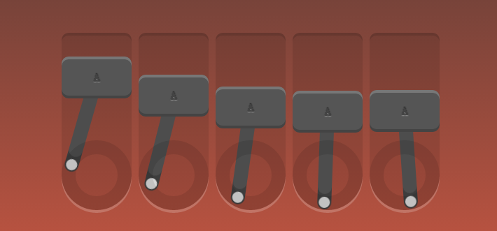
css3动画、边框、投影知识
<!doctype html>

<html lang="en">

<head>

    <meta charset="UTF-8">

    <title>Robot</title>

    <link rel="stylesheet" href="style.css">

</head>

<body>

    <div id="robot">

        <div class="piston"><!--外框-->

            <div class="block"><!--字母框-->

                A

                <div class="arm"></div><!--摆杆-->

            </div>

            <div class="rotator"><!--低圈-->

            </div>

        </div>

        <div class="piston"><!--外框-->

            <div class="block"><!--字母框-->

                A

                <div class="arm"></div><!--摆杆-->

            </div>

            <div class="rotator"><!--低圈-->

            </div>

        </div>

        <div class="piston"><!--外框-->

            <div class="block"><!--字母框-->

                A

                <div class="arm"></div><!--摆杆-->

            </div>

            <div class="rotator"><!--低圈-->

            </div>

        </div>

        <div class="piston"><!--外框-->

            <div class="block"><!--字母框-->

                A

                <div class="arm"></div><!--摆杆-->

            </div>

            <div class="rotator"><!--低圈-->

            </div>

        </div>

        <div class="piston"><!--外框-->

            <div class="block"><!--字母框-->

                A

                <div class="arm"></div><!--摆杆-->

            </div>

            <div class="rotator"><!--低圈-->

            </div>

        </div>

    </div>

</body>

</html>
css
/*定义动画*/

/*上下摆动*/

@-webkit-keyframes topbottom{

    0% { margin-top:; }

    50% { margin-top: 80px; }

    100% { margin-top:; }

}

@keyframes topbottom{

    0% { margin-top:; }

    50% { margin-top: 80px; }

    100% { margin-top:; }

}

/*左右摇摆*/

@-webkit-keyframes rightleft {

    0% { -webkit-transform: rotate(0); }

    25% { -webkit-transform: rotate(-18deg); }

    50% { -webkit-transform: rotate(0); }

    75% { -webkit-transform: rotate(18deg); }

    100% { -webkit-transform: rotate(0); }

}

@keyframes rightleft {

    0% { -webkit-transform: rotate(0); }

    25% { -webkit-transform: rotate(-18deg); }

    50% { -webkit-transform: rotate(0); }

    75% { -webkit-transform: rotate(18deg); }

    100% { -webkit-transform: rotate(0); }

}

*{

    margin:;

    padding:;

    list-style: none;

}

img{

    border:none;

}

body{

    text-align: center;

    margin: 60px 0 0;

    background:linear-gradient(to bottom, #333, tomato);

    /*渐变 上到下*/

}

html{

    height: 100%;

}

#robot{

    position: absolute;

    width: 540px;

    height: 250px;

    margin: auto;

    left:;

    top:;

    bottom:;

    right:;

    color: #444;

    font-weight:;

    text-shadow:0 -1px 1px rgba(0,0,0,0.7),0 1px 1px rgba(255,255,255,0.4);

    /*投影*/

    font-family: 'Oswald', sans-serif;

}

.piston{

    float: left;

    margin-right: 10px;

    position: relative;

    width: 100px;

    height: 250px;

    background: rgba(0,0,0,0.1);

    border-radius: 10px 10px 50px 50px;

    box-shadow: 0 -4px 0 rgba(0,0,0,0.2), 0 4px 0 rgba(255,255,255,0.2);

}

.piston:last-child{

    margin:;

}

.block{

    position: relative;

    width: 100px;

    height: 60px;

    line-height: 60px;

    background: #555;

    border-radius: 10px;

    animation:topbottom 1.2s cubic-bezier(0.5,0,0.5,1) infinite;

    /*cubic-bezier动画方式(曲线)*/

    -webkit-animation:topbottom 1.2s cubic-bezier(0.5,0,0.5,1) infinite;

    box-shadow: inset 0 -4px 0 rgba(0,0,0,0.2), inset 0 4px 0 rgba(255,255,255,0.2)

}

.piston:nth-child(1) .block { -webkit-animation-delay: 0s; animation-delay: 0s; }

.piston:nth-child(2) .block { -webkit-animation-delay: .1s; animation-delay: .1s; }

.piston:nth-child(3) .block { -webkit-animation-delay: .2s; animation-delay: .2s; }

.piston:nth-child(4) .block { -webkit-animation-delay: .3s; animation-delay: .3s; }

.piston:nth-child(5) .block { -webkit-animation-delay: .4s; animation-delay: .4s; }

.arm{

    position: absolute;

    top:50%; left:50%;

    margin: -10px 0 0 -10px;

    width: 20px;

    height: 150px;

    background: #555;

    border-radius: 10px;

    box-shadow: inset 0 -22px 0 rgba(0,0,0,.2);

    z-index: -110;

    -webkit-transform-origin: center 10px;

    -webkit-animation: arm 1.2s linear infinite;

    -webkit-animation-delay: inherit;

    transform-origin: center 10px;

    animation: rightleft 1.2s linear infinite;

    animation-delay: inherit;

}

.arm:before,.arm:after{

    content:"";

    position: absolute;

    left:;

    right:;

    height: 16px;

    width: 16px;

    border-radius: 50%;

    margin: 2px;

    background:#eee;

}

.arm:before{

    top:;

}

.arm:after{

    bottom:;

}

.rotator{

    position: absolute;

    bottom:;

    width: 100px;

    height: 100px;

    border:20px solid rgba(0,0,0,0.1);

    box-sizing:border-box;

    z-index: -110;

    border-radius: 50%;

}
css3动画、边框、投影知识的更多相关文章
- 鼠标悬停显示CSS3动画边框
效果体验:http://keleyi.com/keleyi/phtml/css3/14.htm 以下是代码: <!DOCTYPE html> <html xmlns="ht ...
- css3动画--超级基础知识
这么乱的笔记....供自己阅读!
- CSS3动画详解(结合实例)
一.使用CSS3动画代替JS动画 JS动画频繁操作DOM导致效率非常低 在频繁的操作DOM和CSS时,浏览器会不停的执行重排(reflow)和重绘(repaint) 可以避免占用JS主线程 这边就不细 ...
- 6种炫酷的CSS3按钮边框动画特效
6种炫酷的CSS3按钮边框动画特效Button border animate 用鼠标滑过下面的按钮看看效果! Draw Draw Meet Center Spin Spin Circle Spin T ...
- CSS3动画:流彩文字效果+图片模糊效果+边框伸展效果实现
前言 首先第一步,先布局html代码如下: <div class="wrap"> <img src="images/1.jpg" class= ...
- CSS3动画基本的转换和过渡
理论知识不扎实,在一定程度上能体现你解决问题的能力.今天我们拿CSS3动画来说,简单回忆下他的一些基本属性,这些我们在平常应用中会经常用到. 常用动画属性: transform:translate(x ...
- CSS3动画那么强,requestAnimationFrame还有毛线用?
一.哟,requestAnimationFrame, 新同学,先自我介绍下 Hello, 大家好,我就是风姿卓越,万种迷人的requestAnimationFrame,呵呵呵呵.很高兴和大家见面,请多 ...
- CSS3动画那么强,requestAnimationFrame还有毛线用--摘抄
CSS3动画那么强,requestAnimationFrame还有毛线用? 这篇文章发布于 2013年09月30日,星期一,19:12,归类于 web综合. 阅读 197124 次, 今日 84 次 ...
- JavaScript - 基于CSS3动画的实现
在痛苦的IE8时代,所有的动画都只能基于自己计算相关动画属性,开定时器setTimeout/setInterval轮询动画任务. 而肩负重任的HTML5,早已注意到了日益增强的动画,随着HTML5的降 ...
- css3动画简介以及动画库animate.css的使用
在这个年代,你要是不懂一点点css3的知识,你都不好意思说你是个美工.美你妹啊,请叫我前端工程师好不好.呃..好吧,攻城尸...呵呵,作为一个攻城尸,没有点高端大气上档次的东西怎么能行呢,那么css3 ...
随机推荐
- CentOS---JDK安装与配置
1.先查看一下CentOS中存在的jdk安装包信息 # rpm -qa | grep java 查看CentOS安装的jdk版本 #java -version 2.分别执行以下命令将所有相关包都删除 ...
- PHP静态文件缓存
ob_start(); 2 echo 'aaa'; 3 $string = ob_get_contents(); 4 file_put_contents('a.html', $string); 5 o ...
- Ubuntu12.04下YouCompleteMe安装教程(部分)
1.通过源码编译安装VIM 开发中使用的是Ubuntu 12.04 LTS,通过sudo apt-get install vim安装的版本较低,不支持YCM,所以,用源码编译并安装最新的Vim. 卸载 ...
- day 44 前端HTML
前端HTML HTML介绍 Web服务本质 import socket sk = socket.socket() sk.bind(("127.0.0.1", 8080)) sk ...
- POJ:2185-Milking Grid(KMP找矩阵循环节)
Milking Grid Time Limit: 3000MS Memory Limit: 65536K Description Every morning when they are milked, ...
- 重写BaseAdapter实现ListView
public class BaseAdapterActivity extends BaseActivity { private ListView base_adapter_listView; priv ...
- JVM——自定义类加载器
)以上两种情况在实际中的综合运用:比如你的应用需要通过网络来传输 Java 类的字节码,为了安全性,这些字节码经过了加密处理.这个时候你就需要自定义类加载器来从某个网络地址上读取加密后的字节代码,接着 ...
- 爬虫工程师常用的 Chrome 插件
做多了爬虫都知道,写一个爬虫大部分时间不是在代码上,而是在分析网页上,所有有一套好用的工具可以极大节省劳动力,这里把平时积累的一些 Chrome 插件分享出来,均来自本人和同事推荐,并不定时更新,欢迎 ...
- 转投emacs
(global-set-key [f9] 'compile-file) (global-set-key [f10] 'gud-gdb) (global-set-key (kbd "C-z&q ...
- 项目管理者必知:适用于仪表盘项目的7个优秀JavaScript库
仪表盘是用于目标或业务流程的视觉指示工具,也用于切割杂乱无章的数据,从而分割出要点的重要工具.它可以帮助评估信息并及时做出正确的决定,一款实时可视化的仪表盘通常由图标.测绘图.图形符号以及数据表格等组 ...