CSS3D动画制作一个3d旋转的筛子
希望这个demo能让大家理解CSS3的3d空间动画(其实是个假3D)
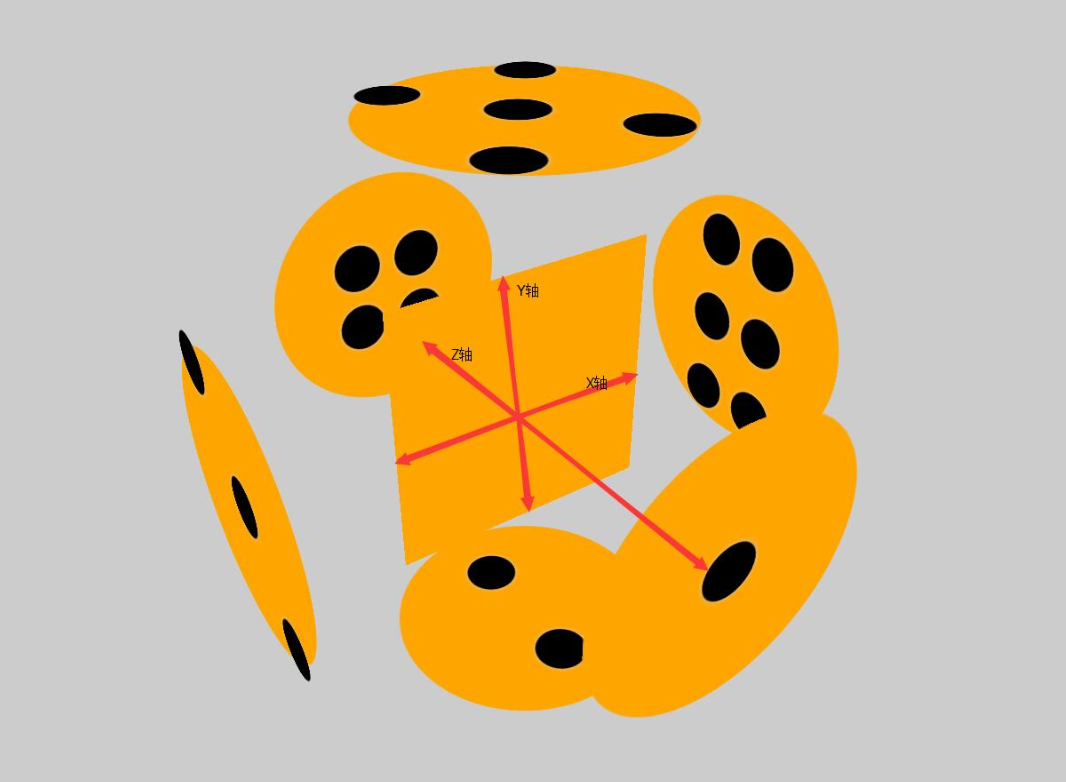
首先给一个3d的解剖图,x/y/z轴线轴线已经标出
下面附上添加特效的动画旋转
可以根据demo并参考上面解剖图进行理解
<!DOCTYPE html>

<html lang="en">

<head>

    <meta charset="UTF-8">

    <title>Document</title>

    <style>

        html{

            height: 100%;

        }

        body{

            height: 100%;

            display: flex;

            justify-content: center;

            align-items: center;

            background-color: black;

            perspective: 1000px;

            transform-style: preserve-3d;

        }

        section{

            width: 300px;

            height: 300px;

            transform-style: preserve-3d;

            animation: zhuan 16s infinite linear;

        }

        div{

            width: 300px;

            height: 300px;

            background-color: orange;

            display: flex;

            flex-wrap: wrap;

            align-items: center;

            justify-content: center;

            position: absolute;

            box-shadow: 0 0 300px green;

            opacity: 0.8;

        }

        div:nth-child(1){

            transform: translateZ(300px);

            border-radius: 50%;

            box-shadow: 0 0 500px orange;

            opacity: 0.4;

        }

        div:nth-child(2){

            transform: rotateX(90deg) translateZ(300px);

            align-items: center;

            justify-content: space-around;

            flex-direction: column;

            border-radius: 50%;

            box-shadow: 0 0 500px orange;

            opacity: 0.4;

        }

        div:nth-child(3){

            transform: rotateY(90deg) translateZ(300px);

            flex-wrap: wrap;

            align-items: flex-start;

            justify-content: center;

            border-radius: 50%;

            box-shadow: 0 0 500px orange;

            opacity: 0.4;

        }

        div:nth-child(3) p:nth-child(2){

            align-self: center;

        }

        div:nth-child(3) p:nth-child(3){

            align-self: flex-end;

        }

        div:nth-child(4){

            transform: translateZ(-300px);

            flex-wrap: wrap;

            border-radius: 50%;

            box-shadow: 0 0 500px orange;

            opacity: 0.4;

        }

        div:nth-child(5){

            transform: rotateX(90deg) translateZ(-300px);

            border-radius: 50%;

            box-shadow: 0 0 500px orange;

            opacity: 0.4;

        }

        div:nth-child(6){

            transform: rotateY(90deg) translateZ(-300px);

            border-radius: 50%;

            box-shadow: 0 0 500px orange;

            opacity: 0.4;

        }

        .low{

            width: 300px;

            height: 150px;

            display: flex;

        }

        .low:nth-child(1){

            align-items: flex-end;

            justify-content: center;

        }

        .low:nth-child(2){

            align-items: flex-start;

            justify-content: center;

        }

        .stree{

            width: 300px;

            height: 33.33%;

            display: flex;

        }

        .stree:nth-child(1){

            justify-content: space-around;

        }

        .stree:nth-child(2){

            justify-content: center;

        }

        .stree:nth-child(3){

            justify-content: space-around;

        }

        .fore{

            width: 300px;

            height: 33.33%;

            display: flex;

        }

        .fore:nth-child(1){

            justify-content: center;

        }

        .fore:nth-child(3){

            justify-content: center;

        }

        p{

            width: 60px;

            height: 60px;

            background-color: white;

            border-radius: 50%;

            box-shadow: 200 60 400px #ccc;

            opacity: 0.7;

            margin: 10px;

        }

        @keyframes zhuan{

            0%{

                transform: rotateX(0deg) rotateY(0deg);

            }

            100%{

                transform: rotateX(360deg) rotateY(360deg) ;

            }

        }

    </style>

</head>

<body>

    <section>

        <div>

            <p></p>

        </div>

        <div>

            <p></p>

            <p></p>

        </div>

        <div>

            <p></p>

            <p></p>

            <p></p>

        </div>

        <div>

        <main class="low">

            <p></p>

            <p></p>

        </main>

        <main class="low">

            <p></p>

            <p></p>

        </main>

        </div>

        <div>

        <main class="stree">

            <p></p>

            <p></p>

        </main>

        <main class="stree">

            <p></p>

        </main>

        <main class="stree">

            <p></p>

            <p></p>

        </main>

        </div>

        <div>

            <main class="fore">

            <p></p>

                <p></p>

            </main>

            <main class="stree">

                <p></p>

                <p></p>

            </main>

            <main class="fore">

                <p></p>

                <p></p>

            </main>

        </div>

    </section>

</body>

</html>
CSS3D动画制作一个3d旋转的筛子的更多相关文章
- Coco2dx制作一个3D旋转的效果
建了工程之后修改HelloWorldScene.cpp文件,修改部分为 // on "init" you need to initialize your instance bool ...
- 用CSS伪类制作一个不断旋转的八卦图?
前言 介绍一下如何制作一个不断旋转的八卦图.快速预览代码及效果,点击:八卦图 代码如下: HTML部分 <!DOCTYPE html> <html> <head> ...
- transform动画的一个3D的正方体盒子
<!DOCTYPE html> <html lang="en"> <head> <meta charset="UTF-8&quo ...
- 使用纯CSS3实现一个3D旋转的书本
有一些前沿的电商站点已经開始使用3D模型来展示商品并支持在线定制,而当中图书的展示是最为简单的一种, 无需复杂的建模过程,使用图片和CSS3的一些变换就可以实现更好的展示效果,简洁而有用. 书本的3D ...
- CSS动画实例:3D立方体
CSS3支持3D转换,与3D转换有关的属性有: transform:向元素应用 2D或3D 转换. transform-origin:改变被转换元素的位置. transform-style:规定被嵌套 ...
- 纯CSS做3D旋转魔方
昨天偶然看见网友(简单说 用CSS做一个魔方旋转的效果)做的一个3D旋转魔方 效果就是本博客右侧公告栏所示 在这里把做法展现出来 感兴趣的可以试试 做成自己特有的魔方 <!DOCTYPE h ...
- iOS 帧动画之翻转和旋转动画
记录两个比较简单的动画,一个是翻转的动画,一个是旋转的动画. 旋转动画: 1 [UIView animateWithDuration:3 animations:^{ if (formView) { f ...
- WPF 3D:简单的Point3D和Vector3D动画创造一个旋转的正方体
原文:WPF 3D:简单的Point3D和Vector3D动画创造一个旋转的正方体 运行结果: 事实上很简单,定义好一个正方体,处理好纹理.关于MeshGeometry3D的正确定义和纹理这里就不多讲 ...
- 【巩固】CSS3的3D动画 ——3D旋转(1)
最近学了妙味的css3的动画,2D,3D的都有,先写一个最简单的3d翻转效果,鼠标移入div,正反面翻转效果. 注意点有: 要给正反面外面加个父级: transform-style: preserve ...
随机推荐
- Visual Studio和eclipse的大小写转换快捷键
Visual Studio: 转小写:ctrl + u 转大写: ctrl + shift + u eclipse: 转小写: ctrl + shift + y 转大写: ctrl + shif ...
- 6.关于Xamarin Android对APK包大小的处理
降低学习成本是每个.NET传教士义务与责任. 建立生态,保护生态,见者有份. 对于apk 包的大小大家都是很敏感的,虽然现在安卓手机的性能和存储越来越厉害了.本着能少一点是一点的态度,我们还是要深入理 ...
- android开发分辨率适配总结
重要概念 什么是屏幕尺寸.屏幕分辨率.屏幕像素密度? 什么是dp.dip.dpi.sp.px?他们之间的关系是什么? 什么是mdpi.hdpi.xdpi.xxdpi?如何计算和区分? 在下面的内容中我 ...
- 移植C/C++代码的十个技巧
这篇文章是我翻译自Top 10 tips for code porting c/c++的一篇小短文,以下是翻译全文,如有错误请留言或查阅原文. 代码的可移植性基本上是指使得源代码能够在不同的平台上编译 ...
- Spring Security构建Rest服务-0900-rememberMe记住我
Spring security记住我基本原理: 登录的时候,请求发送给过滤器UsernamePasswordAuthenticationFilter,当该过滤器认证成功后,会调用RememberMeS ...
- Windows下如何正确下载并安装可视化的Redis数据库管理工具(redis-desktop-manager)(图文详解)
不多说,直接上干货! Redis Desktop Manager是一个可视化的Redis数据库管理工具,使用非常简单. 官网下载:https://redisdesktop.com/down ...
- Gen中的switch分析及lookupswitch与tableswitch指令
int chooseNear(int i) { switch (i) { case 0: return 0; case 1: return 1; case 2: return 2; default: ...
- Node.js最新Web技术栈(2016年4月)
Node.js是比较简单的,只有你有前端js基础,那就按照我的办法来吧!一周足矣,虽然这版上了es语法,但依然是可以简单写,也可以难写,参见<全栈工程师之路-Node.js>,里面讲了No ...
- Qt Model View 框架
Model-View及Qt实现 Model-View-Controller架构最早出现在SmallTalk语言中,至今出现了很多变体. Model是负责维护数据(如管理数据库),View负责显示与用户 ...
- Python魔法方法之属性访问 ( __getattr__, __getattribute__, __setattr__, __delattr__ )
通常情况下,我们在访问类或者实例对象的时候,会牵扯到一些属性访问的魔法方法,主要包括: ① __getattr__(self, name): 访问不存在的属性时调用 ② __getattribute_ ...