纯CSS3冒泡动画按钮实现教程
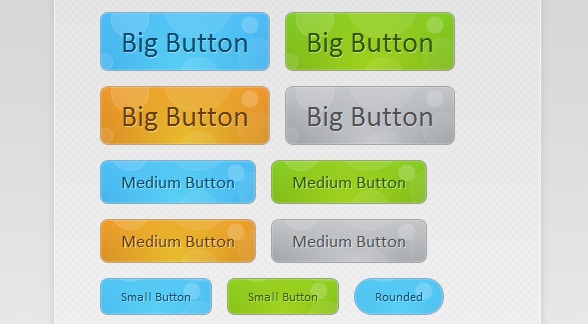
这款CSS3动画按钮非常的有创意,鼠标在滑过按钮时并不像其他按钮那样仅仅改变按钮的背景颜色,而是出现很酷的冒泡动画。这么惊艳的CSS3动画按钮,这篇文章主要将按钮实现的过程和代码分享给大家,希望能给在学习CSS3的同学带来实质性的帮助。可以下来看看在线演示效果:
接下来我们来讲解一下这款CSS3气泡动画的按钮实现过程,主要由HTML代码和CSS代码组成。
HTML代码:
<div id="buttonContainer">

    <a href="#">Big Button</a>

    <a href="#">Big Button</a>

    <a href="#">Big Button</a>

    <a href="#">Big Button</a>

    <a href="#">Medium Button</a>

    <a href="#">Medium Button</a>

    <a href="#">Medium Button</a>

    <a href="#">Medium Button</a>

    <a href="#">Small Button</a>

    <a href="#">Small Button</a>

    <a href="#">Rounded</a>

    <a href="#">Small Button</a>

    <a href="#">Small Button</a>

    <a href="#">Rounded</a>

</div>
HTML代码相对比较简单,即用一个个a链接构造按钮,当然演示中的效果还需要CSS的大力渲染才行。
接下来的重点是CSS代码,首先我们来为每一个button渲染基础的样式,这些样式都是每一个按钮所共有的:
.button{

    font:15px Calibri, Arial, sans-serif;

    /* A semi-transparent text shadow */

    text-shadow:1px 1px 0 rgba(255,255,255,0.4);

    /* Overriding the default underline styling of the links */

    text-decoration:none !important;

    white-space:nowrap;

    display:inline-block;

    vertical-align:baseline;

    position:relative;

    cursor:pointer;

    padding:10px 20px;

    background-repeat:no-repeat;

    /* The following two rules are fallbacks, in case

       the browser does not support multiple backgrounds. */

    background-position:bottom left;

    background-image:url('button_bg.png');

    /* Multiple backgrounds version. The background images

       are defined individually in color classes */

    background-position:bottom left, top right, 0 0, 0 0;

    background-clip:border-box;

    /* Applying a default border raidus of 8px */

    -moz-border-radius:8px;

    -webkit-border-radius:8px;

    border-radius:8px;

    /* A 1px highlight inside of the button */

    -moz-box-shadow:0 0 1px #fff inset;

    -webkit-box-shadow:0 0 1px #fff inset;

    box-shadow:0 0 1px #fff inset;

    /* Animating the background positions with CSS3 */

    /* Currently works only in Safari/Chrome */

    -webkit-transition:background-position 1s;

    -moz-transition:background-position 1s;

    transition:background-position 1s;

}

.button:hover{

    /* The first rule is a fallback, in case the browser

       does not support multiple backgrounds

    */

    background-position:top left;

    background-position:top left, bottom right, 0 0, 0 0;

}

.button:active{

    /* Moving the button 1px to the bottom when clicked */

    bottom:-1px;

}
同样也定义了按钮在鼠标滑过和被激活时的样式。
最后是气泡动画特效,我们拿其中一个按钮为例,代码如下:
.blue.button{

    color:#0f4b6d !important;

    border:1px solid #84acc3 !important;

    /* A fallback background color */

    background-color: #48b5f2;

    /* Specifying a version with gradients according to */

    background-image:    url('button_bg.png'), url('button_bg.png'),

                        -moz-radial-gradient(    center bottom, circle,

                                                rgba(89,208,244,1) 0,rgba(89,208,244,0) 100px),

                        -moz-linear-gradient(#4fbbf7, #3faeeb);

    background-image:    url('button_bg.png'), url('button_bg.png'),

                        -webkit-gradient(    radial, 50% 100%, 0, 50% 100%, 100,

                                            from(rgba(89,208,244,1)), to(rgba(89,208,244,0))),

                        -webkit-gradient(linear, 0% 0%, 0% 100%, from(#4fbbf7), to(#3faeeb));

}

.blue.button:hover{

    background-color:#63c7fe;

    background-image:    url('button_bg.png'), url('button_bg.png'),

                        -moz-radial-gradient(    center bottom, circle,

                                                rgba(109,217,250,1) 0,rgba(109,217,250,0) 100px),

                        -moz-linear-gradient(#63c7fe, #58bef7);

    background-image:    url('button_bg.png'), url('button_bg.png'),

                        -webkit-gradient(    radial, 50% 100%, 0, 50% 100%, 100,

                                            from(rgba(109,217,250,1)), to(rgba(109,217,250,0))),

                        -webkit-gradient(linear, 0% 0%, 0% 100%, from(#63c7fe), to(#58bef7));

}
从代码中我们可以看出,当鼠标滑过按钮时,按钮中的气泡背景图片将实现渐变的动画效果,并加以一定的透明效果,这样便出现了气泡上升的动画特效。所有的代码就是这样,你可以下载源代码来研究。
纯CSS3冒泡动画按钮实现教程的更多相关文章
- 冒泡动画按钮的简单实现(使用CSS3)
冒泡动画按钮的简单实现(使用CSS3) 原始的参考文章是 http://tutorialzine.com/2010/10/css3-animated-bubble-buttons/ ,基本原理是利用了 ...
- 一款基于css3的动画按钮
之前为大家分享了 推荐10款纯css3实现的实用按钮.今天给大家带来一款基于css3的动画按钮.实现的效果图如下: 在线预览 源码下载 实现的代码. html代码: <div class=& ...
- 超酷!纯CSS3烧烤动画实现教程
今天在老外的网站上看到一款很有创意的纯CSS3动画,是模拟烧烤活动的.款动画模拟了一个烧烤架,烧烤架上的食物也都是用纯CSS3绘制而成,没有用一张图片,效果相当逼真.另外一个有意思的是,这个CSS3烧 ...
- 纯CSS3带动画效果导航菜单
随着互联网的发展,网页能表现的东西越来越多.由最开始单纯的文字和链接构成的网页,到后来的表格布局,再到div+css模式,现在发展到了html+css3.网页能表达的东西越来越多,css3兴起已经很多 ...
- 纯css3云彩动画效果
效果描述: 纯CSS3实现的云彩动画飘动效果 非常逼真实用 使用方法: 1.将body中的代码部分拷贝到你的页面中 2.引入对应的CSS文件即可
- 纯css3天气动画场景特效
CSS3超强大,以下是纯用CSS3+HTML实现的场景效果图: 查看效果:http://hovertree.com/h/bjaf/cssrotate.htm css3 3d展示中rotate()介绍与 ...
- 纯CSS3垂直动画菜单
在线演示 本地下载
- 8个超炫酷的纯CSS3动画及源码分享
在现代网页中,我们已经越来越习惯使用大量的CSS3元素,而现在的浏览器也基本都支持CSS3,所以很多时候我们不妨思考一下是否可以用纯CSS3制作一些有趣或者实用的网页.本文要分享8个超炫酷的纯CSS3 ...
- 纯CSS3超酷3D旋转立方体动画特效
简要教程 这是一款神奇的纯 CSS3 立方体动画特效插件.使用CSS3来制作动画效果已经成为WEB前端开发的一种时尚,从简单的颜色和尺寸动画,到复杂的旋转.翻转动画, CSS3 展现了它无穷的魅力.使 ...
随机推荐
- (转)【Java线程】Java内存模型总结
Java的并发采用的是共享内存模型(而非消息传递模型),线程之间共享程序的公共状态,线程之间通过写-读内存中的公共状态来隐式进行通信.多个线程之间是不能直接传递数据交互的,它们之间的交互只能通过共享变 ...
- php integer
一.整数的表示方法: 整型值可以使用十进制,十六进制,八进制或二进制表示,前面可以加上可选的符号(- 或者 +) 要使用二进制表达,数字前必须加上 0b 要使用八进制表达,数字前必须加上 0. 要使用 ...
- angular2项目关于主页结构分析
这里需要弄清楚两个问题: 一:主页模块如何加载进来 angular2的根模块应用加载之后便会根据根模块路由信息来加载主页模块 export const appRoutes=[ { path:'', r ...
- 轻松学C#----第二篇笔记
第二篇: 分析下第一篇的代码,见下图: 2.同其他语言一样,C#语言在编写时也遵守一定的语法规范. A.标识符(identify):指为方法.变量.其他任何用户自定义项指定的名称.标识符必须遵循一定的 ...
- C宏替换优先级
宏替换仅仅是简单的替换,它不会影响运算符优先级的,比如: #define DOUBLE(x) x+x int i = DOUBLE(5)*5; printf("%d", i); 相 ...
- .Net AppDomain详解(二)
AppDomain 类 表示应用程序域,它是一个应用程序在其中执行的独立环境. 此类不能被继承. 命名空间: System程序集: mscorlib(位于 mscorlib.dll) 继承层次结 ...
- Windows XP Ghost系统安装
一.双击Ghost系统安装工具,进入Ghost界面 二.依次单击[Local]-[Partition]-[From Image],可以简单记作1-2-3. 弹出对话框,选择.GHO文件,比如XP.GH ...
- 开源VS商用,IBM区块链从Hyperledger到商用平台之道 | 对话IBM高级架构师【 笔记】(转)
https://www.toutiao.com/a6520005731867951619/?tt_from=weixin&utm_campaign=client_share× ...
- Linux下在root权限下临时使用其它用户运行命令
一.简述 当我们在使用Linux时,经常需要在root权限下执行某些命令,或者在/etc/rc.d/rc.local中写一些角本.而如果某些角本必须使用非root用户时,直接su是不行的,比如Elas ...
- Javascript框架的自定义事件(转)
很多 javascript 框架都提供了自定义事件(custom events),例如 jquery.yui 以及 dojo 都支持“document ready”事件.而部分自定义事件是源自回调(c ...