(3) python--matplotlib
(一)1.如何绘制散点图
import numpy as np
import matplotlib.pyplot as plt

# 如何绘制散点图
# 先随机生成数据
x = np.array(range(100))
y = np.sin(x)

# 直接输入x和y便可绘制相应的散点图
plt.scatter(x, y)
# 不要忘了这句话,表示让图像显示
plt.show()
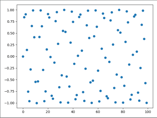
可以看到类似于正弦曲线一样的点
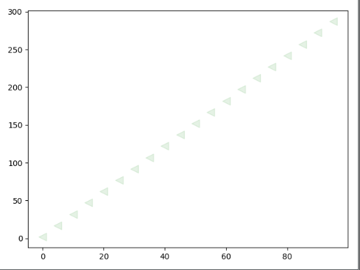
(一)2.如何给散点图加上样式
import numpy as np
import matplotlib.pyplot as plt

x = np.array(range(0, 100, 5))
y = 3 * x + 2

# scatter里面的参数有很多,不过我们主要使用四种
# 1:s,表示点的面积,注意是面积。
# 2:c,颜色,不指定默认为蓝色
# 3:marker:点的形状,不指定默认为点
# 4:alpha:透明度,不指定默认为1,表示透明度为0
plt.scatter(x, y, s=100, c="green", marker="<", alpha=0.1)

plt.show()
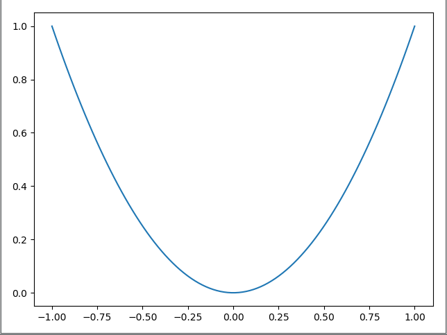
(二)1.如何绘制折线图
import numpy as np
import matplotlib.pyplot as plt

x = np.linspace(-1, 1, 100)
y = x ** 2

plt.plot(x, y)
# 此外还有一个plt.plot_date()函数,专门用来绘制有一个轴是日期格式的数据
plt.show()
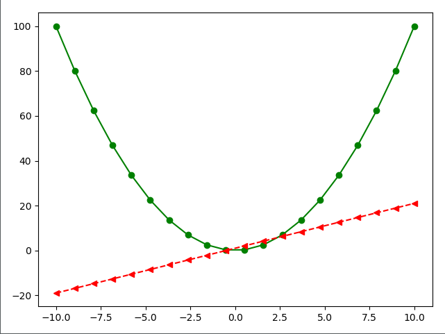
(二)2.如何给折线图加上样式
import numpy as np
import matplotlib.pyplot as plt

x = np.linspace(-10, 10, 20)
y = x ** 2
z = x * 2 + 1

# 关于样式的参数有很多
# linestyle:表示线段的样式
# color:表示颜色
# marker:表示点的样式
plt.plot(x, y, linestyle="-", color="green", marker="o")
plt.plot(x, z, linestyle="--", color="red", marker="<")

plt.show()
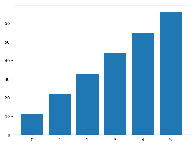
(三)1.如何绘制条形图
import numpy as np
import matplotlib.pyplot as plt

# 还记得每一个图对应的每一个函数吗?
# 散点图:scatter
# 折线图:plot
# 条形图:bar

# 这个函数可以只接收两个参数,分别是条形图中每一条的索引和高度
plt.bar(x=[0, 1, 2, 3, 4, 5], height=[11, 22, 33, 44, 55, 66])
plt.show()
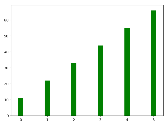
(三)2.如何给条形图加上样式
import matplotlib.pyplot as plt

# color:颜色
# width:线条宽度
plt.bar(x=[0, 1, 2, 3, 4, 5],
        height=[11, 22, 33, 44, 55, 66],
        color="green",
        width=0.2)

plt.show()
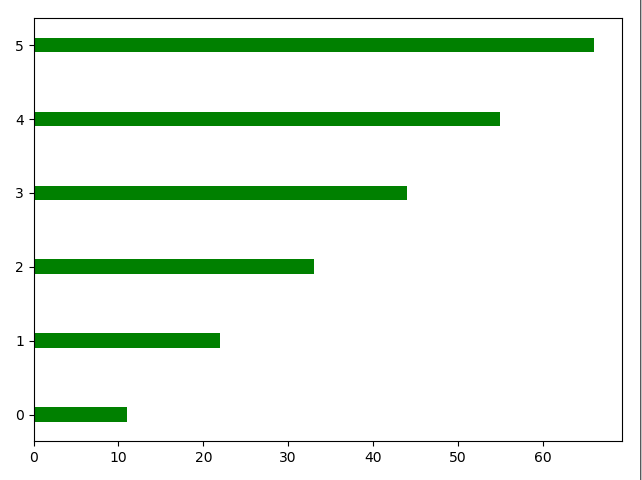
(三)3.如何绘制横向的条形图
import matplotlib.pyplot as plt

# 如果绘制横向的条形图
# 那么bottom相当于之前的x,width相当于之前的height
plt.bar(x=0,
        bottom=[0, 1, 2, 3, 4, 5],
        width=[11, 22, 33, 44, 55, 66],
        color="green",
        height=0.2,
        orientation="horizontal")
# 还有一个plt.barh(),表示花水平的条形图,不用显示的指定orientation="horizontal",但其他的参数还是要有的
plt.show()
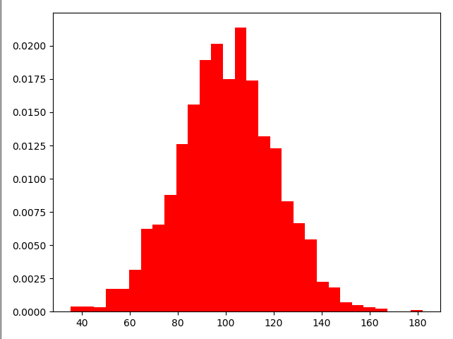
(四)1.如何绘制直方图
import numpy as np
import matplotlib.pyplot as plt

mu = 100
sigma = 20
x = mu + sigma * np.random.randn(2000)

# 设置直方图
# bins:表示要分成多少个区间
# normed:表示是否进行标准化,标准化之后,那么纵坐标不在是个数,而是频率。
plt.hist(x, bins=30, color="red", density=True)
plt.show()
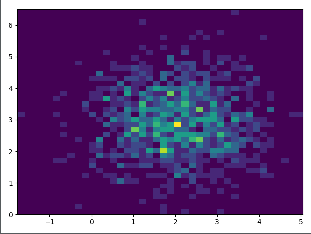
(四)2.如何绘制双变量直方图
import numpy as np
import matplotlib.pyplot as plt

x = np.random.randn(1000)+2
y = np.random.randn(1000)+3

plt.hist2d(x, y, bins=40)

plt.show()
(五)1.如何绘制饼图
import matplotlib.pyplot as plt

labels = ["satori", "mashiro", "nagisa"]
fracs = [40, 30, 30]

# 最重要的两个参数
# x:所占的份额
# labels:对应的标签
plt.pie(x=fracs, labels=labels)
plt.show()
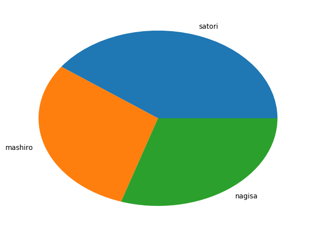
细心地哲学♂家可能回好奇,为什么是一个椭圆,这是因为我们这里少了一句话
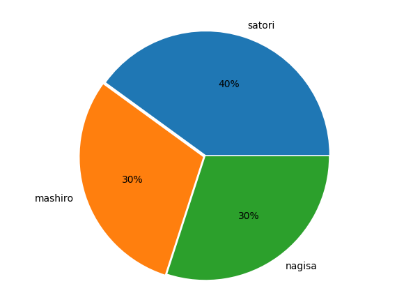
而且每一块上面光秃秃的,每个部分都贴在了一块,也不好看,我们也可以设置一些参数,让其变得好看一些
import matplotlib.pyplot as plt

labels = ["satori", "mashiro", "nagisa"]
fracs = [40, 30, 30]

# 加上这句话表示x和y轴的比例是一比一
# 因此图形就变成了圆形
plt.axes(aspect=1)
# autopct:表示每一块的比例
# explode:突出显示,每个部分不会贴在一块

# shadow:表示加上一层阴影,指定为True即可
plt.pie(x=fracs, labels=labels, autopct="%.0f%%", explode=[0.01, 0.02, 0]) plt.show()
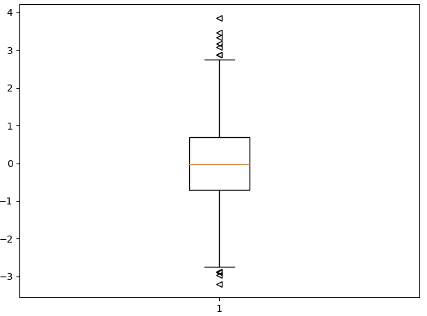
(六)1.如何绘制箱形图
import matplotlib.pyplot as plt
import numpy as np

np.random.seed(100)
data = np.random.normal(0, 1, size=1000)

# sym:形状,表示异常值的形状
# whis:表示虚线的长度,可以控制异常值显示的多少,越大虚线越长
plt.boxplot(data, sym="<", whis=1.5)
plt.show()
(七)颜色和样式
蓝色 - 'b'

绿色 - 'g'

红色 - 'r'

青色 - 'c'

品红 - 'm'

黄色 - 'y'

黑色 - 'k'

白色 - 'w'
'.'       point marker
','       pixel marker
'o'       circle marker
'v'       triangle_down marker
'^'       triangle_up marker
'<'       triangle_left marker
'>'       triangle_right marker
'1'       tri_down marker
'2'       tri_up marker
'3'       tri_left marker
'4'       tri_right marker
's'       square marker
'p'       pentagon marker
'*'       star marker
'h'       hexagon1 marker
'H'       hexagon2 marker
'+'       plus marker
'x'       x marker
'D'       diamond marker
'd'       thin_diamond marker
'|'       vline marker
'_'       hline marker
'-' solid line style
'--' dashed line style
'-.' dash-dot line style
':' dotted line style
输入样式的时候还有一个简便的方法,cx--,c是青色,x是点的样式,--是线的样式
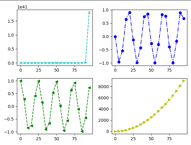
(八)1.如何绘制子图
import numpy as np
import matplotlib.pyplot as plt

x = np.arange(0, 100, 5)

# 生成一个画布
fig = plt.figure()

# 往画布上添加对象
# 这里的221表示,生成一个2X2的画布,并处于第一个位置
s1 = fig.add_subplot(221)
s2 = fig.add_subplot(222)
s3 = fig.add_subplot(223)
s4 = fig.add_subplot(224)
y1 = np.exp(x)
y2 = np.sin(x)
y3 = np.cos(x)
y4 = x ** 2

s1.plot(x, y1, "cx--")
s2.plot(x, y2, "bo-.")
s3.plot(x, y3, "g<--")
s4.plot(x, y4, "y>-.")

# 最后显示要用fig,因为它是我们创建出来的画布,必须要让它显示
fig.show()
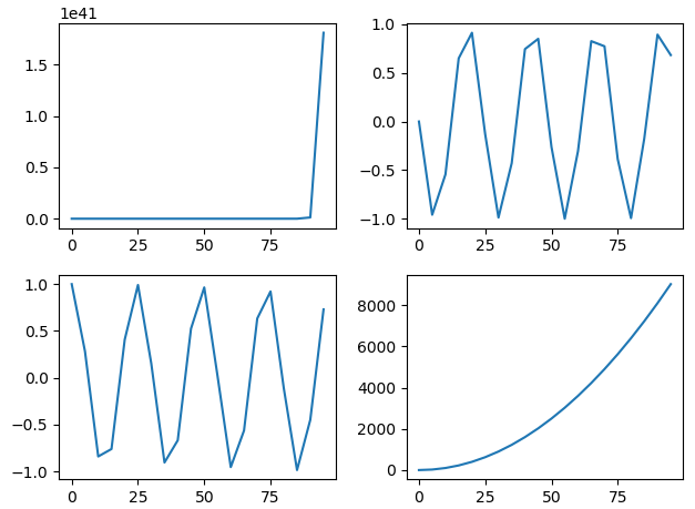
(八)2.如何绘制子图
import numpy as np
import matplotlib.pyplot as plt

x = np.arange(0, 100, 5)

plt.subplot(221)
plt.plot(x, np.exp(x))
plt.subplot(222)
plt.plot(x, np.sin(x))
plt.subplot(223)
plt.plot(x, np.cos(x))
plt.subplot(224)
plt.plot(x, x**2)

plt.show()
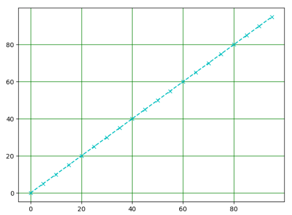
(九)如何绘制网格
import numpy as np
import matplotlib.pyplot as plt

x = np.arange(0, 100, 5)

# 绘制出格子
plt.grid(x, color="green")
# 绘制线段
plt.plot(x, x, "cx--")
plt.show()
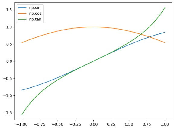
(十)如何给图像带上标记
import numpy as npimport matplotlib.pyplot as plt

x = np.linspace(-1, 1, 100)y1 = np.sin(x)y2 = np.cos(x)y3 = np.tan(x)

# 加上需要的标签labelplt.plot(x, y1, label="np.sin")plt.plot(x, y2, label="np.cos")plt.plot(x, y3, label="np.tan")

# 必须加上这句话,否则标签不显示
# legend里面还有一个location参数,可以指定位置
# 以及ncol可以指定要标签分几列显示
plt.legend()

plt.show()
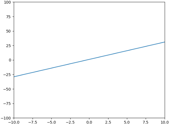
(十一)调整坐标轴范围
import numpy as np
import matplotlib.pyplot as plt

x = np.arange(-100, 100)
y = 3 * x + 1

plt.plot(x, y)
# 表示x轴从-10到10,y轴-100到100# 也可以通过plt.xlim([,])和plt.ylim([,])只调x轴或y轴# 如果只想调整一边的话,就直接指定最大或者最小,xlim(xmin=,xmax=),ylim(ymin=,ymax=)
plt.axis([-10, 10, -100, 100])
plt.show()
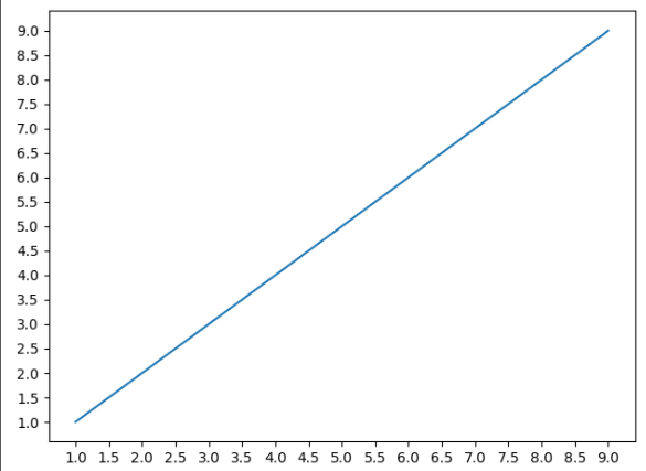
(十二)调整坐标轴刻度
import numpy as np
import matplotlib.pyplot as plt

x = np.arange(1, 10)

plt.plot(x, x)

# 获取坐标轴属性,get current axis
ax = plt.gca()
# nbins表示有多少间隔,可以看到分成了20份
ax.locator_params(nbins=20)
# 如果我只想调整某一个轴的话
# 指定ax.locator_params("x", nbins=20)

plt.show()
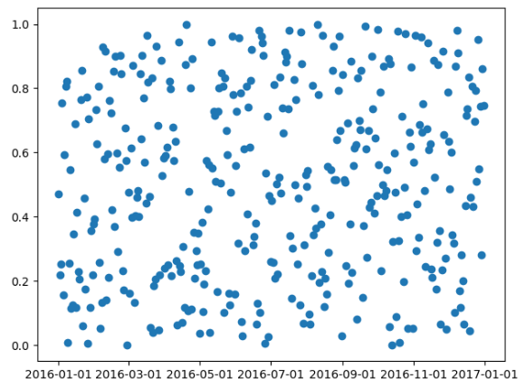
import numpy as np
import matplotlib.pyplot as plt
import matplotlib as mpl
import datetime

start = datetime.date(2016, 1, 1)
end = datetime.date(2017, 1, 1)
timedelta = datetime.timedelta(days=1)

date = mpl.dates.drange(start, end, timedelta)
y = np.random.rand(len(date))

ax = plt.gca()
plt.plot_date(date, y)

# 设置时间格式
date_format = mpl.dates.DateFormatter("%Y-%m-%d")

# 将格式应用到x轴上
ax.xaxis.set_major_formatter(date_format)

plt.show()
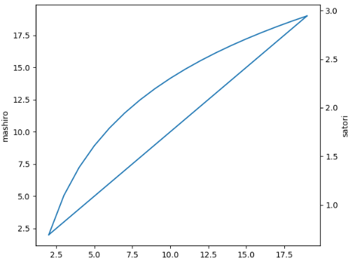
(十三)如何添加坐标轴
import numpy as np
import matplotlib.pyplot as plt

x = np.arange(2, 20, 1)

y1 = x
y2 = np.log(x)

fig = plt.figure()

ax1 = fig.add_subplot(111)

ax1.plot(x, y1)
ax1.set_ylabel("mashiro")

# 表示生成一个双胞胎y轴,twinx,表示生成一个y轴
ax2 = ax1.twinx()

ax2.plot(x, y2)
ax2.set_ylabel("satori")

fig.show()
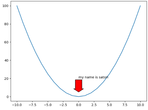
(十四)添加注释
import numpy as np
import matplotlib.pyplot as plt

x = np.arange(-10, 11)

y = x ** 2

plt.plot(x, y)

plt.annotate("my name is satori",
             xy=(0, 5),  # 箭头坐标
             xytext=(0, 20),  # 文本坐标
             arrowprops={"facecolor": "r",  # 颜色
                         "headlength": 10,  # 箭头的长度
                         "headwidth": 30,  # 箭头的头的宽度
                         "width": 20  # 箭头的身体的宽度
                         }
             )

plt.show()
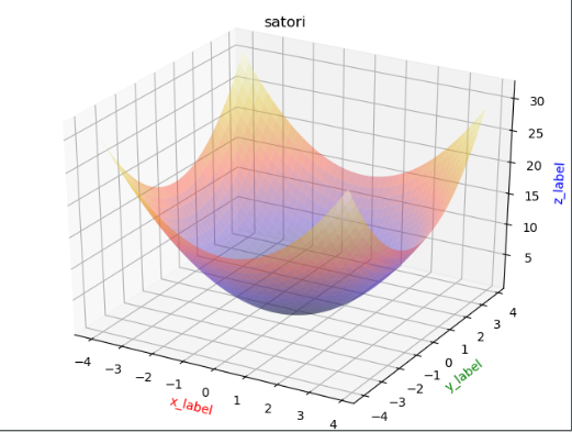
(十五)如何绘制3D图形
import matplotlib.pyplot as plt
import numpy as np
from mpl_toolkits.mplot3d import Axes3D as A3

fig = plt.figure()
ax = A3(fig)
x = np.arange(-4, 4, 0.2)
y = np.arange(-4, 4, 0.2)
x, y = np.meshgrid(x, y)
z = np.power(x, 2) + np.power(y, 2)
plt.title("satori")

# rstride,cstride表示行列每隔多少个点建一个面,cmap表示颜色
ax.plot_surface(x, y, z, rstride=1,
                cstride=1,
                cmap=plt.cm.CMRmap,
                alpha=0.4)
ax.set_xlabel('x_label', color='r')
ax.set_ylabel('y_label', color='g')
ax.set_zlabel('z_label', color='b')

plt.show()
如何解决中文乱码问题
import matplotlib.pyplot as plt

plt.rcParams['font.sans-serif'] = ['SimHei'] # 步骤一(替换sans-serif字体)
plt.rcParams['axes.unicode_minus'] = False   # 步骤二(解决坐标轴负数的负号显示问题)
解决子图重合问题
plt.tight_layout()
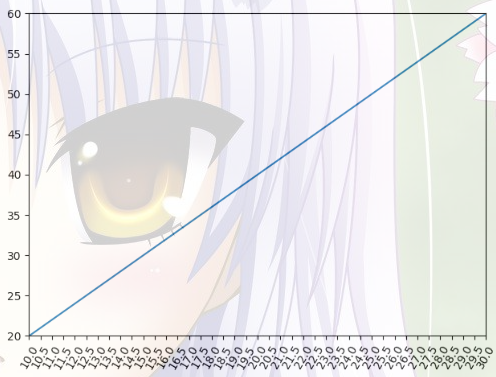
import numpy as np
import matplotlib.pyplot as plt

x = np.arange(1, 100)
y = 2 * x

plt.plot(x, y)
# 调整x,y轴的取值范围
plt.xlim(10, 30)
plt.ylim(20, 60)

# 调整x或y轴的间隔
ax = plt.gca()
ax.locator_params("x", nbins=40)

# 调整x或y轴坐标的倾斜程度
plt.xticks(rotation=60)
plt.show()
(3) python--matplotlib的更多相关文章
- python matplotlib 中文显示参数设置
python matplotlib 中文显示参数设置 方法一:每次编写代码时进行参数设置 #coding:utf-8import matplotlib.pyplot as pltplt.rcParam ...
- python matplotlib plot 数据中的中文无法正常显示的解决办法
转发自:http://blog.csdn.net/laoyaotask/article/details/22117745?utm_source=tuicool python matplotlib pl ...
- python matplotlib画图产生的Type 3 fonts字体没有嵌入问题
ScholarOne's 对python matplotlib画图产生的Type 3 fonts字体不兼容,更改措施: 在程序中添加如下语句 import matplotlib matplotlib. ...
- 使用Python matplotlib做动态曲线
今天看到“Python实时监控CPU使用率”的教程: https://www.w3cschool.cn/python3/python3-ja3d2z2g.html 自己也学习如何使用Python ma ...
- python matplotlib 中文显示乱码设置
python matplotlib 中文显示乱码设置 原因:是matplotlib库中没有中文字体.1 解决方案:1.进入C:\Anaconda64\Lib\site-packages\matplot ...
- Python - matplotlib 数据可视化
在许多实际问题中,经常要对给出的数据进行可视化,便于观察. 今天专门针对Python中的数据可视化模块--matplotlib这块内容系统的整理,方便查找使用. 本文来自于对<利用python进 ...
- 转:使用 python Matplotlib 库 绘图 及 相关问题
使用 python Matplotlib 库绘图 转:http://blog.csdn.net/daniel_ustc/article/details/9714163 Matplotlib ...
- python+matplotlib 绘制等高线
python+matplotlib 绘制等高线 步骤有七: 有一个m*n维的矩阵(data),其元素的值代表高度 构造两个向量:x(1*n)和y(1*m).这两个向量用来构造网格坐标矩阵(网格坐标矩阵 ...
- 安装python Matplotlib 库
转:使用 python Matplotlib 库 绘图 及 相关问题 使用 python Matplotlib 库绘图 转:http://blog.csdn.net/daniel_ustc ...
- python matplotlib.pyplot 散点图详解(1)
python matplotlib.pyplot散点图详解(1) 一.创建散点图 可以用scatter函数创建散点图 并使用show函数显示散点图 代码如下: import matplotlib.py ...
随机推荐
- dubbo的rpc异常
Exception in thread "main" com.alibaba.dubbo.rpc.RpcException: Failed to invoke the method ...
- Android弹出输入提示框--PopupWindow实现
前言 之前直接用Dialog实现了弹出对话框.现在尝试用更好地解决方案--PopupWindow类--来实现 1.首先搞一个弹出框布局,和之前类似. 这样的东西,它的布局是这样: 1 <?xm ...
- 20145202马超 《Java程序设计》第二周学习总结
一.课后练习题目 1.D 并没有给number赋值导致出现错误. 2.A 10/3相当于10=3*3+1: 10/3=3. 3.D 4.D 很明显,byte类型的数据的话300就会出现溢出的情况. 5 ...
- TCP重组问题
今天问题: vqmon 测试一pcap抓包文件18.pcap.发现实际输出的视频分片信息和抓包不符合. ===>pts : 00:00:33 Too much data in TCP recei ...
- HTML5技巧
HTML5技巧 HTML5 技巧一:当今科技发展的速度真惊人,稍不留神,就可能无法跟上它的步伐.新一代的HTML-HTML5的发展也不停的带给我们新的惊喜,我们将通过这篇文章向大家介绍一些HTML ...
- PJSIP-PJLIB(samples) (the usage of the pjlib lib) (eg:string/I/O)
Here are some samples about PJLIB! PJLIB is the basic lib of PJSIP, so we need master the lib first ...
- Linux/Unix中系统级IO
Linux/unix I/O:将设备映射为文件的方式,允许Unix内核引出一个简单.低级的应用接口. Linux/unix IO的系统调用函数很简单,它只有5个函数:open(打开).close(关闭 ...
- gradle构建
https://blog.csdn.net/baidu_30809315/article/details/77865414
- 【转载】法线贴图Nomal mapping 原理
法线贴图多用在CG动画的渲染以及游戏画面的制作上,将具有高细节的模型通过映射烘焙出法线贴图,贴在低端模型的法线贴图通道上,使之拥有法线贴图的渲染效果,却可以大大降低渲染时需要的面数和计算内容,从而达到 ...
- 孤荷凌寒自学python第七天 列表的复制与序列的基本运算
孤荷凌寒自学python第七天 列表的复制与序列的基本运算 (完整学习过程屏幕记录视频地址在文末,手写笔记在文末) (同步语音:https://www.ximalaya.com/keji/191030 ...