
Bootstrap 完全教程笔记
Bootstrap CSS
Bootstrap 排版
引导主体副本
为了给段落添加强调文本,则可以添加 class=”lead”,这将得到更大更粗、行高更高的文本,如下面实例所示:
<h2>引导主体副本</h2>

<p class="lead">这是一个演示引导主体副本用法的实例。</p>- 1
- 2
引导主体副本
这是一个演示引导主体副本用法的实例。
强调
HTML 的默认强调标签 :
<small>(设置文本为父文本大小的 85%)、<strong>(设置文本为更粗的文本)、<em>(设置文本为斜体)。
Bootstrap 提供了一些用于强调文本的类,如下面实例所示:
<small>本行内容是在标签内</small><br>

<strong>本行内容是在标签内</strong><br>

<em>本行内容是在标签内,并呈现为斜体</em><br>

<p class="text-left">向左对齐文本</p>

<p class="text-center">居中对齐文本</p>

<p class="text-right">向右对齐文本</p>

<p class="text-muted">本行内容是减弱的</p>

<p class="text-primary">本行内容带有一个 primary class</p>

<p class="text-success">本行内容带有一个 success class</p>

<p class="text-info">本行内容带有一个 info class</p>

<p class="text-warning">本行内容带有一个 warning class</p>

<p class="text-danger">本行内容带有一个 danger class</p>- 1
- 2
- 3
- 4
- 5
- 6
- 7
- 8
- 9
- 10
- 11
- 12
本行内容是在标签内
本行内容是在标签内
本行内容是在标签内,并呈现为斜体
向左对齐文本
居中对齐文本
向右对齐文本
本行内容是减弱的
本行内容带有一个 primary class
本行内容带有一个 success class
本行内容带有一个 info class
本行内容带有一个 warning class
本行内容带有一个 danger class
缩写
HTML 元素提供了用于缩写的标记,比如 WWW 或 HTTP。Bootstrap 定义 <abbr> 元素的样式为显示在文本底部的一条虚线边框,当鼠标悬停在上面时会显示完整的文本(只要您为 <abbr> title 属性添加了文本)。为了得到一个更小字体的文本,请添加 .initialism 到 <abbr>。
实例
<abbr title="World Wide Web">WWW</abbr><br>

<abbr title="Real Simple Syndication" class="initialism">RSS</abbr>- 1
- 2
WWW
RSS
地址(Address)
使用 <address> 标签,您可以在网页上显示联系信息。由于 <address> 默认为 display:block;,您需要使用标签来为封闭的地址文本添加换行。
实例
<address>

  <strong>Some Company, Inc.</strong><br>

  007 street<br>

  Some City, State XXXXX<br>

  <abbr title="Phone">P:</abbr> (123) 456-7890

</address>

<address>

  <strong>Full Name</strong><br>

  <a href="mailto:#">mailto@somedomain.com</a>

</address>- 1
- 2
- 3
- 4
- 5
- 6
- 7
- 8
- 9
- 10
007 street
Some City, State XXXXX
P: (123) 456-7890 Full Name
mailto@somedomain.com
引用(Blockquote)
您可以在任意的 HTML 文本旁使用默认的 <blockquote>。其他选项包括,添加一个 <small> 标签来标识引用的来源,使用 class .pull-right 向右对齐引用。下面的实例演示了这些特性:
实例
<blockquote>

  <p>

  这是一个默认的引用实例。

  </p>

</blockquote>

<blockquote>

  这是一个带有源标题的引用。

  <small>Someone famous in <cite title="Source Title">Source Title</cite></small>

</blockquote>

<blockquote class="pull-right">

  这是一个向右对齐的引用。

  <small>Someone famous in <cite title="Source Title">Source Title</cite></small>

</blockquote>- 1
- 2
- 3
- 4
- 5
- 6
- 7
- 8
- 9
- 10
- 11
- 12
- 13
这是一个默认的引用实例。
这是一个带有源标题的引用。 Someone famous in Source Title
这是一个向右对齐的引用。 Someone famous in Source Title
.
.
.
列表
Bootstrap 支持有序列表、无序列表和定义列表。
有序列表:有序列表是指以数字或其他有序字符开头的列表。
无序列表:无序列表是指没有特定顺序的列表,是以传统风格的着重号开头的列表。
定义列表:在这种类型的列表中,每个列表项可以包含<dt>和<dd>元素。<dt>代表 定义术语,就像字典,这是被定义的属于(或短语)。接着,<dd>是<dt>的描述。您可以使用 class dl-horizontal 把<dl>行中的属于与描述并排显示。
下面的实例演示了这些类型的列表:
实例
<h4>有序列表</h4>

<ol>

  <li>Item 1</li>

  <li>Item 2</li>

  <li>Item 3</li>

  <li>Item 4</li>

</ol>

<h4>无序列表</h4>

<ul>

  <li>Item 1</li>

  <li>Item 2</li>

  <li>Item 3</li>

  <li>Item 4</li>

</ul>

<h4>未定义样式列表</h4>

<ul class="list-unstyled">

  <li>Item 1</li>

  <li>Item 2</li>

  <li>Item 3</li>

  <li>Item 4</li>

</ul>

<h4>内联列表</h4>

<ul class="list-inline">

  <li>Item 1</li>

  <li>Item 2</li>

  <li>Item 3</li>

  <li>Item 4</li>

</ul>

<h4>定义列表</h4>

<dl>

  <dt>Description 1</dt>

  <dd>Item 1</dd>

  <dt>Description 2</dt>

  <dd>Item 2</dd>

</dl>

<h4>水平的定义列表</h4>

<dl class="dl-horizontal">

  <dt>Description 1</dt>

  <dd>Item 1</dd>

  <dt>Description 2</dt>

  <dd>Item 2</dd>

</dl>- 1
- 2
- 3
- 4
- 5
- 6
- 7
- 8
- 9
- 10
- 11
- 12
- 13
- 14
- 15
- 16
- 17
- 18
- 19
- 20
- 21
- 22
- 23
- 24
- 25
- 26
- 27
- 28
- 29
- 30
- 31
- 32
- 33
- 34
- 35
- 36
- 37
- 38
- 39
- 40
- 41
- 42
有序列表
- Item 1
- Item 2
- Item 3
- Item 4
无序列表
- Item 1
- Item 2
- Item 3
- Item 4
未定义样式列表
- Item 1
- Item 2
- Item 3
- Item 4
内联列表
- Item 1
- Item 2
- Item 3
- Item 4
定义列表
- Description 1
- Item 1
- Description 2
- Item 2
水平的定义列表
- Description 1
- Item 1
- Description 2
- Item 2
更多排版类
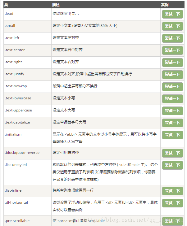
下表提供了 Bootstrap 更多排版类的实例:
Bootstrap 代码
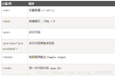
Bootstrap 允许您以两种方式显示代码:
第一种是
<code>标签。如果您想要内联显示代码,那么您应该使用<code>标签。
第二种是<pre>标签。如果代码需要被显示为一个独立的块元素或者代码有多行,那么您应该使用<pre>标签。
请确保当您使用 <pre> 和 <code> 标签时,开始和结束标签使用了 unicode 变体: < 和 >。
实例
<p><code><header></code> 作为内联元素被包围。</p>
<p>如果需要把代码显示为一个独立的块元素,请使用 <pre> 标签:</p>
<pre>
    <article>

        <h1>Article Heading</h1>

    </article>
</pre>- 1
- 2
- 3
- 4
- 5
- 6
- 7
<header> 作为内联元素被包围。
如果需要把代码显示为一个独立的块元素,请使用 <pre> 标签:
<article>
<h1>Article Heading</h1>
</article>
更多实例
Bootstrap 表格
Bootstrap 提供了一个清晰的创建表格的布局。下表列出了 Bootstrap 支持的一些表格元素:
| 标签 | 描述 |
|---|---|
<table> |
为表格添加基础样式。 |
<thead> |
表格标题行的容器元素(<tr>),用来标识表格列。 |
<tbody> |
表格主体中的表格行的容器元素(<tr>)。 |
<tr> |
一组出现在单行上的表格单元格的容器元素(<td> 或 <th>)。 |
<td> |
默认的表格单元格。 |
<th> |
特殊的表格单元格,用来标识列或行(取决于范围和位置)。必须在 <thead> 内使用。 |
<caption> |
关于表格存储内容的描述或总结。(无论放在表格上面位置,都会出现在表格上方) |
表格类
下表样式可用于表格中:
| 类 | 描述 |
|---|---|
| .table | 为任意 <table> 添加基本样式 (只有横向分隔线)(包含大小尺寸等) |
| .table-striped | 在 <tbody> 内添加斑马线形式的条纹 ( IE8 不支持) |
| .table-bordered | 为所有表格的单元格添加边框 |
| .table-hover | 在 <tbody> 内的任一行启用鼠标悬停状态(颜色改变) |
| .table-condensed | 让表格更加紧凑 |
联合使用所有表格类:
    <table class="table table-striped table-bordered table-hover table-condensed">

        <caption>联合使用所有表格类:</caption>

        <thead>

            <tr>

                <th>#</th>

                <th>Firstname</th>

            </tr>

        </thead>

        <tbody>

            <tr>

                <td>1</td>

                <td>Anna</td>

            </tr>

            <tr>

                <td>2</td>

                <td>Debbie</td>

            </tr>

            <tr>

                <td>3</td>

                <td>John</td>

            </tr>

        </tbody>

</table>- 1
- 2
- 3
- 4
- 5
- 6
- 7
- 8
- 9
- 10
- 11
- 12
- 13
- 14
- 15
- 16
- 17
- 18
- 19
- 20
- 21
- 22
- 23
- 24
<tr>, <th> 和 <td> 类
下表的类可用于表格的行或者单元格:
| 类 | 描述 |
|---|---|
| .active | 将悬停的颜色应用在行或者单元格上 |
| .success | 表示成功的操作 |
| .info | 表示信息变化的操作 |
| .warning | 表示一个警告的操作 |
| .danger | 表示一个危险的操作 |
响应式表格
通过把任意的 .table 包在 .table-responsive class 内,您可以让表格水平滚动以适应小型设备(小于 768px)。当在大于 768px 宽的大型设备上查看时,您将看不到任何的差别。
实例
<div class="table-responsive">

  <table class="table">

    <caption>响应式表格布局</caption>

    <thead>

      <tr>

        <th>产品</th>

        <th>付款日期</th>

        <th>状态</th></tr>

    </thead>

    <tbody>

      <tr>

        <td>产品1</td>

        <td>23/11/2013</td>

        <td>待发货</td></tr>

      <tr>

        <td>产品2</td>

        <td>10/11/2013</td>

        <td>发货中</td></tr>

      <tr>

        <td>产品3</td>

        <td>20/10/2013</td>

        <td>待确认</td></tr>

      <tr>

        <td>产品4</td>

        <td>20/10/2013</td>

        <td>已退货</td></tr>

    </tbody>

  </table>

</div>- 1
- 2
- 3
- 4
- 5
- 6
- 7
- 8
- 9
- 10
- 11
- 12
- 13
- 14
- 15
- 16
- 17
- 18
- 19
- 20
- 21
- 22
- 23
- 24
- 25
- 26
- 27
- 28
- 29
Bootstrap 表单
在本章中,我们将学习如何使用 Bootstrap 创建表单。Bootstrap 通过一些简单的 HTML 标签和扩展的类即可创建出不同样式的表单。
表单布局
Bootstrap 提供了下列类型的表单布局:
- 垂直表单(默认)
- 内联表单
- 水平表单
垂直或基本表单
基本的表单结构是 Bootstrap 自带的,个别的表单控件自动接收一些全局样式。下面列出了创建基本表单的步骤:
- 向父
<form>元素添加 role=”form”。 - 把标签和控件放在一个带有 class .form-group 的
<div>中。这是获取最佳间距所必需的。 - 向所有的文本元素
<input>、<textarea>和<select>添加 class .form-control。
<form role="form">

  <div class="form-group">

    <label for="name">名称</label>

    <input type="text" class="form-control" id="name" placeholder="请输入名称">

  </div>

  <div class="form-group">

    <label for="inputfile">文件输入</label>

    <input type="file" id="inputfile">

    <p class="help-block">这里是块级帮助文本的实例。</p>

  </div>

  <div class="checkbox">

    <label>

      <input type="checkbox">请打勾

    </label>

  </div>

  <button type="submit" class="btn btn-default">提交</button>

</form>- 1
- 2
- 3
- 4
- 5
- 6
- 7
- 8
- 9
- 10
- 11
- 12
- 13
- 14
- 15
- 16
- 17
内联表单
如果需要创建一个表单,它的所有元素是内联的,向左对齐的,标签是并排的,请向 标签添加 class .form-inline。
<form class="form-inline" role="form">

  <div class="form-group">

    <label class="sr-only" for="name">名称</label>

    <input type="text" class="form-control" id="name" placeholder="请输入名称">

  </div>

  <div class="form-group">

    <label class="sr-only" for="inputfile">文件输入</label>

    <input type="file" id="inputfile">

  </div>

  <div class="checkbox">

    <label>

      <input type="checkbox">请打勾

    </label>

  </div>

  <button type="submit" class="btn btn-default">提交</button>

</form>- 1
- 2
- 3
- 4
- 5
- 6
- 7
- 8
- 9
- 10
- 11
- 12
- 13
- 14
- 15
- 16
默认情况下,Bootstrap 中的 input、select 和 textarea 有 100%宽度。在使用内联表单时,您需要在表单控件上设置一个宽度。
使用 class .sr-only,您可以隐藏内联表单的标签。
水平表单
水平表单与其他表单不仅标记的数量上不同,而且表单的呈现形式也不同。如需创建一个水平布局的表单,请按下面的几个步骤进行:
- 向父
<form>元素添加 class .form-horizontal。 - 把标签和控件放在一个带有 class .form-group 的
<div>中。 - 向标签添加 class .control-label。
<form class="form-horizontal" role="form">

  <div class="form-group">

    <label for="firstname" class="col-sm-2 control-label">名字</label>

    <div class="col-sm-10">

      <input type="text" class="form-control" id="firstname" placeholder="请输入名字">

    </div>

  </div>

  <div class="form-group">

    <label for="lastname" class="col-sm-2 control-label">姓</label>

    <div class="col-sm-10">

      <input type="text" class="form-control" id="lastname" placeholder="请输入姓">

    </div>

  </div>

  <div class="form-group">

    <div class="col-sm-offset-2 col-sm-10">

      <div class="checkbox">

        <label>

          <input type="checkbox">请记住我

        </label>

      </div>

    </div>

  </div>

  <div class="form-group">

    <div class="col-sm-offset-2 col-sm-10">

      <button type="submit" class="btn btn-default">登录</button>

    </div>

  </div>

</form>- 1
- 2
- 3
- 4
- 5
- 6
- 7
- 8
- 9
- 10
- 11
- 12
- 13
- 14
- 15
- 16
- 17
- 18
- 19
- 20
- 21
- 22
- 23
- 24
- 25
- 26
- 27
- 28
支持的表单控件
Bootstrap 支持最常见的表单控件,主要是 input、textarea、checkbox、radio 和 select。
输入框(Input)
最常见的表单文本字段是输入框 input。用户可以在其中输入大多数必要的表单数据。Bootstrap 提供了对所有原生的 HTML5 的 input 类型的支持,包括:text、password、datetime、datetime-local、date、month、time、week、number、email、url、search、tel 和 color。适当的 type 声明是必需的,这样才能让 input 获得完整的样式。
<form role="form">

  <div class="form-group">

    <label for="name">标签</label>

    <input type="text" class="form-control" placeholder="文本输入">

  </div>

</form>- 1
- 2
- 3
- 4
- 5
- 6
文本框(Textarea)
当您需要进行多行输入的时,则可以使用文本框 textarea。必要时可以改变 rows 属性(较少的行 = 较小的盒子,较多的行 = 较大的盒子)。
<form role="form">

  <div class="form-group">

    <label for="name">文本框</label>

    <textarea class="form-control" rows="3"></textarea>

  </div>

</form>- 1
- 2
- 3
- 4
- 5
- 6
复选框(Checkbox)和单选框(Radio)
复选框和单选按钮用于让用户从一系列预设置的选项中进行选择。
当创建表单时,如果您想让用户从列表中选择若干个选项时,请使用 checkbox。如果您限制用户只能选择一个选项,请使用 radio。
对一系列复选框和单选框使用 .checkbox-inline 或 .radio-inline class,控制它们显示在同一行上。
下面的实例演示了这两种类型(默认和内联):
<label for="name">默认的复选框和单选按钮的实例</label>

<div class="checkbox">

  <label>

    <input type="checkbox" value="">选项 1

  </label>

</div>

<div class="checkbox">

  <label>

    <input type="checkbox" value="">选项 2

  </label>

</div>

<div class="radio">

  <label>

    <input type="radio" name="optionsRadios" id="optionsRadios1" value="option1" checked>选项 1

  </label>

</div>

<div class="radio">

  <label>

    <input type="radio" name="optionsRadios" id="optionsRadios2" value="option2">选项 2 - 选择它将会取消选择选项 1

  </label>

</div>

<label for="name">内联的复选框和单选按钮的实例</label>

<div>

  <label class="checkbox-inline">

    <input type="checkbox" id="inlineCheckbox1" value="option1">选项 1

  </label>

  <label class="checkbox-inline">

    <input type="checkbox" id="inlineCheckbox2" value="option2">选项 2

  </label>

  <label class="checkbox-inline">

    <input type="checkbox" id="inlineCheckbox3" value="option3">选项 3

  </label>

  <label class="checkbox-inline">

    <input type="radio" name="optionsRadiosinline" id="optionsRadios3" value="option1" checked>选项 1

  </label>

  <label class="checkbox-inline">

    <input type="radio" name="optionsRadiosinline" id="optionsRadios4" value="option2">选项 2

  </label>

</div>- 1
- 2
- 3
- 4
- 5
- 6
- 7
- 8
- 9
- 10
- 11
- 12
- 13
- 14
- 15
- 16
- 17
- 18
- 19
- 20
- 21
- 22
- 23
- 24
- 25
- 26
- 27
- 28
- 29
- 30
- 31
- 32
- 33
- 34
- 35
- 36
- 37
- 38
- 39
选择框(Select)
当您想让用户从多个选项中进行选择,但是默认情况下只能选择一个选项时,则使用选择框。
- 使用
<select>展示列表选项,通常是那些用户很熟悉的选择列表,比如州或者数字。 - 使用 multiple=”multiple” 允许用户选择多个选项。
下面的实例演示了这两种类型(select 和 multiple):
<form role="form">

  <div class="form-group">

    <label for="name">选择列表</label>

    <select class="form-control">

      <option>1</option>

      <option>2</option>

      <option>3</option>

      <option>4</option>

      <option>5</option>

    </select>

    <label for="name">可多选的选择列表</label>

    <select multiple class="form-control">

      <option>1</option>

      <option>2</option>

      <option>3</option>

      <option>4</option>

      <option>5</option>

    </select>

  </div>

</form>- 1
- 2
- 3
- 4
- 5
- 6
- 7
- 8
- 9
- 10
- 11
- 12
- 13
- 14
- 15
- 16
- 17
- 18
- 19
- 20
静态控件
当您需要在一个水平表单内的表单标签后放置纯文本时,请在
<p>上使用 class .form-control-static。
<form class="form-horizontal" role="form">

  <div class="form-group">

    <label class="col-sm-2 control-label">Email</label>

    <div class="col-sm-10">

      <p class="form-control-static">email@example.com</p>

    </div>

  </div>

  <div class="form-group">

    <label for="inputPassword" class="col-sm-2 control-label">密码</label>

    <div class="col-sm-10">

      <input type="password" class="form-control" id="inputPassword" placeholder="请输入密码">

    </div>

  </div>

</form>- 1
- 2
- 3
- 4
- 5
- 6
- 7
- 8
- 9
- 10
- 11
- 12
- 13
- 14
表单控件状态
除了 :focus 状态(即,用户点击 input 或使用 tab 键聚焦到 input 上),Bootstrap 还为禁用的输入框定义了样式,并提供了表单验证的 class。
输入框焦点
当输入框 input 接收到 :focus 时,输入框的轮廓会被移除,同时应用 box-shadow。
禁用的输入框 input
如果您想要禁用一个输入框 input,只需要简单地添加 disabled 属性,这不仅会禁用输入框,还会改变输入框的样式以及当鼠标的指针悬停在元素上时鼠标指针的样式。
禁用的字段集 fieldset
对<fieldset>添加 disabled 属性来禁用<fieldset>内的所有控件。
验证状态
Bootstrap 包含了错误、警告和成功消息的验证样式。只需要对父元素简单地添加适当的 class(.has-warning、 .has-error 或 .has-success)即可使用验证状态。
<form class="form-horizontal" role="form">

  <div class="form-group">

    <label class="col-sm-2 control-label">聚焦</label>

    <div class="col-sm-10">

      <input class="form-control" id="focusedInput" type="text" value="该输入框获得焦点...">

    </div>

  </div>

  <div class="form-group">

    <label for="inputPassword" class="col-sm-2 control-label">禁用</label>

    <div class="col-sm-10">

      <input class="form-control" id="disabledInput" type="text" placeholder="该输入框禁止输入..." disabled>

    </div>

  </div>

  <fieldset disabled>

    <div class="form-group">

      <label for="disabledTextInput" class="col-sm-2 control-label">禁用输入(Fieldset disabled)</label>

      <div class="col-sm-10">

        <input type="text" id="disabledTextInput" class="form-control" placeholder="禁止输入">

      </div>

    </div>

    <div class="form-group">

      <label for="disabledSelect" class="col-sm-2 control-label">禁用选择菜单(Fieldset disabled)</label>

      <div class="col-sm-10">

        <select id="disabledSelect" class="form-control">

          <option>禁止选择</option>

        </select>

      </div>

    </div>

  </fieldset>

  <div class="form-group has-success">

    <label class="col-sm-2 control-label" for="inputSuccess">输入成功</label>

    <div class="col-sm-10">

      <input type="text" class="form-control" id="inputSuccess">

    </div>

  </div>

  <div class="form-group has-warning">

    <label class="col-sm-2 control-label" for="inputWarning">输入警告</label>

    <div class="col-sm-10">

      <input type="text" class="form-control" id="inputWarning">

    </div>

  </div>

  <div class="form-group has-error">

    <label class="col-sm-2 control-label" for="inputError">输入错误</label>

    <div class="col-sm-10">

      <input type="text" class="form-control" id="inputError">

    </div>

  </div>

</form>- 1
- 2
- 3
- 4
- 5
- 6
- 7
- 8
- 9
- 10
- 11
- 12
- 13
- 14
- 15
- 16
- 17
- 18
- 19
- 20
- 21
- 22
- 23
- 24
- 25
- 26
- 27
- 28
- 29
- 30
- 31
- 32
- 33
- 34
- 35
- 36
- 37
- 38
- 39
- 40
- 41
- 42
- 43
- 44
- 45
- 46
- 47
- 48
表单控件大小
您可以分别使用 class .input-lg 和 .col-lg-* 来设置表单的高度和宽度。下面的实例演示了这点:
<form role="form">

  <div class="form-group">

    <input class="form-control input-lg" type="text" placeholder=".input-lg">

  </div>

  <div class="form-group">

    <input class="form-control" type="text" placeholder="默认输入">

  </div>

  <div class="form-group">

    <input class="form-control input-sm" type="text" placeholder=".input-sm">

  </div>

  <div class="form-group"></div>

  <div class="form-group">

    <select class="form-control input-lg">

      <option value="">.input-lg</option>

    </select>

  </div>

  <div class="form-group">

    <select class="form-control">

      <option value="">默认选择</option>

    </select>

  </div>

  <div class="form-group">

    <select class="form-control input-sm">

      <option value="">.input-sm</option>

    </select>

  </div>

  <div class="row">

    <div class="col-lg-2">

      <input type="text" class="form-control" placeholder=".col-lg-2">

    </div>

    <div class="col-lg-3">

      <input type="text" class="form-control" placeholder=".col-lg-3">

    </div>

    <div class="col-lg-4">

      <input type="text" class="form-control" placeholder=".col-lg-4">

    </div>

  </div>

</form>- 1
- 2
- 3
- 4
- 5
- 6
- 7
- 8
- 9
- 10
- 11
- 12
- 13
- 14
- 15
- 16
- 17
- 18
- 19
- 20
- 21
- 22
- 23
- 24
- 25
- 26
- 27
- 28
- 29
- 30
- 31
- 32
- 33
- 34
- 35
- 36
- 37
- 38
表单帮助文本
Bootstrap 表单控件可以在输入框 input 上有一个块级帮助文本。为了添加一个占用整个宽度的内容块,请在
<input>后使用 .help-block。下面的实例演示了这点:
<form role="form">

  <span>帮助文本实例</span>

  <input class="form-control" type="text" placeholder="">

  <span class="help-block">一个较长的帮助文本块,超过一行,

  需要扩展到下一行。本实例中的帮助文本总共有两行。</span>

</form>- 1
- 2
- 3
- 4
- 5
- 6
Bootstrap 完全教程笔记的更多相关文章
- <<Bootstrap基础教程>> 新书出手,有心栽花花不开,无心插柳柳成荫
并非闲的蛋疼,做技术也经常喜欢蛋疼,纠结于各种技术,各种需求变更,还有一个很苦恼的就是UI总是那么不尽人意.前不久自己开源了自己做了多年的仓储项目(开源地址:https://github.com/he ...
- BootStrap入门教程 (一)
BootStrap入门教程 (一) 2011年,twitter的"一小撮"工程师为了提高他们内部的分析和管理能力,用业余时间为他们的产品构建了一套易用.优雅.灵活.可扩展的前端 ...
- jQuery官方基础教程笔记(转载)
本文转载于阮一峰的博文,内容基础,结构清晰,是jquery入门不可多得的资料,非常好,赞一个. 阮一峰:jQuery官方基础教程笔记 jQuery是目前使用最广泛的javascript函数库. 据统计 ...
- (转帖)BootStrap入门教程 (一)
2011年,twitter的“一小撮”工程师为了提高他们内部的分析和管理能力,用业余时间为他们的产品构建了一套易用.优雅.灵活.可扩展的前端工具集--BootStrap.Bootstrap由MAR ...
- BootStrap入门教程 (一) :手脚架Scaffolding(全局样式(Global Style),格网系统(Grid System),流式格网(Fluid grid System),自定义(Customing),布局(Layouts))
2011年,twitter的“一小撮”工程师为了提高他们内部的分析和管理能力,用业余时间为他们的产品构建了一套易用.优雅.灵活.可扩展的前端工具集--BootStrap.Bootstrap由MARK ...
- 简单脱壳教程笔记(2)---手脱UPX壳(1)
本笔记是针对ximo早期发的脱壳基础视频教程,整理的笔记. ximo早期发的脱壳基础视频教程 下载地址如下: http://down.52pojie.cn/%E5%90%BE%E7%88%B1%E7% ...
- <转载>Bootstrap 入门教程 http://www.cnblogs.com/ventlam/archive/2012/05/28/2520703.html 系列
Bootstrap建立了一个响应式的12列格网布局系统,它引入了fixed和fluid-with两种布局方式.我们从全局样式(Global Style),格网系统(Grid System),流式格网( ...
- bootstrap实战教程
bootstrap实战教程 bootstrap介绍 简介 Bootstrap 是最受欢迎的 HTML.CSS 和 JS 框架,用于开发响应式布局.移动设备优先的 WEB 项目.全球数以百万计的网站都是 ...
- Docker 入坑教程笔记
Docker 入坑教程笔记 视频网址B站:点这里 查询命令 man docker 简单启动和退出 docker run --name [容器名] -i -t ubuntu /bin/bash 交互启动 ...
随机推荐
- redis恢复(aof)
----------------redis备份恢复方法-----------------------------1.采用aof恢复方法若appendonly设置为no的情况下,在每个节点上执行bgre ...
- 2018年—2019年第二学期第四周C#学习个人总结
第五章面向对象高级包括:5.1类的继承中有5.1.1继承的概念:一是在现实生活中,继承一般指的是子女继承父辈的财产;在C#,类的继承是指在一个现有类的基础上去构建一个新的类,构建出来的新类被称作子类, ...
- 本学期C#学习个人总结
本学期C#的学习结束了,我在这里作一下总结.我还记得陈老师在第一节课上说过,学任何东西,都要学结构,否则你不会学好.当我听到这句话的时候,没有放在心上,可是随着C#学习的不断深入,我越来越发现许多知识 ...
- ERROR: Got error reading packet from server: A slave with the same server_uuid/server_id as this slave has connected to the master
centos7.5 做binlog-server,拉取主库binlog报错 问题: [root@db03-53 binlog]# mysqlbinlog -R --host=10.0.0.55 --u ...
- style1
<!doctype html> 我的简历 基本信息 姓名 张三 性别 男 应聘职位 WEb前端工程师 联系方式 手机 12312341234 Email joinefe@baidu.com ...
- Android中粗字体
前言 最近UI大牛出了一版新的效果图,按照IOS的效果做的,页面里面有普通字体.中粗字体.加粗字体.对于IOS的小伙伴,分分钟搞定,但是对于Android开发的我,瞬间懵逼了.WTF! 安卓只有粗和不 ...
- 蒙德里安的梦想【状压DP】
求把N*M的棋盘分割成若干个1*2的的长方形,有多少种方案. 例如当N=2,M=4时,共有5种方案.当N=2,M=3时,共有3种方案. 如下图所示: 输入格式 输入包含多组测试用例. 每组测试用例占一 ...
- CF Round #551 (Div. 2) D
CF Round #551 (Div. 2) D 链接 https://codeforces.com/contest/1153/problem/D 思路 不考虑赋值和贪心,考虑排名. 设\(dp_i\ ...
- The frequent used operation in Linux system
The frequently used operation in Linux system 2017-04-08 12:48:09 1. mount the hard disk: #: fd ...
- python数据库多字段插入
# -*- co;ding: utf-8 -*-#企业详细信息写入数据库+征信得分import pymysqlfrom impala.dbapi import connect conn = pymys ...