HTML5 动效
HTML5 动效
motion graphics toolbelt for the web
https://github.com/xgqfrms/mojs
A collection of loading indicators animated with CSS
http://tobiasahlin.com/spinkit/
Just-add-water CSS animations
http://daneden.github.io/animate.css/
制作3D旋转导航menu
http://www.imooc.com/code/1883
http://codepen.io/xgqfrms/pen/BLBQZZ
<iframe height="300" style="width: 100%;" scrolling="no" title="HTML5 & CSS3 & 3D menu" src="https://codepen.io/xgqfrms/embed/BLBQZZ?height=300&theme-id=25577&default-tab=result" frameborder="no" allowtransparency="true" allowfullscreen="true">
See the Pen <a href='https://codepen.io/xgqfrms/pen/BLBQZZ'>HTML5 & CSS3 & 3D menu</a> by xgqfrms
(<a href='https://codepen.io/xgqfrms'>@xgqfrms</a>) on <a href='https://codepen.io'>CodePen</a>.
</iframe>

1
demo:
HTML:
<div id="nav">

			<ul class="nav-menu clearfix unstyled">

				<li><a href="#" class="three-d active">

					Home

					<span class="three-d-box"><span class="front">Home</span><span class="back">Home</span></span>

				</a></li>

				<li><a href="#" class="three-d">

					Services

					<span class="three-d-box"><span class="front">Services</span><span class="back">Services</span></span>

				</a></li>

				<li><a href="#" class="three-d">

					Products

					<span class="three-d-box"><span class="front">Products</span><span class="back">Products</span></span>

				</a></li>

				<li><a href="#" class="three-d">

					About

					<span class="three-d-box"><span class="front">About</span><span class="back">About</span></span>

				</a></li>

				<li><a href="#" class="three-d">

					Contact

					<span class="three-d-box"><span class="front">Contact</span><span class="back">Contact</span></span>

				</a></li>

				<li><a href="#" class="three-d">

					Blog

					<span class="three-d-box"><span class="front">Blog</span><span class="back">Blog</span></span>

				</a>

					<ul class="clearfix unstyled drop-menu">

						<li><a href="#" class="three-d">

								Html5

								<span class="three-d-box"><span class="front">Html5</span><span class="back">Html5</span></span>

							</a></li>

							<li><a href="#" class="three-d">

								Css3

								<span class="three-d-box"><span class="front">Css3</span><span class="back">Css3</span></span>

							</a></li>

							<li><a href="#" class="three-d">

								JavaScript

								<span class="three-d-box"><span class="front">JavaScript</span><span class="back">JavaScript</span></span>

							</a></li>

							<li><a href="#" class="three-d">

								Videogames

								<span class="three-d-box"><span class="front">Videogames</span><span class="back">Videogames</span></span>

							</a></li>

					</ul>

				</li>

				<li><a href="#" class="three-d">

					Shop On-line

					<span class="three-d-box"><span class="front">Shop On-line</span><span class="back">Shop On-line</span></span>

				</a></li>

			</ul>

		</div>
CSS:
@import url("http://www.w3cplus.com/demo/css3/base.css");

@font-face {

    font-family: 'sansationregular';

    src: url('http://www.w3cplus.com/demo/css3/3DAnimationDropdownMenu/sansation_regular-webfont.eot');

    src: url('http://www.w3cplus.com/demo/css3/3DAnimationDropdownMenu/sansation_regular-webfont.eot?#iefix') format('http://www.w3cplus.com/demo/css3/3DAnimationDropdownMenu/embedded-opentype'),

         url('http://www.w3cplus.com/demo/css3/3DAnimationDropdownMenu/sansation_regular-webfont.woff') format('woff'),

         url('http://www.w3cplus.com/demo/css3/3DAnimationDropdownMenu/sansation_regular-webfont.ttf') format('truetype'),

         url('http://www.w3cplus.com/demo/css3/3DAnimationDropdownMenu/sansation_regular-webfont.svg#sansationregular') format('svg');

    font-weight: normal;

    font-style: normal;

}

body {

	background-color:#edecec;

}

/* basic menu styles */

.nav-menu {

  display: block;

	background: #74adaa;

	width:950px;

	margin: 50px auto 150px;

}

.nav-menu > li {

  display: inline;

  float:left;

	border-right:1px solid #94c0be;

}

.nav-menu > li:last-child {

  border-right: none;

}

.nav-menu li a {

  color: #fff;

	display: block;

	text-decoration: none;

	font-family: 'sansationregular';

	-webkit-font-smoothing: antialiased;

	-moz-font-smoothing: antialiased;

	font-smoothing: antialiased;

	text-transform: capitalize;

	overflow: visible;

	line-height: 20px;

	font-size: 20px;

	padding: 15px 30px 15px 31px;

}

/* animation domination */

.three-d {

  -webkit-perspective: 200px;

  -moz-perspective: 200px;

  -ms-perspective: 200px;

  -o-perspective: 200px;

  perspective: 200px;

  -webkit-transition: all .07s linear;

  -moz-transition: all .07s linear;

  -ms-transition: all .07s linear;

  -o-transition: all .07s linear;

  transition: all .07s linear;

  position: relative;

}

.three-d:not(.active):hover {

  cursor: pointer;

}

.three-d:not(.active):hover .three-d-box,

.three-d:not(.active):focus .three-d-box {

  -wekbit-transform: translateZ(-25px) rotateX(90deg);

  -moz-transform: translateZ(-25px) rotateX(90deg);

  -o-transform: translateZ(-25px) rotateX(90deg);

  -ms-transform: translateZ(-25px) rotateX(90deg);

  transform: translateZ(-25px) rotateX(90deg);

}

.three-d-box {

  -webkit-transition: all .3s ease-out;

  -moz-transition: all .3s ease-out;

  -ms-transition: all .3s ease-out;

  -o-transition: all .3s ease-out;

  transition: all .3s ease-out;

  -webkit-transform: translatez(-25px);

  -moz-transform: translatez(-25px);

  -ms-transform: translatez(-25px);

  -o-transform: translatez(-25px);

  transform: translatez(-25px);

  -webkit-transform-style: preserve-3d;

  -moz-transform-style: preserve-3d;

  -ms-transform-style: preserve-3d;

  -o-transform-style: preserve-3d;

  transform-style: preserve-3d;

  -webkit-pointer-events: none;

  -moz-pointer-events: none;

  -ms-pointer-events: none;

  -o-pointer-events: none;

  pointer-events: none;

  position: absolute;

  top: 0;

	left: 0;

	display: block;

	width: 100%;

	height: 100%;

}

.front {

  -webkit-transform: rotatex(0deg) translatez(25px);

  -moz-transform: rotatex(0deg) translatez(25px);

  -ms-transform: rotatex(0deg) translatez(25px);

  -o-transform: rotatex(0deg) translatez(25px);

  transform: rotatex(0deg) translatez(25px);

}

.back {

  -webkit-transform: rotatex(-90deg) translatez(25px);

  -moz-transform: rotatex(-90deg) translatez(25px);

  -ms-transform: rotatex(-90deg) translatez(25px);

  -o-transform: rotatex(-90deg) translatez(25px);

  transform: rotatex(-90deg) translatez(25px);

  color: #FFE7C4;

}

.front, .back {

  display: block;

	width: 100%;

	height: 100%;

	position: absolute;

	top: 0;

	left: 0;

	background: #74adaa;

	padding: 15px 30px 15px 31px;

	color: white;

	-webkit-pointer-events: none;

  -moz-pointer-events: none;

  -ms-pointer-events: none;

  -o-pointer-events: none;

  pointer-events: none;

  -webkit-box-sizing: border-box;

  box-sizing: border-box;

}

.nav-menu li .active .front,

.nav-menu li .active .back,

.nav-menu li a:hover .front,

.nav-menu li a:hover .back {

  background-color: #51938f;

  -webkit-background-size: 5px 5px;

  background-size: 5px 5px;

  background-position: 0 0, 30px 30px;

  background-image: -webit-linear-gradient(45deg, #478480 25%, transparent 25%, transparent 75%, #478480 75%, #478480), linear-gradient(45deg, #478480 25%, transparent 25%, transparent 75%, #478480 75%, #478480);

  background-image: -moz-linear-gradient(45deg, #478480 25%, transparent 25%, transparent 75%, #478480 75%, #478480), linear-gradient(45deg, #478480 25%, transparent 25%, transparent 75%, #478480 75%, #478480);

	background-image: -ms-linear-gradient(45deg, #478480 25%, transparent 25%, transparent 75%, #478480 75%, #478480), linear-gradient(45deg, #478480 25%, transparent 25%, transparent 75%, #478480 75%, #478480);

  background-image: -o-linear-gradient(45deg, #478480 25%, transparent 25%, transparent 75%, #478480 75%, #478480), linear-gradient(45deg, #478480 25%, transparent 25%, transparent 75%, #478480 75%, #478480);

  background-image: linear-gradient(45deg, #478480 25%, transparent 25%, transparent 75%, #478480 75%, #478480), linear-gradient(45deg, #478480 25%, transparent 25%, transparent 75%, #478480 75%, #478480);

}

.nav-menu ul {

  position: absolute;

	text-align: left;

	line-height: 40px;

	font-size: 14px;

	width: 200px;

	-webkit-transition: all 0.3s ease-in;

  -moz-transition: all 0.3s ease-in;

  -ms-transition: all 0.3s ease-in;

  -o-transition: all 0.3s ease-in;

  transition: all 0.3s ease-in;

  -webkit-transform-origin: 0px 0px;

  -moz-transform-origin: 0px 0px;

  -ms-transform-origin: 0px 0px;

  -o-transform-origin: 0px 0px;

  transform-origin: 0px 0px;

  -webkit-transform: rotateX(-90deg);

  -moz-transform: rotateX(-90deg);

  -ms-transform: rotateX(-90deg);

  -o-transform: rotateX(-90deg);

  transform: rotateX(-90deg);

  -webkit-backface-visibility: hidden;

  -moz-backface-visibility: hidden;

  -ms-backface-visibility: hidden;

  -o-backface-visibility: hidden;

	backface-visibility: hidden;

}

.nav-menu > li:hover ul {

  display: block;

  -webkit-transform: rotateX(0deg);

  -moz-transform: rotateX(0deg);

  -ms-transform: rotateX(0deg);

  -o-transform: rotateX(0deg);

	transform: rotateX(0deg);

}
JS:
/*

no need javascript!

*/
1
1
1
1
1
1
1
1
1
1
1
1
1
1
1
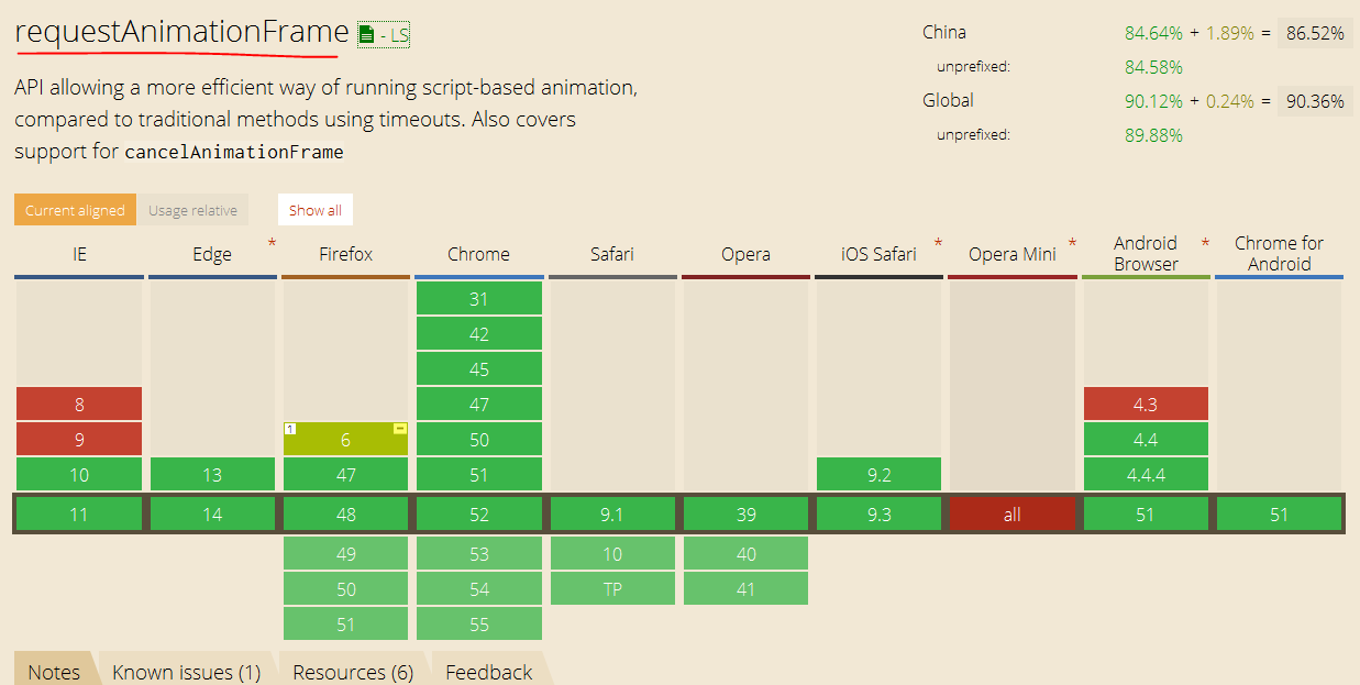
window.requestAnimationFrame
https://developer.mozilla.org/zh-CN/docs/Web/API/Window/requestAnimationFrame
window.requestAnimationFrame
https://html.spec.whatwg.org/multipage/webappapis.html#animation-frames
HTML
Living Standard — Last Updated 2 September 2016
Web Performance Working Group
https://www.w3.org/TR/2011/WD-animation-timing-20110602/
Timing control for script-based animations
W3C Working Draft 2 June 2011
https://www.w3.org/TR/animation-timing/
Timing control for script-based animations
W3C Working Group Note 22 September 2015
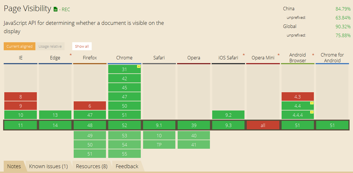
https://www.w3.org/TR/2011/WD-page-visibility-20110602/
Page Visibility
W3C Working Draft 2 June 2011
https://www.w3.org/TR/page-visibility/
Page Visibility (Second Edition)
W3C Recommendation 29 October 2013
https://css-tricks.com/using-requestanimationframe/
http://javascript.ruanyifeng.com/htmlapi/requestanimationframe.html
http://www.zhangxinxu.com/wordpress/2013/09/css3-animation-requestanimationframe-tween-动画算法
1
1
1
1
1
1
1
1
1
HTML5 动效的更多相关文章
- 踏得网互联网新技术垂直搜索服务和分享 - HTML5动效/特效/动画搜索
版权声明:本文为博主原创文章,未经博主同意不得转载. https://blog.csdn.net/iefreer/article/details/34917729 当前主流搜索引擎在解决互联网技术创意 ...
- 玩转HTML5移动页面(动效篇)(转载)
本文转载自: 玩转HTML5移动页面(动效篇)
- 玩转HTML5移动页面(动效篇)
原文:http://www.grycheng.com/?p=458 作为一名前端,在拿到设计稿时你有两种选择: 1.快速输出静态页面 2.加上高级大气上档次狂拽炫酷屌炸天的动画让页面动起来 作为一个有 ...
- 玩转HTML5移动页面(动效篇)
为一名前端,在拿到设计稿时你有两种选择: 快速输出静态页面 加上高级大气上档次狂拽炫酷屌炸天的动画让页面动起来 作为一个有志向的前端,当然是选2啦!可是需求时间又很短很短,怎么办呢? 这次就来谈谈一些 ...
- 转:玩转HTML5移动页面(动效篇)
作为一名前端,在拿到设计稿时你有两种选择: 1.快速输出静态页面 2.加上高级大气上档次狂拽炫酷屌炸天的动画让页面动起来 作为一个有志向的前端,当然是选2啦!可是需求时间又很短很短,怎么办呢? 这次就 ...
- Web动效研究与实践
随着CSS3和HTML5的发展,越来越多狂拽炫酷叼炸天的动效在网页设计上遍地开花,根据最新的浏览器市场份额报告,IE6的份额已经降到了5.21%,这简直是一个喜大普奔的消息,做动效可以完全不care低 ...
- H5动效的常见制作手法
众所周知,一个元素,动往往比静更吸引眼球: 一套操作界面,合适的动态交互反馈能给用户带来更好的操作体验: 一个H5运营宣传页,炫酷的动画特效定能助力传播和品牌打造. 近两年,小到loading动画,表 ...
- iOS开发Facebook POP动效库使用教程
如果说Origami这款动效原型工具是Facebook Paper的幕后功臣,那么POP便是Origami的地基.感谢Facebook开源了POP动效库,让人人都能制作出华丽的动效.我们只需5步,便能 ...
- 一个绚丽的loading动效分析与实现!
最终效果如下 从效果上看,我们需要考虑以下几个问题: 1.叶子的随机产生: 2.叶子随着一条正余弦曲线移动: 3.叶子在移动的时候旋转,旋转方向随机,正时针或逆时针: 4.叶子遇到进度条,似乎是融合进 ...
随机推荐
- IE双击打不开解决办法
方法1 [百度电脑专家]一键修复 建议下载并安装[百度电脑专家],官网:http://zhuanjia.baidu.com .打开[百度电脑专家],在搜索框内输入"IE修复",在搜 ...
- jQuery 选项卡切换过渡效果
<!DOCTYPE html> <head> <meta charset="utf-8"> <title></title> ...
- LinuxCentos7下安装Mysql8.x以及密码修改
LinuxCentos7下安装Mysql以及密码修改 引言: 之前都是用Docker或者yum自动安装,这次主要是下载压缩包解压安装,中间也有些小波折,记录如下,以供参考: 1.删除旧的MySQL 检 ...
- Scalable Go Scheduler Design Doc
https://docs.google.com/document/d/1TTj4T2JO42uD5ID9e89oa0sLKhJYD0Y_kqxDv3I3XMw/ Scalable Go Schedul ...
- 20201102gryz模拟赛解题报告
简述我的苦逼做题经历 考的是NOIP2017day1原题, 开始看到小凯的疑惑时感觉特水,因为这题初中老师讲过, 很nice的秒切 T2发现是个大模拟,虽然字符串不太会用,但起码题意很好理解 边打代码 ...
- 【题解】CF952F 2 + 2 != 4
题目传送门 首先这道题没有翻译,这是很奇怪的,经过了(bai)查(du)字(fan)典(yi)之后,你会发现,什么用都没有-- 楼下的 dalao 们给的解释非常的模糊(果然还是我太弱了),于是我自己 ...
- LOJ10076
USACO 2006 Nov. Gold 贝茜把家搬到了一个小农场,但她常常回到 FJ 的农场去拜访她的朋友.贝茜很喜欢路边的风景,不想那么快地结束她的旅途,于是她每次回农场,都会选择第二短的路径,而 ...
- GeoJson的生成与解析,JSON解析,Java读写geojson,geotools读取shp文件,Geotools中Geometry对象与GeoJson的相互转换
GeoJson的生成与解析 一.wkt格式的geometry转成json格式 二.json格式转wkt格式 三.json格式的数据进行解析 四.Java读写geojson 五.geotools读取sh ...
- java架构《Socket网络编程基础篇》
本章主要介绍Socket的基本概念,传统的同步阻塞式I/O编程,伪异步IO实现,学习NIO的同步非阻塞编程和NIO2.0(AIO)异步非阻塞编程. 目前为止,Java共支持3种网络编程模型:BIO.N ...
- 修改PowerShell的输入提示符
如下图,"PS C:\Windows\System32\drivers\etc>" 就是PowerShell的输入提示符,默认是显示"PS"加上当前所在的 ...