使用Graphlab参加Kaggle比赛(2017-08-20 发布于知乎)

之前用学生证在graphlab上申了一年的graphlab使用权(华盛顿大学机器学习课程需要)然后今天突然想到完全可以用这个东东来参加kaggle.
下午参考了一篇教程,把notebook上面的写好了
本文很多代码参考了turi官网的一个教程,有兴趣的同学可以去看原版 https://turi.com/learn/gallery/notebooks/who_survived_the_titanic.html
代码
import graphlab as gl

%matplotlib inline

import matplotlib.pyplot as mpl

mpl.rcParams['figure.figsize']=(15.0,8.0)

import numpy as np
第一步:数据探索
导入数据
train = graphlab.SFrame.read_csv('train.csv')
数据探索与数据可视化
#看看除了Survived这一列以外其他列的缺值情况

columns = ("Pclass", "Name", "Sex", "Age", "SibSp", "Parch", "Ticket", "Fare", "Cabin", "Embarked")

not_null=[sum(1 for el in train[column] if el or el == 0)for column in columns]

null = [len(train) - el for el in not_null]

#数字指代第几列

indexes = np.arange(len(columns))

width = 0.5

#用柱形图表示缺值情况

not_null_bar = mpl.bar(indexes, not_null, width, color='green', edgecolor='white', alpha=0.8)#非空为绿,底色为白

null_bar = mpl.bar(indexes, null, width, color='red', edgecolor='white', bottom=not_null, alpha=0.8)#空值为红,底色为白

mpl.xlim( indexes[0] - 0.5, indexes[-1] + 1)#横轴的范围

#柱形图标题

mpl.title('Null values for each column', fontsize=20, weight='bold')

#x轴单位长度

mpl.xticks(indexes + width/2., columns, fontsize=16)

#y轴单位长度

mpl.yticks(np.arange(0,1200,100))

#右上角为图例

mpl.legend( (not_null_bar[0], null_bar[0]), ('Not Null', 'Null') )
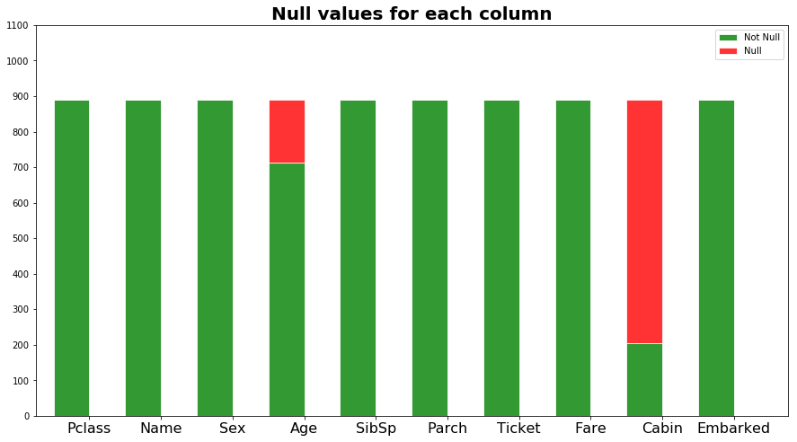
观察上图我们知道Age列有少量缺值,Cabin列有大量的缺值,于是我们需要补全Age缺值,但是把Cabin列整个忽略
直接用Age的均值补全空值
train = train.fillna('Age',train['Age'].mean())

#看看除了Survived这一列以外其他列的缺值情况

columns = ("Pclass", "Name", "Sex", "Age", "SibSp", "Parch", "Ticket", "Fare", "Cabin", "Embarked")

not_null=[sum(1 for el in train[column] if el or el == 0)for column in columns]

null = [len(train) - el for el in not_null]

#数字指代第几列

indexes = np.arange(len(columns))

width = 0.5

#用柱形图表示缺值情况

not_null_bar = mpl.bar(indexes, not_null, width, color='green', edgecolor='white', alpha=0.8)#非空为绿,底色为白

null_bar = mpl.bar(indexes, null, width, color='red', edgecolor='white', bottom=not_null, alpha=0.8)#空值为红,底色为白

mpl.xlim( indexes[0] - 0.5, indexes[-1] + 1)#横轴的范围

#柱形图标题

mpl.title('Null values for each column', fontsize=20, weight='bold')

#x轴单位长度

mpl.xticks(indexes + width/2., columns, fontsize=16)

#y轴单位长度

mpl.yticks(np.arange(0,1200,100))

#右上角为图例

mpl.legend( (not_null_bar[0], null_bar[0]), ('Not Null', 'Null') )

我们看看Pclass与生存率的关系
passenger_class = train["Pclass"].astype(str)

#观察每个Pclass的存活率

#用groupby方法

class_distribution = train.groupby(["Pclass", "Survived"], {'count':gl.aggregate.COUNT()})

#用0和1过滤出生存和死亡

survived = class_distribution.filter_by(1,'Survived').sort("Pclass")

died = class_distribution.filter_by(0,'Survived').sort("Pclass")

width = 0.5

#柱形图的参数

survived_bar = mpl.bar(survived["Pclass"], survived["count"], width, color='green', edgecolor='white', alpha=0.8)

died_bar = mpl.bar(died["Pclass"], died["count"], width, color='red', edgecolor='white', bottom=survived["count"], alpha=0.8)

mpl.xlim( indexes[0] - 0.5, indexes[-1] + 1)

mpl.title('Survived by Passengers Class', fontsize=20, weight='bold')

mpl.xticks(survived["Pclass"] + width/2., survived["Pclass"], fontsize=16)

mpl.xlim(0.5,4)

mpl.yticks(np.arange(0,600,50))

mpl.legend( (survived_bar[0], died_bar[0]), ('Survived', 'Died') )

for ind in np.arange(len(survived)):

    ind = int(ind)

    x = 1 + ind + width / 2.

    y = survived["count"][ind] + died["count"][ind] + 10

    percentage = survived["count"][ind] / float( survived["count"][ind] + died["count"][ind]) * 100

    mpl.text(x, y, "%5.2f%%" % percentage, fontsize=20, ha='center')
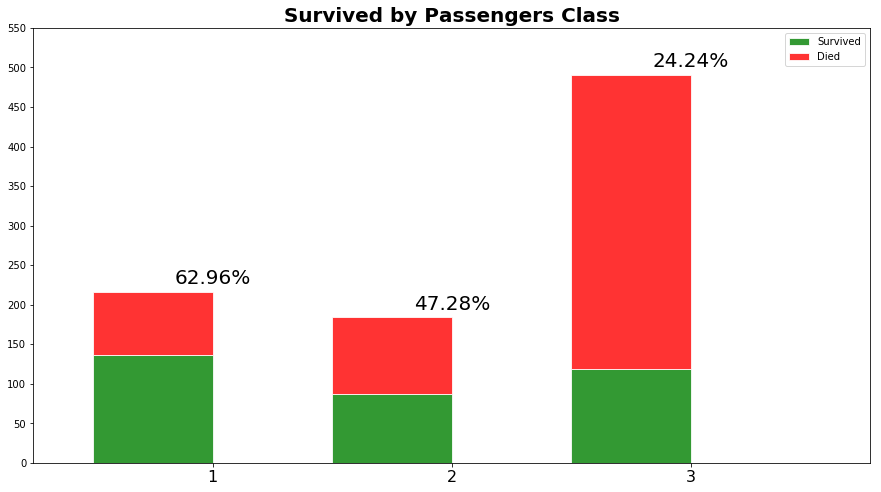
由此可见,Pclass的存活率从1到3逐次下降
我们看看性别与生存率的关系
sex_distribution = train.groupby(["Sex", "Survived"], {'count':gl.aggregate.COUNT()})

survived = sex_distribution.filter_by(1,'Survived').sort("Sex")

died = sex_distribution.filter_by(0,'Survived').sort("Sex")

indexes = np.arange(len(survived["Sex"]))

width = 0.5

survived_bar = mpl.bar(indexes, survived["count"], width, color='green', edgecolor='white', alpha=0.8)

died_bar = mpl.bar(indexes, died["count"], width, color='red', edgecolor='white', bottom=survived["count"], alpha=0.8)

mpl.xlim( indexes[0] - 0.5, indexes[-1] + 1)

mpl.title('Survived by Sex', fontsize=20, weight='bold')

survived["Sex"] = [sex.capitalize() for sex in survived["Sex"]]

mpl.xticks(indexes + width/2., survived["Sex"], fontsize=16)

mpl.xlim(-0.5,2)

mpl.yticks(np.arange(0,700, 50))

mpl.legend( (survived_bar[0], died_bar[0]), ('Survived', 'Died') )

for ind in indexes:

    ind = int(ind)

    x = ind + width / 2.

    y = survived["count"][ind] + died["count"][ind] + 10

    percentage = survived["count"][ind] / float( survived["count"][ind] + died["count"][ind]) * 100

    mpl.text(x, y, "%5.2f%%" % percentage, fontsize=20, ha='center')

mpl.show()

我们看看年龄与生存率的关系
为了更加直观的体现成人与小孩的区别,我再增加一个"Categorized_Age"列
我们使用apply方法来对每个元素进行作用,小于18岁称为小孩,其余均为大人。
#增加列,18以下称为child

train['Categorized_Age'] = train['Age'].apply(lambda x: "Child" if x <= 18 else "Adult")

#用groupby方法把二者关联

age_distribution = train.groupby(["Categorized_Age", "Survived"], {'count':gl.aggregate.COUNT()}).dropna()

#过滤数据

survived = age_distribution.filter_by(1,'Survived').sort("Categorized_Age")

died = age_distribution.filter_by(0,'Survived').sort("Categorized_Age")

#柱形图参数设置

indexes = np.arange(len(survived["Categorized_Age"]))

width = 0.5

survived_bar = mpl.bar(indexes, survived["count"], width, color='green', edgecolor='white', alpha=0.8)

died_bar = mpl.bar(indexes, died["count"], width, color='red', edgecolor='white', bottom=survived["count"], alpha=0.8)

mpl.xlim( indexes[0] - 0.5, indexes[-1] + 1)

mpl.title('Survived by Age Categorization', fontsize=20, weight='bold')

survived["Categorized_Age"] = [sex.capitalize() for sex in survived["Categorized_Age"]]

mpl.xticks(indexes + width/2., survived["Categorized_Age"], fontsize=16)

mpl.xlim(-0.5,2)

mpl.yticks(np.arange(0,700, 50))

mpl.legend( (survived_bar[0], died_bar[0]), ('Survived', 'Died') )

for ind in indexes:

    ind = int(ind)

    x = ind + width / 2.

    y = survived["count"][ind] + died["count"][ind] + 10

    percentage = survived["count"][ind] / float( survived["count"][ind] + died["count"][ind]) * 100

    mpl.text(x, y, "%5.2f%%" % percentage, fontsize=20, ha='center')

mpl.show()
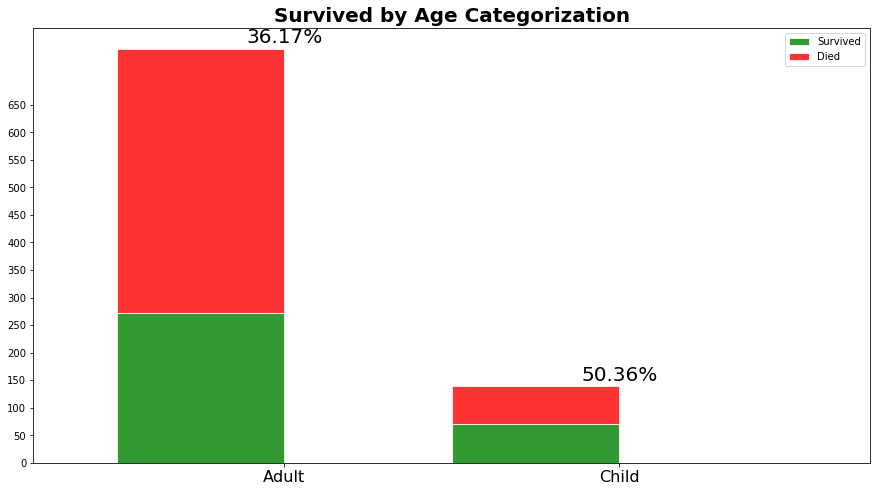
由上图可知,未成年人的存活率远大于成人
我们看看家眷人数与生存率的关系
下面的代码算出了家眷人数与生存率的关系。第一个for循环(line 6)是画图需要,遍历分组完生存率的各个家庭,若某个规模的所有家庭没有人生存,还是要加上一列。事实上,bar方法(line 12,13) 希望在每一个家庭规模都要对应的生存率,但是有5或者8个家眷的家庭都gg了。因此,我们用append方法 (line 8) 增加了两列,生存率记为0。
sibling_spouses = train["SibSp"].astype(str)

sibsp_distribution = train.groupby(["SibSp", "Survived"], {'count':gl.aggregate.COUNT()}).sort(["SibSp"])

survived = sibsp_distribution.filter_by(1,"Survived")

died = sibsp_distribution.filter_by(0,"Survived")

for sibsp in sibsp_distribution["SibSp"]:

    if not survived.filter_by(sibsp, "SibSp"):

        survived = survived.append(gl.SFrame({'SibSp': [sibsp], 'Survived': [1], 'count':[0]}))

width = 0.5

survived_bar = mpl.bar(survived["SibSp"], survived["count"], width, color='green', edgecolor='white', alpha=0.8)

died_bar = mpl.bar(died["SibSp"], died["count"], width, color='red', edgecolor='white', bottom=survived["count"], alpha=0.8)

mpl.xlim( indexes[0] - 0.5, indexes[-1] + 1)

mpl.title('Survived by SibSp', fontsize=20, weight='bold')

mpl.xticks(survived["SibSp"] + width/2., survived["SibSp"], fontsize=16)

mpl.xlim(-0.5,9)

mpl.yticks(np.arange(0,750,50))

mpl.xlabel("SibSp", fontsize=16)

mpl.legend( (survived_bar[0], died_bar[0]), ('Survived', 'Died') )

for ind in np.arange(len(survived)):

    ind = int(ind)

    x = survived["SibSp"][ind] + width / 2.

    y = survived["count"][ind] + died["count"][ind] + 10

    percentage = survived["count"][ind] / float( survived["count"][ind] + died["count"][ind]) * 100

    mpl.text(x, y, "%5.2f%%" % percentage, fontsize=20, ha='center')

mpl.show()

由上图可知,有一个配偶的家庭生存率最高,三口之家次之,接下来才是单身狗,而家眷超过三人生存希望渺茫.
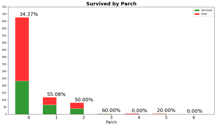
我们看看有没有孩子与生存率的关系
parents_children = train["Parch"].astype(str)

parch_distribution = train.groupby(["Parch", "Survived"], {'count':gl.aggregate.COUNT()})

survived = parch_distribution.filter_by(1,"Survived")

died = parch_distribution.filter_by(0,"Survived")

for parch in parch_distribution["Parch"]:

    if not survived.filter_by(parch, "Parch"):

        survived = survived.append(gl.SFrame({'Parch': [parch], 'Survived': [1], 'count':[0]}))

survived = survived.sort("Parch")

died = died.sort("Parch")

width = 0.5

survived_bar = mpl.bar(survived["Parch"], survived["count"], width, color='green', edgecolor='white', alpha=0.8)

died_bar = mpl.bar(died["Parch"], died["count"], width, color='red', edgecolor='white', bottom=survived["count"], alpha=0.8)

mpl.xlim( indexes[0] - 0.5, indexes[-1] + 1)

mpl.title('Survived by Parch', fontsize=20, weight='bold')

mpl.xticks(survived["Parch"] + width/2., survived["Parch"], fontsize=16)

mpl.xlim(-0.5,7)

mpl.yticks(np.arange(0,800,50))

mpl.xlabel("Parch", fontsize=16)

mpl.legend( (survived_bar[0], died_bar[0]), ('Survived', 'Died') )

for ind in np.arange(len(survived)):

    ind = int(ind)

    x = survived["Parch"][ind] + width / 2.

    y = survived["count"][ind] + died["count"][ind] + 10

    percentage = survived["count"][ind] / float( survived["count"][ind] + died["count"][ind]) * 100

    mpl.text(x, y, "%5.2f%%" % percentage, fontsize=20, ha='center')

mpl.show()
我们看看船费与生存率的关系(有钱人可能有特权
fare = train["Fare"]

survived = train.filter_by(1,'Survived')["Fare"]

died = train.filter_by(0,'Survived')["Fare"]

data_to_plot = [died, survived]

bp = mpl.boxplot(data_to_plot,patch_artist=True, vert=0)

## change outline color, fill color and linewidth of the boxes

for box in bp['boxes']:

    # change outline color

    box.set( color='#7570b3', linewidth=2)

    # change fill color

    box.set( facecolor = '#1b9e77' )

## change color and linewidth of the whiskers

for whisker in bp['whiskers']:

    whisker.set(color='#7570b3', linewidth=2)

## change color and linewidth of the caps

for cap in bp['caps']:

    cap.set(color='#7570b3', linewidth=2)

## change color and linewidth of the medians

for median in bp['medians']:

    median.set(color='#b2df8a', linewidth=2)

## change the style of fliers and their fill

for flier in bp['fliers']:

    flier.set(marker='o', color='#e7298a', alpha=0.5)

mpl.yticks([1,2],['Died', 'Survived'], fontsize=20)

mpl.xticks(np.arange(0,700, 20))

mpl.xlim(-10,515)

mpl.title("Survived by Fare", fontsize=20, weight='bold')

mpl.show()

这个图是反着看的,活下来的人跟死去的人花的船费对比。活下来的人普遍花了较多的船费,均值在35刀。而死去的人花费均值才几美刀。(注意有个花500多刀的真·土豪
我们看看上船渡口与生存率的关系
port = train["Embarked"].apply(

                                    lambda el: el + " (S = Southampton)" if el == "S"

                                        else ( el + " (C = Cherbourg)" if el == "C"

                                         else (el + " (Q = Queenstown)" if el == "Q" else None)))

port.tail(1) # force the lambda to materialize before .show() is processed

port.show()

embarked_distribution = train.groupby(["Embarked", "Survived"], {'count':gl.aggregate.COUNT()}).dropna()

survived = embarked_distribution.filter_by(1,'Survived').sort("Embarked")

survived = survived[1:]

died = embarked_distribution.filter_by(0,'Survived').sort("Embarked")

indexes = np.arange(len(survived["Embarked"]))

width = 0.5

survived_bar = mpl.bar(indexes, survived["count"], width, color='green', edgecolor='white', alpha=0.8)

died_bar = mpl.bar(indexes, died["count"], width, color='red', edgecolor='white', bottom=survived["count"], alpha=0.8)

mpl.xlim( indexes[0] - 0.5, indexes[-1] + 1)

mpl.title('Survived by Port of Embarkation', fontsize=20)

labels = [ el + "\n(S = Southampton)" if el == "S" else ( el + "\n(C = Cherbourg)" if el == "C" else el + "\n(Q = Queenstown)") for el in survived["Embarked"]]

mpl.xticks(np.arange(len(survived["Embarked"])) + width/2.,labels, fontsize=16)

for ind in indexes:

    ind = int(ind)

    x = ind + width / 2.

    y = survived["count"][ind] + died["count"][ind] + 10

    percentage = survived["count"][ind] / float( survived["count"][ind] + died["count"][ind]) * 100

    mpl.text(x, y, "%5.2f%%" % percentage, fontsize=20, ha='center')

mpl.legend( (survived_bar[0], died_bar[0]), ('Survived', 'Died') )

mpl.show()
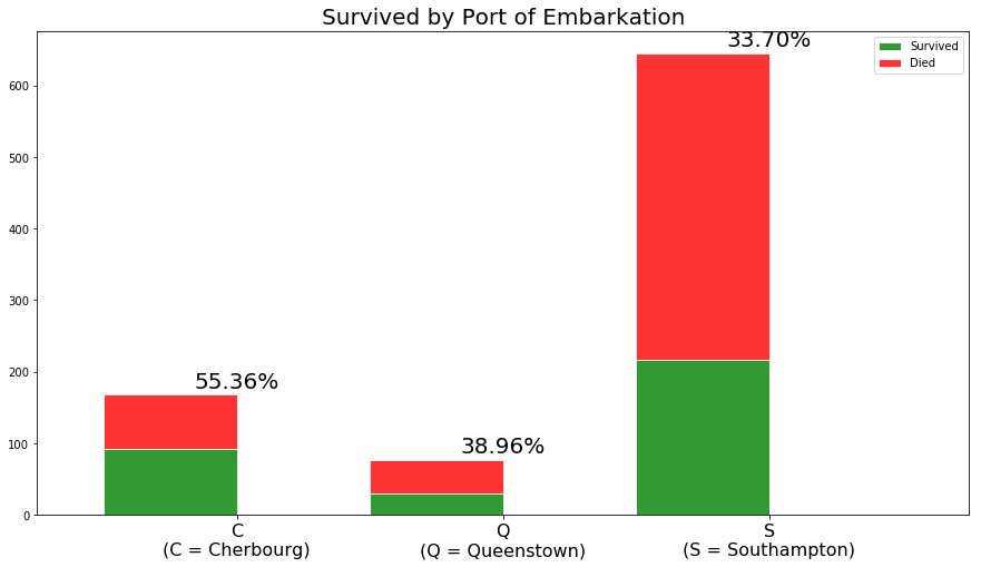
所以Cherbourg上船的人存活率巨高……我个人不太明白为什么
第二步:模型构建
在Embarked列中有一些缺值,我们补全一下
train["Embarked"] = train["Embarked"].apply(lambda x: x if x != '' else "S")

port_of_embarkation = train["Embarked"]

port_of_embarkation.tail(1)

port_of_embarkation.show()
在训练集中再取80%来训练模型,20%来验证模型。
train_set, test_set = train.random_split(0.8, seed=4)

print "Rows for training:", train_set.num_rows()

print "Rows for testing:", test_set.num_rows()
试一下 gradient boosted tree 这个模型
model_4 = gl.boosted_trees_regression.create(train_set,target='Survived',

                                  features=['Sex', 'Age', 'Pclass', 'SibSp', 'Parch', 'Embarked', 'Fare'])

result_4 = model_4.evaluate(test_set)

print result_4
下面是训练过程PROGRESS: Creating a validation set from 5 percent of training data. This may take a while.
You can set ``validation_set=None`` to disable validation tracking. Boosted trees regression:
--------------------------------------------------------
Number of examples : 663
Number of features : 7
Number of unpacked features : 7
+-----------+--------------+--------------------+----------------------+---------------+-----------------+
| Iteration | Elapsed Time | Training-max_error | Validation-max_error | Training-rmse | Validation-rmse |
+-----------+--------------+--------------------+----------------------+---------------+-----------------+
| 1 | 0.094067 | 0.640132 | 0.640625 | 0.413718 | 0.452089 |
| 2 | 0.095066 | 0.736341 | 0.741699 | 0.361147 | 0.435120 |
| 3 | 0.097067 | 0.799792 | 0.795940 | 0.326181 | 0.414205 |
| 4 | 0.098068 | 0.843834 | 0.853179 | 0.300373 | 0.418672 |
| 5 | 0.099068 | 0.866550 | 0.875894 | 0.284084 | 0.414071 |
| 6 | 0.100069 | 0.886572 | 0.895917 | 0.268531 | 0.401603 |
+-----------+--------------+--------------------+----------------------+---------------+-----------------+
{'max_error': 0.9767722487449646, 'rmse': 0.3790493668897309}
三、导入测试集进行预测
test = graphlab.SFrame.read_csv('test.csv')

model_4.predict(test)

dtype: float

Rows: 418

[0.24605900049209595, 0.1579868197441101, 0.09492728114128113, 0.08076220750808716, 0.820347249507904, 0.13742545247077942, 0.46745458245277405, 0.08334535360336304, 0.6385629177093506, 0.053301453590393066, 0.7933655977249146, 0.10734456777572632, 0.9794546365737915, 0.0696893036365509, 0.9803991913795471, 0.9651352167129517, 0.08926722407341003, 0.32400867342948914, 0.8363758325576782, 0.1579868197441101, 0.4781973361968994, 0.6420668363571167, 0.4161583185195923, 0.28341546654701233, 0.9170076847076416, 0.0696893036365509, 0.9794546365737915, 0.17743894457817078, 0.5841416120529175, 0.7112432718276978, 0.0696893036365509, 0.09834089875221252, 0.7118383646011353, 0.36395323276519775, 0.47720423340797424, 0.2933708429336548, 0.4699748754501343, 0.16753268241882324, 0.0941736102104187, 0.5083406567573547, 0.2918650507926941, 0.7348397970199585, 0.10613331198692322, 0.9710206985473633, 0.9803991913795471, 0.14958679676055908, 0.42003297805786133, 0.5664023756980896, 0.9672679901123047, 0.7332731485366821, 0.5267215967178345, 0.1717779040336609, 0.9495010375976562, 0.9067643880844116, 0.8308284282684326, 0.05739110708236694, 0.08792659640312195, 0.11708483099937439, 0.8308284282684326, 0.9750292301177979, 0.06759494543075562, 0.13685157895088196, 0.10684752464294434, 0.7940642237663269, 0.1582772135734558, 0.7426018714904785, 0.7501979470252991, 0.1021573543548584, 0.2818759083747864, 0.8806270360946655, 0.7940642237663269, 0.06759494543075562, 0.7951251268386841, 0.2818759083747864, 0.9750292301177979, 0.28711044788360596, 0.8174170255661011, 0.9488879442214966, 0.13685157895088196, 0.7940642237663269, 0.893699049949646, 0.04857367277145386, 0.20609065890312195, 0.7933655977249146, 0.6543059349060059, 0.8308284282684326, 0.9047337770462036, 0.16753268241882324, 0.8481748104095459, 0.9108253717422485, 0.5572522878646851, 0.7125066518783569, 0.35652855038642883, 0.8174170255661011, 0.28670477867126465, 0.28864753246307373, 0.9726588726043701, 0.16057392954826355, 0.70356285572052, 0.1119779646396637, ... ]
使用Graphlab参加Kaggle比赛(2017-08-20 发布于知乎)的更多相关文章
- Kaggle比赛:从何着手?
介绍 参加Kaggle比赛,我必须有哪些技能呢? 你有没有面对过这样的问题?最少在我大二的时候,我有过.过去我仅仅想象Kaggle比赛的困难度,我就感觉害怕.这种恐惧跟我怕水的感觉相似.怕水,让我无法 ...
- kaggle比赛流程(转)
一.比赛概述 不同比赛有不同的任务,分类.回归.推荐.排序等.比赛开始后训练集和测试集就会开放下载. 比赛通常持续 2 ~ 3 个月,每个队伍每天可以提交的次数有限,通常为 5 次. 比赛结束前一周是 ...
- Kaggle比赛总结
做完 Kaggle 比赛已经快五个月了,今天来总结一下,为秋招做个准备. 题目要求:根据主办方提供的超过 4 天约 2 亿次的点击数据,建立预测模型预测用户是否会在点击移动应用广告后下载应用程序. 数 ...
- 用python参加Kaggle的经验总结【转】
用python参加Kaggle的经验总结 转载自:http://www.jianshu.com/p/32def2294ae6,作者 JxKing 最近挤出时间,用python在kaggle上试了 ...
- 用python参加Kaggle的些许经验总结(收藏)
Step1: Exploratory Data Analysis EDA,也就是对数据进行探索性的分析,一般就用到pandas和matplotlib就够了.EDA一般包括: 每个feature的意义, ...
- Kaggle比赛冠军经验分享:如何用 RNN 预测维基百科网络流量
Kaggle比赛冠军经验分享:如何用 RNN 预测维基百科网络流量 from:https://www.leiphone.com/news/201712/zbX22Ye5wD6CiwCJ.html 导语 ...
- http://www.cnblogs.com/jqyp/archive/2010/08/20/1805041.html
http://www.cnblogs.com/jqyp/archive/2010/08/20/1805041.html
- Visual Studio 2017正式版发布全纪录
又是一年发布季,微软借着Visual Studio品牌20周年之际,于美国太平洋时间2017年3月7日9点召开发布会议,宣布正式发布新一代开发利器Visual Studio 2017.同时发布的还有 ...
- .NET Core 2.0版本预计于2017年春季发布
英文原文: NET Core 2.0 Planned for Spring 2017 微软项目经理 Immo Landwerth 公布了即将推出的 .NET Core 2.0 版本的细节,该版本预计于 ...
随机推荐
- 对http请求进行过滤处理,转换成接收着需要的格式
需要在Global.asax的Application中进行初始化处理 这样:GlobalConfiguration.Configuration.MessageHandlers.Add(new Defa ...
- Mysql CPU使用率长期100%的解决思路备忘
最近一台服务器的CPU使用率长期保持在100%的状态,查看进程发现是Mysql服务导致的.于是搜索各方资料,终于成功解决问题.备忘以及分享一下,希望可以帮助各位新手朋友. (服务器运行环境是Windo ...
- Python爬虫学习代码
[1]用一个简单的程序来显示Python的数字类型. code: class ShowNumType(object): def __init__(self): self.showInt() self. ...
- HBase部署与使用
HBase部署与使用 概述 HBase的角色 HMaster 功能: 监控RegionServer 处理RegionServer故障转移 处理元数据的变更 处理region的分配或移除 在空闲时间进行 ...
- ASP.NET登录验证码解决方案
目录 #验证码效果图 #代码 0.html代码 1.Handler中调用验证码生成类 2.验证码图片绘制生成类 3.高斯模糊算法类 #注意 #参考 在web项目中,为了防止登录被暴力破解,需要在登录的 ...
- python课堂整理10---局部变量与全局变量
一.局部变量与全局变量 1. 没有缩进,顶头写的变量为全局变量 2. 在子程序里定义的变量为局部变量 3. 只有函数能把变量私有化 name = 'lhf' #全局变量 def change_name ...
- 【转】8年!我在OpenStack路上走过的坑。。。
8年!我在OpenStack路上走过的坑... 摘要: 2010年10月,OpenStack发布了第一个版本:上个月,发布了它的第18个版本Rocky.几年前气氛火爆,如今却冷冷清清.Rocky版本宣 ...
- Flink实战(八) - Streaming Connectors 编程
1 概览 1.1 预定义的源和接收器 Flink内置了一些基本数据源和接收器,并且始终可用.该预定义的数据源包括文件,目录和插socket,并从集合和迭代器摄取数据.该预定义的数据接收器支持写入文件和 ...
- js - 原生ajax访问后台读取数据并显示在页面上
1.前台调用ajax访问后台方法,并接收数据 <%@ page contentType="text/html;charset=UTF-8" language="ja ...
- 段落超出div部分隐藏显示
overflow: hidden; white-space: nowrap; text-overflow: ellipsis;