11-[CSS]-标准文档流,display,浮动,清除浮动,overflow
1、标准文档流
<!DOCTYPE html>
<html lang="en">
<head>
<meta charset="UTF-8">
<title></title>
<style type="text/css">
span{
font-size: 50px;
}
</style>
</head>
<body> <div>
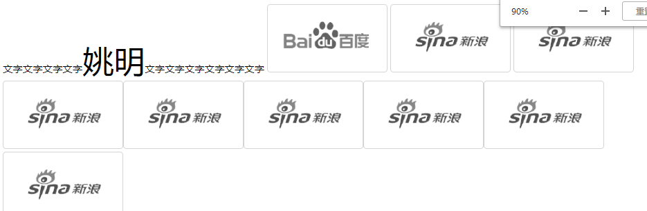
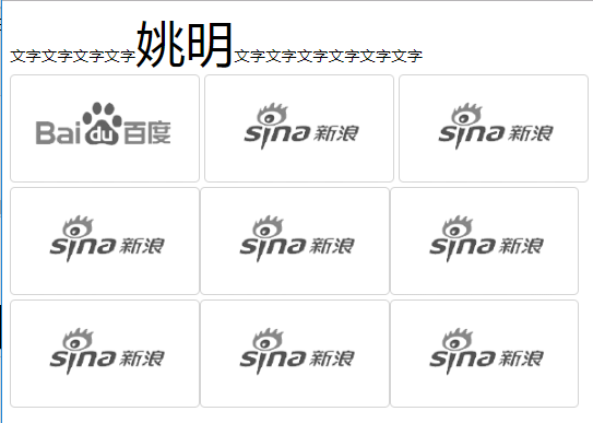
文字文字文字文字<span>姚明</span>文字文字文字文字文字文字
<img src="./images/企业1.png" alt="">
<img src="./images/企业2.png" alt="">
<img src="./images/企业2.png" alt="">
<img src="./images/企业2.png" alt=""><img src="./images/企业2.png" alt=""><img src="./images/企业2.png" alt=""><img src="./images/企业2.png" alt=""><img src="./images/企业2.png" alt=""><img src="./images/企业2.png" alt="">
</div> </body>
</html>
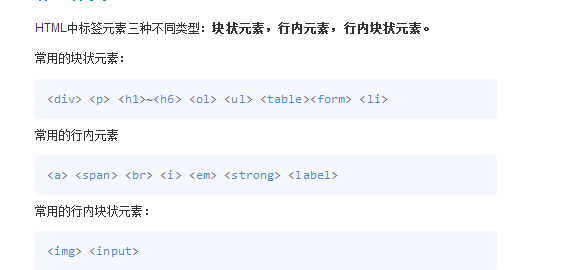
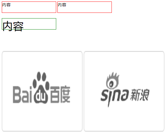
2、display:行内元素与块级元素的转换

<!DOCTYPE html>

<html lang="cn">

<head>

    <meta charset="UTF-8">

    <title>display</title>

    <style type="text/css">

        div{

            width: 100px;

            height: 100px;

            background-color: red;

            /* 控制元素隐藏 不占位置 */

            /*display: none;*/

            /*控制元素隐藏 占位置 影响后面盒子的布局*/

            /*visibility: hidden;*/

            /*转为 行内块元素*/

            /*display: inline-block;*/

            /*将 块级元素转换为 行内元素 不能设置宽高*/

            display: inline;

        }

        a{

            /*display: block;*/

            /*display: inline-block;*/

            width: 300px;

            height: 300px;

            background-color: yellow;

        }

        img{

            /* 行内块元素 一般转化块级元素 */

            /*display: block;*/

            display: inline;  /*转为行内元素 依然可设置宽高 没必要转换  */

            width: 100px;

            height: 100px;

        }

    </style>

</head>

<body>

    <div>123</div>

    <div>987</div>

    <a href="#">百度一下</a>

    <img src="./images/homesmall1.png" alt="python">

</body>

</html>
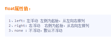
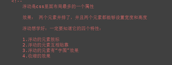
3、浮动
<!DOCTYPE html>

<html lang="cn">

<head>

    <meta charset="UTF-8">

    <title>浮动</title>

    <style type="text/css">

        .wrap div{

            width: 200px;

            height: 200px;

            background-color: red;

            border: 1px solid black;

            /*

            文档流:可见元素在文档中的显示位置;

            浮动产生的效果:

                浮动可以使元素按指定位置排列,直到遇到父元素的边界或者另一个元素的边界停止

            */

            /* left 左浮动 左侧为起始,从左往右依次排列*/

            float: left;

            /* right 右浮动 右侧为起始,从右往左依次排列  */

            /*float: right;*/

            /*float: none;*/

        }

    </style>

</head>

<body>

    <div class="wrap">

        <div>1</div>

        <div>2</div>

        <div>3</div>

        <div>4</div>

        <div>5</div>

        <div>6</div>

        <div>7</div>

        <div>8</div>

        <div>9</div>

    </div>

</body>

</html>
(1)脱离了标准文档流
<!DOCTYPE html>
<html lang="en">
<head>
<meta charset="UTF-8">
<title>浮动</title>
<style type="text/css">
*{
padding: 0;
margin: 0;
} .box1{
width: 200px;
height: 200px;
background-color: red;
float: left; }
.box2{
width: 400px;
height: 400px;
background-color: yellow; }
span{
background-color: green;
float: left;
width: 300px;
height: 50px;
}
</style>
</head>
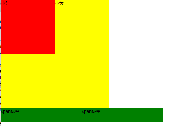
<body> <!--
脱标: 脱离了标准文档流 小红盒子浮动了,脱离了标准流,此时小黄这个盒子就是标准文档流中的第一个盒子。所以就渲染到了左上方。 浮动元素 “飘起来了” --> <div class="box1">小红</div>
<div class="box2">小黄</div> <!--
span标签不需要转成块级元素,也能够设置宽高。 所有的标签一旦设置浮动,能够并排,都不区分行内、块状元素,设置宽高
-->
<span>span标签</span>
<span>span标签</span> </body>
</html>
(2)互相贴靠
<!DOCTYPE html>
<html lang="en">
<head>
<meta charset="UTF-8">
<title></title>
<style type="text/css">
span{
background-color: red;
float: left;
}
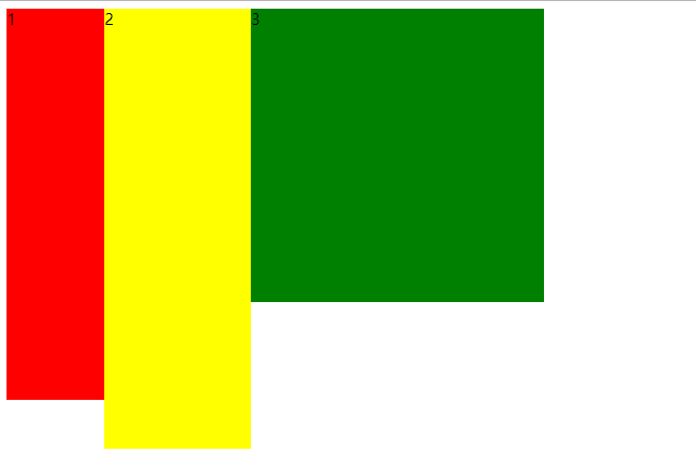
.box1{
width: 100px;
height: 400px;
float: left;
background-color: red;
}
.box2{
width: 150px; height: 450px;
float: left;
background-color: yellow;
}
.box3{
width: 300px;
height: 300px;
float: left;
background-color: green;
}
</style>
</head>
<body>
<!-- <span>文字</span>
<span>文字</span> --> <!--
如果父元素有足够的空间,那么3哥紧靠着2哥,2哥紧靠着1哥,1哥靠着边。
如果没有足够的空格,那么就会靠着1哥,如果没有足够的空间靠着1哥,自己往边靠
--> <div class="box1">1</div>
<div class="box2">2</div>
<div class="box3">3</div> </body>
</html>
(3)字围效果
<!DOCTYPE html>
<html lang="en">
<head>
<meta charset="UTF-8">
<title></title>
<style type="text/css">
*{
padding: 0;
margin: 0;
}
div{
float: left;
}
p{
background-color: #666;
}
</style>
</head>
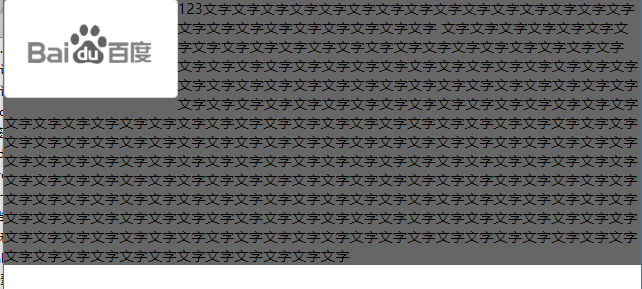
<body> <!-- 所谓字围效果:
当div浮动,p不浮动
div挡住了p,div的层级提高,但是p中的文字不会被遮盖,此时就形成了字围效果 关于浮动我们强调一点,浮动这个元素,我们初期一定要遵循一个原则 永远不是一个盒子单独浮动,要浮动就要一起浮动。
-->
<div>
<img src="./images/企业1.png" alt="">
</div>
<p>
123文字文字文字文字文字文字文字文字文字文字文字文字文字文字文字文字文字文字文字文字文字文字文字文字
文字文字文字文字文字文字文字文字文字文字文字文字文字文字文字文字文字文字文字文字文字文字
文字文字文字文字文字文字文字文字文字文字文字文字文字文字文字文字文字文字文字文字文字文字文字文字文字文字文字文字文字文字文字文字文字文字文字文字文字文字文字文字文字文字文字文字文字文字文字文字文字文字文字文字文字文字文字文字文字文字文字文字文字文字文字文字文字文字文字文字文字文字文字文字文字文字文字文字文字文字文字文字文字文字文字文字文字文字文字文字文字文字文字文字文字文字文字文字文字文字文字文字文字文字文字文字文字文字文字文字文字文字文字文字文字文字文字文字文字文字文字文字文字文字文字文字文字文字文字文字文字文字文字文字文字文字文字文字文字文字文字文字文字文字文字文字文字文字文字文字文字文字文字文字文字文字文字文字文字文字文字文字文字文字文字文字文字文字文字文字文字文字文字文字文字文字文字文字文字文字文字文字文字文字文字文字文字文字文字文字文字文字文字文字文字文字文字文字文字文字文字文字文字文字文字文字文字文字文字文字文字文字文字文字文字文字
</p> </body>
</html>
(4)收缩
<!DOCTYPE html>
<html lang="en">
<head>
<meta charset="UTF-8">
<title>Document</title>
<style type="text/css">
div{
float: left;
background-color: red;
}
</style>
</head>
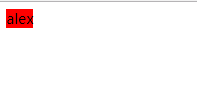
<body> <!-- 收缩:一个浮动元素。如果没有设置width,
那么就自动收缩为文字的宽度(这点跟行内元素很像) 如果想制作整个网页,就是通过浮动来实现并排
--> <div>
alex
</div> </body>
</html>
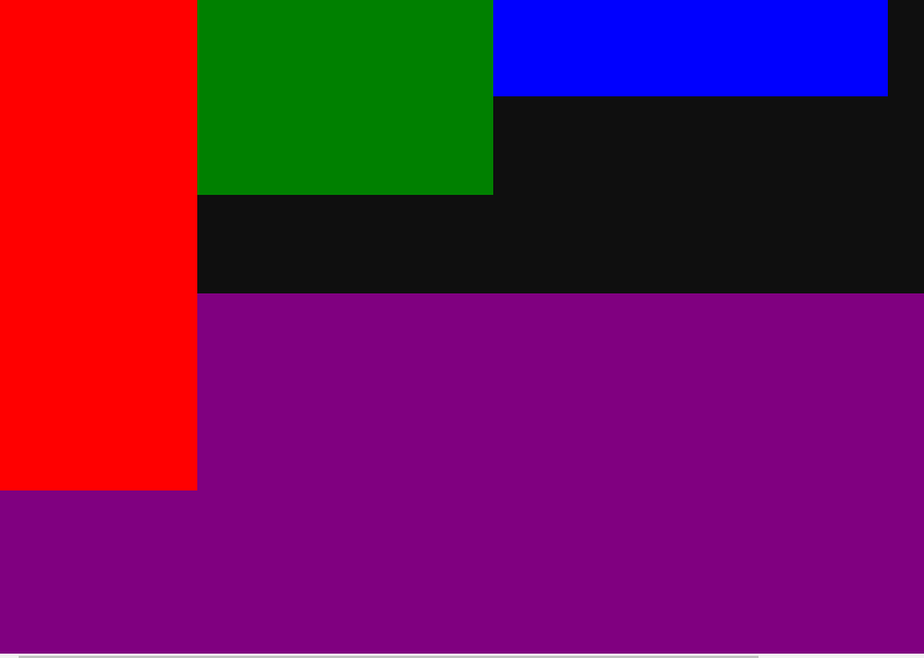
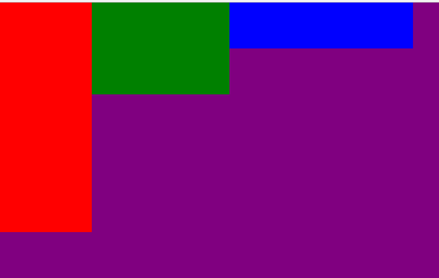
4、浮动产生的问题

<!DOCTYPE html>

<html lang="en">

<head>

    <meta charset="UTF-8">

    <title></title>

    <style type="text/css">

        *{

            padding: 0;

            margin: 0;

        }

        .father{

            width: 1126px;

            /*子元素浮动 父盒子一般不设置高度*/

              /* 通常页面布局时,父盒子的高度不需要设置,通过子盒子 自动填充父盒子;*/

            /*出现这种问题,我们要清除浮动带来影响*/

            /*height: 300px;*/

            background-color: #0f0f0f;

        }

        .box1{

            width: 200px;

            height: 500px;

            float: left;

            background-color: red;

        }

        .box2{

            width: 300px;

            height: 200px;

            float: left;

            background-color: green;

        }

        .box3{

            width: 400px;

            float: left;

            height: 100px;

            background-color: blue;

        }

        .father2{

            width: 1126px;

            height: 600px;

            background-color: purple;

        }

    </style>

</head>

<body>

    <div class="father">

        <div class="box1"></div>

        <div class="box2"></div>

        <div class="box3"></div>

    </div>

    <div class="father2"></div>

</body>

</html>
5、清除浮动
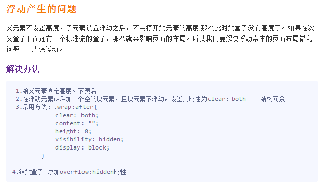
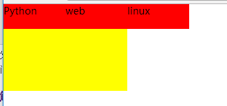
(1)父元素设定高度
<!DOCTYPE html>

<html lang="en">

<head>

    <meta charset="UTF-8">

    <title></title>

    <style type="text/css">

        *{

            padding: 0;

            margin: 0;

        }

        div{

            width: 400px;

            /*给父盒子设置高度,这种方式不灵活。如果哪天公司产品突然要改,

            要求父盒子高度变大,而且不仅一个地方哦,那么我们不可能去找源码去手动修改*/

            /*固定导航栏*/

            /*height: 40px;*/

        }

        ul{

            list-style: none;

            height: 40px;

        }

        div ul li {

            float: left;

            width: 100px;

            height: 40px;

            background-color: red;

        }

        .box{

            width: 200px;

            height: 100px;

            background-color: yellow;

        }

    </style>

</head>

<body>

    <div>

        <ul>

            <li>Python</li>

            <li>web</li>

            <li>linux</li>

        </ul>

    </div>

    <div class="box">

    </div>

</body>

</html>
(2)内墙法
<!DOCTYPE html>

<html lang="en">

<head>

    <meta charset="UTF-8">

    <title></title>

    <style type="text/css">

        *{

            padding: 0;

            margin: 0;

        }

        ul{

            list-style: none;

        }

        div{

            width: 400px;

        }

        div ul li {

            float: left;

            width: 100px;

            height: 40px;

            background-color: red;

        }

        .box{

            width: 200px;

            height: 100px;

            background-color: yellow;

        }

        .clear{

            clear: both;

        }

    </style>

</head>

<body>

    <div>

        <ul>

            <li>Python</li>

            <li>web</li>

            <li>linux</li>

            <!-- 给浮动元素最后面加一个空的div 并且该元素不浮动 ,然后设置clear:both,就会撑开盒子,清除别人对我的浮动影响-->

            <!-- 内墙法 -->

            <!-- 无缘无故加了div元素  结构冗余 -->

        </ul>

        <div class="clear"></div>

    </div>

    <div class="box">

    </div>

</body>

</html>

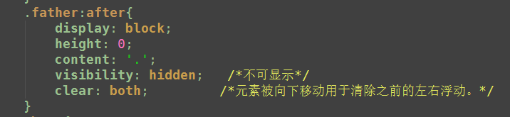
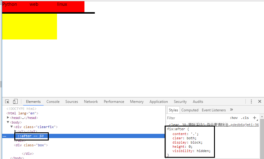
(3)伪元素after法
<!DOCTYPE html>

<html lang="en">

<head>

    <meta charset="UTF-8">

    <title>伪元素清除法(常用)</title>

    <style type="text/css">

        *{

            padding: 0;

            margin: 0;

        }

        ul{

            list-style: none;

        }

        div{

            width: 400px;

        }

        div ul li {

            float: left;

            width: 100px;

            height: 40px;

            background-color: red;

        }

        .box{

            width: 200px;

            height: 100px;

            background-color: yellow;

        }

        /*伪元素选择器*/

        .clearfix:after{

            /*必须要写这三句话*/

            content: '.';

            clear: both;

            display: block;

            height: 0;

            visibility: hidden;

            /*

            新浪首页清除浮动伪元素方法

             content: ".";

                display: block;

                height: 0;

                clear: both;

                visibility: hidden

            */

        }

    </style>

</head>

<body>

    <div class="clearfix">

        <ul>

            <li>Python</li>

            <li>web</li>

            <li>linux</li>

        </ul>

    </div>

    <div class="box">

    </div>

</body>

</html>
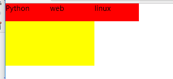
(4)overflow:hidden 推荐
<!DOCTYPE html>

<html lang="en">

<head>

    <meta charset="UTF-8">

    <title>伪元素清除法(常用)</title>

    <style type="text/css">

        *{

            padding: 0;

            margin: 0;

        }

        ul{

            list-style: none;

        }

        .box{

            width: 400px;

            /*父元素不添加高度*/

            overflow: hidden;

        }

        .box ul li {

            float: left;

            width: 100px;

            height: 40px;

            background-color: red;

        }

        .box2{

            width: 200px;

            height: 100px;

            background-color: yellow;

        }

    </style>

</head>

<body>

    <div class="box">

        <ul>

            <li>Python</li>

            <li>web</li>

            <li>linux</li>

        </ul>

    </div>

    <div class="box2">

    </div>

</body>

</html>
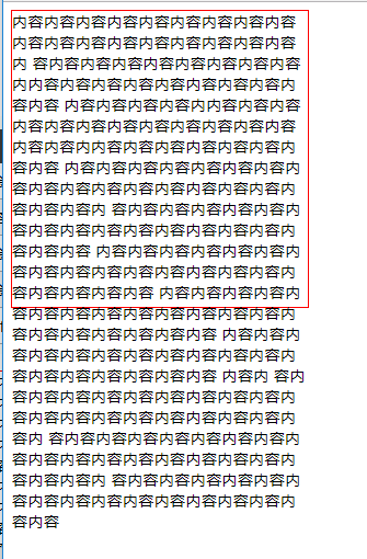
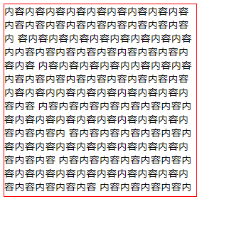
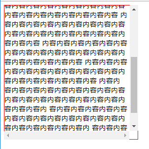
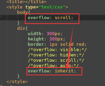
6.overflow属性
<!DOCTYPE html>

<html lang="en">

<head>

    <meta charset="UTF-8">

    <title></title>

    <style type="text/css">

        body{

            overflow: scroll;

        }

        div{

            width: 300px;

            height: 300px;

            border: 1px solid red;

            /*overflow: visible;*/

            /*overflow: hidden;*/

            /*overflow: scroll;*/

            /*overflow: auto;*/

            overflow: inherit;

        }

    </style>

</head>

<body>

    <div>

        内容内容内容内容内容内容内容内容内容内容内容内容内容内容内容内容内容内容内

        容内容内容内容内容内容内容内容内容内内容内容内容内容内容内容内容内容内容内容

        内容内容内容内容内内容内容内容

        内容内容内容内容内容内容内容内容内容内容内容内内容内容内容内容内容内容内容内容

        内容内容内容内容内容内容内容内容内容内容内容内容内容内容内容内容内容内容内容内

        容内容内容内容内容内容内容内容内容内容内容内容内容内容内容内容内容内容

        内容内容内容内容内容内容内容内容内容内容内容内容内容内容内容内容内容内容内容内容

        内容内容内容内容内容内容内容内容内容内容内容内容内容内容内容内容内容内容内容内容

        内容内容内容内容内容内容内容内容内容内容内容内容内容内容内容内容内容内容    内容内

        容内容内容内容内容内容内容内容内容内容内容内容内容内容内容内容内容内容内容内容内

        容内容内容内容内容内容内容内容内容内容内容内容内容内容内容内容内容内容内容内容内

        容内容内容内容内容内容内容内容内容内容内容内容内容内容内容内容内容

    </div>

</body>

</html>
11-[CSS]-标准文档流,display,浮动,清除浮动,overflow的更多相关文章
- css标准文档流
css标准文档流 所谓的标准文档流指的是网页当中的一个渲染顺序,就如同人类读书一样,从上向下,从左向右.网页的渲染顺序也是如此.而我们使用的标签默认都是存在于标准文档流当中. 标准文档流当中的特性 空 ...
- CSS标准文档流 块级元素和行内元素
标准文档流 什么是标准文档流 宏观的将,我们的web页面和ps等设计软件有本质的区别,web 网页的制作,是个“流”,从上而下 ,像 “织毛衣”.而设计软件 ,想往哪里画东西,就去哪里画 空白折叠现象 ...
- css 盒模型 文档流 几种清除浮动的方法
盒模型 1.box-sizing: content-box 是普通的默认的一种盒子表现模式 盒子大小为 width + padding + border content-box:此值为其默认值,其 ...
- 前端css盒模型及标准文档流及浮动问题
1.盒模型 "box model"这一术语是用来设计和布局时使用,然后在网页中基本上都会显示一些方方正正的盒子.我们称为这种盒子叫盒模型. 盒模型有两种:标准模型和IE模型.这里重 ...
- python 全栈开发,Day48(标准文档流,块级元素和行内元素,浮动,margin的用法,文本属性和字体属性)
昨日内容回顾 高级选择器: 后代选择 : div p 子代选择器 : div>p 并集选择器: div,p 交集选择器: div.active 属性选择器: [属性~='属性值'] 伪类选择器 ...
- {03--CSS布局设置} 盒模型 二 padding bode margin 标准文档流 块级元素和行内元素 浮动 margin的用法 文本属性和字体属性 超链接导航栏 background 定位 z-index
03--CSS布局设置 本节目录 一 盒模型 二 padding(内边距) 三 boder(边框) 四 简单认识一下margin(外边距) 五 标准文档流 六 块级元素和行内元素 七 浮动 八 mar ...
- 页面标准文档流、浮动层、float属性(转)
CSS float 浮动属性介绍 float属性:定义元素朝哪个方向浮动. 1.页面标准文档流.浮动层.float属性 1.1 文档流 HTML页面的标准文档流(默认布局)是:从上到下,从左到右,遇块 ...
- Unit 6.标准文档流,浮动,清除浮动以及margin塌陷问题
一. 什么是标准文档流 文本流其实就是文档的读取和输出顺序,也就是我们通常看到的由左到右.由上而下的读取和输出形式,在网页中每个元素都是按照这个顺序进行排序和显示的,而float和position两个 ...
- day 41 标准文档流 浮动
一.标准文档流 什么是标准文档流 宏观的将,我们的web页面和ps等设计软件有本质的区别,web 网页的制作,是个“流”,从上而下 ,像 “织毛衣”.而设计软件 ,想往哪里画东西,就去哪里画 标准文档 ...
随机推荐
- linuxGame:文明5汉化
此包来源苹果戏台的steam平台 参考网页: 1.https://tieba.baidu.com/p/4529797745 2.http://www.civclub.net/bbs/forum.php ...
- [翻译] USING GIT IN XCODE [5] 在XCODE中使用GIT[5]
USING GIT IN XCODE USING BRANCHES Branches can be a very effective tool to isolate new features or e ...
- Linux优化远程SSH连接
优化远程SSH连接 1.Linxu和Window的ssh连接区别 Windom默认3389端口,管理员administartor 普通是guest Linux 默认22端口 管理员root 普通一堆 ...
- 内置数据结构(tuple)
一.元组(tuple) 元组不能增.删和改,所以元组的元素只能查. tp = tuple() #初始化一个元组 tp = () #同上 tp = (1, 2, 3, 4,) #错误的定义元组方式 t ...
- [2018HN省队集训D8T1] 杀毒软件
[2018HN省队集训D8T1] 杀毒软件 题意 给定一个 \(m\) 个01串的字典以及一个长度为 \(n\) 的 01? 序列. 对这个序列进行 \(q\) 次操作, 修改某个位置的字符情况以及查 ...
- 字符串到-->list到-->字典的转变
怎么把字符串变成字典呢?? 要先转成列表list(用split方法),然后再把列表转成字典,这时候就用到-->怎么把列表转换成字典呢??列表的索引和字典的新增,然后就能把字符串转成字典了.
- 【原创】uWSGI http和http-socket说明
http 和 http-socket的使用上有一些区别: http: 自己会产生一个http进程(可以认为与nginx同一层)负责路由http请求给worker, http进程和worker之间使用的 ...
- base大家族详解
base大家族详解 */--> pre.src {background-color: #292b2e; color: #b2b2b2;} pre.src {background-color: # ...
- smooth l1
1.loss要规范化,这样就不会受图片大小的影响 2.w.h采用log:比较特殊的是w,hw,h的regression targets使用了log space. 师兄指点说这是为了降低w,hw,h产生 ...
- python pip安装报错: ConnectTimeoutError
错误: 解决方案: 使用镜像:pip install xxxx -i https://pypi.douban.com/simple 如:pip3 install --upgrade tensorf ...