纯css+html做emoji动态表情
<!DOCTYPE html>

<html lang="zh-CN">

<head>

  <meta charset="UTF-8" />

  <meta name="viewport" content="width=device-width, initial-scale=1.0" />

  <title>表情</title>

  <link rel="stylesheet" href="./style.css" />

</head>

<body>

  <div class="emoji one">

    <!-- TODO 表情写在这里呀 -->

    <div class="pen pen_l">

      <div class="pencil"></div>

    </div>

    <div class="pen pen_r">

      <div class="pencil"></div>

    </div>

    <div class="blush blush_l"></div>

    <div class="blush blush_r"></div>

    <div class="ruler"></div>

  </div>

  <!-- 多个表情请分别写在多个 div 下 -->

  <div class="emoji  emoji--sad">

    <!-- TODO 表情写在这里呀 -->

    <div class="emoji__face">

      <div class="emoji__eyebrows"></div>

      <div class="emoji__eyes"></div>

      <div class="emoji__mouth"></div>

    </div>

  </div>

  <div class="emoji crying-emoji">

    <!-- TODO 表情写在这里呀 -->

    <div class="crying_l"></div>

    <div class="crying_r"></div>

    <div class="crying_z"></div>

    <div class="crying_b"></div>

    <div class="crying_h"></div>

  </div>

  <div class="emoji laughing-emoji">

    <div class="comic"></div>

    <div class="laughing"></div>

    <div class="eraser">

      <div class="emoji__tongue"></div>

    </div>

    <div class="crayon_l"></div>

    <div class="crayon_r"></div>

  </div>

</body>

</html>
body {

    text-align: center;

    margin: 80px auto 0;

    font-family: "Lucida Sans Unicode", "Lucida Grande", sans-serif;

}

.emoji {

  width: 160px;

  height: 160px;

  border-radius: 50%;

  background-color: #ffda6a;

 display: inline-block;

}

.pen{

  width: 60px;       /* 圆的宽度 */

  height: 60px;      /* 圆的高度 */

  border-radius: 50%; /* 将元素的四个角变成圆形 */

  background-color: white; /* 圆的填充颜色 */

  position: absolute;

  z-index: 30;

}

.pen_r{

    position: relative;

    top: -20px;

    right: -89px;

}

.pen_l{

    position: relative;

    top: 39px;

    left: 14px;

}

.pencil{

  width: 20px;       /* 圆的宽度 */

  height: 20px;      /* 圆的高度 */

  border-radius: 50%; /* 将元素的四个角变成圆形 */

  background-color: #000; /* 圆的填充颜色 */

  position: relative;

  left: 20px;

  top: 20px;

  animation: moveUp 1s infinite  linear; /* 应用动画 */

}

@keyframes moveUp {

  0% {

    transform: translateY(0);

  }

  100% {

    transform: translateY(-100%);

  }

}

  .blush {

       width: 20px;

  }

.blush_l{

    position: relative;

    top: -14px;

    left: 67px;

    box-shadow: -25px 0 0 0 #000000, 25px 0 0 0 #000000, -45px -2px 27px 10px #D5234C, 50px -2px 30px 10px #D5234C;

}

.blush_r{

  position: relative;

    top: -97px;

    left: 113px;

}

.ruler{

    width: 38px;

    position: relative;

    height: 6px;

    background-color: #d35d06;

    border-radius: 10px;

    left: 61px;

    top: 0;

}

    .emoji__face,

    .emoji__eyebrows,

    .emoji__eyes,

    .emoji__mouth {

      position: absolute;

    }

    .emoji__face:before,

    .emoji__face:after,

    .emoji__eyebrows:before,

    .emoji__eyebrows:after,

    .emoji__eyes:before,

    .emoji__eyes:after,

    .emoji__mouth:before,

    .emoji__mouth:after {

      position: absolute;

      content: '';

    }

    .emoji__face {

      width: inherit;

      height: inherit;

    }

    .emoji--sad .emoji__face {

      animation: sad-face 2s ease-in infinite;

    }

    .emoji--sad .emoji__eyebrows {

      left: calc(50% - 3px);

      top: 35px;

      height: 6px;

      width: 6px;

      border-radius: 50%;

      background: transparent;

      box-shadow: -40px 9px 0 0 #000000,

        -25px 0 0 0 #000000,

        25px 0 0 0 #000000,

        40px 9px 0 0 #000000;

    }

    .emoji--sad .emoji__eyebrows:before {

 width: 30px;

    height: 21px;

    border: 6px solid #000000;

    box-sizing: border-box;

    border-radius: 50%;

    border-bottom-color: transparent;

    border-left-color: transparent;

    border-right-color: transparent;

    top: -8px;

    left: calc(50% - 20px);

    }

    .emoji--sad .emoji__eyebrows:after {

    width: 30px;

    height: 21px;

    border: 6px solid #000000;

    box-sizing: border-box;

    border-radius: 50%;

    border-bottom-color: transparent;

    border-left-color: transparent;

    border-right-color: transparent;

    top: -8px;

    left: calc(50% - 10px);

    }

    .emoji--sad .emoji__eyebrows:before {

    margin-left: -31px;

    transform: rotate(152deg);

    }

    .emoji--sad .emoji__eyebrows:after {

     margin-left: 30px;

    transform: rotate(-150deg);

    }

    .emoji--sad .emoji__eyes {

      width: 14px;

      height: 16px;

      left: calc(50% - 7px);

      top: 50px;

      border-radius: 50%;

      background: transparent;

      box-shadow: 25px 0 0 0 #000000,

        -25px 0 0 0 #000000;

    }

    .emoji--sad .emoji__eyes:after {

      background: #548DFF;

      width: 12px;

      height: 12px;

      margin-left: 6px;

      border-radius: 0 100% 40% 50% / 0 50% 40% 100%;

      transform-origin: 0% 0%;

      animation: tear-drop 2s ease-in infinite;

    }

    .emoji--sad .emoji__mouth {

      width: 60px;

      height: 80px;

      left: calc(50% - 30px);

      top: 80px;

      box-sizing: border-box;

      border: 6px solid #000000;

      border-radius: 50%;

      border-bottom-color: transparent;

      border-left-color: transparent;

      border-right-color: transparent;

      background: transparent;

      animation: sad-mouth 2s ease-in infinite;

    }

    .emoji--sad .emoji__mouth:after {

      width: 6px;

      height: 6px;

      background: transparent;

      border-radius: 50%;

      top: 4px;

      left: calc(50% - 3px);

      box-shadow: -18px 0 0 0 #000000,

        18px 0 0 0 #000000;

    }

    @keyframes sad-face {

      25%,

      35% {

        top: 122px;

      }

      55%,

      95% {

        top: 91px;

      }

      100%,

      0% {

        top: 74px;

      }

    }

    @keyframes sad-mouth {

      25%,

      35% {

        transform: scale(0.85);

        top: 70px;

      }

      55%,

      100%,

      0% {

        transform: scale(1);

        top: 80px;

      }

    }

    @keyframes tear-drop {

      0%,

      100% {

        display: block;

        left: 35px;

        top: 15px;

        transform: rotate(45deg) scale(0);

      }

      25% {

        display: block;

        left: 35px;

        transform: rotate(45deg) scale(2);

      }

      49.9% {

        display: block;

        left: 35px;

        top: 65px;

        transform: rotate(45deg) scale(0);

      }

      50% {

        display: block;

        left: -35px;

        top: 15px;

        transform: rotate(45deg) scale(0);

      }

      75% {

        display: block;

        left: -35px;

        transform: rotate(45deg) scale(2);

      }

      99.9% {

        display: block;

        left: -35px;

        top: 65px;

        transform: rotate(45deg) scale(0);

      }

    }

       .crying-emoji {

      position: relative;

    }

    @keyframes stream-breath {

      0% {

        transform: rotate(45deg) rotate(0deg);

      }

      25% {

        transform: rotate(45deg) scale(1);

      }

      50% {

        transform: rotate(45deg) scale(3);

      }

      75% {

        transform: rotate(45deg) scale(1);

      }

      100% {

        transform: rotate(45deg) scale(0);

      }

    }

    .crying_l {

      width: 46px;

      position: relative;

      height: 8px;

      background-color: #d35d06;

      border-radius: 10px;

      left: 14px;

      top: 62px

    }

    .crying_r {

      width: 46px;

      position: relative;

      height: 8px;

      background-color: #d35d06;

      border-radius: 10px;

      left: 69px;

      top: 54px;

    }

    .crying_z {

      width: 26px;

      position: relative;

      height: 8px;

      background-color: #d35d06;

      border-radius: 10px;

      left: 49px;

      top: 84px;

    }

    .crying_b {

      position: relative;

      right: -122px;

      top: -8px;

      background: #548DFF;

      width: 12px;

      height: 12px;

      margin-left: 6px;

      border-radius: 0 100% 40% 50% / 0 50% 40% 100%;

      transform-origin: 0% 0%;

      animation: stream-breath 2s ease-in infinite;

    }

    .crying_h {

      width: 20px;

      position: relative;

      top: 74px;

      left: 69px;

      box-shadow: -25px 0 0 0 #000000, 25px 0 0 0 #000000, -45px -2px 27px 10px #D5234C, 20px -2px 30px 10px #D5234C;

    }

      .laughing-emoji {

      position: relative;

    }

    .comic {

      position: absolute;

      left: calc(50% - 3px);

      top: 35px;

      animation: haha-amnt 2s linear infinite;

    }

    .comic:before,

    .comic:after {

      position: absolute;

      content: '';

    }

    .comic:before,

    .comic:after {

      width: 42px;

      height: 20px;

      border: 6px solid #d35d06;

      box-sizing: border-box;

      border-radius: 50%;

      border-bottom-color: transparent;

      border-left-color: transparent;

      border-right-color: transparent;

      top: 20px;

      left: calc(50% - 15px);

    }

    .comic:before {

      margin-left: -40px;

      transform: rotate(-30deg);

    }

    .comic:after {

      margin-left: 32px;

      transform: rotate(26deg);

    }

    .laughing {

      position: absolute;

      left: calc(50% - 3px);

      top: 45px;

      animation: haha-amnts 2s linear infinite;

    }

    .laughing:before,

    .laughing:after {

      position: absolute;

      content: '';

    }

    .laughing:before,

    .laughing:after {

      width: 48px;

      height: 40px;

      border: 6px solid #d35d06;

      box-sizing: border-box;

      border-radius: 50%;

      border-bottom-color: transparent;

      border-left-color: transparent;

      border-right-color: transparent;

      top: 30px;

      left: calc(50% - 15px);

    }

    .laughing:before {

      margin-left: -40px;

      transform: rotate(0deg);

    }

    .laughing:after {

      margin-left: 32px;

      transform: rotate(0deg);

    }

    .eraser {

      position: absolute;

      width: 90px;

      height: 40px;

      left: calc(50% - 43px);

      top: 64%;

      background: #fff;

      border-radius: 0 0 40px 40px;

      overflow: hidden;

      z-index: 1;

      animation: haha-mouth 2s linear infinite;

      border: 1px solid #ae7179;

    }

    .eraser::before,

    .eraser::after,

    .emoji__tongue::before,

    .emoji__tongue::after {

      position: absolute;

      content: '';

    }

    .emoji__tongue {

      width: 89px;

      height: 30px;

      background: #ae7179;

      left: calc(50% - 44px);

      bottom: -1px;

      border-radius: 0%;

      position: absolute;

    }

    @keyframes haha-mouth {

      10% {

        transform: translate(0 -10px);

        top: 55%;

      }

      50% {

        transform: translate(0 0px);

        top: 65%;

      }

      100% {

        transform: translate(0 -10px);

        top: 55%;

      }

    }

    @keyframes haha-amnt {

      10% {

        transform: translate(0 -10px);

        top: 30px;

      }

      50% {

        transform: translate(0 0px);

        top: 35px;

      }

      100% {

        transform: translate(0 -10px);

        top: 30px;

      }

    }

    @keyframes haha-amnts {

      10% {

        transform: translate(0 -10px);

        top: 40px;

      }

      50% {

        transform: translate(0 0px);

        top: 45px;

      }

      100% {

        transform: translate(0 -10px);

        top: 40px;

      }

    }

    .crayon_r {

      position: relative;

      right: -125px;

      top: 105px;

      background: #548DFF;

      width: 12px;

      height: 12px;

      margin-left: 6px;

      border-radius: 0 100% 40% 50% / 0 50% 40% 100%;

      transform-origin: 0% 0%;

      animation: crayon-drop 2s ease-in infinite;

    }

    .crayon_l {

      position: relative;

      right: -26px;

      top: 105px;

      background: #548DFF;

      width: 12px;

      height: 12px;

      margin-left: 6px;

      border-radius: 0 100% 40% 50% / 0 50% 40% 100%;

      transform-origin: 0% 0%;

      animation: crayon_l-drop 2s ease-in infinite;

    }

    @keyframes crayon_l-drop {

      0% {

        transform: rotate(90deg) scale(2);

        top: 85px;

      }

      25% {

        transform: rotate(65deg) scale(2);

        top: 95px;

      }

      50% {

        transform: rotate(45deg) scale(3);

        top: 105px;

      }

      75% {

        transform: rotate(45deg) scale(2);

        top: 115px;

      }

      100% {

        transform: rotate(45deg) scale(2);

        top: 125px;

      }

    }

    @keyframes crayon-drop {

      0% {

        transform: rotate(0deg) scale(2);

        top: 75px;

      }

      25% {

        transform: rotate(25deg) scale(2);

        top: 85px;

      }

      50% {

        transform: rotate(45deg) scale(3);

        top: 95px;

      }

      75% {

        transform: rotate(45deg) scale(2);

        top: 105px;

      }

      100% {

        transform: rotate(45deg) scale(2);

        top: 115px;

      }

    }
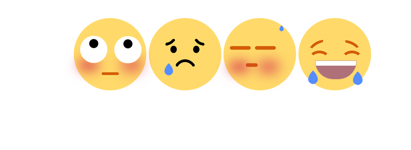
看做出来的截图,就没有做成gif显示案例
纯css+html做emoji动态表情的更多相关文章
- 有趣的纯CSS实现动态晴阴雨雪
我们先来看看实现的效果吧 非常的美腻,对吧.这个是纯css,且单标签实现的哦~ 先贴完整代码,我们再来看看这个里面究竟有什么可以借鉴的知识点 <!DOCTYPE html> <htm ...
- less可以做什么?less详解!(less嵌套选择器实现纯CSS二级导航)
前端技术众多,作为一名前端工程师,我们每接触新技术首先要懂得此技术的优势和劣势,这是最基本的.往深入了说还需要懂得技术的应用场景,配合的技术等,方便为以后架构做准备.而less作为一门CSS预处理语言 ...
- 纯css做幻灯片效果
css3里面有一个@keyframes动画功能. w3c上面的例子: 可以使用它来做一个幻灯片效果. <!DOCTYPE html> <html lang="en" ...
- 纯css做的安卓开机动画
随着css3的发展,越来越多的负责绚丽的效果可以由纯css来完成了.用css3实现的动画效果丝毫不必js实现的逊色,而且浏览器对css渲染的速度远比js快,大多数时候css的体积也不js小.其中css ...
- 纯CSS无hacks的跨游览器多列布局
利用纯CSS创建一个等高多列的布局并不件易事,本教程将着重分析出现在多列布局的多个问题,然后为大家等来一个简单全游览器通吃的解决方法,不使用图片,脚本,CSS hacks并在最严格的XHTML 规范中 ...
- 分享:纯 css 瀑布流 和 js 瀑布流
分享一次纯 css 瀑布流 和 js 瀑布流 纯 css 写瀑布流 1.multi-columns 方式: 通过 Multi-columns 相关的属性 column-count.column-ga ...
- 纯CSS菜单样式,及其Shadow DOM,Json接口 实现
先声明,要看懂这篇博客要求你具备少量基础CSS知识, 当然如果你只是要用的话就随便了,不用了解任何知识 完整项目github链接:https://github.com/git-Code-Shelf/M ...
- 纯CSS实现网站常用的五角星评分和分数展示交互效果
最近做的一个项目涉及到评分和展示分数的模块,UI设计师也给了几个切好的图片,实现五角星评分方式很多,本质爱折腾的精神和对性能追求以及便于维护的考虑,搜集和尝试了很多方式,最终采用了纯css驱动的实现方 ...
- Expression构建DataTable to Entity 映射委托 sqlserver 数据库里面金额类型为什么不建议用float,实例告诉你为什么不能。 sql server 多行数据合并成一列 C# 字符串大写转小写,小写转大写,数字保留,其他除外 从0开始用U盘制作启动盘装Windows10系统(联想R720笔记本)并永久激活方法 纯CSS打造淘宝导航菜单栏 C# Winform
Expression构建DataTable to Entity 映射委托 1 namespace Echofool.Utility.Common { 2 using System; 3 using ...
- 使用纯 CSS 实现 Google Photos 照片列表布局
文章太长,因为介绍了如何一步一步进化到最后接近完美的效果的,不想读的同学可以直接跳到最后一个大标题之后看代码.demo及原理就好,或者也可以直接看下面这个链接的源代码. 不过还是建议顺序读下去,因为后 ...
随机推荐
- Java学生信息管理系统源码
学生信息管理系统 功能说明 学生信息管理,包括学生.班级.院系.课程.成绩等的管理. 本程序仅供学习食用. 工程环境 JDK IntelliJ IDEA MySQL 运行说明 1.安装JDK. 2.导 ...
- CF1995E Long Inversions(贪心 + 差分)
见代码 点击查看代码 //背景:夸一下自己,CF1955A~E均是自己想出来的,这道题思路是自己想的,唯一没想到用差分数组维护 //原理:贪心(想最左边的1开始,不可能对其左边包括自己操作了,否则又要 ...
- 同程旅行基于 RocketMQ 高可用架构实践
简介: 我们在几年前决定引入 MQ 时,市场上已经有不少成熟的解决方案,比如 RabbitMQ , ActiveMQ,NSQ,Kafka 等.考虑到稳定性.维护成本.公司技术栈等因素,我们选择了 R ...
- dotnet 世界猜测 随机数的小测试
这是一个半技术向的博客,主题来源于我读过的某本书的片段,这是一个稍稍有些前置知识的故事,主题的大概内容就是假定世界存在某个规则序列,通过一代代的探索,可以获取到此序列的内容.本文将模拟此情形,写一个随 ...
- dotnet OpenXML 解析 PPT 图表 面积图入门
本文告诉大家如何使用 OpenXML 解析 PPT 的图表,以面积图为入门例子告诉大家 OpenXML 的存储 在 PPT 里面,有强大的图表功能,可以联动 Excel 展示数据.在 PPT 里面的图 ...
- 5.k8s Service四层负载:服务端口暴露
题目一:暴露服务service 设置配置环境: [candidate@node-1] $ kubectl config use-context k8s Task 请重新配置现有的 deployment ...
- 什么是SQL 语句中相关子查询与非相关子查询
1.什么是SQL子查询 要理解相关子查询和非相关子查询,我们得首先理解什么是子查询,子查询是指在一个查询语句中嵌套的另一个查询语句. 子查询可以嵌套在其他查询语句中,如 SELECT.INSERT.U ...
- 九、ODBC External Table Of Doris
ODBC External Table Of Doris 提供了Doris通过数据库访问的标准接口(ODBC)来访问外部表 ODBC Driver的安装和配置: 要求所有的BE节点都安装上相同的Dri ...
- 4.10 + (double)(rand()%10)/100.0
黑色星期四 坏消息: 没有奥赛课,所以大概率调不出来 CF1479D 好消息: 5k 回来了,调题有望 中午起床直接来的机房,有学科自习就说 氟硫氢 不知道 结果被叫回去了 而且今天班里没水了,趁着大 ...
- nim 7. nimble--制作包
1. nim的包管理工具: nimble nim的包管理工具,是nimble. 在安装nim的时候,已经自带了nimble. nible通常需要使用git服务器存储包,因此,本地需要git命令的支持. ...