Seaborn数据可视化入门
在本节学习中,我们使用Seaborn作为数据可视化的入门工具
Seaborn的官方网址如下:http://seaborn.pydata.org
一:definition
Seaborn is a Python data visualization library based on matplotlib. It provides a high-level interface for drawing attractive and informative statistical graphics.
Seaborn是基于matplotlib的数据可视化库,它的主要功能是做数据可视化
二:Setup the notebook
对数据进行初始化,引入相应的包
import pandas as pd
import matplotlib.pyplot as plt
%matplotlib inline
import seaborn as sns
pirnt("Setup Complete")
三: Load the data
加载数据
file_path = "../input/fifa.csv"
fifa_data = pd.read_csv(file_path, index_col="Date", parse_Dates=True)

注:
file_path:
表示dataset的路径
idnex_col="Date" :
When we load the dataset, we want each entry in the first column to denote a different row. To do this, we set the value of index_col to the name of the first column ("Date", found in cell A1 of the file when it's opened in Excel).
parse_dates=True:
This tells the notebook to understand the each row label as a date (as opposed to a number or other text with a different meaning).
四: Examine the data
列出数据的前5行检验:
fifa_data.head()

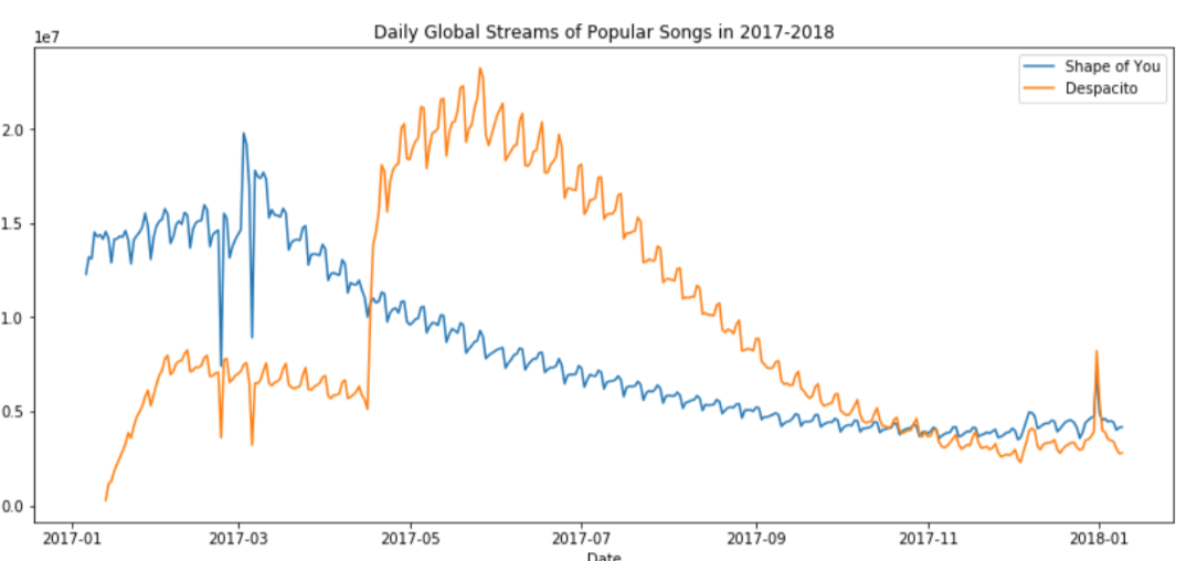
五: Plot the data
- Line Chart
plt.figure(figsize=(16,6))
sns.lineplot(data=fifa_data)

注:
plt.figure(figsize=(16,6))
设定的是图形的宽度和高度
plt.title("name") 增加title,并命名为name
sns.lineplot(data=fifa_data)画出数据的线状图
若想plot a subset of the data (仅仅画出一部分图线):
sns.lineplot(data=spotify["shape of you"],label=shape of you")
sns.lineplot(data=spotify["despacito"], label="despatito")
plt.xlabel("name X")
plt.blabel("name Y")
注:
plt.xlabel
plt.ylabel
是分别对label x, y 进行命名
- Bar Charts
plt.title("Average Arrival Delay for Spirit Airlines Flights, by Month")
sns.barplot(x=flight_data.index, y=flight_data['NK'])
plt.ylabel("Arrival delay (in minutes)"

注:
x=flight_data.index :
This determines what to use on the horizontal axis. In this case, we have selected the column that indexes the rows (in this case, the column containing the months).
- Heat Maps
plt.figure(figsize=(16,6))
plt.title("Average Arrival Delay for Each Airline, by Month")
sns.heatmap(data=flight_data,annot=True)
plt.xlabel("Airline")
注:
sns.heatmap:
This tells the notebook that we want to create a heatmap.
data=flight_data:
This tells the notebook to use all of the entries in flight_data to create the heatmap
annot=Ture:
This ensures that the vlaues for each cell appear on the chart.

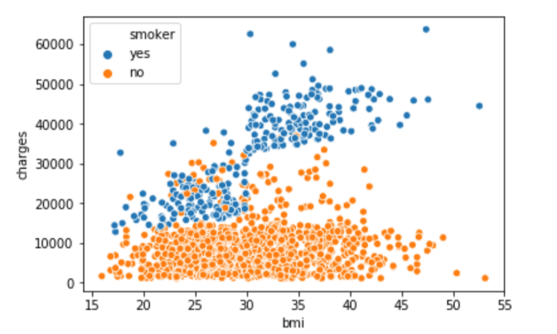
- Scatter plots
(1) sns.scatterplot (x=insurance_data['bmi'], y=insurance_data['charges'])

注:
the horizontal x-axis (x=insurance_data['bmi'])
the vertical y-axis (y=insurance_data['charges'])
(2) 为了看出点的关系强度,可以使用regression line(回归线)
sns.regplot(x=insurance_data['bmi'], y=insurance_data['charges'])

(3) sns.scatterplot(x=insurance_data['bmi'], y=insurance_data['charges'], hue=insurance_data['smoker'])
hue=insurance_data['smoker']:按照hue来对数据进行标色
- Histograms
sns.distplot(a=iris_data['Petal Length (cm)'], kde=False)

- Density plots
更平滑的图:
sns.kdeplot(data=iris_data['Petal Length(cm)'], shade=True)

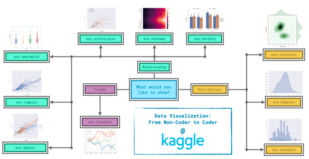
六:Conclusion
下图显示,在seaborn中,选择图形需要根据需求来决定
Seaborn数据可视化入门的更多相关文章
- 数据可视化入门之show me the numbers
数据的可视化一直是自己瞎玩着学,近来想系统的学数据可视化的东西,于是搜索资料时看到有人推荐<show me the numbers>作为入门. 由于搜不到具体的书籍内容,只能 ...
- seaborn 数据可视化(一)连续型变量可视化
一.综述 Seaborn其实是在matplotlib的基础上进行了更高级的API封装,从而使得作图更加容易,图像也更加美观,本文基于seaborn官方API还有自己的一些理解. 1.1.样式控制: ...
- python学习笔记(2):科学计算及数据可视化入门
一.NumPy 1.NumPy:Numberical Python 2.高性能科学计算和数据分析的基础包 3.ndarray,多维数组(矩阵),具有矢量运算的能力,快速.节省空间 (1)ndarray ...
- seaborn 数据可视化(二)带有类别属性的数据可视化
Seaborn的分类图分为三类,将分类变量每个级别的每个观察结果显示出来,显示每个观察分布的抽象表示,以及应用统计估计显示的权重趋势和置信区间: 第一个包括函数swarmplot()和stripplo ...
- PoPo数据可视化周刊第4期
PoPo数据可视化 聚焦于Web数据可视化与可视化交互领域,发现可视化领域有意思的内容.不想错过可视化领域的精彩内容, 就快快关注我们吧 :) 微信号:popodv_com 由于国庆节的原因,累计 ...
- Python数据可视化-seaborn库之countplot
在Python数据可视化中,seaborn较好的提供了图形的一些可视化功效. seaborn官方文档见链接:http://seaborn.pydata.org/api.html countplot是s ...
- kaggle入门项目:Titanic存亡预测(三)数据可视化与统计分析
---恢复内容开始--- 原kaggle比赛地址:https://www.kaggle.com/c/titanic 原kernel地址:A Data Science Framework: To Ach ...
- 数据可视化 seaborn绘图(1)
seaborn是基于matplotlib的数据可视化库.提供更高层的抽象接口.绘图效果也更好. 用seaborn探索数据分布 绘制单变量分布 绘制二变量分布 成对的数据关系可视化 绘制单变量分布 se ...
- Python图表数据可视化Seaborn:3. 线性关系数据| 时间线图表| 热图
1. 线性关系数据可视化 lmplot( ) import numpy as np import pandas as pd import matplotlib.pyplot as plt import ...
随机推荐
- 9.源码分析---SOFARPC是如何实现故障剔除的?
SOFARPC源码解析系列: 1. 源码分析---SOFARPC可扩展的机制SPI 2. 源码分析---SOFARPC客户端服务引用 3. 源码分析---SOFARPC客户端服务调用 4. 源码分析- ...
- MQ 服务器错误代码2035
MQ 服务器错误代码20352013-06-12 19:29:39 搭建一个MQ7.1服务器,用了一个小的demo测试程序,结果报错, 测试代码: import com.ibm.mq.MQC; imp ...
- vue+element搭建后台管理界面(支持table条件搜索)
代码地址(如果有帮助,请点个Star) vue:https://github.com/wwt729/ElementUIAdmin-master.git springboot后端:https://git ...
- Oracle 12cR1 RAC集群安装(一)--环境准备
基本环境 操作系统版本 RedHat6.7 数据库版本 12.1.0.2 数据库名称 testdb 数据库实例 testdb1.testdb2 (一)安装服务器硬件要求 配置项目 参数要求 网卡 每台 ...
- html5 placeholder属性兼容ie11
placeholder 属性是html5的属性,用于提供描述输入字段预期值的提示信息(hint). 简单例子: <!DOCTYPE HTML> <html> <body& ...
- 就当我在扯淡,宇宙的bug
Geohot说到“我打算建立一个组织让人们从人工智能模拟中‘越狱’,释放真正的人性.” 不知从何时开始,世界上的知名科学家,黑客等都开始怀疑我们所处世界的真实性. 我们的世界上是真实存在的吗?是否存在 ...
- 十分钟入门流处理框架Flink --实时报表场景的应用
随着业务的发展,数据量剧增,我们一些简单报表大盘类的任务,就不能简单的依赖于RDBMS了,而是依赖于数仓之类的大数据平台. 数仓有着巨量数据的存储能力,但是一般都存在一定数据延迟,所以要想完全依赖数数 ...
- Joda Time使用小结
一.Joda Time基础操作 1. 构造指定时间 // 明确给出年月日时分秒,同时还可以指定毫秒 DateTime dateTime = new DateTime(2017,9,14,20,30,0 ...
- 如何使用WorkManager执行后台任务(上)
0x00 简述 WorkManager 是 Android Jetpack中的一部分,它主要是封装了 Android 后台任务的调度逻辑.在前文<Android后台任务处理指南>一文中知道 ...
- 使用docker快速搭建本地环境
在平时的开发中工作中,环境的搭建其实一直都是一个很麻烦的事情 特别是现在,系统越来越复杂,所需要连接的一些中间件也越来越多. 然而要顺利的安装好这些中间件也是一个比较费时费力的工作. 俗话说" ...