Heat map 绘图神奇
https://study.163.com/provider/400000000398149/index.htm?share=2&shareId=400000000398149(博主视频教学主页)
https://en.wikipedia.org/wiki/Talk:Heat_map
Heat map
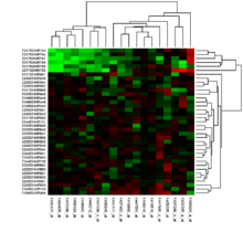
Heat map generated from DNA microarray data reflecting gene expression values in several conditions
A heat map (or heatmap) is a graphical representation of data where the individual values contained in a matrixare represented as colors. Fractal maps and tree maps both often use a similar system of color-coding to represent the values taken by a variable in a hierarchy.
Contents
[hide]
History[edit]
The term Heatmap was originally coined and trademarked by software designer Cormac Kinney in 1991, to describe a 2D display depicting real time financial market information.[1]
Heat maps originated in 2D displays of the values in a data matrix. Larger values were represented by small dark gray or black squares (pixels) and smaller values by lighter squares. Sneath (1957) displayed the results of a cluster analysis by permuting the rows and the columns of a matrix to place similar values near each other according to the clustering. Jacques Bertin used a similar representation to display data that conformed to aGuttman scale. The idea for joining cluster trees to the rows and columns of the data matrix originated with Robert Ling in 1973. Ling used overstruck printer characters to represent different shades of gray, one character-width per pixel. Leland Wilkinson developed the first computer program in 1994 (SYSTAT) to produce cluster heat maps with high-resolution color graphics. The Eisen et al. display shown in the figure is a replication of the earlier SYSTAT design.[citation needed]
Types[edit]

A heat map, atop a color bathymetric map, indicating the probable location of missingMalaysia Airlines Flight 370 based on a Bayesian method analysis of possible flight paths of the aircraft.[2]
There are different kinds of heat maps:[citation needed]
- Web heat maps have been used for displaying areas of a Web page most frequently scanned by visitors. Web heatmaps are often used alongside other forms of web analytics and session replay tools.
- Biology heat maps are typically used in molecular biology to represent the level of expression of many genes across a number of comparable samples (e.g. cells in different states, samples from different patients) as they are obtained from DNA microarrays.
- The tree map is a 2D hierarchical partitioning of data that visually resembles a heat map.
- A mosaic plot is a tiled heat map for representing a two-way or higher-way table of data. As with treemaps, the rectangular regions in a mosaic plot are hierarchically organized. The means that the regions are rectangles instead of squares. Friendly (1994) surveys the history and usage of this graph.
- A density function visualization is a heat map for representing the density of dots in a map. It enables to perceive density of points independently of the zoom factor. Perrot et al (2015) proposed a way to use density funciton to visualize billions of dots using big data infrastructure with Spark and Hadoop.[3]
Color schemes[edit]
There are many different color schemes that can be used to illustrate the heatmap, with perceptual advantages and disadvantages for each. Rainbowcolormaps are often used, as humans can perceive more shades of color than they can of gray, and this would purportedly increase the amount of detail perceivable in the image. However, this is discouraged by many in the scientific community, for the following reasons:[4][5][6][7][8]
- The colors lack the natural perceptual ordering found in grayscale or blackbody spectrum colormaps.[citation needed]
- Common colormaps (like the "jet" colormap used as the default in many visualization software packages) have uncontrolled changes in luminance that prevent meaningful conversion to grayscale for display or printing. This also distracts from the actual data, arbitrarily making yellow and cyan regions appear more prominent than the regions of the data that are actually most important.[citation needed]
- The changes between colors also lead to perception of gradients that aren't actually present, making actual gradients less prominent, meaning that rainbow colormaps can actually obscure detail in many cases rather than enhancing it.[citation needed]
Choropleth Maps vs. Heat Maps[edit]
Choropleth maps are sometimes incorrectly referred to as heat maps. A choropleth map features different shading or patterns within geographic boundaries to show the proportion of a variable of interest, whereas the coloration a heat map (in a map context) does not correspond to geographic boundaries.[9]
Software implementations[edit]

A sample heat map created using a Surface Chart in Microsoft Excel.
Several heat map software implementations are listed here (the list is not complete):
- PermutMatrix is a work space designed to graphically explore numerical datasets. It offers several methods for the optimal reorganization of rows and columns of a numerical dataset.[10]
- NeoVision Hypersystems, Inc., a software firm founded by Cormac Kinney, and funded by Intel and Deutsche Bank, developed Heatmaps depicting real time financial data and calculations, which were licensed to over 50,000 users. NeoVision Heatmaps became a feature on nasdaq.com.[11]
- R, a free software environment for statistical computing and graphics, contains several functions to trace heat maps[12][13]
- Gnuplot, a universal and free command-line plotting program, can trace 2D and 3D heat maps[14]
- The Google Docs spreadsheet application includes a Heat Map gadget, but for country-wise data only, not for general matrix data.
- Dave Green's 'cubehelix' colour scheme provides resources for a colour scheme that prints as a monotonically increasing greyscale on black and white postscript devices[15]
- Origin, a graphing and data analysis software can generate heat maps from data in a matrix, or a virtual matrix in a worksheet.[citation needed]
- Qlucore includes a heat map that is dynamically updated when filter parameters are changed.[citation needed]
- The ESPN Gamecast for soccer games uses heat maps to show where certain players have spent time on the field.[citation needed]
- Microsoft Excel can be used to generate heat maps using the Surface Chart. Though the default color range for Surface Charts in Excel is not conducive to heat maps, the colors can be edited to generate user-friendly and intuitive heat maps.[citation needed]
- Sightsmap is a sightseeing popularity heatmap overlaid on Google Maps, based on crowdsourcing: the number of Panoramio photos taken at each place in the world.[citation needed]
- Maptitude is business mapping software that includes a variety of customizable heat mapping tools and can use external data such as Excel files to show the results on geographic maps of your location.[citation needed]
- HeatMap Builder is a standalone application for generating heatmaps of genomic microarray data developed at the Ashley Lab at Stanford.[16]
- Heat Map Software - DaqPlaner. For Personal Use.
- Heat Map Service - HeatMapCo.
- Data Visualization Tool - VisArt. Browser Based.
- Open Source Heatmap Software.
Examples[edit]
|
|
This section contains a gallery of images. Galleries containing indiscriminate images of the article subject are discouraged; please improve or remove the section accordingly, moving freely licensed images to Wikimedia Commons if not already hosted there. (February 2015) |

Geographical heat map of ocean salinity, using a rainbow colormap
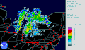
Lake effect snow -weather radarinformation is usually shown using a heatmap.

Choropleth heatmap showing election results by municipality

Human voice visualized with a spectrogram; a heat map representing the magnitude of theSTFT. An alternative visualization is thewaterfall plot.

Example showing the relationships between a heat map, surface plot, and contour lines of the same data

Combination of surface plot and heatmap, where the surface height represents the amplitude of the function, and the color represents the phase angle.
References[edit]
Examples[edit]
|
|
This section contains a gallery of images. Galleries containing indiscriminate images of the article subject are discouraged; please improve or remove the section accordingly, moving freely licensed images to Wikimedia Commons if not already hosted there. (February 2015) |
Geographical heat map of ocean salinity, using a rainbow colormap
Lake effect snow -weather radarinformation is usually shown using a heatmap.
Choropleth heatmap showing election results by municipality
Human voice visualized with a spectrogram; a heat map representing the magnitude of theSTFT. An alternative visualization is thewaterfall plot.
Example showing the relationships between a heat map, surface plot, and contour lines of the same data
Combination of surface plot and heatmap, where the surface height represents the amplitude of the function, and the color represents the phase angle.
https://study.163.com/course/courseMain.htm?courseId=1006383008&share=2&shareId=400000000398149(博主录制)
Heat map 绘图神奇的更多相关文章
- Power Map 更新日志
2015-05-18,五月更新 Custom Regions feature,允许用户自定义区域要素,支持kml和shape格式 New customization features,包括图例/文本框 ...
- Source Map入门教程
部署前端之前,开发者通常会对代码进行打包压缩,这样可以减少代码大小,从而有效提高访问速度.然而,压缩代码的报错信息是很难Debug的,因为它的行号和列号已经失真.这时就需要Source Map来还原真 ...
- Google Map 学习过程中的代码
<!DOCTYPE html><html> <head> <title>Simple click event</title> <met ...
- Video Target Tracking Based on Online Learning—深度学习在目标跟踪中的应用
摘要 近年来,深度学习方法在物体跟踪领域有不少成功应用,并逐渐在性能上超越传统方法.本文先对现有基于深度学习的目标跟踪算法进行了分类梳理,后续会分篇对各个算法进行详细描述. 看上方给出的3张图片,它们 ...
- Python数据可视化的四种简易方法
摘要: 本文讲述了热图.二维密度图.蜘蛛图.树形图这四种Python数据可视化方法. 数据可视化是任何数据科学或机器学习项目的一个重要组成部分.人们常常会从探索数据分析(EDA)开始,来深入了解数据, ...
- 4种更快更简单实现Python数据可视化的方法
数据可视化是数据分析或机器学习项目中十分重要的一环.通常,你需要在项目初期进行探索性的数据分析(EDA),从而对数据有一定的了解,而且创建可视化确实可以使分析的任务更清晰.更容易理解,特别是对于大规模 ...
- Python数据可视化的10种技能
今天我来给你讲讲Python的可视化技术. 如果你想要用Python进行数据分析,就需要在项目初期开始进行探索性的数据分析,这样方便你对数据有一定的了解.其中最直观的就是采用数据可视化技术,这样,数据 ...
- R2—《R in Nutshell》 读书笔记(连载)
R in Nutshell 前言 例子(nutshell包) 本书中的例子包括在nutshell的R包中,使用数据,需加载nutshell包 install.packages("nutshe ...
- 11-MySQL DBA笔记-MySQL的监控
第11章 MySQL的监控 为什么我们需要监控呢?因为如果没有了监控,那么我们的服务可用性就无从度量,我们也无法及时地发现问题和处理问题.一个完善的监控体系,不仅需要进行实时的监控,也需要分析历史的监 ...
随机推荐
- Linux Ubuntu XShell连接虚拟机问题记录
我们先用ip addr / ifconfig查看虚拟机ip地址,然后到windows下的cmd中ping 一下对应地址 一般是可以ping通的. 然后用Xshell或者其他工具连接虚拟机. 如果连不上 ...
- 常用的virsh管理命令
常用的virsh管理命令 列出所有的虚拟机 [root@ubuntu ~]# virsh list --all 显示虚拟机信息 [root@ubuntu ~]# virsh dominfo CentO ...
- Linux 01 LiunxvI命令大全
进入vi的命令 vi filename :打开或新建文件,并将光标置于第一行首 vi +n filename :打开文件,并将光标置于第n行首 vi + filename :打开文件,并将光标置于最后 ...
- Maven打包Web项目成war包——4
1. 需要安装maven 的war插件支持 在pom.xml里面配置war插件 2. 运行命令: mvn clean package 3.部署到Tomcat下面发布,并访问!
- css超链接
超链接的代码<a href="http://www.divcss5.com/" target="_blank" title="关于div css ...
- FFmpeg常用命令学习笔记(七)直播相关命令
直播相关命令 主要涉及到直播中的推流和拉流 1.直播推流 ffmpeg -re -i out.mp4 -c copy -f flv rtmp://server/live/streamName -re: ...
- for循环使用后contains方法失去效果
重写了cartInfo中的equals和hashcode方法 第一种方式:包含是可以的List<CartInfo> cookie = new ArrayList<CartInfo&g ...
- JQuery中 text()、html() 以及 val()以及innerText、innerHTML和value
设置内容 - text().html() 以及 val() 我们将使用前一章中的三个相同的方法来设置内容: text() - 设置或返回所选元素的文本内容 html() - 设置或返回所选元素的内容( ...
- python的logging日志模块(一)
最近修改了项目里的logging相关功能,用到了Python标准库里的logging模块,在此做一些记录.主要是从官方文档和stackoverflow上查询到的一些内容. 官方文档 技术博客 基本用法 ...
- 025_自动为其他脚本添加解释器信息#!/bin/bash
#!/bin/bash#先使用 grep 判断对象脚本是否已经有解释器信息,如果没有则使用 sed 添加解释器以及描述信息if ! grep -q "^#!" $1; then # ...