css多栏自适应布局
css多栏自适应布局还是需要总结一下的,都是基本功。
一般使用position属性布局,或者用float属性布局,也可以使用display属性。
看资料说position适合首页布局,因为首页内容往往可以完全控制。float适合模板布局,模板中填充的内容无法控制。
一、左侧尺寸固定右侧自适应
1、浮动实现
在css浮动一文已介绍过。
 .left{

    width: 150px; float: left;

  }

  /*流体布局*/

.right { margin-left: 150px;}
原理:左侧定宽浮动,右侧使用margin-left,且不要定宽,容器尺寸变化右侧可自适应
<!DOCTYPE html>

<meta charset="utf-8"/>

<html>

<head>

    <title></title>

    <style type="text/css">

.left {

    width: 150px;

    float: left;

    background-color: pink;

}

/*流体布局*/

.right {

    margin-left: 150px;

    background-color: green;

}

  </style>

</head>

<body>

    <div class="left">

        左侧内容固定---------左左左左左左左左左左左左左左左左左左左左左左左左左左左左左左左左左左左左左左左左左左左左左左左左左左左左左左左左左左左左左左左左左左左左左左左左左左左左左左左左左左左左左左左左左左左左左左左左左左左

    </div>

    <div class="right">

        右侧内容自适应----------右右右右右右右右右右右右右右右右右右右右右右右右右右右右右右右右右右右右右右右右右右右右右右右右右右右右右右右右右右右右右右右右右右右右右右右右右右右右右右右右右右右右右右右右右右右右右右右右右右

    </div>

</body>

</html>

2、绝对定位实现
.container{width: 100%;position: relative;padding-left: 150px;}

.left {width: 150px;position: absolute;left:;}

/*流体布局*/

.right {width: 100%;}
原理:重点是container设置padding-left给left腾出空间,left相对于containr绝对定位,right占满剩余空间。
<!DOCTYPE html>
<meta charset="utf-8"/>
<html>
<head>
<title>2 columns layout of starof</title>
<style type="text/css">
.container {
width: 100%;
position: relative;
padding-left: 150px;
}
.left {
width: 150px;
position: absolute;
left: 0;
background-color: pink;
} /*流体布局*/
.right {
width: 100%;
background-color: green;
}
</style>
</head>
<body>
<div class="container">
<div class="left">
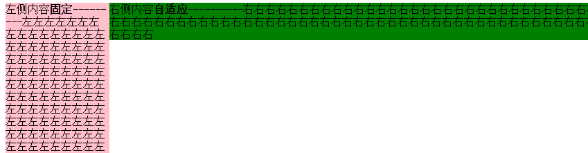
左侧内容 <strong>固定</strong>
---------左左左左左左左左左左左左左左左左左左左左左左左左左左左左左左左左左左左左左左左左左左左左左左左左左左左左左左左左左左左左左左左左左左左左左左左左左左左左左左左左左左左左左左左左左左左左左左左左左左左
</div>
<div class="right">
右侧内容 <strong>自适应</strong>
----------右右右右右右右右右右右右右右右右右右右右右右右右右右右右右右右右右右右右右右右右右右右右右右右右右右右右右右右右右右右右右右右右右右右右右右右右右右右右右右右右右右右右右右右右右右右右右右右右右右
</div>
</div>
</body>
</html>
3、BFC实现
.left {width: 150px;float: left;}

.right {display: table-cell;}
原理:左栏定宽浮动,右栏生成BFC,根据BFC特性,与浮动元素相邻的,创建了BFC的元素,都不能与浮动元素相互覆盖。
<!DOCTYPE html>
<meta charset="utf-8"/>
<html>
<head>
<title>2 columns layout of starof</title>
<style type="text/css">
.left {
width: 150px;
float: left;
background-color: pink;
} /*流体布局*/
.right {
display: table-cell;
background-color: green;
}
</style>
</head>
<body>
<div class="left">
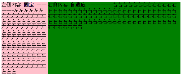
左侧内容 <strong>固定</strong>
---------左左左左左左左左左左左左左左左左左左左左左左左左左左左左左左左左左左左左左左左左左左左左左左左左左左左左左左左左左左左左左左左左左左左左左左左左左左左左左左左左左左左左左左左左左左左左左左左左左左左
</div>
<div class="right">
右侧内容 <strong>自适应</strong>
----------右右右右右右右右右右右右右右右右右右右右右右右右右右右右右右右右右右右右右右右右右右右右右右右右右右右右右右右右右右右右右右右右右右右右右右右右右右右右右右右右右右右右右右右右右右右右右右右右右右
</div>
</body>
</html>
效果同上。
4、table实现
.container {width: 100%;display: table;}

.left {width: 150px;display: table-cell;}

.right {display: table-cell;}
原理:不说了。
<!DOCTYPE html>

<meta charset="utf-8"/>

<html>

<head>

    <title>2 columns layout of starof</title>

<style type="text/css">

.container {

    width: 100%;

    display: table;

}

.left {

    width: 150px;

    display: table-cell;

    background-color: pink;

}

.right {

    display: table-cell;

    background-color: green;

}

</style>

</head>

<body>

    <div class="container">

        <div class="left">

            左侧内容 <strong>固定</strong>

            ---------左左左左左左左左左左左左左左左左左左左左左左左左左左左左左左左左左左左左左左左左左左左左左左左左左左左左左左左左左左左左左左左左左左左左左左左左左左左左左左左左左左左左左左左左左左左左左左左左左左左

        </div>

        <div class="right">

            右侧内容 <strong>自适应</strong>

            ----------右右右右右右右右右右右右右右右右右右右右右右右右右右右右右右右右右右右右右右右右右右右右右右右右右右右右右右右右右右右右右右右右右右右右右右右右右右右右右右右右右右右右右右右右右右右右右右右右右右

        </div>

    </div>

</body>

</html>
二、 右侧尺寸固定,左侧自适应的流体布局
1、不改变DOM位置的写法【用的比较多】
在css浮动一文已介绍过。
.wrap {

    width: 100%;

    float: left;

    background-color: green;

}

.left {

    margin-right: 150px;

}

.right {

    width: 150px;

    float: left;

    margin-left: -150px;

    background-color: pink;

}
原理:给left包裹一层wrap,wrap用来布局,left调整内容。
wrap和right都左浮动,这样right会超过视口,通过设置margin-left负值拉回。
此时right回到窗口,但会覆盖wrap内容。left就派上用场了,left设置margin-right将内容拉回。此时布局和内容都达到目的,完成!
<!DOCTYPE html>
<meta charset="utf-8"/>
<html>
<head>
<title></title>
<style type="text/css">
.wrap {
width: 100%;
float: left;
background-color: green;
}
.left {
margin-right: 150px;
}
.right {
width: 150px;
float: left;
margin-left: -150px;
background-color: pink;
}
</style>
</head>
<body>
<div class="wrap">
<div class="left">
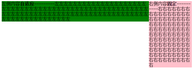
左侧内容 <strong>自适应</strong>
---------左左左左左左左左左左左左左左左左左左左左左左左左左左左左左左左左左左左左左左左左左左左左左左左左左左左左左左左左左左左左左左左左左左左左左左左左左左左左左左左左左左左左左左左左左左左左左左左左左左左
</div>
</div>
<div class="right">
右侧内容 <strong>固定</strong>
----------右右右右右右右右右右右右右右右右右右右右右右右右右右右右右右右右右右右右右右右右右右右右右右右右右右右右右右右右右右右右右右右右右右右右右右右右右右右右右右右右右右右右右右右右右右右右右右右右右右
</div>
</body>
</html>
2、改变DOM位置的写法
在css浮动一文已介绍过。
.right{

float: right;

width: 150px;

}

.left{

margin-right: 150px;

}
原理:因为右边先渲染,右边右浮动,左边设margin-right即可。
<!DOCTYPE html>

<meta charset="utf-8"/>

<html>

<head>

    <title>2 columns layout of starof</title>

    <style type="text/css">

.left {

    margin-right: 150px;

    background-color: green;

}

.right {

    width: 150px;

    float: right;

    background-color: pink;

}

</style>

</head>

<body>

    <div class="right">

        右侧内容 <strong>固定</strong>

        ----------右右右右右右右右右右右右右右右右右右右右右右右右右右右右右右右右右右右右右右右右右右右右右右右右右右右右右右右右右右右右右右右右右右右右右右右右右右右右右右右右右右右右右右右右右右右右右右右右右右

    </div>

    <div class="left">

        左侧内容 <strong>自适应</strong>

        ---------左左左左左左左左左左左左左左左左左左左左左左左左左左左左左左左左左左左左左左左左左左左左左左左左左左左左左左左左左左左左左左左左左左左左左左左左左左左左左左左左左左左左左左左左左左左左左左左左左左左

    </div>

</body>

</html>

三、左右都自适应
在css浮动一文已介绍过。
.left {float: left;}

.right{display: table-cell;}
原理:左栏左浮动,右栏生成BFC,根据BFC特性:与浮动元素相邻的、创建了BFC的元素,都不能与浮动元素相互覆盖。
<!DOCTYPE html>
<meta charset="utf-8"/>
<html>
<head>
<title>2 columns layout of starof</title>
<style type="text/css">
.left {
float: left;
background-color: green;
}
img{
width: 100px;
height: 100px;
}
.right {
display: table-cell;
background-color: pink;
}
</style>
</head>
<body>
<div class="left">
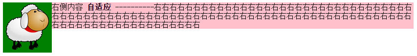
<img src="img/sheep.png"></div>
<div class="right">
右侧内容 <strong>自适应</strong>
----------右右右右右右右右右右右右右右右右右右右右右右右右右右右右右右右右右右右右右右右右右右右右右右右右右右右右右右右右右右右右右右右右右右右右右右右右右右右右右右右右右右右右右右右右右右右右右右右右右右
</div>
</body>
</html>
缺点:由于IE6并不支持display:table-cell,用css hack弥补,右侧设定overflow:auto;zoom:1或者overflow:hidden;zoom:1。
.right{ display:table-cell;_display:block;zoom:;}
应用案例:红色框部分,两栏自适应,左右都不定宽,右侧栏数量不定。
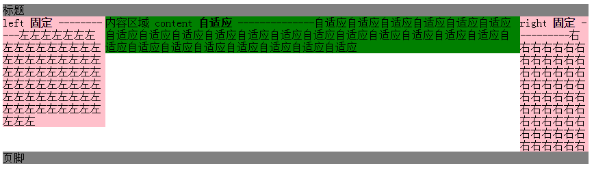
四、三栏布局,左右定宽,中间内容自适应【update20170422】
1、左右float+中间margin实现
.left {width: 150px;float: left;}

.right {width: 100px;float: right;}

.content {margin-right: 100px;margin-left: 150px;}

.footer {clear: both;}
原理:用float实现。
左边定宽左浮动,右边定宽右浮动,中间margin调整左右间距,底部清除浮动。
Note:left和right的html代码写在content之前,先渲染。
<!DOCTYPE>
<html>
<meta charset="utf-8"/>
<head>
<title>3 columns layout of starof</title>
<style type="text/css">
.header {
background-color: gray;
} .left {
background-color: pink;
width: 150px;
float: left;
} .right {
background-color: pink;
float: right;
width: 100px;
} .content {
background-color: green;
margin-right: 100px;
margin-left: 150px;
} .footer {
background-color: grey;
clear: both;
}
</style>
</head>
<body>
<div id="page">
<div class="header">
标题
</div>
<div class="left">
left <strong>固定</strong>
-----------左左左左左左左左左左左左左左左左左左左左左左左左左左左左左左左左左左左左左左左左左左左左左左左左左左左左左左左左左左左左左左左左
</div>
<div class="right">
right <strong>固定</strong>
----------右右右右右右右右右右右右右右右右右右右右右右右右右右右右右右右右右右右右右右右右右右右右右右右右右右右右右右右
</div> <div class="content">
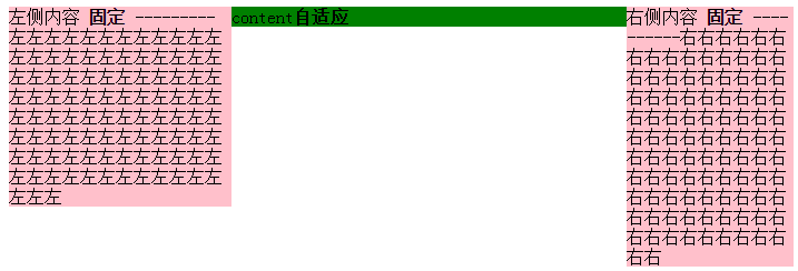
内容区域
content
<strong>自适应</strong>
--------------自适应自适应自适应自适应自适应自适应自适应自适应自适应自适应自适应自适应自适应自适应自适应自适应自适应自适应自适应自适应自适应自适应自适应自适应自适应自适应
</div>
<div class="footer">
<p>页脚</P>
</div>
</div>
</body>
</html>
缺点:
DOM顺序和视觉顺序不同,关键的主体内容在文档后面,主次不合理。如果右栏包含大量脚本资源,可能影响甚至阻塞整个页面的载入。不适合用做整站页面框架的搭建。
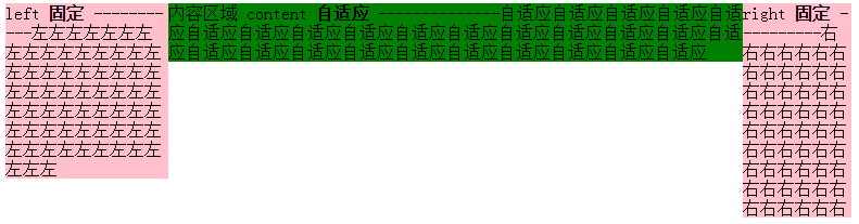
2、左右绝对定位+margin
原理:左右绝对定位,中间margin:0 100px 0 150px;
<!DOCTYPE>

<html>

<meta charset="utf-8"/>

<head>

    <title>3 columns layout of starof</title>

    <style type="text/css">

        .page{

            position: relative;

        }

        .left {

            background-color: pink;

            width: 150px;

            position: absolute;

            left: 0;

            top:0;

        }

        .right {

            background-color: pink;

            position: absolute;

            right:0;

            top: 0;

            width: 100px;

        }

        .content {

            background-color: green;

            margin-right: 100px;

            margin-left: 150px;

        }

    </style>

</head>

<body>

<div class="page">

    <div class="left">

        left <strong>固定</strong>

        -----------左左左左左左左左左左左左左左左左左左左左左左左左左左左左左左左左左左左左左左左左左左左左左左左左左左左左左左左左左左左左左左左左

    </div>

    <div class="content">

        内容区域

        content

        <strong>自适应</strong>

        --------------自适应自适应自适应自适应自适应自适应自适应自适应自适应自适应自适应自适应自适应自适应自适应自适应自适应自适应自适应自适应自适应自适应自适应自适应自适应自适应

    </div>

    <div class="right">

        right <strong>固定</strong>

        ----------右右右右右右右右右右右右右右右右右右右右右右右右右右右右右右右右右右右右右右右右右右右右右右右右右右右右右右右

    </div>

</div>

</body>

</html>
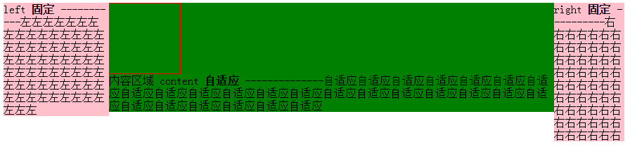
3、左中右全部浮动+左右margin-left负值
重点是content 右2层标签,外层content布局,内层body内容展示。content,right,content都左浮动。content100%宽度,left设置margin-left:-100%,由于前面的content宽度100%于浏览器,所以这里的-100%margin值正好使左栏div定位到了页面的左侧,right设置margin-left:-100px;content里面加一层body为内容主体,设置margin:0 100px 0 150px;
<!DOCTYPE>

<html>

<meta charset="utf-8"/>

<head>

    <title>3 columns layout of starof</title>

    <style type="text/css">

        .content, .left, .right {

            float: left;

        }

        .left {

            background-color: pink;

            width: 150px;

            margin-left: -100%;

        }

        .right {

            background-color: pink;

            width: 100px;

            margin-left: -100px;

        }

        .content {

            width: 100%;

            background-color: green;

        }

        .body {

            margin-left: 150px;

            margin-right: 100px;

        }

    </style>

</head>

<body>

<div class="content">

    <div class="body">

        <div style="width:100px;height: 100px;border:1px solid red"></div>

        内容区域

        content

        <strong>自适应</strong>

        --------------自适应自适应自适应自适应自适应自适应自适应自适应自适应自适应自适应自适应自适应自适应自适应自适应自适应自适应自适应自适应自适应自适应自适应自适应自适应自适应

    </div>

</div>

<div class="left">

    left <strong>固定</strong>

    -----------左左左左左左左左左左左左左左左左左左左左左左左左左左左左左左左左左左左左左左左左左左左左左左左左左左左左左左左左左左左左左左左左

</div>

<div class="right">

    right <strong>固定</strong>

    ----------右右右右右右右右右右右右右右右右右右右右右右右右右右右右右右右右右右右右右右右右右右右右右右右右右右右右右右右

</div>

</body>

</html>
content结构在left和right前面。
4、float+负margin实现
原理:分而治之,多封装一层,两两处理。
原理简单,处理起来稍复杂,我分步说明。
步骤一:先处理好right布局,wrap和right都左浮动,即应用上面【右侧尺寸固定,左侧自适应的流体布局】的第一种方法。
<!DOCTYPE html>
<meta charset="utf-8"/>
<html>
<head>
<title></title>
<style type="text/css">
.wrap {
width: 100%;
float: left;
background-color: green;
}
.leftwrap {
margin-right: 150px;
}
.right {
width: 150px;
float: left;
margin-left: -150px;
background-color: pink;
}
</style>
</head>
<body>
<div class="wrap">
<div class="leftwrap">
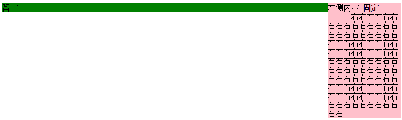
留空
</div>
</div>
<div class="right">
右侧内容 <strong>固定</strong>
----------右右右右右右右右右右右右右右右右右右右右右右右右右右右右右右右右右右右右右右右右右右右右右右右右右右右右右右右右右右右右右右右右右右右右右右右右右右右右右右右右右右右右右右右右右右右右右右右右右右
</div>
</body>
</html>
目前的效果是这样:
将左边leftwrap留空部分补上下面结构
<div class="contentwrap">

    <div class="content">主体部分</div>

</div>

<div class="left">左侧栏</div>
步骤二:再处理left和content布局,contentwrap右浮动,left左浮动,完成。
<!DOCTYPE html>

<meta charset="utf-8"/>

<html>

<head>

    <title>3 columns layout of starof</title>

<style type="text/css">

/*步骤一:先处理好right布局,wrap和right都右浮动*/

.wrap { width: 100%; float: left; } /*wrap控制布局*/

.leftwrap { margin-right: 150px; }/*leftwrap控制内容*/

.right { width: 150px; float: left; margin-left: -150px; background-color: pink; }

/*步骤二:再处理left和content布局,contentwrap右浮动,left左浮动*/

.contentwrap { float: right; width: 100%; }/*contentwrap控制主体内容布局*/

.left { float: left; width: 200px; margin-right: -200px; background-color: pink; }

.content { margin-left: 200px; background-color: green; }/*content控制主体内容*/

</style>

</head>

<body>

    <div class="wrap">

        <div class="leftwrap">

            <div class="contentwrap">

                <div class="content">content<strong>自适应</strong></div>

            </div>

            <div class="left">

            左侧内容 <strong>固定</strong>

            ---------左左左左左左左左左左左左左左左左左左左左左左左左左左左左左左左左左左左左左左左左左左左左左左左左左左左左左左左左左左左左左左左左左左左左左左左左左左左左左左左左左左左左左左左左左左左左左左左左左左左</div>

        </div>

    </div>

    <div class="right">

        右侧内容 <strong>固定</strong>

        ----------右右右右右右右右右右右右右右右右右右右右右右右右右右右右右右右右右右右右右右右右右右右右右右右右右右右右右右右右右右右右右右右右右右右右右右右右右右右右右右右右右右右右右右右右右右右右右右右右右右

    </div>

</body>

</html>
缺点:嵌套多层标签,html文档不够简洁。
总结:如果不是必要,浮动布局不要轻易定宽高,尽量自适应。
资源链接:
基于CSS3的自适应布局技术
https://github.com/RubyLouvre/myless/issues/2
本文作者starof,因知识本身在变化,作者也在不断学习成长,文章内容也不定时更新,为避免误导读者,方便追根溯源,请诸位转载注明出处:http://www.cnblogs.com/starof/p/4744392.html有问题欢迎与我讨论,共同进步。
css多栏自适应布局的更多相关文章
- css 多栏自适应布局
在页面重构中,我们经常会需要实现多栏布局,例如n栏固定宽度 + m栏自适应宽度的组合,绝对布局+padding+百分比宽度是容易想到的比较暴力的解决方法,但是作为未来的"工程师", ...
- CSS 三栏自适应布局
CSS布局 这个很基础,方法也很多,要留意的知识点还是有一些. 比如IE6的触发layout *zoom:1 比如使用浮动后的清除浮动 clear:both 需求的延伸也会有一些: 比如三栏等高 ...
- CSS 3栏自适应布局
绝对定位 css html,body{margin: 0px;height:100%;} div{height: 100%;} .left,.right {top: 0px;position: abs ...
- 【转】CSS深入理解流体特性和BFC特性下多栏自适应布局
这篇文章发布于 2015年02月12日,星期四,23:36,归类于 css相关. 阅读 30873 次, 今日 63 次 by zhangxinxu from http://www.zhangxinx ...
- CSS深入理解流体特性和BFC特性下多栏自适应布局
一.块状元素的流体特性与自适应布局 块状元素像放在容器中的水流一样,内容区域会随着margin, padding, border的出现自动填满剩余空间,这就是块状元素的流体特性. 来一个小实验: di ...
- css实现等高布局 两栏自适应布局 三栏自适应布局
等高布局: HTML结构如下: <div class="wrapper"> <div class="box"> <h1>.. ...
- 你知道BFC、IFC、FFC、GFC及多栏自适应布局吗?
FC(Formatting Context)格式化内容,常见的FC有BFC.IFC.FFC.GFC四种类型,BFC和IFC是W3C CSS2.1规范提出的概念,FFC和GFC是W3C CSS3规范提出 ...
- css布局 - 两栏自适应布局的几种实现方法汇总
这种两列布局的样式是我们在平时工作中非常常见的设计,同时也是面试中要求实现的高频题.很有必要掌握以备不时之需: 整理了几种实现方法,当然,风骚的代码不止这几种能实现,欢迎各位的补充. 方法汇总目录 简 ...
- 使用CSS实现三栏自适应布局(两边宽度固定,中间自适应)
来源:http://blog.csdn.net/cinderella_hou/article/details/52156333 所谓三列自适应布局指的是两边定宽,中间block宽度自适应.这道题在今年 ...
随机推荐
- Eclipse的SVN插件提示:验证验证位置时发生错误:"Unable to load default SVN Client“解决
这个原因是你的机器上没有 JAVAHL 这个包, 这个是另外的一个开源组件, 所以, 在trigis的svn插件发行版里面没有这个东西,下载装上就是, 这个包在不同的系统上, 有不同的情况...详情见 ...
- 今天做项目时,用到了好多关于js的知识点,有的忘记了,然后晚上回来自己整理一番,明天继续整理。哈哈,分享给大家。
javascript 数据类型 typeof (直接量/变量)-------判断数据类型 简单数据类型(栈,空间小,速度快) string字符串 用引号引起来的文本 number数字 所有数字 NaN ...
- Dewplayer 音乐播放器
Dewplayer 是一款用于 Web 的轻量级 Flash 音乐播放器.提供有多种样式选择,支持播放列表,并可以通过 JavaScript 接口来控制播放器. 注意事项: 该播放器只支持 mp3 格 ...
- Planetary.js:帮助你构建超炫的互动球体效果
Planetary.js 是一个 JavaScript 库,用于构建互动球体效果.它使用 D3 和 TopoJSON 解析和渲染地理数据.Planetary.js 采用了基于插件的架构,即使是默认的功 ...
- JavaScript学习笔记-对象
枚举对象的属性:通常用for(...in...)来循环遍历,由于 for in 总是要遍历整个原型链,因此如果一个对象的继承层次太深的话会影响性能 for(var i in foo){ if(foo. ...
- 微信不支持Object.assign
微信不支持Object.assign,让我Vue怎么用QAQ... 解决方法: https://developer.mozilla.org/zh-CN/docs/Web/JavaScript/Refe ...
- SharePoint Online 创建门户网站系列之首页布局
前 言 SharePoint Online中创建首页布局,一般都是首先将美工提供的效果图,切图成为Html + Css + Script的形式,然后,将所有资源文件传到SharePoint Onlin ...
- HttpClient示例
<%@page import="com.sun.xml.ws.client.BindingProviderProperties"%> <%@page conten ...
- 操作系统开发系列—12.e.Makefile
先来看一个简单的Makefile,我们把它放在目录/boot下,可以用来编译boot.bin和loader.bin. # Makefile for boot # Programs, flags, et ...
- 配置Kotlin环境(DataBinding)
1.安装Kotlin插件 在plugin中搜索kotlin,安装两个kotlin插件,重新启动Android Studio.2.build.gradle(project level) buildscr ...