css多栏自适应布局
css多栏自适应布局还是需要总结一下的,都是基本功。
一般使用position属性布局,或者用float属性布局,也可以使用display属性。
看资料说position适合首页布局,因为首页内容往往可以完全控制。float适合模板布局,模板中填充的内容无法控制。
一、左侧尺寸固定右侧自适应
1、浮动实现
在css浮动一文已介绍过。
 .left{

    width: 150px; float: left;

  }

  /*流体布局*/

.right { margin-left: 150px;}
原理:左侧定宽浮动,右侧使用margin-left,且不要定宽,容器尺寸变化右侧可自适应
<!DOCTYPE html>
<meta charset="utf-8"/>
<html>
<head>
<title></title>
<style type="text/css">
.left {
width: 150px;
float: left;
background-color: pink;
} /*流体布局*/
.right {
margin-left: 150px;
background-color: green;
}
</style>
</head>
<body>
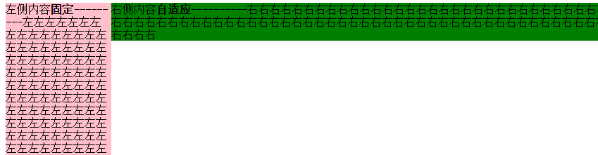
<div class="left">
左侧内容固定---------左左左左左左左左左左左左左左左左左左左左左左左左左左左左左左左左左左左左左左左左左左左左左左左左左左左左左左左左左左左左左左左左左左左左左左左左左左左左左左左左左左左左左左左左左左左左左左左左左左左
</div>
<div class="right">
右侧内容自适应----------右右右右右右右右右右右右右右右右右右右右右右右右右右右右右右右右右右右右右右右右右右右右右右右右右右右右右右右右右右右右右右右右右右右右右右右右右右右右右右右右右右右右右右右右右右右右右右右右右右
</div>
</body>
</html>

2、绝对定位实现
.container{width: 100%;position: relative;padding-left: 150px;}

.left {width: 150px;position: absolute;left:;}

/*流体布局*/

.right {width: 100%;}
原理:重点是container设置padding-left给left腾出空间,left相对于containr绝对定位,right占满剩余空间。
<!DOCTYPE html>
<meta charset="utf-8"/>
<html>
<head>
<title>2 columns layout of starof</title>
<style type="text/css">
.container {
width: 100%;
position: relative;
padding-left: 150px;
}
.left {
width: 150px;
position: absolute;
left: 0;
background-color: pink;
} /*流体布局*/
.right {
width: 100%;
background-color: green;
}
</style>
</head>
<body>
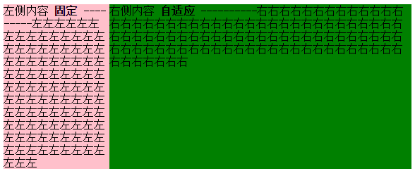
<div class="container">
<div class="left">
左侧内容 <strong>固定</strong>
---------左左左左左左左左左左左左左左左左左左左左左左左左左左左左左左左左左左左左左左左左左左左左左左左左左左左左左左左左左左左左左左左左左左左左左左左左左左左左左左左左左左左左左左左左左左左左左左左左左左左
</div>
<div class="right">
右侧内容 <strong>自适应</strong>
----------右右右右右右右右右右右右右右右右右右右右右右右右右右右右右右右右右右右右右右右右右右右右右右右右右右右右右右右右右右右右右右右右右右右右右右右右右右右右右右右右右右右右右右右右右右右右右右右右右右
</div>
</div>
</body>
</html>
3、BFC实现
.left {width: 150px;float: left;}

.right {display: table-cell;}
原理:左栏定宽浮动,右栏生成BFC,根据BFC特性,与浮动元素相邻的,创建了BFC的元素,都不能与浮动元素相互覆盖。
<!DOCTYPE html>

<meta charset="utf-8"/>

<html>

<head>

    <title>2 columns layout of starof</title>

<style type="text/css">

.left {

    width: 150px;

    float: left;

    background-color: pink;

}

/*流体布局*/

.right {

    display: table-cell;

    background-color: green;

}

</style>

</head>

<body>

        <div class="left">

            左侧内容 <strong>固定</strong>

            ---------左左左左左左左左左左左左左左左左左左左左左左左左左左左左左左左左左左左左左左左左左左左左左左左左左左左左左左左左左左左左左左左左左左左左左左左左左左左左左左左左左左左左左左左左左左左左左左左左左左左

        </div>

        <div class="right">

            右侧内容 <strong>自适应</strong>

            ----------右右右右右右右右右右右右右右右右右右右右右右右右右右右右右右右右右右右右右右右右右右右右右右右右右右右右右右右右右右右右右右右右右右右右右右右右右右右右右右右右右右右右右右右右右右右右右右右右右右

        </div>

</body>

</html>
效果同上。
4、table实现
.container {width: 100%;display: table;}

.left {width: 150px;display: table-cell;}

.right {display: table-cell;}
原理:不说了。
<!DOCTYPE html>

<meta charset="utf-8"/>

<html>

<head>

    <title>2 columns layout of starof</title>

<style type="text/css">

.container {

    width: 100%;

    display: table;

}

.left {

    width: 150px;

    display: table-cell;

    background-color: pink;

}

.right {

    display: table-cell;

    background-color: green;

}

</style>

</head>

<body>

    <div class="container">

        <div class="left">

            左侧内容 <strong>固定</strong>

            ---------左左左左左左左左左左左左左左左左左左左左左左左左左左左左左左左左左左左左左左左左左左左左左左左左左左左左左左左左左左左左左左左左左左左左左左左左左左左左左左左左左左左左左左左左左左左左左左左左左左左

        </div>

        <div class="right">

            右侧内容 <strong>自适应</strong>

            ----------右右右右右右右右右右右右右右右右右右右右右右右右右右右右右右右右右右右右右右右右右右右右右右右右右右右右右右右右右右右右右右右右右右右右右右右右右右右右右右右右右右右右右右右右右右右右右右右右右右

        </div>

    </div>

</body>

</html>
二、 右侧尺寸固定,左侧自适应的流体布局
1、不改变DOM位置的写法【用的比较多】
在css浮动一文已介绍过。
.wrap {

    width: 100%;

    float: left;

    background-color: green;

}

.left {

    margin-right: 150px;

}

.right {

    width: 150px;

    float: left;

    margin-left: -150px;

    background-color: pink;

}
原理:给left包裹一层wrap,wrap用来布局,left调整内容。
wrap和right都左浮动,这样right会超过视口,通过设置margin-left负值拉回。
此时right回到窗口,但会覆盖wrap内容。left就派上用场了,left设置margin-right将内容拉回。此时布局和内容都达到目的,完成!
<!DOCTYPE html>
<meta charset="utf-8"/>
<html>
<head>
<title></title>
<style type="text/css">
.wrap {
width: 100%;
float: left;
background-color: green;
}
.left {
margin-right: 150px;
}
.right {
width: 150px;
float: left;
margin-left: -150px;
background-color: pink;
}
</style>
</head>
<body>
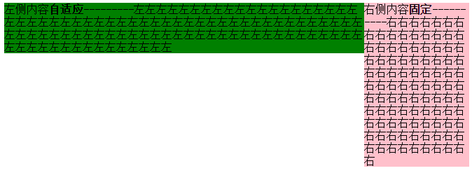
<div class="wrap">
<div class="left">
左侧内容 <strong>自适应</strong>
---------左左左左左左左左左左左左左左左左左左左左左左左左左左左左左左左左左左左左左左左左左左左左左左左左左左左左左左左左左左左左左左左左左左左左左左左左左左左左左左左左左左左左左左左左左左左左左左左左左左左
</div>
</div>
<div class="right">
右侧内容 <strong>固定</strong>
----------右右右右右右右右右右右右右右右右右右右右右右右右右右右右右右右右右右右右右右右右右右右右右右右右右右右右右右右右右右右右右右右右右右右右右右右右右右右右右右右右右右右右右右右右右右右右右右右右右右
</div>
</body>
</html>
2、改变DOM位置的写法
在css浮动一文已介绍过。
.right{

float: right;

width: 150px;

}

.left{

margin-right: 150px;

}
原理:因为右边先渲染,右边右浮动,左边设margin-right即可。
<!DOCTYPE html>

<meta charset="utf-8"/>

<html>

<head>

    <title>2 columns layout of starof</title>

    <style type="text/css">

.left {

    margin-right: 150px;

    background-color: green;

}

.right {

    width: 150px;

    float: right;

    background-color: pink;

}

</style>

</head>

<body>

    <div class="right">

        右侧内容 <strong>固定</strong>

        ----------右右右右右右右右右右右右右右右右右右右右右右右右右右右右右右右右右右右右右右右右右右右右右右右右右右右右右右右右右右右右右右右右右右右右右右右右右右右右右右右右右右右右右右右右右右右右右右右右右右

    </div>

    <div class="left">

        左侧内容 <strong>自适应</strong>

        ---------左左左左左左左左左左左左左左左左左左左左左左左左左左左左左左左左左左左左左左左左左左左左左左左左左左左左左左左左左左左左左左左左左左左左左左左左左左左左左左左左左左左左左左左左左左左左左左左左左左左

    </div>

</body>

</html>

三、左右都自适应
在css浮动一文已介绍过。
.left {float: left;}

.right{display: table-cell;}
原理:左栏左浮动,右栏生成BFC,根据BFC特性:与浮动元素相邻的、创建了BFC的元素,都不能与浮动元素相互覆盖。
<!DOCTYPE html>
<meta charset="utf-8"/>
<html>
<head>
<title>2 columns layout of starof</title>
<style type="text/css">
.left {
float: left;
background-color: green;
}
img{
width: 100px;
height: 100px;
}
.right {
display: table-cell;
background-color: pink;
}
</style>
</head>
<body>
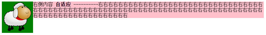
<div class="left">
<img src="img/sheep.png"></div>
<div class="right">
右侧内容 <strong>自适应</strong>
----------右右右右右右右右右右右右右右右右右右右右右右右右右右右右右右右右右右右右右右右右右右右右右右右右右右右右右右右右右右右右右右右右右右右右右右右右右右右右右右右右右右右右右右右右右右右右右右右右右右
</div>
</body>
</html>
缺点:由于IE6并不支持display:table-cell,用css hack弥补,右侧设定overflow:auto;zoom:1或者overflow:hidden;zoom:1。
.right{ display:table-cell;_display:block;zoom:;}
应用案例:红色框部分,两栏自适应,左右都不定宽,右侧栏数量不定。
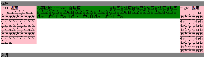
四、三栏布局,左右定宽,中间内容自适应【update20170422】
1、左右float+中间margin实现
.left {width: 150px;float: left;}

.right {width: 100px;float: right;}

.content {margin-right: 100px;margin-left: 150px;}

.footer {clear: both;}
原理:用float实现。
左边定宽左浮动,右边定宽右浮动,中间margin调整左右间距,底部清除浮动。
Note:left和right的html代码写在content之前,先渲染。
<!DOCTYPE>

<html>

<meta charset="utf-8"/>

<head>

    <title>3 columns layout of starof</title>

    <style type="text/css">

        .header {

            background-color: gray;

        }

        .left {

            background-color: pink;

            width: 150px;

            float: left;

        }

        .right {

            background-color: pink;

            float: right;

            width: 100px;

        }

        .content {

            background-color: green;

            margin-right: 100px;

            margin-left: 150px;

        }

        .footer {

            background-color: grey;

            clear: both;

        }

    </style>

</head>

<body>

<div id="page">

    <div class="header">

        标题

    </div>

    <div class="left">

        left <strong>固定</strong>

        -----------左左左左左左左左左左左左左左左左左左左左左左左左左左左左左左左左左左左左左左左左左左左左左左左左左左左左左左左左左左左左左左左左

    </div>

    <div class="right">

        right <strong>固定</strong>

        ----------右右右右右右右右右右右右右右右右右右右右右右右右右右右右右右右右右右右右右右右右右右右右右右右右右右右右右右右

    </div>

    <div class="content">

        内容区域

        content

        <strong>自适应</strong>

        --------------自适应自适应自适应自适应自适应自适应自适应自适应自适应自适应自适应自适应自适应自适应自适应自适应自适应自适应自适应自适应自适应自适应自适应自适应自适应自适应

    </div>

    <div class="footer">

        <p>页脚</P>

    </div>

</div>

</body>

</html>
缺点:
DOM顺序和视觉顺序不同,关键的主体内容在文档后面,主次不合理。如果右栏包含大量脚本资源,可能影响甚至阻塞整个页面的载入。不适合用做整站页面框架的搭建。
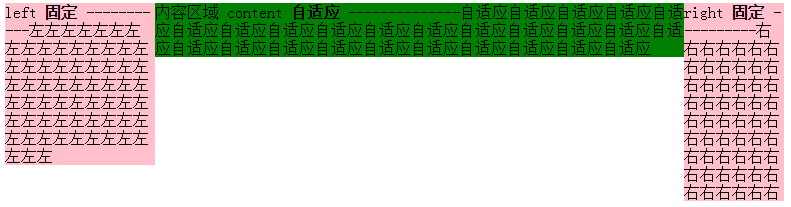
2、左右绝对定位+margin
原理:左右绝对定位,中间margin:0 100px 0 150px;
<!DOCTYPE>

<html>

<meta charset="utf-8"/>

<head>

    <title>3 columns layout of starof</title>

    <style type="text/css">

        .page{

            position: relative;

        }

        .left {

            background-color: pink;

            width: 150px;

            position: absolute;

            left: 0;

            top:0;

        }

        .right {

            background-color: pink;

            position: absolute;

            right:0;

            top: 0;

            width: 100px;

        }

        .content {

            background-color: green;

            margin-right: 100px;

            margin-left: 150px;

        }

    </style>

</head>

<body>

<div class="page">

    <div class="left">

        left <strong>固定</strong>

        -----------左左左左左左左左左左左左左左左左左左左左左左左左左左左左左左左左左左左左左左左左左左左左左左左左左左左左左左左左左左左左左左左左

    </div>

    <div class="content">

        内容区域

        content

        <strong>自适应</strong>

        --------------自适应自适应自适应自适应自适应自适应自适应自适应自适应自适应自适应自适应自适应自适应自适应自适应自适应自适应自适应自适应自适应自适应自适应自适应自适应自适应

    </div>

    <div class="right">

        right <strong>固定</strong>

        ----------右右右右右右右右右右右右右右右右右右右右右右右右右右右右右右右右右右右右右右右右右右右右右右右右右右右右右右右

    </div>

</div>

</body>

</html>
3、左中右全部浮动+左右margin-left负值
重点是content 右2层标签,外层content布局,内层body内容展示。content,right,content都左浮动。content100%宽度,left设置margin-left:-100%,由于前面的content宽度100%于浏览器,所以这里的-100%margin值正好使左栏div定位到了页面的左侧,right设置margin-left:-100px;content里面加一层body为内容主体,设置margin:0 100px 0 150px;
<!DOCTYPE>

<html>

<meta charset="utf-8"/>

<head>

    <title>3 columns layout of starof</title>

    <style type="text/css">

        .content, .left, .right {

            float: left;

        }

        .left {

            background-color: pink;

            width: 150px;

            margin-left: -100%;

        }

        .right {

            background-color: pink;

            width: 100px;

            margin-left: -100px;

        }

        .content {

            width: 100%;

            background-color: green;

        }

        .body {

            margin-left: 150px;

            margin-right: 100px;

        }

    </style>

</head>

<body>

<div class="content">

    <div class="body">

        <div style="width:100px;height: 100px;border:1px solid red"></div>

        内容区域

        content

        <strong>自适应</strong>

        --------------自适应自适应自适应自适应自适应自适应自适应自适应自适应自适应自适应自适应自适应自适应自适应自适应自适应自适应自适应自适应自适应自适应自适应自适应自适应自适应

    </div>

</div>

<div class="left">

    left <strong>固定</strong>

    -----------左左左左左左左左左左左左左左左左左左左左左左左左左左左左左左左左左左左左左左左左左左左左左左左左左左左左左左左左左左左左左左左左

</div>

<div class="right">

    right <strong>固定</strong>

    ----------右右右右右右右右右右右右右右右右右右右右右右右右右右右右右右右右右右右右右右右右右右右右右右右右右右右右右右右

</div>

</body>

</html>
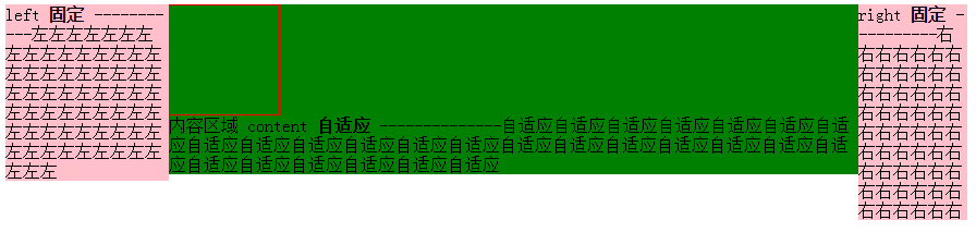
content结构在left和right前面。
4、float+负margin实现
原理:分而治之,多封装一层,两两处理。
原理简单,处理起来稍复杂,我分步说明。
步骤一:先处理好right布局,wrap和right都左浮动,即应用上面【右侧尺寸固定,左侧自适应的流体布局】的第一种方法。
<!DOCTYPE html>

<meta charset="utf-8"/>

<html>

<head>

    <title></title>

<style type="text/css">

.wrap {

    width: 100%;

    float: left;

    background-color: green;

}

.leftwrap {

    margin-right: 150px;

}

.right {

    width: 150px;

    float: left;

    margin-left: -150px;

    background-color: pink;

}

</style>

</head>

<body>

    <div class="wrap">

        <div class="leftwrap">

            留空

        </div>

    </div>

    <div class="right">

        右侧内容 <strong>固定</strong>

        ----------右右右右右右右右右右右右右右右右右右右右右右右右右右右右右右右右右右右右右右右右右右右右右右右右右右右右右右右右右右右右右右右右右右右右右右右右右右右右右右右右右右右右右右右右右右右右右右右右右右

    </div>

</body>

</html>
目前的效果是这样:
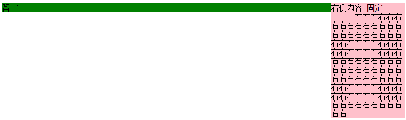
将左边leftwrap留空部分补上下面结构
<div class="contentwrap">

    <div class="content">主体部分</div>

</div>

<div class="left">左侧栏</div>
步骤二:再处理left和content布局,contentwrap右浮动,left左浮动,完成。
<!DOCTYPE html>
<meta charset="utf-8"/>
<html>
<head>
<title>3 columns layout of starof</title>
<style type="text/css">
/*步骤一:先处理好right布局,wrap和right都右浮动*/
.wrap { width: 100%; float: left; } /*wrap控制布局*/
.leftwrap { margin-right: 150px; }/*leftwrap控制内容*/
.right { width: 150px; float: left; margin-left: -150px; background-color: pink; }
/*步骤二:再处理left和content布局,contentwrap右浮动,left左浮动*/
.contentwrap { float: right; width: 100%; }/*contentwrap控制主体内容布局*/
.left { float: left; width: 200px; margin-right: -200px; background-color: pink; }
.content { margin-left: 200px; background-color: green; }/*content控制主体内容*/
</style>
</head>
<body>
<div class="wrap">
<div class="leftwrap">
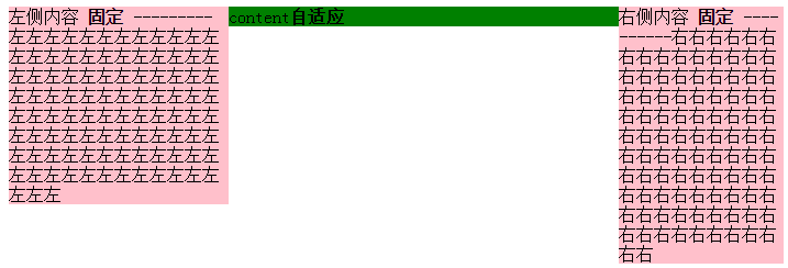
<div class="contentwrap">
<div class="content">content<strong>自适应</strong></div>
</div>
<div class="left">
左侧内容 <strong>固定</strong>
---------左左左左左左左左左左左左左左左左左左左左左左左左左左左左左左左左左左左左左左左左左左左左左左左左左左左左左左左左左左左左左左左左左左左左左左左左左左左左左左左左左左左左左左左左左左左左左左左左左左左</div>
</div>
</div>
<div class="right">
右侧内容 <strong>固定</strong>
----------右右右右右右右右右右右右右右右右右右右右右右右右右右右右右右右右右右右右右右右右右右右右右右右右右右右右右右右右右右右右右右右右右右右右右右右右右右右右右右右右右右右右右右右右右右右右右右右右右右
</div>
</body>
</html>
缺点:嵌套多层标签,html文档不够简洁。
总结:如果不是必要,浮动布局不要轻易定宽高,尽量自适应。
资源链接:
基于CSS3的自适应布局技术
https://github.com/RubyLouvre/myless/issues/2
本文作者starof,因知识本身在变化,作者也在不断学习成长,文章内容也不定时更新,为避免误导读者,方便追根溯源,请诸位转载注明出处:http://www.cnblogs.com/starof/p/4744392.html有问题欢迎与我讨论,共同进步。
css多栏自适应布局的更多相关文章
- css 多栏自适应布局
在页面重构中,我们经常会需要实现多栏布局,例如n栏固定宽度 + m栏自适应宽度的组合,绝对布局+padding+百分比宽度是容易想到的比较暴力的解决方法,但是作为未来的"工程师", ...
- CSS 三栏自适应布局
CSS布局 这个很基础,方法也很多,要留意的知识点还是有一些. 比如IE6的触发layout *zoom:1 比如使用浮动后的清除浮动 clear:both 需求的延伸也会有一些: 比如三栏等高 ...
- CSS 3栏自适应布局
绝对定位 css html,body{margin: 0px;height:100%;} div{height: 100%;} .left,.right {top: 0px;position: abs ...
- 【转】CSS深入理解流体特性和BFC特性下多栏自适应布局
这篇文章发布于 2015年02月12日,星期四,23:36,归类于 css相关. 阅读 30873 次, 今日 63 次 by zhangxinxu from http://www.zhangxinx ...
- CSS深入理解流体特性和BFC特性下多栏自适应布局
一.块状元素的流体特性与自适应布局 块状元素像放在容器中的水流一样,内容区域会随着margin, padding, border的出现自动填满剩余空间,这就是块状元素的流体特性. 来一个小实验: di ...
- css实现等高布局 两栏自适应布局 三栏自适应布局
等高布局: HTML结构如下: <div class="wrapper"> <div class="box"> <h1>.. ...
- 你知道BFC、IFC、FFC、GFC及多栏自适应布局吗?
FC(Formatting Context)格式化内容,常见的FC有BFC.IFC.FFC.GFC四种类型,BFC和IFC是W3C CSS2.1规范提出的概念,FFC和GFC是W3C CSS3规范提出 ...
- css布局 - 两栏自适应布局的几种实现方法汇总
这种两列布局的样式是我们在平时工作中非常常见的设计,同时也是面试中要求实现的高频题.很有必要掌握以备不时之需: 整理了几种实现方法,当然,风骚的代码不止这几种能实现,欢迎各位的补充. 方法汇总目录 简 ...
- 使用CSS实现三栏自适应布局(两边宽度固定,中间自适应)
来源:http://blog.csdn.net/cinderella_hou/article/details/52156333 所谓三列自适应布局指的是两边定宽,中间block宽度自适应.这道题在今年 ...
随机推荐
- 不简单的SQL查询和排序语句
真不简单!! 一:使用select语句进行查询 语法: SELECT <列名> FROM <表名> [WHERE <查询条件表达式>] [OR ...
- [Cordova] 无法显示Alert视窗
[Cordova] 无法显示Alert视窗 问题情景 今天开了一个Cordova专案做范例,将预设的index.html页面修改为下列内容.按下执行却发现,这样一个简单的范例无法正常执行.点击页面上的 ...
- HTML5 表单新增属性
1. 表单内元素的form属性 在H5中可以把form放到页面的任何地方,然后为该元素指定一个form属性,属性值为该表单的id,这样就可以声明该元素从属于指定表单了 <form id=&quo ...
- 利用IIS导出,导入快速部署 web站点
部署负载均衡站点的时候会创建多个站点拷贝.用脚本可以提高效率,并且减少错误 1 以管理员身份运行CMD 2 Cd C:\Windows\System32\inetsrv 3 导出指定的应用程序池 ap ...
- [GitHub] GitHub Repositories
https://github.com/karqical2016/karqical2016.github.io.git https://github.com/karqical2016/java.git ...
- objective-c系列-@Property&点语法
//解释 property后边的圆括号中的修饰词的含义: // nonatomic 非线程安全 非原子操作 特点是: 操作变量的效率高 // atomic ...
- IOS开发证书显示“此证书的签发者无效”解决方法
今天早上同事说咱们的证书无法使用了,显示“此证书的签发者无效”.一开始以为谁误操作了证书,查看后发现所有证书都无效了.查了会才发下原来是Apple Worldwide Developer Relati ...
- js confirm函数 删除提示
<a href="del.php" onclick="return confirm('是否将此留言信息删除?')">删除留言</a>
- WPF学习之路(十四)样式和模板
样式 实例: <Window.Resources> <Style x:Key="BtnStyle"> <Setter Property=" ...
- java获取客户端ID地址
转:http://zhenchengchagangzi.iteye.com/blog/1199300#bc2372048 在JSP里,获取客户端的IP地址的方法是:request.getRemoteA ...