多啦A梦的制作
小叮当简单颜色单一,操作起来也很容易上手。接下来的一个实例就是用css画出一个多啦A梦,首先将其分为头部,和身体。然后,再根据身体各部分细节进行进一步的具体刻画。
由于最近一直在学习JavaWeb方面的东西,所以,我的这个小叮当就是用jsp页面进行映衬。
代码如下:首先是写jsp页面,将其分成多个块,然后再分块操作:
 <%@ page language="java" import="java.util.*" pageEncoding="utf-8"%>

 <%

 String path = request.getContextPath();

 String basePath = request.getScheme()+"://"+request.getServerName()+":"+request.getServerPort()+path+"/";

 %>

 <!DOCTYPE HTML PUBLIC "-//W3C//DTD HTML 4.01 Transitional//EN">

 <html>

   <head>

     <base href="<%=basePath%>">

     <link rel="stylesheet" type="text/css" href="bootstrap-3.3.5-dist/css/bootstrap.min.css">

     <link rel="stylesheet" type="text/css" href="css/DLAM.css">

     <title>here</title>

     <meta http-equiv="pragma" content="no-cache">

     <meta http-equiv="cache-control" content="no-cache">

     <meta http-equiv="expires" content="0">

     <meta http-equiv="keywords" content="keyword1,keyword2,keyword3">

     <meta http-equiv="description" content="This is my page">

     <!--

     <link rel="stylesheet" type="text/css" href="styles.css">

     -->

   </head>

   <body>

   <div class="doraemon">

     <div class="head">

         <div class="eyes">

            <div class="eye left"><div class="black bleft"></div></div>

            <div class="eye right"><div class="black bright"></div></div>

         </div>

         <div class="face">

            <div class="white"></div>

            <div class="nose"><div class="light"></div></div>

            <div class="nose_line"></div>

            <div class="mouth"></div>

            <div class="whiskers">

                     <div class="whisker rTop r160"></div>

                     <div class="whisker rt"></div>

                     <div class="whisker rBottom r20"></div>

                     <div class="whisker lTop r20"></div>

                     <div class="whisker lt"></div>

                     <div class="whisker lBottom r160"></div>

            </div>

         </div>

     </div>

     <div class="choker">

         <div class="bell">

             <div class="bell_line"></div>

             <div class="bell_circle"></div>

             <div class="bell_under"></div>

             <div class="bell_light"></div>

         </div>

     </div>

     <div class="bodys">

          <div class="body"></div>

          <div class="wraps"></div>

          <div class="pocket"></div>

          <div class="pocket_mask"></div>

     </div>

     <div class="hand_right">

            <div class="arm"></div>

         <div class="circle"></div>

          <div class="arm_rewrite"></div>

     </div>

     <div class="hand_left">

         <div class="arm"></div>

         <div class="circle"></div>

          <div class="arm_rewrite"></div>

     </div>

     <div class="foot">

          <div class="left"></div>

         <div class="right"></div>

         <div class="foot_rewrite"></div>

     </div>

   </div>

   </body>

 </html>
再接下来就是每一个div的细致描写刻画:
 @CHARSET "UTF-8";

 .CC{

       font-size:100px;

       font-weight:;

       font-family:"华文楷体";

       text-align: center;

 }

 .doraemon{

     position:relative;

     margin-top:5px;

     margin-left:530px;

 }

 .doraemon .head{

     width:320px;

     height:300px;

     border-radius:150px;

     background:#07bbee;

     background:-webkit-radial-gradient(right top,#fff 10%, #07bbee 20%,#10a6ce 75%,#000);

     background:-moz-radial-gradient(right top,#fff 10%, #07bbee 20%,#10a6ce 75%,#000);

     background:-ms-radial-gradient(right top,#fff 10%, #07bbee 20%,#10a6ce 75%,#000);

     border:#555 2px solid;

     box-shadow:-5px 10px 15px rgba(0,0,0,0.45);

     position:relative;

 }

 .doraemon .face{

     position:relative;

     z-index:;

 }

 .doraemon .face .white{

     border:#000 2px solid;

     width:265px;

     height:195px;

     border-radius:150px 150px;

     position:absolute;

     top:75px;left:25px;

     background:#fff;

     background:-webkit-radial-gradient(right top,#fff 75%, #eee 75%,#eee 80%,#999 90%,#444);

     background:-moz-radial-gradient(right top,#fff 75%, #eee 75%,#eee 80%,#999 90%,#444);

     background:-ms-radial-gradient(right top,#fff 10%, #eee 75%,#eee 80%,#999 90%,#444);

 }

 .doraemon .face .nose{

     border: 2px solid #000;

     width:30px;

     height:30px;

     border-radius:30px;

     position:absolute;

     background:#c93300;

     top:110px;left:140px;

     z-index:;

 }

 .doraemon .face .nose .light{

     border-radius:5px;

     box-shadow:19px 8px 5px #FFF;

     width:10px;

     height:10px;

 }

 .doraemon .face .nose_line{

     background:#333;

     width:3px;

     height:100px;

     top:140px;left:155px;

     position:absolute;

     z-index:;

 }

 .doraemon .face .mouth{

     width:220px;

     height:400px;

     border-radius:120px;

     border-bottom:3px solid #333;

     position:absolute;

     top:-160px;left:45px;

 }

 .doraemon .eyes{

     position:relative;

     z-index:;

 }

 .doraemon .eyes .eye{

     width:72px;

     height:82px;

     position:absolute;

     top:40px;

     background:#fff;

     border: 2px solid #000;

     border-radius:35px 35px;

 }

 .doraemon .eyes .eye .black{

     width:14px;

     height:14px;

     background:#000;

     border-radius:14px;

     position:relative;

     top:40px;

 }

 .doraemon .eyes .left{

     left:82px;

 }

 .doraemon .eyes .right{

     left:156px;

 }

 .doraemon .eyes .eye .bleft{

     left:50px;

 }

 .doraemon .eyes .eye .bright{

     left:7px;

 }

 .doraemon .whiskers{

     width:220px;

     height:80px;

     background:#fff;

     position:relative;

     border-radius:15px;

     top:120px;left:45px;

     z-index:;

 }

 .doraemon .whiskers .whisker{

     background:#333;

     width:60px;

     height:2px;

     position:absolute;

     z-index:;

 }

 .doraemon .whiskers .rTop{

     top:25px;left:165px;

 }

 .doraemon .whiskers .rt{

     top:45px;left:167px;

 }

 .doraemon .whiskers .rBottom{

     top:65px;left:165px;

 }

 .doraemon .whiskers .lTop{

     top:25px;left:0px;

 }

 .doraemon .whiskers .lt{

     top:45px;left:-2px;

 }

 .doraemon .whiskers .lBottom{

     top:65px;left:0px;

 }

 .doraemon .whiskers .r160{

     transform:rotate(160deg);

     -webkit-transform:rotate(160deg);

 }

 .doraemon .whiskers .r20{

     transform:rotate(20deg);

     -webkit-transform:rotate(20deg);

 }

 .doraemon .choker{

     position:relative;

     z-index:;

     top:-40px;left:45px;

     background:#c40;

     background:-webkit-gradient(linear,left top,left bottom,from(#c40),to(#800400));

     background:-moz-linear-gradient(center top,#c40,#800400);

     background:-ms-linear-gradient(center top,#c40,#800400);

     border: 2px solid #000000;

     border-radius:10px 10px 10px 10px;

     width:230px;

     height:20px;

 }

 .doraemon .choker .bell{

     width:40px;

     height:40px;

     _overflow:hidden;

     border-radius:50px;

     border: 2px solid #000;

     background:#f9f12a;

     background:-webkit-gradient(linear,left top,left bottom,from(#f9f12a),color-stop(0.5,#e9e11a),to(#a9a100));

     background:-moz-linear-gradient(top,#f9f12a,#e9e11a 75%,#a9a100);

     background:-ms-linear-gradient(top,#f9f12a,#e9e11a 75%,#a9a100);

     box-shadow:-5px 5px 10px rgba(0,0,0,0.25);

     position:relative;

     top:5px;left:90px;

 }

 .doraemon .choker .bell_line{

     background:#c40;

     border-radius:3px 3px 0px 0px;

     border:2px solid #333333;

     height:2px;width:36px;

     position:relative;

     top:10px;

 }

 .doraemon .choker .bell_circle{

     background:#000;

     border-radius:5px;

     height:10px;width:12px;

     position:relative;

     top:10px;

     left:13px;

 }

 .doraemon .choker .bell_circle{

     background:#000;

     border-radius:5px;

     height:10px;width:12px;

     position:relative;

     top:10px;

     left:13px;

 }

 .doraemon .choker .bell_under{

     background:#000;

     height:15px;width:3px;

     top:10px;

     left:18px;

     position:relative;

 }

 .doraemon .choker .bell_light{

     border-radius:10px;

     box-shadow:19px 8px 5px #fff;

     height:11px;width:11px;

     position:relative;

     top:-34px;

     left:4px;

     opacity:0.7;

 }

 .doraemon .bodys{

     position:relative;

     top:-310px;

 }

 .doraemon .bodys .body{

     background:#07beea;

     background:-webkit-gradient(linear,right top,left top,from(#07beea),color-stop(0.5,#0073b3),color-stop(0.75,#00b0e0),to(#0096be));

     background:-moz-linear-gradient(right center,#07beea,#0073b3 50%,#00b0e0 75%,#0096be 100%);

     background:-ms-linear-gradient(right center,#07beea,#0073b3 50%,#00b0e0 75%,#0096be 100%);

     border: 2px solid #333;

     height:165px;width:220px;

     position:absolute;

     top:265px;

     left:50px;

 }

 .doraemon .bodys .wraps{

     background:#fff;

     background:-webkit-gradient(linear,right top,left bottom,from(#fff),color-stop(0.75,#fff),color-stop(0.83,#eee),color-stop(0.90,#999),color-stop(0.95,#444),to(#000));

     background:-moz-linear-gradient(right top,#fff,#fff 50%,#eee 75%,#eee 83%,#999 90%,#444 95%,#000);

     background:-ms-linear-gradient(right top,#fff,#fff 50%,#eee 75%,#eee 83%,#999 90%,#444 95%,#000);

     border: 2px solid #000;

     border-radius:85px;

     position:absolute;

     height:170px;width:170px;

     top:230px;

     left:72px;

 }

 .doraemon .bodys .pocket{

     position:relative;

     height:130px;width:130px;

     border-radius:65px;

     background:#fff;

     background:-webkit-gradient(linear,right top,left bottom,from(#fff),color-stop(0.70,#fff),color-stop(0.75,#f8f8f8),color-stop(0.80,#eee),color-stop(0.88,#ddd),to(#fff));

     background:-moz-linear-gradient(right top,#fff,#fff 70%,#f8f8f8 75%,#eee 80%,#ddd 88%,#fff);

     background:-ms-linear-gradient(right top,#fff,#fff 70%,#f8f8f8 75%,#eee 80%,#ddd 88%,#fff);

     border: 2px solid #000;

     top:250px;

     left:92px;

 }

 .doraemon .bodys .pocket_mask{

     position:relative;

     height:60px;width:134px;

     background:#fff;

     border-bottom:2px solid #000;

     top:125px;

     left:92px;

 }

 .doraemon .hand_right{

     height:100px;width:100px;

     position:absolute;

     top:272px;

     left:248px;

 }

 .doraemon .hand_left{

     height:100px;width:100px;

     position:absolute;

     top:272px;

     left:-10px;

 }

 .doraemon .arm{

     background:#07beea;

     background:-webkit-gradient(linear,left top,left bottom,from(#07beea),color-stop(0.85,#07beea),to(#555));

     background:-moz-linear-gradient(center top,#07beea,#07beea 85%,#555);

     background:-ms-linear-gradient(center top,#07beea,#07beea 85%,#555);

     border: 1px solid #000000;

     position:relative;

     height:50px;width:80px;

     box-shadow:-10px 7px 10px rgba(0,0,0,0.35);

     z-index:-1;

 }

 .doraemon .hand_right .arm{

     top:17px;

     transform:rotate(35deg);

     -webkit-transform:rotate(35deg);

 }

 .doraemon .hand_left .arm{

     top:17px;

     background:#0096be;

     box-shadow:5px -7px 10px rgba(0,0,0,0.25);

     transform:rotate(145deg);

     -webkit-transform:rotate(145deg);

 }

 .doraemon .circle{

     background:#fff;

     background:-webkit-gradient(linear,right top,left bottom,from(#fff),color-stop(0.5,#fff),color-stop(0.7,#eee),color-stop(0.8,#ddd),to(#999));

     background:-moz-linear-gradient(right top,#fff,#fff 50%,#eee 70%,#ddd 80%,#999);

     position:absolute;

     height:60px;width:60px;

     border: 2px solid #000;

     border-radius:30px;

 }

 .doraemon .hand_right .circle{

     left:40px;

     top:32px;

 }

 .doraemon .hand_left .circle{

     left:-20px;

     top:32px;

 }

 .doraemon .arm_rewrite{

     background:#07beea;

     position:relative;

     height:45px;width:5px;

 }

 .doraemon .hand_right .arm_rewrite{

     left:20px;

     top:-45px;

 }

 .doraemon .hand_left .arm_rewrite{

     left:60px;

     top:-45px;

     background:#0096be;

 }

 .doraemon .foot{

     height:40px;

     left:20px;

     position:relative;

     top:-141px;

     width:280px;

 }

 .doraemon .foot .left{

     background:#fff;

     background:-webkit-gradient(linear,right top,left bottom,from(#fff),color-stop(0.75,#fff),color-stop(0.85,#eee),to(#999));

     background:-moz-linear-gradient(right top,#fff,#fff 75%,#eee 85%,#999);

     background:-ms-linear-gradient(right top,#fff,#fff 75%,#eee 85%,#999);

     border: 2px solid #333;

     border-radius:80px 60px 60px 40px;

     box-shadow:-6px 0 10px rgba(0,0,0,0.35);

     height:30px;

     left:14px;

     position:relative;

     top:69px;

     width:125px;

 }

 .doraemon .foot .right{

     background:#fff;

     background:-webkit-gradient(linear,right top,left bottom,from(#fff),color-stop(0.75,#fff),color-stop(0.85,#eee),to(#999));

     background:-moz-linear-gradient(right top,#fff,#fff 75%,#eee 85%,#999);

     background:-ms-linear-gradient(right top,#fff,#fff 75%,#eee 85%,#999);

     border: 2px solid #333;

     border-radius:80px 60px 60px 40px;

     box-shadow:-6px 0 10px rgba(0,0,0,0.35);

     height:30px;

     left:141px;

     position:relative;

     top:39px;

     width:125px;

 }

 .doraemon .foot .foot_rewrite{

     position:relative;

     top:0px;

     left:132px;

     _left:127px;

     width:20px;

     height:11px;

     background:#fff;

     background:-webkit-gradient(linear,right top,left bottom,from(#666),color-stop(0.83,#fff),to(#fff));

     background:-moz-linear-gradient(right top,#666,#fff 83%,#fff);

     background:-ms-linear-gradient(right top,#666,#fff 83%,#fff);

     border-top:2px solid #000;

     border-right:2px solid #000;

     border-left:2px solid #000;

     border-top-right-radius:40px;

     border-top-left-radius:40px;

 }
这个是整体的描绘,接下来,我来根据自己的理解更加深刻地理解每一个特效的来源。
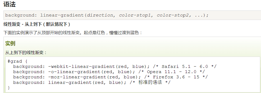
background:-webkit-radial-gradien :这个属性是讲颜色的渐变,比如哆啦A梦的蓝色,从右上再到左下,颜色逐渐加深,线性渐变;
线性渐变实例:
border-radius:转换为圆角; http://www.runoob.com/w3cnote/css3-rounded-picture-2.html 这个链接里面有很多我很喜欢的效果。
z-index:指定该元素的层叠顺序,比如说图片,若z-index为-1,覆盖在图片上面的字就会显示出来。
rgba(0,0,0,0.45):表示透明度的;
—overflow:设置当元素的内容溢出其区域时发生的事情,hidden,隐藏。
transform:转换和旋转;
这里还有一个动画效果,目的是让小叮当的眼睛动起来~
 <style type="text/css">

     @-webkit-keyframes eyemove{

         80%{margin:; }

         85%{margin:-20px 0 0 0;}

         90%{margin:0 0 0 0;}

         93%{margin:0 0 0 7px;}

         96%{margin:0 0 0 0;}

     }

     @-webkit-keyframes eyemove{

         80%{margin:; }

         85%{margin:-20px 0 0 0;}

         90%{margin:0 0 0 0;}

         93%{margin:0 0 0 7px;}

         96%{margin:0 0 0 0;}

     }

     @-webkit-keyframes eyemove{

         80%{margin:; }

         85%{margin:-20px 0 0 0;}

         90%{margin:0 0 0 0;}

         93%{margin:0 0 0 7px;}

         96%{margin:0 0 0 0;}

     }

     .doraemon .eyes .eye .black{

         -webkit-animation-name:eyemove;

         -webkit-animation-duration: 5s;

         -webkit-animation-timing-function:linear;

         -webkit-animation-iteration-count:;

         -webkit-animation-name:eyemove;

         -webkit-animation-duration: 5s;

         -webkit-animation-timing-function:linear;

         -webkit-animation-iteration-count:;

         -webkit-animation-name:eyemove;

         -webkit-animation-duration: 5s;

         -webkit-animation-timing-function:linear;

         -webkit-animation-iteration-count:;

     }

     </style>
最后再来看一看哆啦A梦的最终效果图。

多啦A梦的制作的更多相关文章
- 如何实现织梦dedecms表单提交时发送邮箱功能【已解决】
我们通过织梦系统制作网站时,很多客户需要有在线留言功能,这时就会用到自定义表单.但是很多用户觉得经常登陆后台查看留言信息太麻烦了,于是想能否在提交留言是直接把内容发送到指定邮箱.网站经过测试终于实现了 ...
- dedecms织梦做中英文(多语言)网站步骤详解
用dedecms织梦程序如何做中英文网站,下面是一个详细的图文教程,希望能帮助到大家. 以下是用dedecms织梦程序制作过的一个5国语言网站,下面开始教程. 一.首先在后台建栏目,有三点需要注意 1 ...
- 如何让{dede:channel}有子栏目显示子栏目,无子栏目不显示同级栏目
我们在使用织梦系统制作网站时经常会遇到网站栏目较多,显示当前栏目下的二级与三级栏目时,使用栏目嵌套标签,但是当三级栏目为空时,会显示同级栏目.从用户体验角度出发,常理情况下也是需要空白的,即二级栏目下 ...
- dede currentstyle属性完美解决方案
问题一.dede让channelartlist标签支持currentstyle属性 完美解决 打开include\taglib\channelartlist.lib.php找到$pv->Fiel ...
- dedecms跳转标签
我们在使用织梦dedecms制作网站的时候,有时会遇到利用arclist和list标签调用redirecturl属性.但是,dedecms的arclist和list标签不支持redirecturl.很 ...
- 一个技术汪的开源梦 —— 基于 .Net Core 的组件 Nuget 包制作 & 发布
一个技术汪的开源梦 —— 目录 微软的 ASP.Net Core 强化了 Nuget 的使用,所有的 .Net Core 组件均有 Nuget 管理,所以有必要探讨一下 .Net Core 组件制作 ...
- 织梦dedecms中html和xml格式的网站地图sitemap制作方法
sitemap是网站上各网页的列表.创建并提交sitemap有助于百度(Google)发现并了解您网站上的所有网页,包括百度通过传统抓取方式可能找不到的网页.还可以使用sitemap提供有关你网站的其 ...
- 织梦dedecms模板制作时,循环递增autoindex使用方法整理
文章转载:http://www.maihui123.com/dedecms/2012051964.html 织梦dedecms模板制作时,我们需要每循环一次,变量加一,这是就需要使用到autoinde ...
- CSS源码之纯css3制作的哆啦a梦图片
本文章向大家介绍一个纯css3制作的哆啦a梦图像,主要巧妙的使用了css3的border-radius属性,需要的朋友介意参考一下本文章的源码. 效果图: 源码 <!doctype html&g ...
随机推荐
- java基础编程——二维数组中的查找
题目描述 在一个二维数组中(每个一维数组的长度相同),每一行都按照从左到右递增的顺序排序,每一列都按照从上到下递增的顺序排序.请完成一个函数,输入这样的一个二维数组和一个整数,判断数组中是否含有该整数 ...
- linux三剑客之sed深度实践
参数: -a:追加文本到指定行后 -i:插入文本到指定行前 1.单行增加 [root@redhat~]# sed ' 2a 6,f ' linux.tet 1,a 2,b 6,f 3,c 4 ...
- 详解 JS 中 new 调用函数原理
JavaScript 中经常使用构造函数创建对象(通过 new 操作符调用一个函数),那在使用 new 调用一个函数的时候到底发生了什么?先看几个例子,再解释背后发生了什么. 1)看三个例子 1.1 ...
- String使用方法详解
标准c++中string类函数介绍 注意不是CString 之所以抛弃char*的字符串而选用C++标准程序库中的string类,是因为他和前者比较起来,不必 担心内存是否足够.字符串长度等等,而且作 ...
- [BZOJ1503]郁闷的出纳员(Splay)
Description OIER公司是一家大型专业化软件公司,有着数以万计的员工.作为一名出纳员,我的任务之一便是统计每位员工的工资.这本来是一份不错的工作,但是令人郁闷的是,我们的老板反复无常,经常 ...
- sql中一个服务器建立另一个服务器的连接
EXEC sp_addlinkedserver 'TonyLink','','SQLOLEDB','111.111.1.111(服务器名)' EXEC sp_addlinkedsrvlogin 'To ...
- Java面向对象---方法的创建与重载
方法的创建 方法就是可重复调用的代码段. 定义: 访问修饰符 返回值类型 方法名(参数){ 方法主体 } 返回值类型:void(无返回值):基本数据类型:应用数据类型:类对象等. 方法名的命名规则:第 ...
- python项目中输出指定颜色的日志
起因 在开发项目过程中,为了方便调试代码,经常会向stdout中输出一些日志,默认的这些日志就直接显示在了终端中.而一般的应用服务器,第三方库,甚至服务器的一些通告也会在终端中显示,这样就搅乱了我们想 ...
- 4 Template层-验证码
1.验证码 在用户注册.登录页面,为了防止暴力请求,可以加入验证码功能,如果验证码错误,则不需要继续处理,可以减轻一些服务器的压力 使用验证码也是一种有效的防止crsf的方法 验证码效果如下图: 官网 ...
- LOJ #6010. 「网络流 24 题」数字梯形
#6010. 「网络流 24 题」数字梯形 题目描述 给定一个由 n nn 行数字组成的数字梯形如下图所示.梯形的第一行有 m mm 个数字.从梯形的顶部的 m mm 个数字开始,在每个数字处可以 ...