WPF Input Validation Using MVVM
Data validation is a key part in WPF.
Validation is used to alert the user that the data he entered is illegal.
In this post we will see how to Validate user input using MVVM binding.
I have created 2 different templates for input validation :
Click WPFInputValidation Link To Download full source.
Example 1 :
To impelment validation we need to use IDataErrorInfo interface.
IDataErrorInfo interface provides the functionality to offer custom error information that a user interface can bind to.
It has 2 Properties :
- Error : Gets an error message indicating what is wrong with this object.
- string this[string columnName] Indexer : it will return the error message for the property. The default is an empty string ("")
Let's go through step by step to understand validation with mvvm binding and styling the validation template.
Step 1 : First change ErrorToolTip style by customizing the Template.
<ControlTemplate x:Key="ErrorToolTipTemplate_1">

 <ControlTemplate.Resources>

  <Style x:Key="textblockErrorTooltip" TargetType="TextBlock">

   <Setter Property="HorizontalAlignment" Value="Center" />

   <Setter Property="VerticalAlignment" Value="Center" />

   <Setter Property="FontWeight" Value="Bold" />

   <Setter Property="Foreground" Value="White" />

   <Setter Property="Margin" Value="10 0 10 0" />

  </Style>

 </ControlTemplate.Resources>

 <DockPanel LastChildFill="true">

  <Border Height="Auto"

   Margin="5,0,0,0"

   Background="#DC000C"

   CornerRadius="3"

   DockPanel.Dock="right">

    <TextBlock Style="{StaticResource textblockErrorTooltip}"

Text="{Binding ElementName=customAdorner, Path=AdornedElement.(Validation.Errors)[0].ErrorContent}" />

  </Border>

  <AdornedElementPlaceholder Name="customAdorner">

   <Border BorderBrush="#DC000C" BorderThickness="1.3" />

  </AdornedElementPlaceholder>

 </DockPanel>

</ControlTemplate>
As shown in above source, created ControlTemplate and changed the error tooltip style by AddingBorder control in DockPanel, within Border TextBlock placed with Text property binded to the error message set to the property from viewmodel.
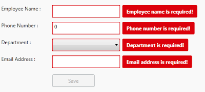
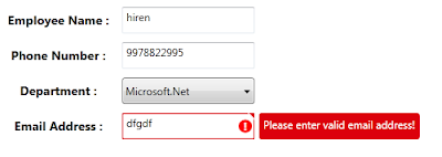
changed Backgroud of the border to Red so it will display error message surround with border fill with red color. This will dispaly error on right side of the TextBox control. like :
ErrorTemplate uses adorner layer. which is drawing layer, using adorner layer you can add visual appearance to indicate an error without replacing controltemplate.
AdornedElementPlaceholder is part of the Validation feature of data binding. it specify where a decorated control is placed relative to other elements in the ControlTemplate.
Step 2 : Create TextBox style and set Validation ErrorTemplate.
<Style TargetType="TextBox">

 <Setter Property="HorizontalAlignment" Value="Left" />

 <Setter Property="VerticalAlignment" Value="Top" />

 <Setter Property="Width" Value="150" />

 <Setter Property="Height" Value="30" />

 <Setter Property="Validation.ErrorTemplate"

                 Value="{DynamicResource ErrorToolTipTemplate_1}" />

 <Style.Triggers>

  <Trigger Property="Validation.HasError" Value="true">

   <Setter Property="ToolTip"

Value="{Binding RelativeSource={RelativeSource Self}, Path=(Validation.Errors)[0].ErrorContent}" />

  </Trigger>

 </Style.Triggers>

</Style>
Created style of TargetType=TextBox, and Validation.ErrorTemplate is set to previously created template (DynamicResource ErrorToolTipTemplate)
you have to set Resource using DynamicResource, if your temaplate/style is available at global place (App.xaml)
if your control style and template is created in page itself then set resource using StaticResourcekeyword.
Step 3 : Create ViewModel class, that contains Properties to Bind into view.
public class InputValidationViewModel : ViewModelBase

{

 public InputValidationViewModel()

 {

 }

 private string employeeName;

 public string EmployeeName

 {

  get { return employeeName; }

  set { employeeName = value; RaisePropertyChanged("EmployeeName"); }

 }

 private string email;

 public string Email

 {

  get { return email; }

  set {email = value; RaisePropertyChanged("Email"); }

 }

 private long phoneNumber;

 public long PhoneNumber

 {

  get { return phoneNumber; }

  set { phoneNumber = value; RaisePropertyChanged("PhoneNumber"); }

 }

 private bool IsValidEmailAddress

 {

  get { return emailRegex.IsMatch(Email); }

 }

}
as shown in above code, ViewModel created and added some propeties that need to bind in UserControl.
Step 4 : Implement IDataErrorInfo Interface
public class InputValidationViewModel : ViewModelBase, IDataErrorInfo
{
private Regex emailRegex = new Regex(@"^([a-zA-Z0-9_\.\-])+\@(([a-zA-Z0-9\-])+\.)+([a-zA-Z0-9]{2,4})+$");
public InputValidationViewModel()
{
} private string error = string.Empty;
public string Error
{
get { return error; }
}
public string this[string columnName]
{
get
{
error = string.Empty;
if (columnName == "EmployeeName" && string.IsNullOrWhiteSpace(EmployeeName))
{
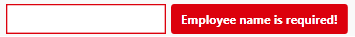
error = "Employee name is required!";
}
else if (columnName == "PhoneNumber" && PhoneNumber == 0)
{
error = "Phone number is required!";
}
else if (columnName == "PhoneNumber" && PhoneNumber.ToString().Length > 10)
{
error = "Phone number must have less than or equal to 10 digits!";
}
else if (columnName == "Email" && string.IsNullOrWhiteSpace(Email))
{
error = "Email address is required!";
}
else if (columnName == "Email" && !IsValidEmailAddress)
{
error = "Please enter valid email address!";
}
return error; } }
}
IDataErrorInfo has Error property which returns the validation error that does not match the codition.
in above code, i set the error for each propeties by checking the codition, it coditiion is false then set the error for that property.
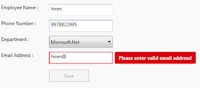
For valid email validation, created Regex expression to check entered email address is valid ro not.
This error appear on right side of the control that has property binded.
Step 5 : Last, Add TextBox cotrol in View
<TextBox Grid.Row="1"

 Grid.Column="1"

 Text="{Binding EmployeeName,

           Mode=TwoWay,

           UpdateSourceTrigger=PropertyChanged,

    ValidatesOnDataErrors=True}" />
Here EmployeeName proeprty is binded to TextBox control, you have to set ValidatesOnDataErrors=True to throw data error ( entered data is valida or not.)
Mode=TwoWay will allow user to change property from UI as well update UI from ViewModel property.
UpdateSourceTrigger=PropertyChanged will notify changes is updated as soon as the property changes.
If UpdateSourceTrigger is not set, then TextBox was not immediately sent back to the source. Instead, the source was updated only after focus was lost on the TextBox.
This behavior is controlled by a property on the binding called UpdateSourceTrigger.
Example 2 :
In this example, only ControlTemplate is chaned, other things like : ViewModels Property, Controls are same.
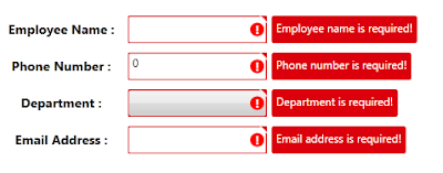
As shown in above image, tooltip style is changed, ! mark with red circle surrounded image is added on the errortemplate.
small triangle added on template, to show top right corner of the control if any data error exists.
below are the template change compare to previous example template :
<Border x:Name="ValidationErrorElement"

 BorderBrush="#FFDB000C"

 BorderThickness="1.2"

 CornerRadius="1"

 ToolTip="{Binding ElementName=customAdorner,

 Path=AdornedElement.(Validation.Errors)[0].ErrorContent}">

 <Grid Width="12"

  Height="12"

  Margin="1,-4,-4,0"

  HorizontalAlignment="Right"

  VerticalAlignment="Top"

  Background="Transparent">

  <Path Margin="1,3,0,0"

        Data="M 1,0 L6,0 A 2,2 90 0 1 8,2 L8,7 z"

        Fill="#FFDC000C" />

  <Path Margin="1,3,0,0"

        Data="M 0,0 L2,0 L 8,6 L8,8"

        Fill="#ffffff" />

 </Grid>

</Border>

<Border Grid.Column="0"

 Width="15"

 Height="15"

 Margin="0 0 3 0"

 HorizontalAlignment="Right"

 VerticalAlignment="Center"

 Background="Red"

 CornerRadius="10"

 ToolTip="{Binding ElementName=customAdorner,

 Path=AdornedElement.(Validation.Errors)[0].ErrorContent}">

 <TextBlock HorizontalAlignment="center"

  VerticalAlignment="center"

  FontWeight="Bold"

  Foreground="white"

  Text="!" />

</Border>
as shown in above code,
In First border, 2 shapes is created using path, this will create Triangle shape to disply on top right corner of the control.
To know more about how to draw shpaes using Path, Please refer Shapes & Drawing in WPF This Link
it will help you to create your custom shapes based on your requirement.
Second border will create red cirlce (by setting CornerRadius proeprty) with ! text wihin cirlce area.
it will display right side of the cotrol, if any data error is there for property.
Conclusion
This way you can create you custom error template for input controls.
Dwonload link
WPF Input Validation Using MVVM的更多相关文章
- 从PRISM开始学WPF(七)MVVM(三)事件聚合器EventAggregator-更新至Prism7.1
原文:从PRISM开始学WPF(七)MVVM(三)事件聚合器EventAggregator-更新至Prism7.1 事件聚合器EventAggregator [7.1updated]除了app部分,没 ...
- WPF学习08:MVVM 预备知识之COMMAND
WPF内建的COMMAND是GOF 提出的23种设计模式中,命令模式的实现. 本文是WPF学习07:MVVM 预备知识之数据绑定的后续,将说明实现COMMAND的三个重点:ICommand Comm ...
- 从PRISM开始学WPF(七)MVVM(三)事件聚合器EventAggregator?
原文:从PRISM开始学WPF(七)MVVM(三)事件聚合器EventAggregator? 从PRISM开始学WPF(一)WPF? 从PRISM开始学WPF(二)Prism? 从PRISM开始学WP ...
- 在 WPF 程序中使用 MVVM 模式
MVVM 模式是一个很久之前的技术了,最近因为一个项目的原因,需要使用 WPF 技术,所以,重新翻出来从前的一段程序,重温一下当年的技术. MVVM 模式 MVVM 实际上涉及三个部分,Model, ...
- (ZZ)WPF经典编程模式-MVVM示例讲解
http://www.cnblogs.com/xjxz/archive/2012/11/14/WPF.html 本篇从两个方面来讨论MVVM模式: MVVM理论知识 MVVM示例讲解 一,MVVM理论 ...
- 从PRISM开始学WPF(六)MVVM(二)Command?
从PRISM开始学WPF(一)WPF? 从PRISM开始学WPF(二)Prism? 从PRISM开始学WPF(三)Prism-Region? 从PRISM开始学WPF(四)Prism-Module? ...
- 从PRISM开始学WPF(六)MVVM(二)Command-更新至Prism7.1
命令绑定(Command) [7.1updated]这一节除了基础app部分,并没有什么变化 什么是Command? 先看下微软官方的说明: Commanding is an input mechan ...
- WPF 从属性赋值到MVVM模式详解
示例源码 这两天学习了一下MVVM模式,和大家分享一下,也作为自己的学习笔记.这里不定义MVVM的概念,不用苍白的文字说它的好处,而是从简单的赋值讲起,一步步建立一个MVVM模式的Simple.通过前 ...
- WPF学习笔记:MVVM模式下,ViewModel如何关闭View?
原文:http://blog.csdn.net/leftfist/article/details/32349731 矫枉过正,从一个极端走向另一个极端.MVVM模式,View只负责呈现,虽然也有后台代 ...
随机推荐
- [POI2010]GRA-The Minima Game
OJ题号:洛谷3507 思路: 如果选了$k_i$,那么你的对手就可以选上所有$\geq{k_i}$的数.那么他其中获得的分数也一定$\geq{k_i}$. 如果你选了$k_i$以及所有$\geq{k ...
- 解决qt提示:qt.network.ssl: QSslSocket: cannot call unresolved function DH_free
方法一(解决):把C:\Qt\Qt5.8.0\Tools\QtCreator\bin下的libeay32.dll和ssleay32.dll库复制到C:\Qt\Qt5.8.0\5.8\msvc2015_ ...
- ASP.NET MVC 4 中的JSON数据交互
前台Ajax请求很多时候需要从后台获取JSON格式数据,一般有以下方式: 拼接字符串 return Content("{\"id\":\"1\",\& ...
- 异常 try catch finally return 执行关系 MD
Markdown版本笔记 我的GitHub首页 我的博客 我的微信 我的邮箱 MyAndroidBlogs baiqiantao baiqiantao bqt20094 baiqiantao@sina ...
- IDEA下使用Maven的test命令乱码
IDEA下使用Maven的test命令乱码的时候,加上 -Dfile.encoding=GBK 就可以解决啦 如下图所示: 或者在Maven的pom.xml文件中增加: <propert ...
- grid - 网格项目跨行或跨列
默认情况下网格项目跨度只有一个列和行,但可以跨越多个行和列. 1.可以通过设置grid-column-end和grid-column-start距离多个网络线号实现多个列跨越. <view cl ...
- 微软BI 之SSRS 系列 - 如何让报表在一页显示,两种常用的技巧
通常情况下,SSRS 报表在页面内容过多的时候会自动分页.但有的时候当页面内容不是很多,大概最多2页的情况下,或者客户要求所有内容必须在一页显示时,应该如何设置. 实际上,要考虑两种情况:第一种情况是 ...
- efcore数据库自动生成
// This method gets called by the runtime. Use this method to configure the HTTP request pipeline. p ...
- !HDU 1574 RP-dp-(重点在状态确定)
题意:有n件事.每件事若发生有两种情况.添加RP为a,可是收益会降低c:降低R为a,收益会添加c. 每件事可以发生的前提是小于等于或者大于等于门限值b.求最大收益. 分析:这题我没找到状态,所以就不会 ...
- asp.net core 2.1 post 无法提交参数?
起 ,是微软二逼升级了.....不是说好了合并Controller 了吗?又倒回去了.................