
H5中需要掌握的 ANIMATION 动画效果
CSS3的动画在PC网页上或者APP上用得越来越多,比如H5页面的应用,目前在营销传播上的意义比较大,还有企业官网或者APP主要介绍也用得比较多,当然还有很多地方都用到.所以学习css的动画也迫在眉睫.那我们就进入主题!
animation 属性在CSS中可以使用其他的css属性,来实现动画,例如color,background-color,height或者width.每一个动画需要定义@keyframes 动画名,作为animation的属性值,例如:
.element {

  animation: pulse 5s infinite;
}
@keyframes pulse {

  0% {

    background-color: #001F3F;

  }

  100% {

    background-color: #FF4136;

  }

}
我们来实现下面这个动作:
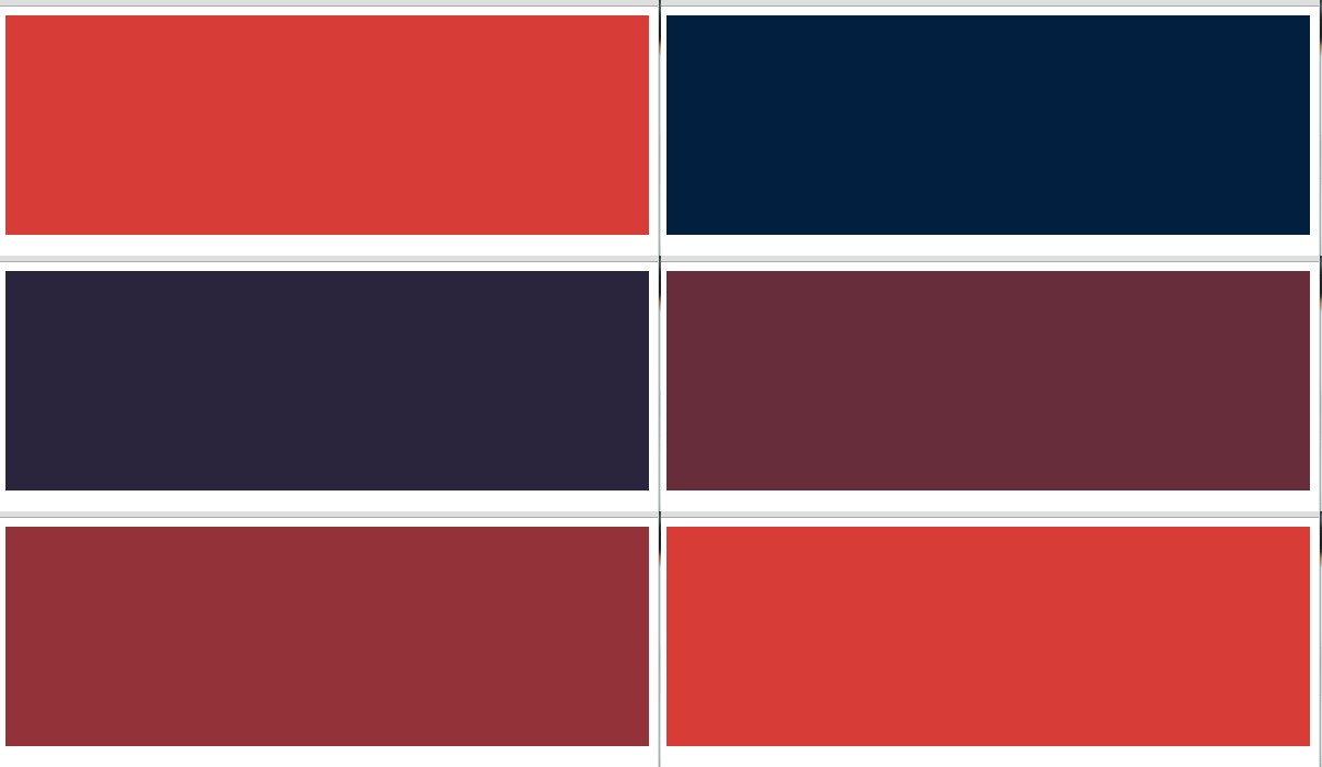
HTML结构:
- <div class="element"></div>
CSS代码:
- .element {
- width: 100%;
- height: 100%;
- animation: pulse 5s infinite;
- }
- @keyframes pulse {
- 0% {
- background-color: #001F3F;
- }
- 100% {
- background-color: #FF4136;
- }
- }
每一个 @keyframes 属性规则的定义,都会在指定的时间内发生动作.例如,动作从0%开始,到100%结束.keyframes 可以用简写方式,animation属性来控制,或者其他八个子属性,控制keyframes如何运作..
子属性
animation-name: 申明动画@keyframes的名称.animation-duration: 动画在多久内完成一个周期.animation-timing-function: 设置预加速度曲线动画,例如 ease 或者linear.animation-delay: 动画延迟执行的时间.animation-direction: 设定动画执行完成后的方向.默认是起始开始执行.animation-iteration-count: 动画执行的次数.animation-fill-mode:设定动画是执行之前还是之后.
例如,你可以设置动画保持在最后的状态,或者也可以切换回动画开始的状态.animation-play-state: 开始或者暂停动画
这些属性可以这样使用:
@keyframes stretch {

  /* declare animation actions here */
}
.element {

  animation-name: stretch;

  animation-duration: 1.5s;

  animation-timing-function: ease-out;

  animation-delay: 0;

  animation-direction: alternate;

  animation-iteration-count: infinite;

  animation-fill-mode: none;

  animation-play-state: running;
}
/*

  is the same as:

*/
.element {

  animation:

    stretch

    1.5s

    ease-out

    0

    alternate

    infinite

    none

    running;

}
我们来看下这个动画:

HTML结构:
- <div class="element"></div>
CSS代码:
- .element {
- height: 250px;
- width: 250px;
- margin: 0 auto;
- background-color: red;
- animation-name: stretch;
- animation-duration: 1.5s;
- animation-timing-function: ease-out;
- animation-delay: 0;
- animation-direction: alternate;
- animation-iteration-count: infinite;
- animation-fill-mode: none;
- animation-play-state: running;
- }
- @keyframes stretch {
- 0% {
- transform: scale(.3);
- background-color: red;
- border-radius: 100%;
- }
- 50% {
- background-color: orange;
- }
- 100% {
- transform: scale(1.5);
- background-color: yellow;
- }
- }
- body,
- html {
- height: 100%;
- }
- body {
- display: flex;
- align-items: center;
- justify-content: center;
- }
下面是子属性可以使用的所有值列表:
animation-timing-function |
ease, ease-out, ease-in, ease-in-out, linear, cubic-bezier(x1, y1, x2, y2) (例如. cubic-bezier(0.5, 0.2, 0.3, 1.0)) |
animation-duration |
Xs 或者 Xms |
animation-delay |
Xs 或者 Xms |
animation-iteration-count |
X |
animation-fill-mode |
forwards, backwards, both, none |
animation-direction |
normal, alternate |
animation-play-state |
paused, running, running |
合并写法
如果动画有着同样的开始和结束属性,可以用逗号分隔0%和100%:
@keyframes pulse {

  0%, 100% {

    background-color: yellow;

  }

  50% {

    background-color: red;

  }

}
多个动画
一个选择器可以同时申明多个动画,它们之间用逗号隔开.下面的例子,使用了两个keyframe,也就是2个动画的效果
.element {

  animation:

    pulse 3s ease infinite alternate,

    nudge 5s linear infinite alternate;
}
我们看下下面这个动画

HTML代码结构
- <div class="element"></div>
CSS代码:
- .element {
- height: 400px;
- width: 400px;
- background-color: red;
- animation:
- pulse 3s ease infinite alternate,
- nudge 5s linear infinite alternate;
- border-radius: 100%;
- }
- @keyframes pulse {
- 0%, 100% {
- background-color: red;
- }
- 50% {
- background-color: orange;
- }
- }
- @keyframes nudge {
- 0%, 100% {
- transform: translate(0, 0);
- }
- 50% {
- transform: translate(150px, 0);
- }
- 80% {
- transform: translate(-150px, 0);
- }
- }
- html, body {
- height: 100%;
- }
- body {
- display: flex;
- align-items: center;
- justify-content: center;
- }
性能
多数动画属性都存在着性能问题,因此,我们在使用它们的时候,需要谨慎的去处理.可以,我们也可以和下面的安全性动画一起使用:
transform: translate()transform: scale()transform: rotate()opacity
本文属于吴统威的博客,微信公众号:bianchengderen 的原创文章,转载时请注明出处及相应链接:http://www.wutongwei.com/front/infor_showone.tweb?id=151 ,欢迎大家传播与分享.

H5中需要掌握的 ANIMATION 动画效果的更多相关文章
- Android中xml设置Animation动画效果详解
在 Android 中, Animation 动画效果的实现可以通过两种方式进行实现,一种是 tweened animation 渐变动画,另一种是 frame by frame animation ...
- android中设置Animation 动画效果
在 Android 中, Animation 动画效果的实现可以通过两种方式进行实现,一种是 tweened animation 渐变动画,另一种是 frame by frame animation ...
- 模仿百度首页“元宵节汤圆”动图,并实现360°不停旋转(CSS3的animation动画效果)
模仿百度首页“元宵节汤圆”动图,并实现360°不停旋转(CSS3的animation动画效果) 效果图: 切图地址: https://ss1.bdstatic.com/5eN1bjq8AAUYm2zg ...
- 使用jQuery 中的显示与隐藏动画效果实现折叠下拉菜单的收缩和展开,在页面的列表中有若干项,列表的每项中有一个二级列表,二级列表默认为隐藏状态。点击列表的项,切换二级列表的显示或隐藏状态
查看本章节 查看作业目录 需求说明: 使用jQuery 中的显示与隐藏动画效果实现折叠下拉菜单的收缩和展开,在页面的列表中有若干项,列表的每项中有一个二级列表,二级列表默认为隐藏状态.点击列表的项,切 ...
- android Animation 动画效果介绍
Android的animation由四种类型组成 XML中 alpha 渐变透明度动画效果 scale 渐变尺寸伸缩动画效果 translate 画面转换位置移动动画效果 rotate 画面转移旋转动 ...
- Mono For Android中简单实现按钮的动画效果
Android中动画的分Tween Animation和Frame Animation,本节主要讲Tween Animation的实现. 一般是通过XML文件来定义动画的,具体如下: 1.在项目res ...
- ios animation 动画效果实现
1.过渡动画 CATransition CATransition *animation = [CATransition animation]; [animation setDuration:1.0]; ...
- AngularJS中实现显示或隐藏动画效果的3种方式
本篇体验在AngularJS中实现在"显示/隐藏"这2种状态切换间添加动画效果. 通过CSS方式实现显示/隐藏动画效果 思路: →npm install angular-anima ...
- Android Animation动画效果简介
AlphaAnimation 淡入淡出动画 <alpha>A fade-in or fade-out animation. Represents an AlphaAnimation. a ...
随机推荐
- 阻止iOS设备锁屏
[[UIApplicationsharedApplication] setIdleTimerDisabled: YES];
- struts2 最新S2-016-S2-017漏洞通杀struts2所有版本及修复方法
详情查看http://zone.wooyun.org/content/5159 官方漏洞说明 http://struts.apache.org/release/2.3.x/docs/s2-016.ht ...
- 什么要缓存curl资源
在看公司的代码框架底层时,发现了一个问题,如下: 代码中调用接口时,使用的是curl,框架将curl资源以IP :端口的形式缓存了下来,例如: 10.10.10.10:80 curl1 10. ...
- selenium.common.exceptions.TimeoutException: Message: Screenshot: available via screen
在使用selenium+phantomjs的时候在Windows平台下能够正常工作,在Linux下却不能,并得到错误信息: selenium.common.exceptions.TimeoutExce ...
- c# 发送邮件、附件 分类: C# 2014-12-17 16:41 201人阅读 评论(0) 收藏
WinForm窗体代码如下: <span style="font-size:14px;">using System; using System.Collections. ...
- 一个Hibernate小程序
基本步骤 在前一篇博文Hibernate环境搭建中为大家详细的介绍如何搭建一个学习新类库的学习环境.今天,为大家带来一个Hibernate小例子,让大家能够快速上手. 步骤如下: 1.配置hibern ...
- android:ImageView 和ImageButton的区别
1.继承不同: java.lang.Object ↳ android.view.View ↳android.widget.ImageView ↳ android.widget.ImageButton ...
- 构建ASP.NET MVC4+EF5+EasyUI+Unity2.x注入的后台管理系统(17)-LinQ动态排序
原文:构建ASP.NET MVC4+EF5+EasyUI+Unity2.x注入的后台管理系统(17)-LinQ动态排序 首先修复程序中的一个BUG这个BUG在GridPager类中,把sord修改为s ...
- SDUT2608(Alice and Bob)
题目描述 Alice and Bob like playing games very much.Today, they introduce a new game. There is a polynom ...
- webservice传递特殊字符时的解决的方法
webservice soap报文是xml格式交互的,当中针对特殊字符传递无法解析,导致数据处理失败. 解决的方法例如以下: 1.在发送报文之前,针对报文进行base64转码,转义后避免报文中含有特殊 ...